OVA App: Privacy-First Period Tracking
Raksha T
Verified
OVA App: A privacy first , Pg13+ Period Tracking App for women.
Ova is focused on allowing women of all ages to track their periods, have a period companion - Ova to guide them through their cycles, give them insights about their period and give predictive feedback of their upcoming cycles, symptoms and moods. Ova is aimed to provide users with a warm companion who acts as their buddy throughout their reproductive journey.
What I did + Timelines
Product Strategy + Vision + UX (2 weeks)
UI design + Handover (2 weeks)
When Hannah Wartooth approached me with this project she was clear about what she was looking for which is a privacy-first , teenage friendly period tracking app. Her frustruation came from all the market competitives that make period tracking app explicit and unfriendly for the younger generation and also share their data which results in a lack of privacy for the users.
Hannah has a few consumer apps on Base and is a crypto influencer on X. She was looking to bring this app under her parent company (Cryptiq) and looking to test this app with early users. I immediately connected with her on this vision and we decided to start right away with the project on the day of our first call.
In order to understand her frustrations and reason for her solution I dug into a bunch of period tracking apps in the market to really see where this industry is going. We all are aware of the major competitions like Flo ($9M revenue per month as of 2025) and are sure of the market need of such a product.
Since this is a 0-1 product I started with basic competitor analysis and created a PRD to outline all the features that were relevant to what we were building.
I looked into 4 competitors
Looking into these apps a few things were clear :
We needed an app that felt less analytical and more warm
We needed a bit of educational content. Not every woman knows what leutal phase is or ovulation is. Adding an educational layer meant we're helping women of all age understand their bodies better
We had to let the users know their data is encrypted.
A companion resonated the most because that seemed slightly missing from the market. AI companions are on a rise in the US and it made sense to hop onto the trend to make the most out of this wave.
Moodboard 1 : Digital Confection
Bright, colorful, approachable, sweet, new school, feminine.
This design language meant we were going for something approachable, fun, slightly gamified and light hearted. We could make the language catered towards a holistic approach and not just focus on the cycles but also the symptoms , cravings etc. We wanted to appeal to the younger girls so this design direction would align with the aesthetic of that demographic as well.
Moodboard 2 : Warm constructivism
Warm, grown up, sophisticated, subtle, feminine, grounded.
This direction was about creating something bold, warm, and expressive. We wanted it to feel mature but still full of energy - tactile, confident, and a little sensual. The palette pulls from natural tones like clay, skin, and peach to bring in a sense of warmth and depth, while the structured shapes and geometry keep it feeling sharp and modern. It’s less playful, more grounded, something that speaks to creativity and confidence while still feeling human and emotional.
After the presentation the winner between these was the 1st direction - Digital Confection. The idea that we want to cater to a bigger demographic and not just grown ups steered this decision.
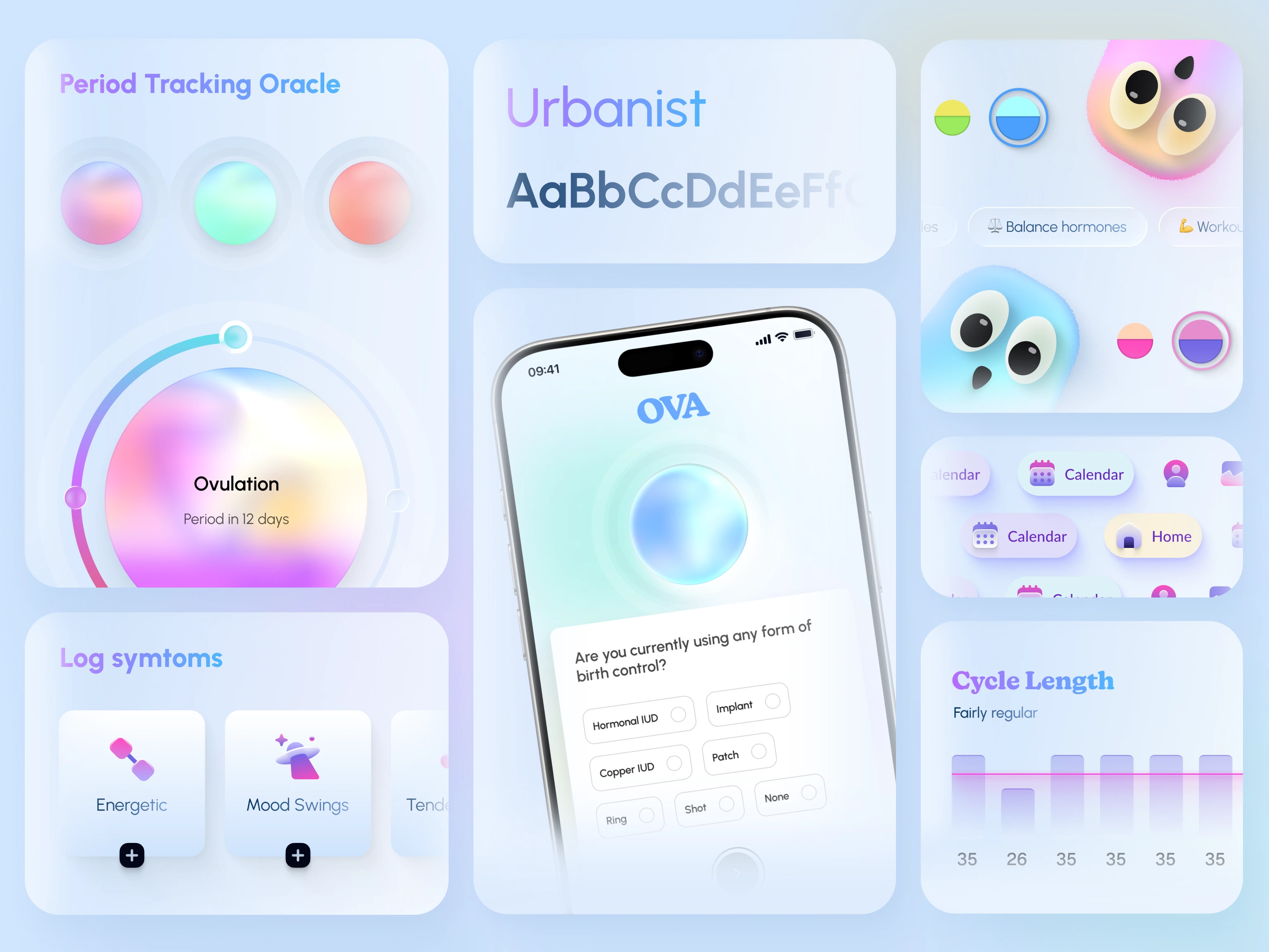
Ova character concepts
We were clear we wanted Ova as a companion. Something not too complicated like a full blown character but something cute and relatable for users to connect with. I started with a few digital sketches and drawings (I made some silly drawings that I may or may not be proud of to get into my creative flow)
The finalised characters were selected based off of the resemblance of an egg (OVA) which is the main element of periods in women. The character was minimal, youthful and curious. This vibe resonated with the kind of app we were trying to build and the target demographic. The colors used made sure to keep the design style aligned with our direction.
During onboarding we let the users pick between the Ova they wanted, giving each Ova a unique color combination, name and character. This would allow users to pick the tone they feel most comfortable with.
We asked the users basic and important questions during onboarding about their hormonal health, birth control and goals to better align the app to their specific needs.
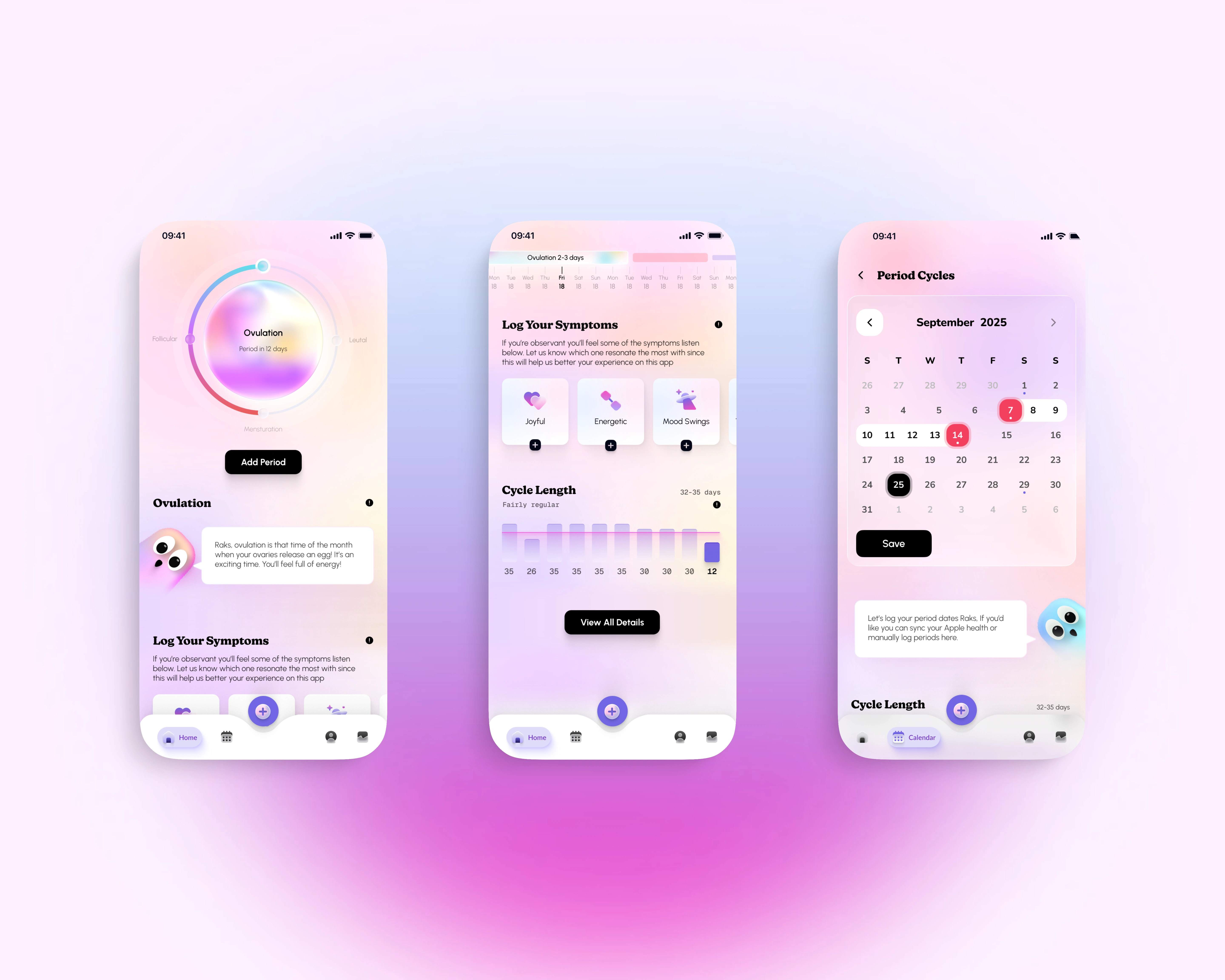
The users get introduced to an Oracle that shows them their current cycle status, allows them to log their symptoms (if any) and allow them to log their period which then helps the app predict their future cycles, symptoms and the health of their cycle.
We also added a feature where the users could chat with Ova and get personalised recommendations on their paid plan which could also have a voice enabled chat for convenience.
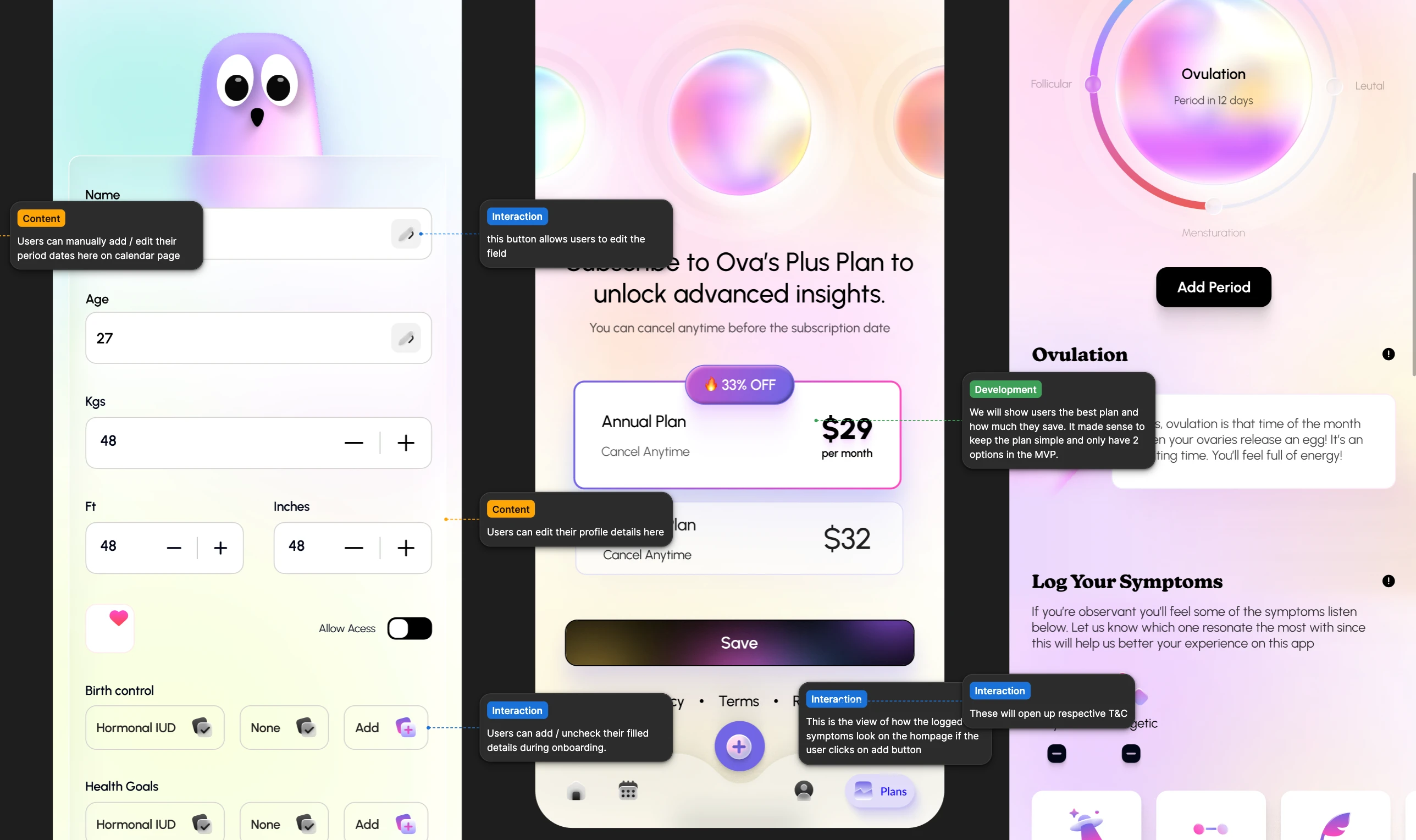
Development : The beta version of the app will be released on Base and after early feedback will be released on IOS and Android devices. For dev annotations I bucketed them into Interaction / Content / Development.
For the parent company and to check the early release of Ova Cryptiq head over to : https://x.com/cryptiqofficial
This was my 0-1 journey of building OVA with Hannah. If you like what you see head over to www.raksha.design to book a call with me. Cheers!
Like this project
Posted Feb 20, 2026
Designed a privacy-first period tracking app for Cryptiq, focusing on teenage-friendly UX and user privacy.
Likes
1
Views
36
Timeline
Aug 25, 2025 - Ongoing