Framer & Motion Designer | Bringing Ideas to life


Framer & Motion Designer | Bringing Ideas to life



AI Video Producer | Product Designer | UI & Branding


AI Video Producer | Product Designer | UI & Branding
I love the concept behind HCB and the amount of effort everyone at Contra Labs is putting into testing and comparing models through pure taste and creative direction.
So I decided to give it a shot myself and create these two clips using the exact same prompt, but with different models.
Curious to know which one works better as a hook according to you?
5
21
3.5K

Imagine - complete protection from scams, cyber threats, device theft, privacy breaches, and even low-battery warnings for all your devices.
Hey everyone,
I created Links ✽ for the AnythingAppChallenge. It’s a universal command center for all your devices, phones, tablets, and laptops.
Users get a real-time view of what’s active, needs attention, and can access quick actions like pinging or locking devices.
The live moderation feed highlights unusual activity, such as spikes, risky sites, and odd logins, so you can resolve issues instantly. Links ✽ also supports daily routines with quiet hours and automation rules, ensuring a healthy screen time and protected workflows. Each user has a private view, while shared devices are visible to the group.
A fast, human-centered way to manage your screens, clean, real-time, and premium.
6
33
4.4K
I asked myself a simple question:
"When is human, human enough?"
And believe it or not, this challenge completely changed the way I think about creative thinking and AI assisted workflows.
Over the past few days, I have been sharing my journey here on @Contra and on X, asking people to contribute their thoughts on ideation, visual direction, and refinement. From classic pen and paper brainstorming to a fully realized product, every step happened within the limited timeline of the @Envato Challenge.
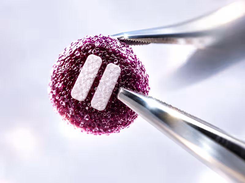
'Pause (https://on.contra.com/cLGnfB)' is the brand I created for this challenge, it is the result of human creativity steering AI capabilities and the outcome goes far beyond simply generating visuals, it demonstrates what happens when intentional thinking guides powerful tools.
Using Envato's AI Suite, I built an entire brand from the logo and visual assets to the product campaign and even a motion design video. The experience exceeded every expectation I had.
The tagline, "PAUSE THE NOISE," was written by me. It does not just define the brand. It also reflects what I believe is the real message behind this challenge: pausing the noise around the idea that AI is here to replace creatives.
The human contribution was never just writing prompts. It was constantly questioning assumptions, pivoting from one idea to another, exploring different visual languages, selecting the strongest assets, directing the product campaign, shaping the motion design, and refining every output until it aligned with the vision. AI generated the assets. Human creativity gave them purpose.
I am so proud of the final result that I am now turning Pause into a detailed Contra case study.
My two cents:
AI is a tool. Like a sword, it is only as powerful as the person wielding it. In the hands of someone without vision, it loses its edge. In the hands of a creative thinker, it becomes a force multiplier. The future does not belong to AI alone. It belongs to people who know how to think, direct, and create with it.
Sound on 🔊
Scroll through the comments to explore all the visuals and the complete motion design videos.
Tools Used -
Envato
My own Vibe coded text behind video & Video editing apps
16
23
3.2K


Brand & Web Designer for Immersive Digital Experiences

Brand & Web Designer for Immersive Digital Experiences



AI Video Producer | Brand & Web Designer for Startups

AI Video Producer | Brand & Web Designer for Startups


Product design, Framer development, full-stack builds
Product design, Framer development, full-stack builds


Product & Web Designer for AI/Tech Startups
Product & Web Designer for AI/Tech Startups

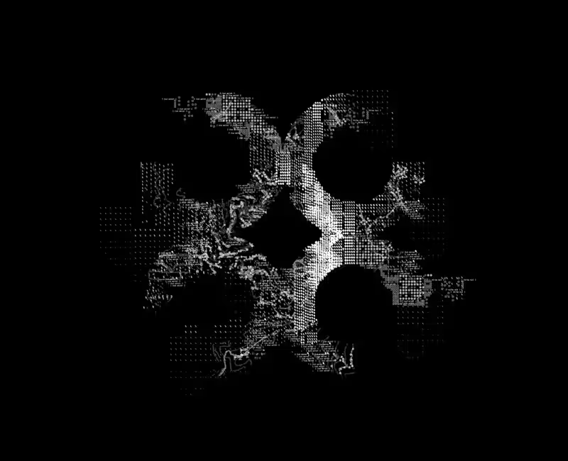
Building a brand pattern for a diagnostics AI company — this one’s a work in progress!
I’ve been experimenting with micro-details like symbols (slashes, squares, text fragments) and topographical map lines inspired by the brand’s origin location to bring depth and structure to the logomark.
Still refining the details over the next few days, but I think it has started to shape up really well!
4
670

Product Designer | Mobile apps, Web apps, Software

Product Designer | Mobile apps, Web apps, Software


The only person you need to strategize your marketing
- $•••••
- Earned
- 10x
- Hired
- 5.0
- Rating
- 55
- Followers
The only person you need to strategize your marketing