
Brand Identity, Art Direction & Digital Precise, opinionated

Brand Identity, Art Direction & Digital Precise, opinionated



Framer Designer & Developer | Top Creator 🏆


Framer Designer & Developer | Top Creator 🏆




Framer Expert | Web & UX/UI Design | App Design
Framer Expert | Web & UX/UI Design | App Design


Digital Web Designer/ Framer Developer
Digital Web Designer/ Framer Developer


Brand identities • Websites
Italian taste, worldwide vision.
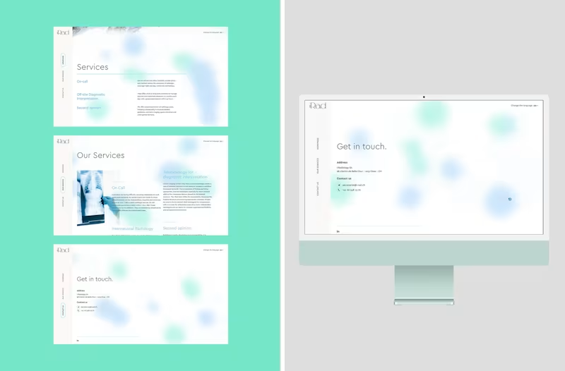
iRAD — Brand Identity & Website
iRAD is a Swiss teleradiology company providing specialist radiological reporting and support to hospitals, clinics and medical centres.
The goal was to build a visual identity that could communicate expertise and reliability without relying on the cold, clinical aesthetics traditionally associated with healthcare.
Starting from the brand identity, I developed a softer and more contemporary visual language through a distinctive colour palette, refined typography, generous whitespace and rounded graphic elements. The visual direction balances the precision of a highly technical service with a more human and approachable personality.
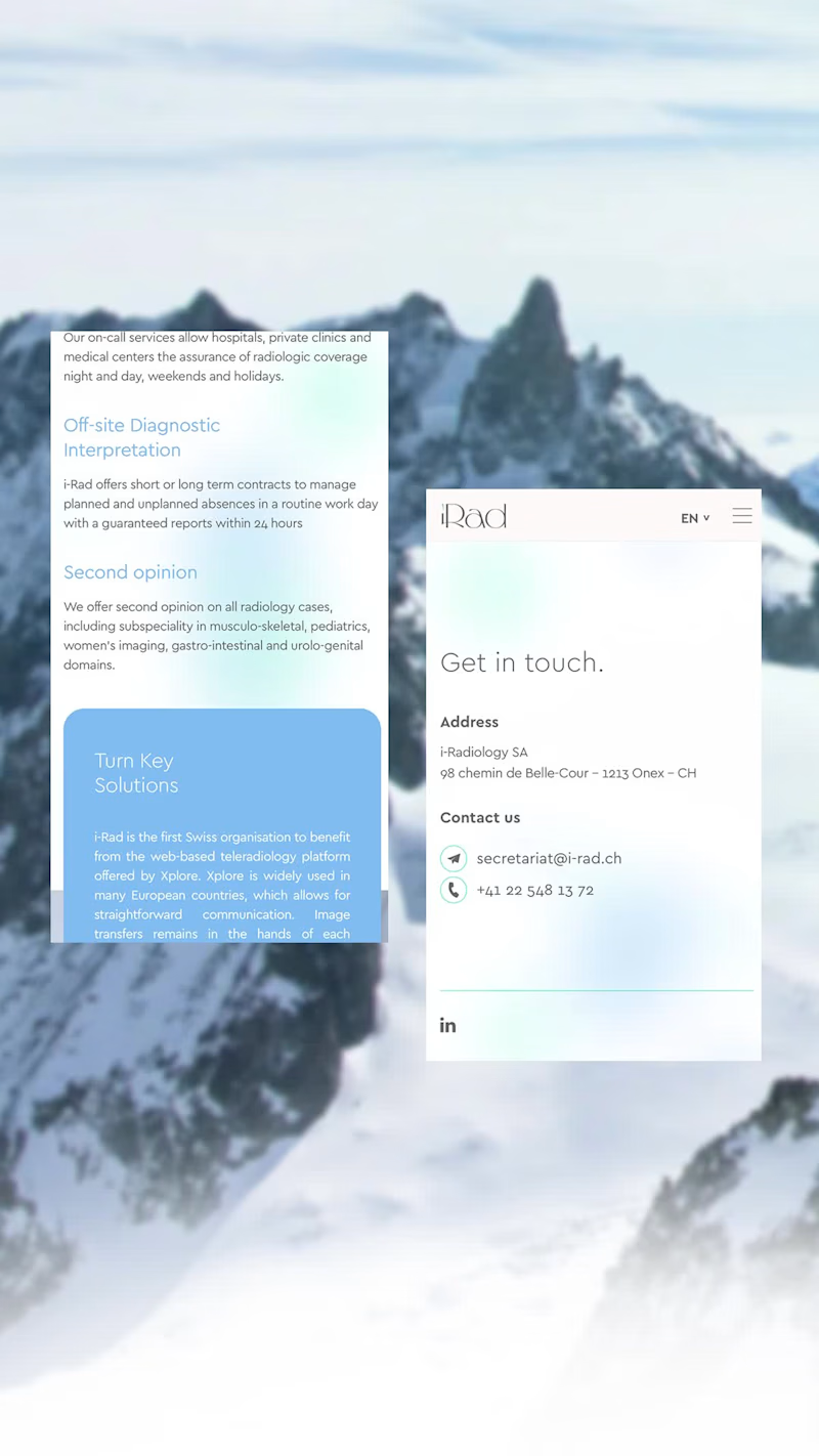
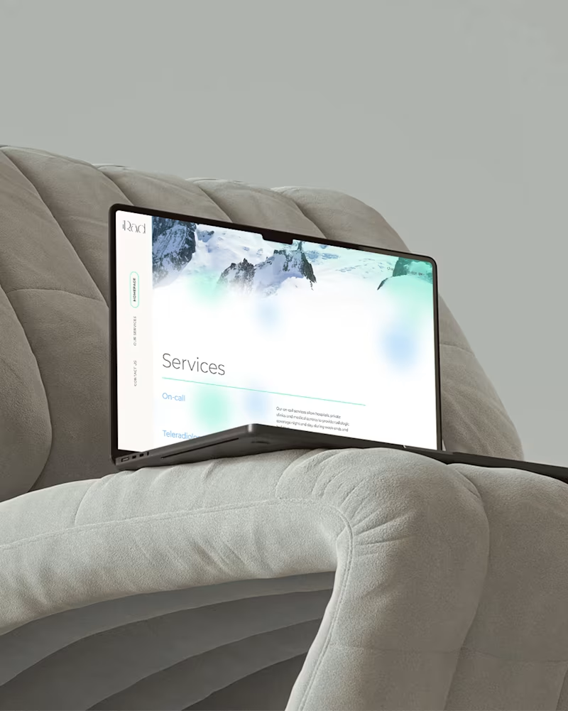
This language was then translated into a bespoke website, designed from scratch around iRAD’s content, audience and positioning. Subtle motion and graphic details add personality while maintaining a clear and intuitive experience across desktop and mobile.
The result is a brand that feels professional and credible, while deliberately moving away from the conventional visual codes of the medical sector.
Scope: Brand Identity · Logo Design · Art Direction · Website Design · Digital Art Direction
0
64
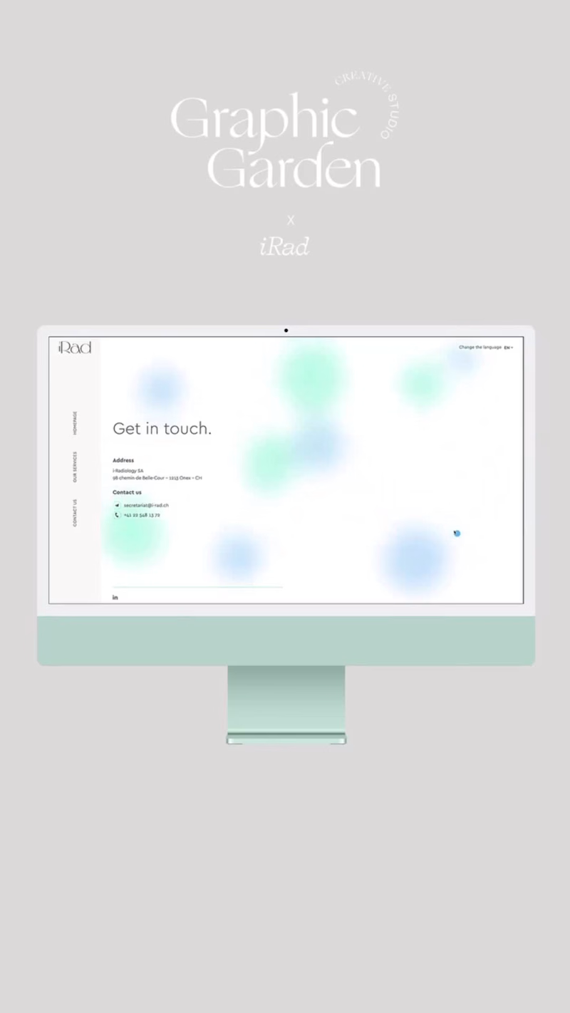
Everything about iRad website. Four ultra clean pages: Home, Services, About and Contacts. Friendly bubbles floating around make the atmosphere soft and delicate if even this is a healthcare website. The goal? Tele-radiology but..friendly!
0
64

UI/UX Designer & Webflow Developer | SaaS & AI Startups





Web designer & Webflow/Framer Developer


