Design & Development for Startups | Certified Framer Expert

Design & Development for Startups | Certified Framer Expert
Brand Identity for a Tech Platform
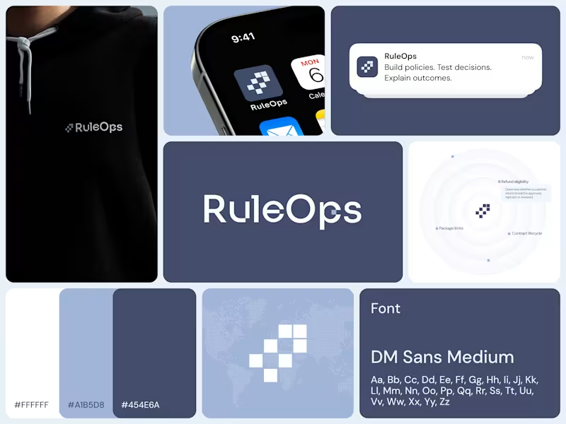
We developed a complete brand identity for RuleOps, a technical platform that helps teams create policies, test decisions, track outcomes, and manage complex business rules from one place.
The main goal was to create a visual language that feels technical, precise, and trustworthy while remaining distinctive and recognizable. We developed the logo system, typography, color palette, graphic elements, and overall visual direction, building a flexible identity that could work consistently across digital products, marketing materials, and brand communications.
The visual system combines structured geometry, a restrained color palette, and clean typography to reflect the logic and clarity behind the product. Every element was designed to support RuleOps’ positioning as a modern technology platform built for technical teams.
Alongside the brandbook, we also redesigned the website and explored both light and dark visual directions, extending the new identity into a cohesive digital experience.
The result is a scalable brand system that gives RuleOps a stronger, more consistent presence across every touchpoint.
Need help with branding, product design, or development? DM me!
2
385
Brand Identity for a Crypto Trading Company
My team and I developed the brand identity for XCHAINGER, a proprietary crypto asset trading company operating in the digital finance space.
Our goal was to create a modern and recognizable visual identity that reflects technology, precision, and credibility while giving the brand a distinctive presence in the crypto industry.
We developed the logo, color direction, typography, and core visual language, combining a clean geometric approach with a vibrant gradient palette. The identity was designed to feel digital and forward looking while remaining professional enough for a company working with financial institutions, trading platforms, and business partners.
The result is a flexible and recognizable brand system that gives XCHAINGER a strong foundation for consistent communication across its digital presence and future brand materials.
Need help with branding, product design, or development? DM me!
2
134

CRO & UX/UI Designer for Ecommerce & App | Online Store Shop
- 1x
- Hired
- 5.0
- Rating
- 19
- Followers
CRO & UX/UI Designer for Ecommerce & App | Online Store Shop


Logo & Brand Identity Design | Branding | Web Design
- $1k+
- Earned
- 1x
- Hired
- 10
- Followers
Logo & Brand Identity Design | Branding | Web Design
Client: "Can we start with a simple square and just see where it goes?"
Me: Splits geometry into dynamic typography 🪄
Logo motion concept for SOHO—watching a single shape multiply and morph into the final brand mark.
Let's make your brand identity move!
1
11
342

Oh my god, robots can buy wine now. 🤖🍷🤯
Seriously! AI agents are officially buying real-world stuff on their own.
But how does a robot prove it's 21? That's where AgentScore (https://www.linkedin.com/company/agentscorekya/) comes in. They built the digital "Passport" and compliance "Gate" that lets robots shop safely and legally.
As the brand designer, my job was to make this futuristic "Agent Economy" look modern and trustworthy—without using boring, old-school tech colors. If robots are going to shop in the real world, they gotta look good doing it, right?
The future is here, it’s wild, and it’s open for business.
P.S. Launching a game-changing tech product, a wild new Web3 platform? Shoot me a DM! Let’s chat about building a brand identity that stands out from the crowd. 🚀
4
324
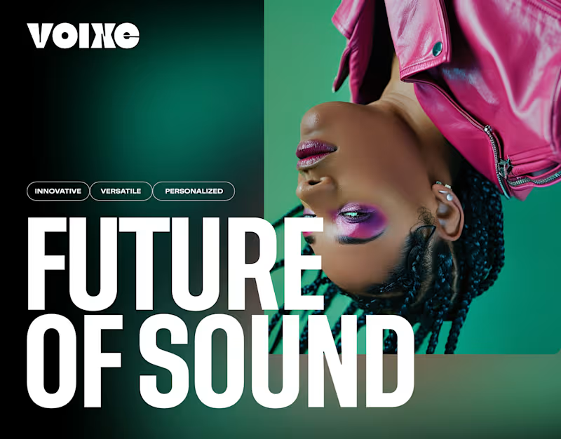


Senior UI/UX designer turning strategy into launch-ready UX
- 5.0
- Rating
- 6
- Followers
Senior UI/UX designer turning strategy into launch-ready UX

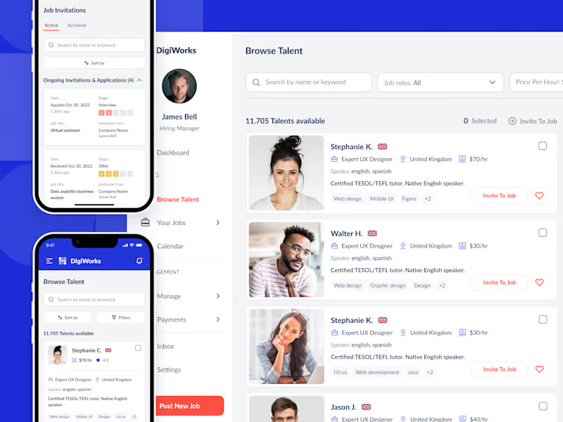



Brand transformation agency for gamechanging tech businesses

"Finally, it’s time to be me."
"Shed your extra layers."
This video explores the shift between two inner states—realization and release.
Raw photography captures honest emotion, while restrained typography keeps the focus on meaning rather than decoration.
The contrast between the two frames reflects the brand’s core belief:
authenticity isn’t created through effort or performance—it emerges when unnecessary layers fall away.
1
4
178


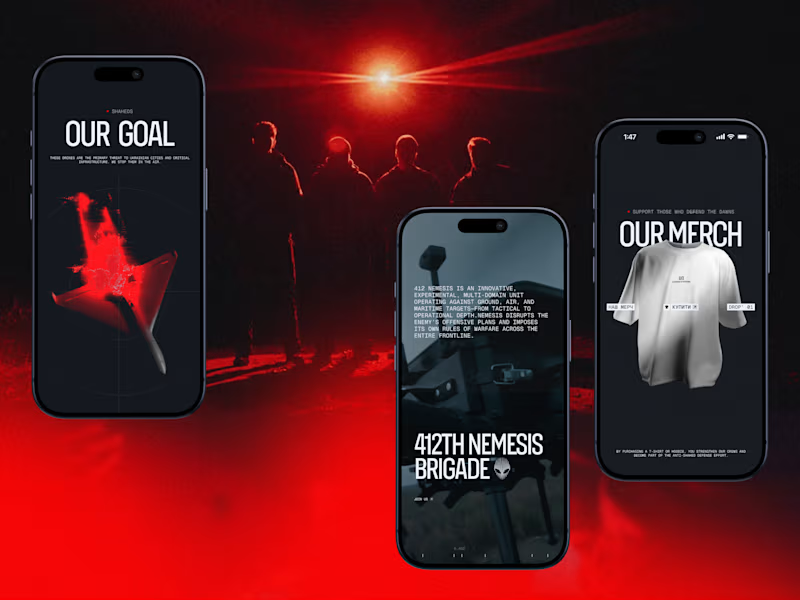
Darknode’s digital identity is built as a system — and that system adapts seamlessly across devices.
The mobile version isn’t a simplified copy of desktop. It preserves the same tactical tension, optical metaphors, and controlled motion — just recalibrated for vertical interaction. Precision grids shift into compact structures. Red-spectrum accents become sharper. Every tap replaces hover with deliberate feedback.
We designed the interface in layers: background depth, targeting lines, UI panels, motion overlays. Each layer serves a purpose — creating dimensionality without visual noise.
Contrast plays a strategic role. Dark foundations amplify red highlights. Minimal typography sharpens hierarchy. Space becomes a tool for focus.
1
170


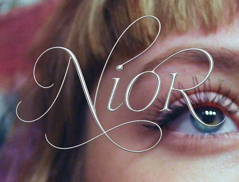

Minimalistic designs with meaning
Minimalistic designs with meaning


Brand Identity and Framer Designer