Qream Design
Brand transformation agency for gamechanging tech businesses
Ready for work
Qream is ready for their next project!
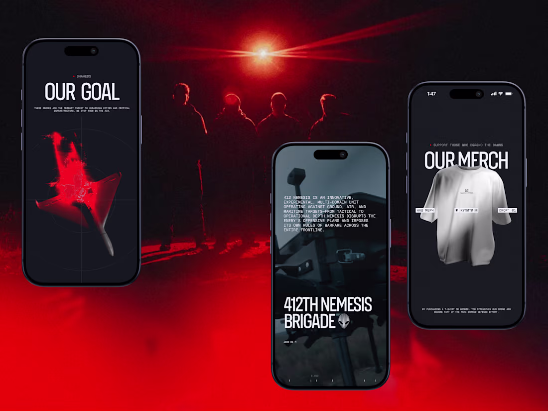
Darknode’s digital identity is built as a system — and that system adapts seamlessly across devices.
The mobile version isn’t a simplified copy of desktop. It preserves the same tactical tension, optical metaphors, and controlled motion — just recalibrated for vertical interaction. Precision grids shift into compact structures. Red-spectrum accents become sharper. Every tap replaces hover with deliberate feedback.
We designed the interface in layers: background depth, targeting lines, UI panels, motion overlays. Each layer serves a purpose — creating dimensionality without visual noise.
Contrast plays a strategic role. Dark foundations amplify red highlights. Minimal typography sharpens hierarchy. Space becomes a tool for focus.
1
62
Interactive System — Built to Engage
For this shot, we’re showcasing one of the core interactive mechanics of the website — a dynamic slider that reinforces the feeling of operating within a tactical interface.
The slider isn’t decorative. It behaves like a calibrated system panel: controlled transitions, sharp motion timing, and precise micro-interactions. Each slide shifts like switching modes on a combat console — structured, intentional, responsive.
As users navigate through it, they don’t just consume information — they interact with it. Content reveals feel measured. Movement feels engineered. Nothing is random.
This level of interactivity transforms the website from a static presentation into an experience. It mirrors the unit’s values: control, accuracy, and technological superiority.
1
2
47
Advanced Manufacturing Website Production—TRIOL
The primary challenge was translating highly technical engineering systems into a digital experience that feels clear, reliable, and precise—without oversimplifying the product or losing technical depth.
Every design decision was driven by the realities of heavy industry: reliability, accuracy, system control, and engineering logic. The interface prioritizes structured content, strong visual hierarchy, and restrained aesthetics to support fast scanning and confident decision-making.
The final result is a production-ready website that supports TRIOL’s positioning in advanced manufacturing — delivering clarity, trust, and performance for a highly specialized industrial audience.
2
5
86
Mascot Animation for Mental Health Brand — SelfApp
We approached animation as part of the product language, not a visual effect.
The mascot animation system was designed to communicate emotional states through form and movement.
Different mascot states represent how the self changes under external influence — becoming constrained, fragmented, or muted over time. Transitions between these states were carefully designed to feel gradual and intentional, mirroring moments of disconnection and reconnection.
From a design perspective, animation acts as a narrative layer that supports the product’s core idea and maintains emotional continuity across the app experience.
13
141
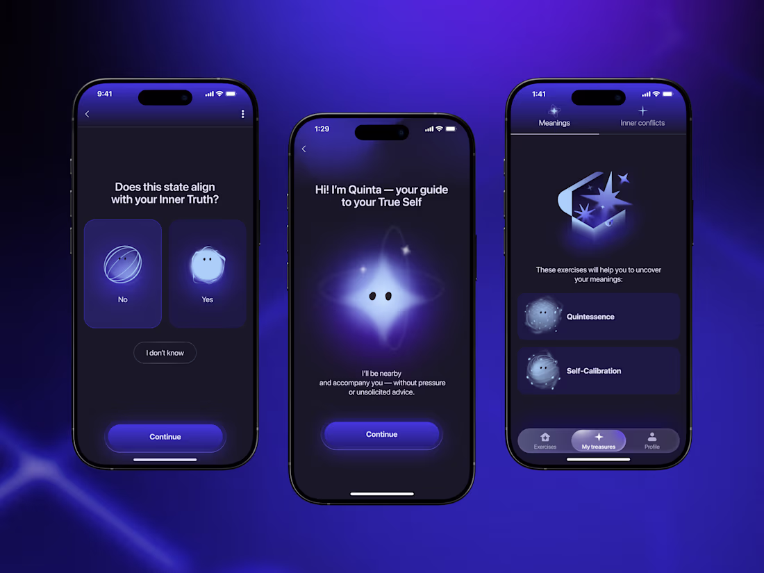
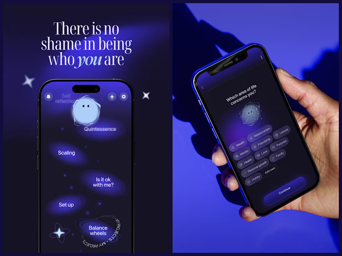
App Design for Mental Health Brand — Self App. Quinta, the Guide.
Quinta was designed as a functional visual element within the app’s system, serving as a consistent point of reference across user flows.
The interface is based on a progression metaphor, expressed through screen transitions, layout rhythm, and color contrast. Dark tones support introspection, while light accents indicate direction and state change.
Quinta does not provide instruction or feedback. Its role is to maintain conceptual alignment — reinforcing the product’s focus on self-awareness without introducing hierarchy or judgment.
1
1
58
"Finally, it’s time to be me."
"Shed your extra layers."
This video explores the shift between two inner states—realization and release.
Raw photography captures honest emotion, while restrained typography keeps the focus on meaning rather than decoration.
The contrast between the two frames reflects the brand’s core belief:
authenticity isn’t created through effort or performance—it emerges when unnecessary layers fall away.
1
4
79
Hundreds of screens. Ten exercises. One goal—help people meet their true selves.
That was a summary of a product we did for Self App. We didn’t want to build another “productivity” app that is based only on coaching, psychological terms, or fake success. We aimed higher—to create a space that feels safe enough to open up and find your Self.
2
49
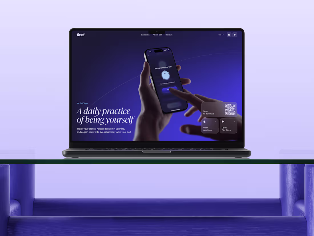
Before build the interface, build the intention 💜
For Self App, the website wasn’t just a landing page — it was the first emotional touchpoint.
The moment where a person decides whether this product feels safe enough to step into.
We designed and developed the website as a calm, structured introduction to the app’s world. Clear hierarchy, restrained interactions, and a classic layout help explain the product without overwhelming the user.
The website speaks the same language as the product — not persuasive, not instructional, but supportive and honest.
Design and development moved together to ensure consistency across screens, performance, and responsiveness. Every section was built to feel intentional, steady, and respectful of the user’s attention.
1
4
75
We’ve always believed that design has the power to change more than brand appearance—it can change how people live, feel, and connect.
Qream mission is simple: to inspire gamechangers through design, motion, and emotion. Forget about average—together, with our partners, we’re shaping a healthier, happier, and more sustainable world. This is what we stand for.
We refuse to follow trends. We set them. We don’t work for brands. We co-create with them. And we always choose purpose over convenience.
Watch the story behind our agency. Hope it brings you a little inspo of the day 💜
6
38
302
Viber for Business - Complex Brand Design
35
437
SentinelX - Brand Identity for Web3 company
9
72
Nebula - Website design for the DeFi company
10
80
Nebula - Brand Identity for DeFi company
2
32
Soscale - Website for the performance marketing agency
39
265
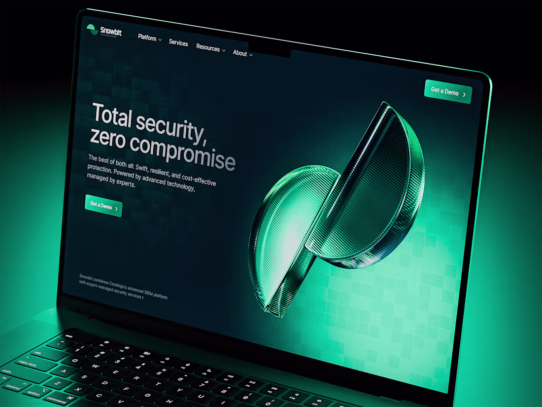
Snowbit - Website design for cybersecurity company
1
25
Snowbit - Website design for the cybersecurity company
0
12
Website Design with 3D for the AI-Driven CRM Platform
1
11
Website Design with Illustrations for the CRM Platform
2
19
Branding & Identity with 3D for the AI-driven CRM Platform
3
19