Nebula - Brand Identity for DeFi company
Qream Design
A brand isn’t just a mark—it’s an experience. With Nebula, we crafted a bold and kinetic identity that extends beyond the logo into a powerful visual system.
These promotional assets capture the essence of DeFi: fluid, fearless, and in constant motion. No banks. No middlemen. Just pure financial evolution.
Yet, everything has started with a logo (frankly speaking, from a deep dive into the strategy and ideation).
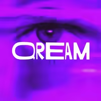
The Eye of the Nebula.
Logo design for the DeFi company by Qream
Inspired by cosmic formations, the mark embodies observation, security, and financial flow.
The eye-like structure isn’t just aesthetic; it reflects Nebula’s mission to oversee and safeguard decentralized assets.
Here are some concepts our team thought about during the creation of the brand's identity.
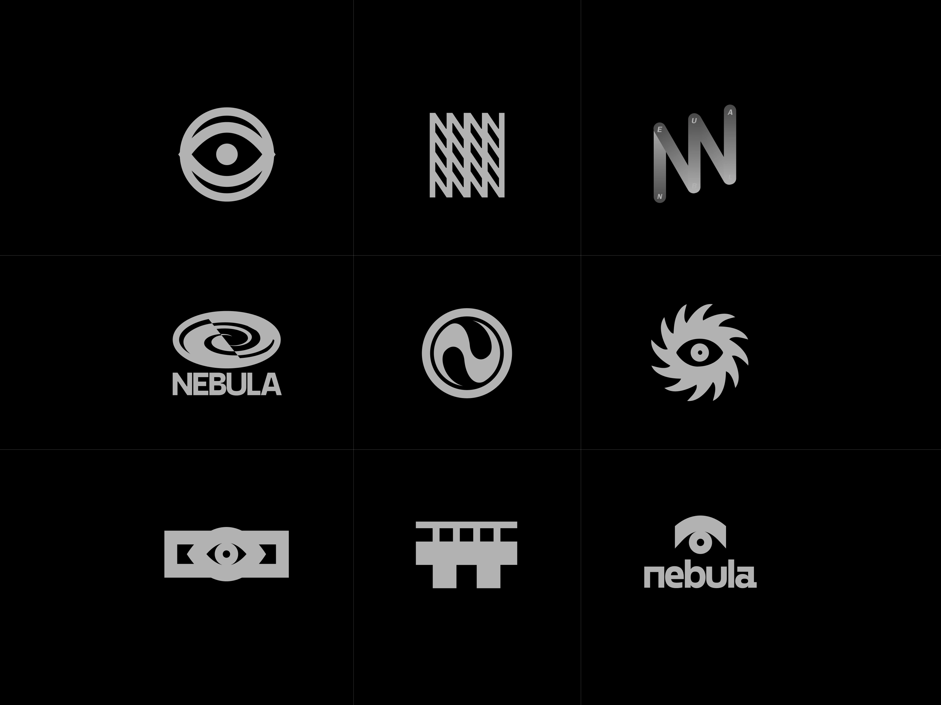
Logo variations for DeFi company made by Qream
A brand identity isn’t just made of a logo — it’s a living system. Below, you can witness how Nebula comes to life through merch, translating the brand’s motion-first visual language into tactile, everyday objects.
Beyond the Logo: The Nebula Brand Universe
Merch design for a DeFi company
Merch is more than a cool extra — it’s a vital touchpoint. Every bottle, tee, or sticker reinforces your brand's story, values, and style. When done right, it builds recognition, sparks connection, and travels far beyond the screen.
Incredible team of this project:
Dima Alimov — Concept idea, graphic design
Illya Bilyk — 3d, animation
Denys Koloskov — web design
WHEN YOU BLEND IN, CUSTOMERS TUNE OUT
Stand out, get noticed, win more business. It starts with strategic design.
Like this project
Posted May 12, 2025
A bold DeFi brand, fully in motion. From identity to website and marketing promo assets — we crafted a complete, future-facing image for Nebula.
Likes
2
Views
31
Timeline
Jan 20, 2025 - Mar 15, 2025