Landing Page Design for Currency Exchange Mobile App

Yuliia Ishchenko


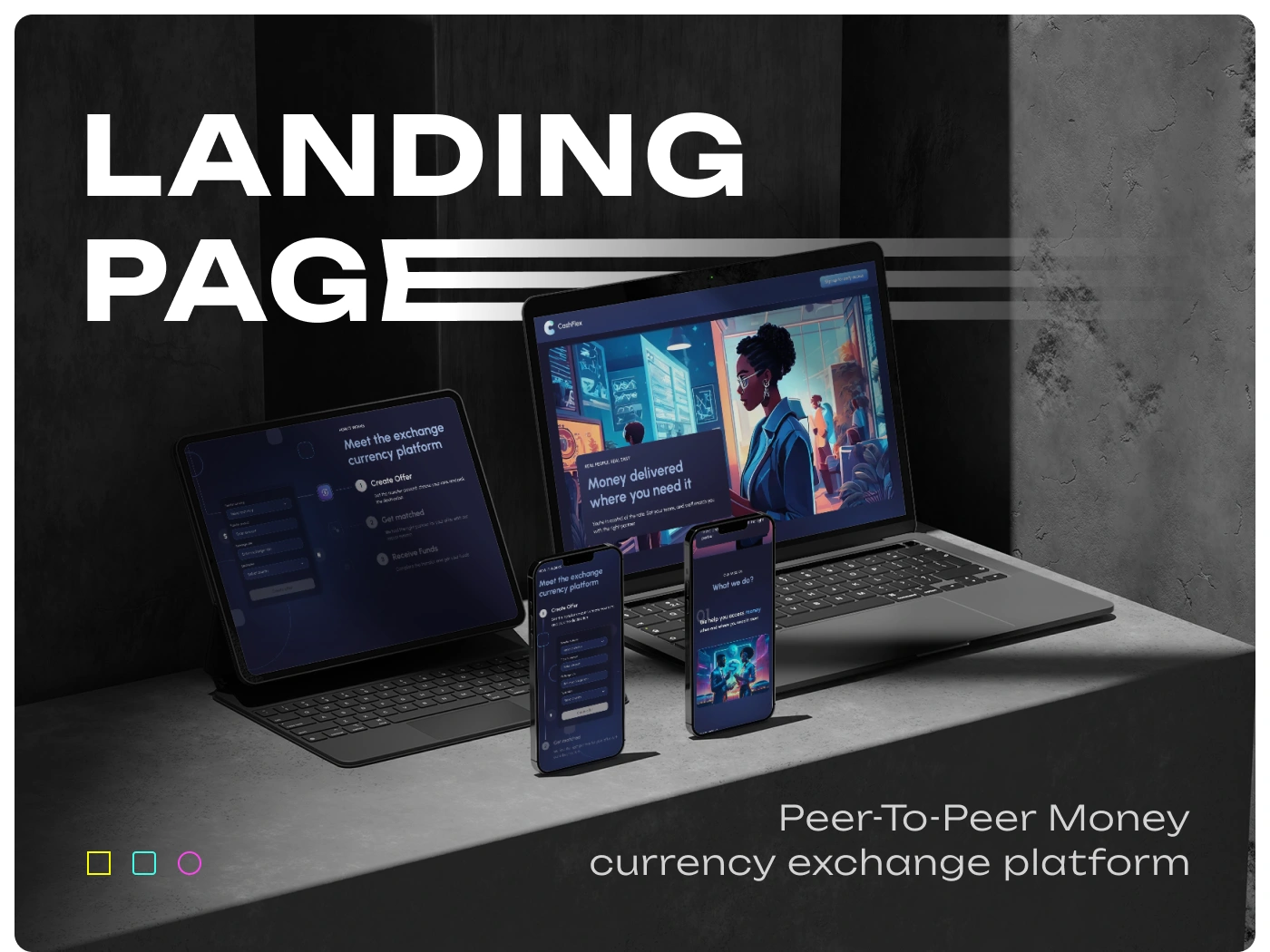
Landing Page Design for a Peer-to-Peer Currency Exchange Platform
A bold fintech landing page designed to introduce a peer-to-peer money exchange platform and collect early access sign-ups.
CashFlex is a peer-to-peer currency exchange platform concept that helps users access money when and where they need it most. The landing page was designed to communicate the product idea, explain the exchange process, and encourage users to sign up for early access.
Industry: FinTech, Money Transfer, Currency Exchange, P2P Platform
Project Type: Landing Page Design
Scope: Landing Page, Visual Direction, Responsive Adaptation, UI Elements
Contribution: UX/UI Design, Visual Identity, Landing Page Design, Mobile & Tablet Adaptation, Icon Set, Form Design
Project Overview
CashFlex needed a landing page that could present a new peer-to-peer currency exchange platform in a clear, modern, and visually memorable way.
The main challenge was to make the product feel trustworthy and financial, while also giving it a bold digital identity that stands out from traditional banking or money transfer platforms.
The landing page introduces the platform, explains how it works, communicates the mission, and invites users to sign up for early access to the app.
Problems
The platform idea needed to be explained quickly
Peer-to-peer money exchange can feel unfamiliar to new users, so the landing page had to explain the value proposition in a simple and direct way.
Fintech products require a high level of trust
Because the product is connected to money and currency exchange, the design had to feel secure, reliable, and professional.
The brand needed to stand out from typical finance websites
Many financial platforms use predictable corporate visuals. CashFlex needed a more modern, energetic, and digital-first visual identity.
The sign-up process had to be simple
The page needed to collect early access requests without overwhelming users with too many fields or complicated steps.
The design had to work across devices
The landing page needed to look strong on desktop, tablet, and mobile screens while keeping the key message and sign-up form easy to access.
Goals
Create a modern landing page for a peer-to-peer currency exchange platform.
Clearly explain the product mission and how the platform works.
Build a strong fintech visual identity with a bold digital mood.
Design a simple early access sign-up form.
Make the landing page responsive across desktop, tablet, and mobile.
Use visual storytelling to make the product feel innovative and memorable.
Keep the interface clean, trustworthy, and conversion-focused.
Design Direction
The visual direction combines a dark fintech interface with bright blue and neon-style accents. This helped create a futuristic, energetic, and digital atmosphere while keeping the page grounded and professional.
The design uses strong contrast, large typography, device mockups, financial illustrations, and textured backgrounds to make the landing page feel premium and memorable.
The overall mood is bold, urban, and technology-driven — suitable for a modern money exchange product.
Visual Identity
Typography
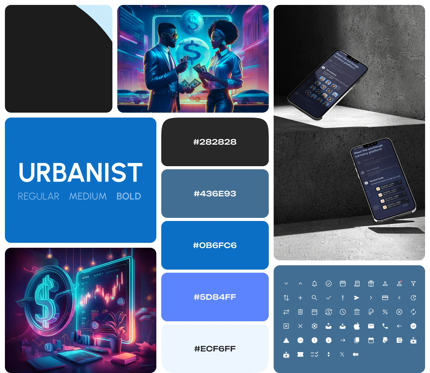
The main typeface is Urbanist, used in Regular, Medium, and Bold styles.
Urbanist gives the design a clean, modern, and confident look. Its geometric structure works well for fintech products because it feels both digital and approachable.
Color Palette
The color palette is built around dark neutral backgrounds and bright blue accents:
#282828 — dark base color for contrast and premium fintech mood.
#436E93 — muted blue for secondary interface elements.
#0B6FC6 — strong blue for primary actions and highlights.
#5D84FF — bright accent color for emphasis and visual energy.
#ECF6FF — light blue surface color for soft contrast and content blocks.
This palette helped balance trust, clarity, and innovation.
Icon System
A consistent icon set was prepared to support interface actions, financial features, user navigation, notifications, filters, and platform functionality.
The icons are simple, clean, and minimal, helping the landing page feel more complete and scalable as a digital product.
Landing Page Structure
The landing page was designed as a clear conversion journey.
Hero Section
The hero section introduces the product with a strong headline and device mockups showing the platform across desktop, tablet, and mobile screens.
The goal was to immediately communicate that CashFlex is a digital-first currency exchange platform.
Product Explanation
The landing page explains the core process in a simple way:
Create an offer
Get matched
Receive funds
This helps users quickly understand how the platform works without needing a long technical explanation.
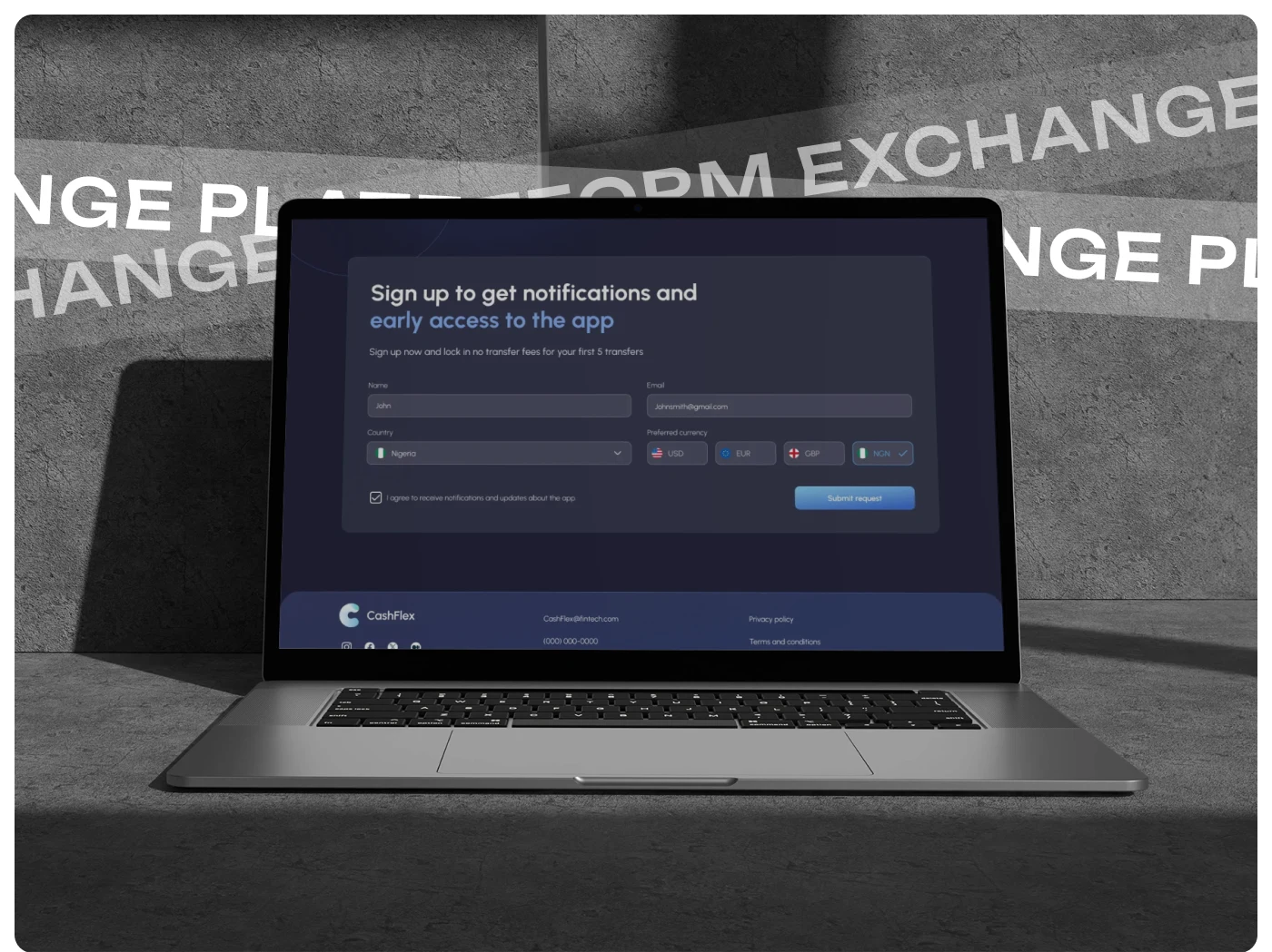
Early Access Form
A sign-up form was designed to collect early access requests and app notifications.
The form includes fields for:
Name
Email
Country
Preferred currency
Notification agreement
The form is simple and focused, reducing friction and making it easy for users to submit a request.
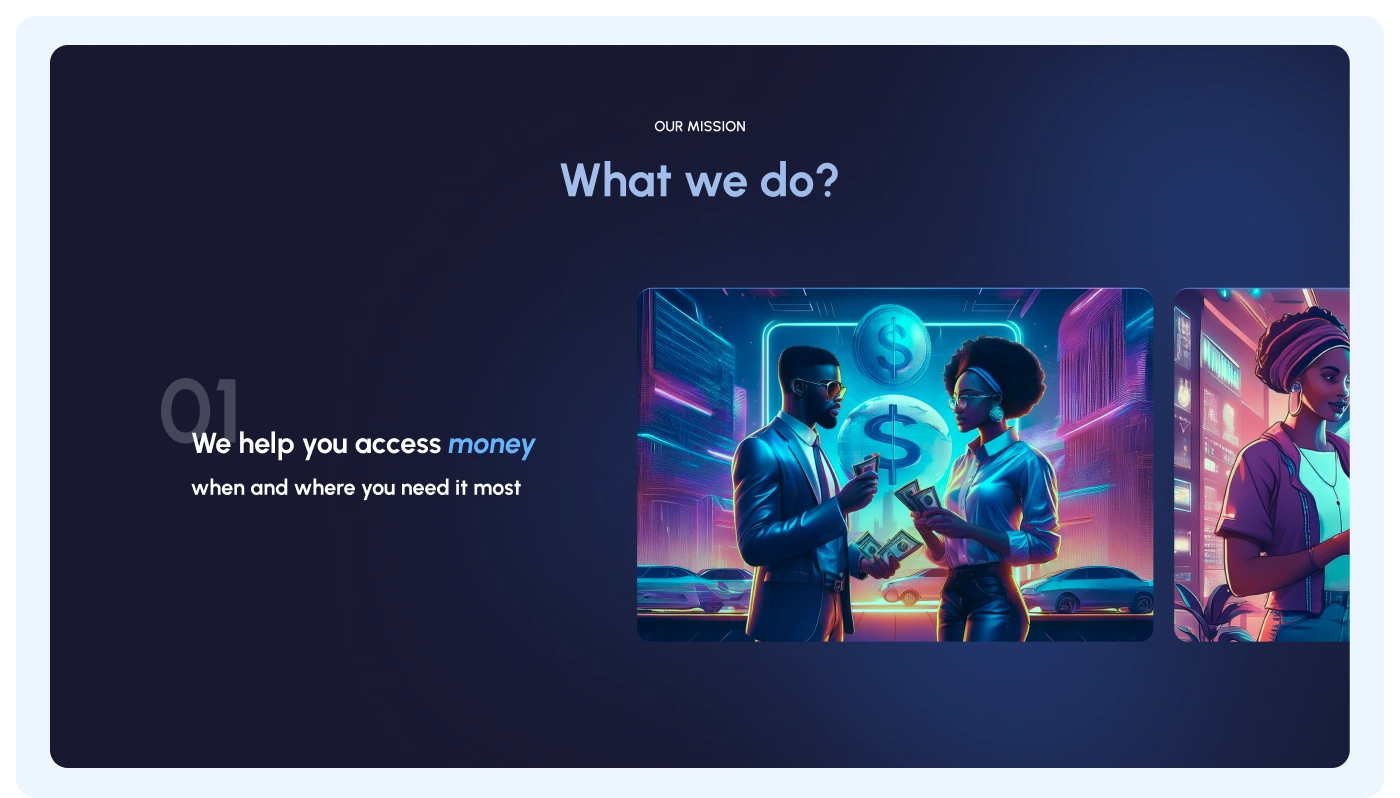
Mission Section
The “What we do?” section presents the main product mission:
We help you access money when and where you need it most.
This section combines emotional messaging with strong visuals. The goal was to make the product feel human and practical, not just technical.
The illustrations support the idea of exchange, financial access, and global money movement.
Responsive Adaptation
The landing page was adapted for multiple device sizes, including desktop, tablet, and mobile.
The responsive design keeps the main message, visuals, and sign-up form accessible across screens.
The mobile version focuses on clarity and simplicity, making sure users can understand the product and complete the form without friction.
Visual Assets and Mockups
The case study includes a strong set of visual assets:
Desktop mockup
Tablet mockup
Mobile mockups
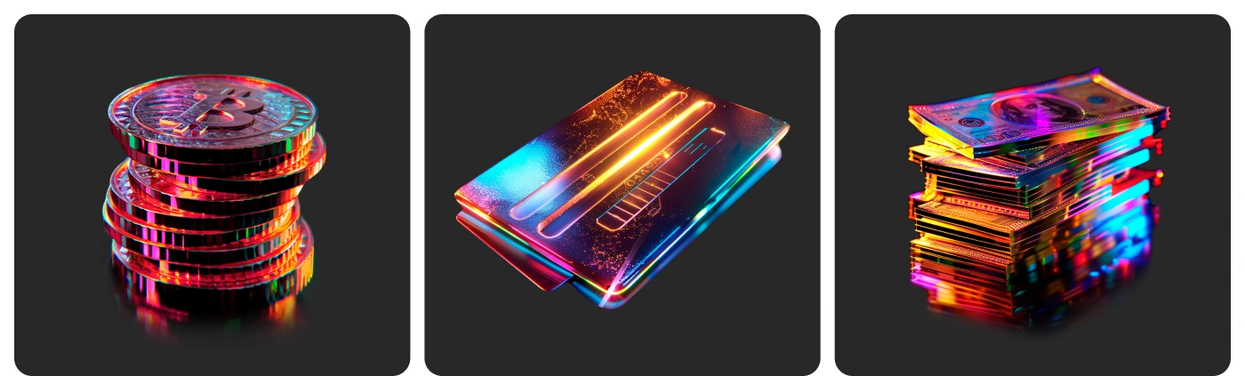
Fintech illustration cards
Currency and money-themed visuals
Brand color system
Typography section
Icon system
Sign-up interface preview
These visuals helped present the landing page as a complete digital product experience rather than just a static webpage.

Results
The final design created a strong visual foundation for CashFlex and helped position the platform as a modern fintech product.
Key Results
A complete landing page design for a peer-to-peer currency exchange platform.
Clear product messaging explaining the platform mission and early access offer.
Simple sign-up flow for collecting users interested in app notifications and early access.
Responsive layouts for desktop, tablet, and mobile devices.
Strong fintech visual identity with dark UI, blue accents, and futuristic imagery.
Consistent typography, iconography, and color system to support future product growth.
Premium presentation mockups showing how the landing page works across devices.
Project Scope
This case study focuses on the landing page and visual presentation for CashFlex.
The scope included landing page design, responsive adaptation, sign-up form design, visual identity elements, color palette, typography system, icons, and product mockups.
The design can later be expanded into a full product website, onboarding flow, user dashboard, or mobile app interface.
Conclusion
CashFlex is a fintech landing page concept designed to make peer-to-peer currency exchange feel simple, modern, and trustworthy.
The design combines bold visual storytelling with a clear conversion structure, helping users understand the product quickly and sign up for early access.
The final result is a strong digital presence for a fintech platform that wants to stand out in the money transfer and currency exchange market.
✍️ Contact me and I will provide you with an estimate for your project!
Like this project
Posted May 1, 2026
Landing page design for CashFlex, a peer-to-peer currency exchange platform with bold fintech visuals, responsive layouts, and early access sign-up.
Likes
1
Views
22
Timeline
Aug 20, 2025 - Aug 31, 2025