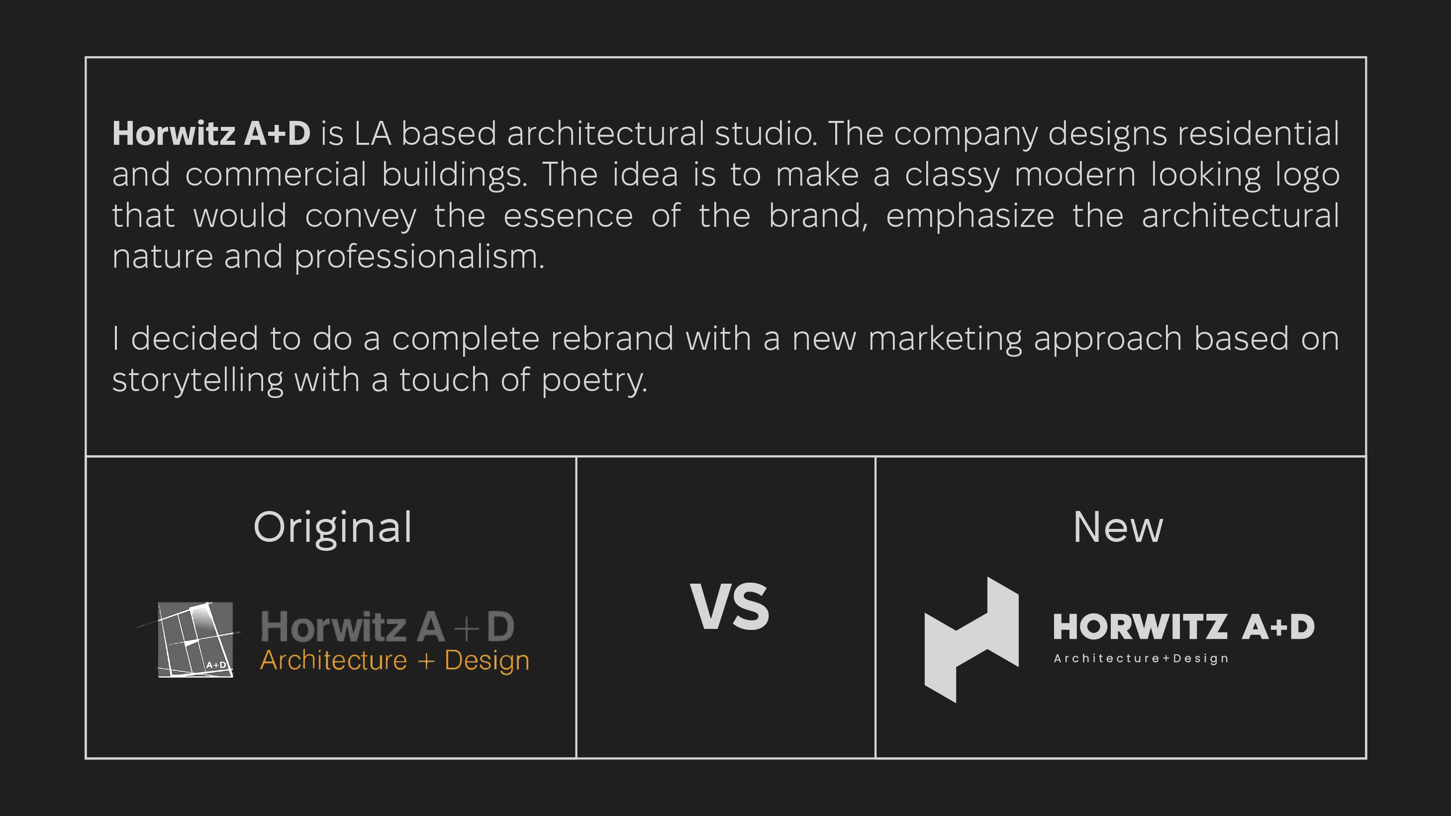
Horwitz: Rebranding Architecture with Stories in Every Structure
Illia Kaizer
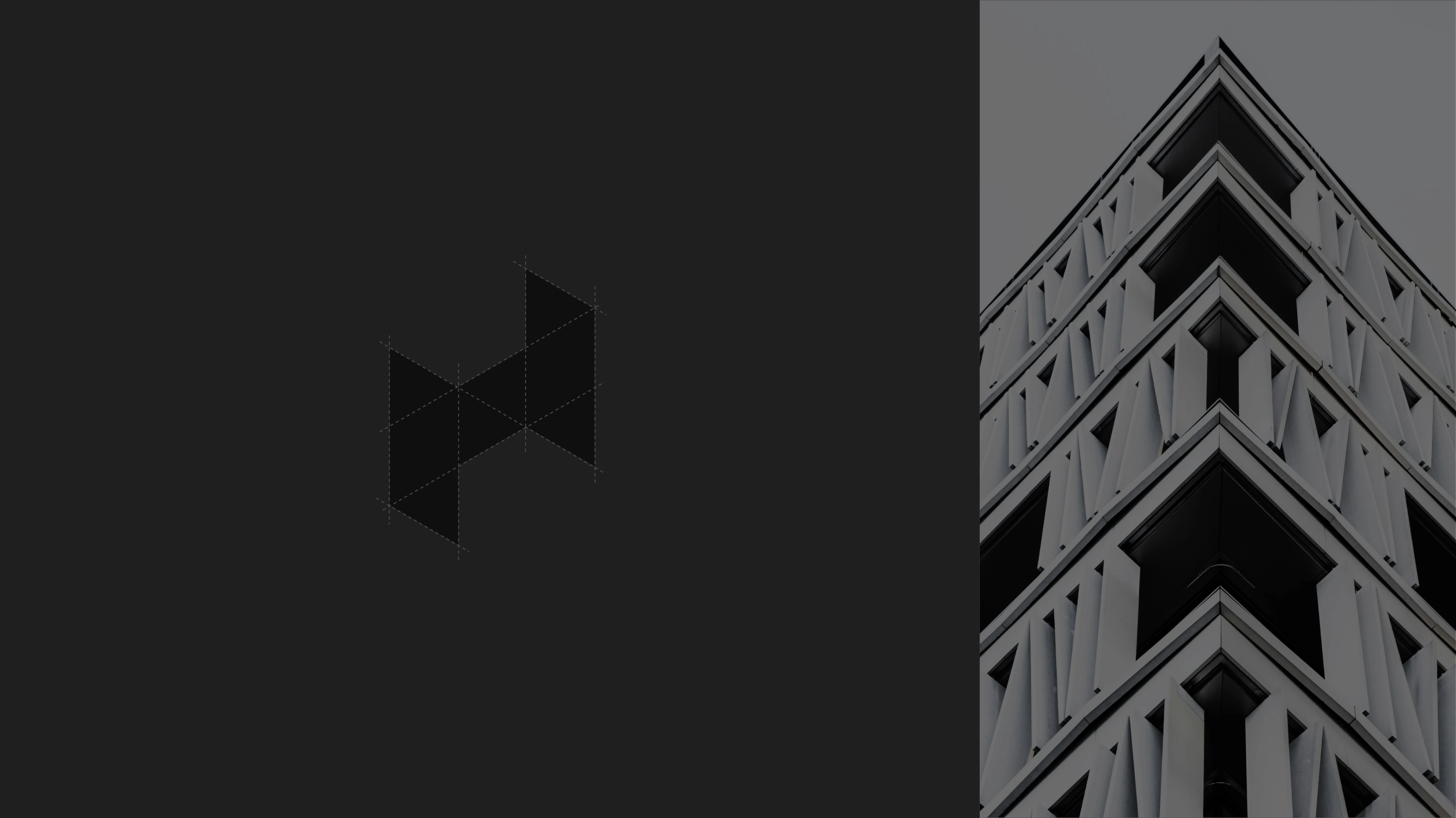
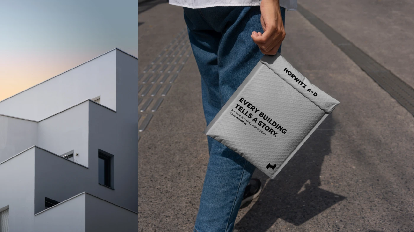
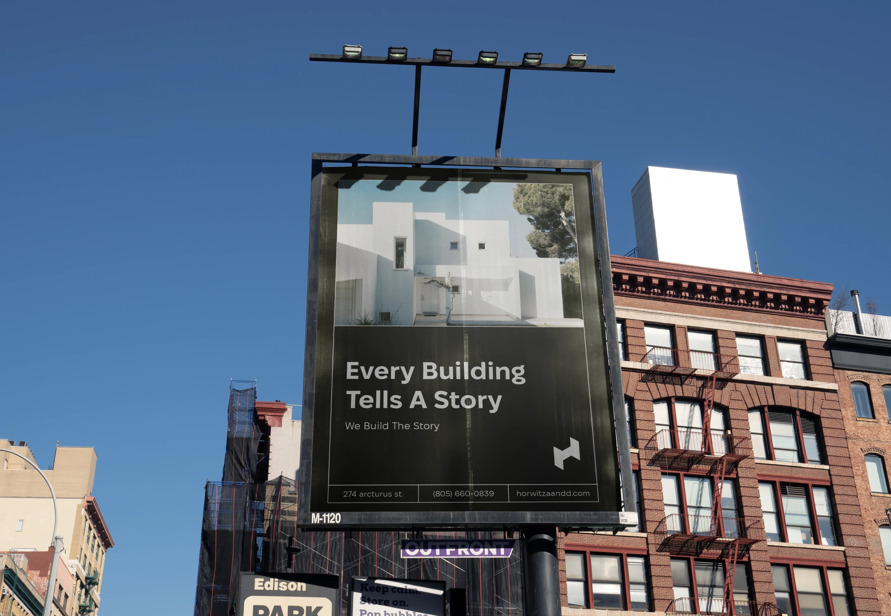
Every building tells a story.
Horwitz is a bold rebranding project driven by the idea that ‘Every building tells a story.’ This concept anchors the entire identity, drawing from architectural elements like grids, lines, perspectives, and the creative process itself. Inspired by brutalist design, the rebranding brings a modern and professional touch to the studio’s image.
Concept
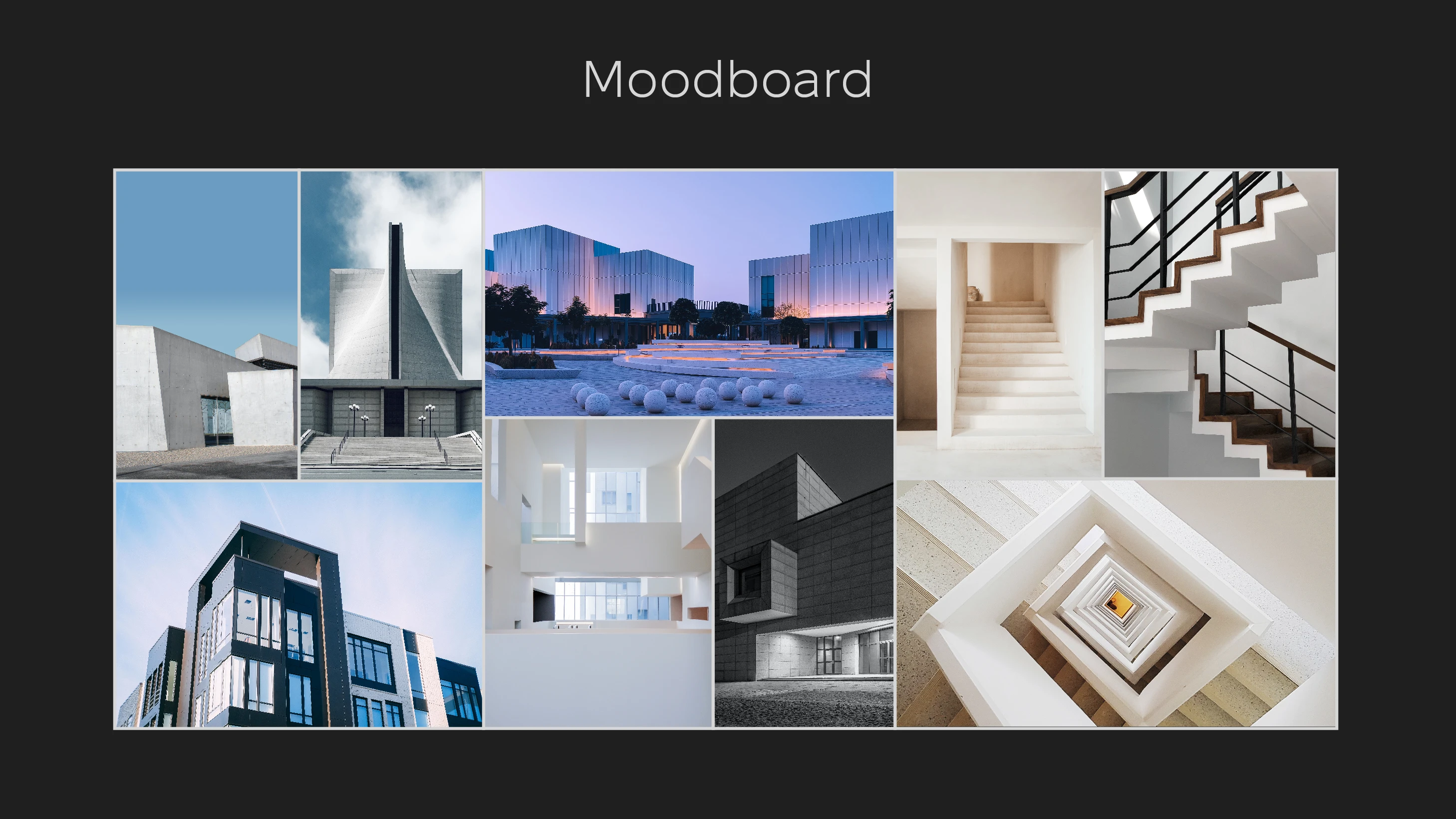
The central theme is “Every building tells a story” guided the design, emphasizing the narrative behind every architectural project. From the precision of grids to the creativity of sketches, the branding reflects the studio’s commitment to storytelling through structure.
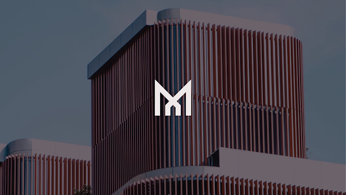
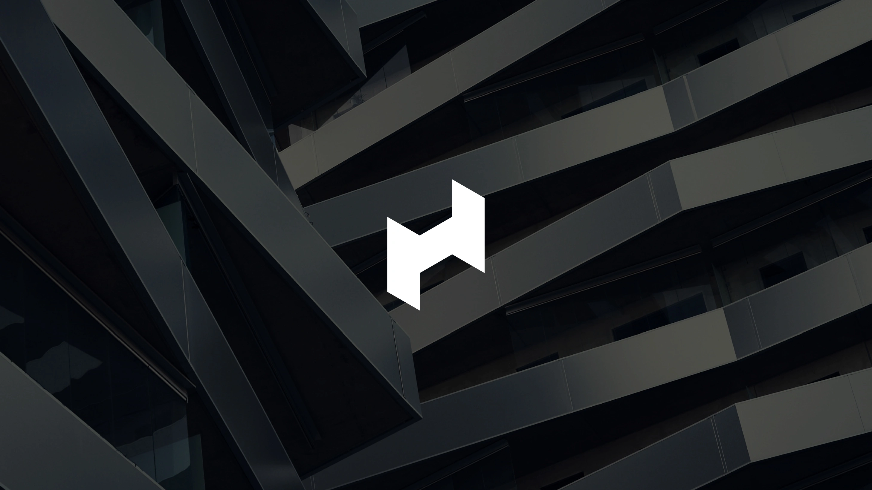
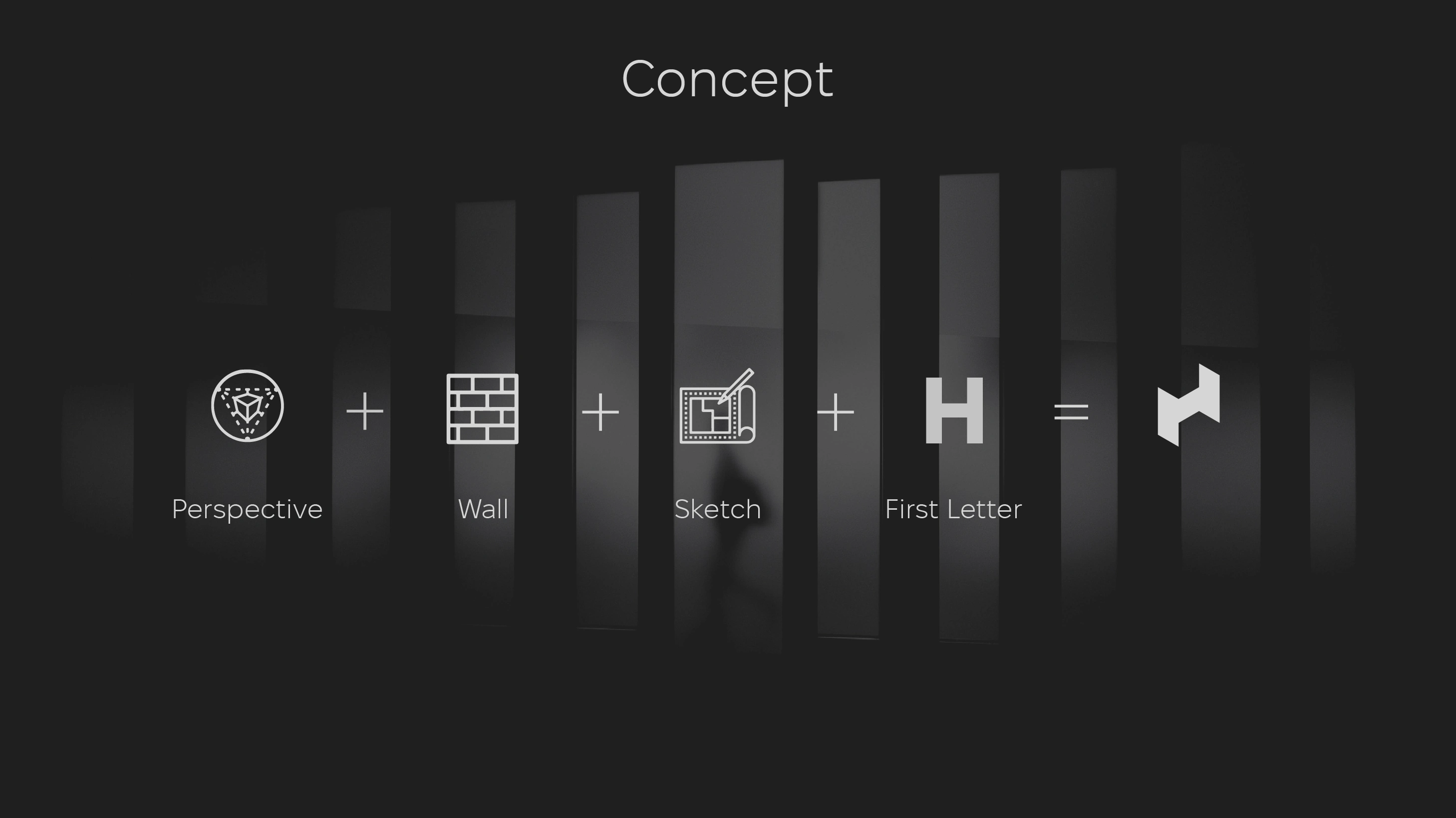
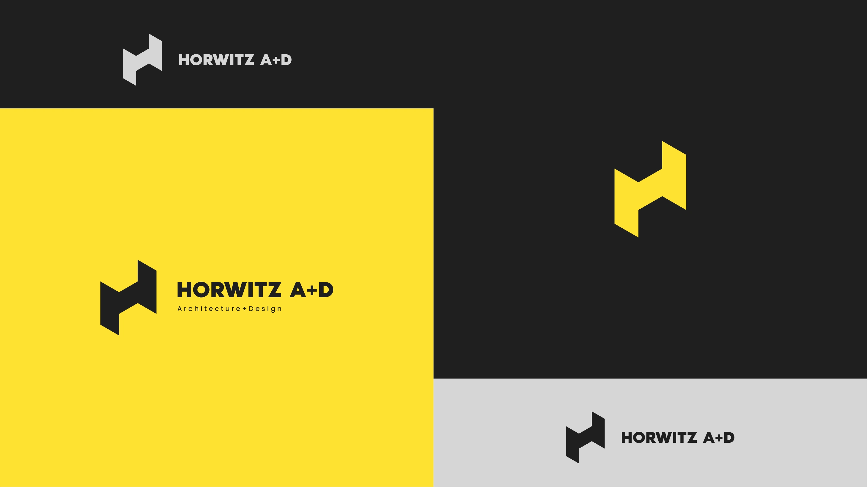
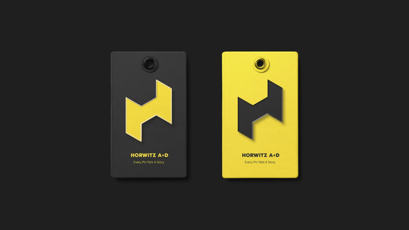
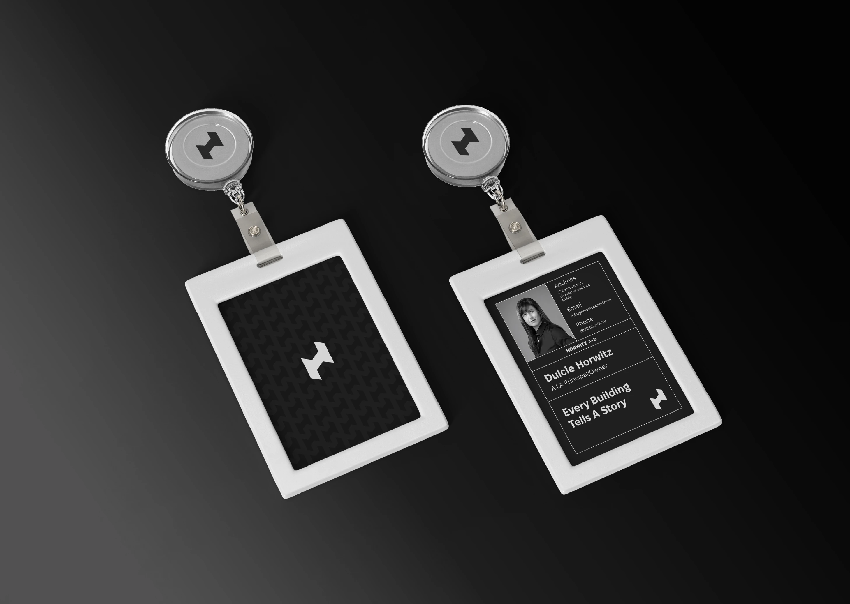
What is behind the logo
The logo integrates symbols that evoke the process of building and designing:
A wall symbolizes stability and strength.
Doors represent new opportunities and connections.
An architectural sketch emphasizes the creative process.
The letter “H” ties the elements together, set in perspective for depth and professionalism.
The influence of brutalism brings a raw, structured aesthetic, ensuring the design stands out.
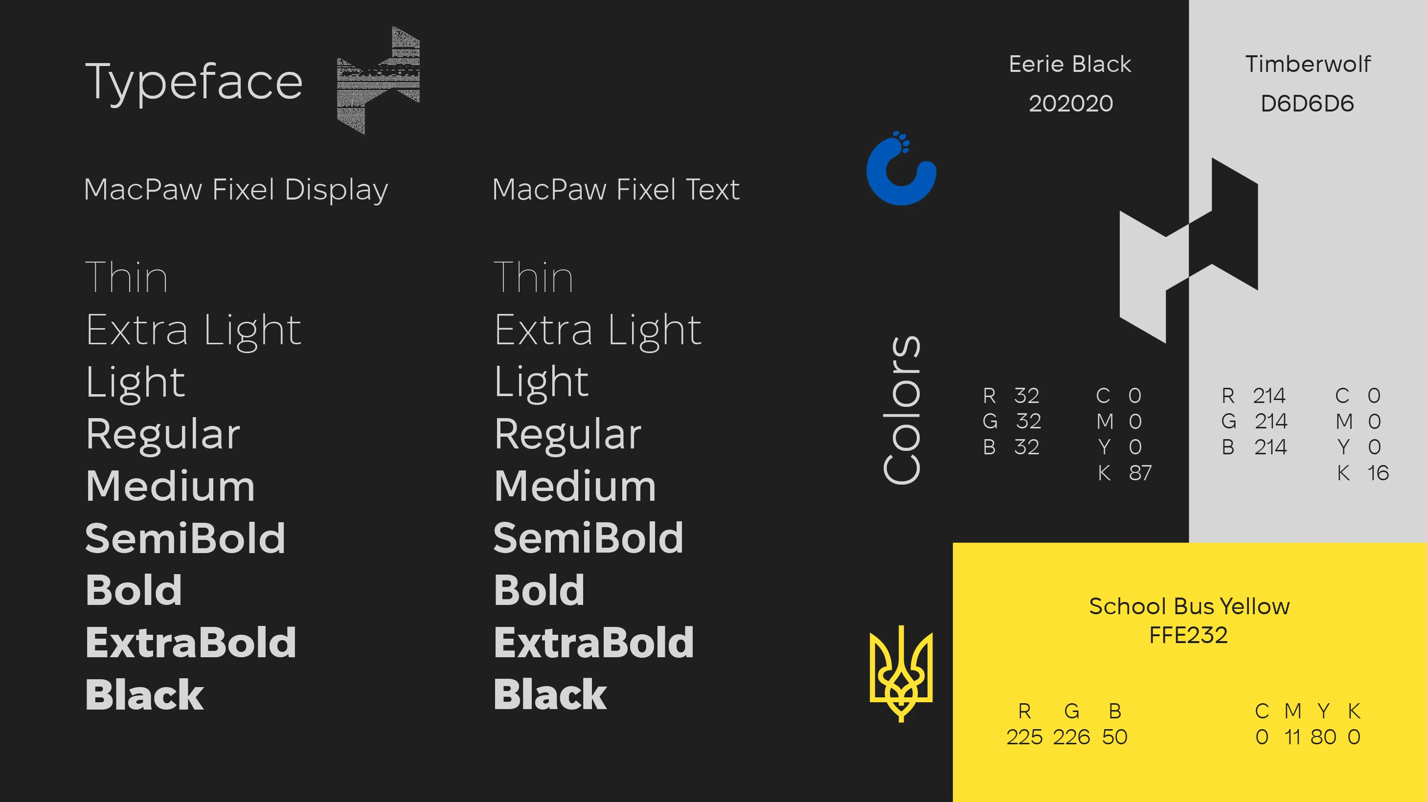
Typography and colors
Typography
MacPaw Fixel, featuring a bold and adaptable design, reinforces the brand’s modern yet professional identity. Its clean lines and versatility make it suitable for both digital and print applications.
Color Palette
The color palette of black, grey, and yellow aligns with the construction theme:
Black signifies professionalism and strength.
Grey symbolizes neutrality and precision.
Yellow injects energy and creativity, evoking a sense of construction and progress.
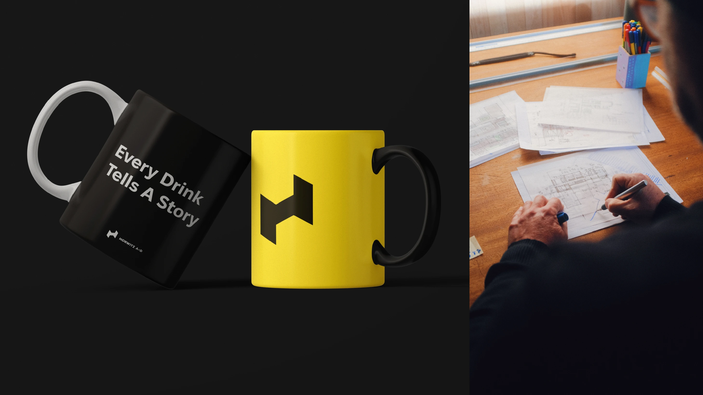
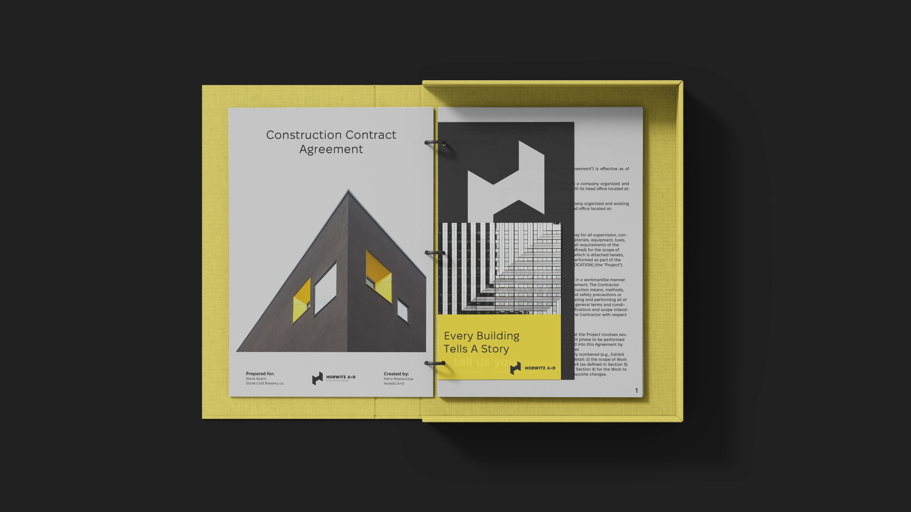
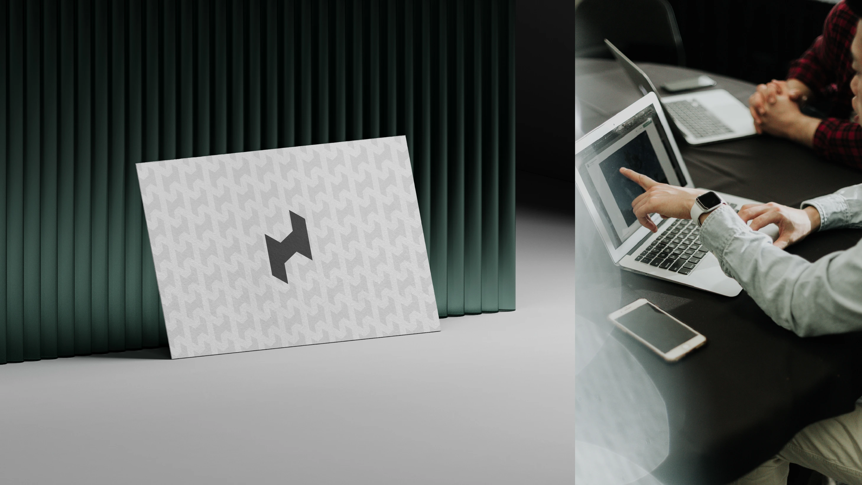
Applications
The branding system applies seamlessly across multiple platforms, enhancing the studio’s professional and creative image
Signage & Stationery: Clean and modern designs reflecting architectural precision.
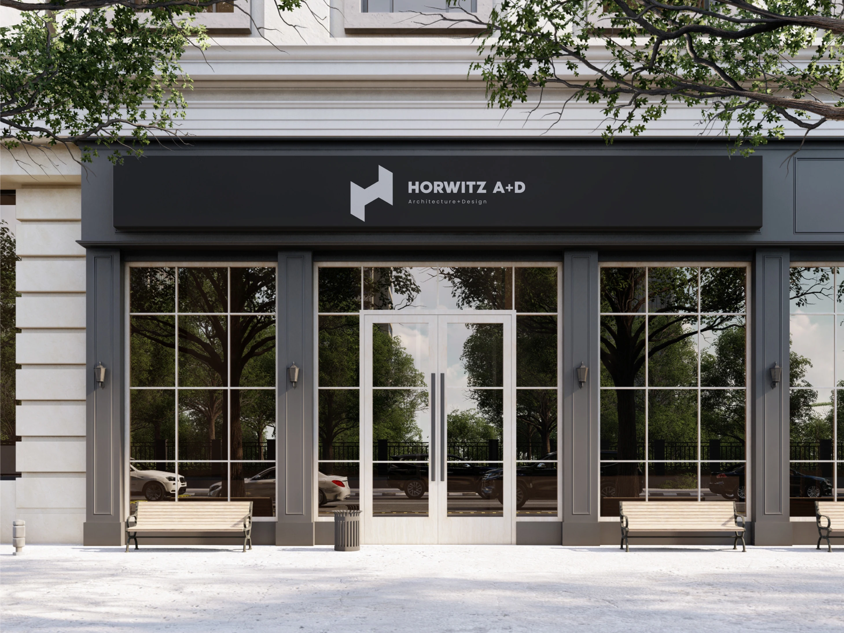
Stationery & Documentation: Minimalist, structured designs aligned with the architectural theme.
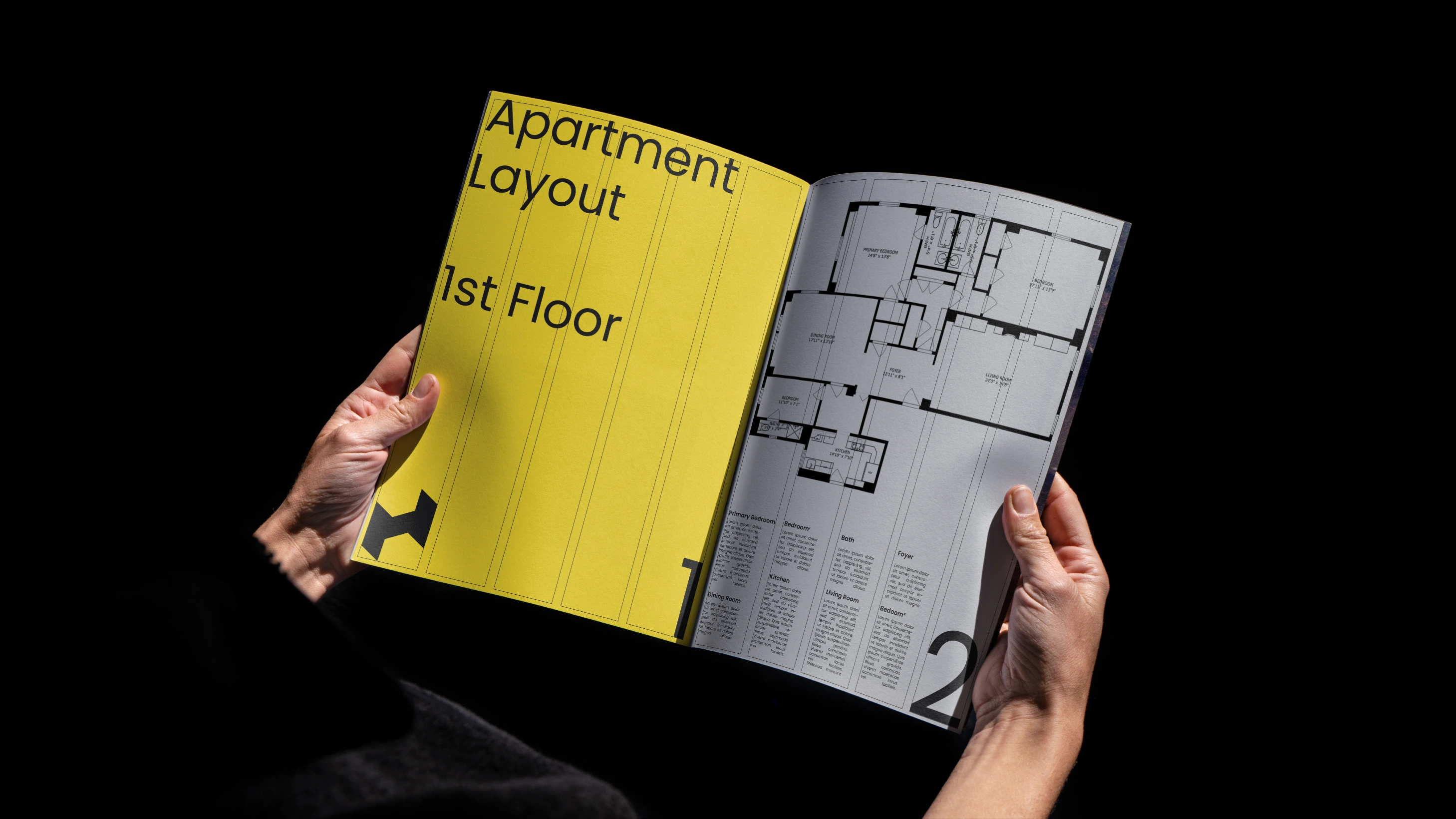
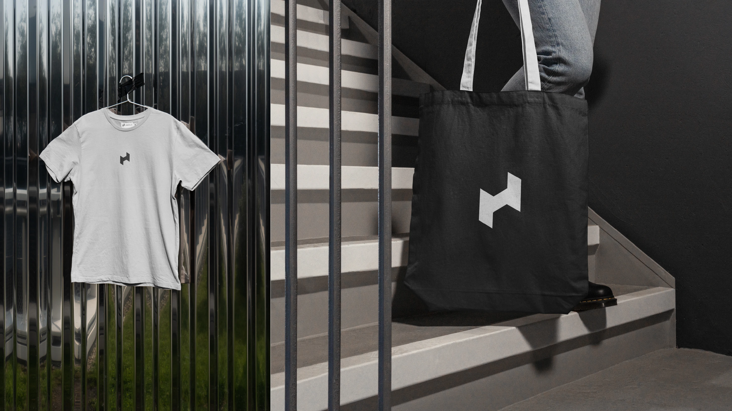
Magazines & Accessories: Bold visuals showcasing the narrative-driven identity.
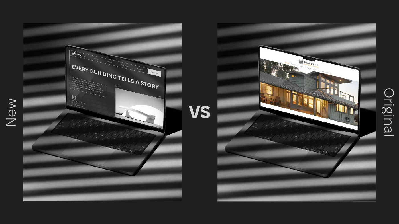
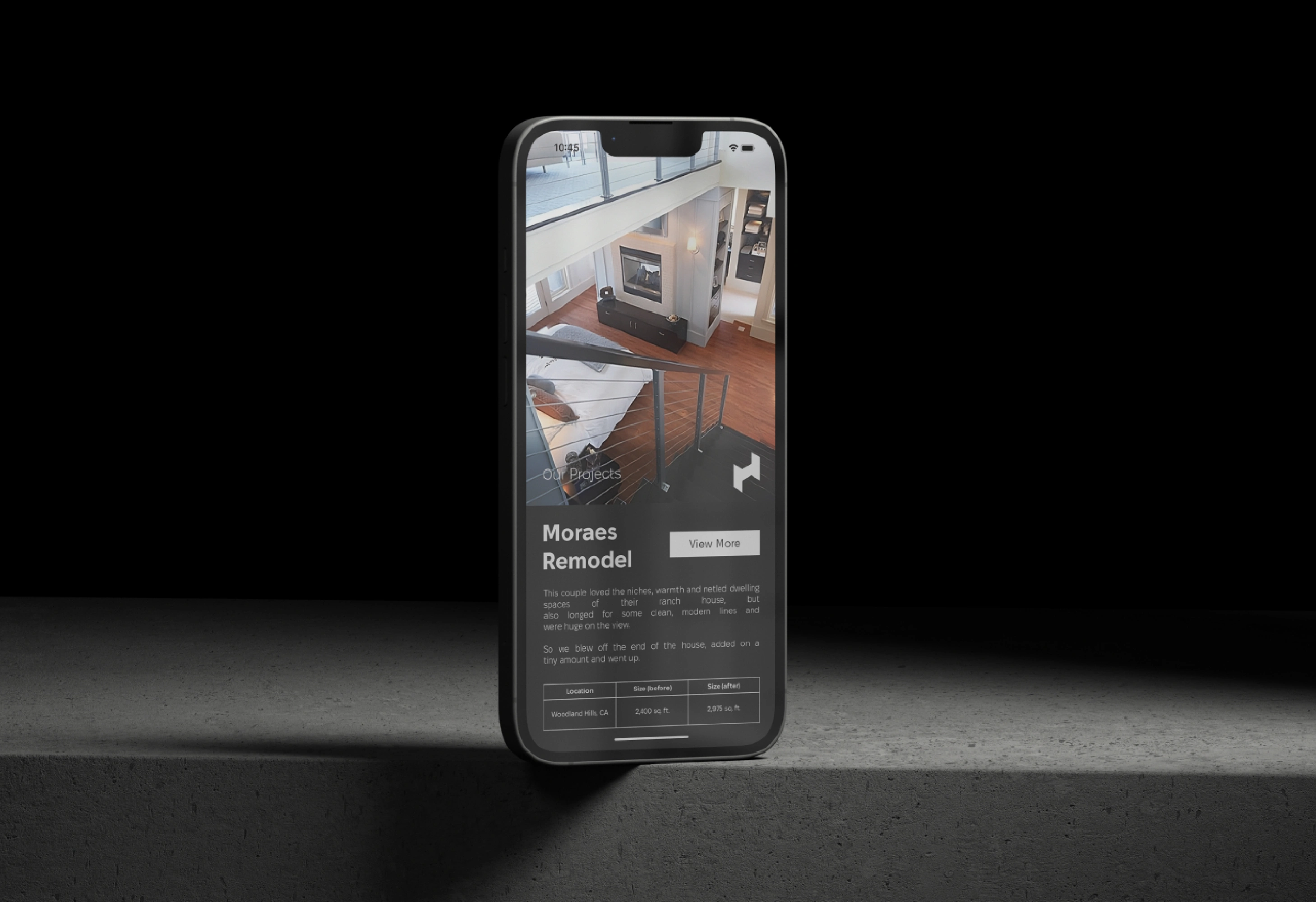
Digital Platforms: Sleek, functional interfaces for web and mobile applications.
Outdoor Ads: Eye-catching visuals paired with the tagline, designed to inspire and attract.
Thank you for your attention! Check this and my other projects on Behance :)
Like this project
Posted Dec 3, 2024
Horwitz’s rebranding stands out in the architectural industry by embracing a narrative-driven approach.