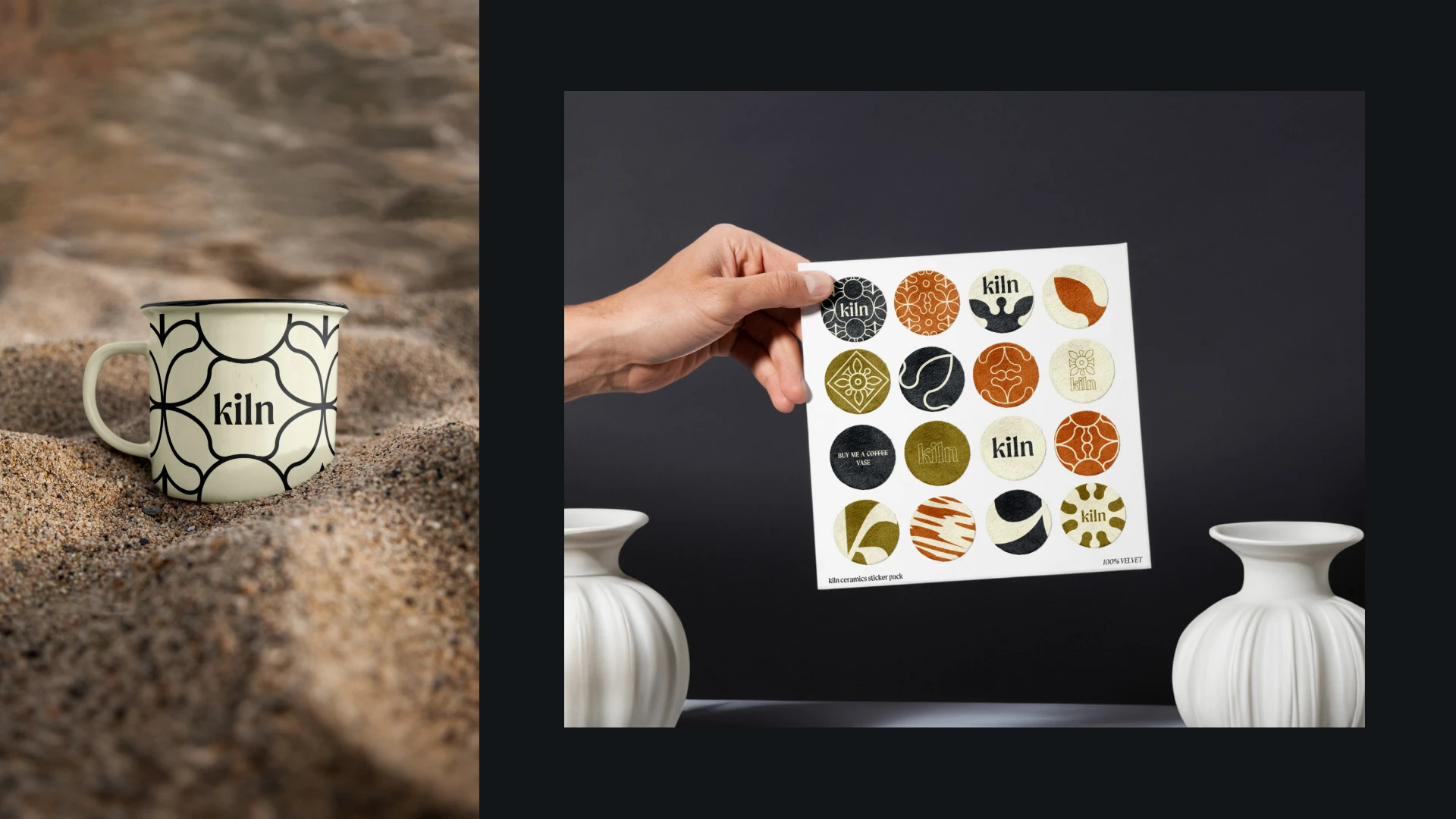
Kiln — pottery studio logo + branding +naming
Illia Kaizer
What is Kiln?
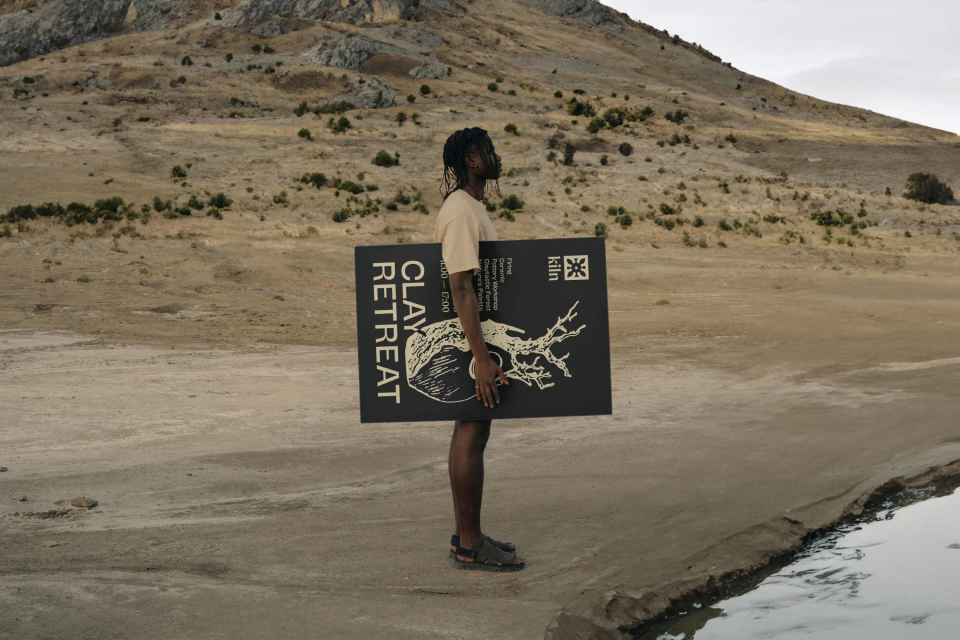
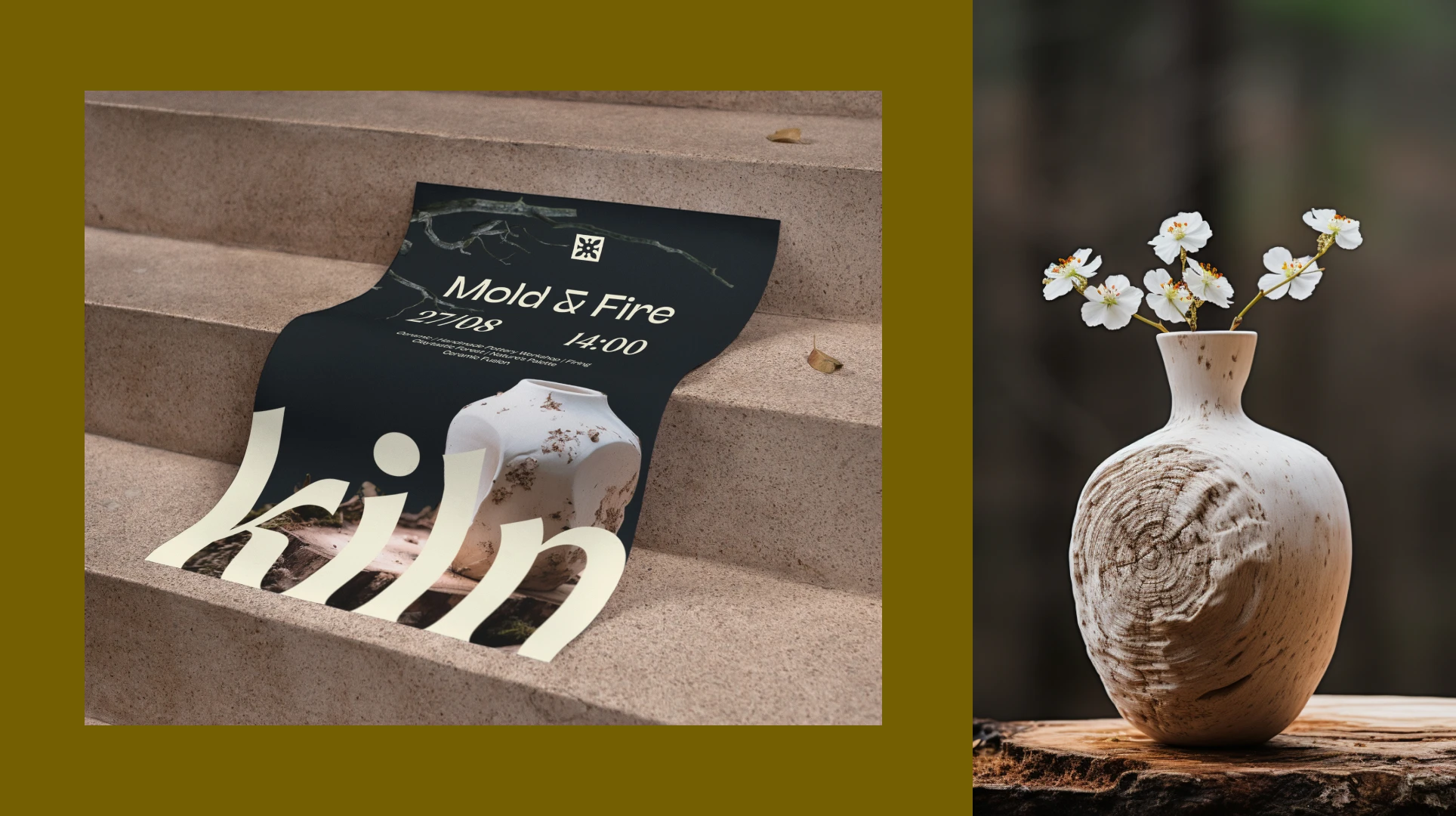
Kiln is a conceptual branding project I developed to challenge myself as a designer. I crafted the identity for a pottery studio that embodies the warmth and artistry of handmade ceramics. This self-initiated project showcases my logo design, branding strategy, and visual storytelling skills, using tools like Adobe Illustrator, Photoshop, and MidJourney for unique visuals.
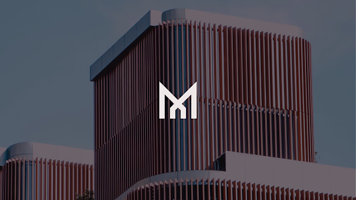
Clean for kiln
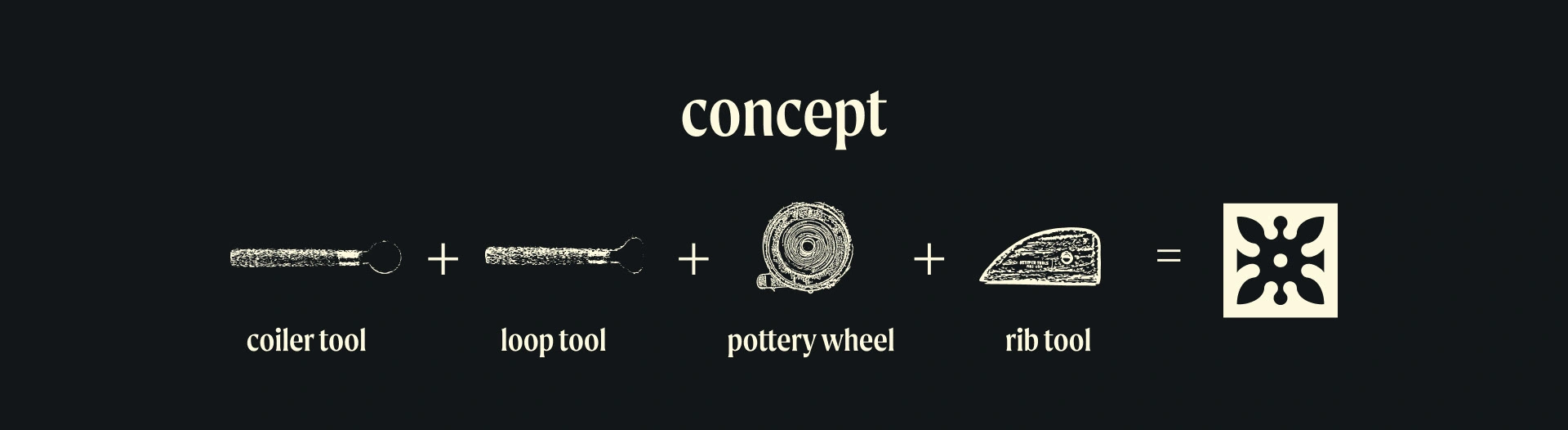
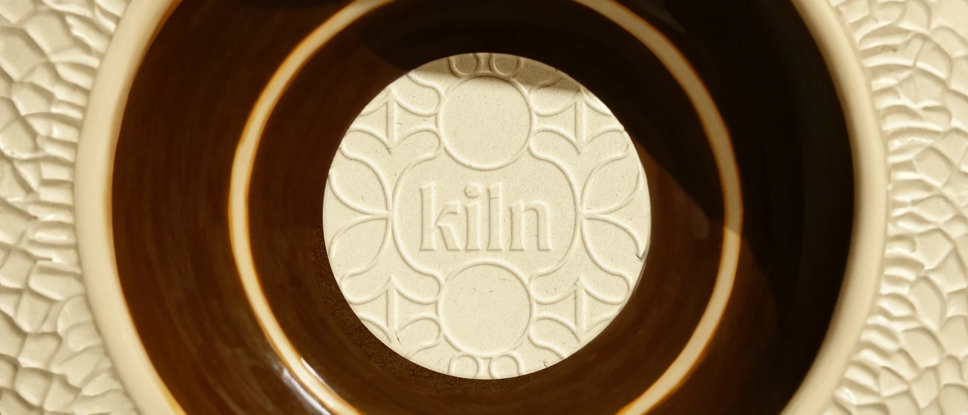
The concept behind the logo draws from the tools of a potter’s craft: the coiler tool, loop tool, pottery wheel, and rib tool. Each element symbolizes the process of shaping, refining, and creating. These tools come together in a minimalist design, embodying the brand name Kiln and the artistry it represents.
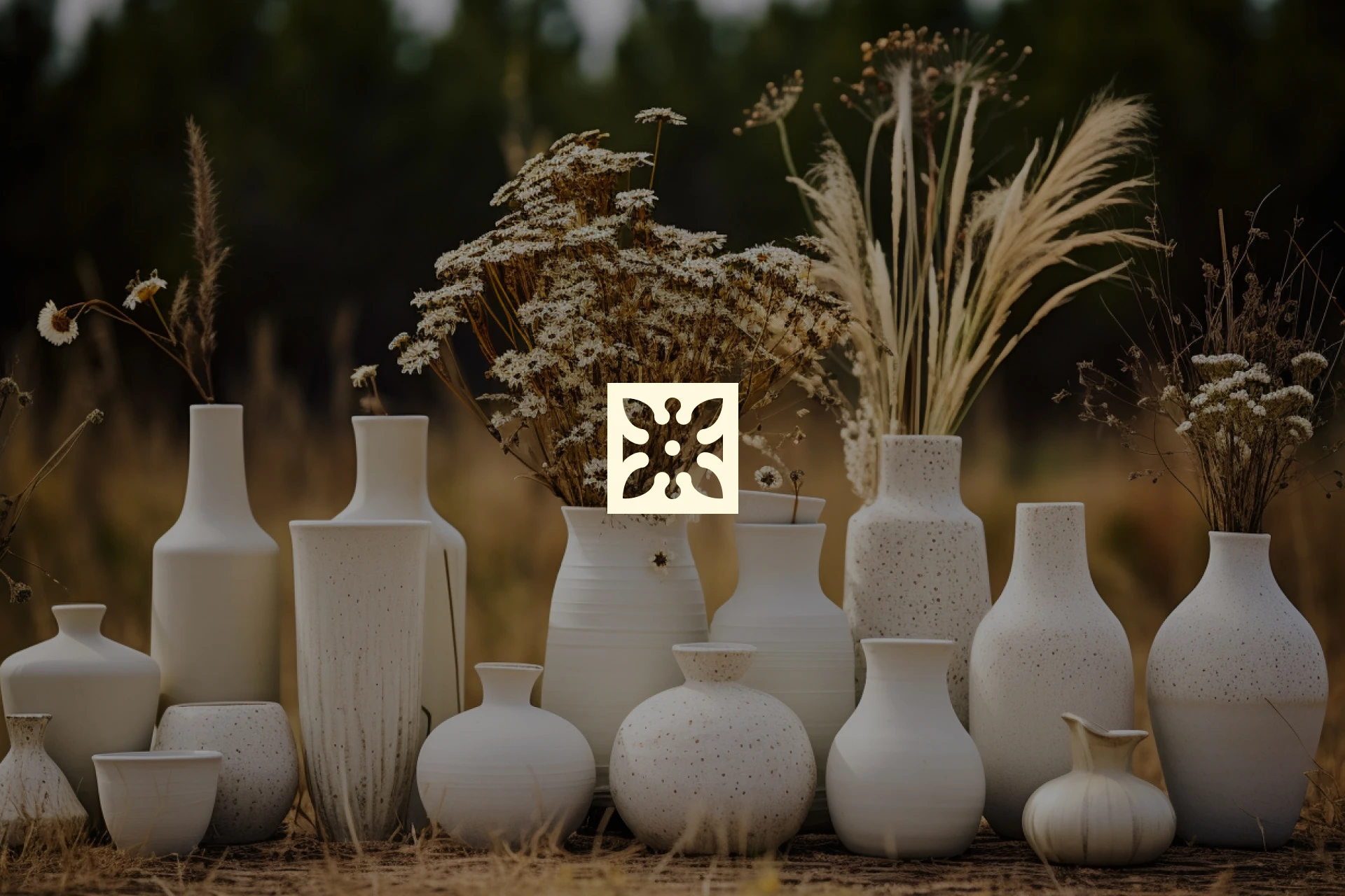
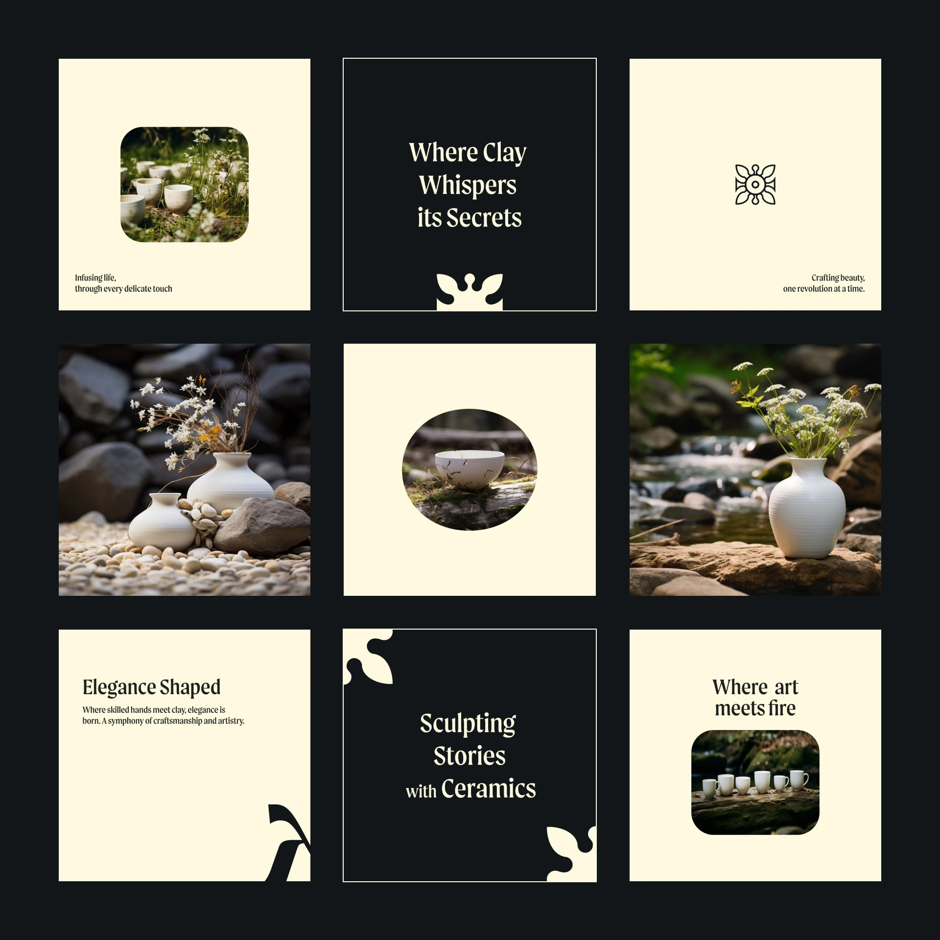
Feel the nature
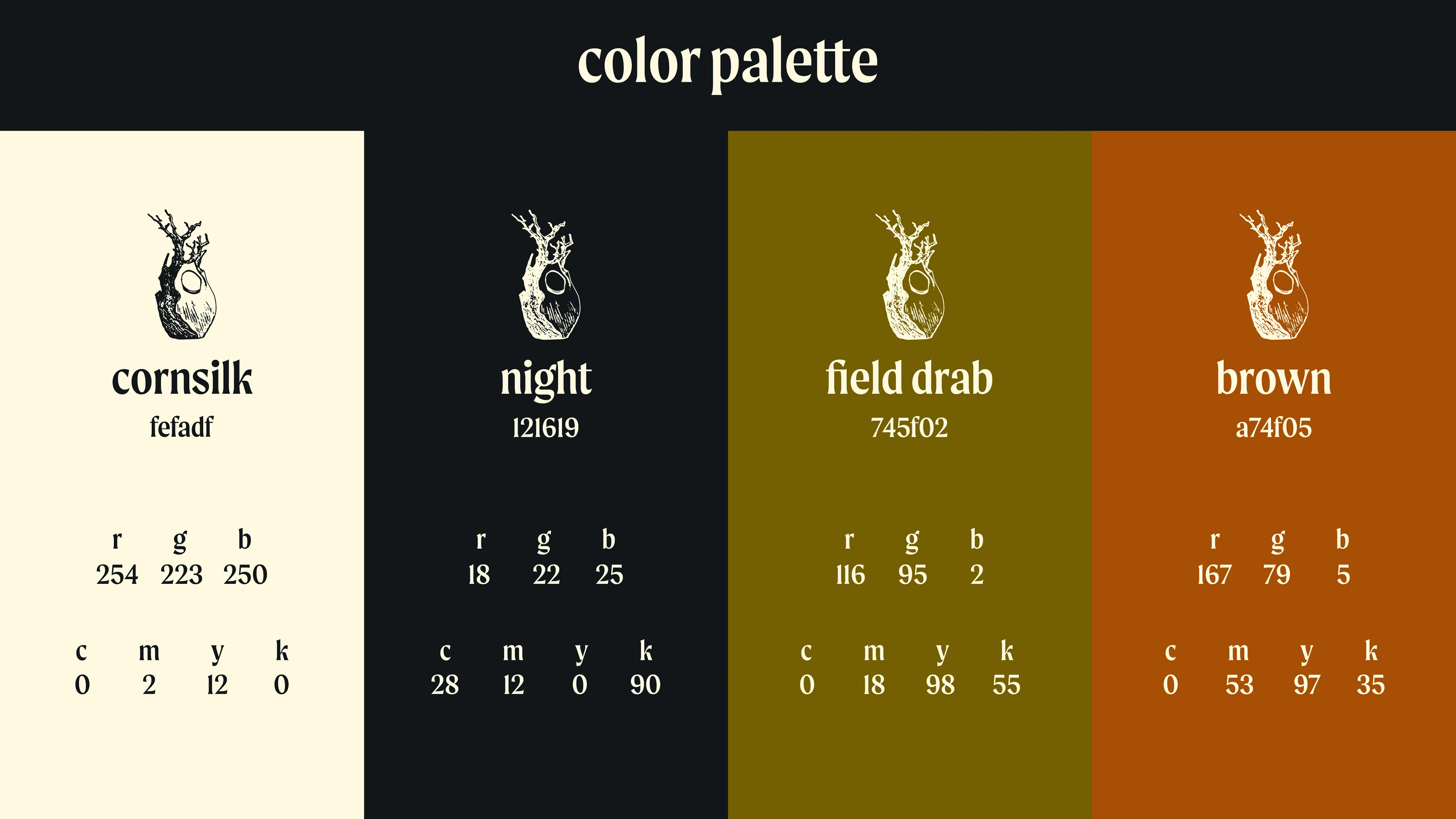
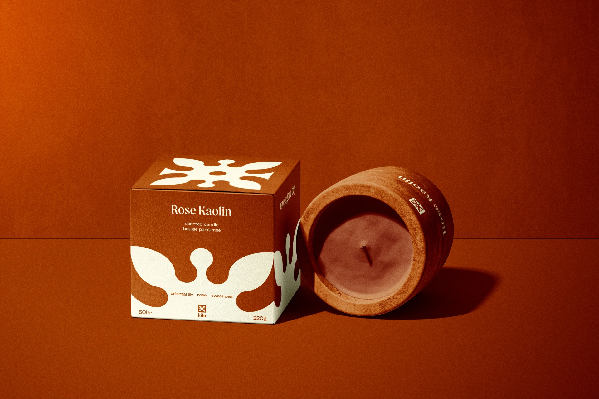
The color palette for Kiln reflects the natural tones of clay, earth, and fire. Each color was chosen to represent a key part of the pottery-making process:
— Cornsilk: A soft, neutral base reminiscent of raw clay.
— Night: A deep, grounding tone that evokes the shadows of the kiln.
— Field Drab: An earthy green inspired by the natural surroundings of traditional pottery studios.
— Brown: A warm, rich shade symbolizing the baked clay and the kiln's heat.
My Role:
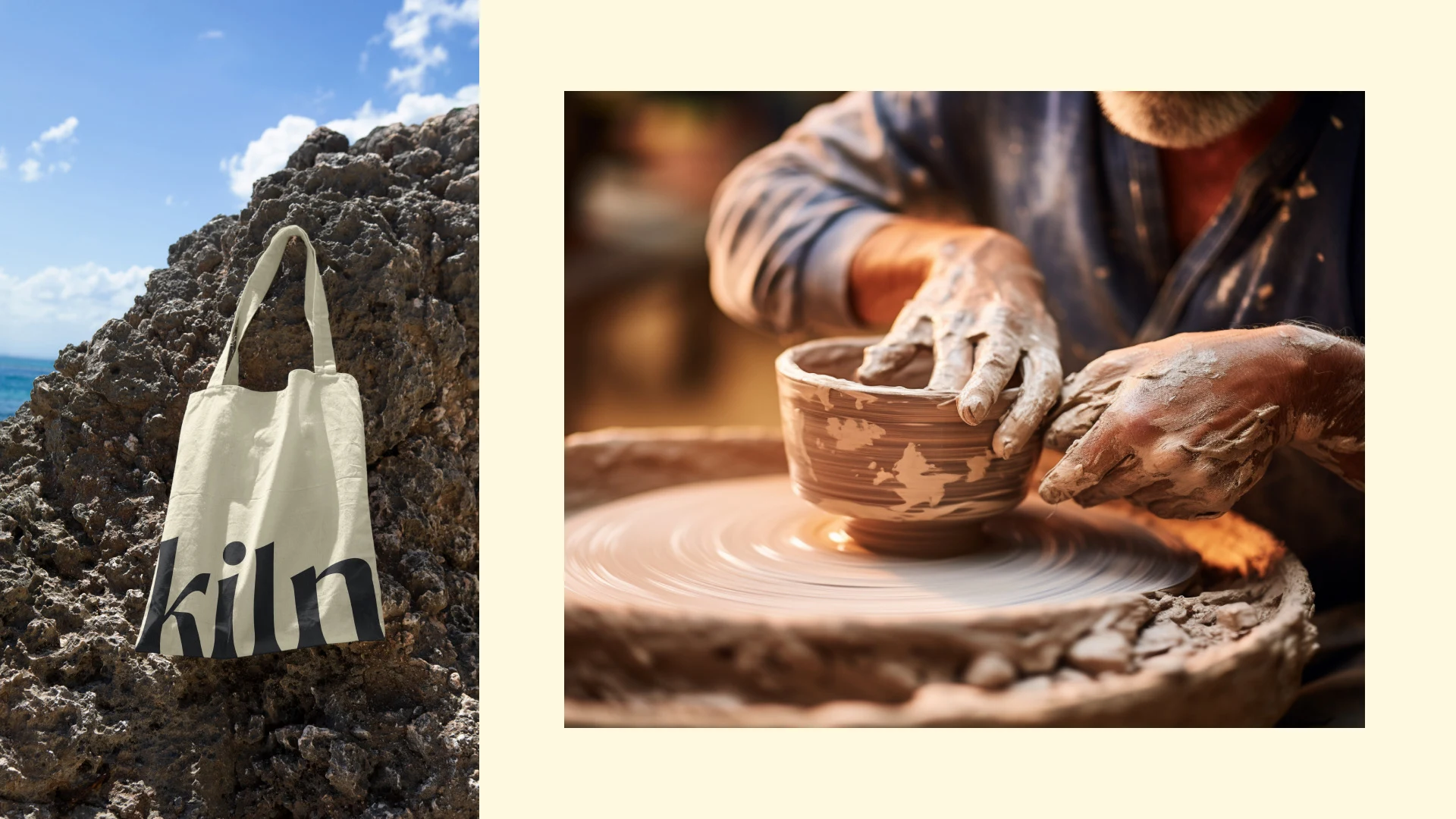
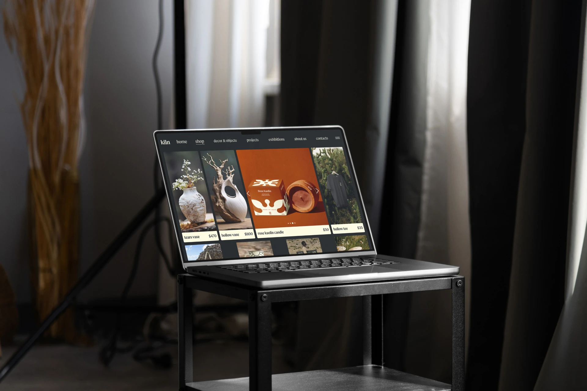
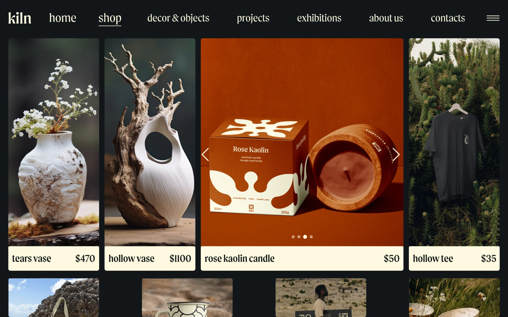
I have created the naming, logo, brand concepts, and almost all graphics and assets for Kiln. My partner, Mariia, generated the imagery and made a montage of videos.
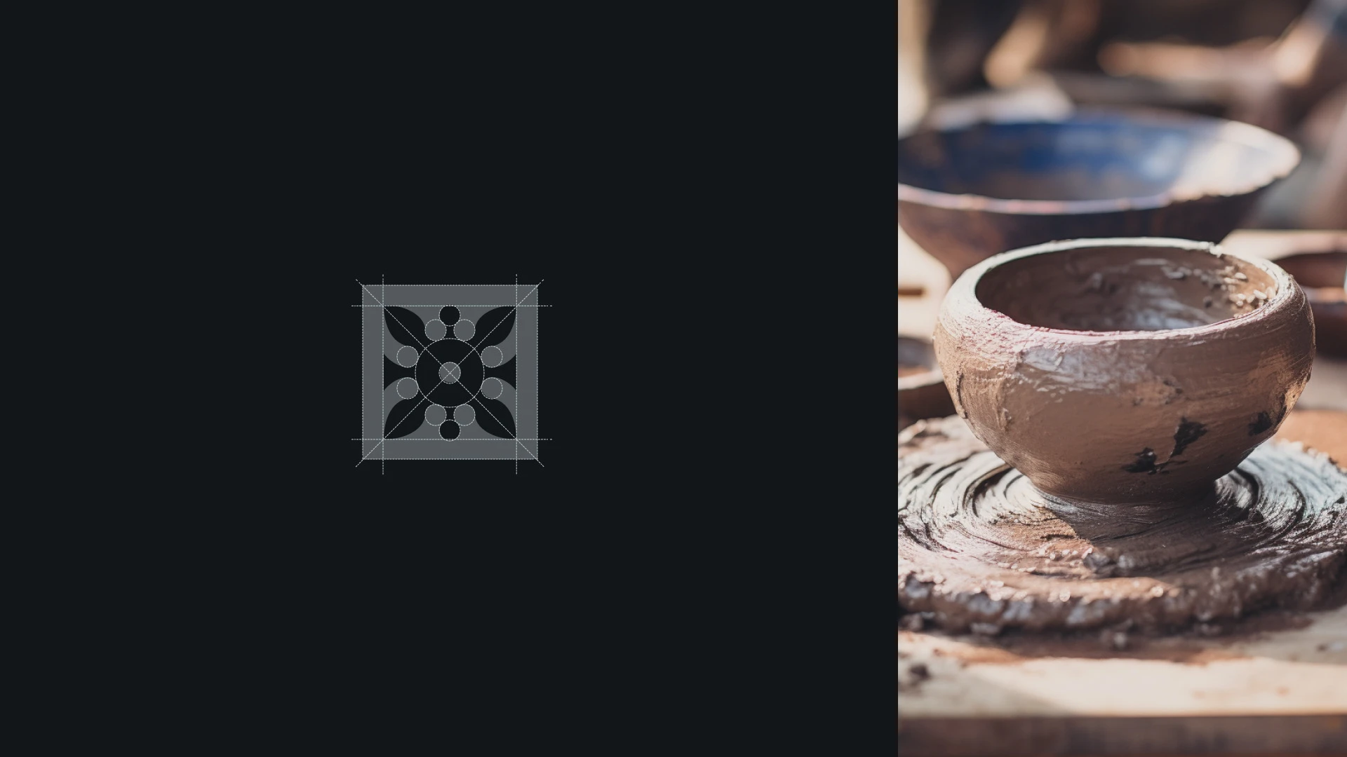
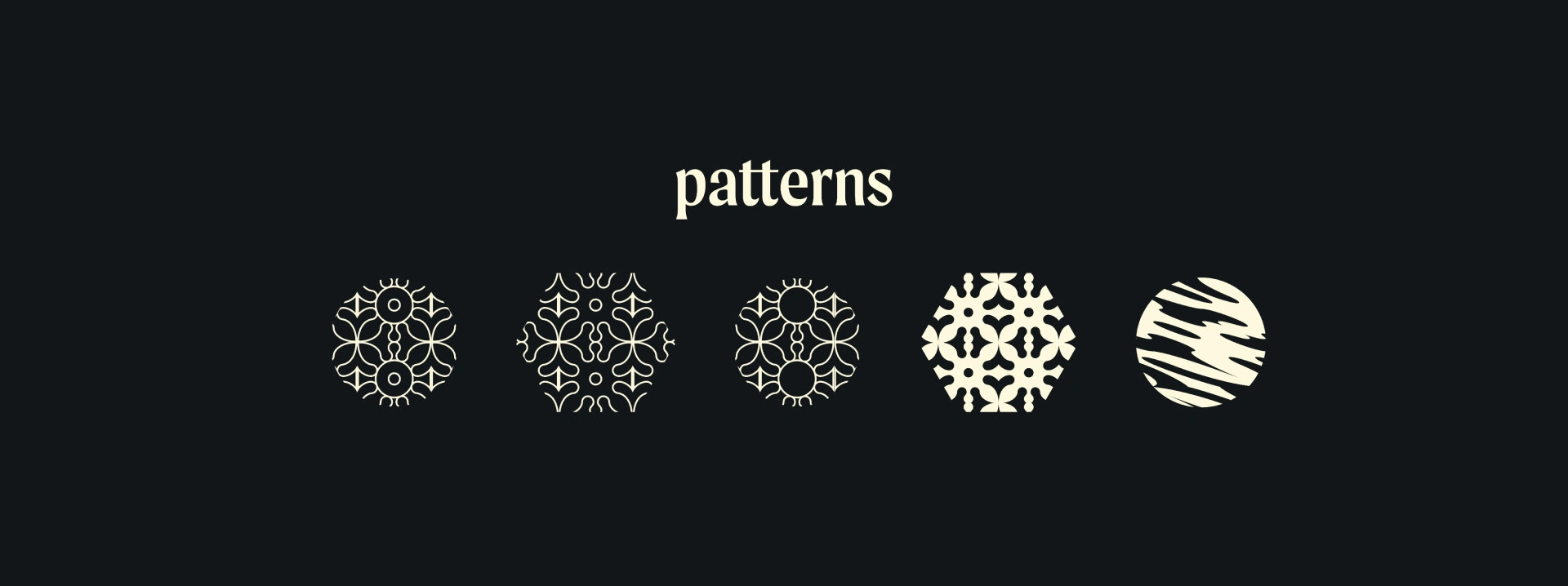
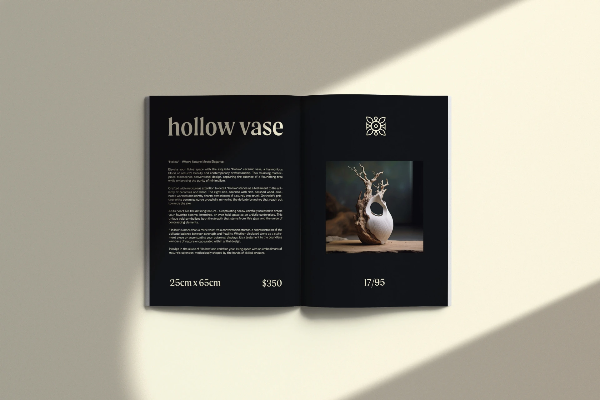
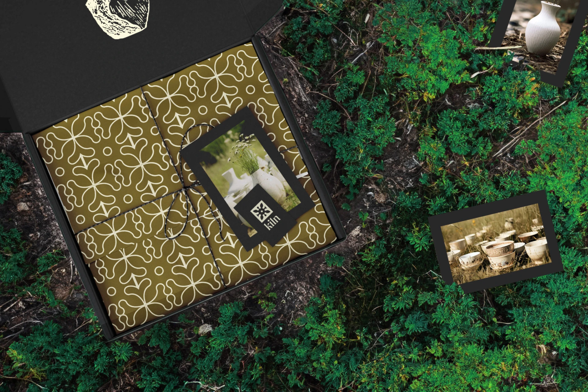
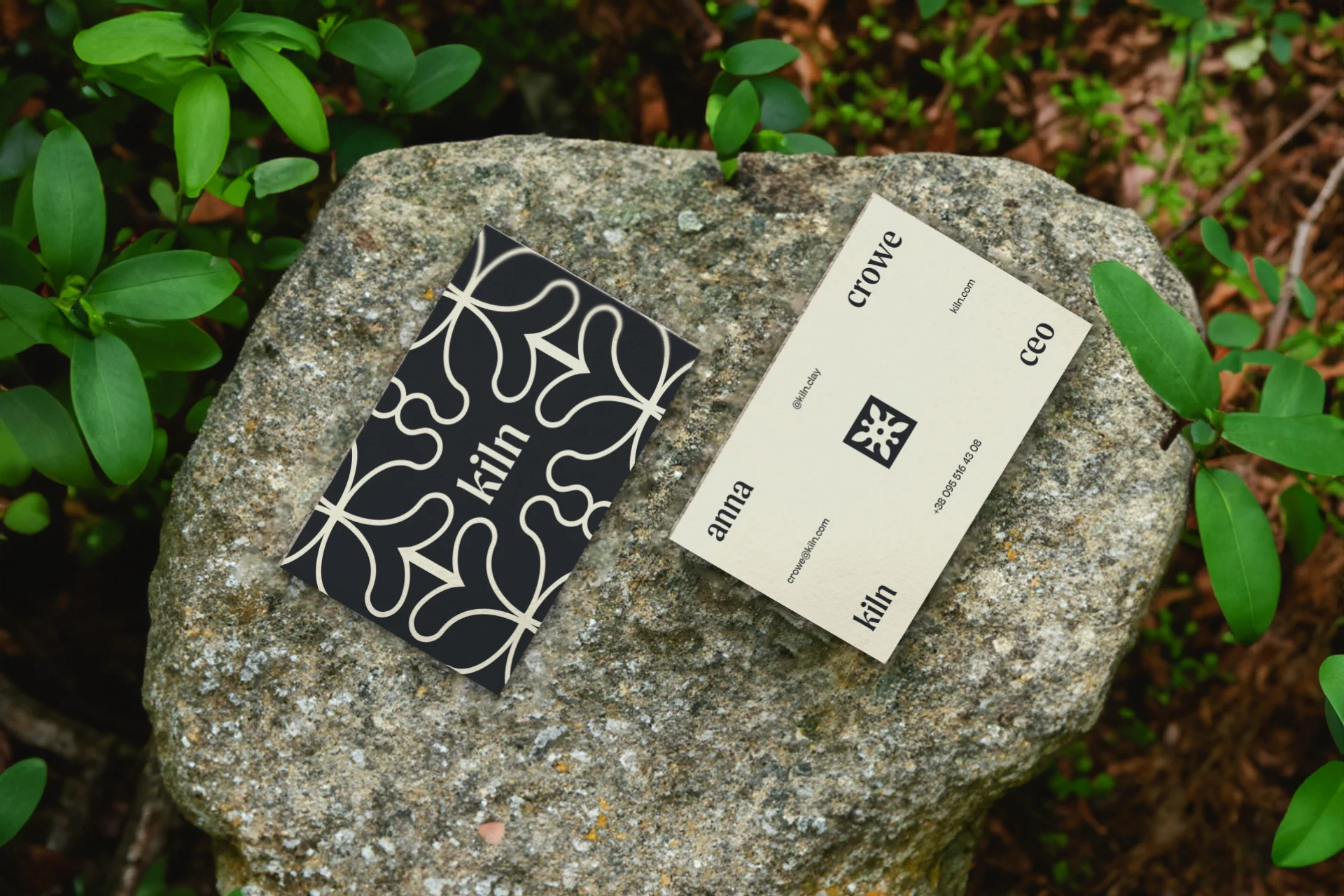
Patterns are visual representations of ceramic prints that emphasize nature, capturing the essence of floral themes.
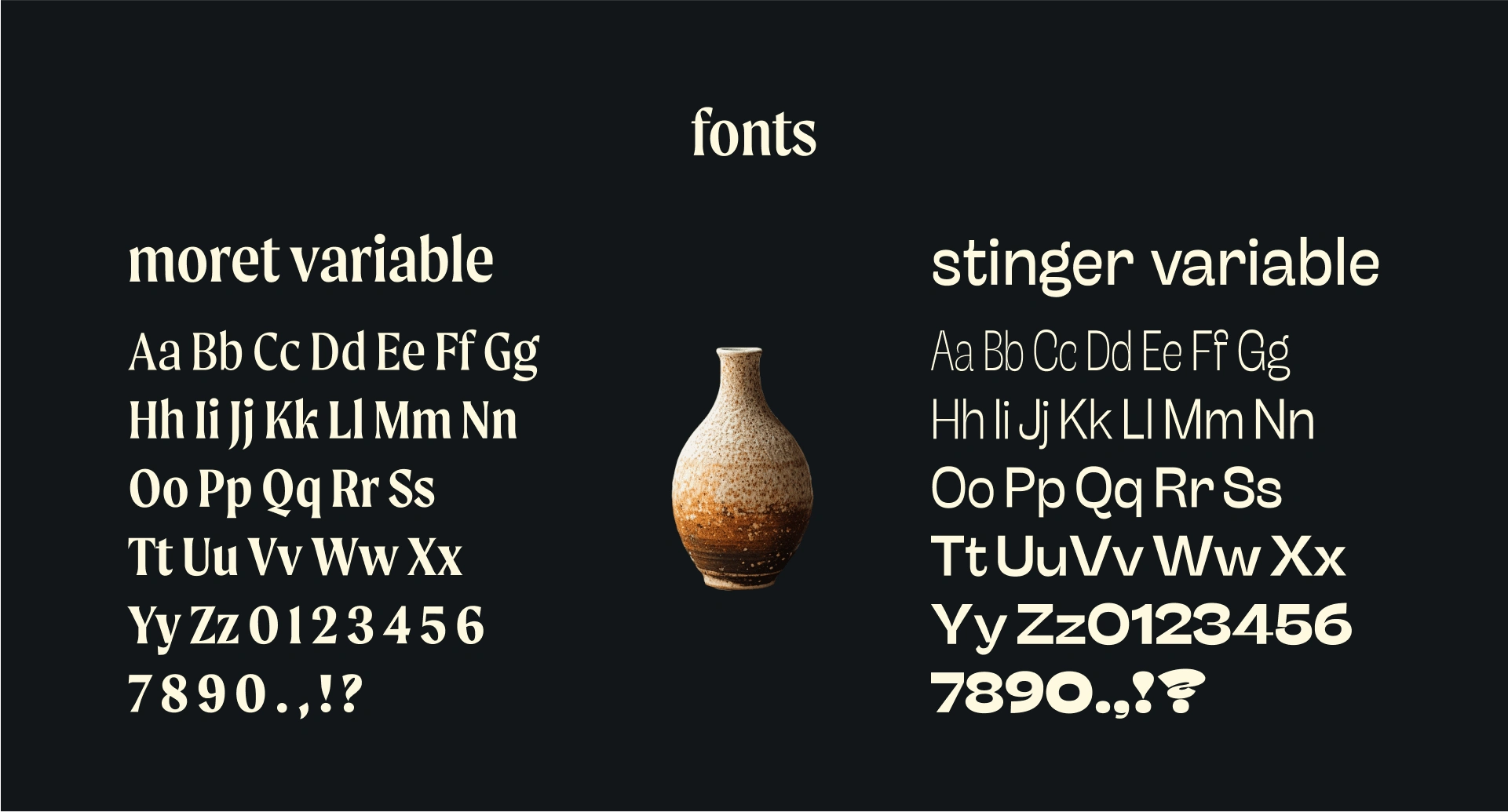
Typography
The typography for Kiln combines elegance and modernity, reflecting the brand’s artisanal yet approachable identity.
— Moret Variable: A sophisticated serif font that evokes tradition and craftsmanship, perfect for headlines and brand statements.
— Stinger Variable: A clean, contemporary sans-serif font that balances the serif’s elegance with readability, ideal for supporting text and digital use.
These typefaces create a harmonious blend of classic and modern styles, reinforcing the brand’s commitment to honoring tradition while embracing a fresh, creative perspective.
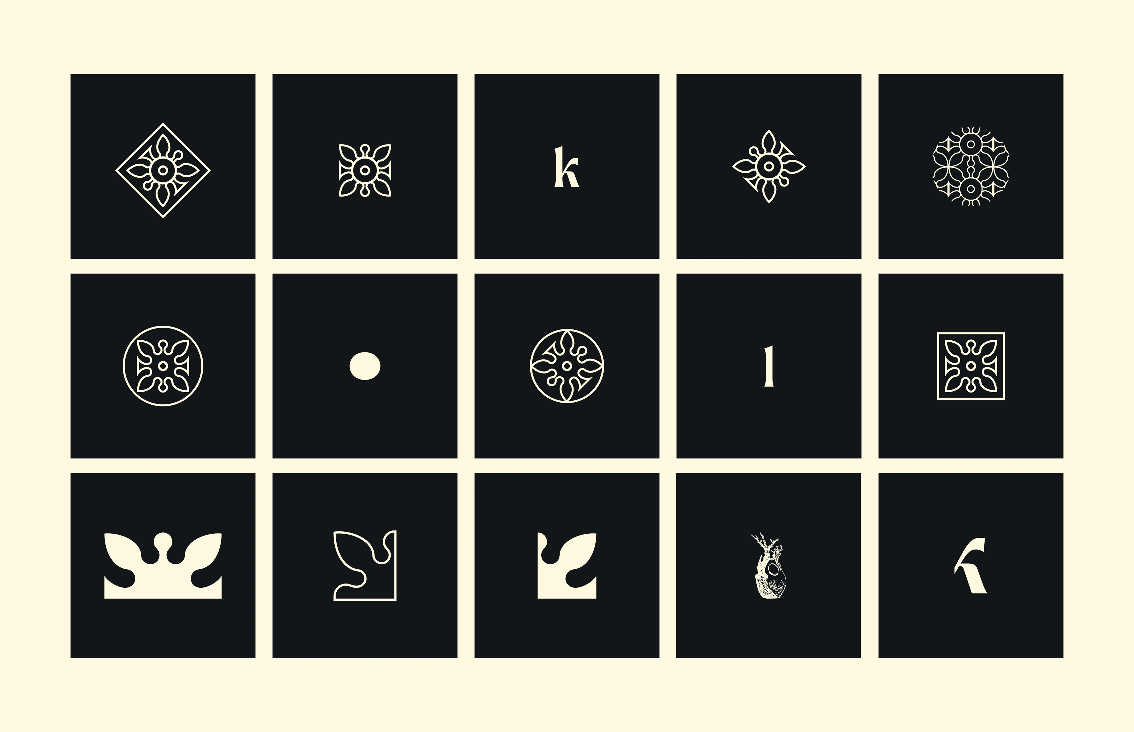
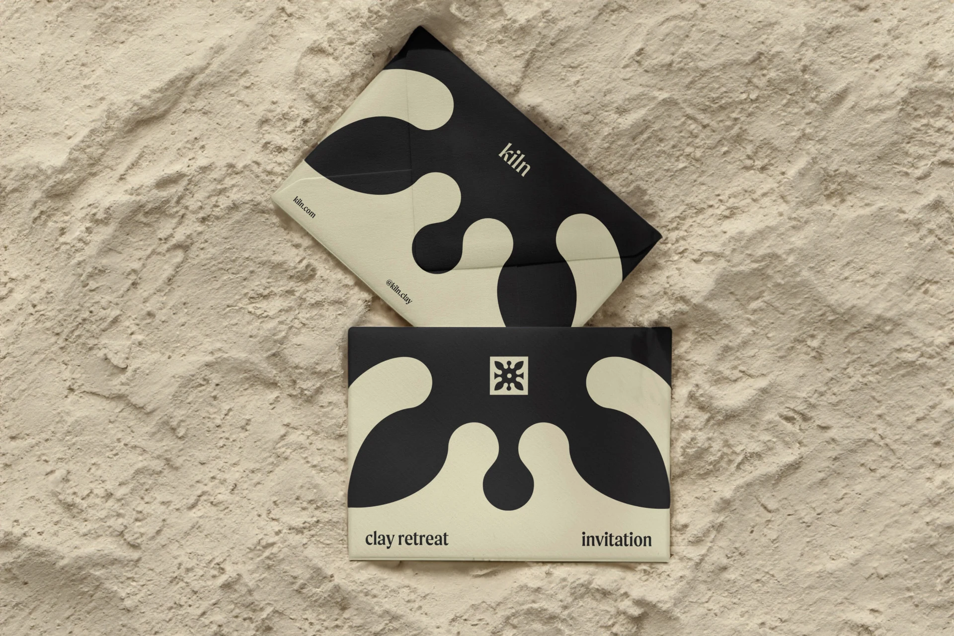
Brand elements
Brand elements are developed by deconstructing and modernizing the logo. One of the main elements is a vase, which represents the heart of the brand — a mix of pottery and nature.
Outcome
We’ve crafted a beautiful blend of colors, text, and brand elements infused with passion, creating the elegant and modern pottery studio design we’ve always dreamed of. We’re so excited to share it!
Check my other projects on my Behance :)
Thank you for your attention. Have a great day! :)
Like this project
Posted Dec 3, 2024
Kiln is a conceptual branding project. I crafted the identity for a pottery studio that embodies the warmth and artistry of handmade ceramics.