Freelance Brand Designers in Kosovo
Sign Up
Post a job
Sign Up
Log In
Filters
2
Projects
People
Hibye Studio
pro
Kosovo
Brand Identity & Packaging Design Studio
$25k+
Earned
5x
Hired
5.0
Rating
47
Followers
Follow
Message
Brand Identity & Packaging Design Studio
0
Tête-à-Pet — Pet Treat Brand & Packaging
0
11
0
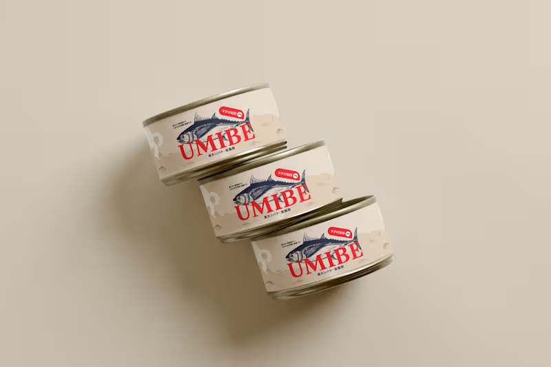
Umibe — Premium Tuna Packaging
0
14
0
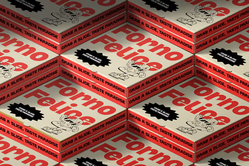
Forno Felice — Pizza Brand & Packaging
0
15
0
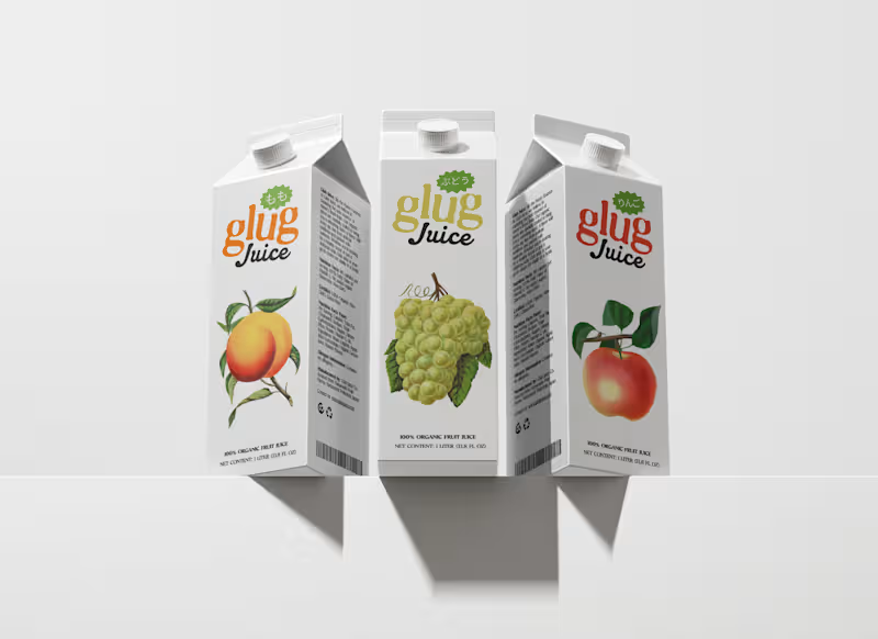
Glug — Bold Juice Brand & Packaging
0
14
Brand Designer
(17)
Follow
Message
Andi Gola
pro
Pristina
Brand and Graphic Designer building brands that last.
1x
Hired
50
Followers
Follow
Message
Brand and Graphic Designer building brands that last.

0
BREADCLUB The Type Does the Baking
0
4
0
RINU - A Modern Brand for Longevity and Renewal
0
18
0
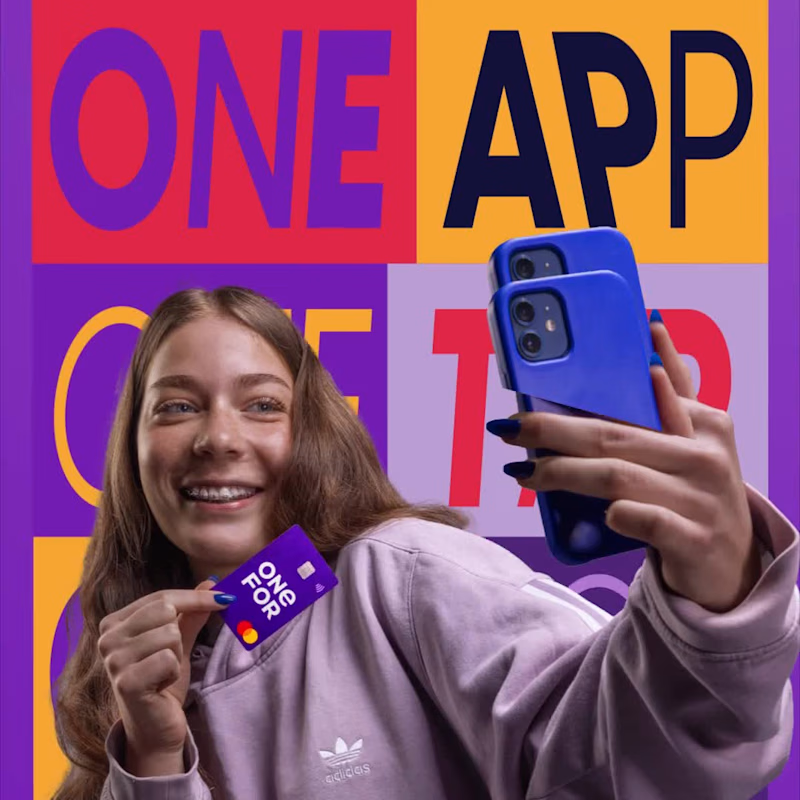
Designing OneFor’s Visual & Social Ecosystem
0
9
2
Initsix Brand Identity
2
23
Brand Designer
(11)
Follow
Message
Uran Doli
Pristina
Senior Graphic Designer ✦ UI/UX Designer
1x
Hired
5.0
Rating
9
Followers
Follow
Message
Senior Graphic Designer ✦ UI/UX Designer
0
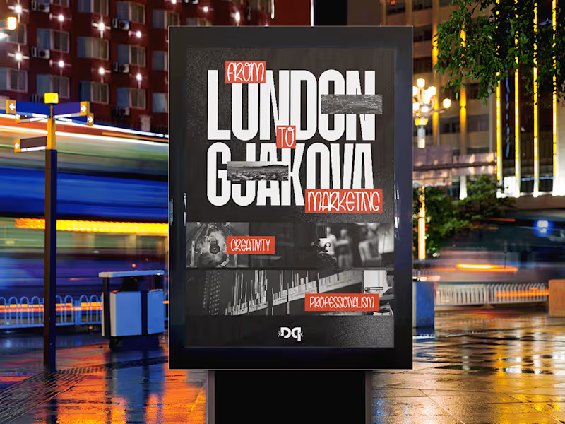
From London to Gjakova / Marketing Agency Poster
0
86
1
hellopuna - Logo Branding
1
8
1
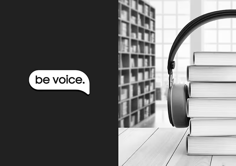
bevoice. - Logo proposal
1
6
1
True Group - Logo
1
7
Brand Designer
(6)
Follow
Message
Rinor Rama
Kosovo
Brand Identity & Web Designer
25
Followers
Follow
Message
Brand Identity & Web Designer
1
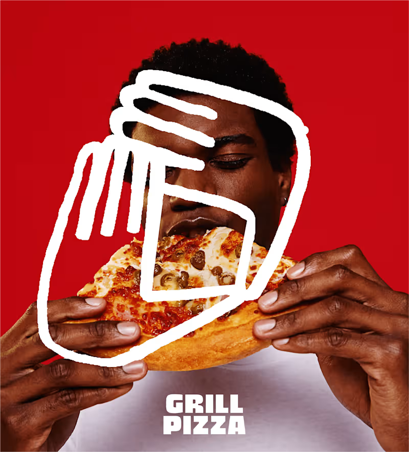
LOGO/BRAND IDENTITY FOR GRILL PIZZA
1
16
2
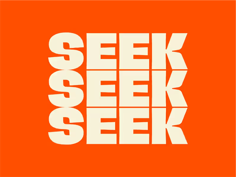
LOGO/BRAND IDENTITY REDESIGN FOR SEEK
2
14
3
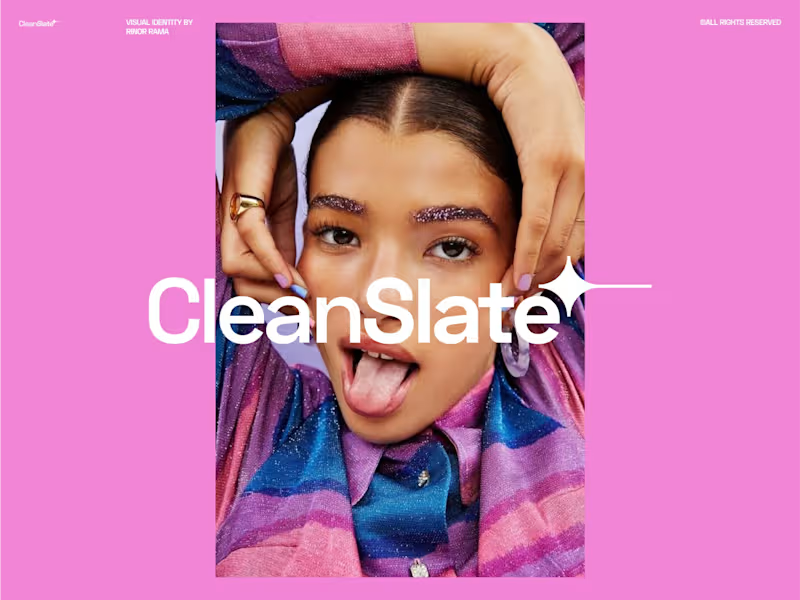
CLEANSLATE LOGO/BRANDING IDENTITY
3
21
2
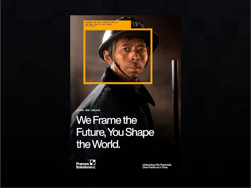
LOGO/BRANDING DESIGN FOR FRAMES SOLUTIONS AI
2
5
Brand Designer
(5)
Follow
Message
Viona Fonda
Pristina
Graphic Designer, Branding, Illustrations, SM Designs
Follow
Message
Graphic Designer, Branding, Illustrations, SM Designs
2
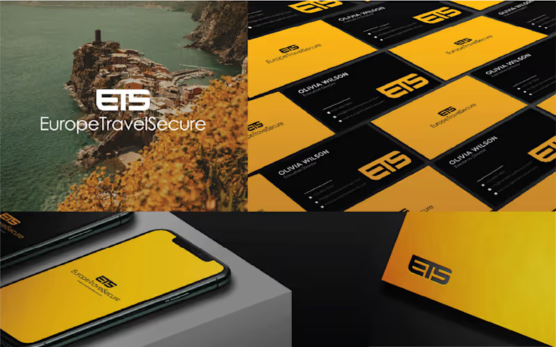
I designed the EuropeTravelSecure (ETS) logo and visual identity to reflect the brand’s core values of safety, clarity, and trust in European travel. The concept merges the initials “ETS” into a unified symbol that subtly forms a road map, representing movement, direction, and travel. At the same time, the mark also resembles a speech bubble, symbolizing guidance, support, and the information provided to clients. The color palette, yellow, black, and white, creates strong contrast while referencing the recognizable tones of the European Union. Overall, the identity communicates a bold and modern system for travelers seeking reliable support and secure journeys across Europe.
2
74
4
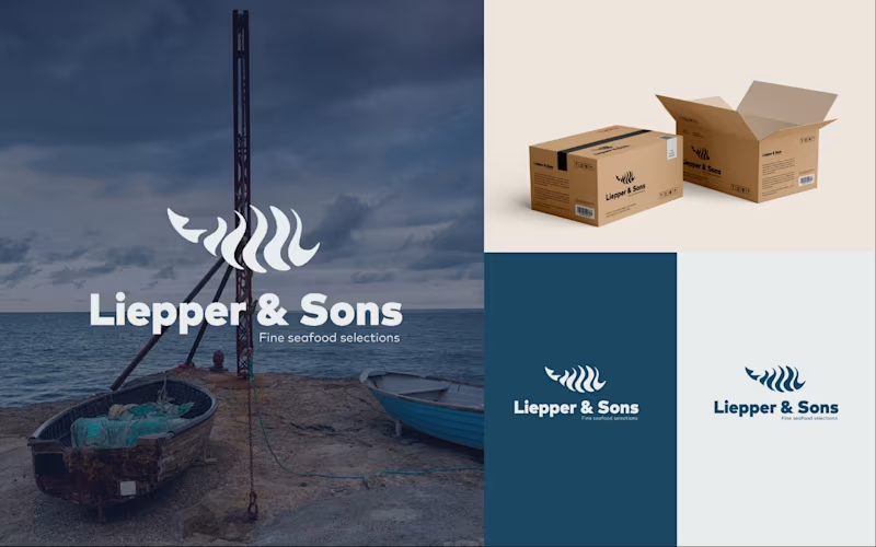
I developed a complete brand identity redesign for Liepper & Sons (https://lieppersons.com/?utm_source=chatgpt.com), a premium seafood supplier serving top restaurants and chefs throughout New York City. The new identity draws inspiration from the company's commitment to quality, freshness, and trusted relationships with fishermen around the world, creating a visual system that feels both refined and authentic while reflecting the heritage and expertise behind the brand.
4
156
3
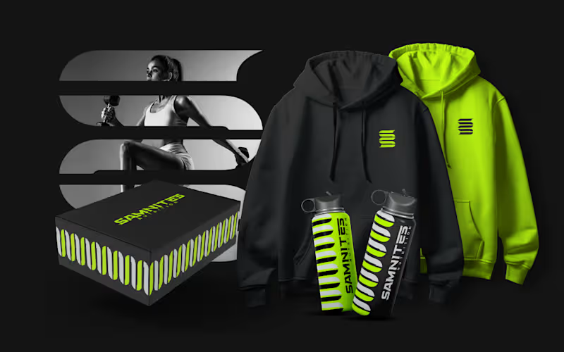
I designed the Samnites Nutrition logo as a brand identity that combines the strength of the ancient Samnites with a modern focus on protein-rich nutrition. The main element is a stylized double “S”, representing both the brand name and the concept of strength. In its vertical form, it reflects resilience and subtly references Samnite heritage, with dashed details inspired by arrows to symbolize precision and focus. When rotated horizontally, the same shape transforms into a protein symbol, reinforcing the brand’s nutrition-focused identity. This dual meaning connects heritage with modern health and performance. The result is a simple, adaptable mark that communicates strength, discipline, and innovation.
3
135
2
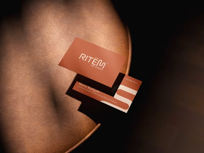
The name Ritëm comes from the idea of moving at a personal rhythm, without pressure or comparison. In the context of a CBT studio, it represents each client’s individual process—a journey that does not need to be fast or perfect, but steady and aligned with oneself. The main element of the logo, the letter “M,” is designed in a slightly asymmetrical and organically balanced way to reflect this concept. Its form suggests a free and natural movement, like a line that follows a unique rhythm, with variations and small pauses. This visual approach symbolizes the idea that progress is not linear and that each individual has their own pace of development. Through this, the logo communicates a sense of comfort, acceptance, and calm—making the studio a space where clients can feel safe to move forward in their own way and at their own time.
2
118
Brand Designer
(4)
Follow
Message
Leart Raka
Pristina
Design engineer specializing in Branding & Product
Follow
Message
Design engineer specializing in Branding & Product
0
Logo Design for Avante Furniture
0
8
0
Logo Design for Mist Food Tech
0
6
0
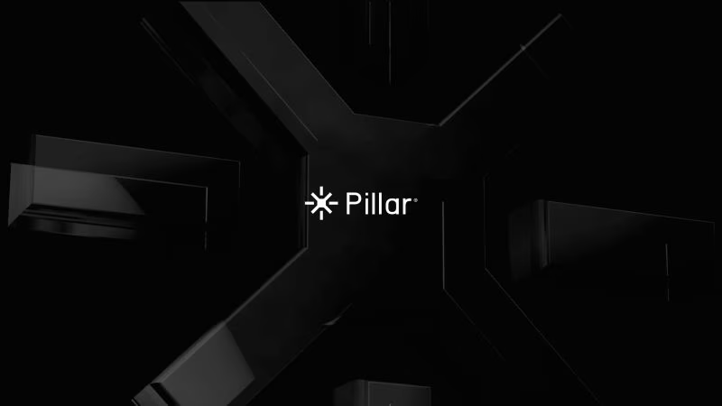
Brand Identity Design for Pillar Studio
0
6
View more →
Brand Designer
(3)
Follow
Message
Arianit Bulliqi
Pristina
Graphic Designer
Follow
Message
Graphic Designer
0
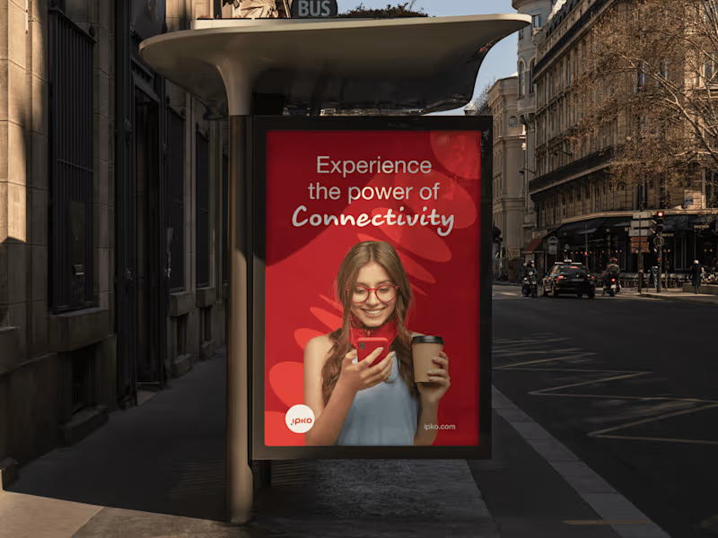
IPKO Brand Identity Refresh
0
4
0
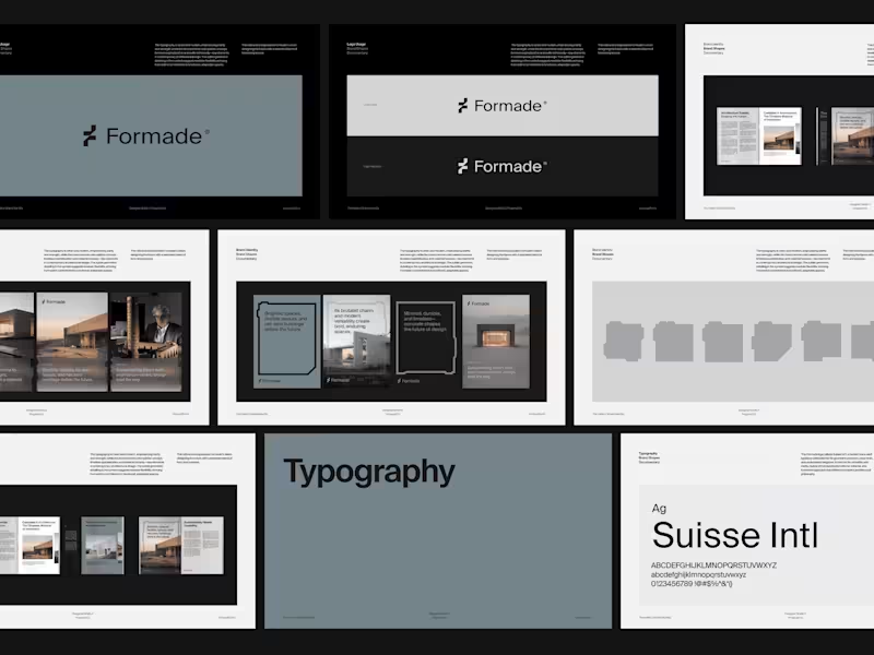
Formade Brand Identity
0
4
0
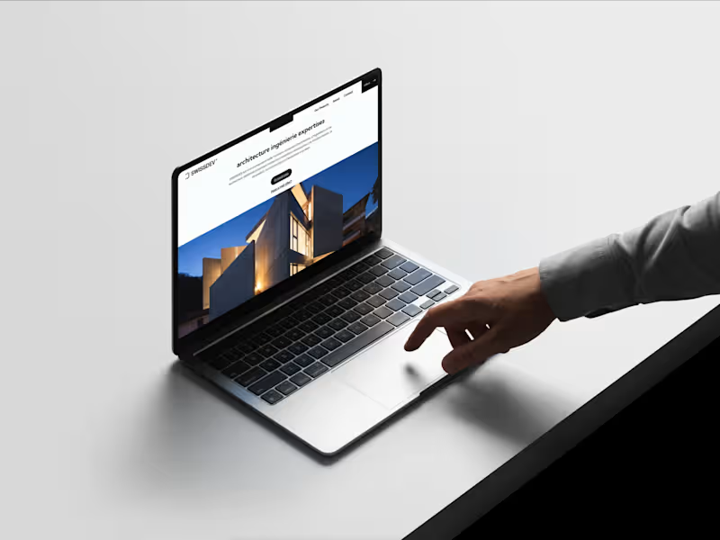
SwissDev Brand Identity
0
3
0
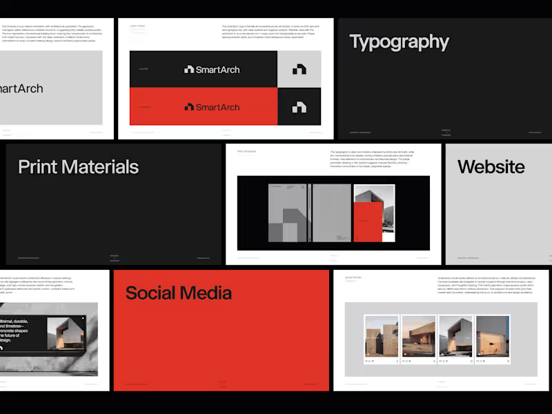
SmartArch Brand Identity
0
4
Brand Designer
(3)
Follow
Message
Albulena Kurti
Kosovo
Graphic & UI/UX Designer | Brand Identity Expert
Follow
Message
Graphic & UI/UX Designer | Brand Identity Expert
0
Valentine | Brand Identity & Website Design
0
8
1
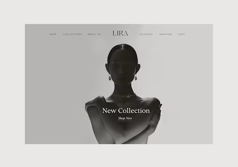
Lira Jewelry | Brand Identity & Website Design
1
4
0
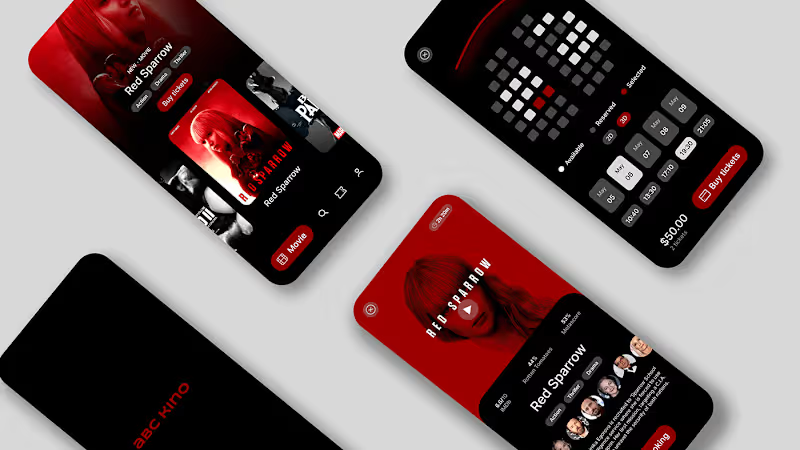
ABC Kino | Mobile App Design
0
7
0
Marks & Logotypes
0
3
Brand Designer
(2)
Follow
Message
Explore people