Umibe — Premium Tuna Packaging

Hibye Studio


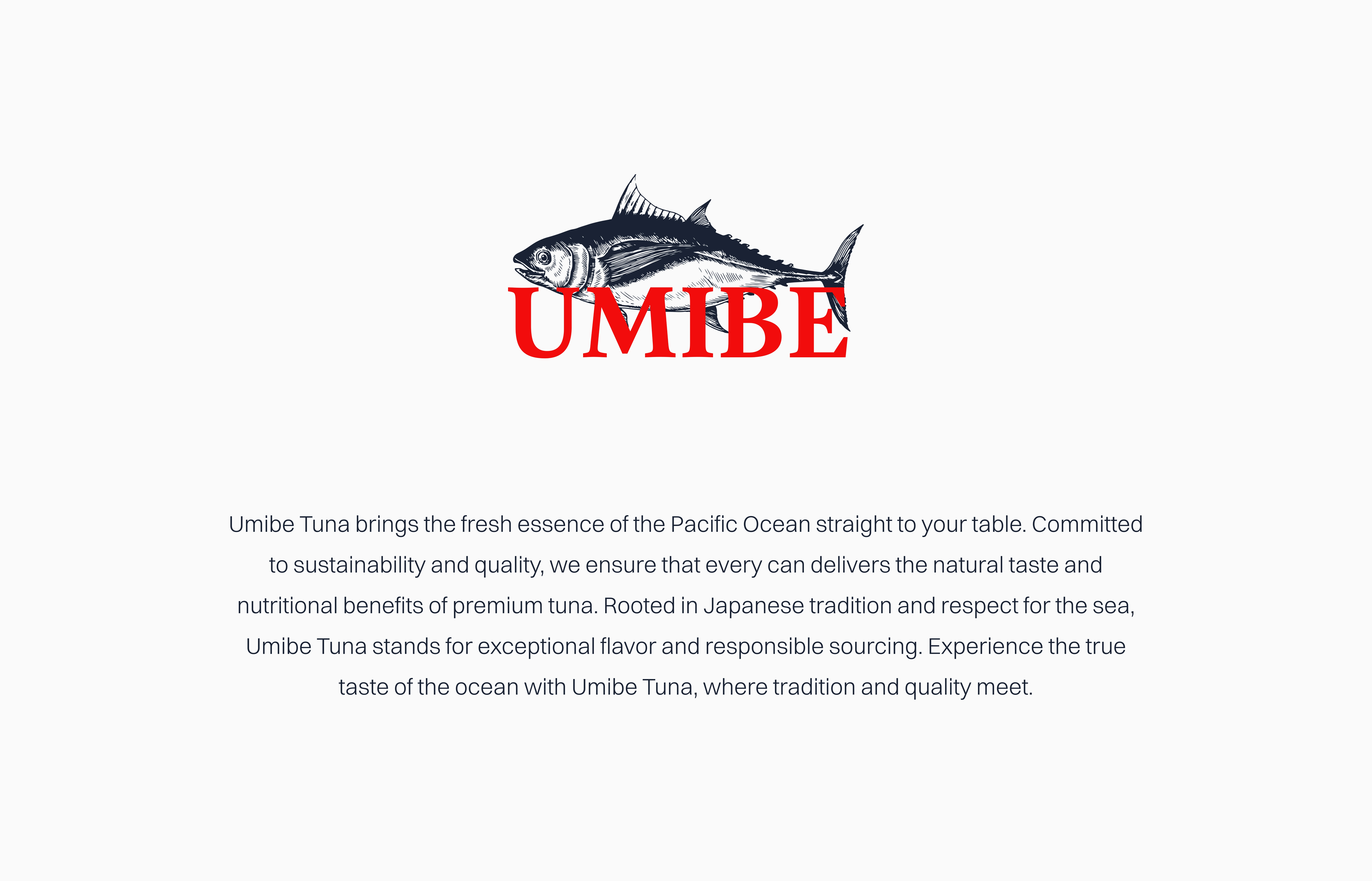
A premium tuna packaging concept exploring how refined typography and ocean-inspired visuals can elevate a simple canned product into something that feels intentional and high-end.
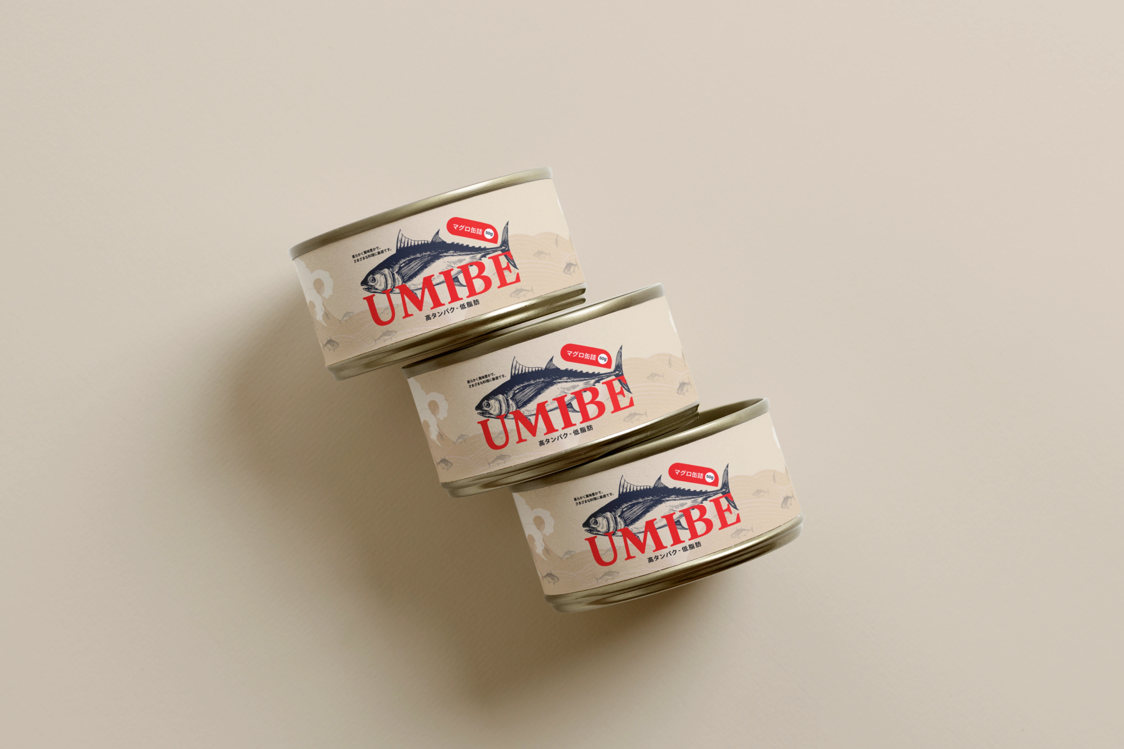
The visual direction draws from Japanese design principles: clean lines, considered spacing, and a respect for the product itself. Nothing competes with the quality of what is inside.
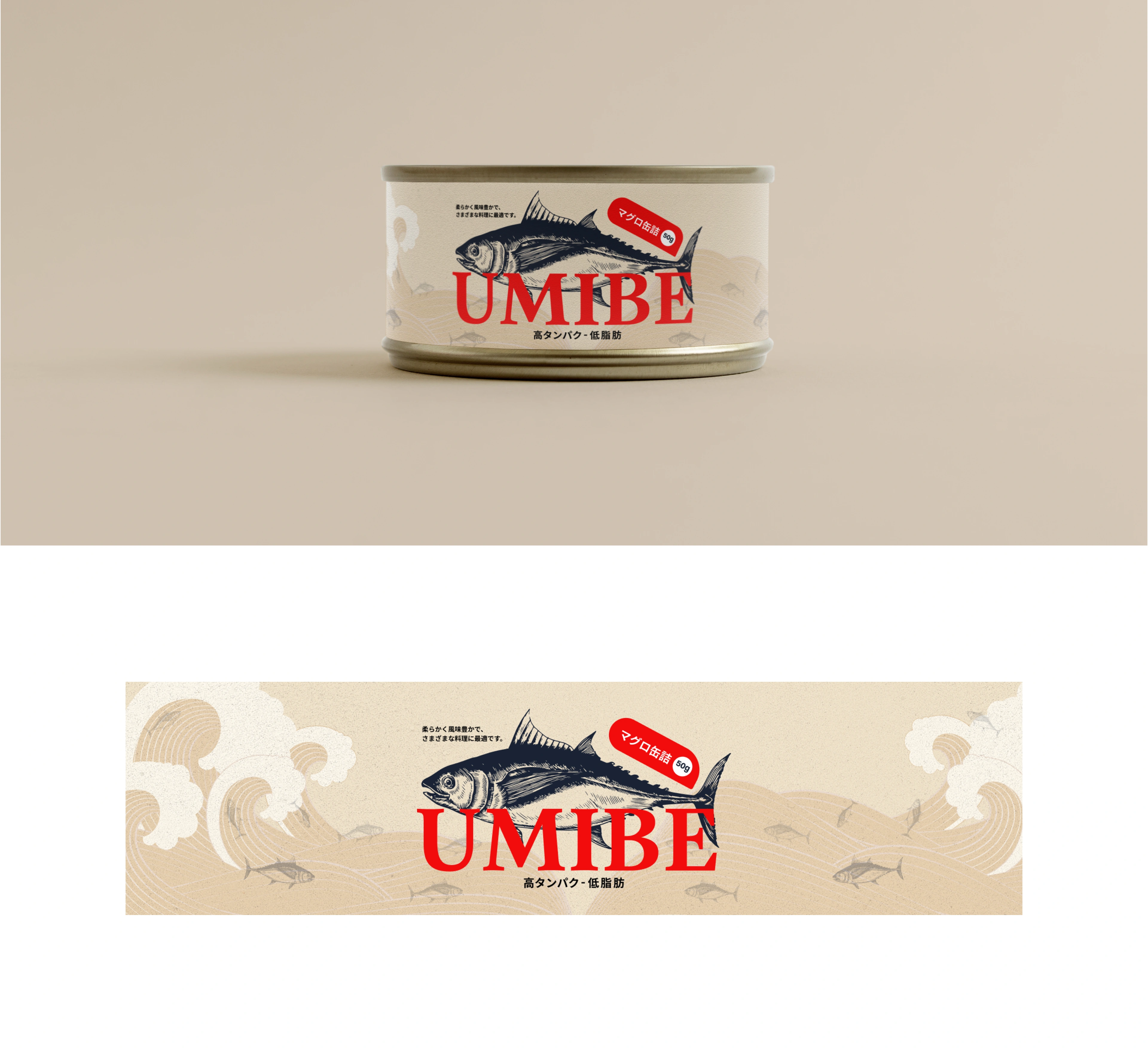
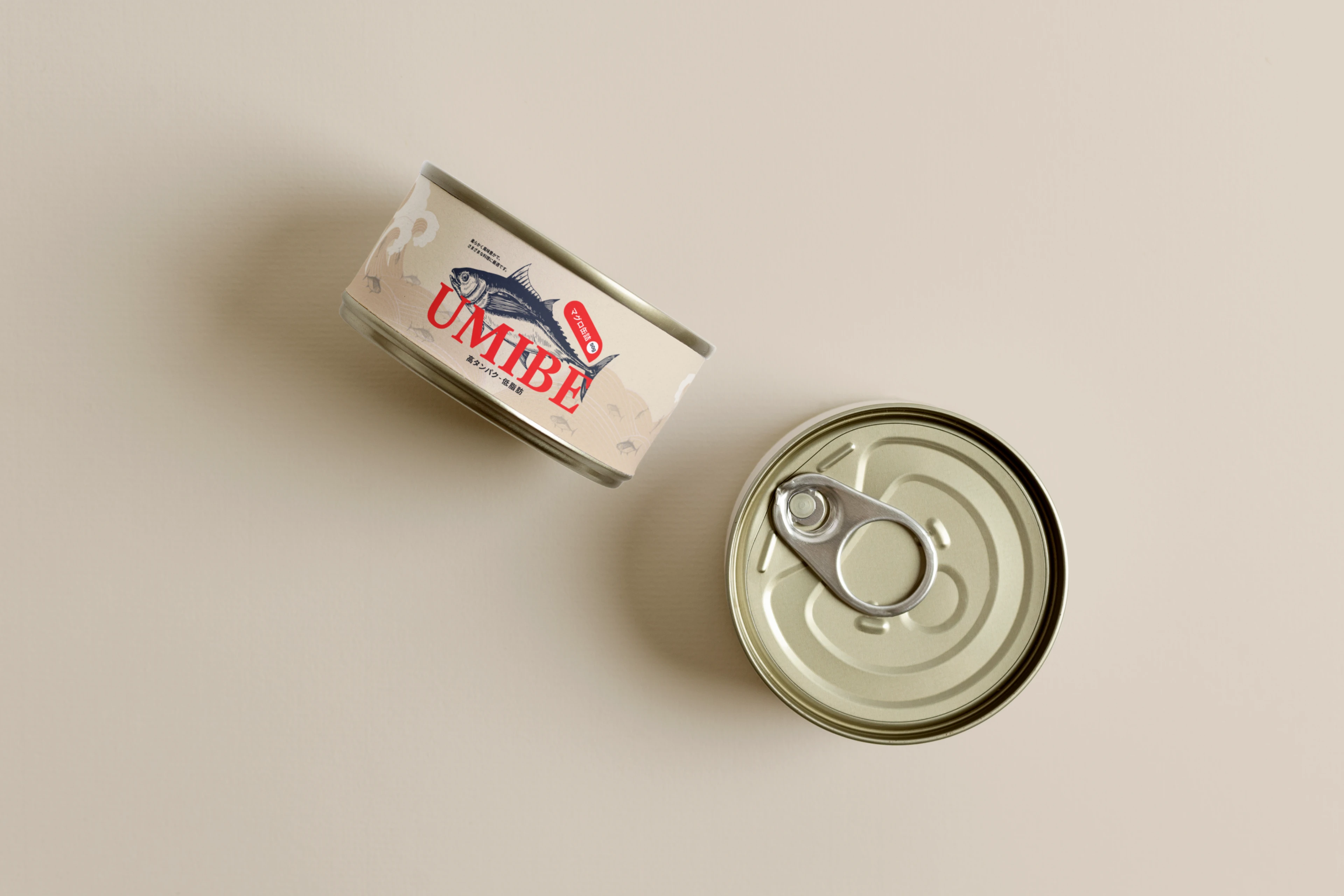
The label system uses a restrained color palette inspired by the ocean. Deep blues and soft neutrals create a sense of freshness and quality without relying on product photography.
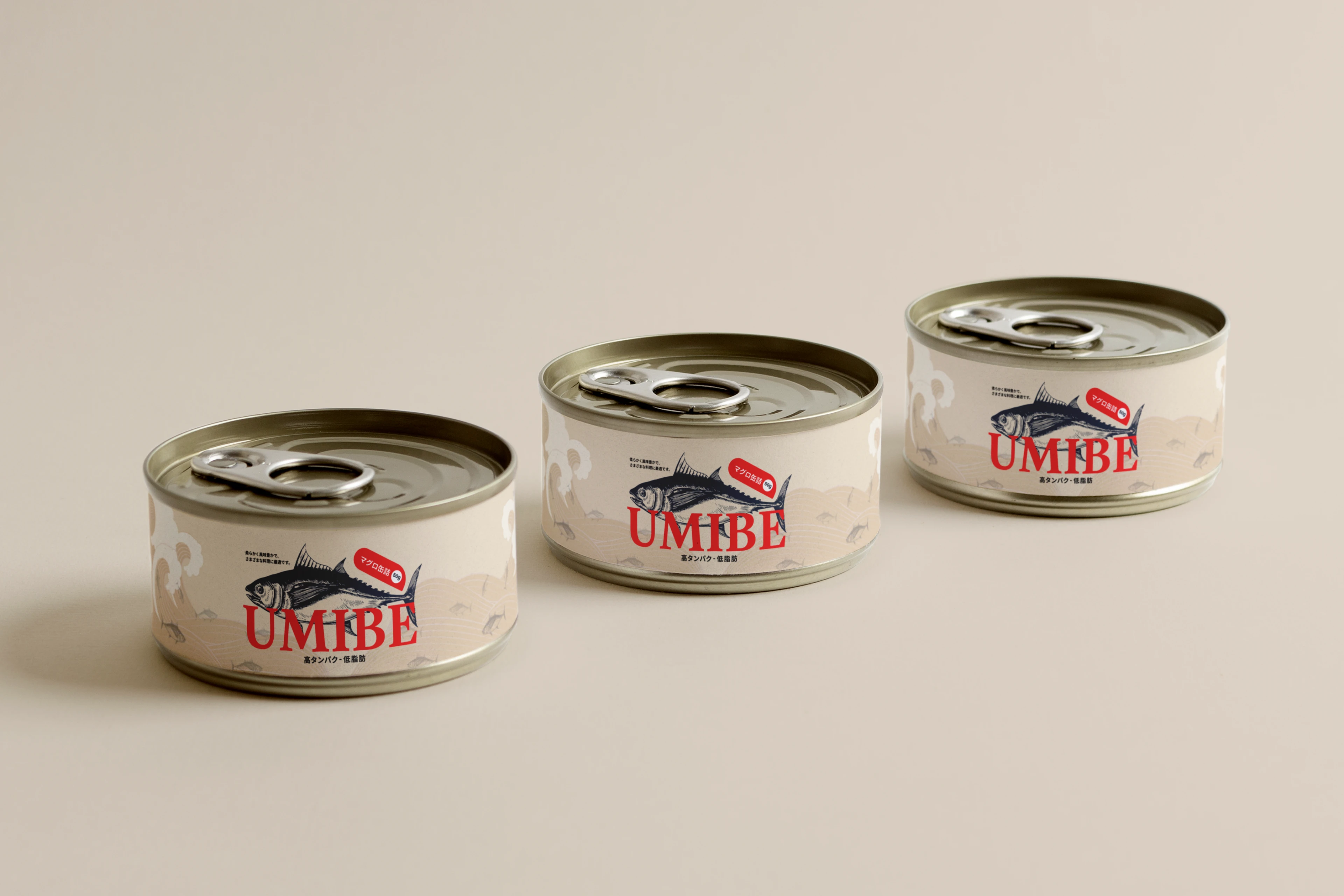
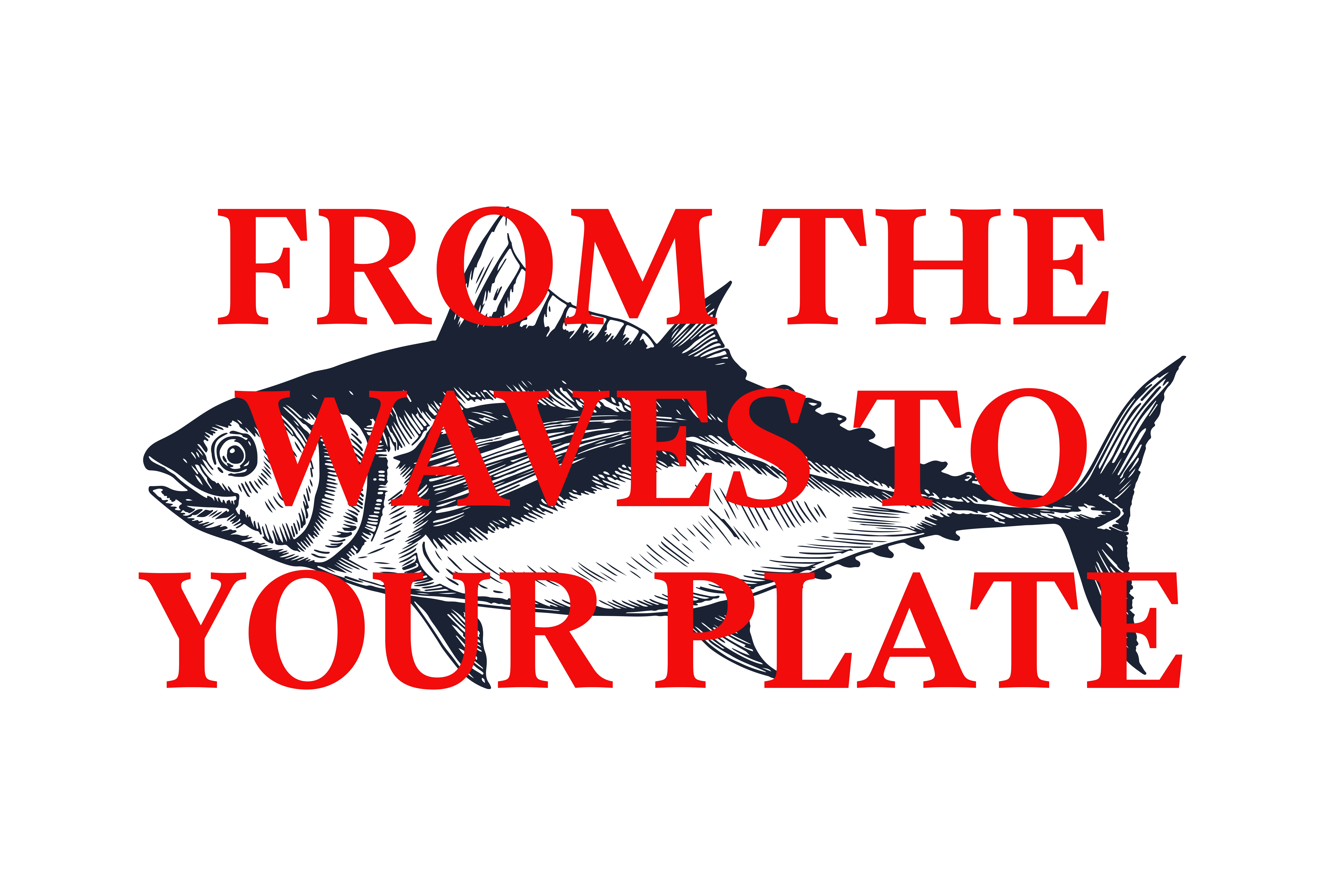
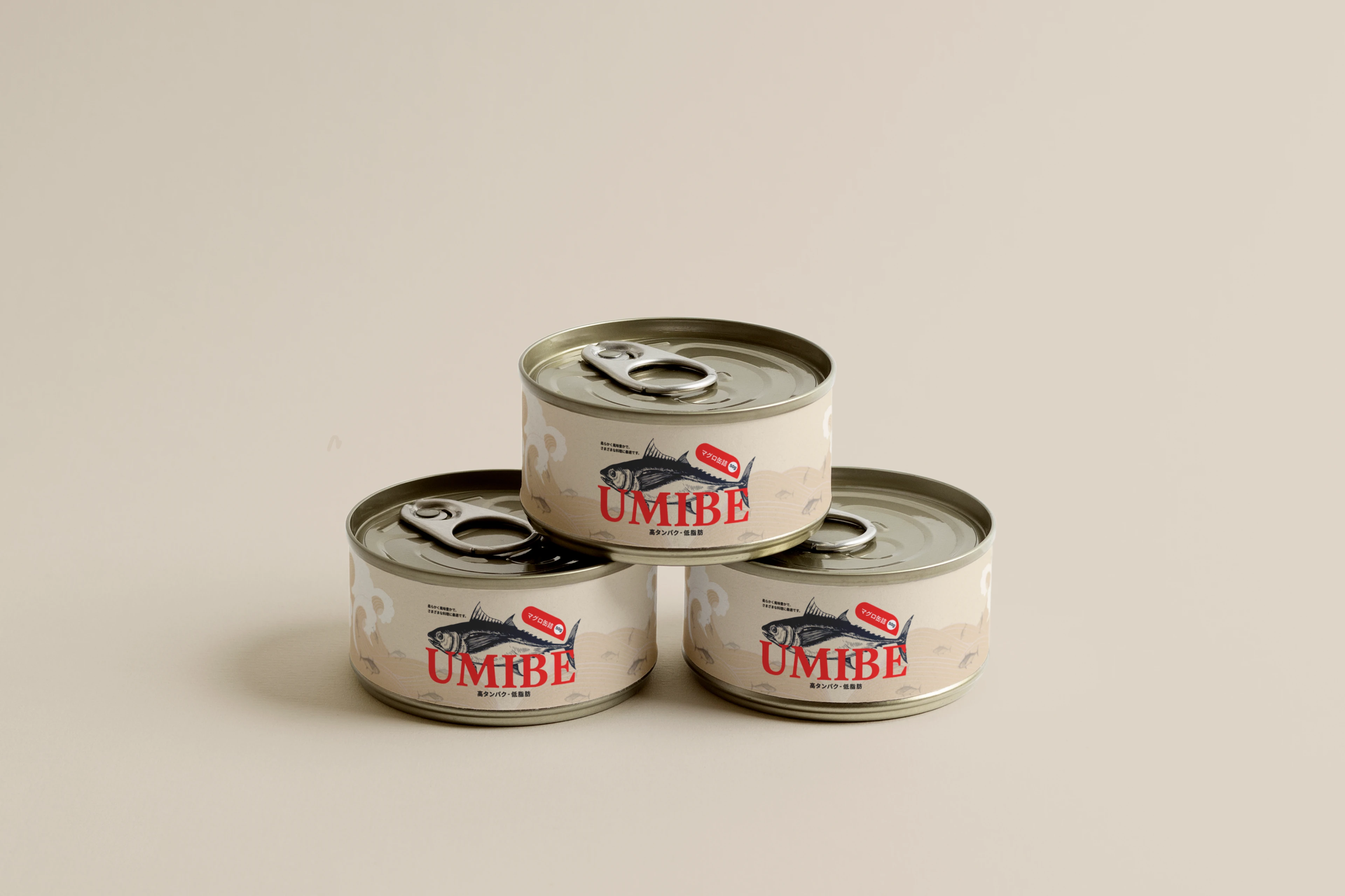
Typography carries most of the weight. The type choices signal premium positioning while remaining legible at the small scale that canned goods demand.
Like this project
Posted Jun 19, 2026
Designed a premium tuna packaging identity with refined typography, clean layouts, and ocean-inspired visuals focused on quality and freshness.