Flower Mistress — Botanical Skincare Packaging

Hibye Studio


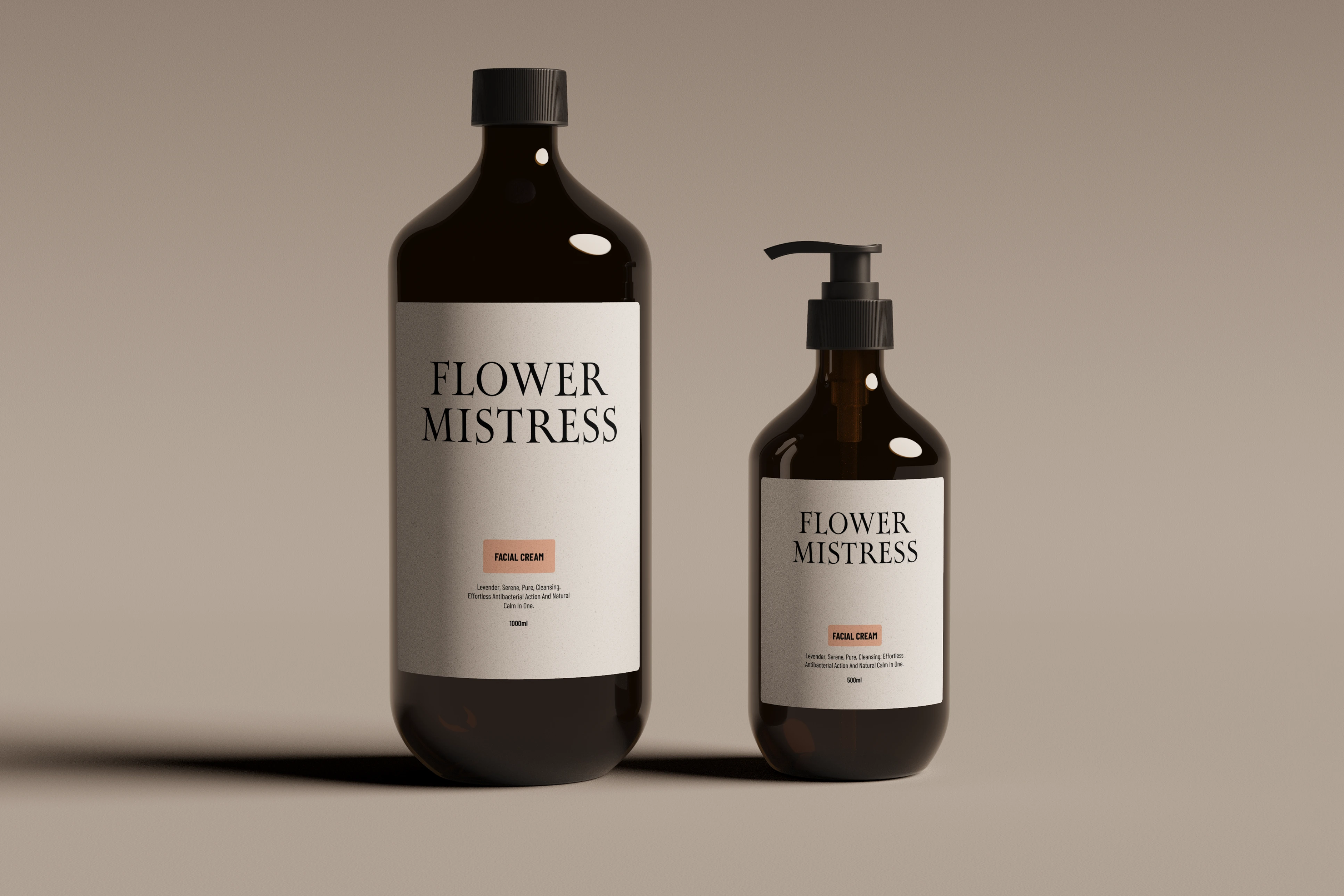
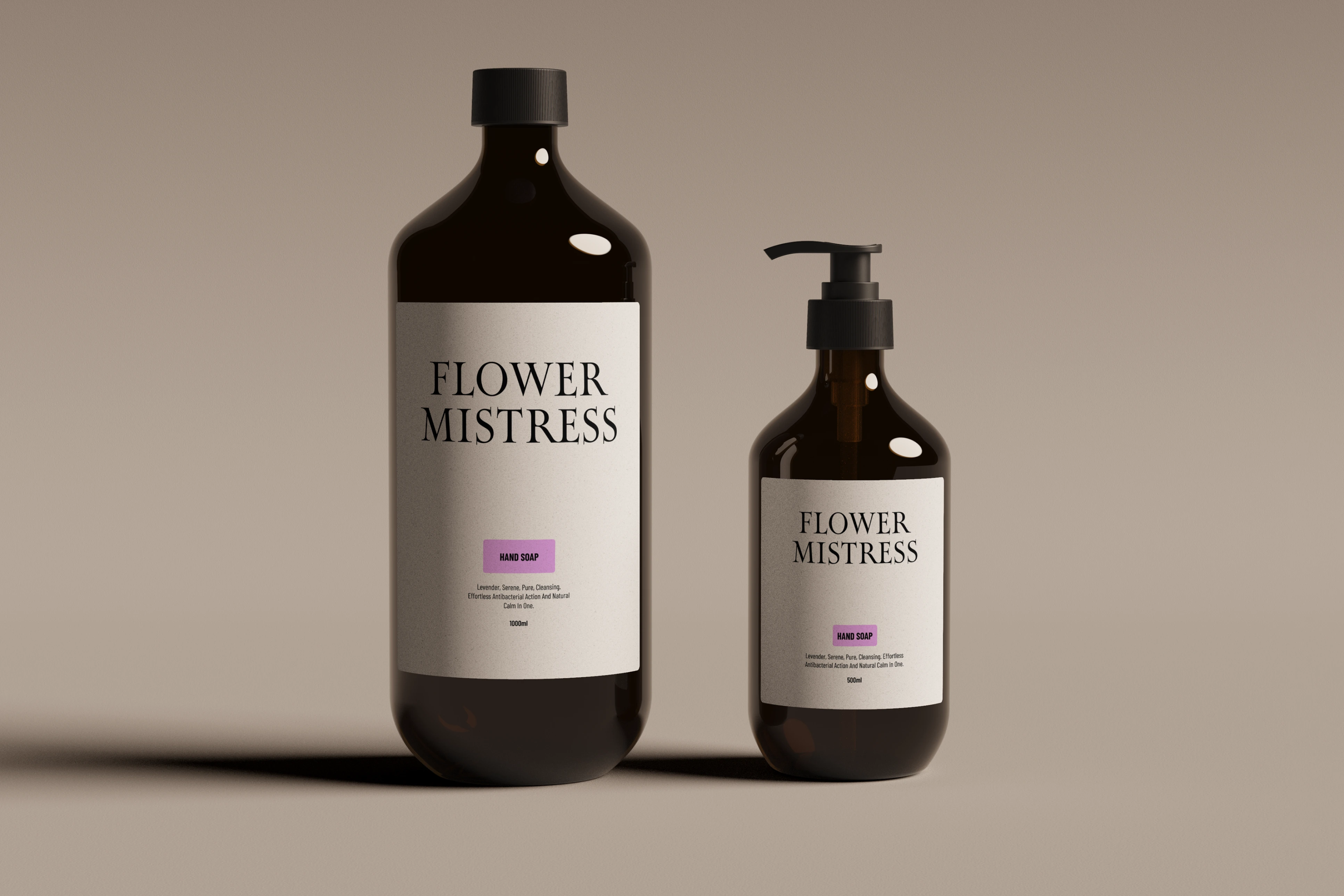
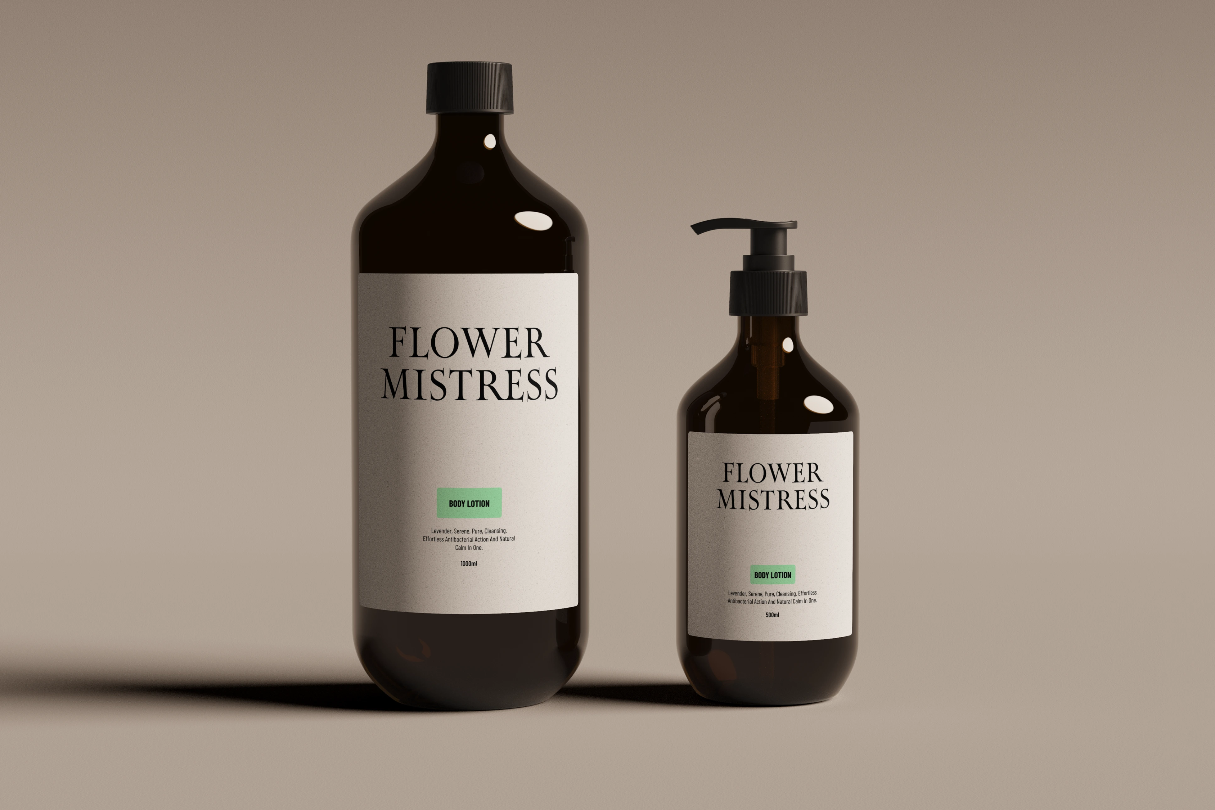
A skincare packaging concept rooted in botanical illustration and vintage elegance. The direction explores what happens when you treat a beauty product like a piece of art.
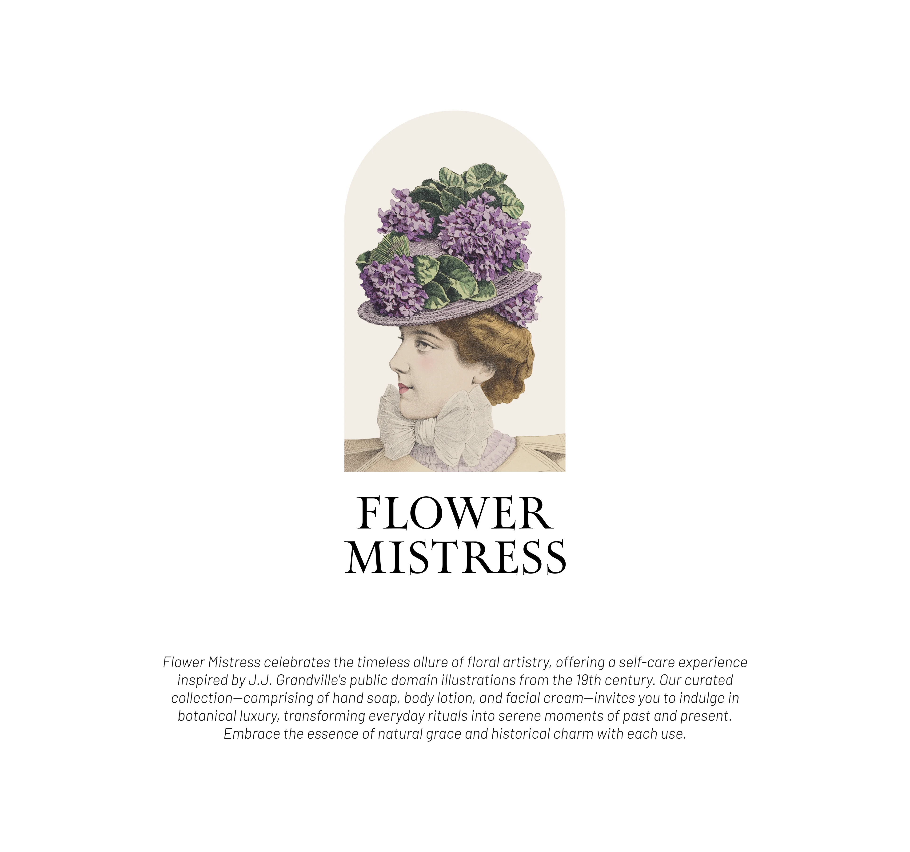
The visual language draws from classical botanical prints. Hand-drawn floral illustrations give each product a sense of craft and heritage that feels rare in modern skincare.
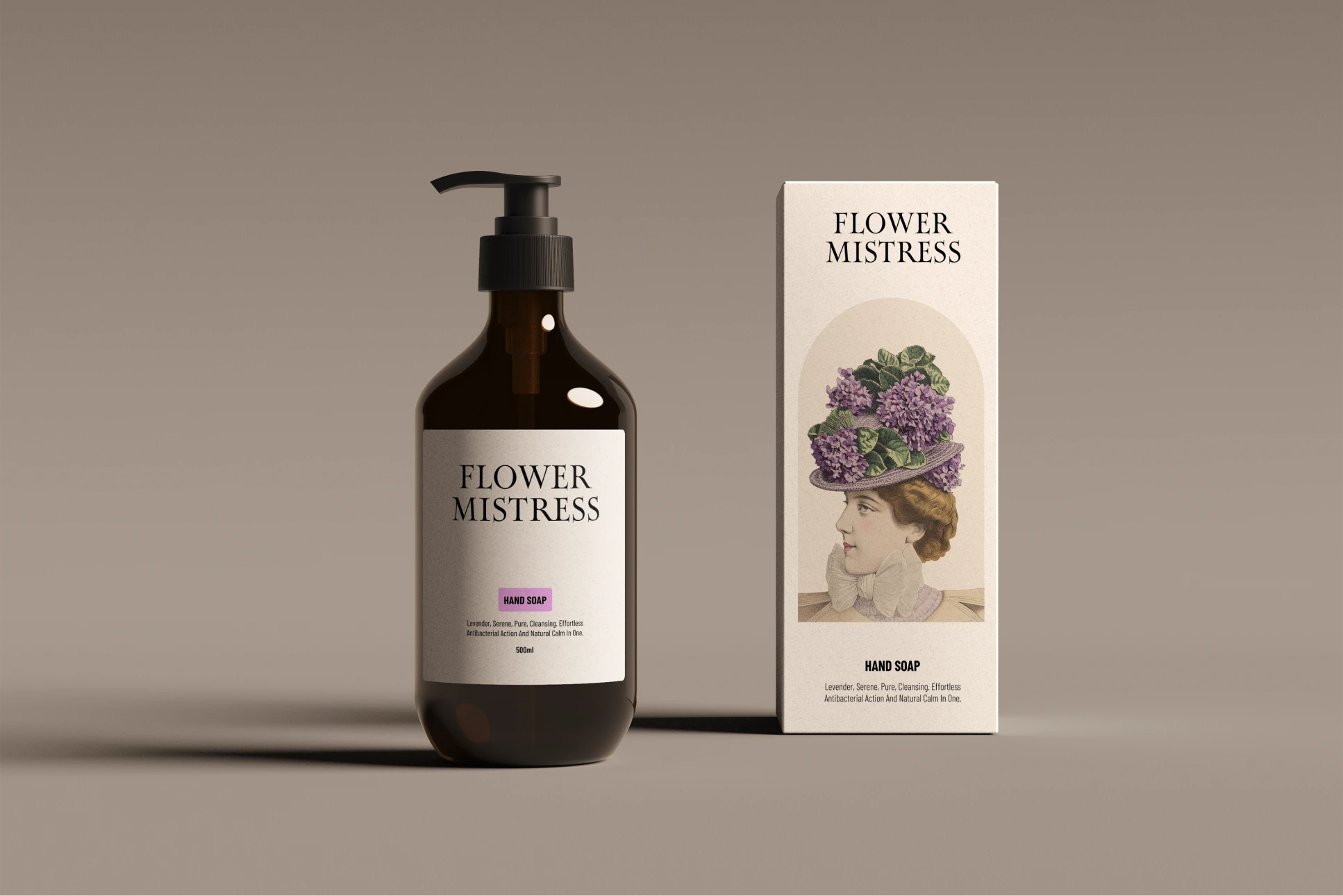
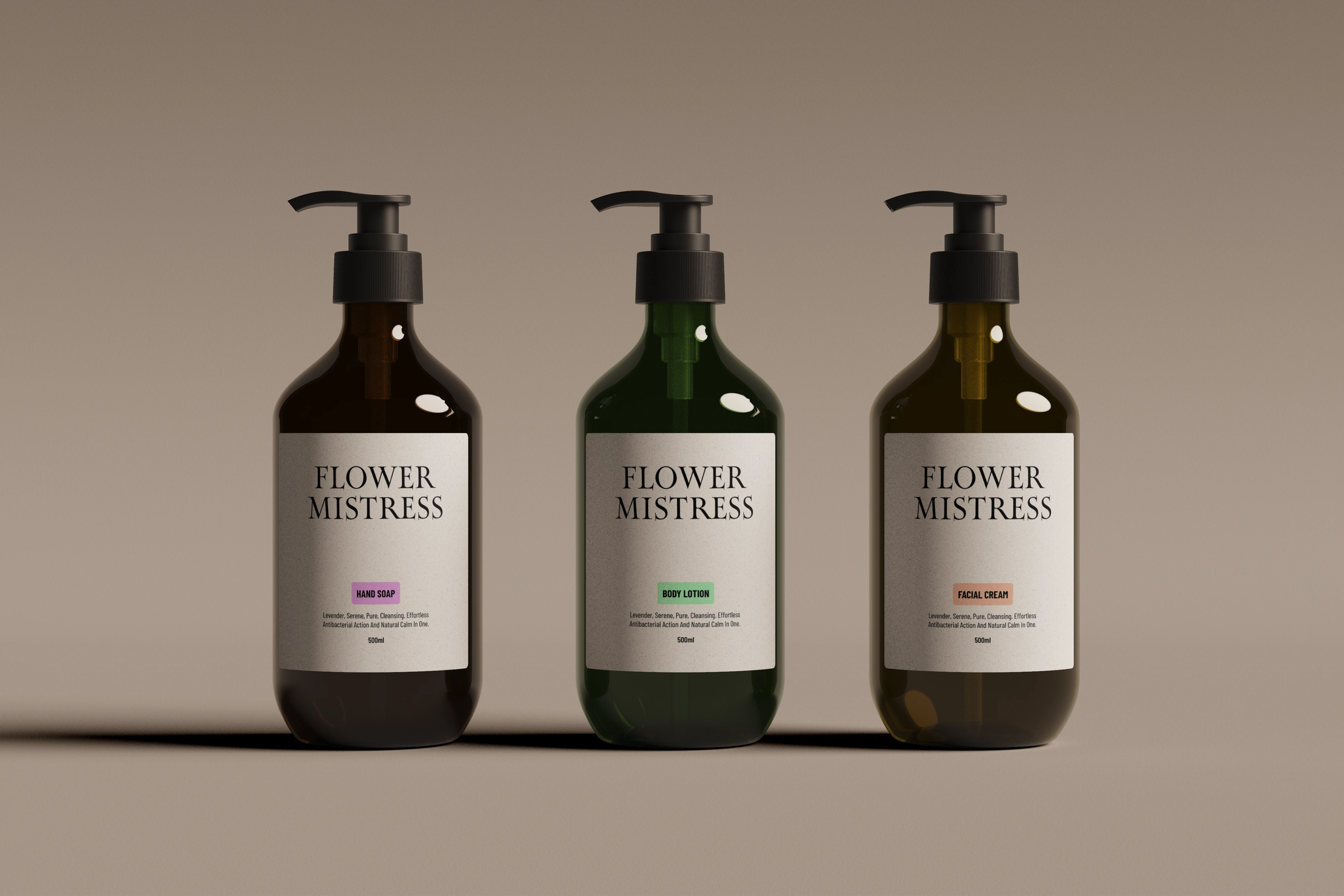
The color palette is soft and muted. Dusty pinks, sage greens, and warm creams create a world that feels gentle and considered.
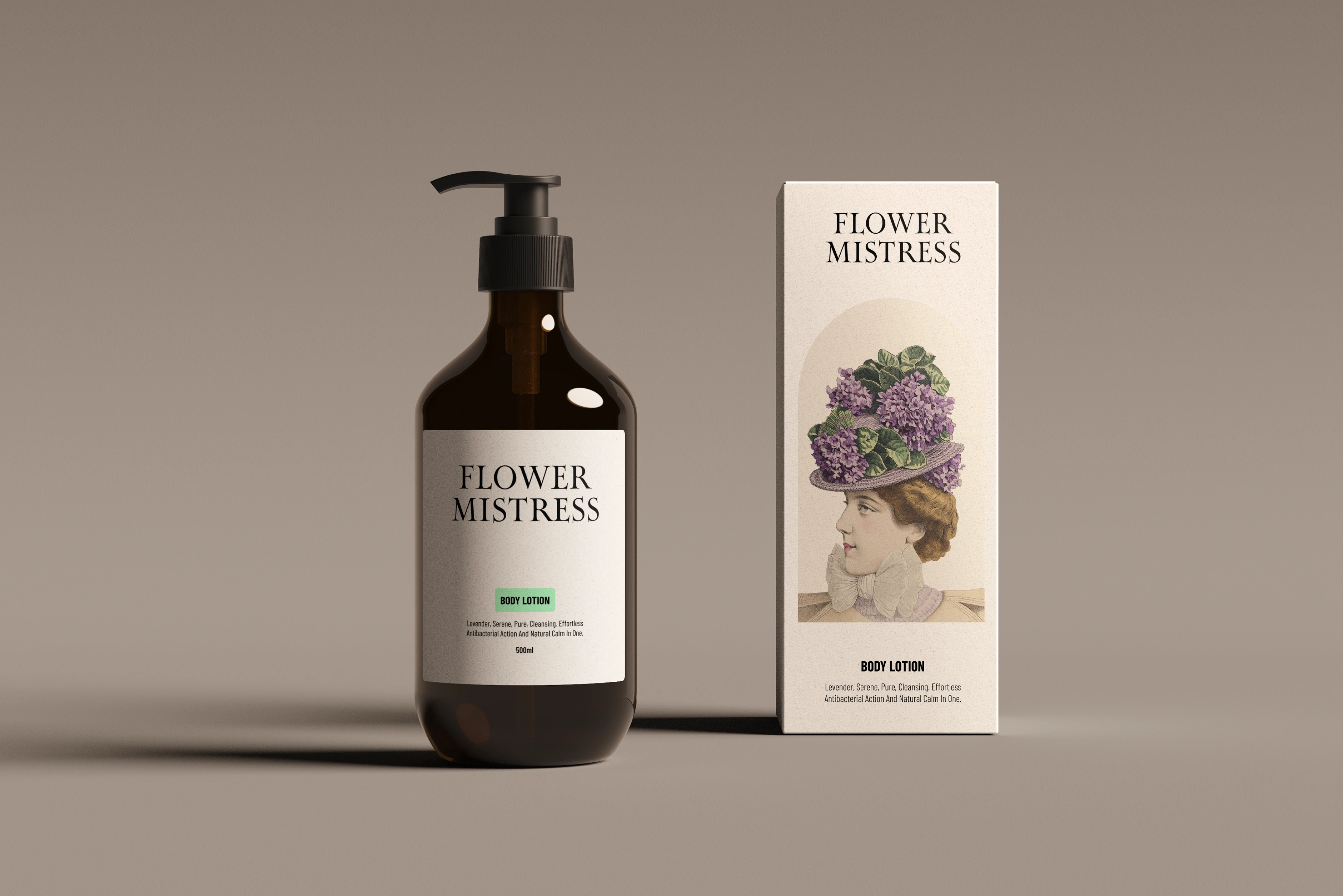
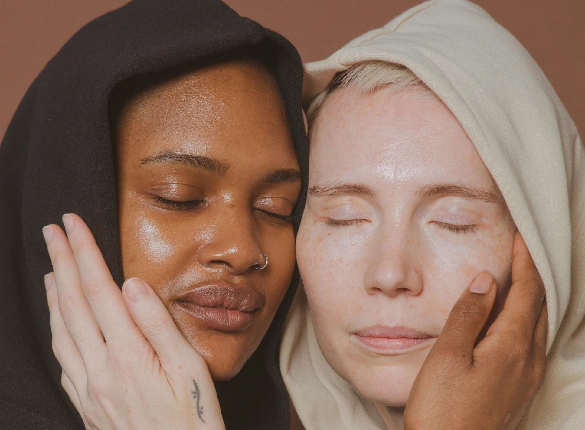
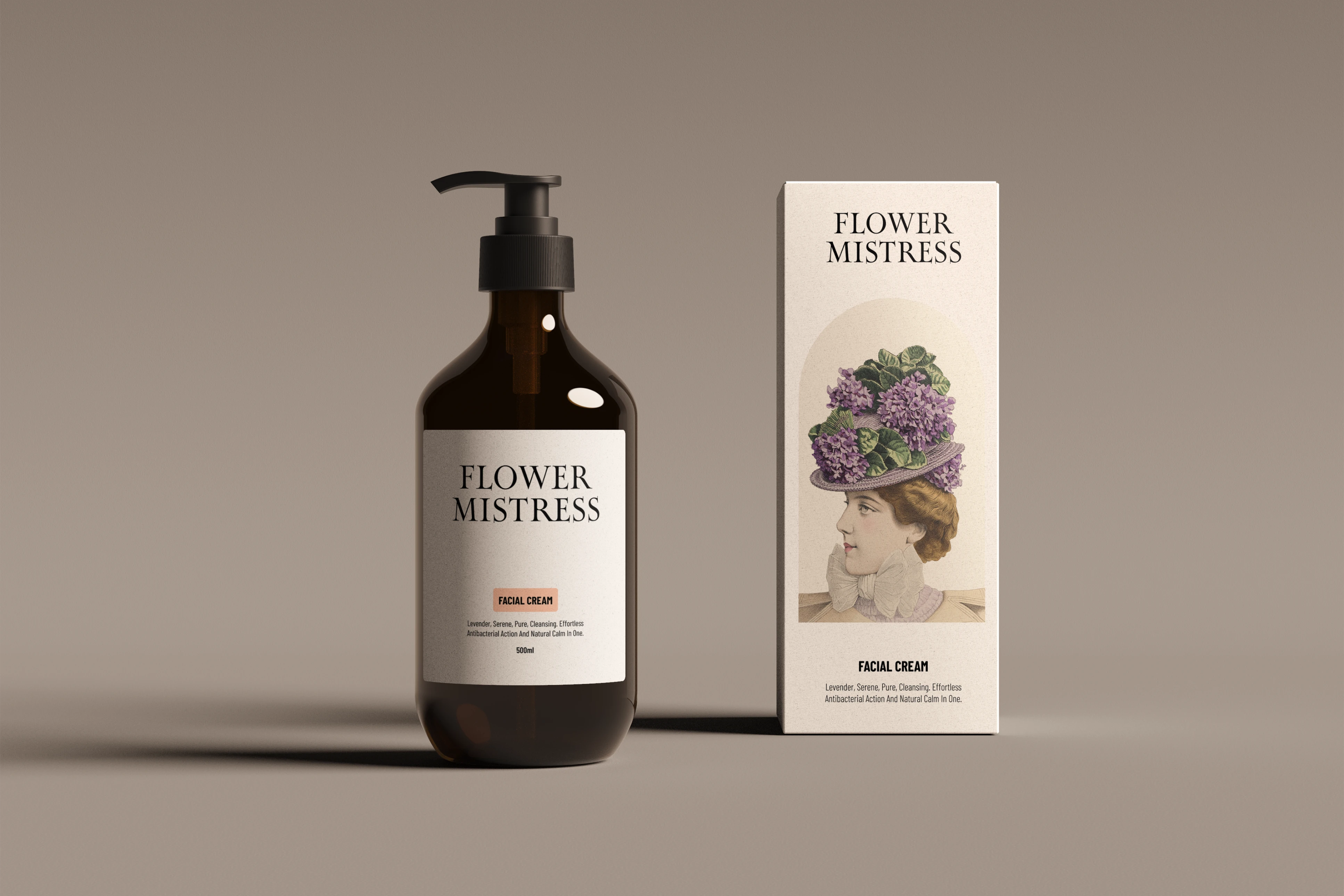
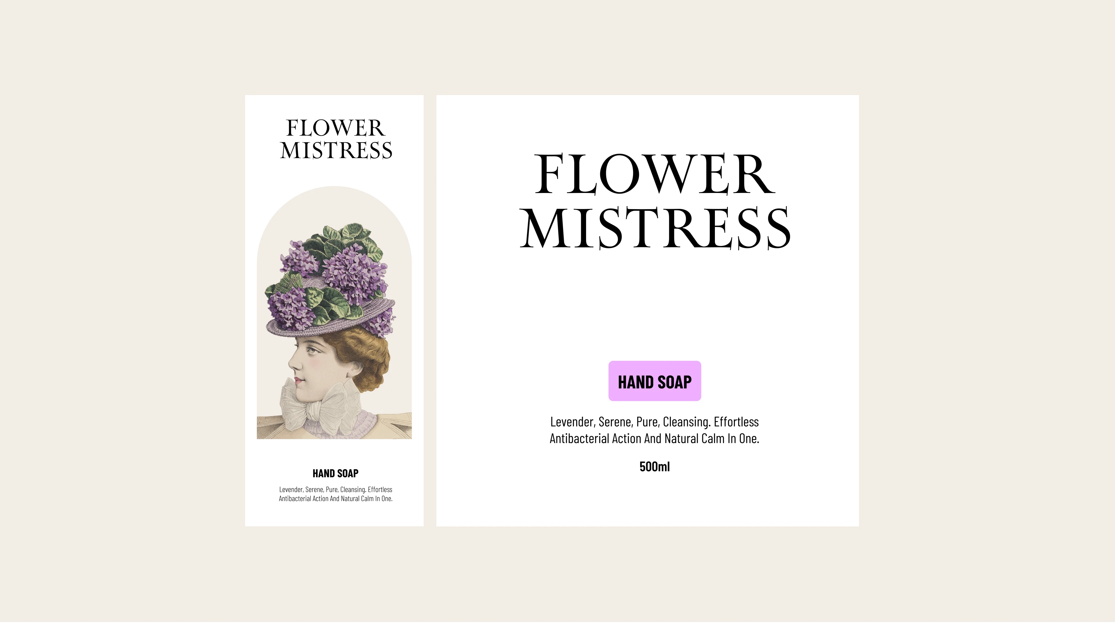
Packaging layouts balance the illustrative detail with clean typography. The labels feel rich without being cluttered, giving each product room to breathe.
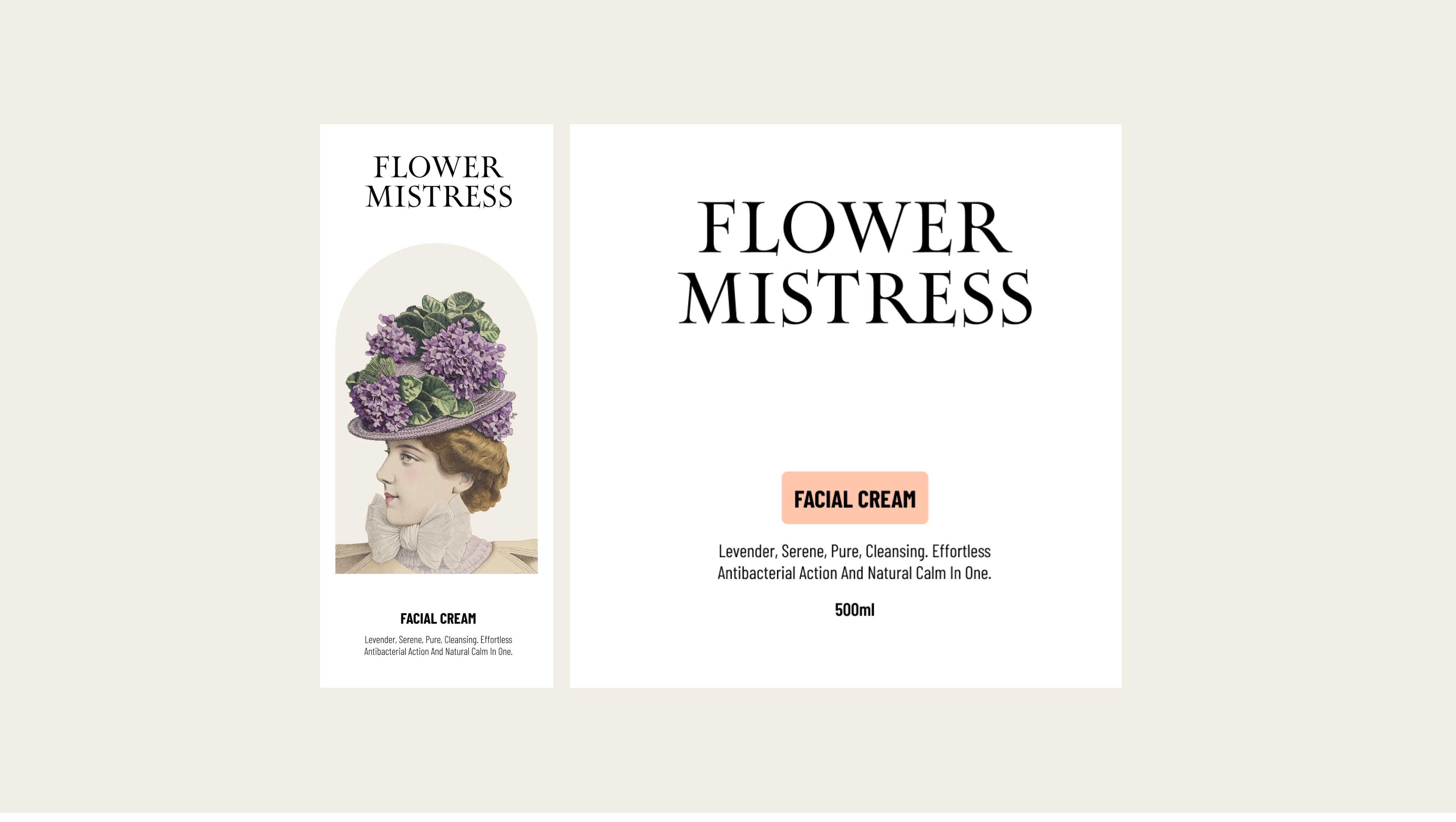

The system extends across the full product range. Serums, creams, and oils each carry the same botanical DNA while maintaining their own identity through illustration and color variation.
Like this project
Posted Jun 19, 2026
Designed an elegant floral skincare identity with vintage-inspired illustrations, refined packaging, and a soft botanical visual direction.