Sorella Health — Healthcare Brand Identity

Hibye Studio


A healthcare company needed a brand identity that could communicate trust and clarity across every touchpoint. The challenge was translating complex medical positioning into a visual language that felt human, approachable, and scalable.
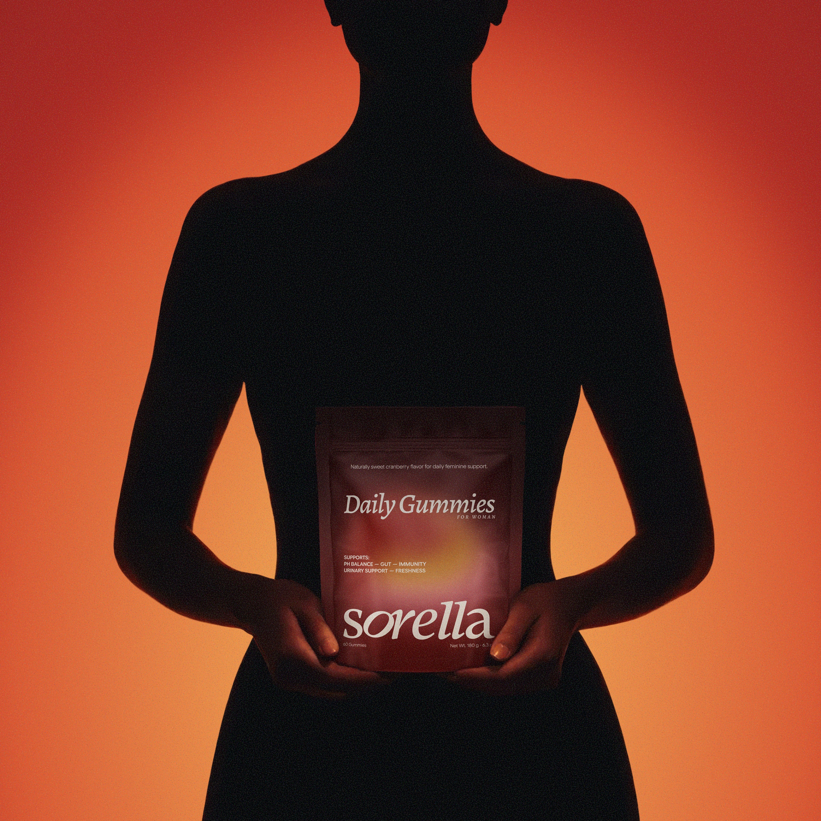
We started with strategic positioning, defining the brand's voice and visual territory before touching any design tools. The goal was a system that could grow with the company, not one that would need replacing in a year.
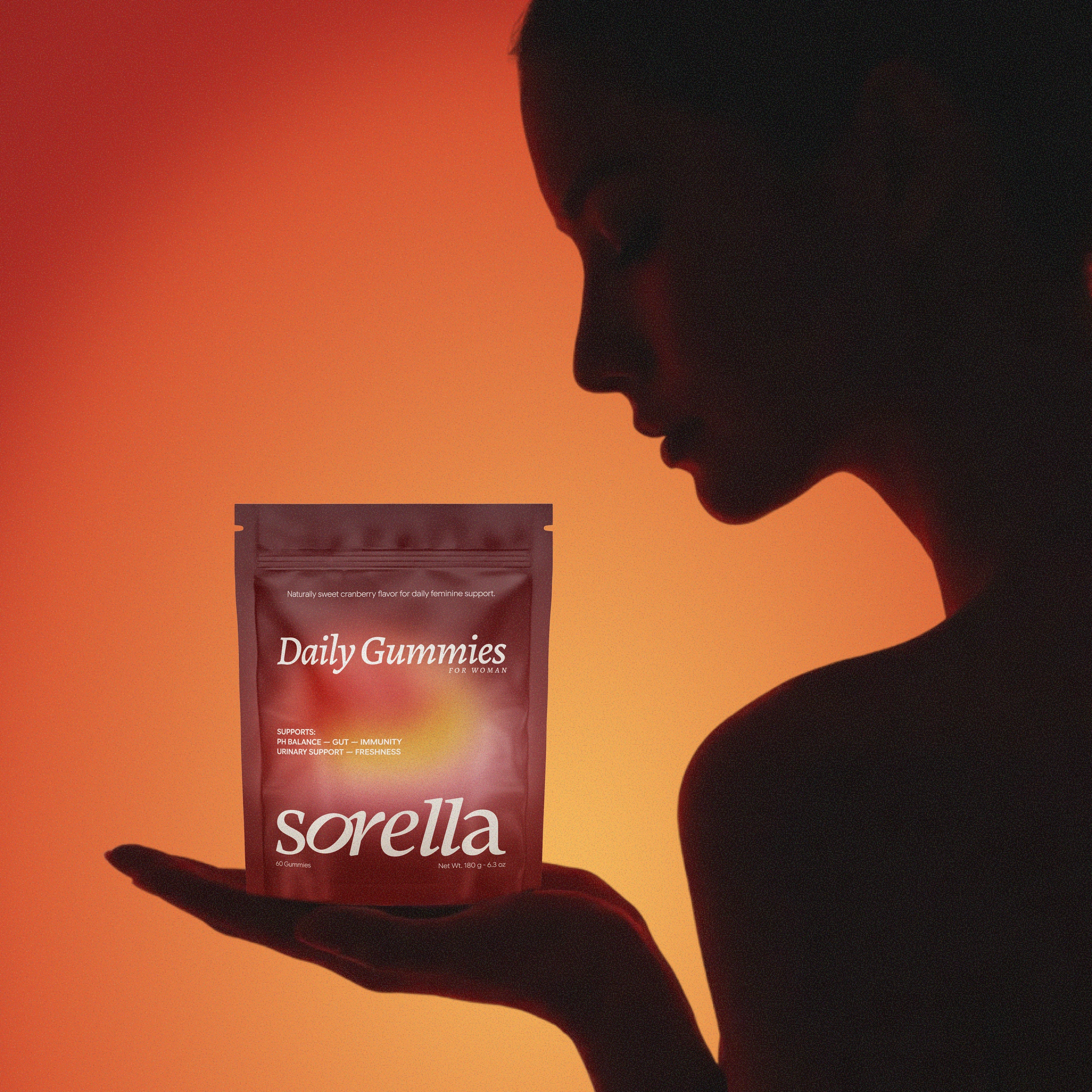
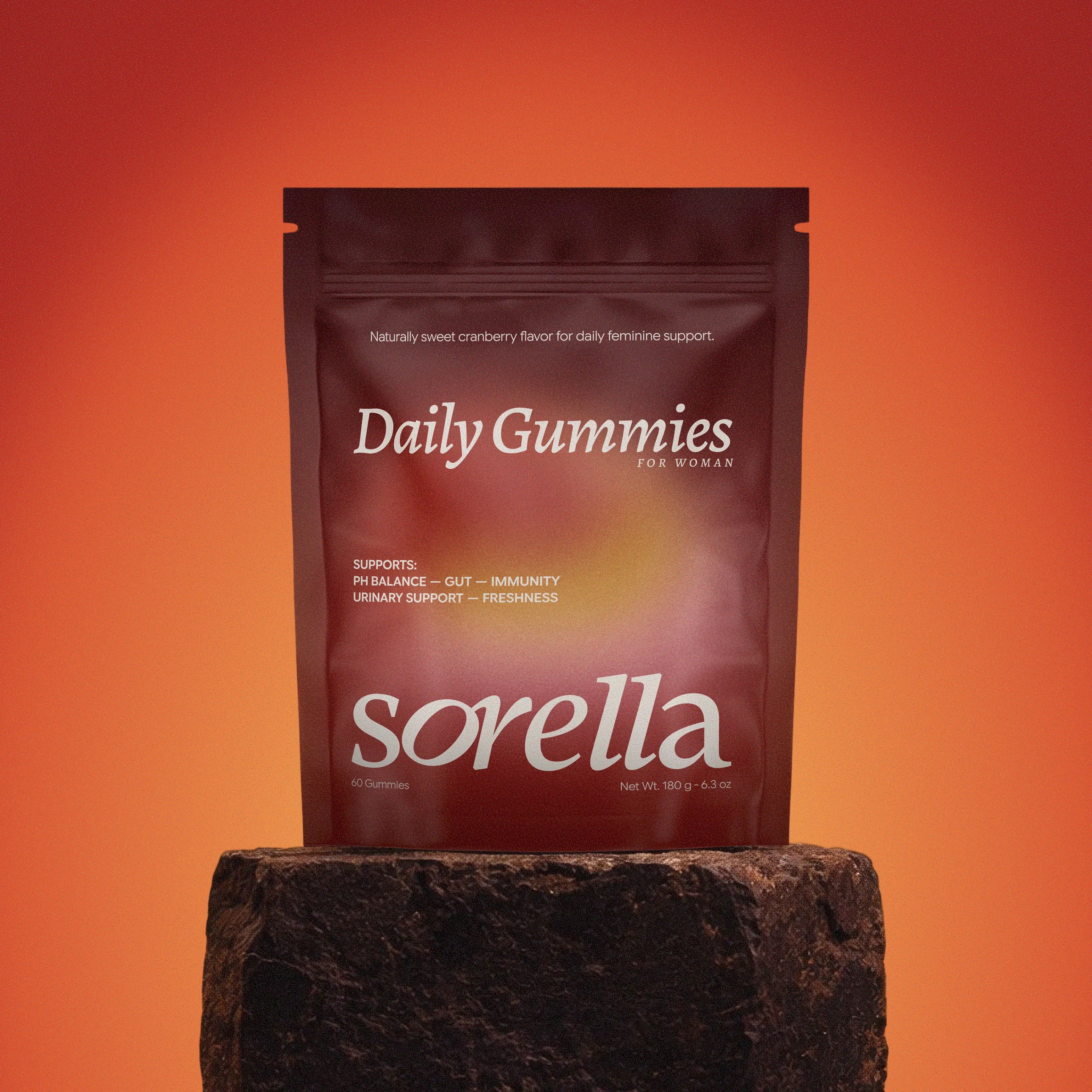
The logo was designed to balance professionalism with warmth. We paired it with a refined color palette and typography system that works across digital, print, and environmental applications.
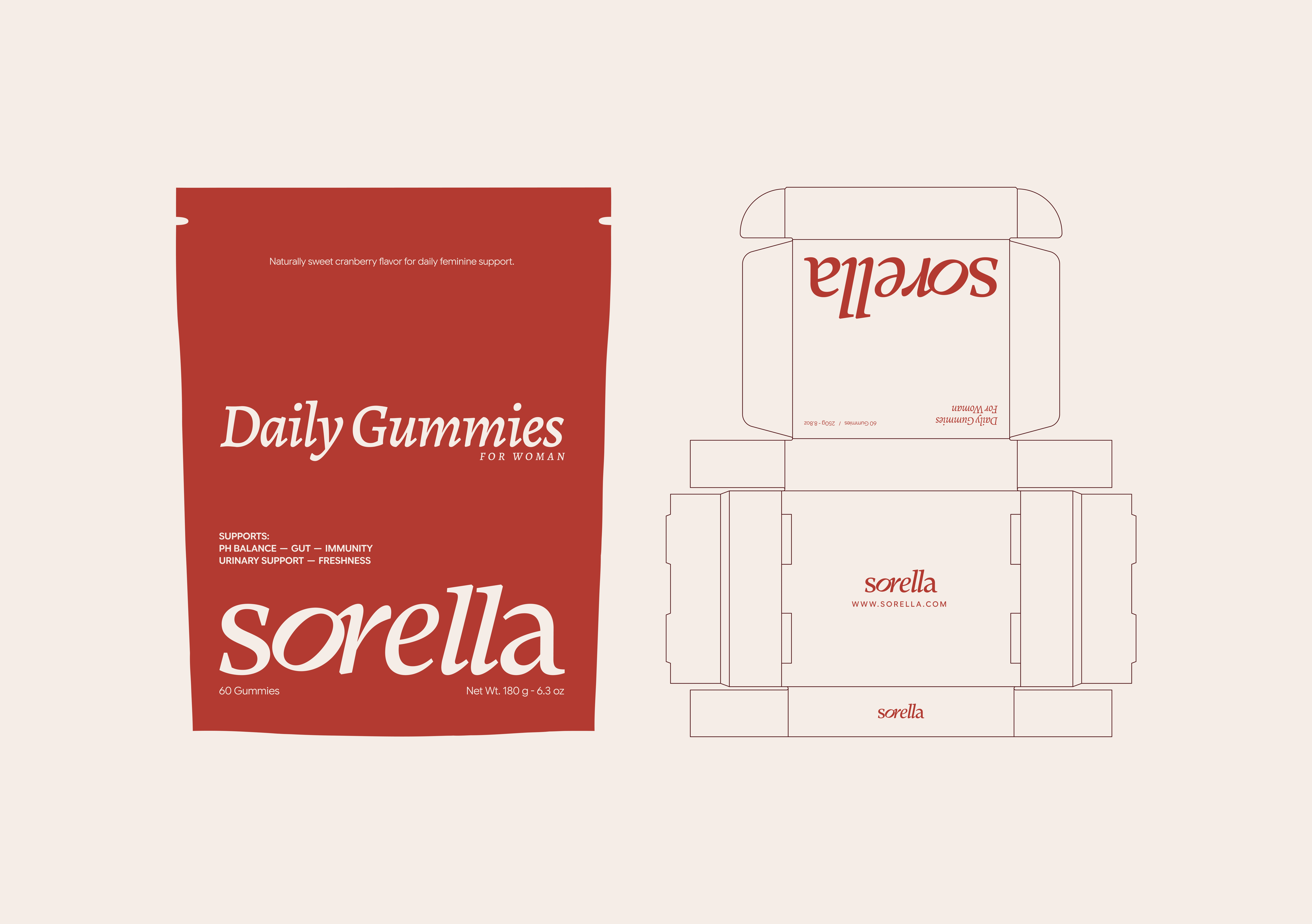

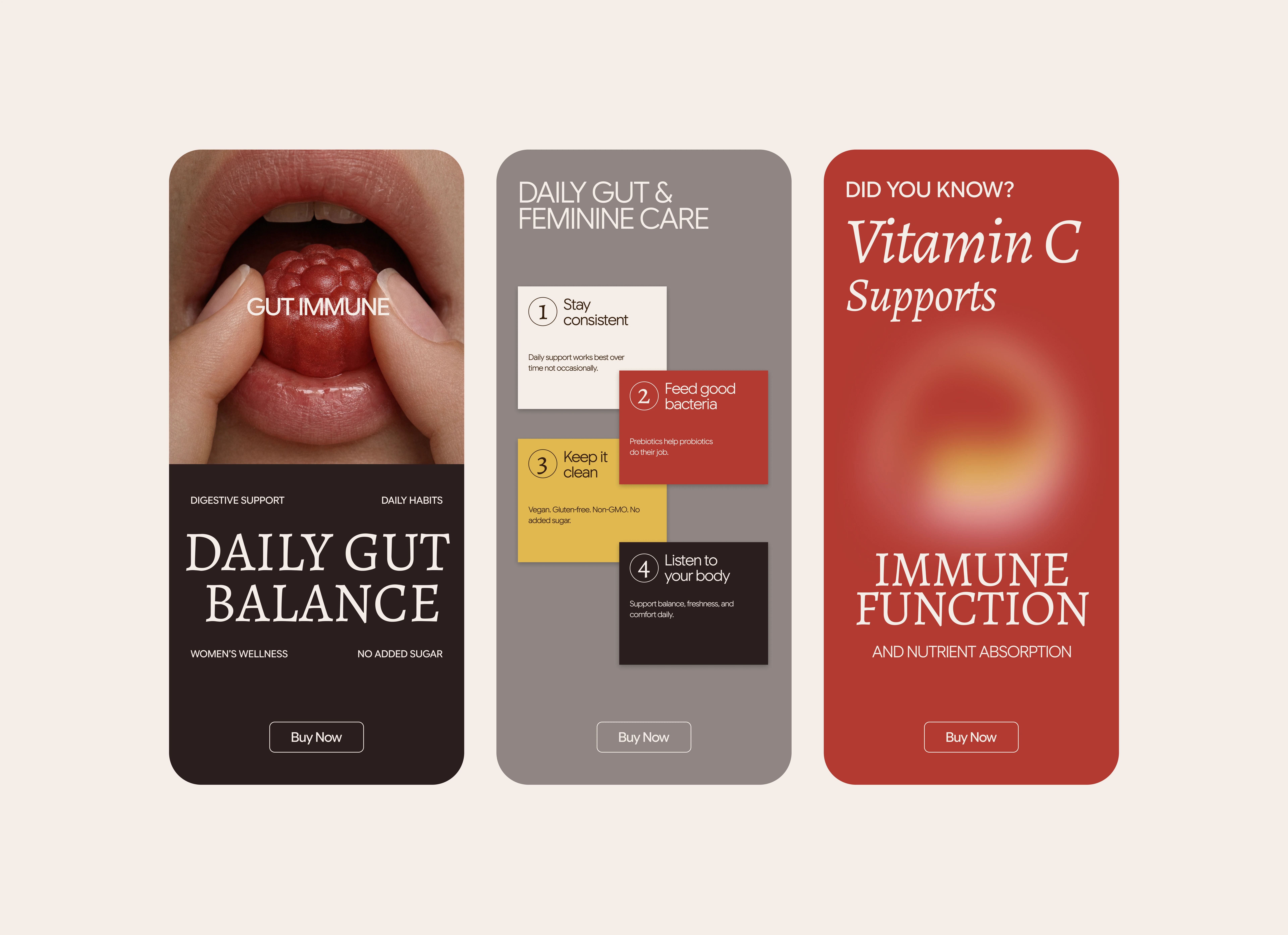
Every element was built with consistency in mind. From business cards to digital interfaces, the system holds together without needing constant oversight.
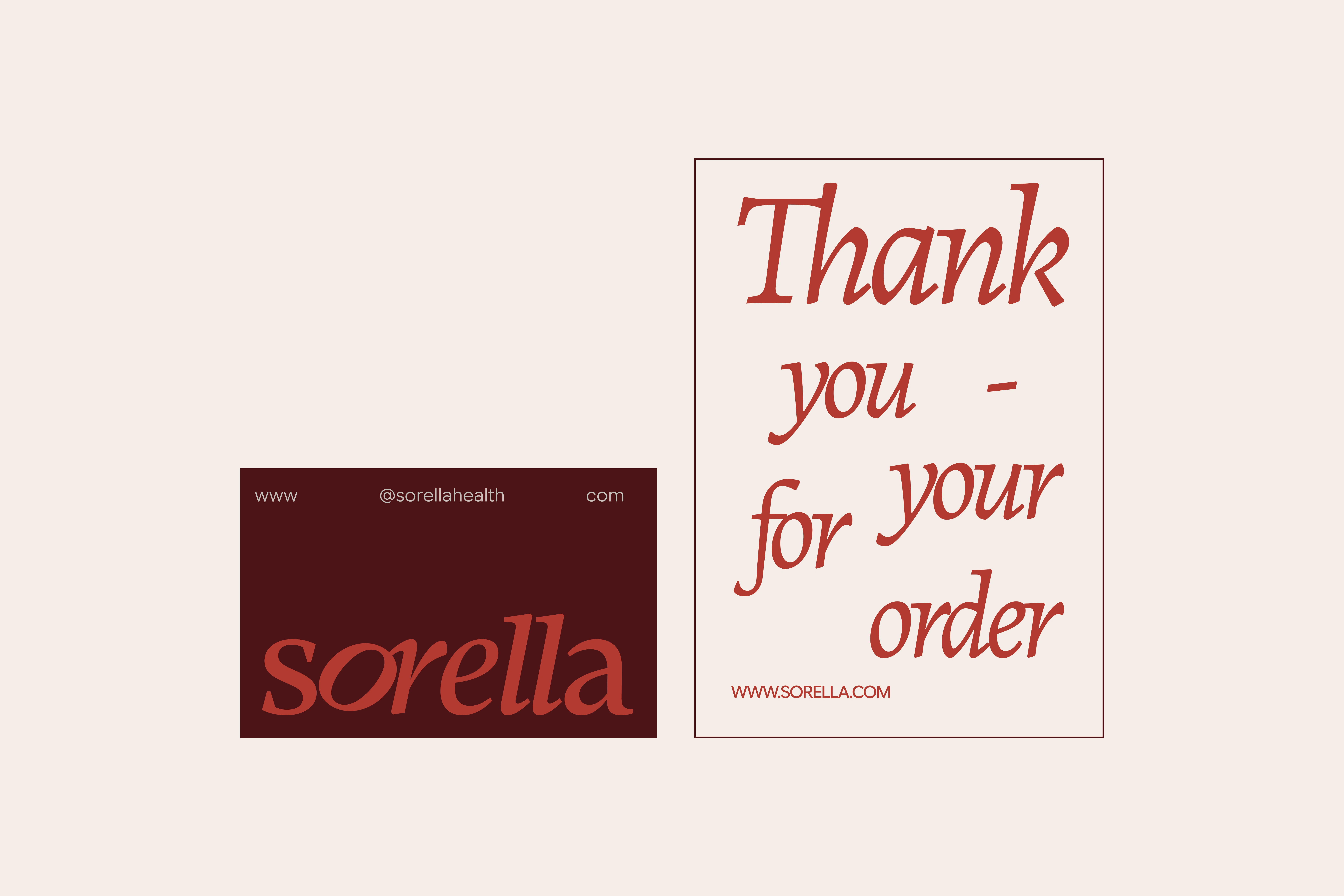

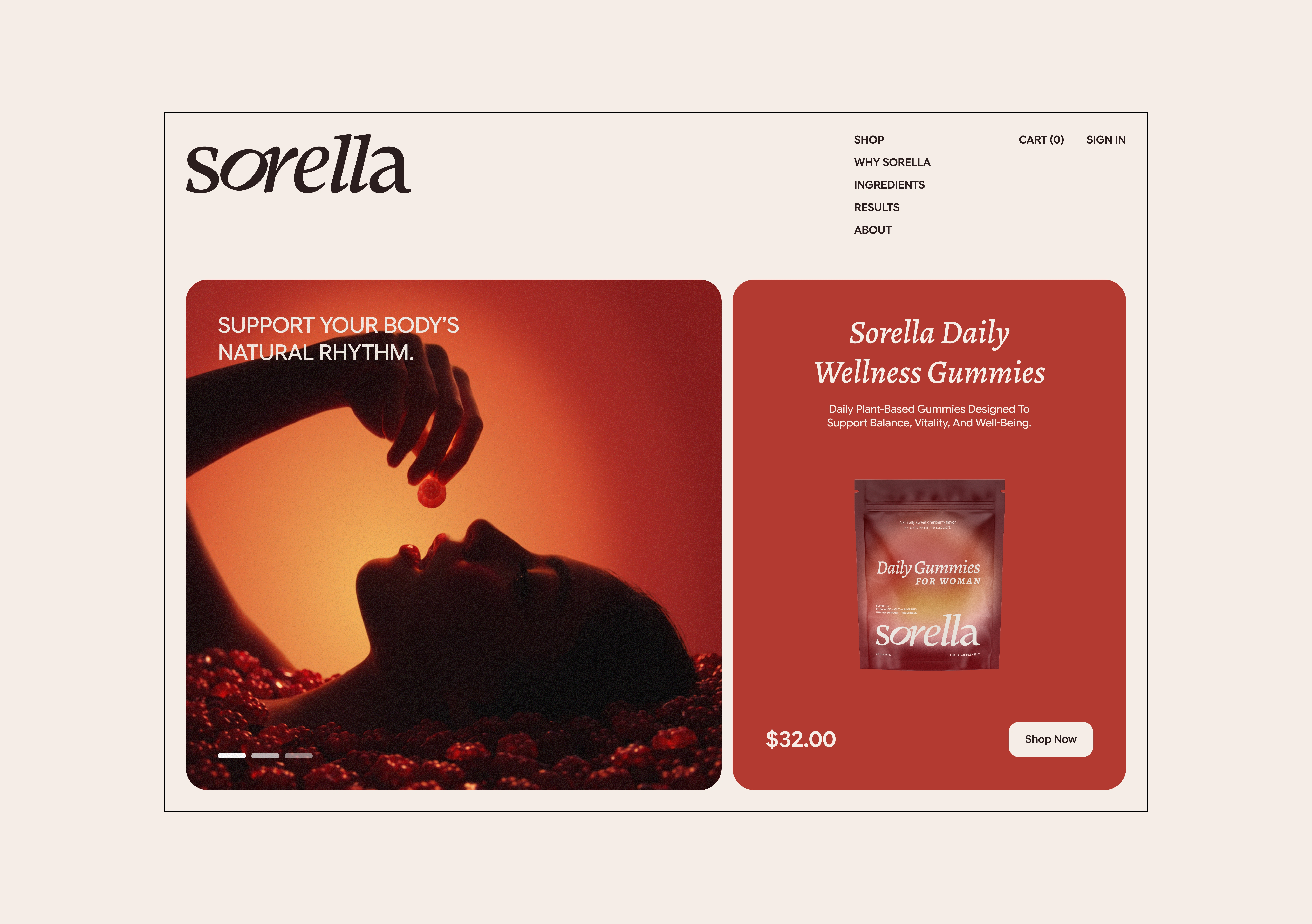
The final deliverables included the full brand identity, logo suite, color and typography guidelines, stationery design, and a visual system built for long-term scalability.

Like this project
Posted Jun 19, 2026
Brand identity for a healthcare company. We translated complex needs into a clear visual language, creating a scalable system built for long-term growth.
Likes
2
Views
13
Timeline
Feb 8, 2026 - Mar 8, 2026