Glug — Bold Juice Brand & Packaging

Hibye Studio


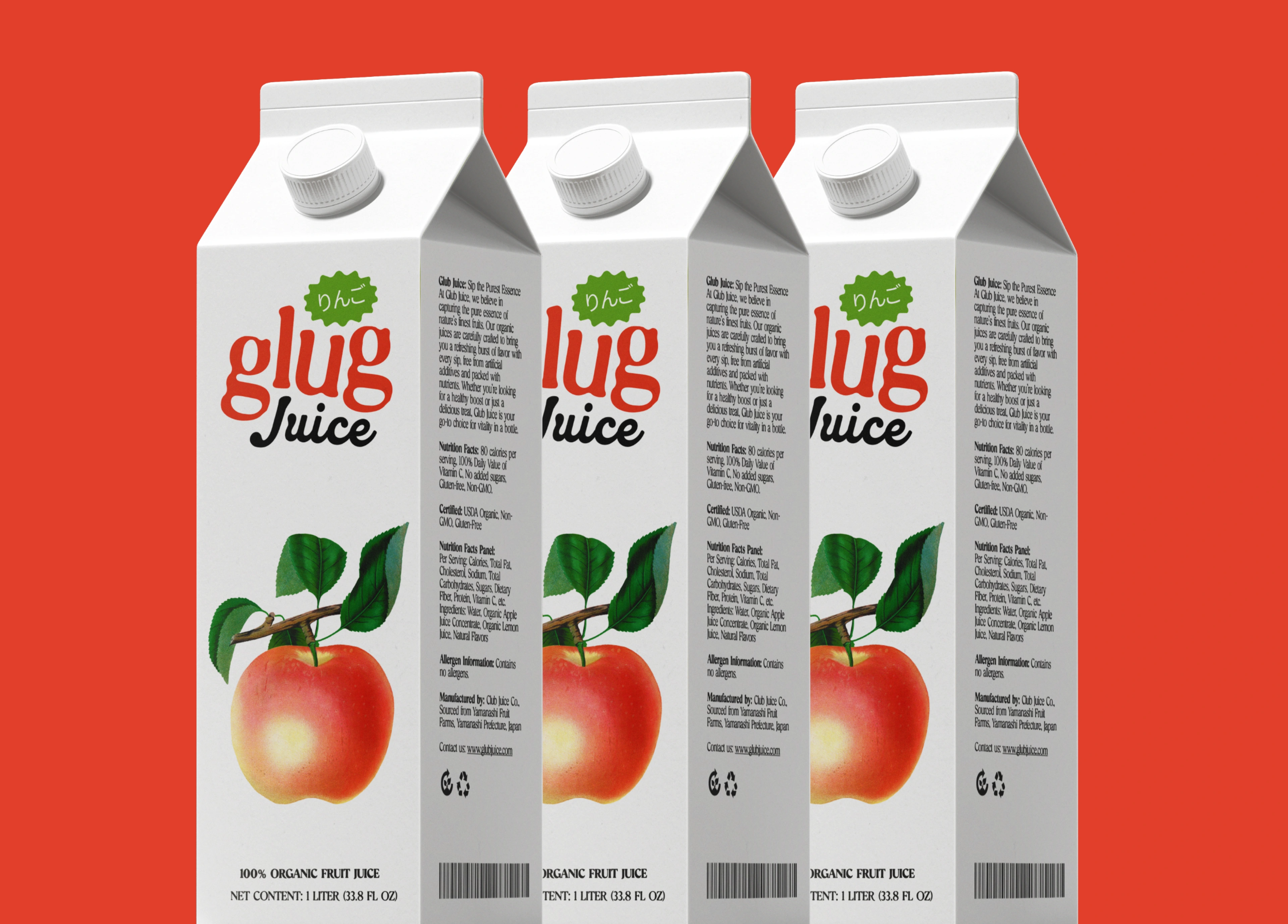
A juice brand concept that goes the opposite direction from clean and minimal. Glug is loud, fun, and unapologetically bold. The kind of packaging that makes you pick it up before you even know what flavor it is.
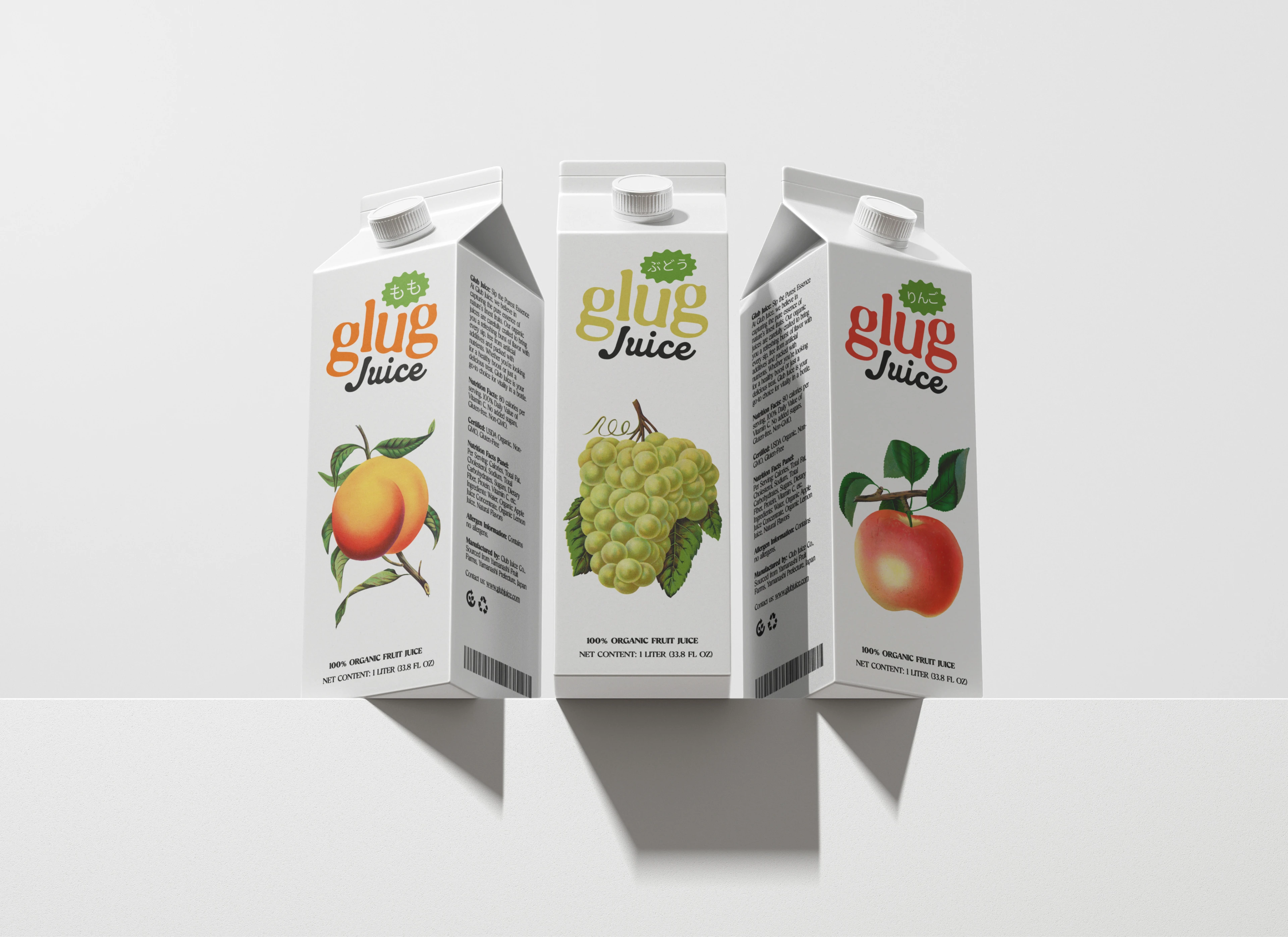
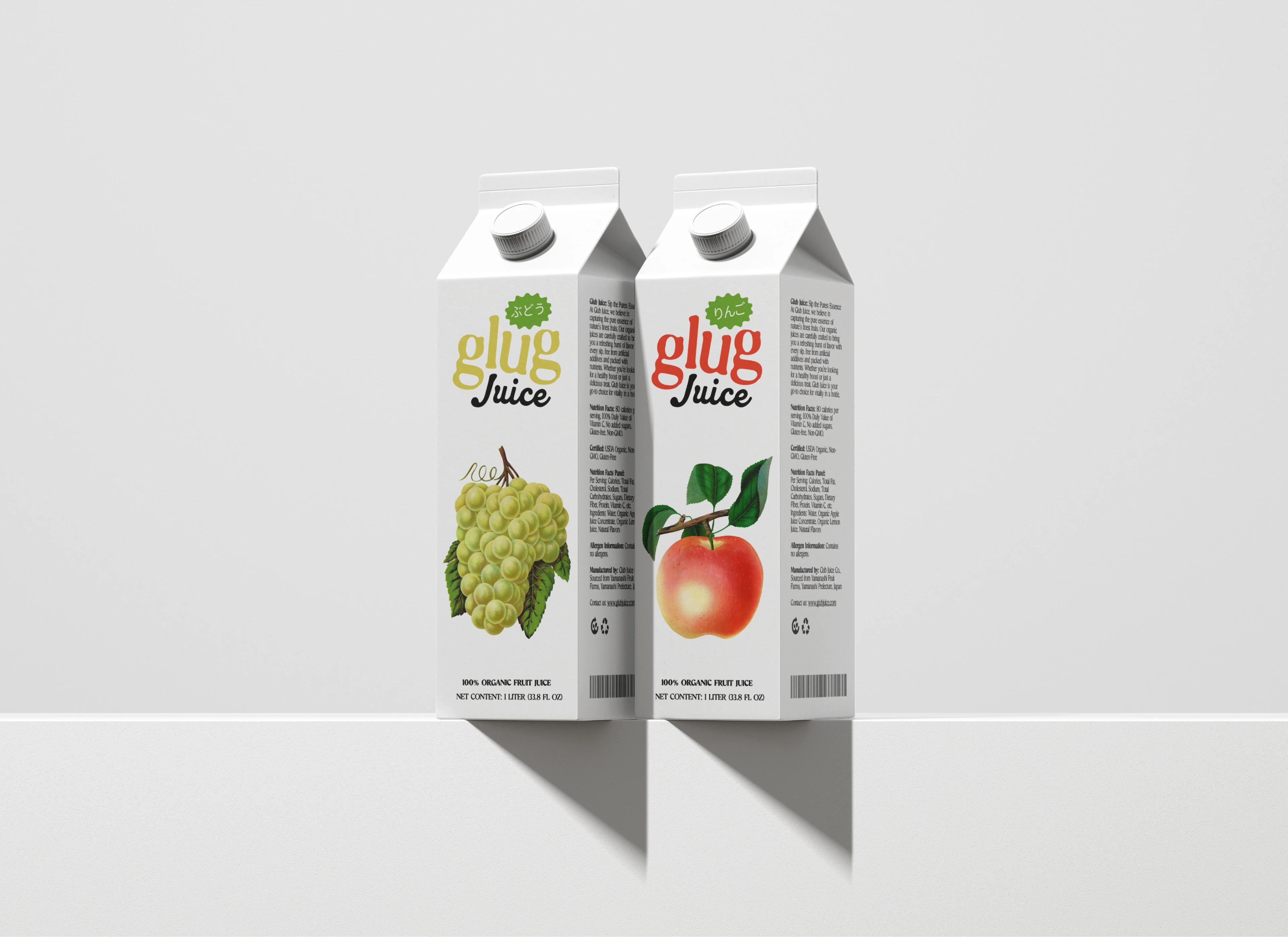
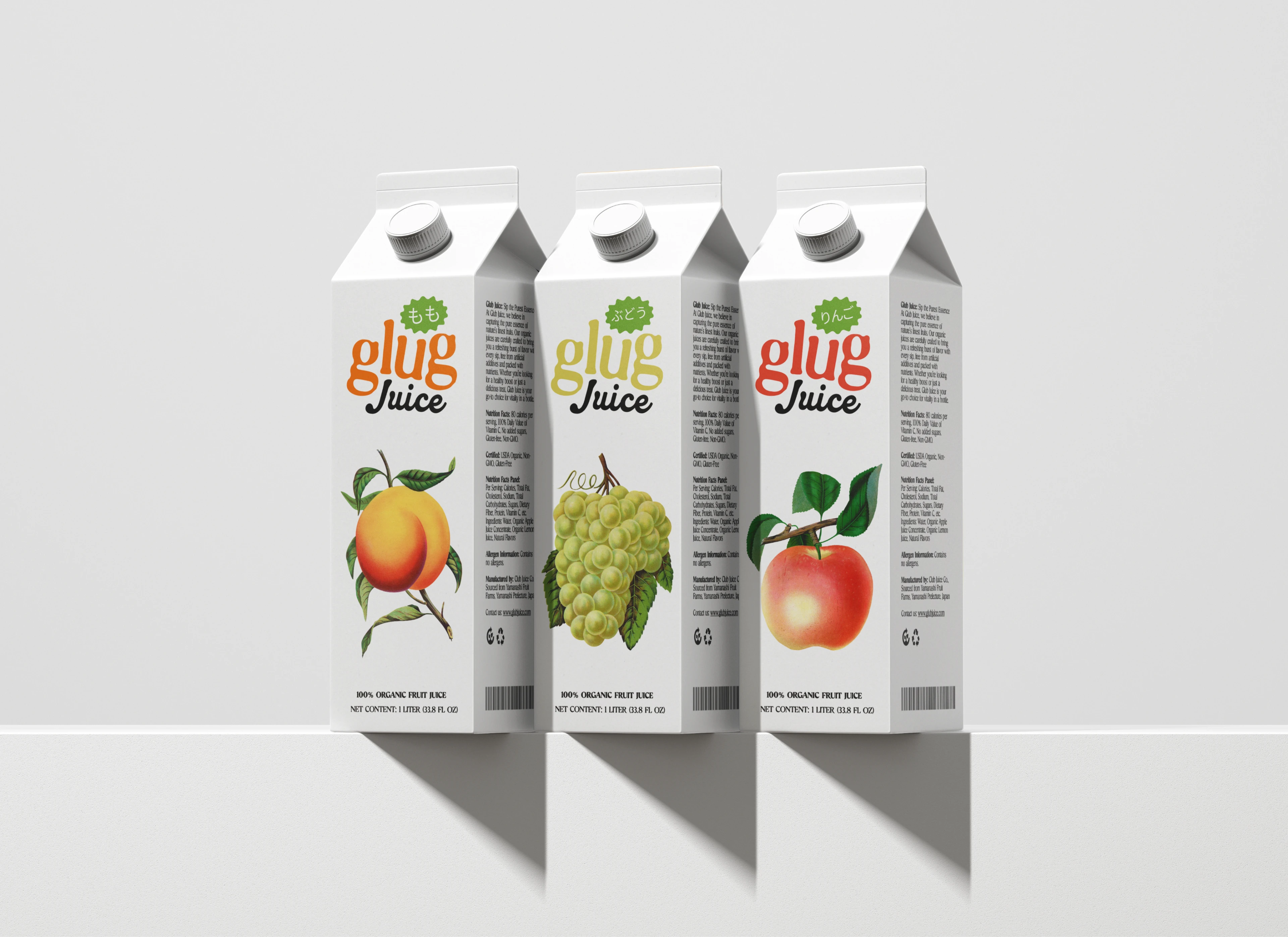
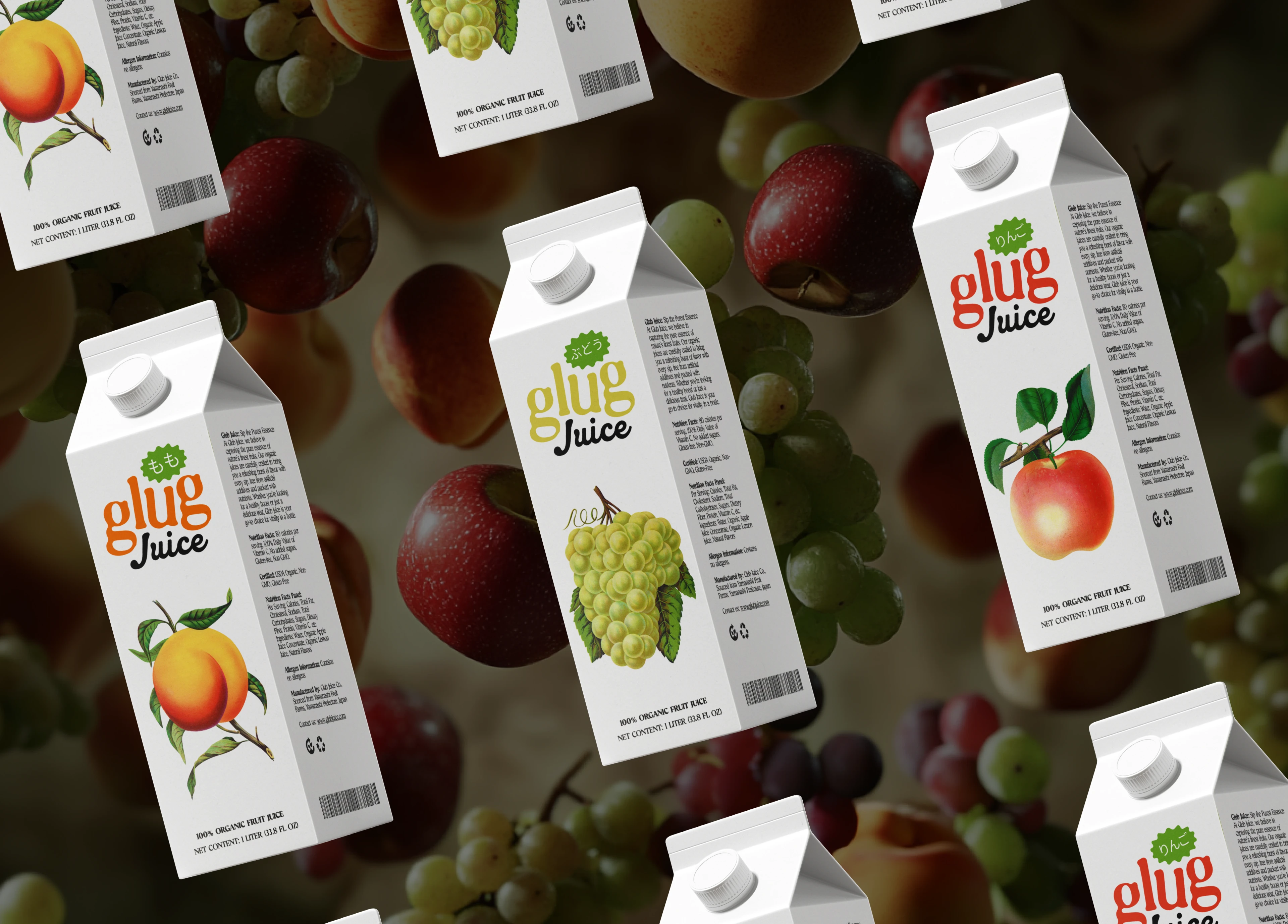
The visual system is built on energy. Oversized type, saturated colors, and playful illustrations that give each flavor its own personality while keeping the family tight.
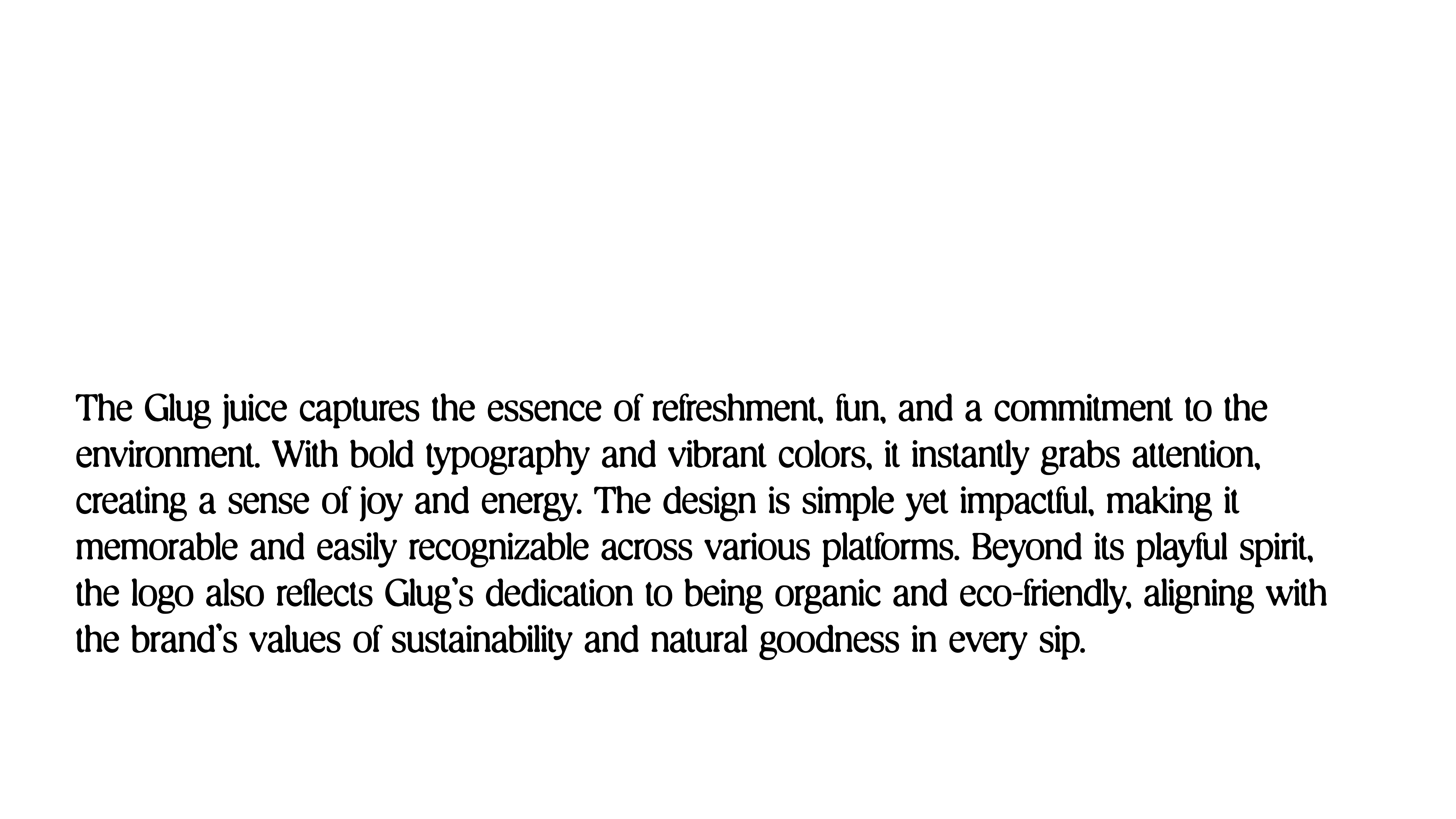
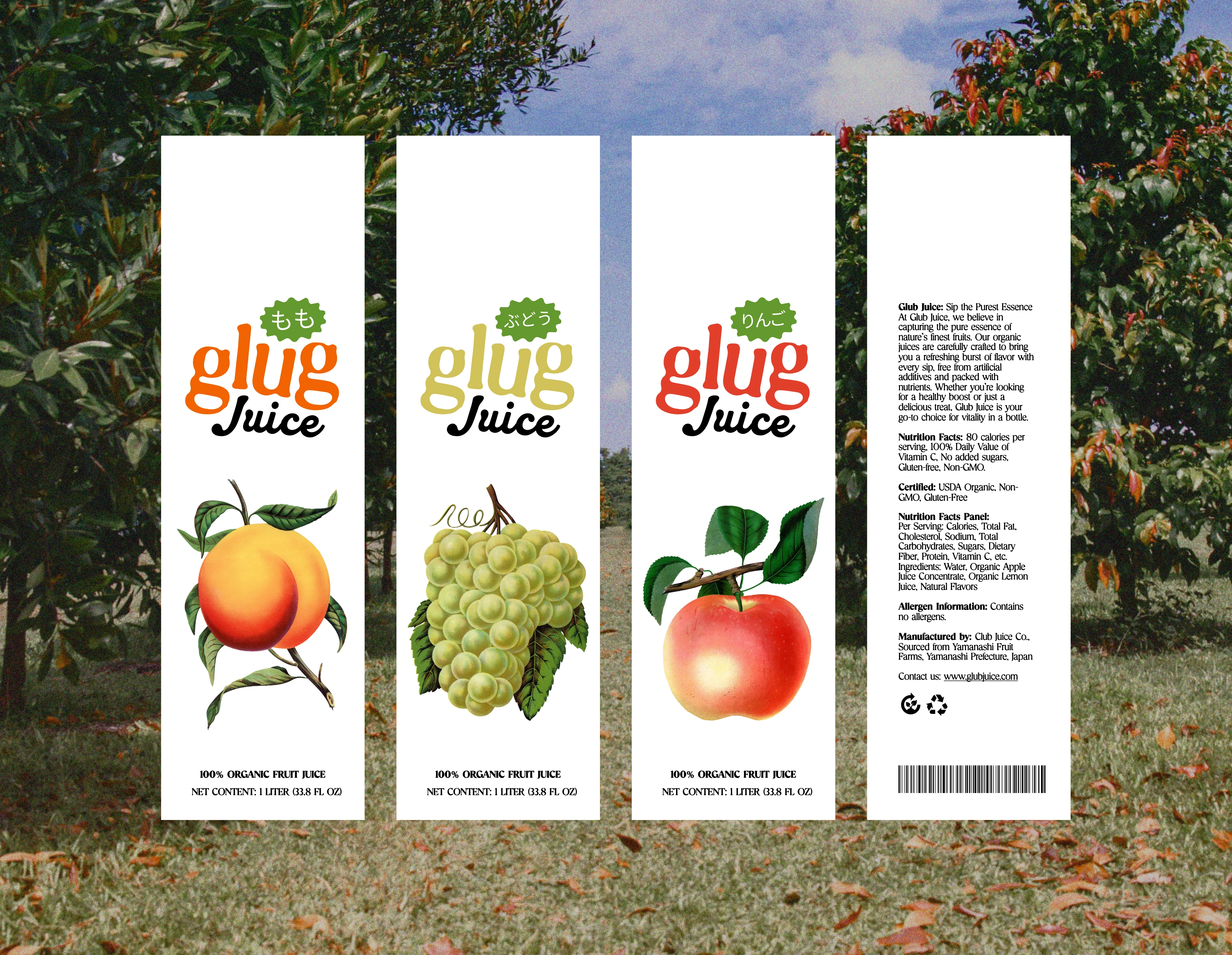
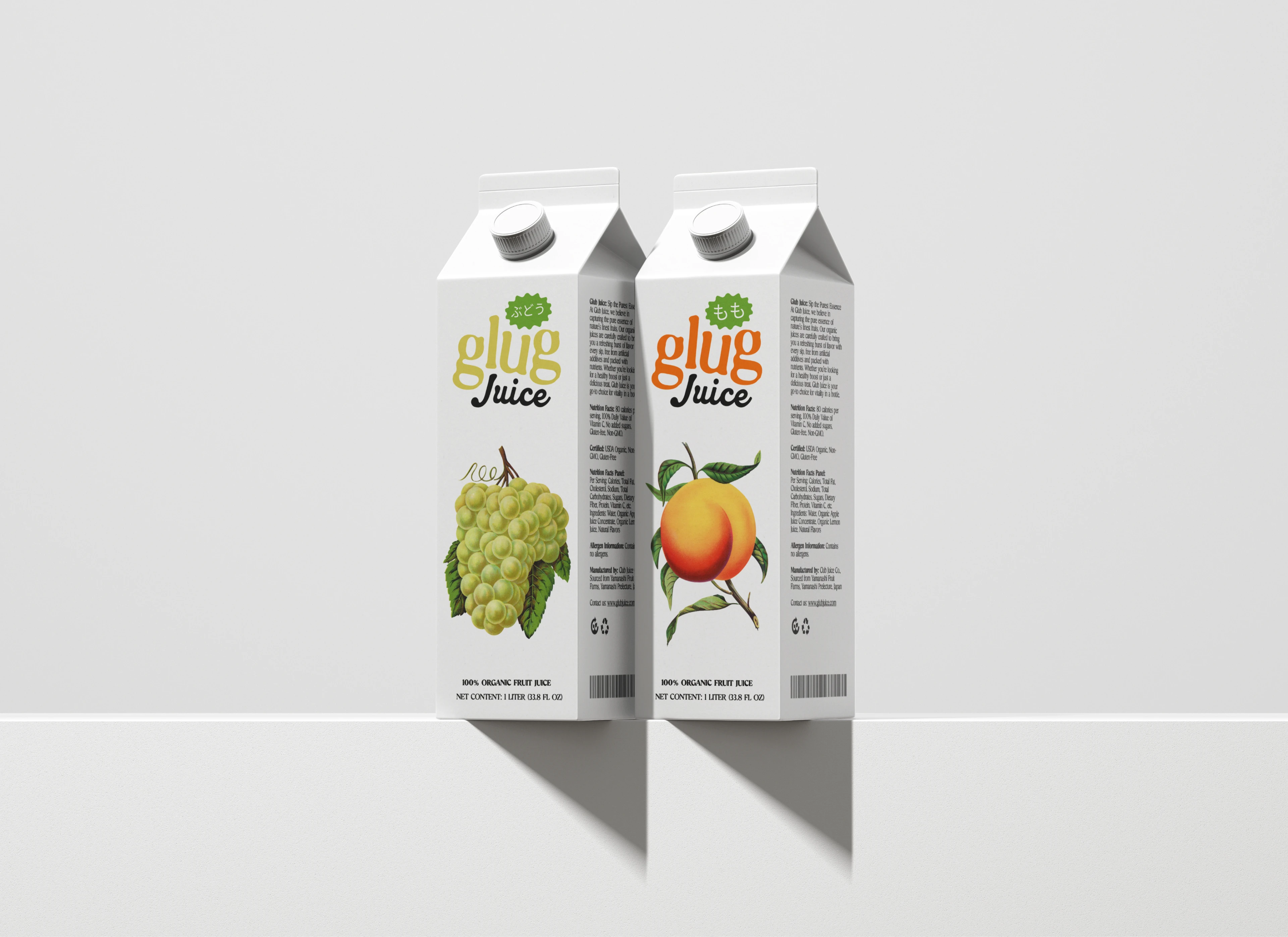
Each flavor variant gets its own color world and character illustration. The structural layout stays consistent so the brand reads as one system, even when the individual expressions are wildly different.
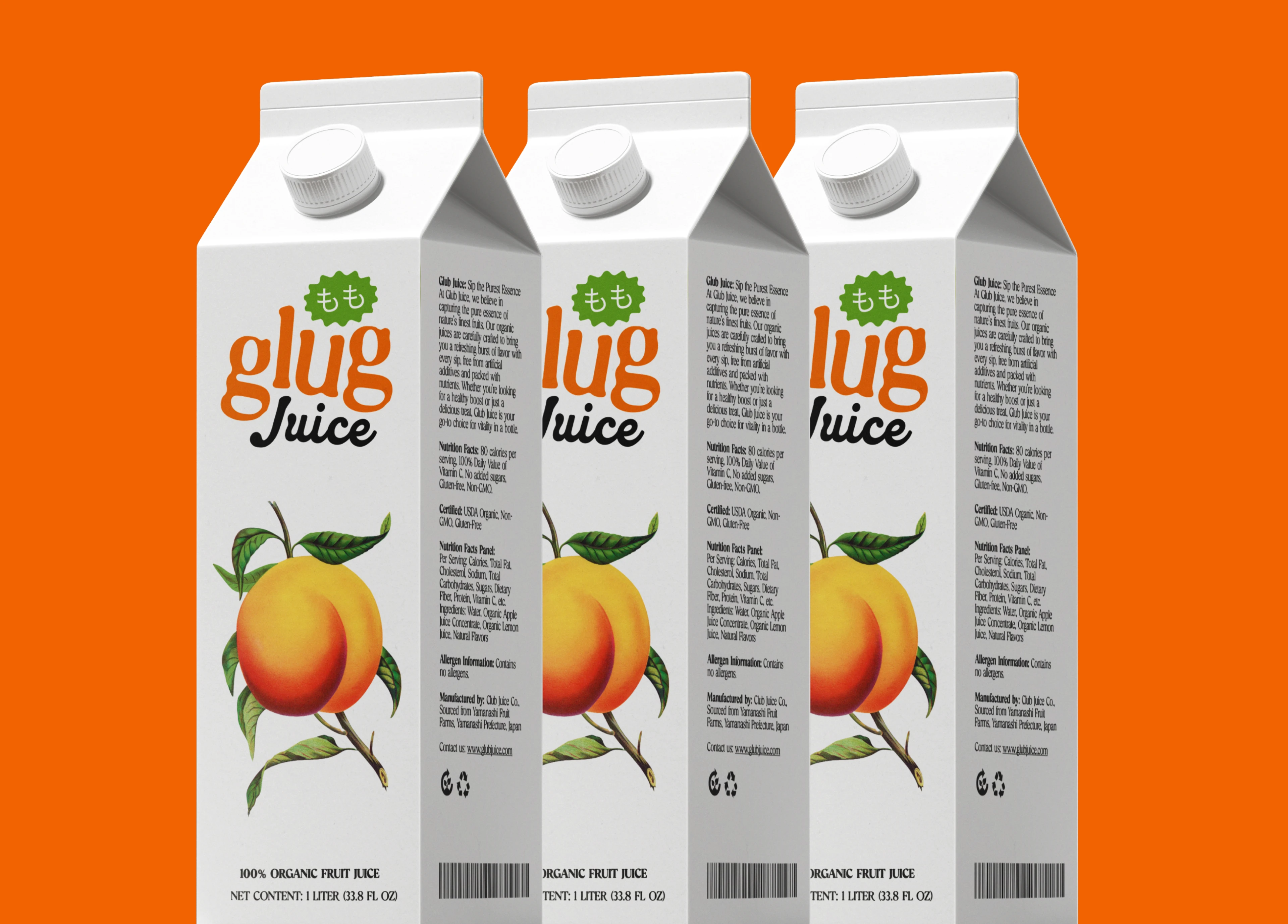
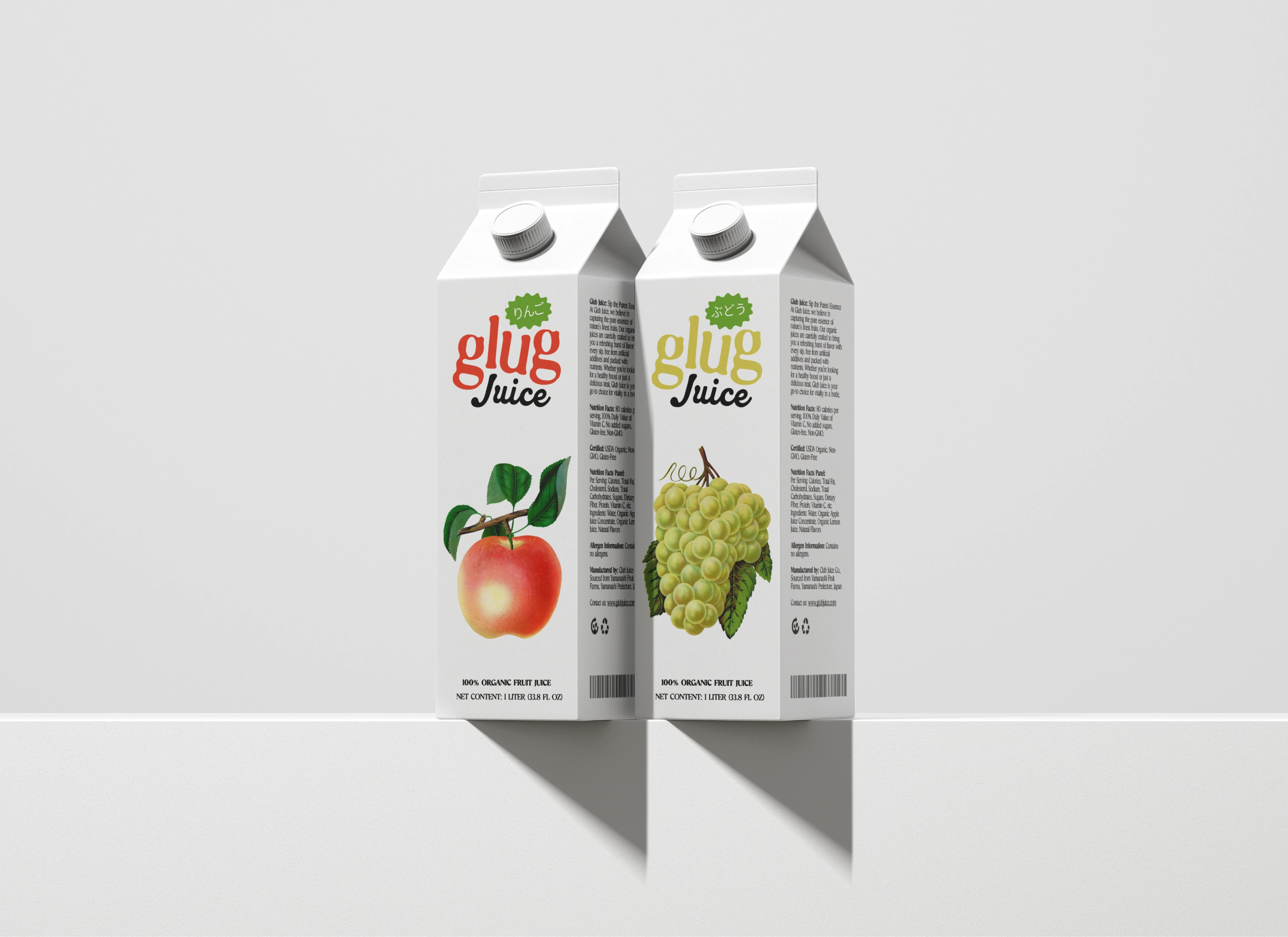
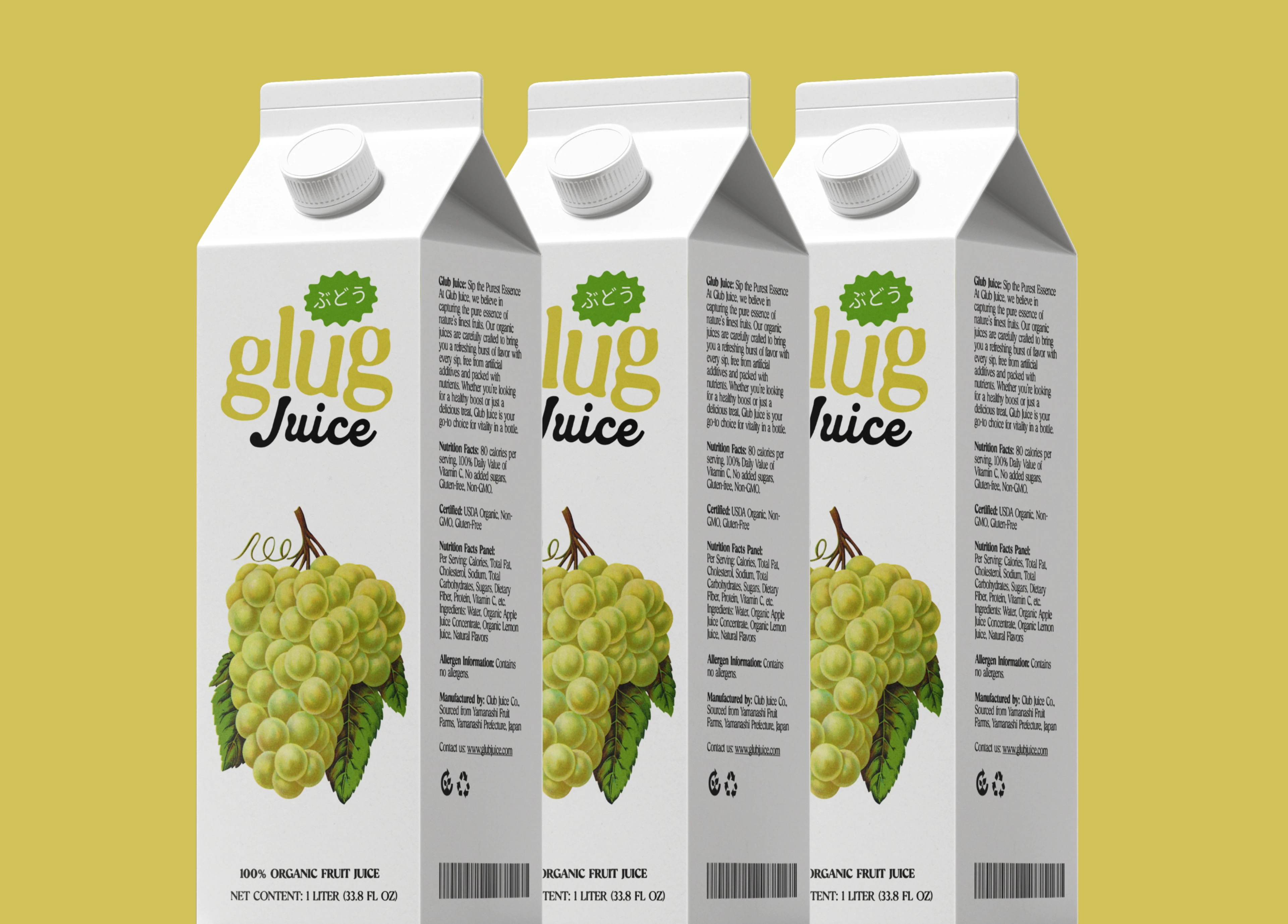
The packaging works across juice boxes, bottles, and cartons. Same energy, different formats.
Like this project
Posted Jun 19, 2026
Built a fun juice brand system with bold type, clean packaging, and energetic visuals that make Glug feel fresh and memorable.