Epochal — Architecture Brand Identity

Hibye Studio


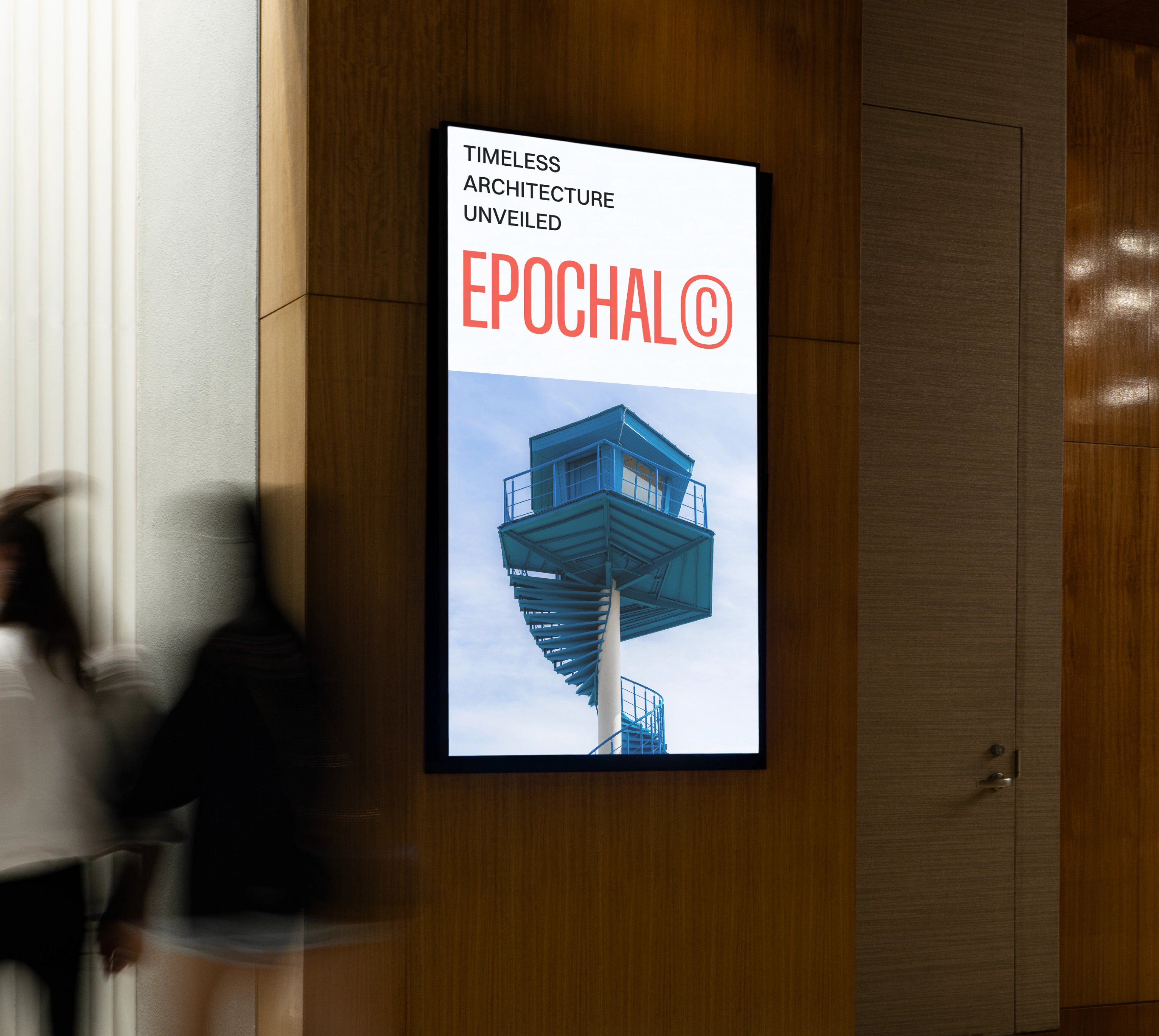
A brand identity concept for an architecture firm that wanted to feel as considered as the spaces it designs. The direction is rooted in precision, restraint, and timelessness.
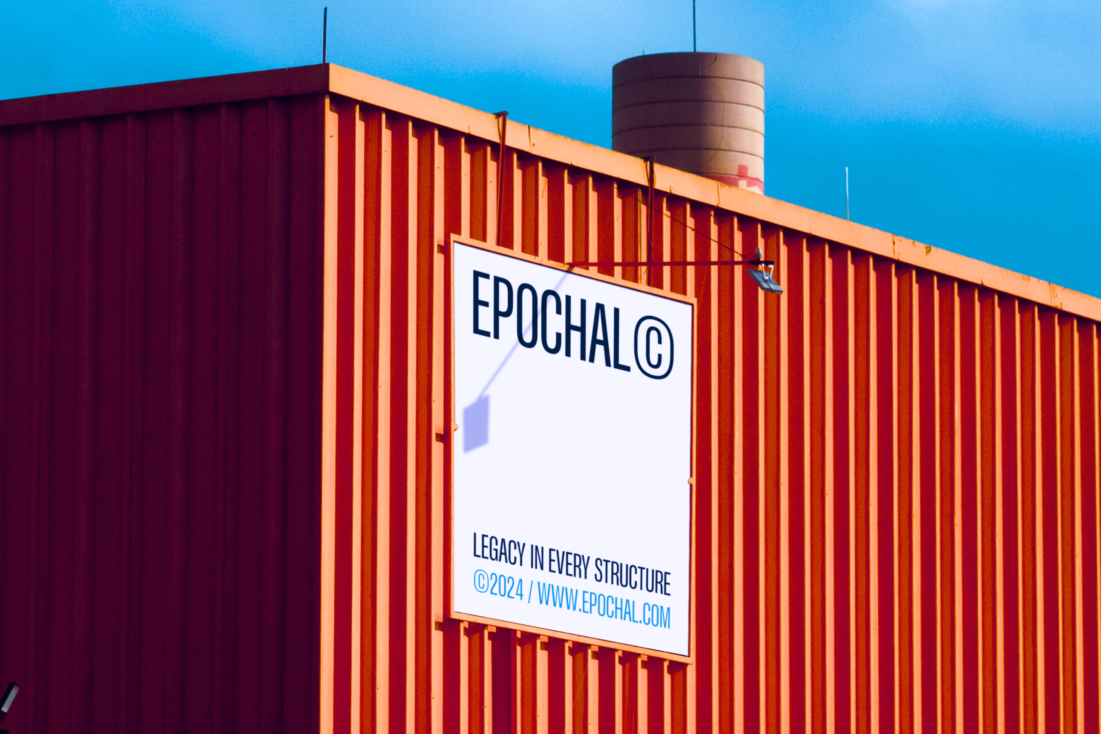
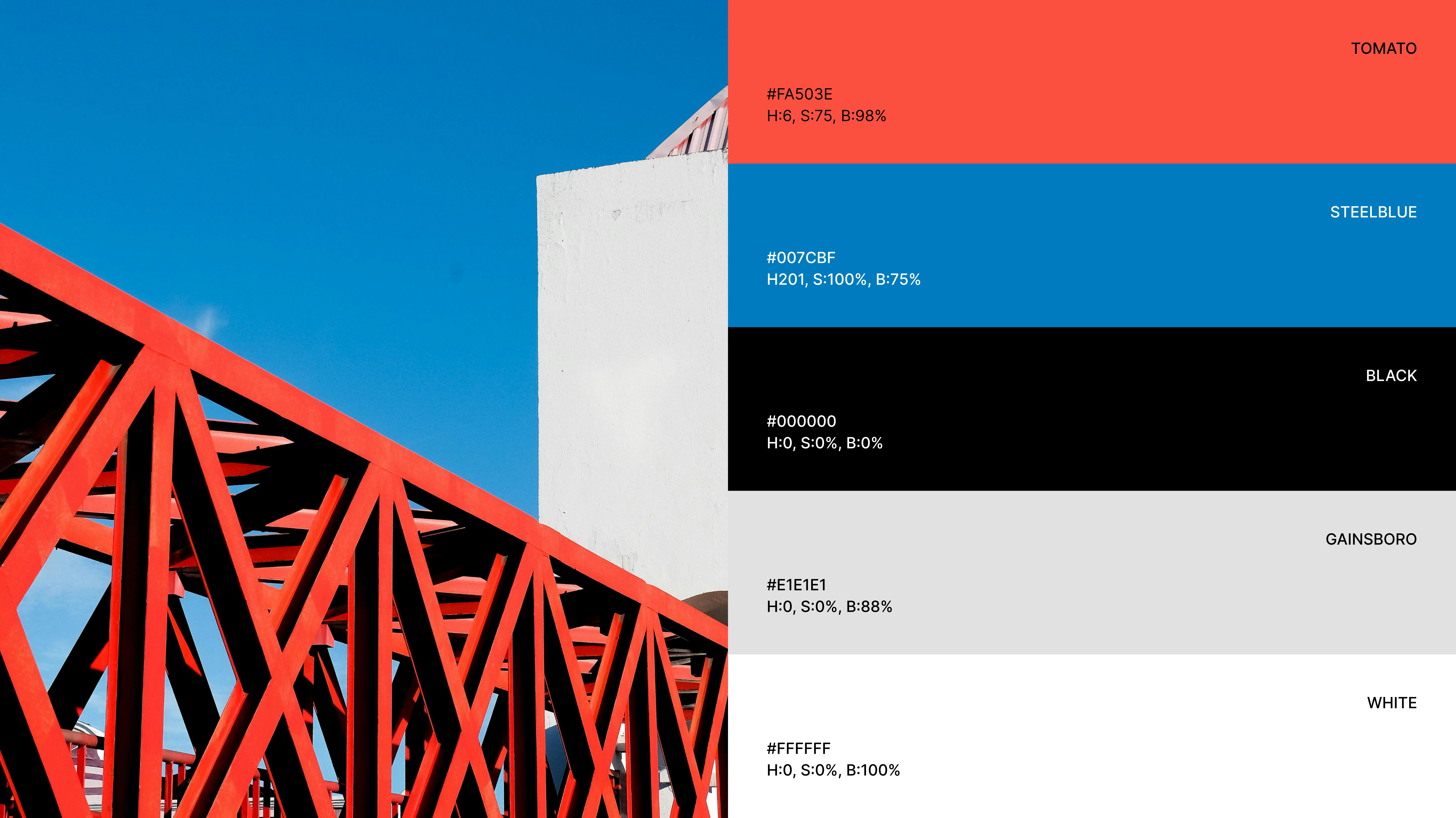
The visual system borrows from architectural principles: strong grids, deliberate proportions, and materials that age well. Nothing trendy, nothing disposable.

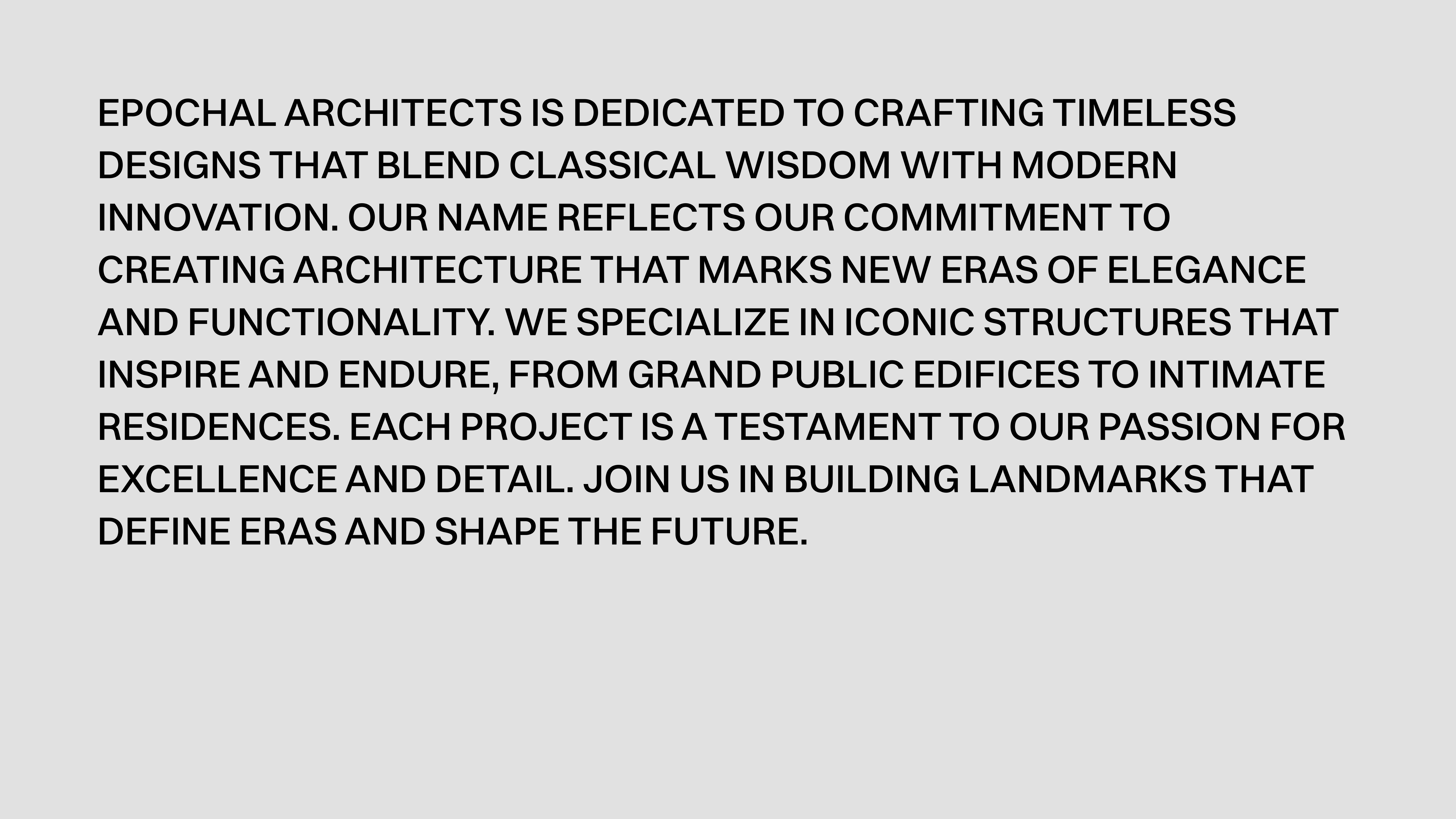
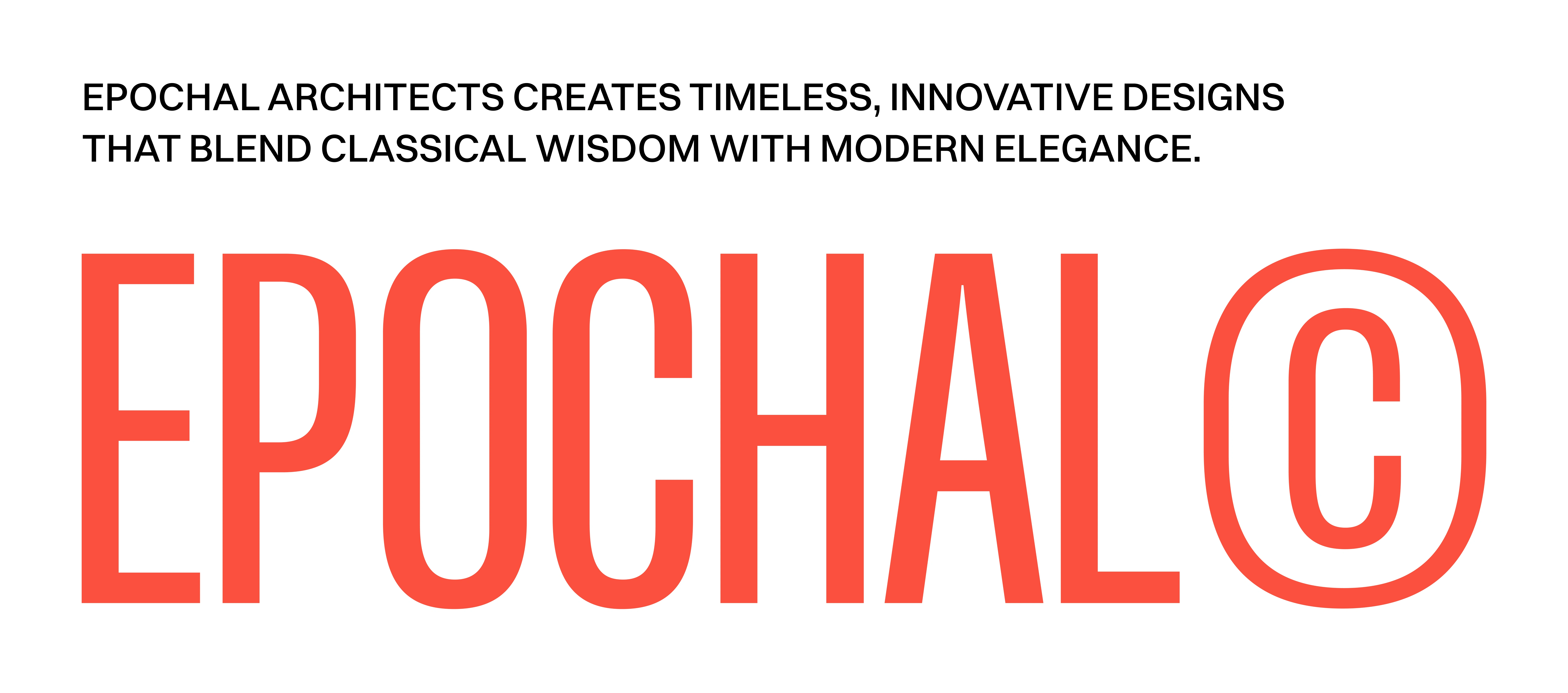
The logo is built on geometric structure with sharp, clean lines. It reads as both a monogram and an architectural form, depending on how you look at it.
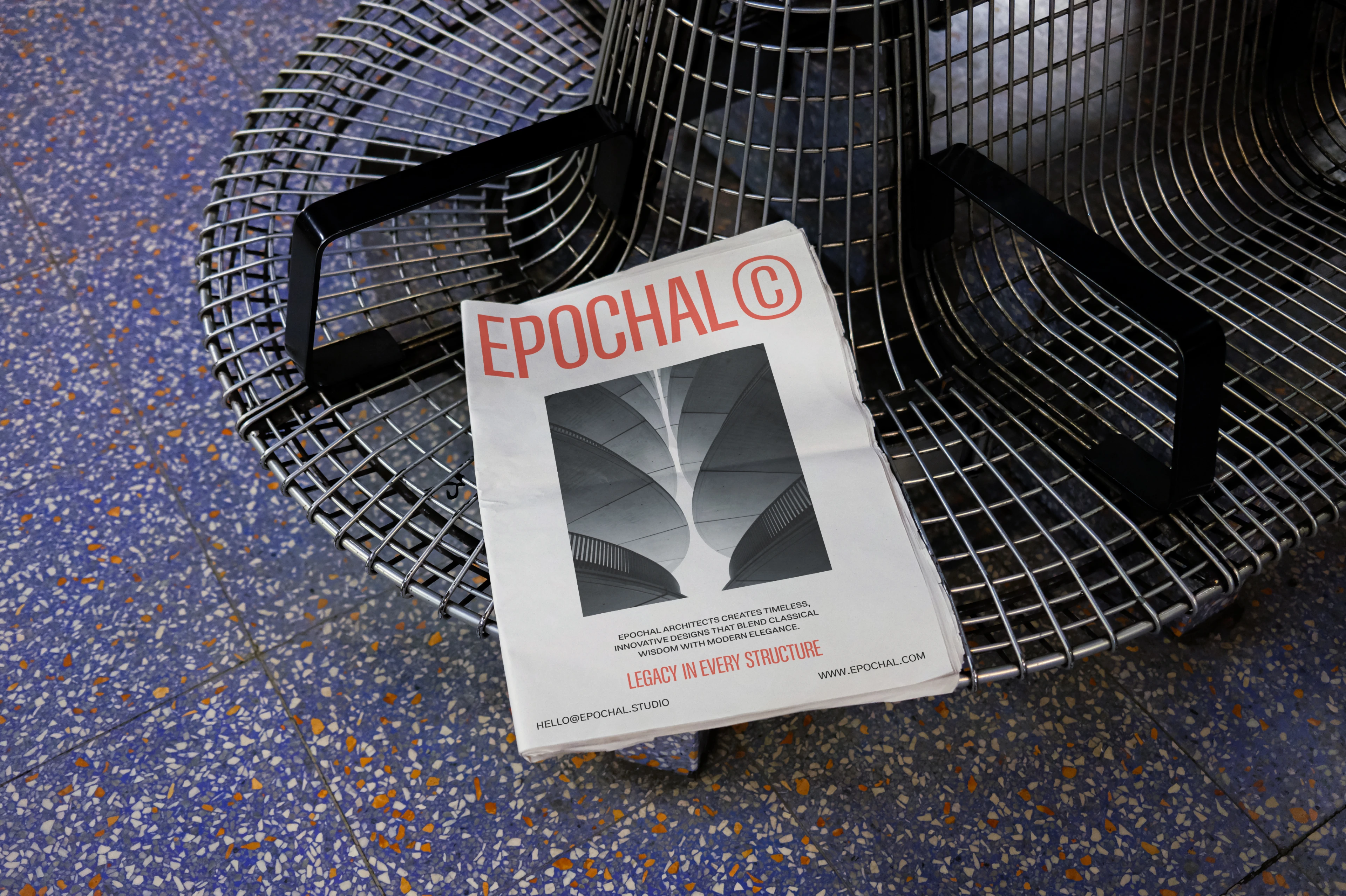
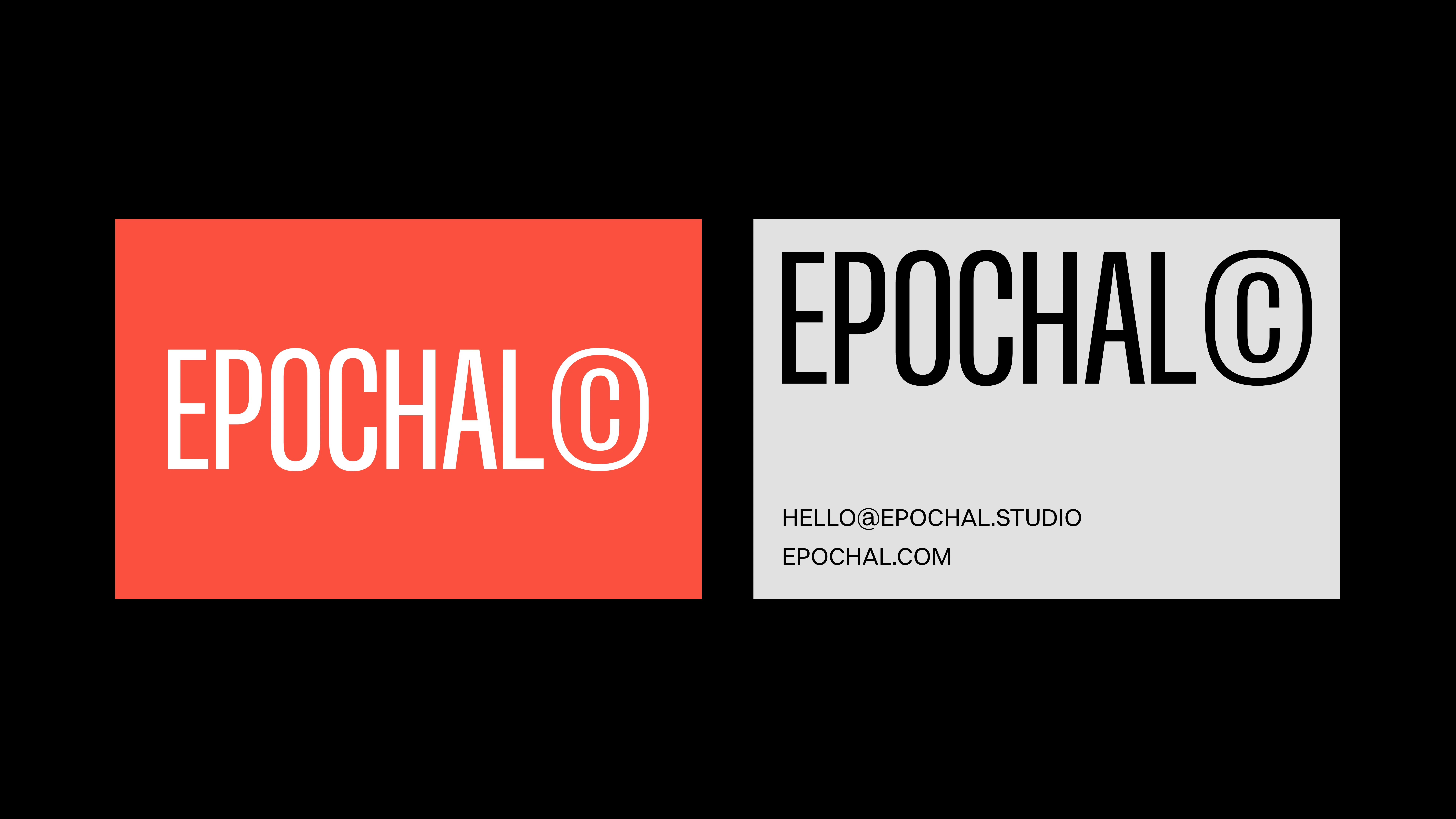
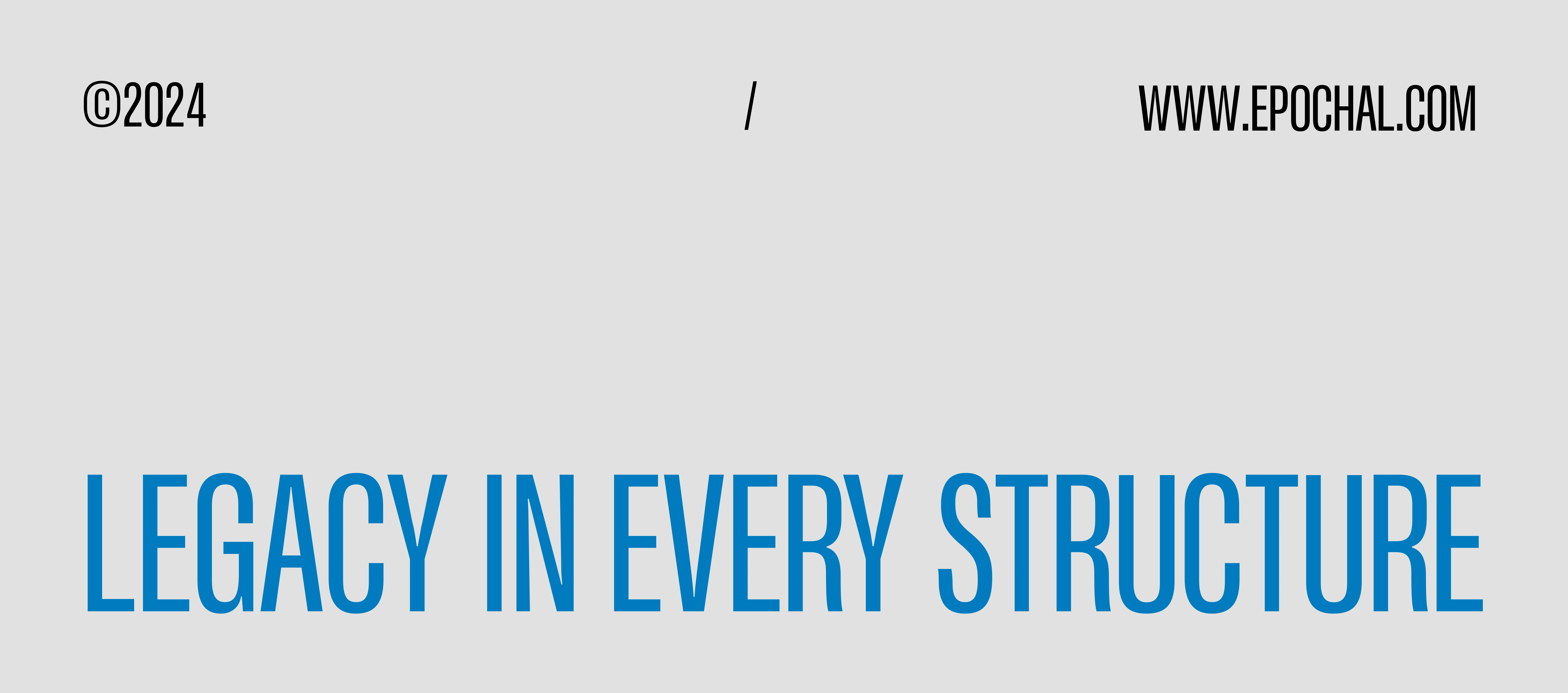
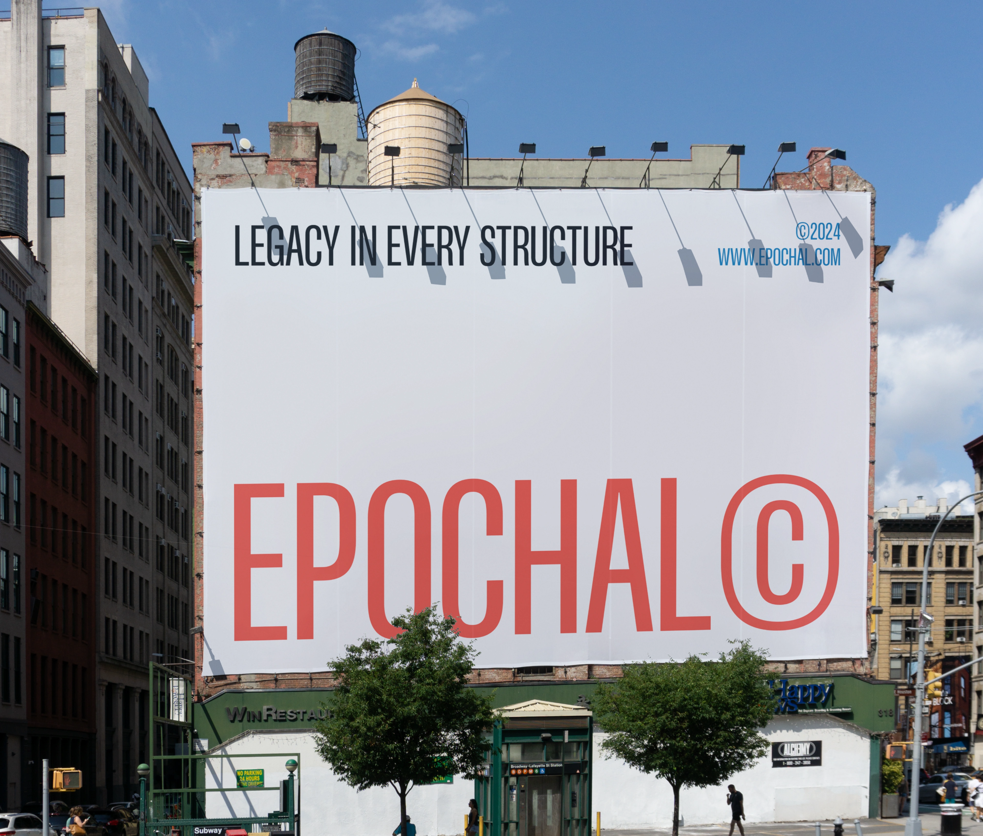
Typography was selected for its structural quality. The type system works across large-format environmental signage and small-scale business cards without losing its character.
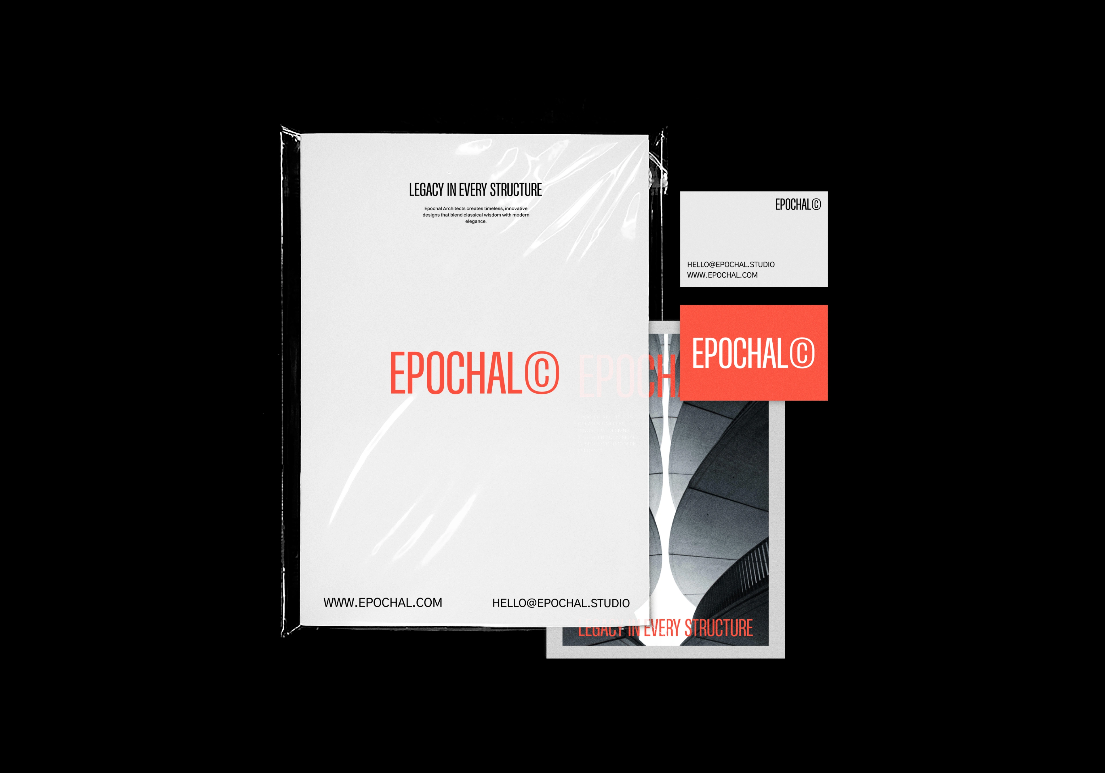
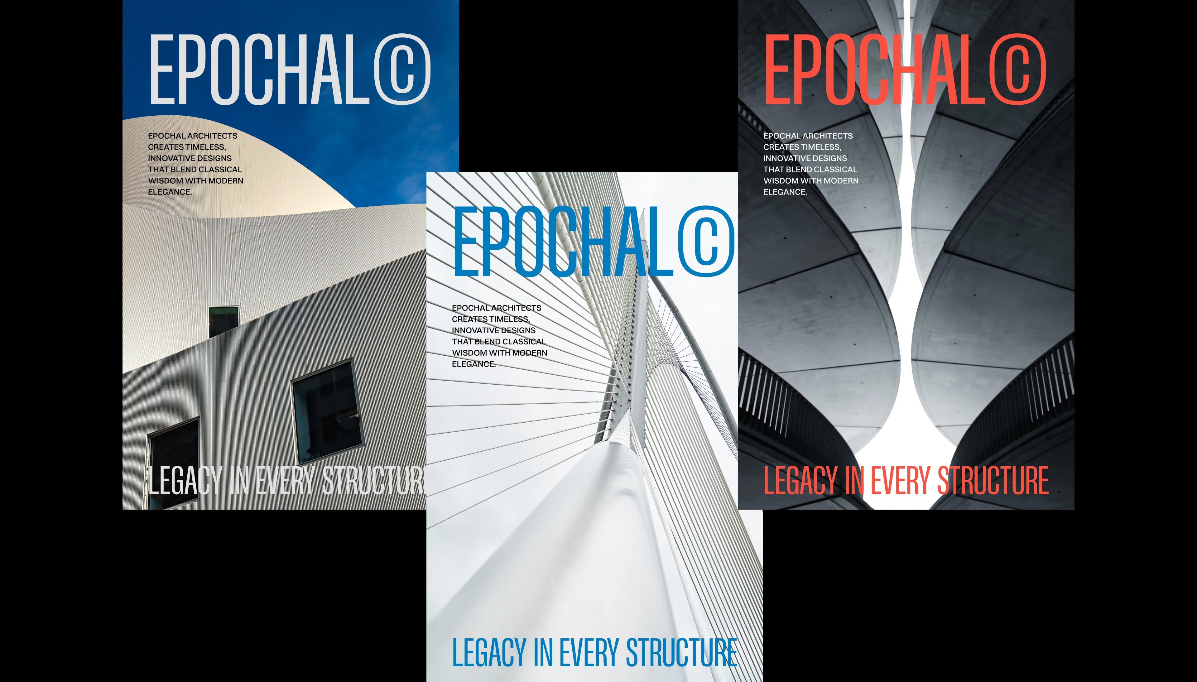
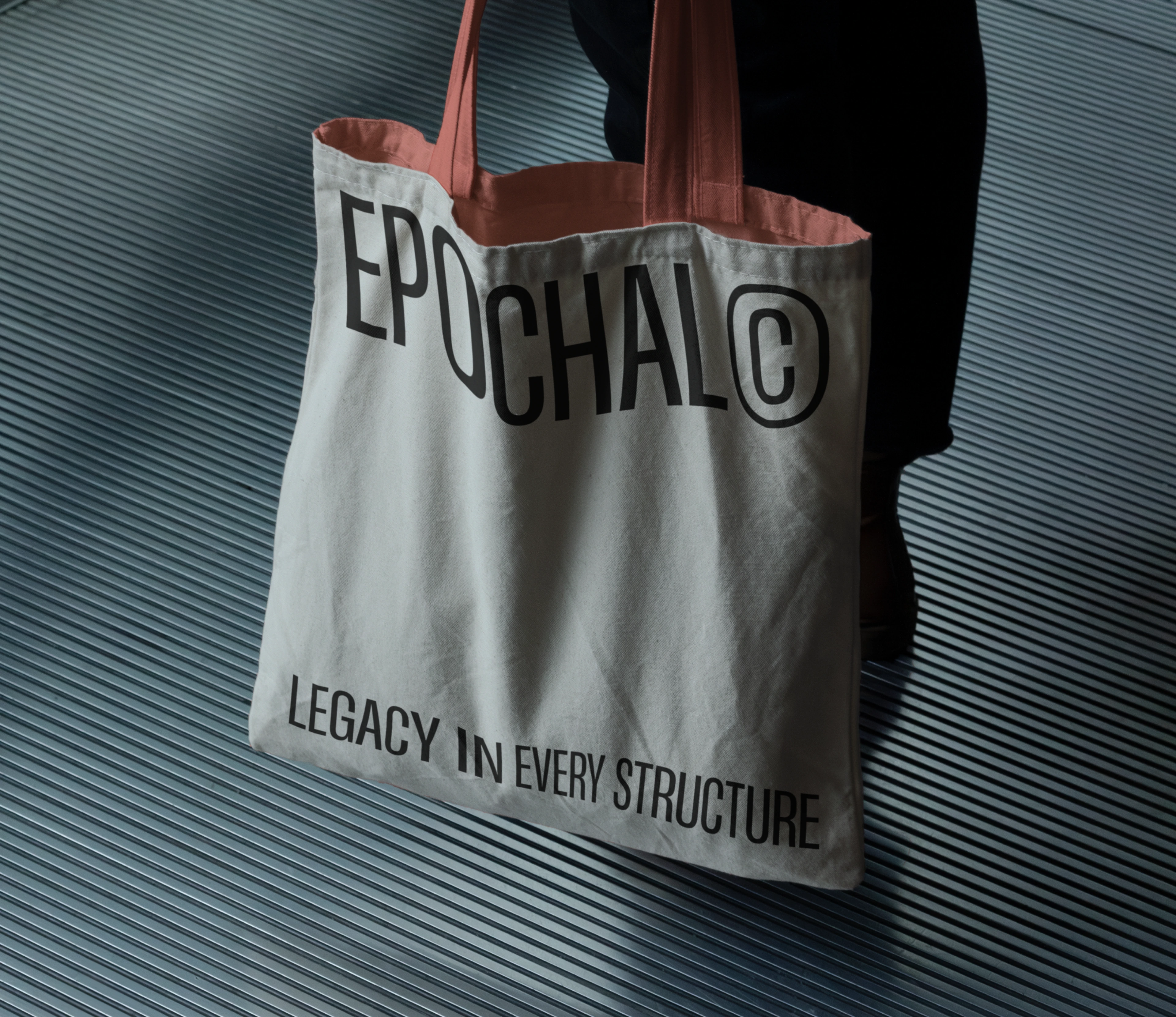
The brand extends into editorial layouts, project presentations, and environmental graphics. Every application reinforces the same sense of quiet confidence.
Like this project
Posted Jun 19, 2026
Created a refined architecture brand identity with strong typography, minimal layouts, and a timeless visual system for a premium feel.