Pokpok — Playful Snack Brand & Packaging

Hibye Studio


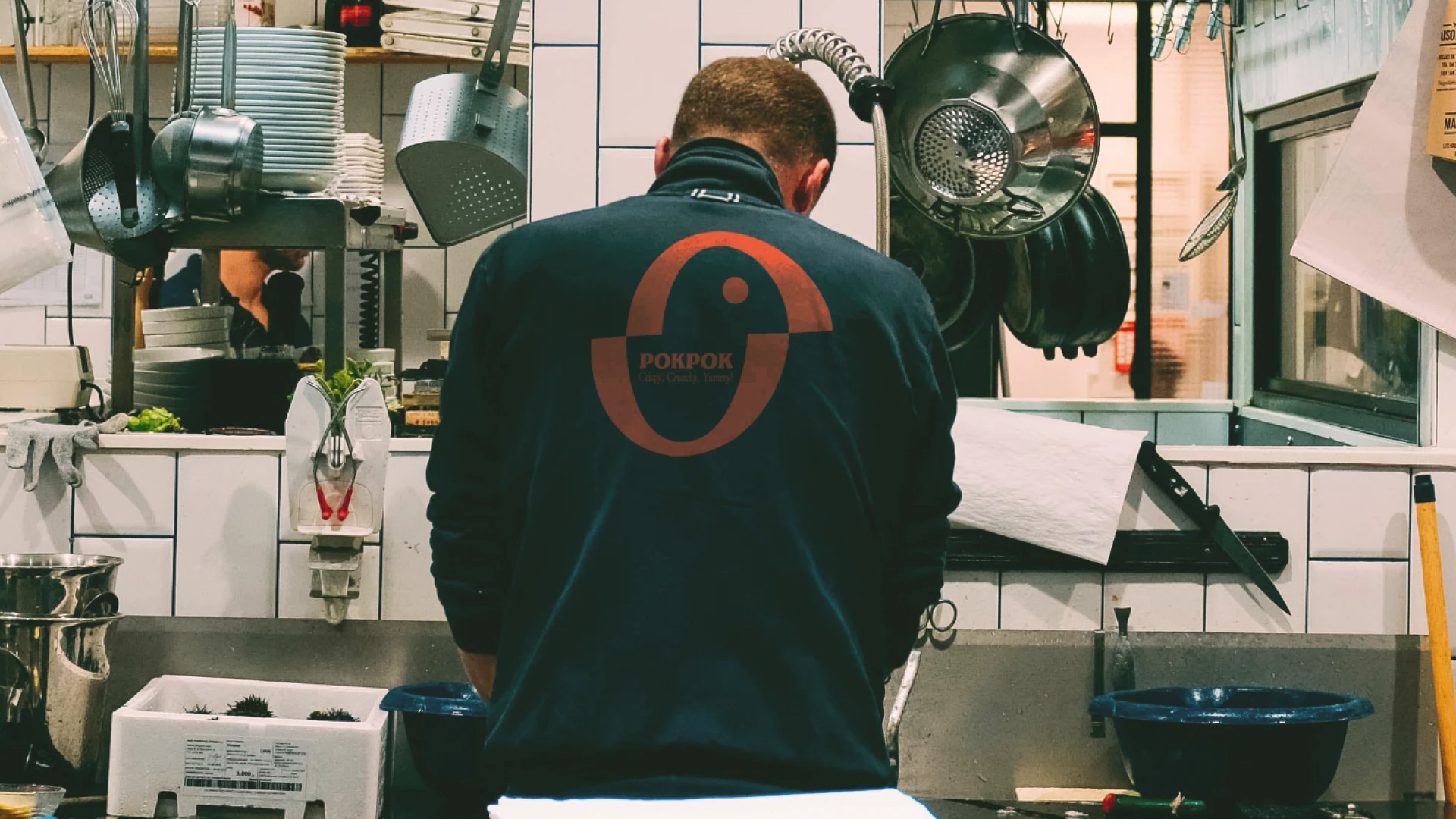
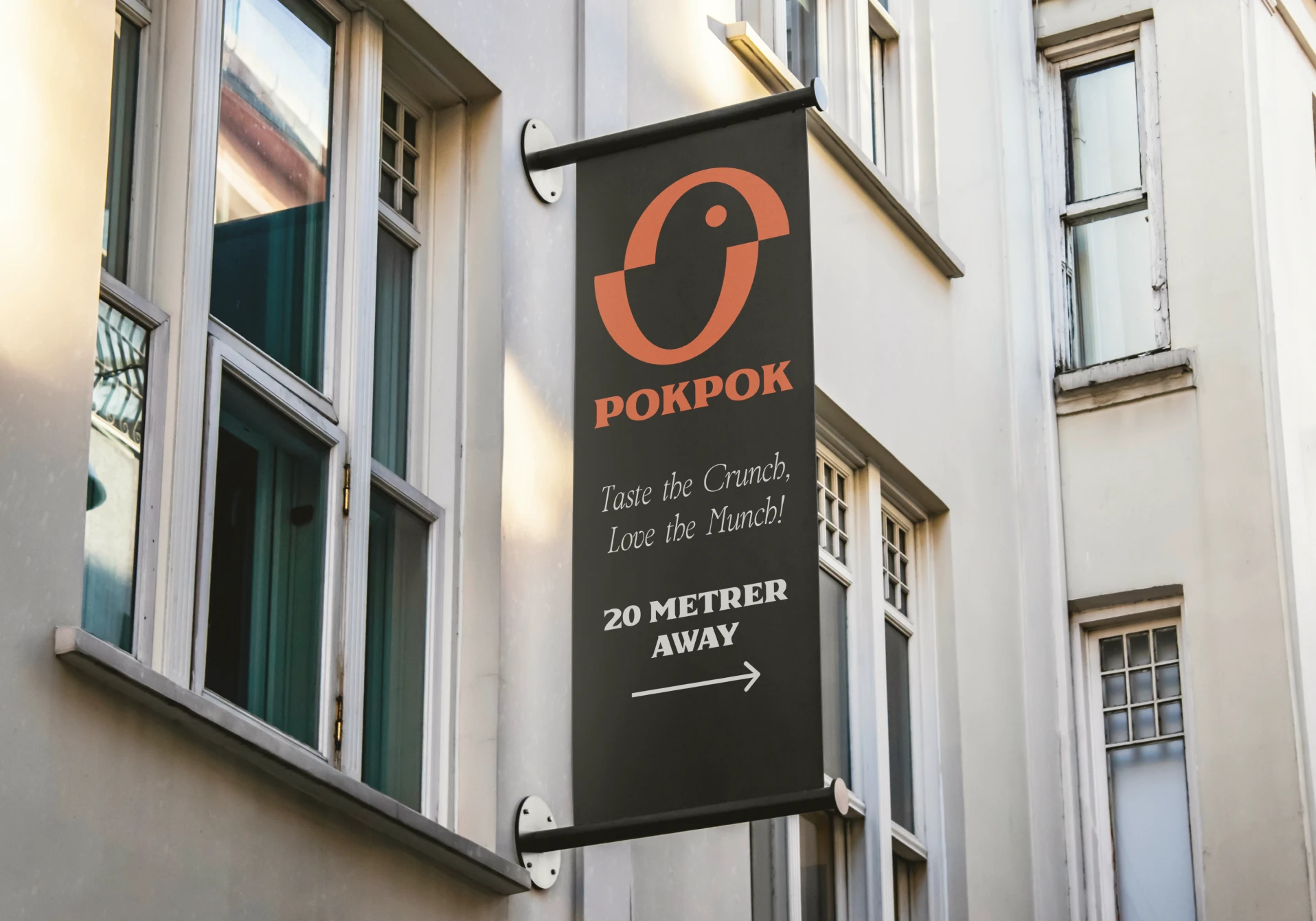
A snack brand concept designed to spark curiosity. Pokpok is playful, visual, and built to stand out in a category that tends to blur together on the shelf.
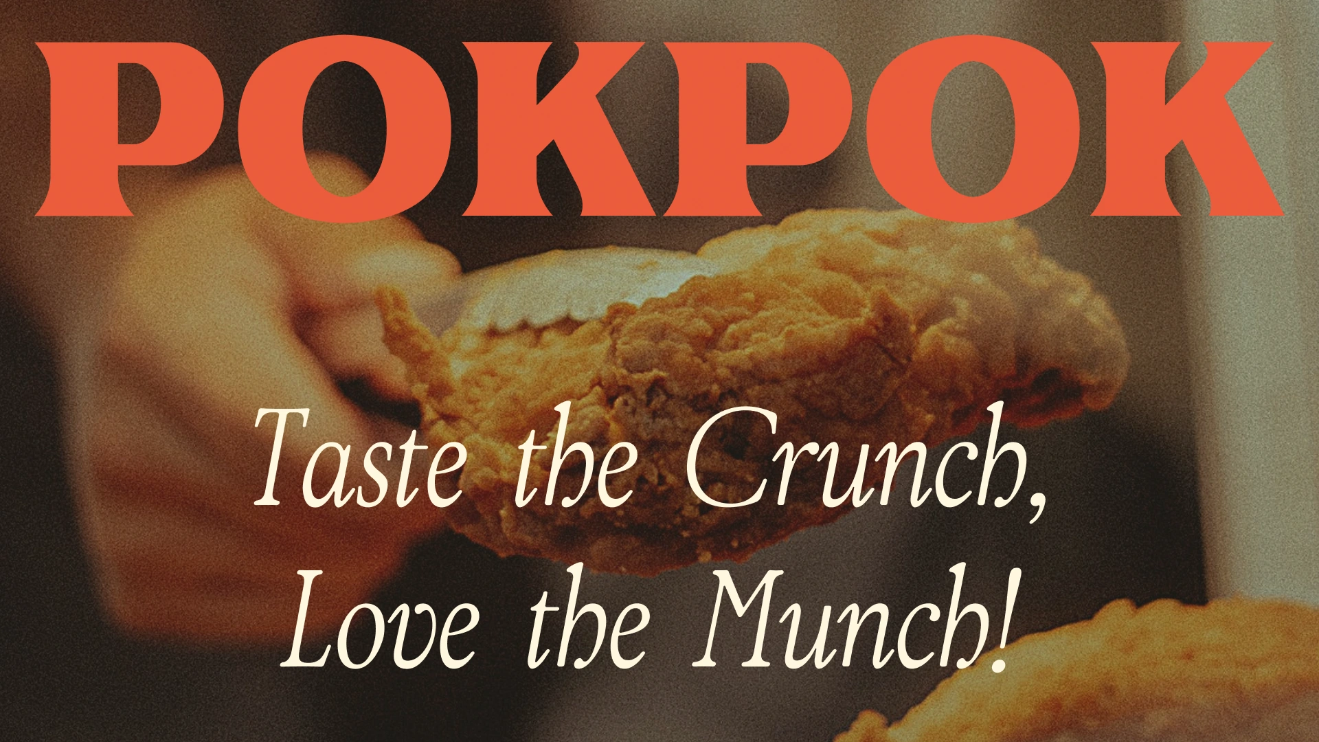
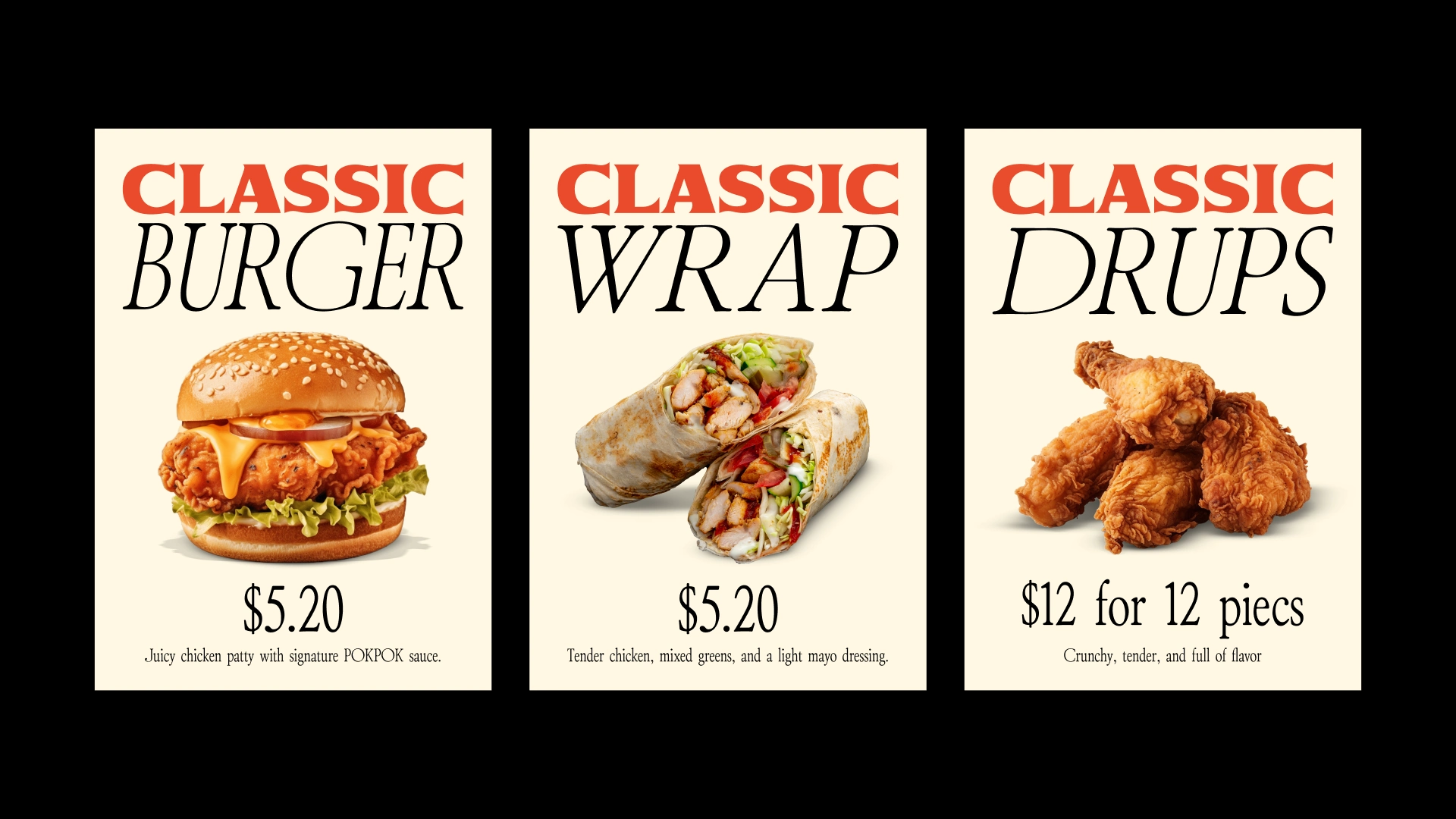
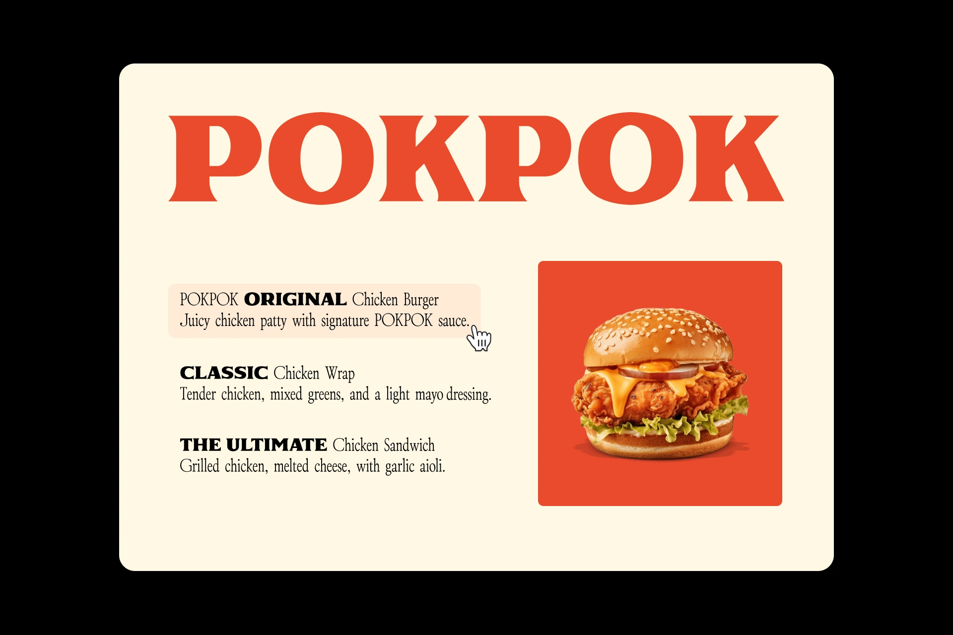
The identity is driven by custom typography and bold color. The name itself has a rhythmic, tactile quality, and the visual system amplifies that energy.
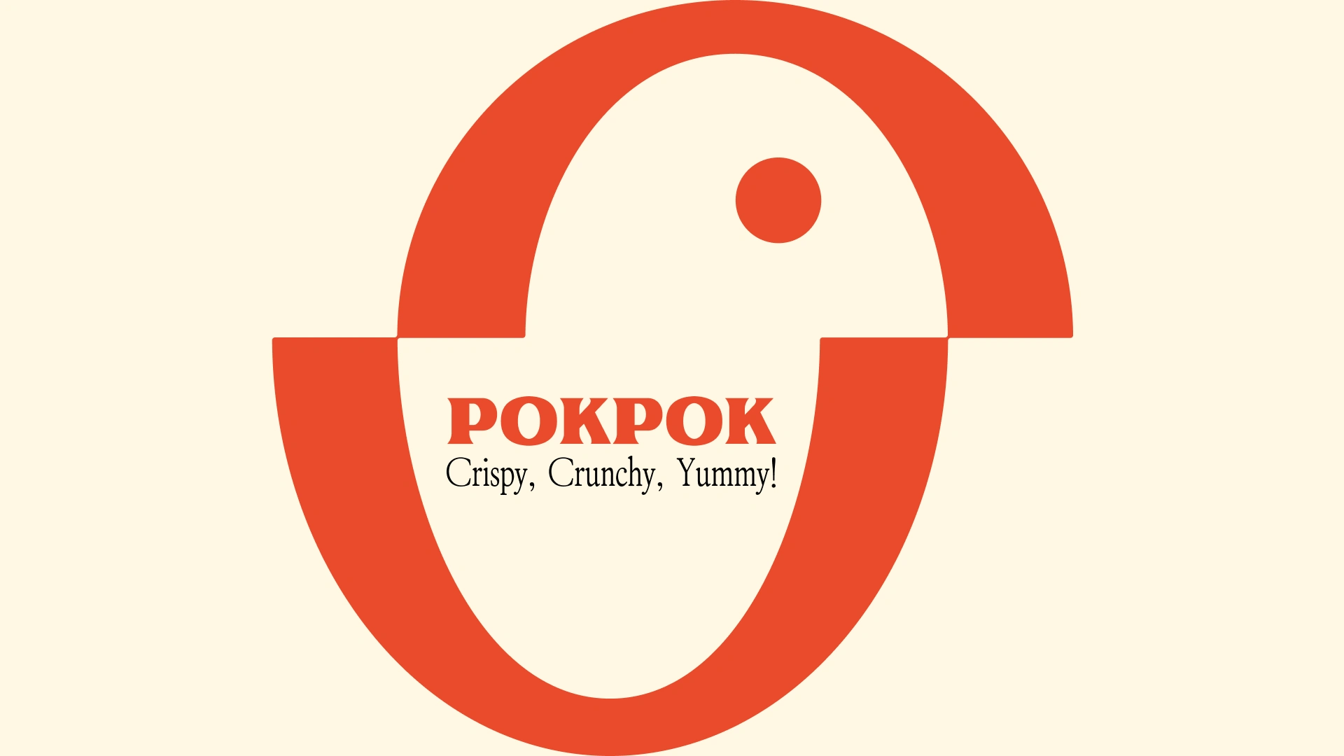
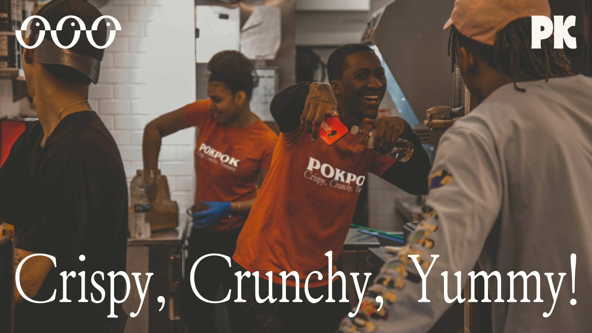
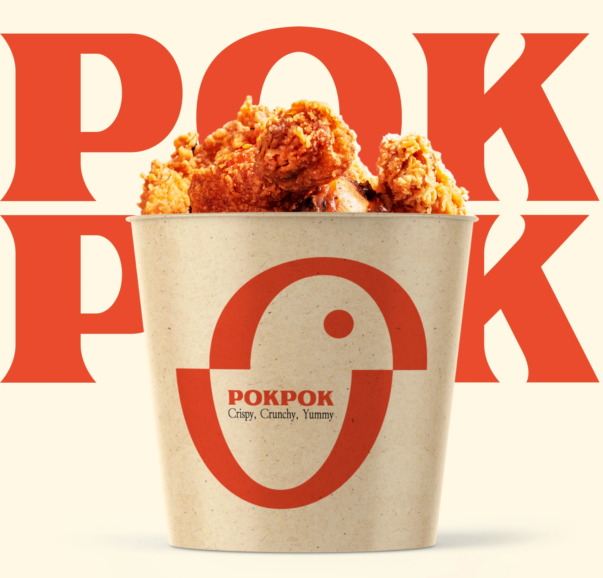
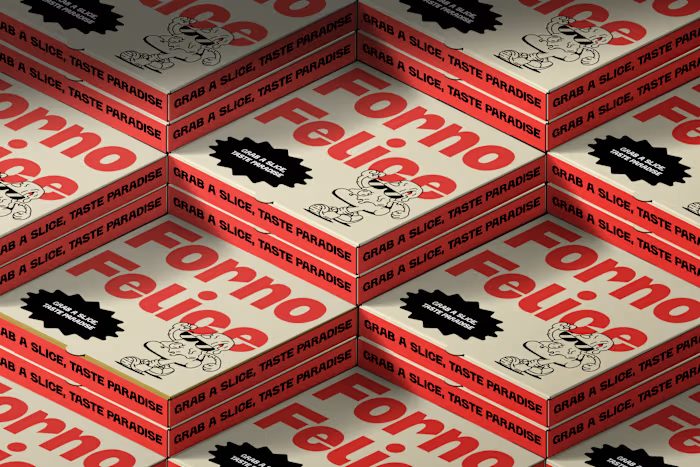
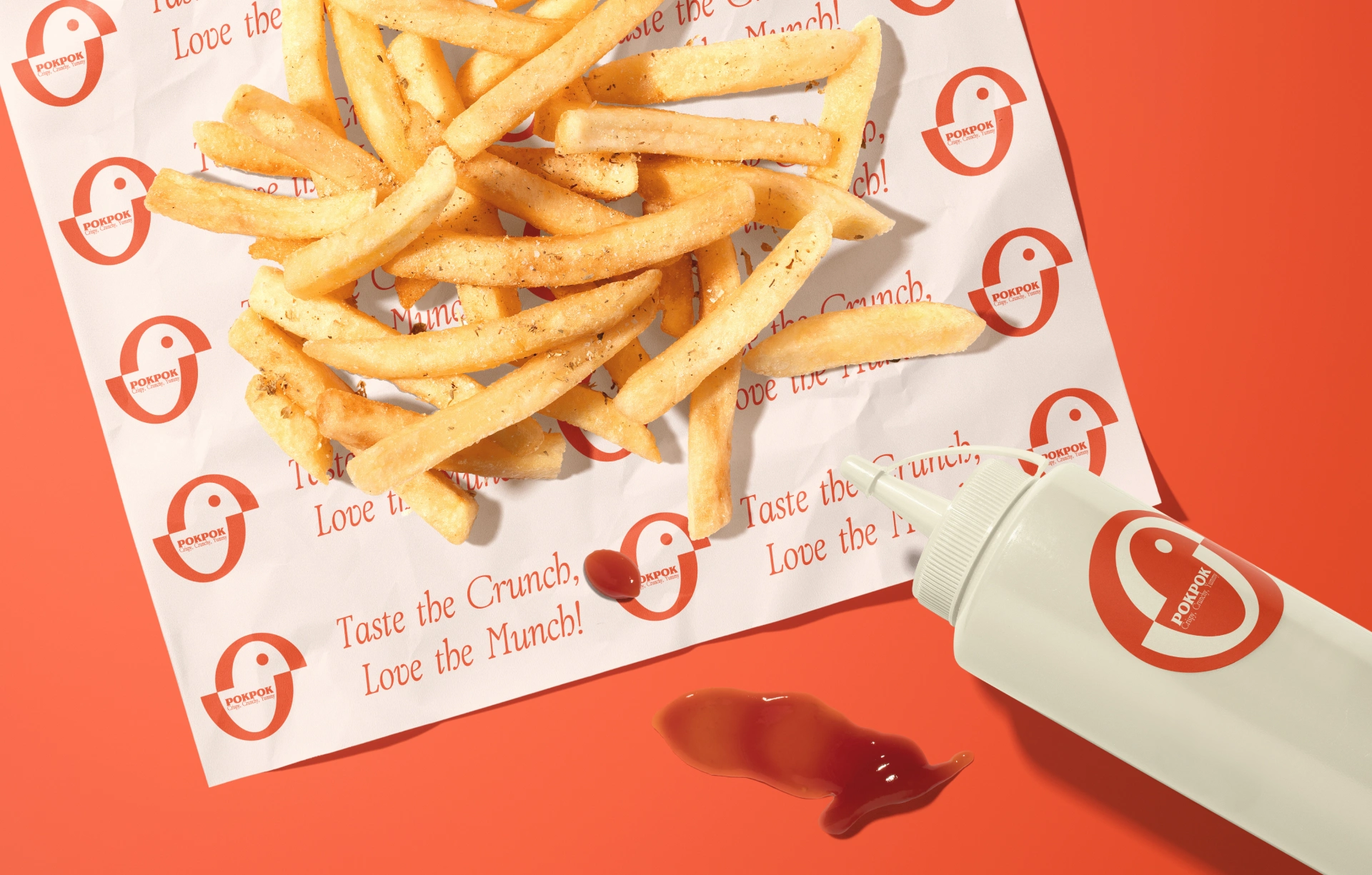
Packaging uses the full surface as a canvas. Oversized letterforms, vibrant backgrounds, and a layout that treats every panel as an opportunity to grab attention.
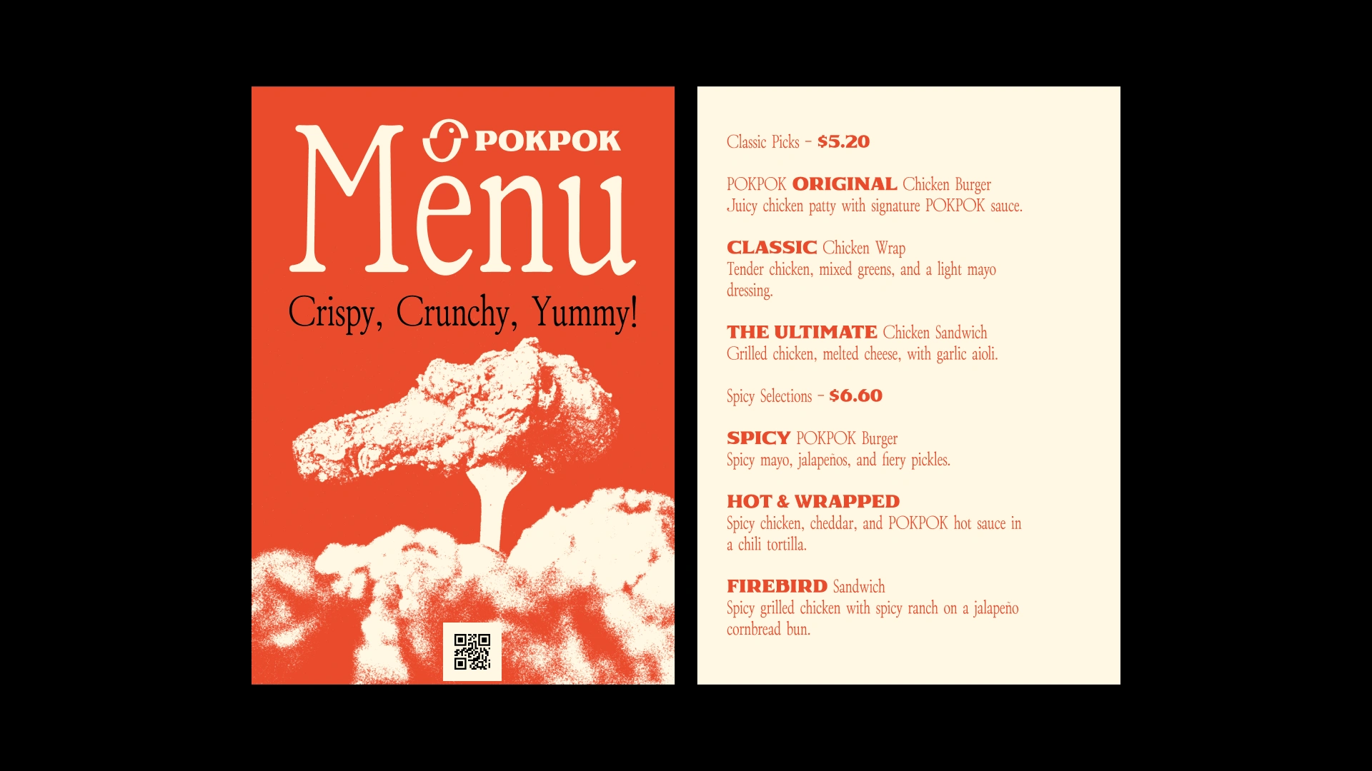
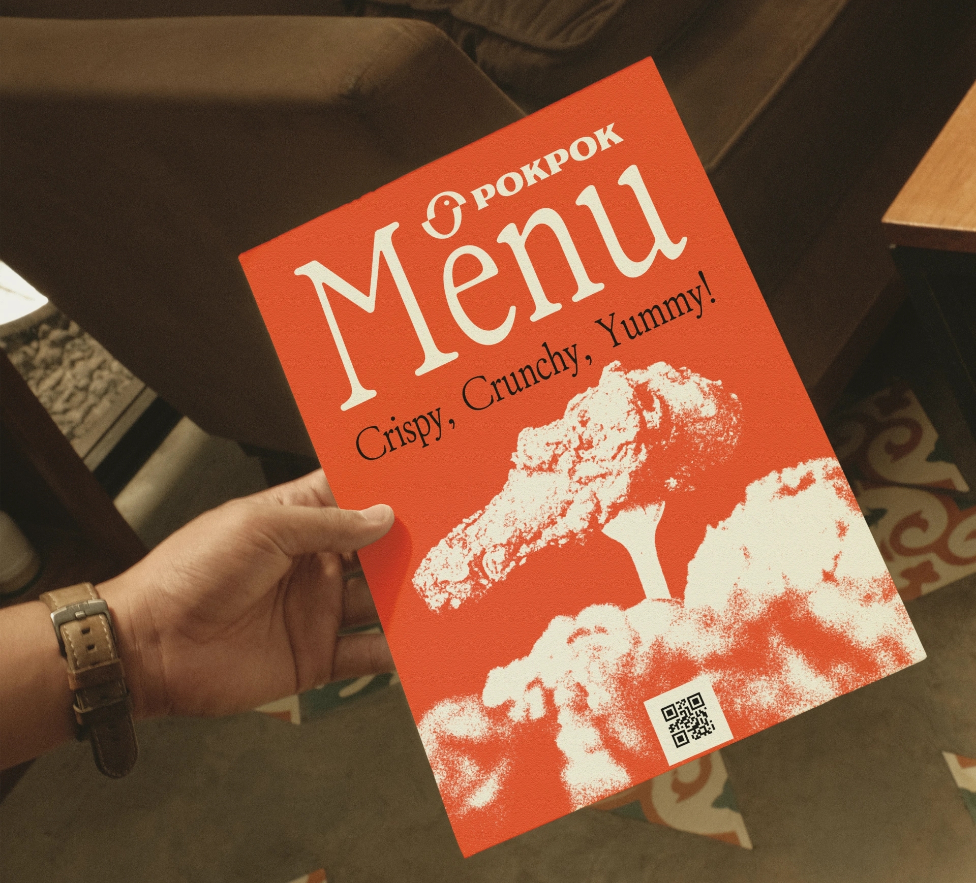
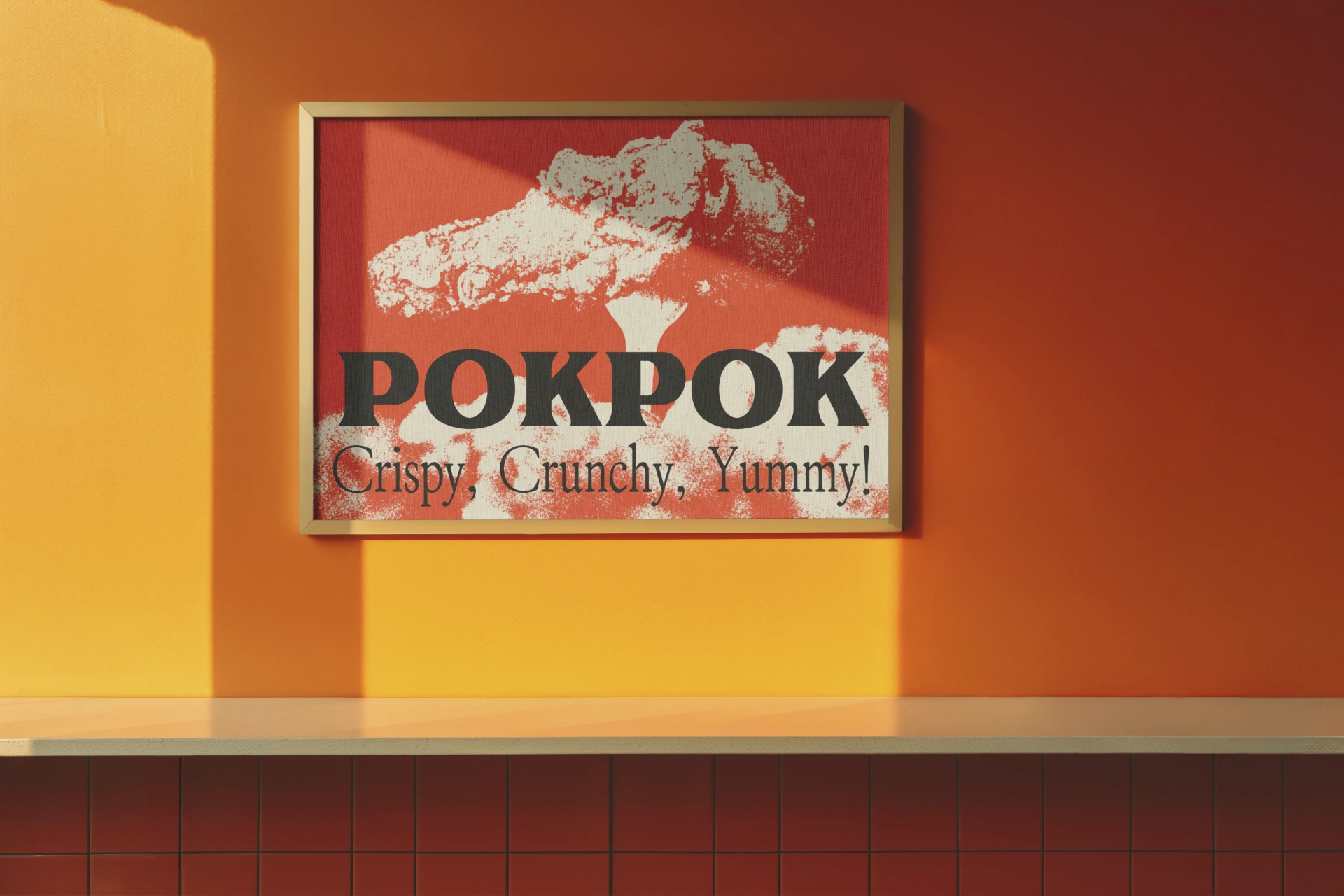
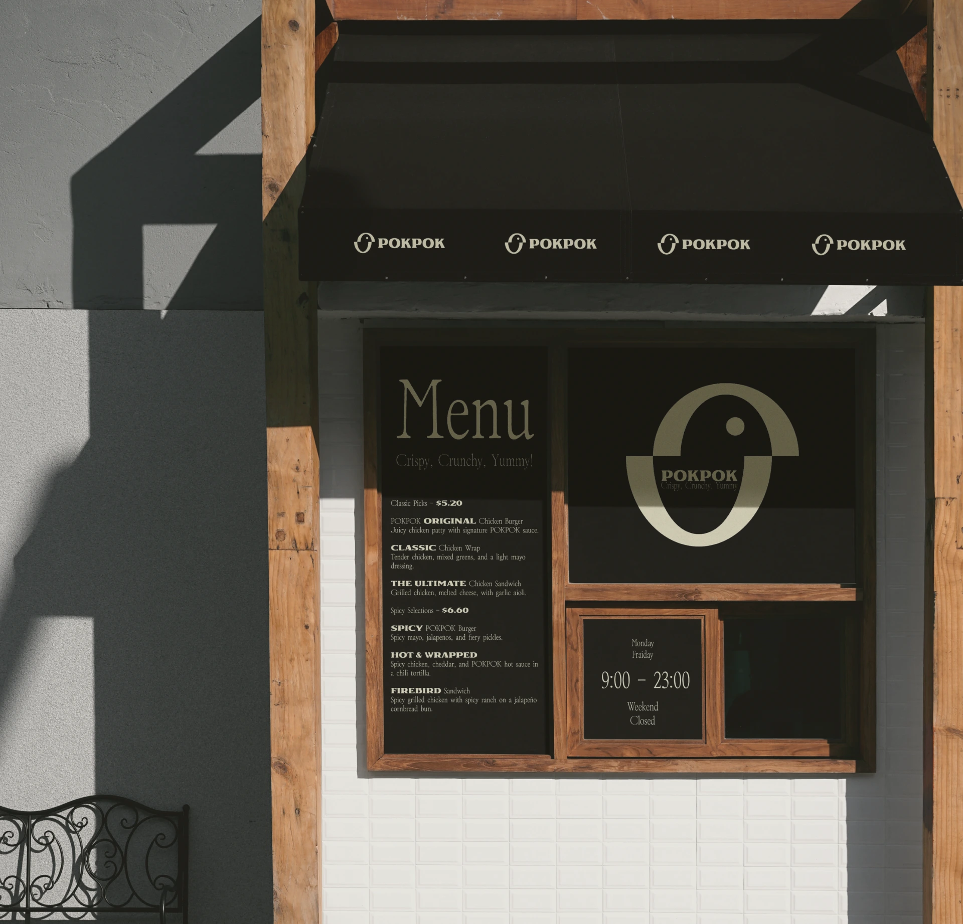
The system scales across bag sizes, box formats, and promotional materials. Each variant feels like part of the same world while having its own personality.

Like this project
Posted Oct 22, 2025
We had the joy of bringing POKPOK to life a playful, visual brand built to spark curiosity and connection.