The network for creativity
Join 1.25M professional creatives like you
Connect with clients, get discovered, and run your business 100% commission-free
Creatives on Contra have earned over $150M and we are just getting started
Back to feedPost
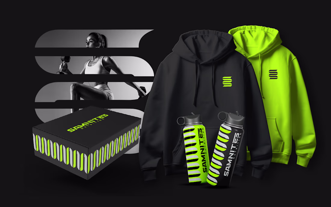
I designed the Samnites Nutrition logo as a brand identity that combines the strength of the ancient Samnites with a modern focus on protein-rich nutrition.
The main element is a stylized double “S”, representing both the brand name and the concept of strength. In its vertical form, it reflects resilience and subtly references Samnite heritage, with dashed details inspired by arrows to symbolize precision and focus.
When rotated horizontally, the same shape transforms into a protein symbol, reinforcing the brand’s nutrition-focused identity. This dual meaning connects heritage with modern health and performance.
The result is a simple, adaptable mark that communicates strength, discipline, and innovation.
The network for creativity
Join 1.25M professional creatives like you
Connect with clients, get discovered, and run your business 100% commission-free
Creatives on Contra have earned over $150M and we are just getting started
Related posts
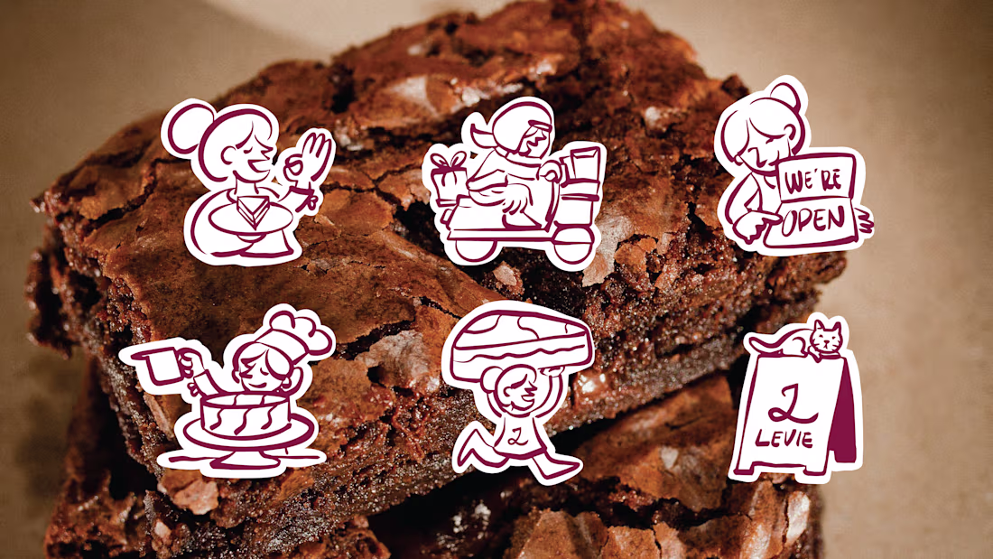
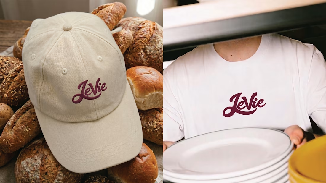
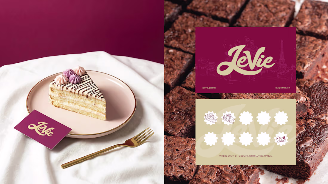
Strategic brand identity for Levie Pastries, positioning the brand as a modern artisan pâtisserie while strengthening brand recognition, customer perception, and business growth.
Nice one
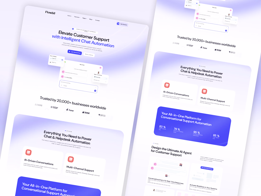
🚀 Elevating customer support with intelligent design.
A modern AI-powered SaaS landing page crafted to simplify conversations, automate workflows, and create a seamless user experience. Focused on clean layouts, clear hierarchy, and conversion-driven UI that helps businesses scale support efficiently.
💡 Great design isn't just about aesthetics—it's about creating experiences that drive results.
📩 Available for SaaS, AI, Web App, and Dashboard UI/UX projects.
👉 Book a call: https://calendly.com/gopi-uiux/30min
👉 Dribble: https://dribbble.com/OptimityLogics
👉 Behance: https://www.behance.net/optimitylogics
👉 Portfolio: https://gopi-prajapati-portfolio.vercel.app
Great work 🔥
It's beautiful ❤️
Challenges
View allTrending
Claude
Claude has entered the design space. How are you using Claude Design?
Contra University
Learn from expert creatives how to earn more using next-gen AI tools.
creativeaiflow
Creative AI workflows are evolving. What tools do you use, and what are their strengths and weaknesses?
portfolioreview
The best portfolios tell a story, not just show a grid. Share yours for feedback.
freelancerlife
Freelancer life is wins, pivots, and everything in between. What’s yours right now?