IPKO Brand Identity Refresh
Arianit Bulliqi
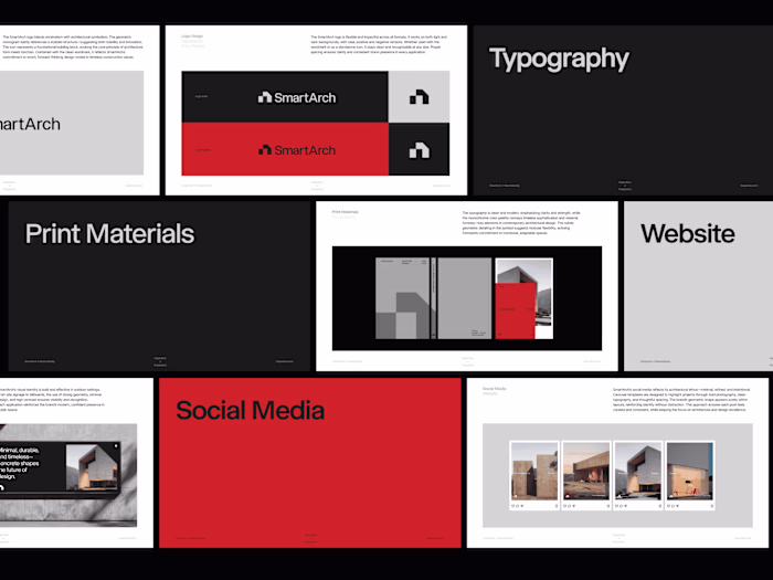
Ipko Visual Communication
Client
Ipko
Year
2023
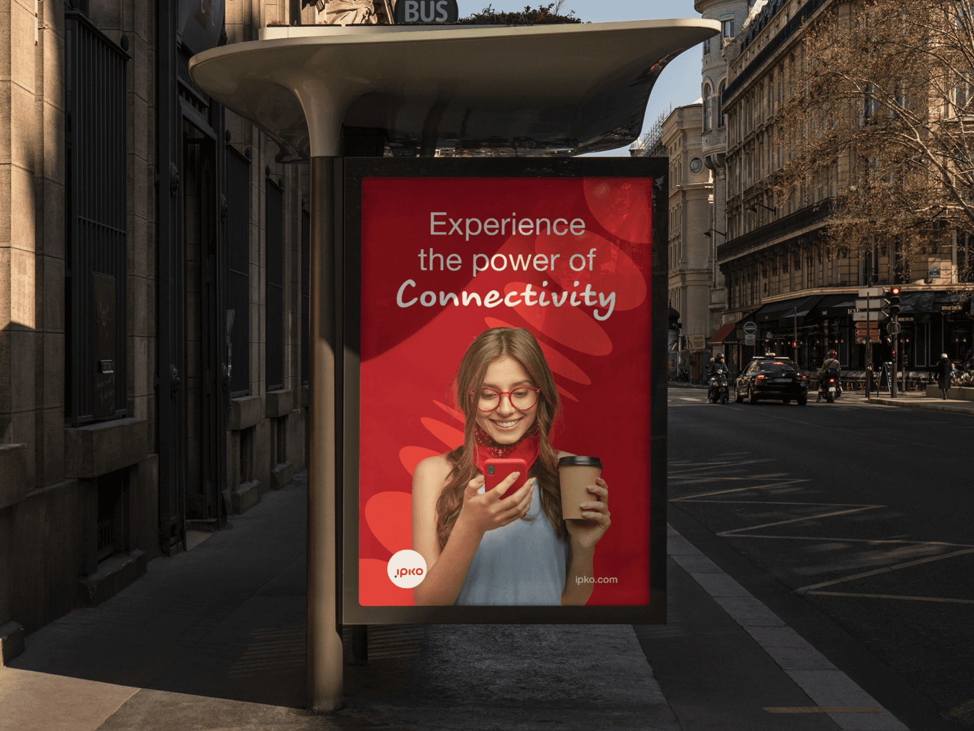
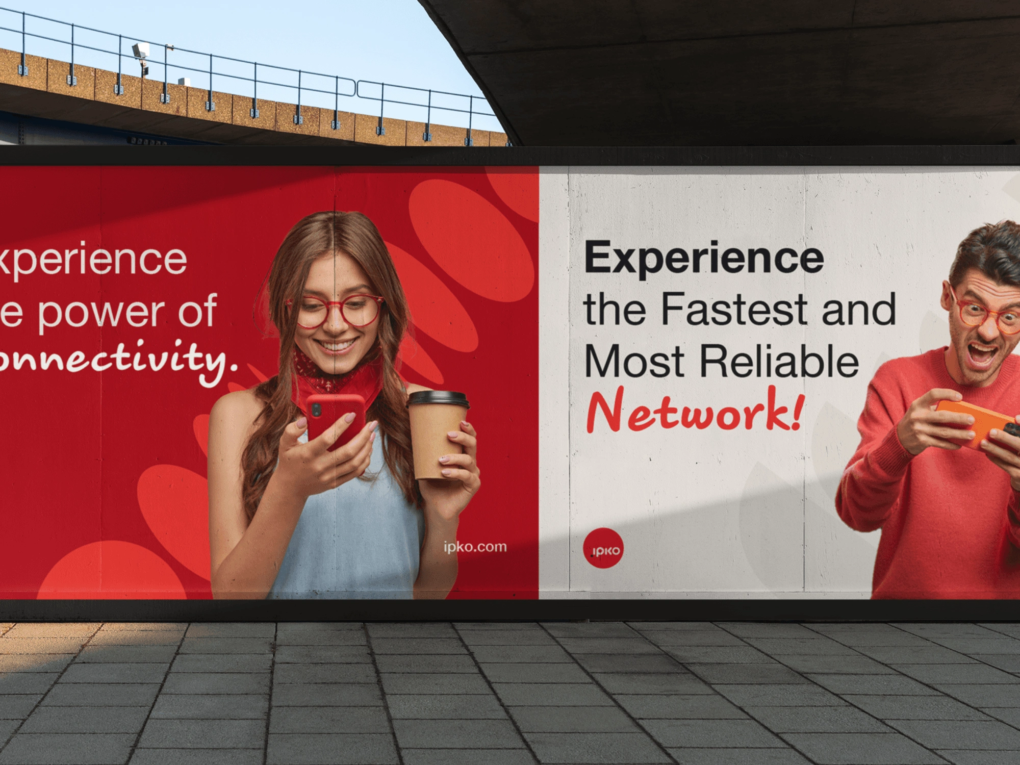
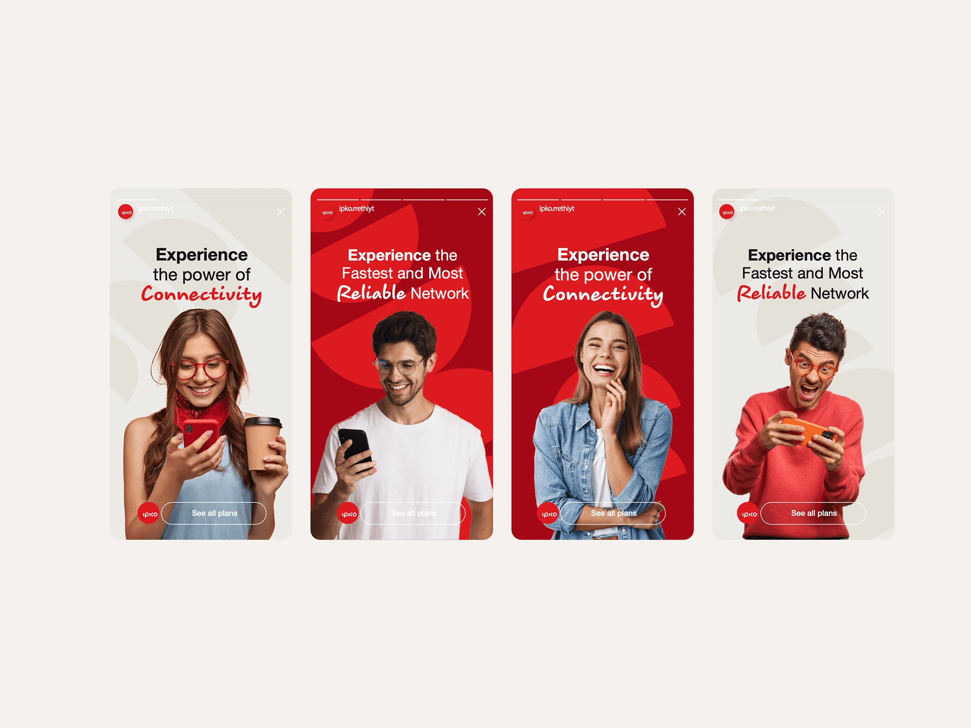
The IPKO brand identity refresh reimagines one of Kosovo’s leading telecommunication brands for a digital-first era. The goal was to strengthen IPKO’s position as the fastest and most reliable network while creating a visual system that feels modern, human, and adaptable across all communication channels.
Overview
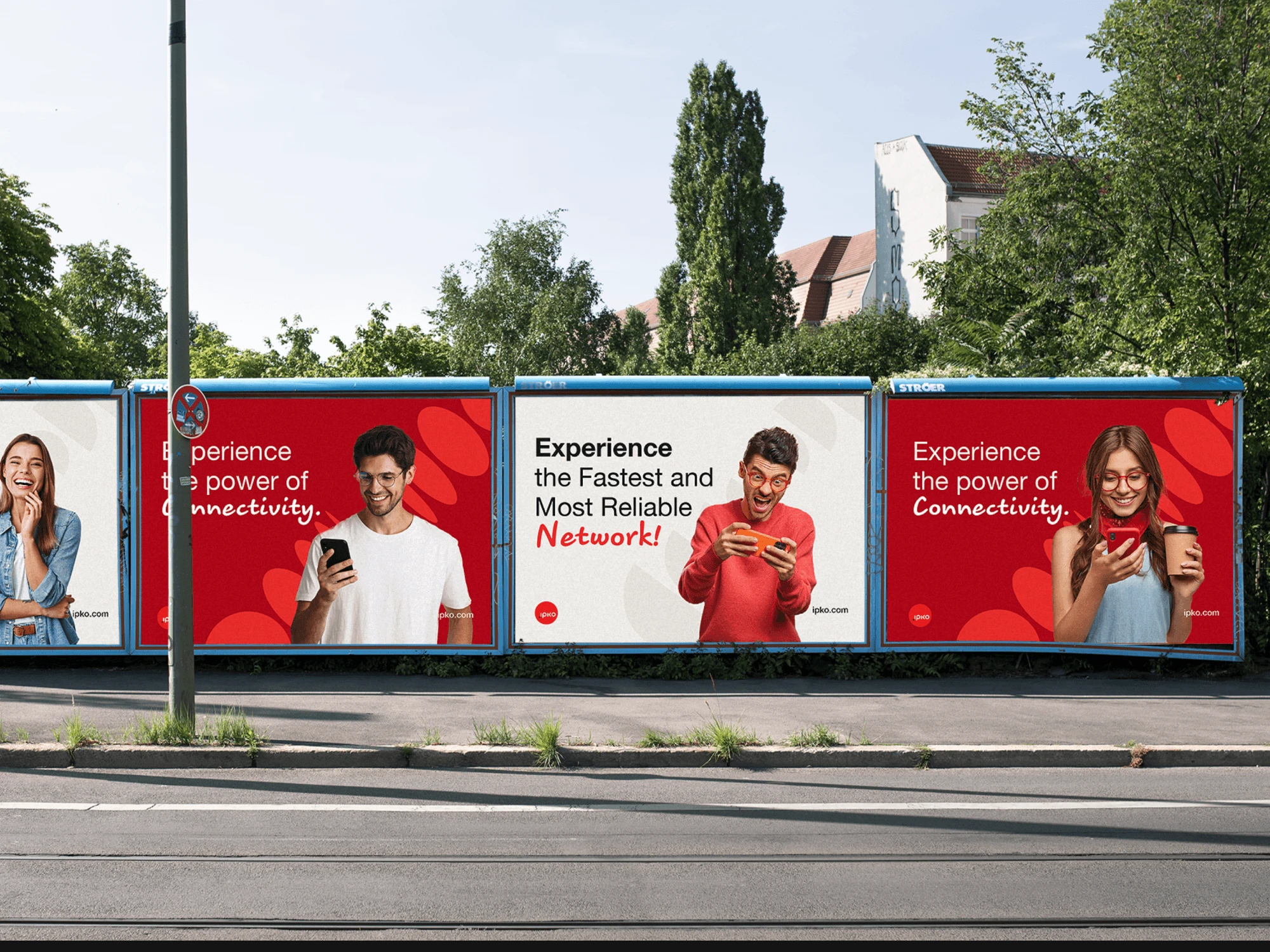
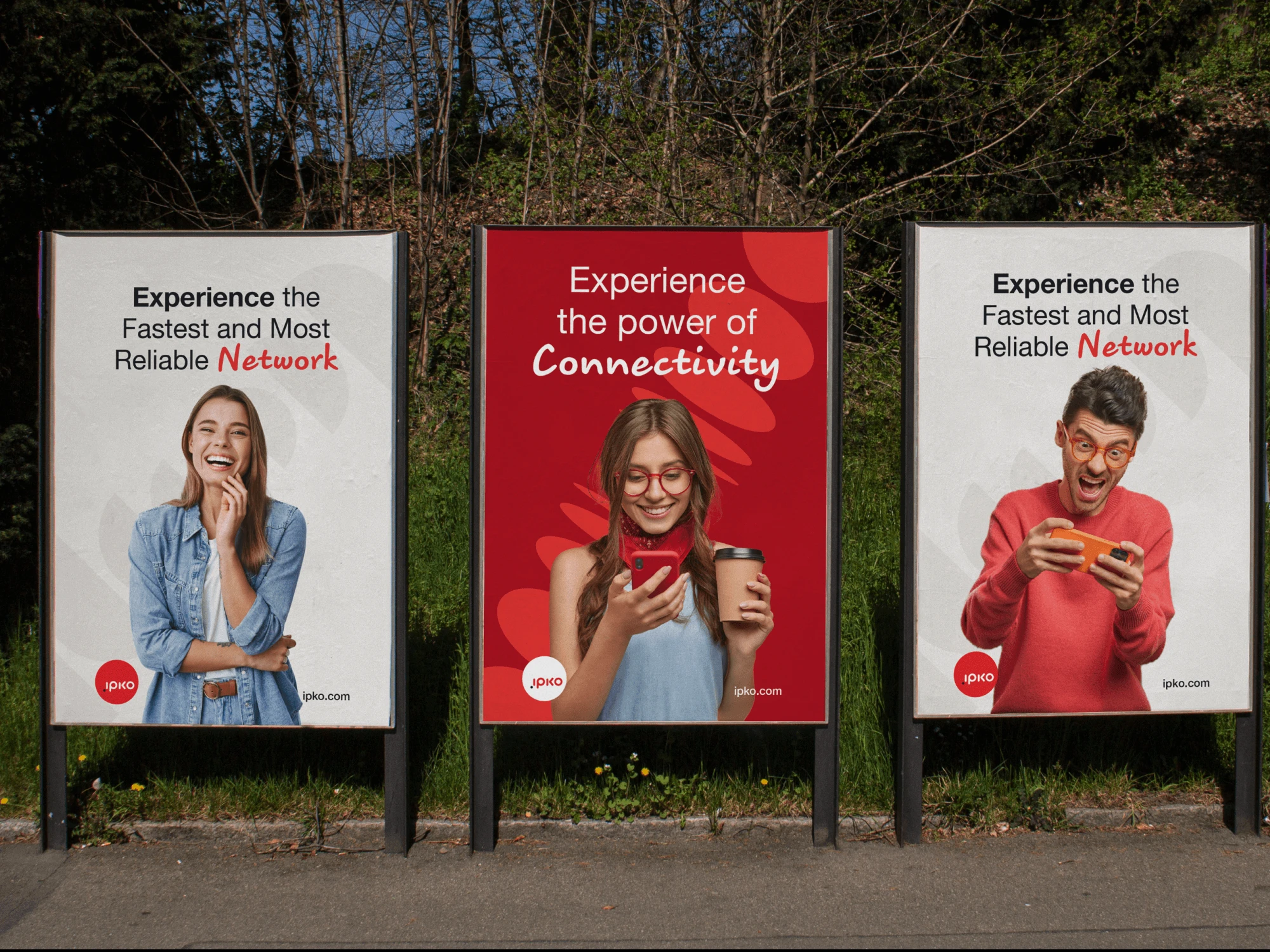
IPKO has long been a household name in Kosovo’s telecom market, known for its connectivity and innovative services. However, the brand’s identity needed to reflect the evolving expectations of a younger, tech-savvy audience. The new visual system had to be clean, engaging, and scalable, ensuring consistency from billboards to mobile screens while emphasizing IPKO’s brand promise: experience the power of connectivity.
The Challenge
The challenge was to refresh an established brand without losing its recognizability and trust, while also building a dynamic identity that works seamlessly across traditional advertising, digital platforms, and customer touchpoints in a highly competitive telecommunications landscape.
The Solution
The solution was a bold, flexible identity system centered on IPKO’s signature red, balanced with clean typography, modern layouts, and human-focused imagery. The design emphasizes clarity and emotional connection, highlighting people’s everyday interactions with technology. Messaging such as “Experience the power of Connectivity” reinforces IPKO’s role in keeping people connected, while the refreshed design language creates an energetic, approachable, and future-ready brand.
The Result
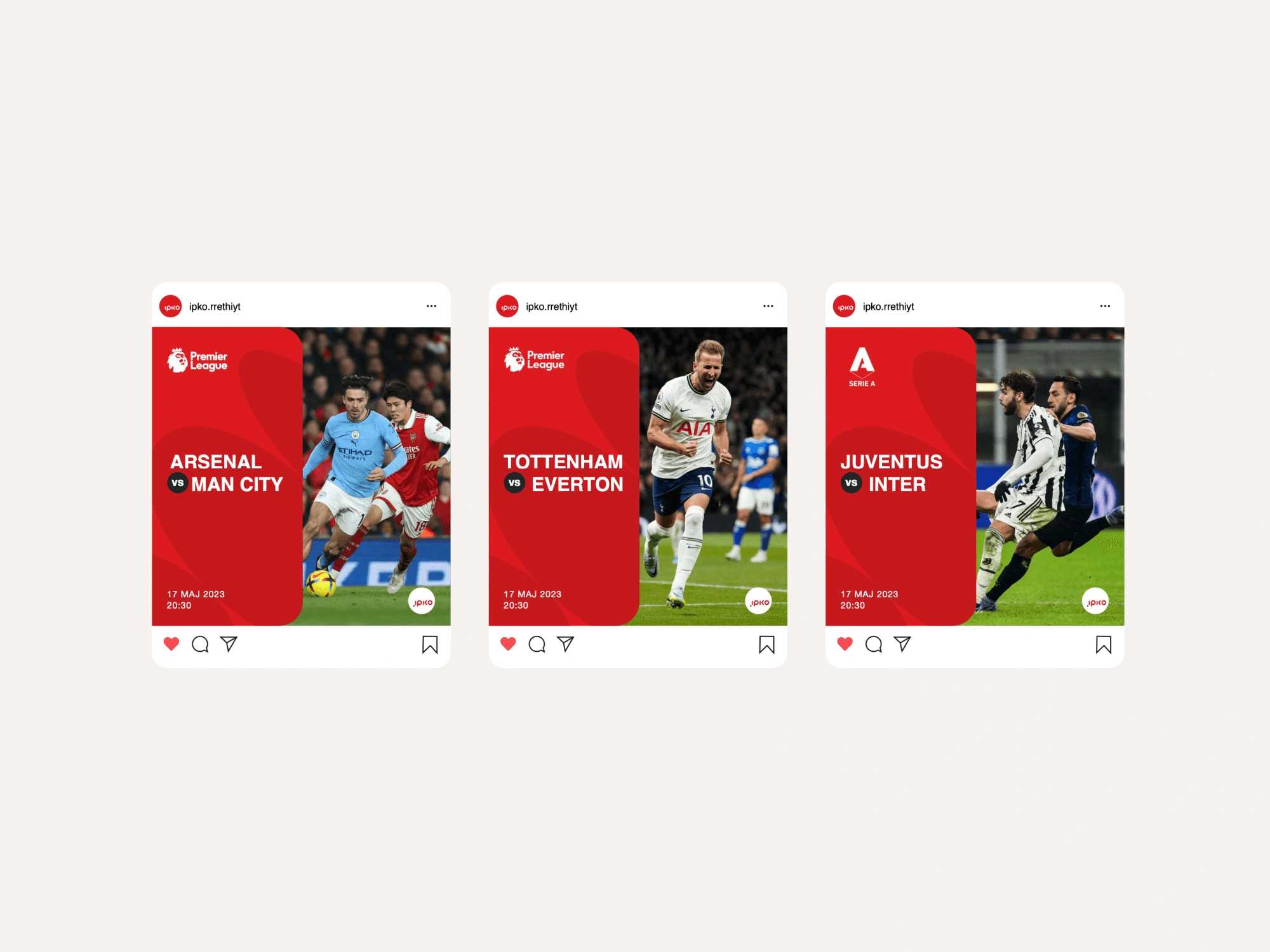
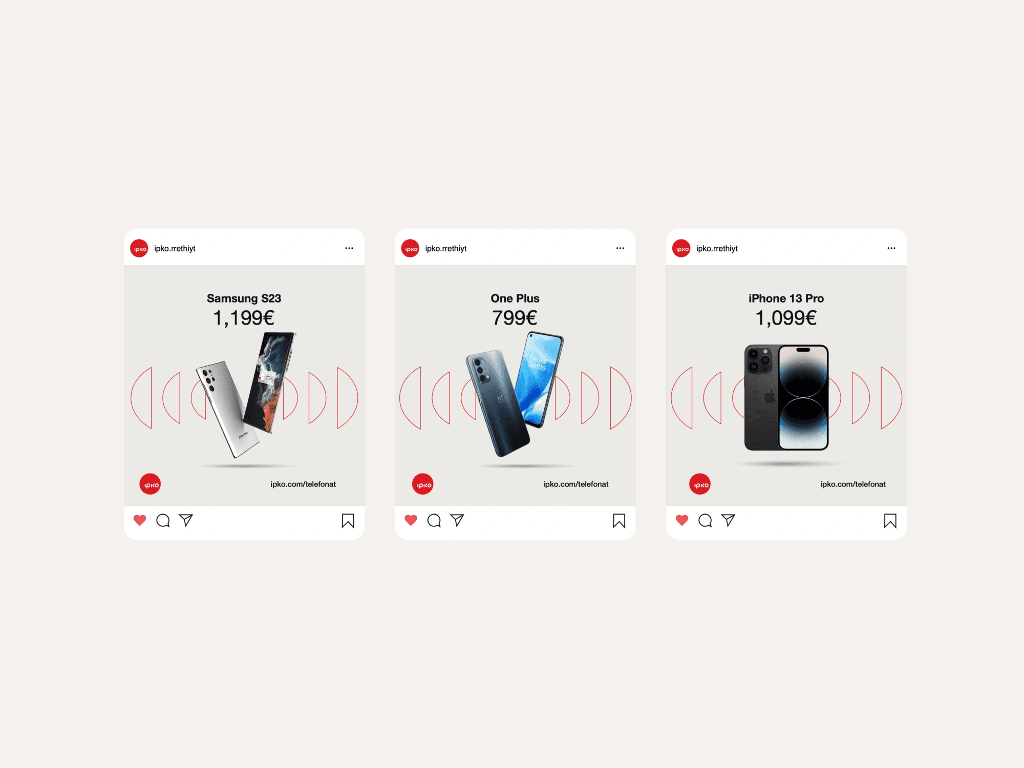
The refreshed identity gives IPKO a renewed sense of authority and approachability. It works across social media, outdoor campaigns, and product communications with equal impact. The new system enhances IPKO’s visibility, reinforces its promise of reliability and speed, and ensures the brand remains relevant and engaging for current and future generations of users.

Like this project
Posted May 20, 2026
IPKO brand refresh for a modern, digital-first identity.