SwissDev Brand Identity
Arianit Bulliqi

SwissDev
Overview
SwissDev, a construction company, required a distinctive brand identity that reflects its precision, innovation, and Swiss heritage. The goal was to create a modern, structured, and professional visual system that aligns with the company’s reputation for high-quality construction and engineering solutions.
The main challenge was to develop a unique and recognizable identity that would set SwissDev apart in the highly competitive construction industry. The branding needed to communicate reliability, sophistication, and a strong technical foundation while maintaining a sleek, modern aesthetic.

The Challenge
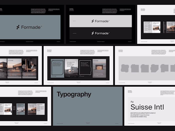
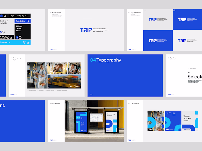
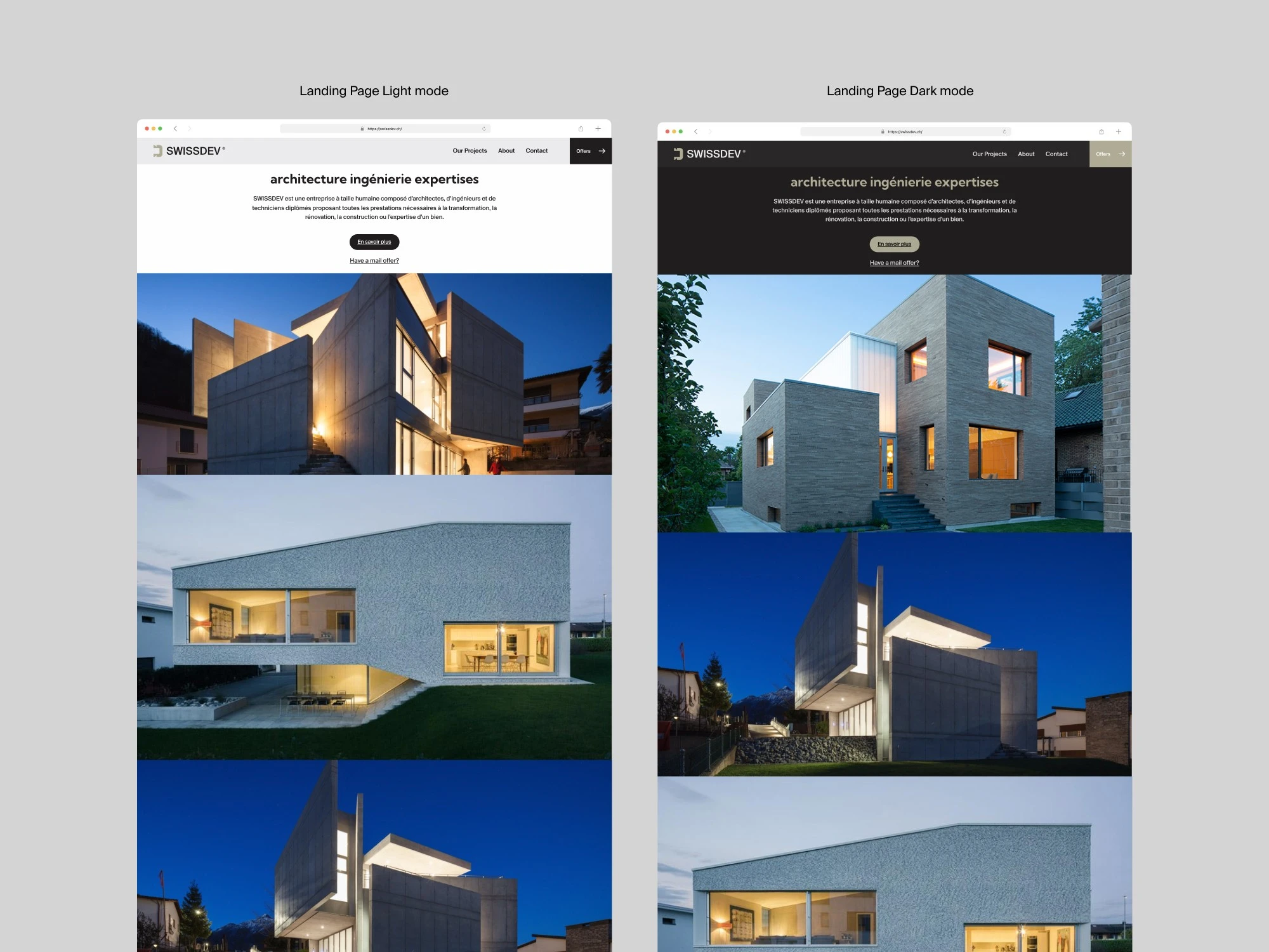
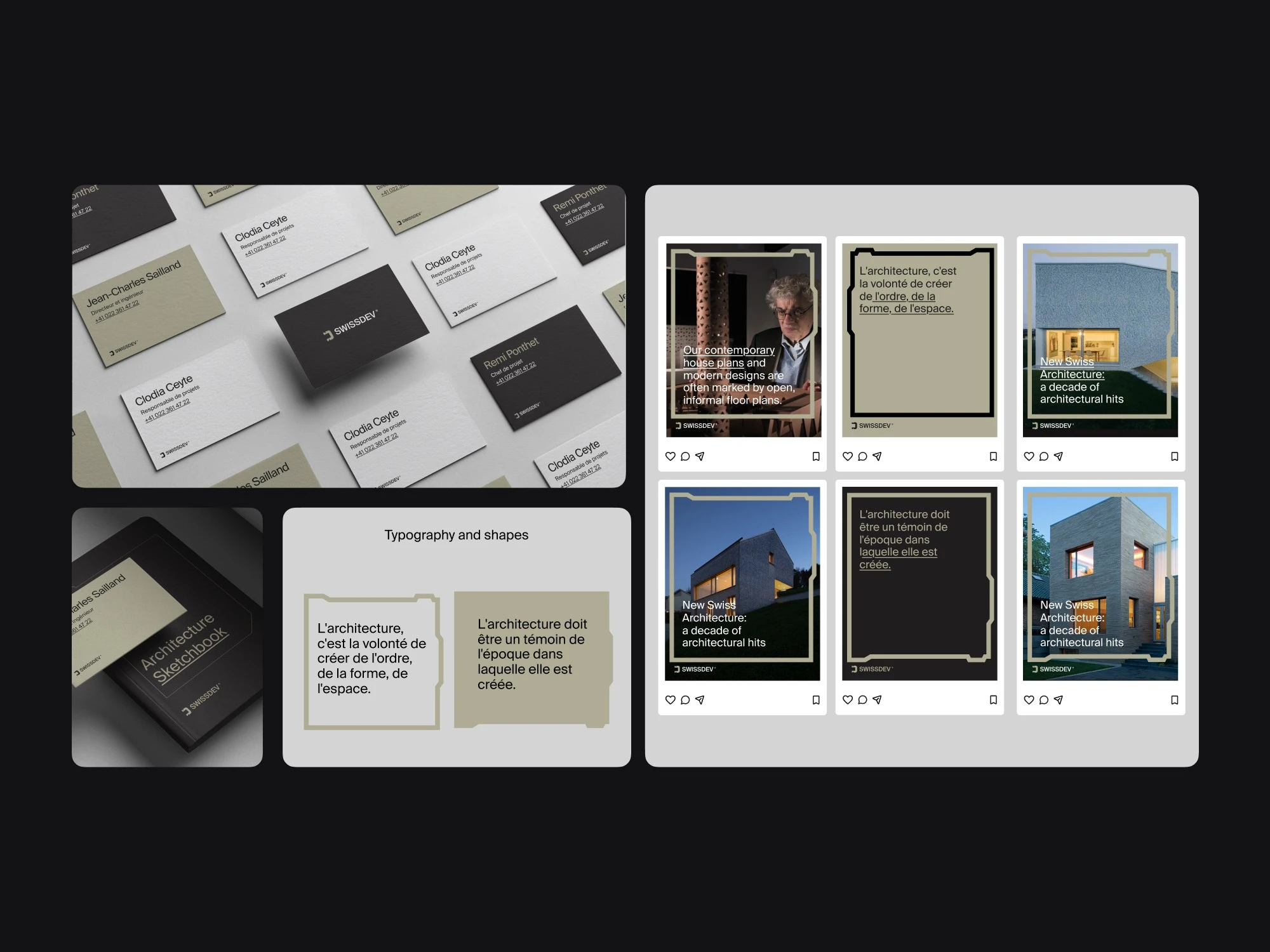
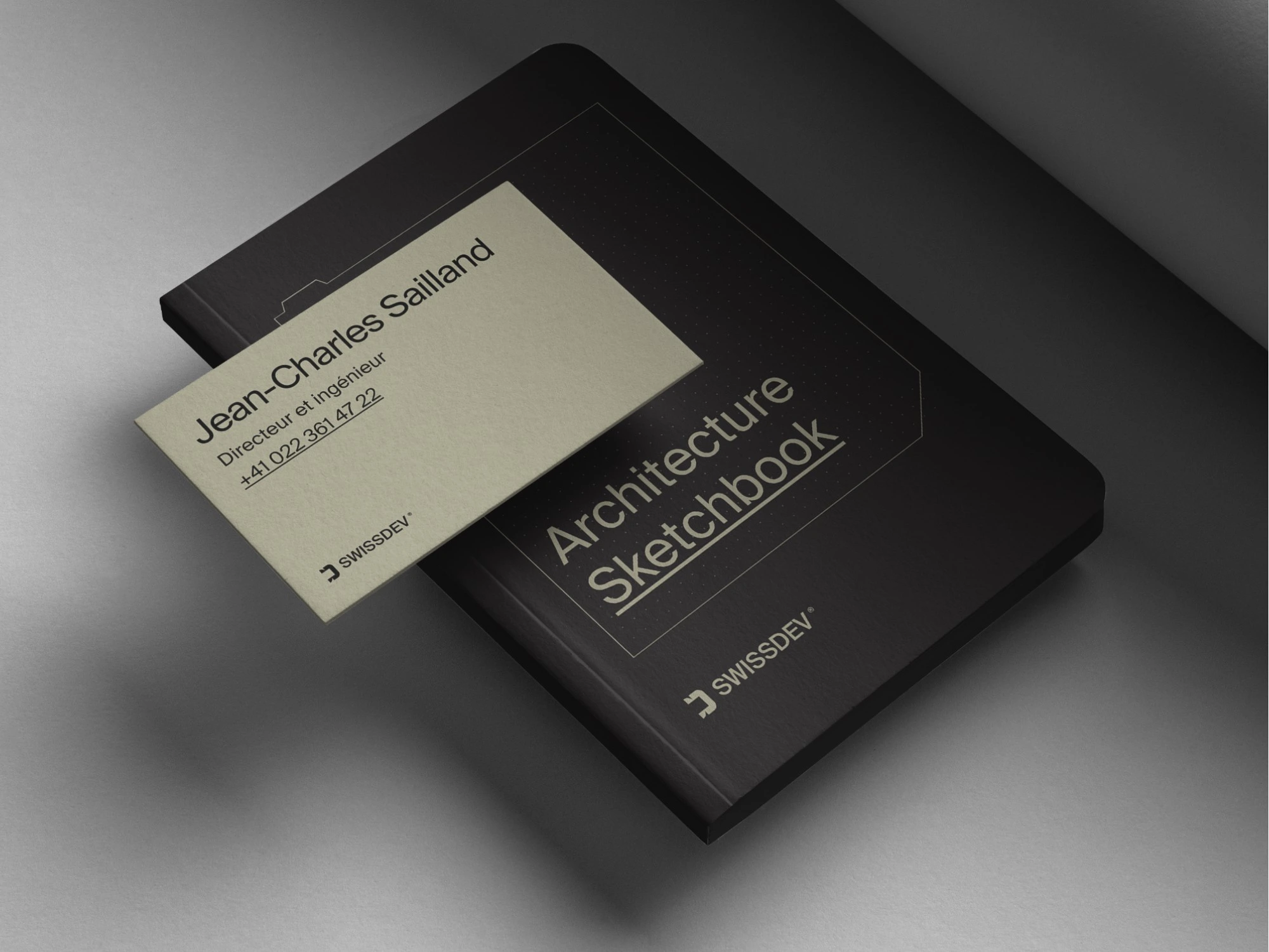
By using a geometric grid, the logo was crafted to symbolize structure and balance, essential qualities in construction. The brand shapes were designed to echo architectural blueprints, reinforcing the company’s core expertise. The color scheme, a blend of neutral and earthy tones, evokes trust, stability, and professionalism. The identity extends seamlessly to business cards, web presence, and marketing materials, ensuring a cohesive and memorable brand experience.
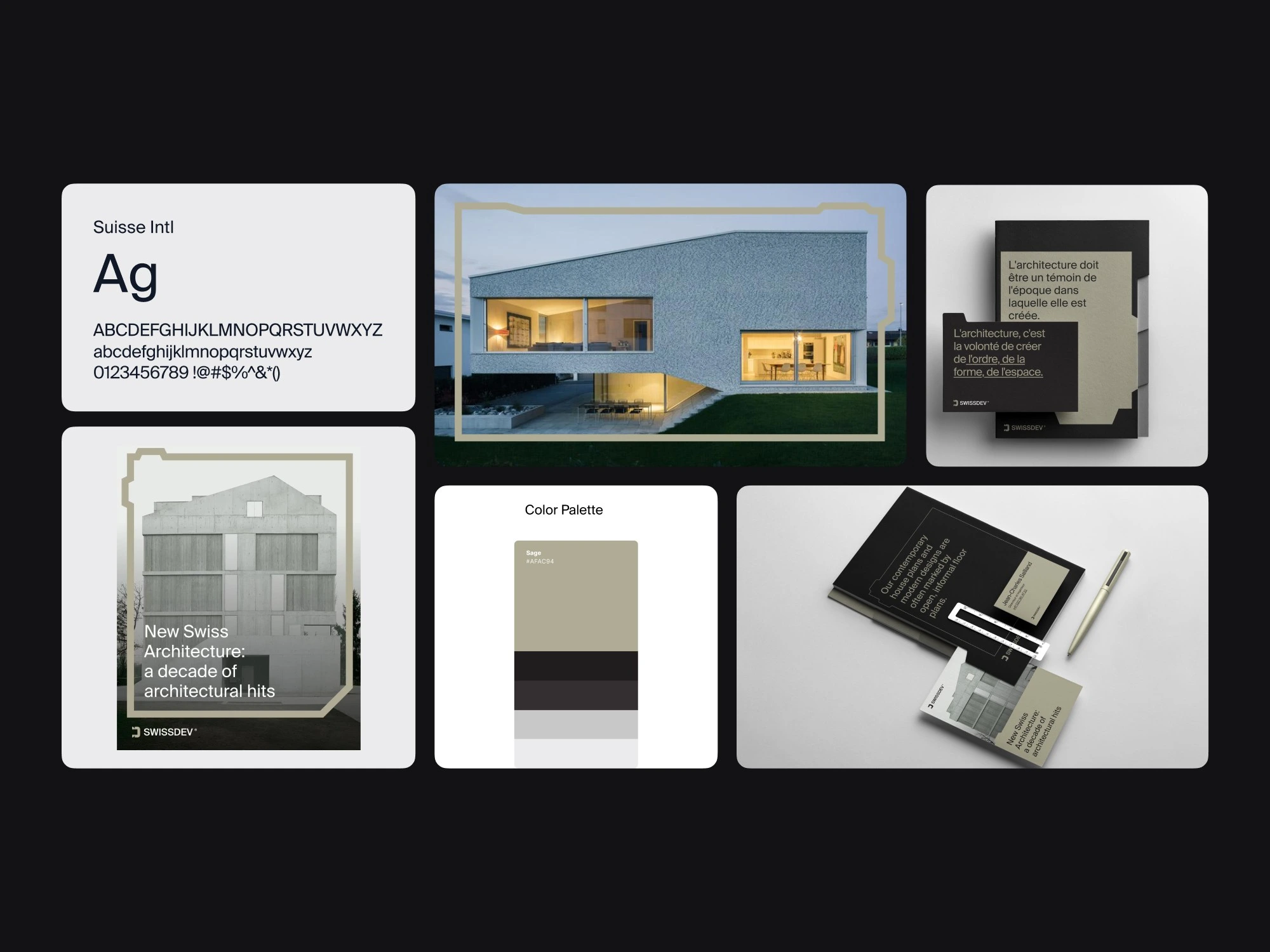
The Solution
By using a geometric grid, the logo was crafted to symbolize structure and balance, essential qualities in construction. The brand shapes were designed to echo architectural blueprints, reinforcing the company’s core expertise. The color scheme, a blend of neutral and earthy tones, evokes trust, stability, and professionalism. The identity extends seamlessly to business cards, web presence, and marketing materials, ensuring a cohesive and memorable brand experience.
The Result
The final brand identity successfully positions SwissDev as a forward-thinking and dependable construction company. The design language effectively communicates the company’s core values while maintaining a premium and timeless appeal. The cohesive visual system strengthens brand recognition and ensures SwissDev stands out in the industry.
Like this project
Posted May 20, 2026
Developed a modern brand identity for SwissDev reflecting precision and Swiss heritage in construction.