BREADCLUB The Type Does the Baking

Andi Gola


Breadclub: The Type Does the Baking
Breadclub is a bakery and eatery in Prishtina. The brief gave us one instruction: design a wordmark. No icon, no symbol, no mark to fall back on when the type needed help. Most bakery brands hide behind a croissant or a wheat sheaf. Breadclub couldn't. The name had to do everything.
We started with the rolling pin, the tool every baker touches before anyone touches the bread. Not its shape. Its motion: press, stretch, spring back. We built the identity on that motion instead of a picture of the tool.
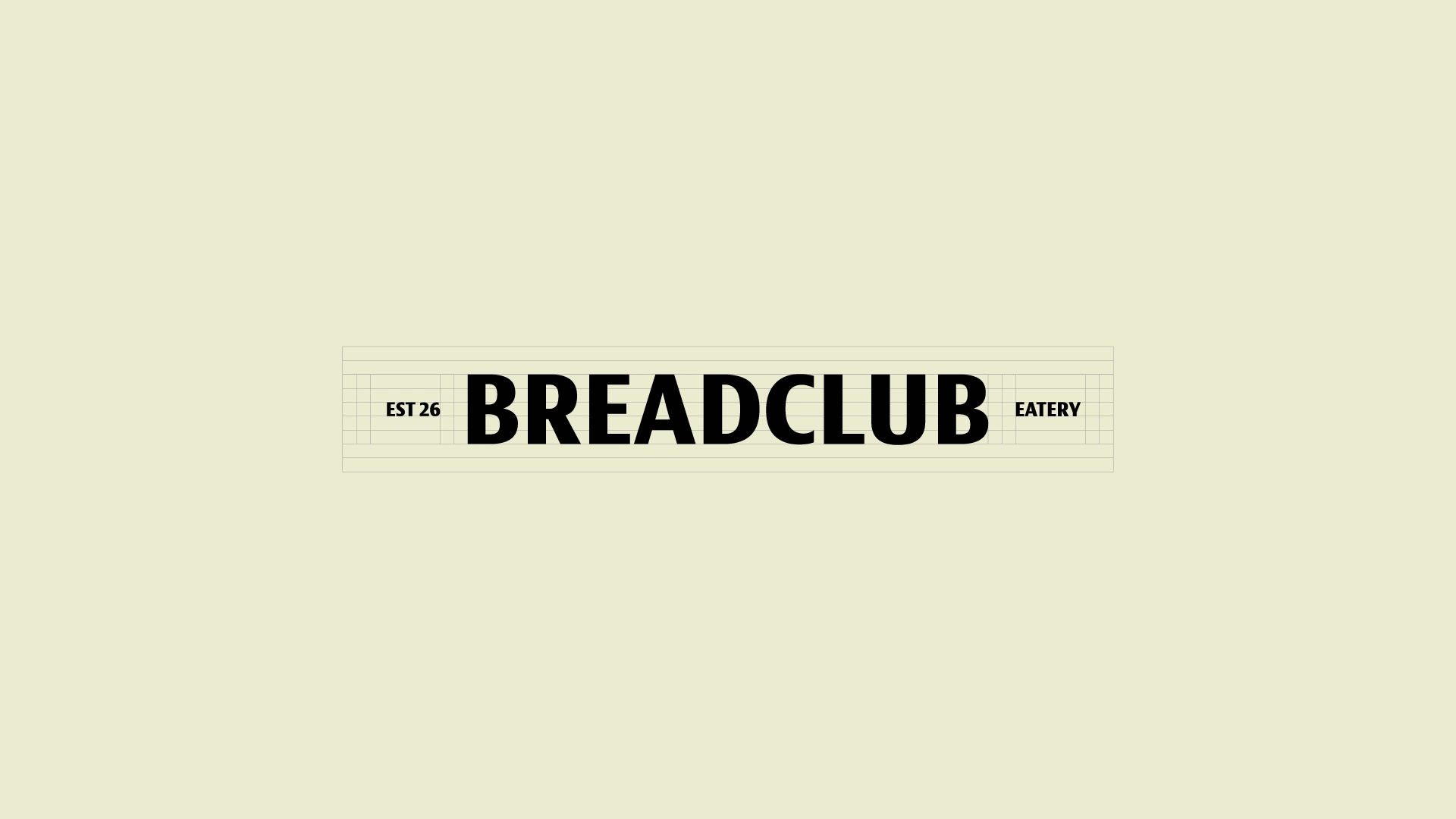
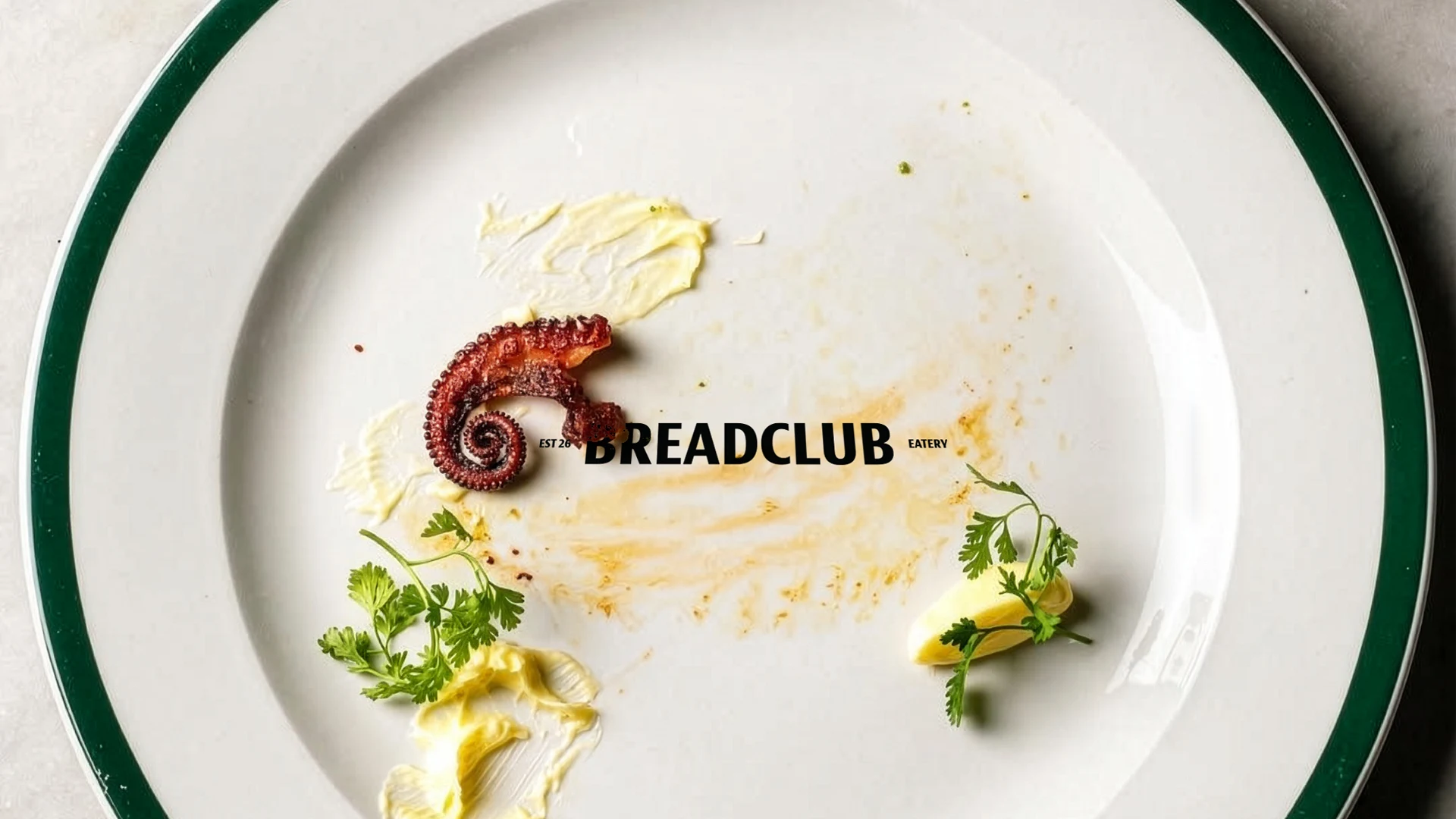
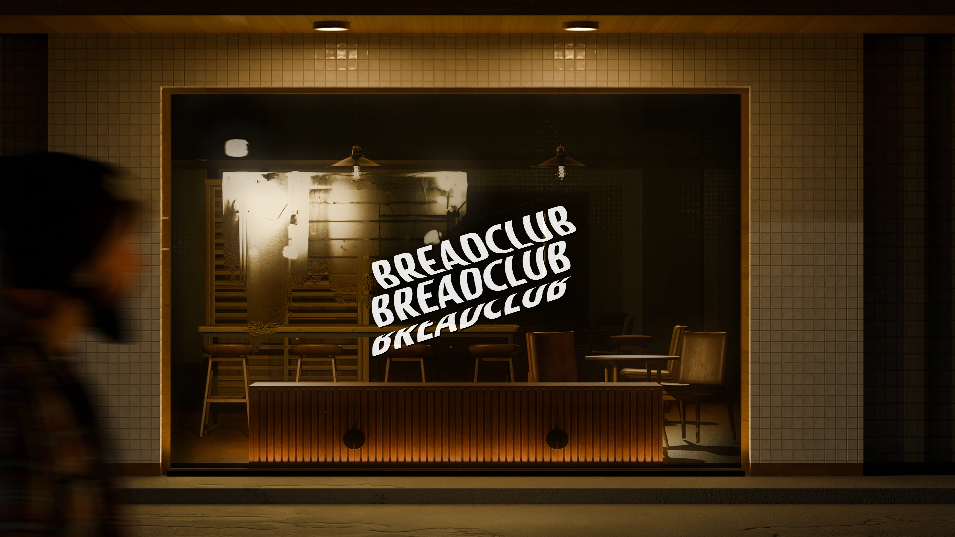
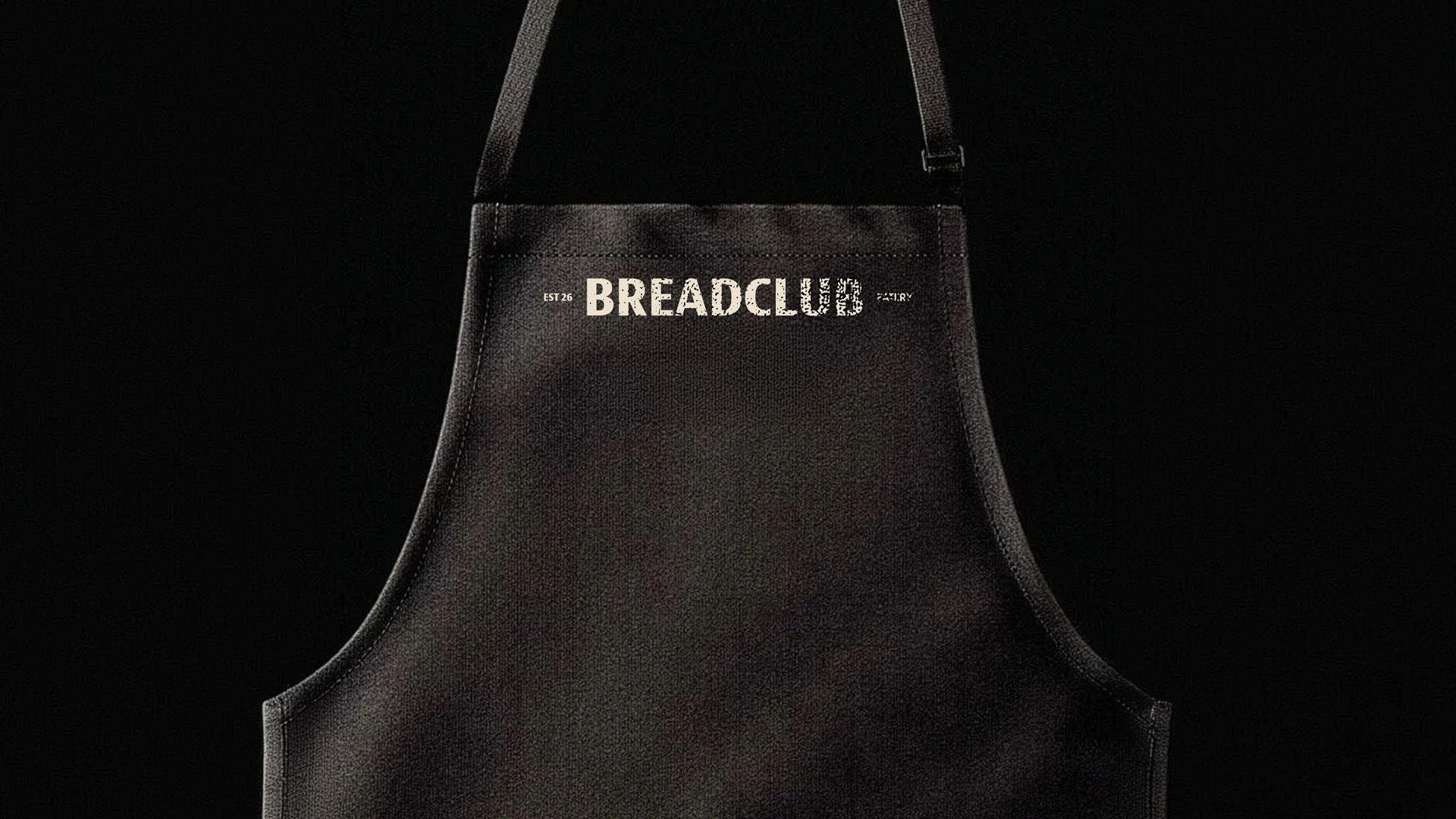
Breadclub is set in a bold, condensed slab. Two small-caps tags sit either side of it, EST 26 and EATERY. At rest, it reads as a plain wordmark. Moving, it rolls: the letters stretch and compress across the baseline the way dough gives under a pin, then spring back into shape.
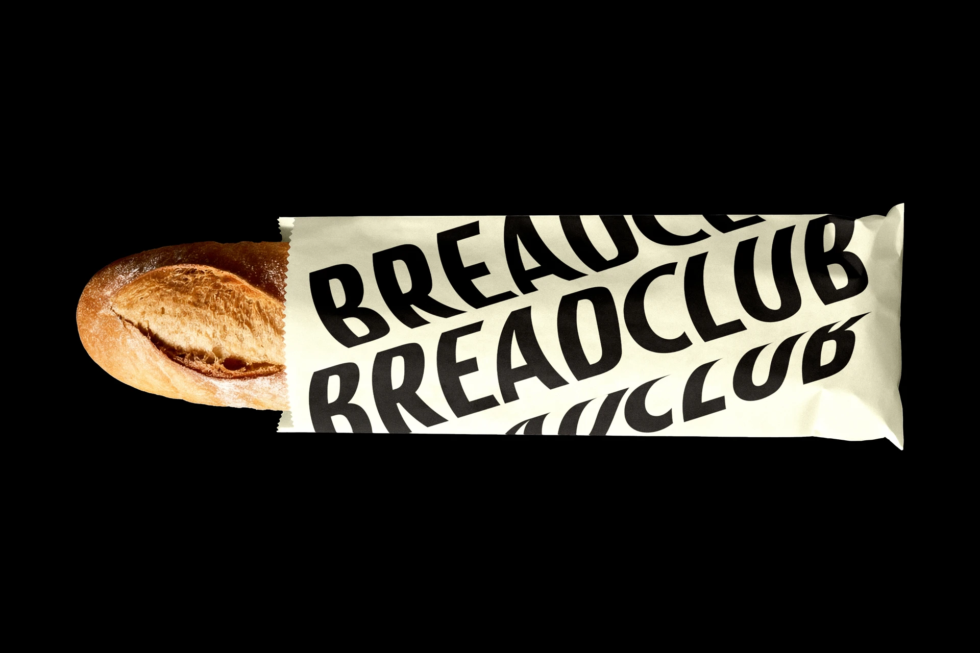
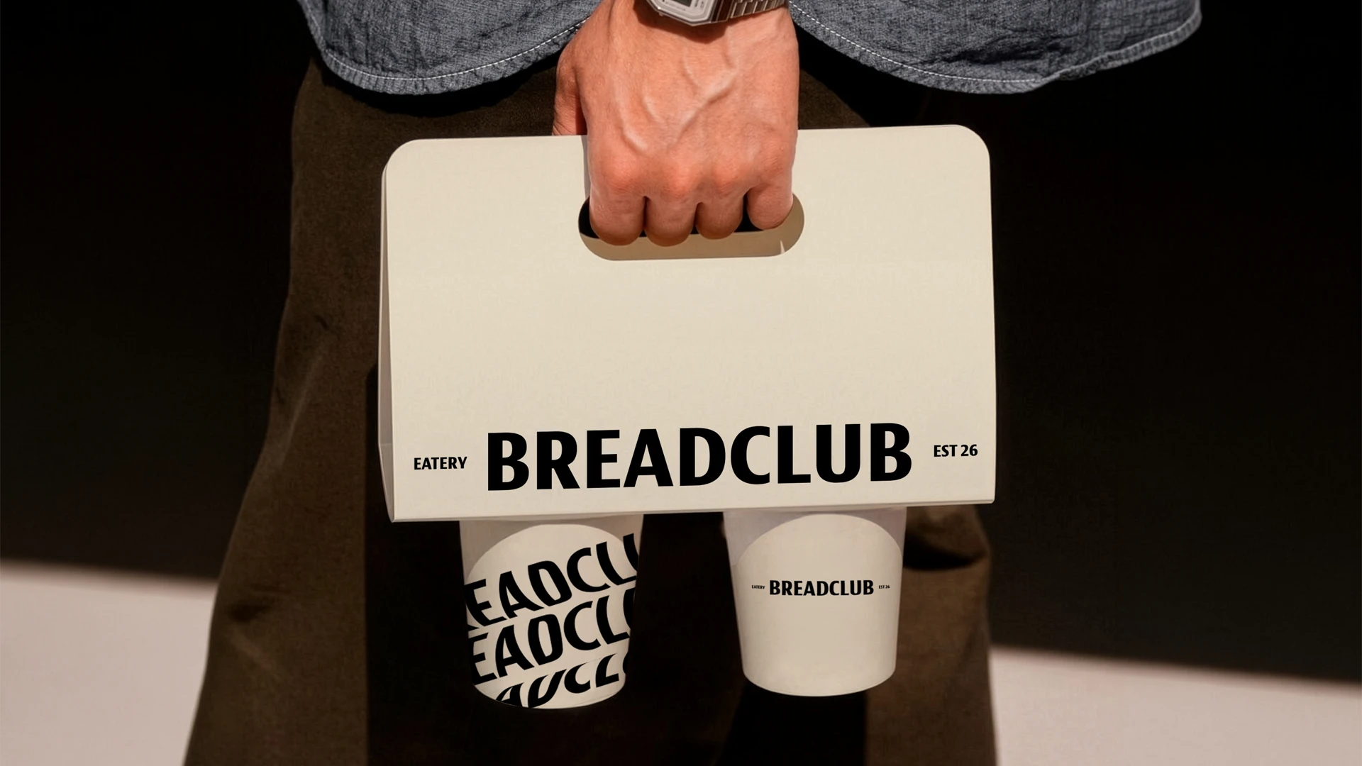
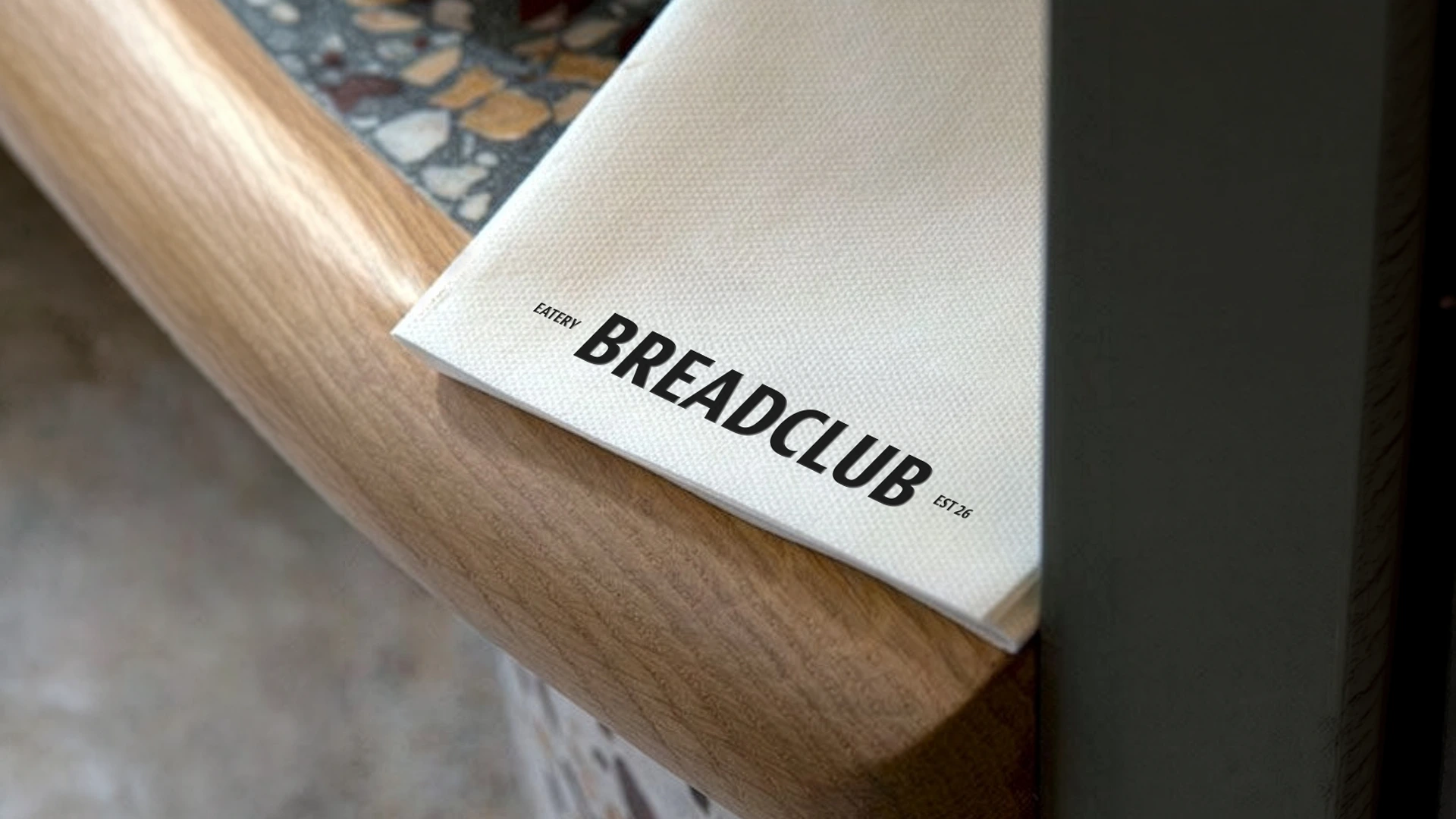
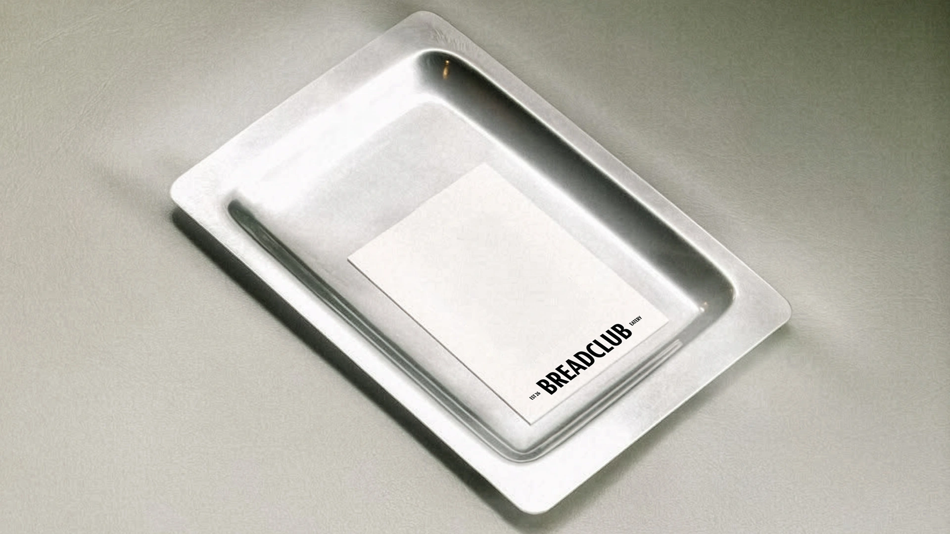
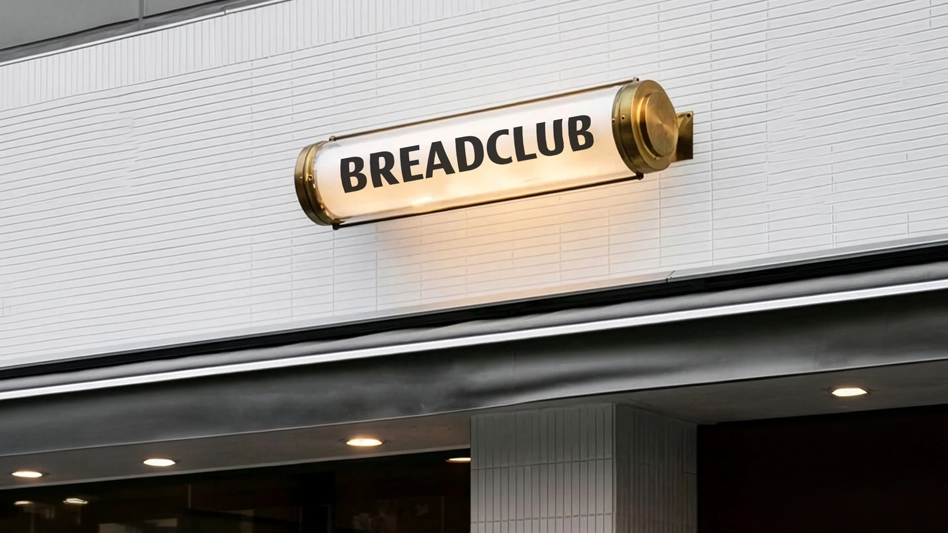
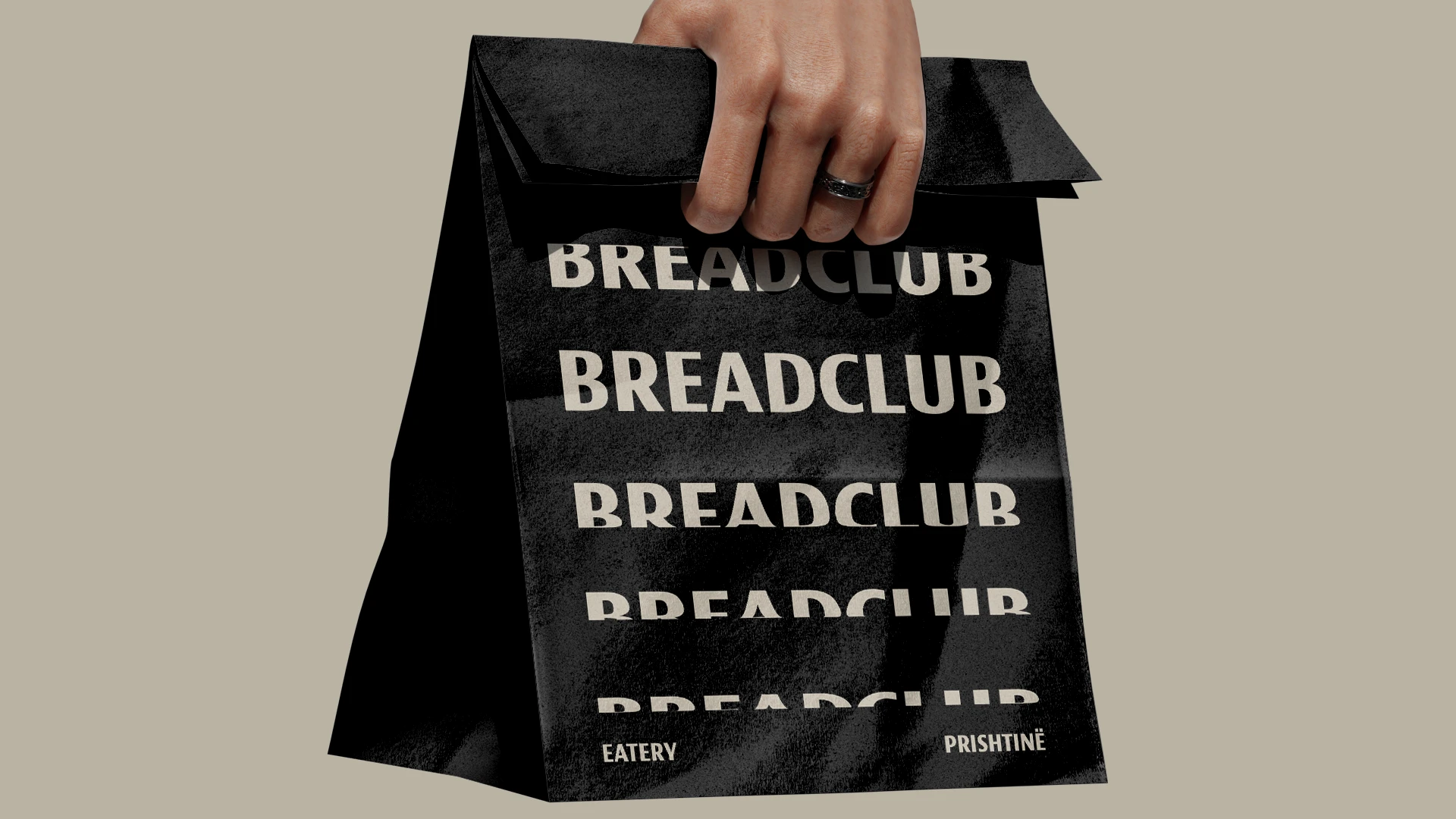
That one motion carries the whole system. The wordmark stretches down the side of a paper bag, catches mid-roll on the lit sign above the door, and repeats and flattens across cups and takeout boxes. Menus, aprons, and plates keep the letters at rest.
Like this project
Posted Sep 10, 2026
A dynamic motion driven brand identity for one of the finest bread eatery in Prishtina.