Analytics Specialist and Data Visualizer
- $1k+
- Earned
- 3x
- Hired
- 5.0
- Rating
- 36
- Followers
Analytics Specialist and Data Visualizer

Helping B2B businesses unlock growth with AI & Automations
- $5k+
- Earned
- 5x
- Hired
- 5.0
- Rating
- 15
- Followers
Helping B2B businesses unlock growth with AI & Automations

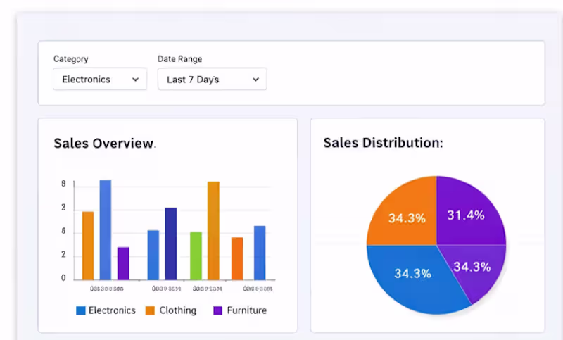
Excel & KPI Dashboards for Small Business Decisions
- 96
- Followers
Excel & KPI Dashboards for Small Business Decisions
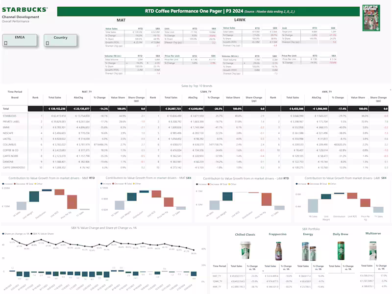
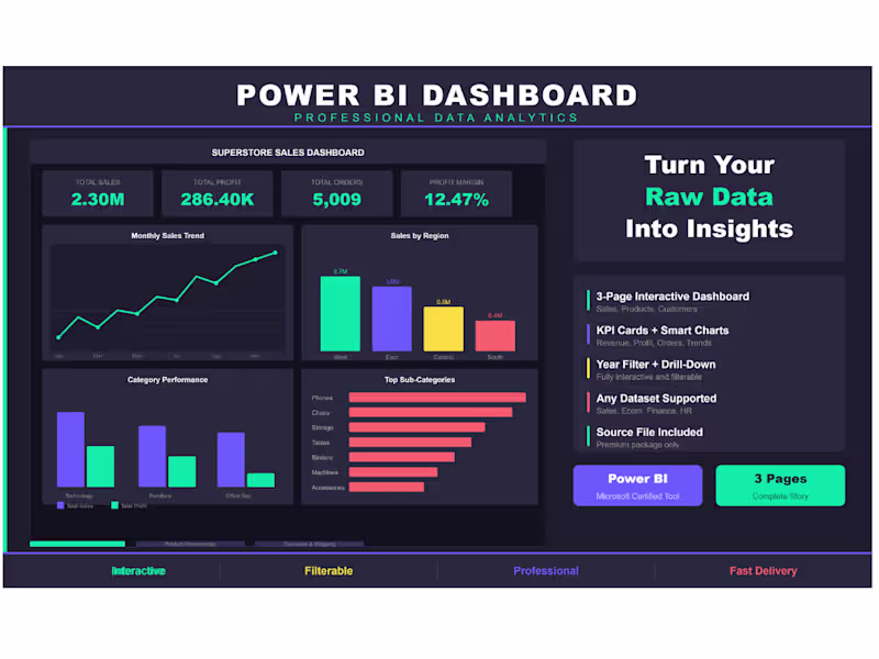
Power BI Consultant & Analyst


Product Analytics Expert | Mixpanel Certified
- $1k+
- Earned
- 3x
- Hired
- 5.0
- Rating
- 3
- Followers
Product Analytics Expert | Mixpanel Certified


![Cover image for [Case Studies] How I helped startups with product growth](https://media.contra.com/image/upload/q_auto,w_800/uxiibfbxkk1up1hgpv6k.avif)
View more →
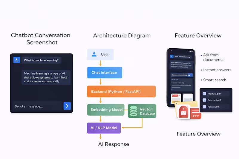
AI Automation & Chatbot Developer | Flutter Developer
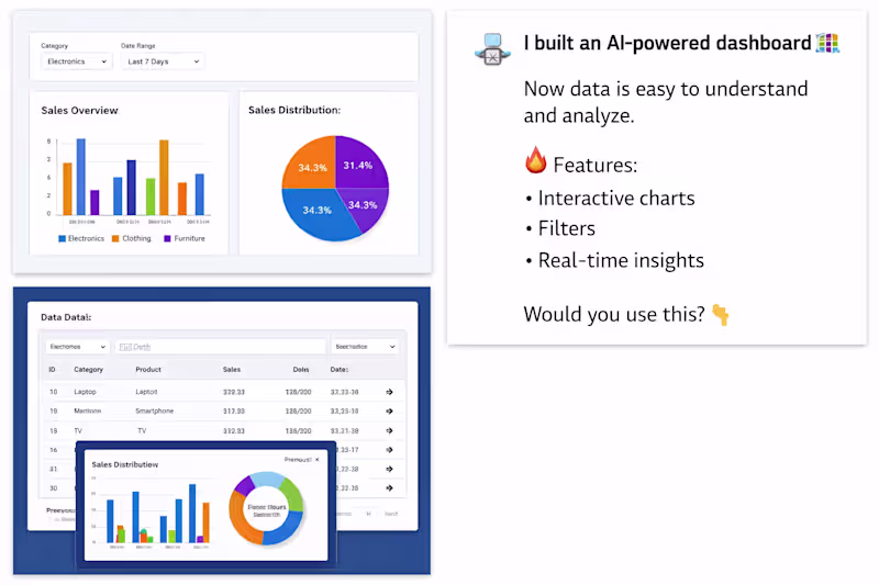
I build AI-powered data apps and dashboards
Data Science and Visualization Expert