The network for creativity
Join 1.25M professional creatives like you
Connect with clients, get discovered, and run your business 100% commission-free
Creatives on Contra have earned over $150M and we are just getting started
Back to feedPost

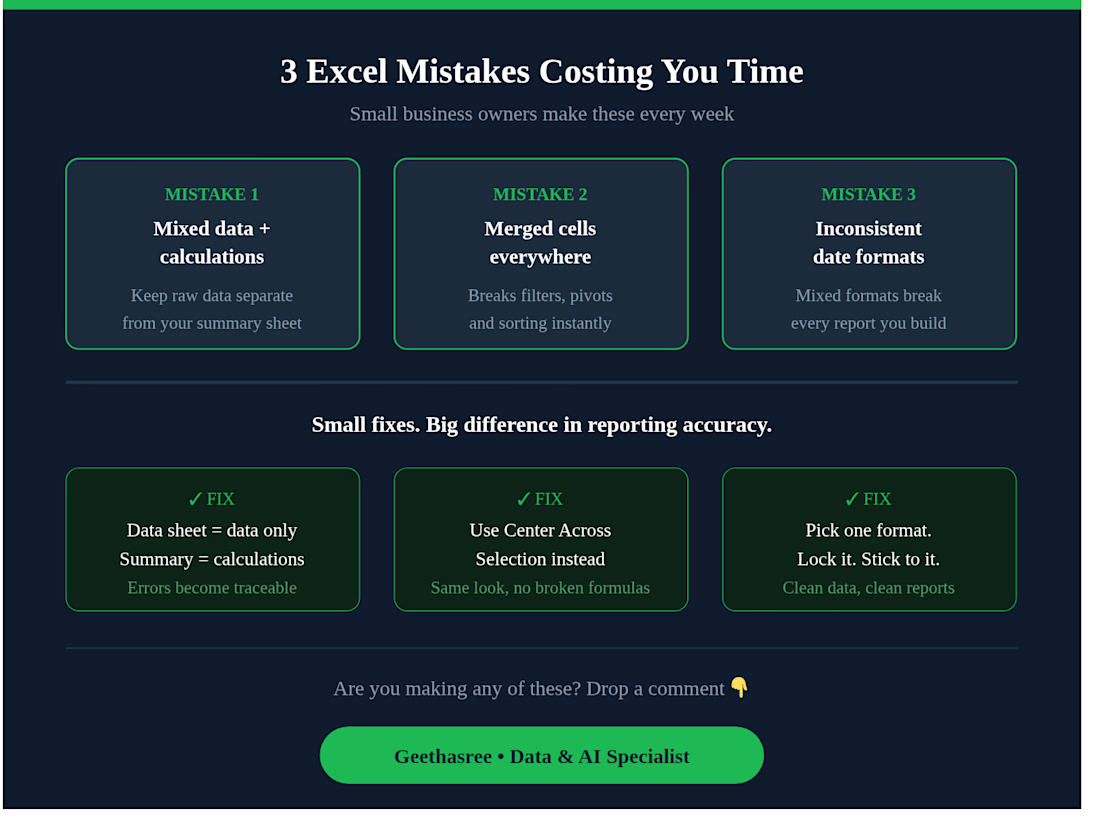
3 Excel mistakes I see small business owners make every week 👇
Mixing raw data with calculations in the same sheet — your data sheet should only have data. Calculations go in a separate summary sheet.
Using merged cells everywhere — they break filters, pivot tables, and sorting. Use "Center Across Selection" instead.
No consistent date format — mixed formats break every report you build. Pick one and lock it. Small fixes. Big difference in your reporting accuracy.
Are you making any of these? Drop a comment 👇


The network for creativity
Join 1.25M professional creatives like you
Connect with clients, get discovered, and run your business 100% commission-free
Creatives on Contra have earned over $150M and we are just getting started

Challenges
View all


Related posts

Animated Fintech UI for pie showing portfolio performance, Investment income, Investment advisory, and smart advisory features through interactive financial visualization
A motion exploration for Pie, bringing key wealth-management features to life through animated UI components.
The concept explores how portfolio performance, investment income, investment advisory, and smart advisory can be presented in a clear and engaging way while keeping the overall experience simple and premium.
A look at how motion can make financial products feel more intuitive, modern, and easier to understand.


The motion-led charts make a dense wealth-management story feel approachable; the distinct panels give each metric room to breathe while still reading as one system.

Keystone - HR Management Platform
Employee list screens are the homework assignment of SaaS design. A table is a table is a table. Nobody's winning an award for this view and that's exactly why it matters.
The restraint here is the point. No colored tags, no status badges fighting for attention, no dashboard widgets crammed into the sidebar. Just the data, breathing in a dark container with enough row spacing that your eyes don't blur at record five.
That split between a bold brand identity and a restrained product UI is one of the hardest things to get right in B2B SaaS.
#SaaS #DashboardDesign #DarkUI #B2BTech #ProductDesign
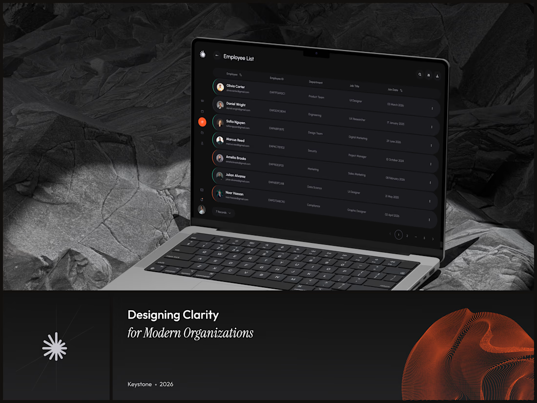

"A table is a table" is the harder argument to make internally than the design itself - most teams would've shipped colored status tags just to have something to show in a review.

AI Governance Dashboard | Control AI Usage. Ensure Compliance.
AI is becoming part of every organization, but managing how teams use AI tools is becoming a serious challenge.
I designed this AI Governance Dashboard to bring policy management, compliance monitoring, AI application usage, user activity, and governance analytics into one centralized platform.
The goal was to keep a complex enterprise product simple, clear, and actionable through:
• AI Policy Management
• Compliance Monitoring
• AI App Usage Analytics
• User & Access Management
• Governance Status
• Policy Activity
• Compliance Reporting
The interface uses a clean SaaS design system with clear hierarchy, data visualization, subtle gradients, and focused interactions.
Designed in Figma.
If you're building an AI SaaS, enterprise dashboard, or web application, feel free to connect or message me.
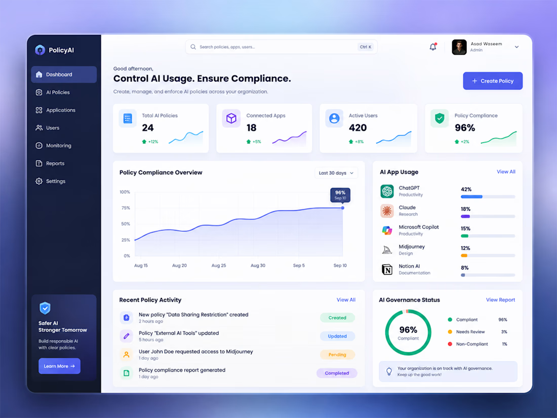
The hierarchy is doing the hard work here—policy health, app usage, and governance status read as one calm operational story instead of a wall of enterprise data. The focused sidebar and restrained gradients keep the dashboard actionable without making compliance feel heavy.