
pro
Geethasree Naguboina
Excel & KPI Dashboards for Small Business Decisions
Ready for work
Geethasree is ready for their next project!

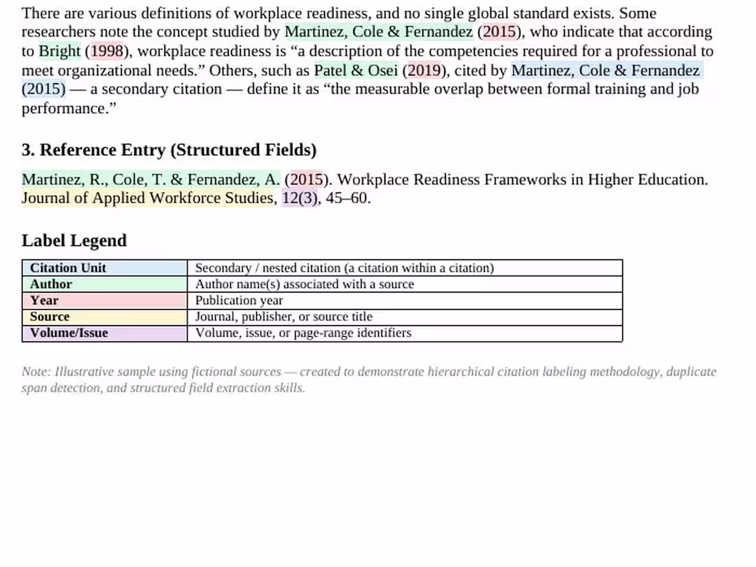
Text Annotation for AI Training Data
1
2

Most small business owners I talk to have the same problem — their data is scattered across WhatsApp messages, paper notes, and half-filled Excel sheets.
They know something is wrong. They just don't know where to start.
Here's what I do in the first 30 minutes of any project:
✅ Understand what data you have and where it lives
✅ Identify what's missing, duplicate, or inconsistent
✅ Suggest the simplest structure that works for your business
No complicated tools. No jargon. Just clean, organised data you can actually use.
If your business data feels messy and overwhelming — let's fix that together.
Message me and we'll start with a free 15-minute consultation. 📊
2
87
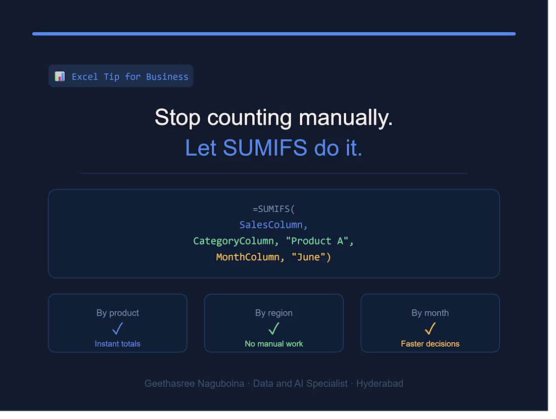
Spending hours manually totalling your sales data?
SUMIFS does it in seconds.
=SUMIFS(SalesColumn, CategoryColumn, "Category A", MonthColumn, "June")
Instant totals by product, region, or month — no manual counting needed.
Clean data = faster decisions = business growth. 📊
2
143
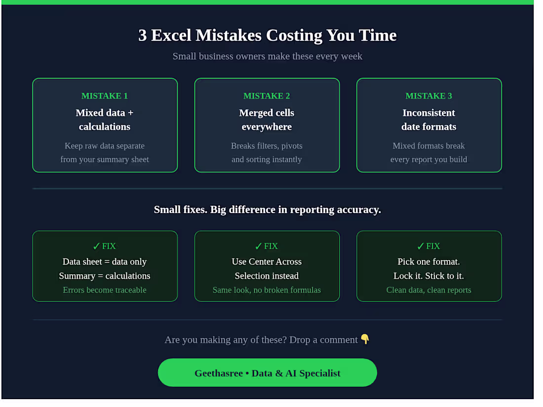
3 Excel mistakes I see small business owners make every week 👇
Mixing raw data with calculations in the same sheet — your data sheet should only have data. Calculations go in a separate summary sheet.
Using merged cells everywhere — they break filters, pivot tables, and sorting. Use "Center Across Selection" instead.
No consistent date format — mixed formats break every report you build. Pick one and lock it. Small fixes. Big difference in your reporting accuracy.
Are you making any of these? Drop a comment 👇
2
217
I used to spend hours cleaning messy Excel files manually.
Now? I use AI tools to cut that time in half — and deliver better results to my clients.
Here's how AI has changed my freelance data workflow:
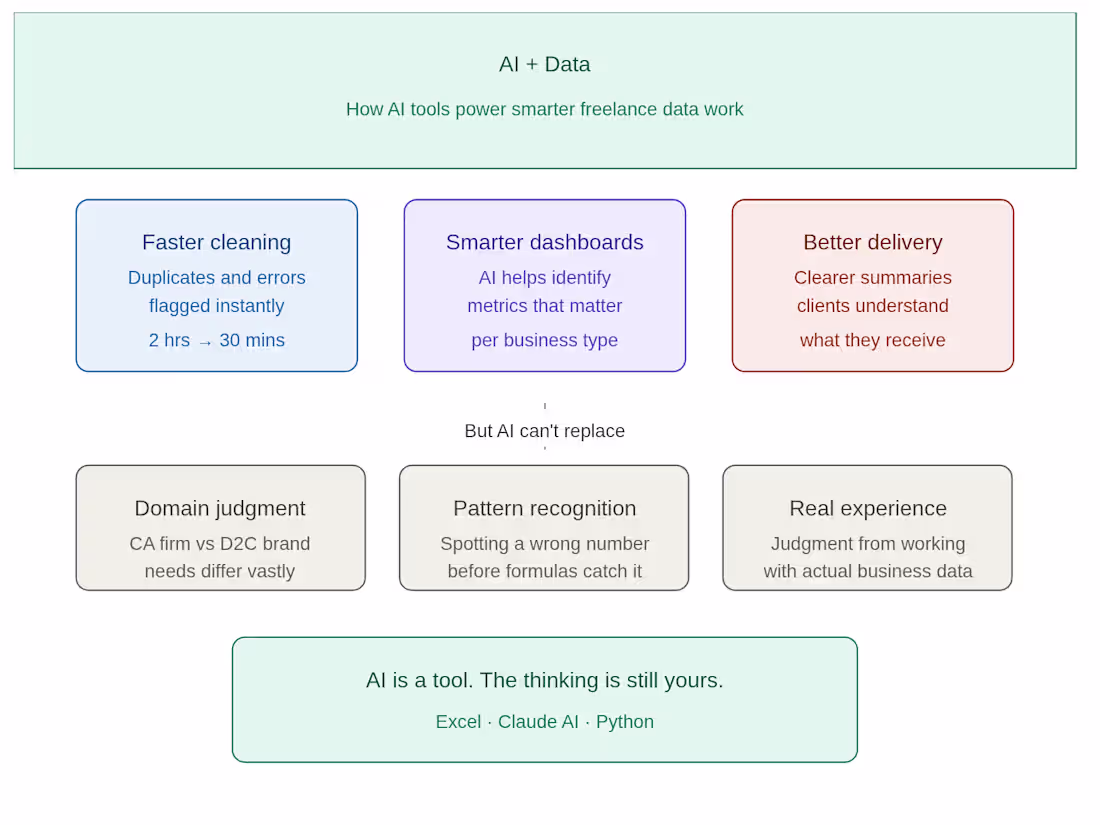
🔹 Faster data cleaning
Instead of manually hunting for duplicates and formatting errors, I use AI to flag inconsistencies instantly. What used to take 2 hours now takes 30 minutes.
🔹 Smarter dashboard structure
Before building any dashboard, I use AI to help me think through what metrics actually matter for that specific business — not just what looks good.
🔹 Better client communication
I use AI to help me write clearer project summaries and delivery notes — so clients understand exactly what they're getting and why it matters.
But here's what AI can't replace:
✔ Understanding what a CA firm actually needs vs what a D2C brand needs
✔ Knowing when a number looks wrong before the formula catches it
✔ The judgment that comes from actually working with real business data
AI is a tool. The thinking is still yours.
If you're a small business owner or CA firm drowning in Excel data — I can help you turn it into something you can actually use.
DM me or check my portfolio 👇
geethasree-data-support-cr241o7.gamma.site (http://geethasree-data-support-cr241o7.gamma.site)
3
5
410
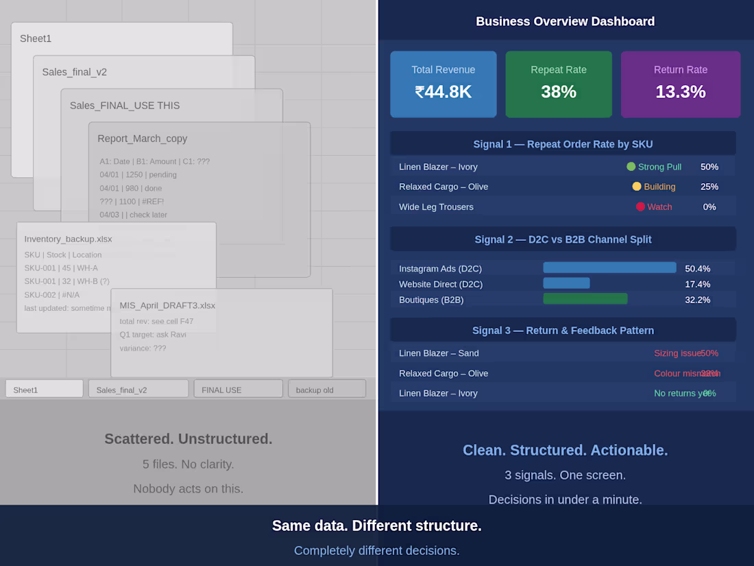
Title: Your data is not the problem. The structure is.
Most business owners I speak to are not short on data.
They have spreadsheets. Exports. Reports sent every month. Numbers sitting in three different files that nobody looks at after the first week.
The real problem is not missing data — it is data that cannot be read quickly enough to change a decision.
A 5,000 row export tells you nothing at a glance. But a single dashboard showing revenue by channel, top performing SKU, and pending payments — that changes how a founder spends the next hour.
I have seen this pattern across CA firms, D2C brands, and small businesses. The data exists. The structure does not.
Clean structure means:
One place for all numbers
Metrics linked to actual decisions
Flags that tell you when something needs attention — not just what the current state is
If your data lives in scattered sheets and nobody is acting on it, the issue is not the data. It is the system around it.
That is exactly what I fix.
2
5
269

A client asked me to translate a 160-page devotional book into Telugu and Hindi — and record voiceovers in all three languages — in 15 days.
720 chapters later, she gave me 5 stars and a tip.
Most Indian businesses publish content only in English — reaching a fraction of their actual audience.
95 million people speak Telugu natively. 600 million speak Hindi. A customer reading content in their mother tongue converts at a significantly higher rate.
Translation and voiceover in Telugu, Hindi and English is not a luxury. It is a growth channel most businesses leave unused.
If you create content for Indian audiences and it only exists in English — that is the gap I help close.
#Translation #Voiceover #Telugu #Hindi #MultilingualContent
1
5
268
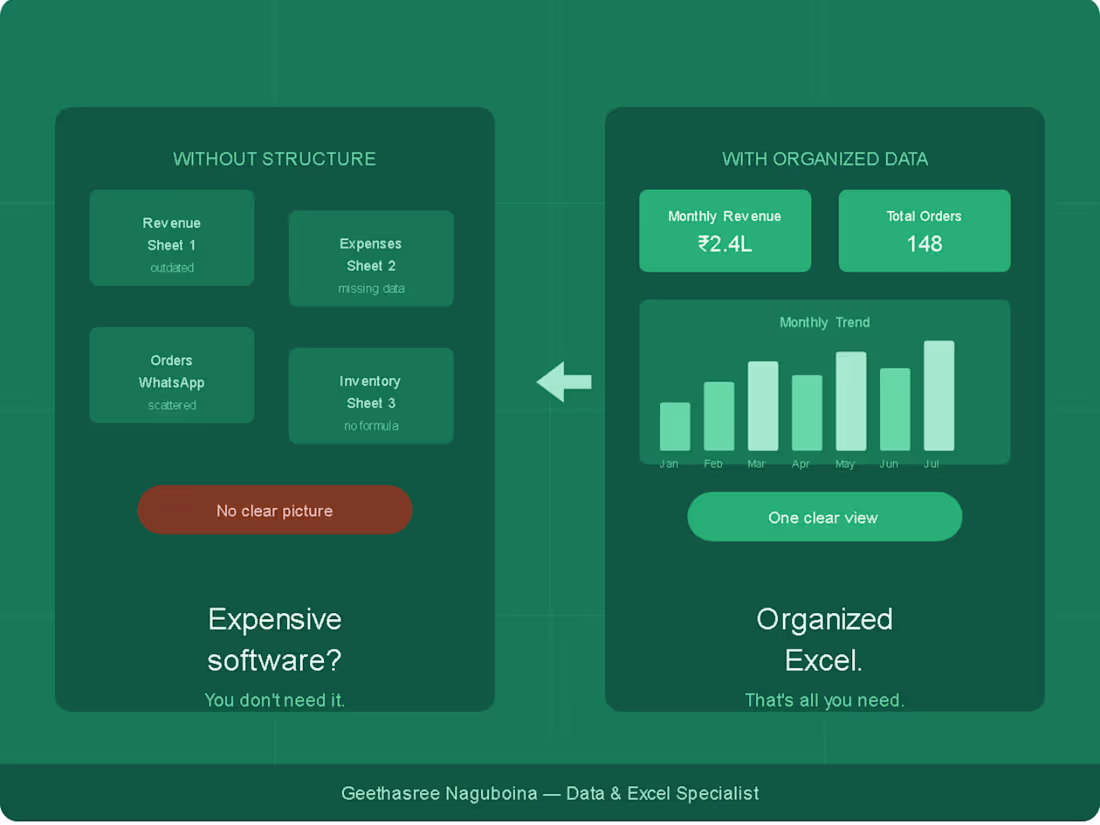
Most small business owners think they need expensive software to get their data under control.
An ERP. A CRM. A dashboard platform.
So they either spend lakhs on software they barely use — or they do nothing and keep drowning in scattered spreadsheets.
Here's what I've seen actually work for small businesses:
Not expensive software.
Just organized data.
A well-built Excel system can track your inventory, sales, expenses, and performance — all in one place. Clean. Automated. No monthly subscription.
When I talk to founders and business owners, the most common situation I hear is:
— Revenue tracked in one sheet
— Expenses in another
— Orders on WhatsApp
— And no single view of how the business is actually doing
The tool was never the problem.
The structure was.
If your data feels chaotic right now — you probably don't need new software.
You need someone to organize what you already have.
That's exactly what I do.
Happy to build you a free sample dashboard based on your business — just drop a comment or DM me.
2
6
169

Why Excel still beats expensive software for small businesses
Most small business owners I talk to feel like they should be using some fancy CRM or ERP system.
But here's the truth nobody tells you:
For businesses under 50 people, Excel done right beats expensive software almost every time.
Here's why 👇
1. You already have it
No subscription. No onboarding. No monthly fees. Excel is sitting right there.
2. It bends to your business
Software forces you into its structure. Excel fits around your workflow — your terms, your columns, your logic.
3. Your team already knows it
No training required. Everyone from the accountant to the sales person can open and read a well-built Excel file.
4. One clean file beats 3 scattered tools
I've seen businesses track leads in WhatsApp, revenue in a notebook and expenses in their head. One organized Excel dashboard brings it all together.
The problem was never Excel.
The problem was never having it set up properly.
What tool does your business currently use to track data?
3
7
216
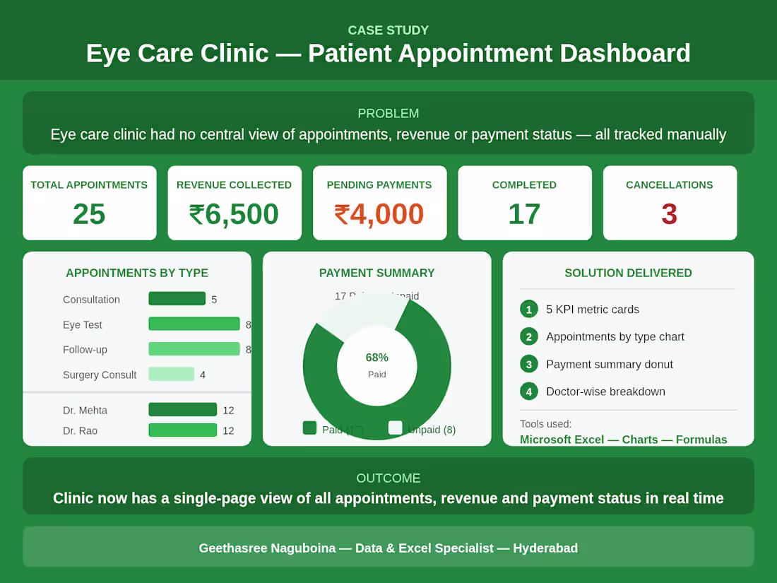
Patient Appointment Dashboard for Eye Care Clinic
1
4
The biggest pain point I see with business data:
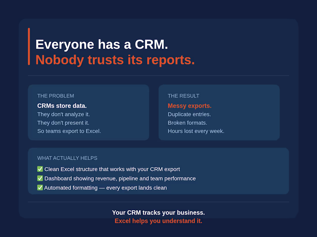
Everyone has a CRM. Almost no one trusts the reports it generates.
Here's why that happens —
CRMs are built to store data. Not to analyze it. Not to present it. Not to answer the specific questions your business actually needs answered.
So what do most business owners and managers do?
They export the data to Excel anyway.
But here's the real problem — the exported data is messy. Duplicate entries, inconsistent naming, blank fields, merged cells that break everything. The CRM gave you the data but not the clarity.
This is exactly where I see businesses lose hours every week — manually cleaning exports, rebuilding the same reports, and still not getting a clear picture of performance.
What actually helps:
✅ A clean Excel structure that works with your CRM export — not against it
✅ Automated formatting so every export lands clean
✅ A dashboard that answers your actual business questions — revenue by period, pipeline by stage, team performance — in one view
Your CRM tracks your business. Excel helps you understand it.
If your team is still spending hours cleaning CRM exports every month, that's a problem worth solving.
#Excel #DataAnalysis #CRM #Dashboard #SmallBusiness #Hyderabad #Freelance
2
6
235
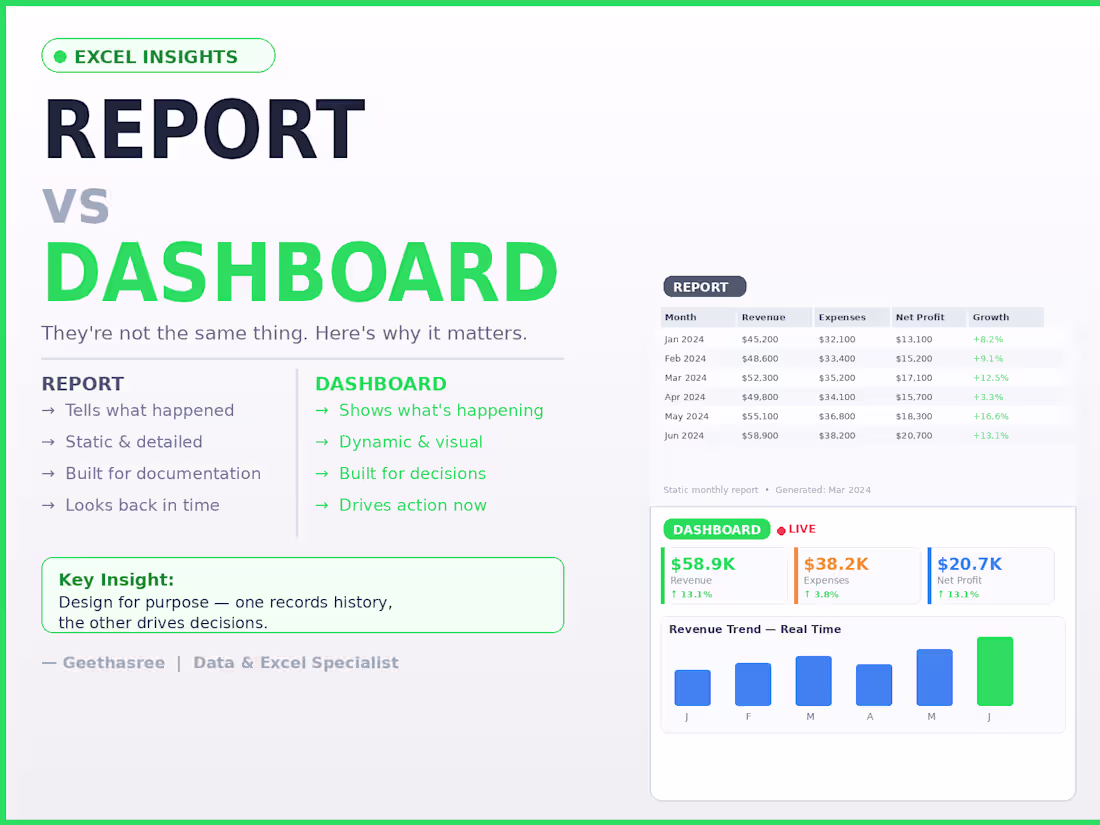
The difference between a report and a dashboard
Most people use these words interchangeably.
They're not the same thing.
A report tells you what happened.
A dashboard shows you what's happening.
The difference:
Report → static, detailed, built for documentation
Dashboard → dynamic, visual, built for decisions
The mistake I see most often:
People build dashboards that are actually just reports.
The result?
— Decision makers scroll through pages of data
— Numbers are outdated by the time anyone reads them
— No one knows what to act on
The fix is simple:
A report answers: "What happened last month?"
A dashboard answers: "What do I need to do right now?"
When you design for the right purpose:
Reports become clear records.
Dashboards become decision tools.
One looks back. The other drives forward.
2
3
217
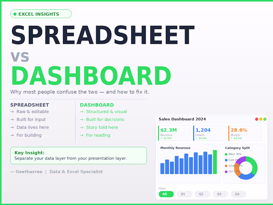
Most people think a spreadsheet and a dashboard are the same thing.
They're not.
A spreadsheet is where data lives.
A dashboard is where decisions happen.
The difference:
Spreadsheet → raw, editable, flexible, built for input
Dashboard → structured, visual, built for reading and decisions
The mistake I see most often:
People try to do both in the same sheet.
The result?
Decision makers see too much raw data
Numbers get accidentally edited
No one knows what to trust
The fix is simple:
Keep your data layer and your presentation layer separate.
Raw data in one sheet. Dashboard in another.
One is for building. One is for reading.
When you separate them, updates become clean, mistakes become rare, and your reports actually get used.
A spreadsheet stores your data.
A dashboard tells its story.
4
6
233
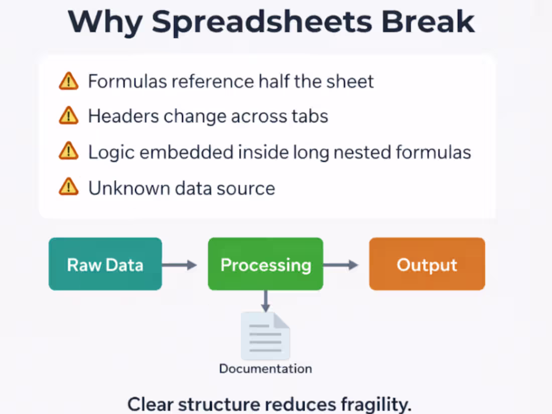
Most spreadsheet problems are not Excel problems.
They’re structure problems.
I often see spreadsheets where:
• formulas reference half the sheet
• headers change across tabs
• logic is embedded inside long nested formulas
• no one knows where the numbers actually come from
The result?
Small updates quietly break the entire model.
A simple structure solves most of this:
Raw Data → Processing → Output → Documentation
Raw data stays untouched.
Processing handles the logic.
Output shows only what decision-makers need.
Documentation explains how metrics are calculated.
Clean structure reduces fragility and makes updates predictable.
Good spreadsheets aren't just about formulas.
They’re about clear data flow and transparent logic.
3
3
256
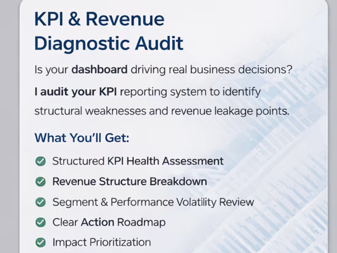
Most dashboards don’t have a visualization problem.
They have a KPI problem.
I’ve reviewed dozens of reporting systems recently and the pattern is consistent:
Metrics are defined differently across sheets
“Revenue” means one thing in finance and another in marketing
KPIs are tracked… but not tied to decisions
Dashboards look clean but don’t answer operational questions
When metric logic isn’t aligned, teams don’t have a data problem.
They have a decision problem.
That’s why I’ve started offering a structured KPI & Revenue Diagnostic Audit — focused on:
• Metric consistency
• Reporting logic
• Revenue driver alignment
• Decision-readiness
If you're building dashboards or scaling reporting systems, this layer matters more than design.
8
8
333
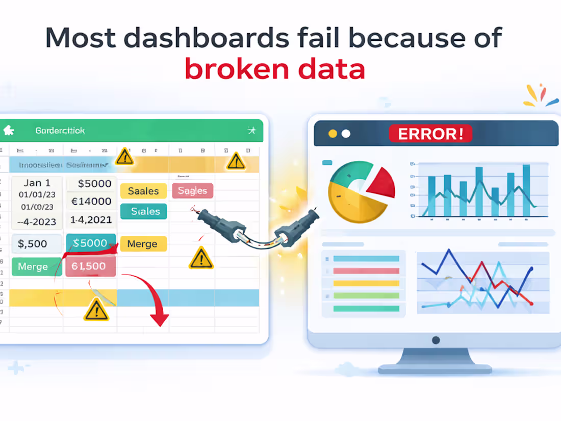
Most dashboards fail before they are even built.
Not because of bad charts.
Not because of wrong formulas.
Because the data underneath is structurally broken.
Here’s what I see often in small businesses:
• Dates stored as text
• Multiple columns for the same metric
• Inconsistent naming (Revenue / Sales / Total Sales)
• Manual copy-paste every week
• No clear data flow
Then they ask:
“Why doesn’t this dashboard update properly?”
A dashboard is just a mirror.
If the data structure is messy, the reflection will be distorted.
Before I build any report, I focus on 3 things:
Standardized column logic
Single source of truth
Repeatable data flow (no manual dependency)
Clean structure → Reliable metrics → Better decisions.
If your reporting feels fragile, the issue usually isn’t Excel.
It’s the foundation.
15
8
355
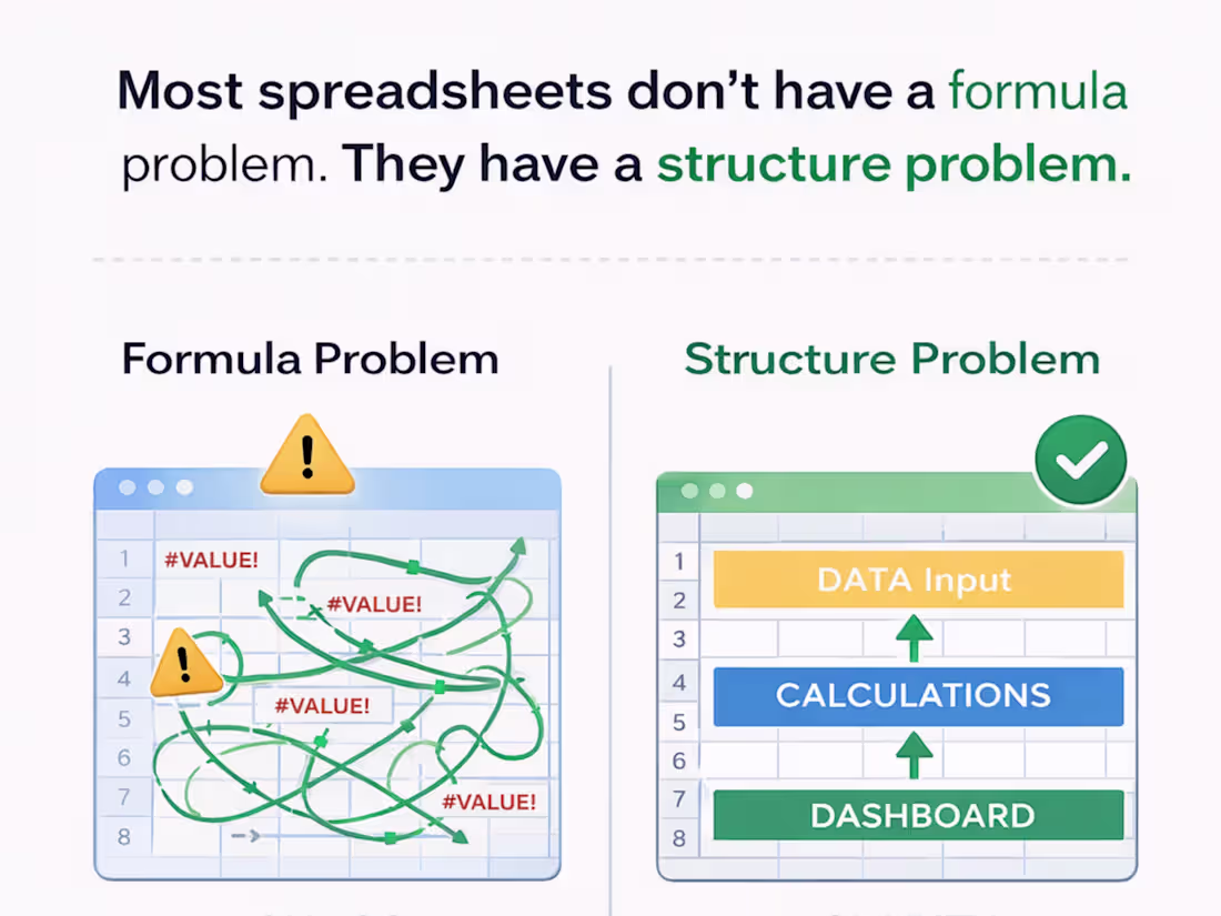
Most spreadsheets don’t have a formula problem.
They have a structure problem.
When reporting feels unreliable, it’s rarely because Excel is limited.
It’s usually because the data flow was never designed.
Before I build any dashboard, I check:
1️⃣ Where does the data originate?
2️⃣ Is there one clear source of truth?
3️⃣ Are inputs separated from calculations?
4️⃣ Can someone else maintain this in 6 months?
Dashboards are the visible layer.
Structure is the foundation.
When the structure is right:
✔️ Reports update automatically
✔️ Errors drop
✔️ Decisions get faster
If your spreadsheet needs manual fixing every week, the issue probably isn’t formulas — it’s system design.
What’s the biggest spreadsheet headache you’re dealing with?
5
269
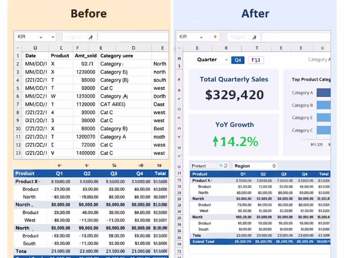
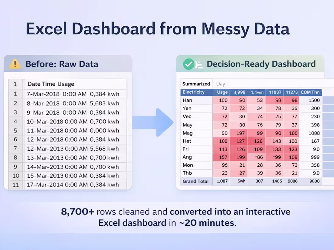
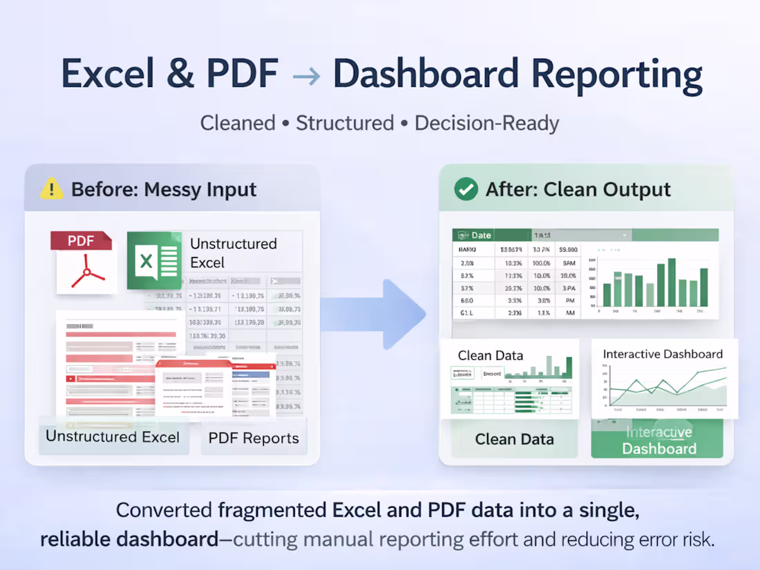
Messy Excel data → Decision-ready dashboard 📊
A recent Excel workflow I worked on involved raw, unstructured data that wasn’t usable for analysis or reporting.
What I did:
Cleaned and structured the raw dataset
Fixed formatting and consistency issues
Built pivot tables and an interactive Excel dashboard
Result:
✔️ Clear insights
✔️ Faster reporting
✔️ No manual rework
This is the kind of Excel cleanup + reporting support I help teams with regularly.
If you’re dealing with messy spreadsheets and need clean, reliable Excel reports — happy to help.
5
6
321
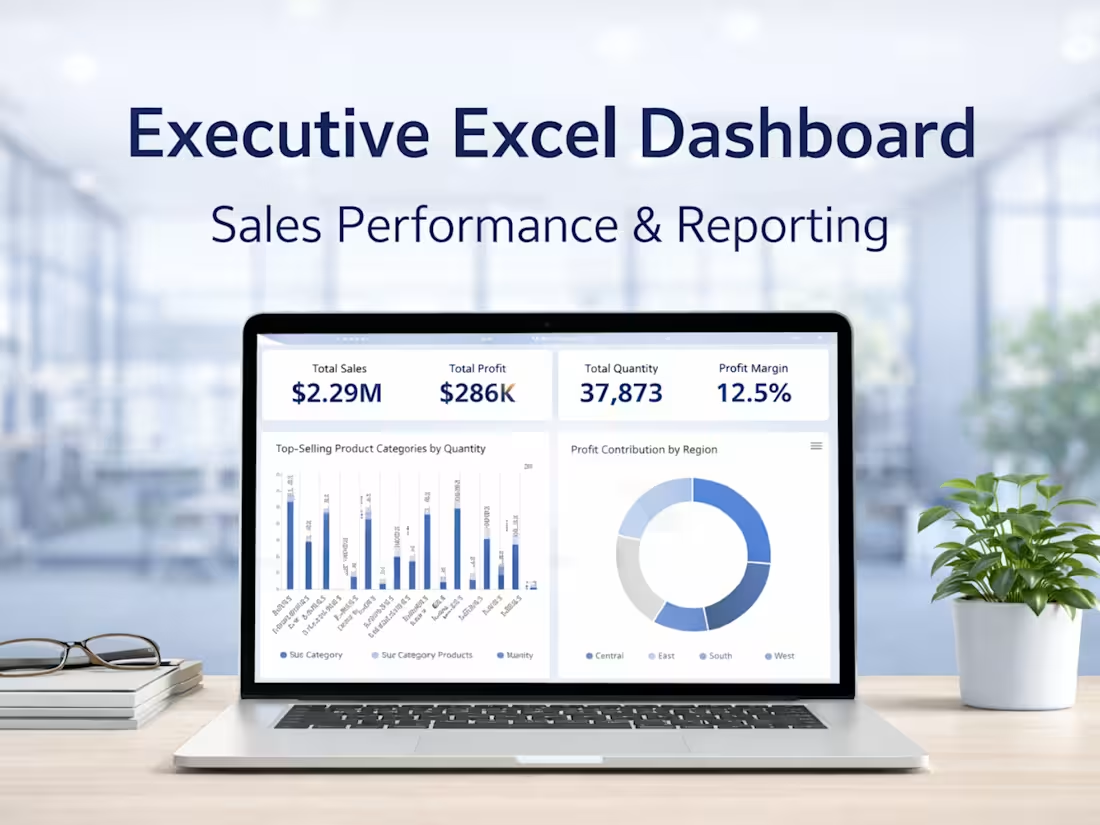
Executive Excel Dashboard for Business Reporting
4
9

Market & Competitor Research (E-Learning Industry)
2
3
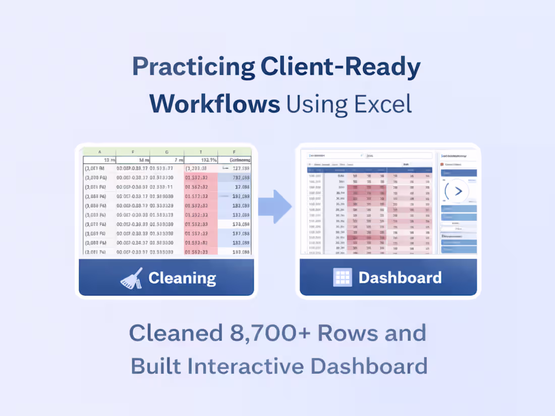
Turning messy Excel data into an interactive dashboard 📊
In my latest Excel case study, I worked with a raw, unstructured dataset (8,700+ rows) and focused on doing the fundamentals right:
• Cleaned inconsistent time, date, and text values
• Structured the data for accurate analysis
• Built pivot tables with day, month, and time logic
• Added slicers and conditional formatting for interactivity
No fancy tools — just solid Excel workflows that make data reliable and easy to explore.
This is exactly how I approach real client data:
clean first → structure next → visualize last.
👉 Full case study is live on my profile.
6
10
418
Excel Data Cleaning & Dashboard Reporting
4
13
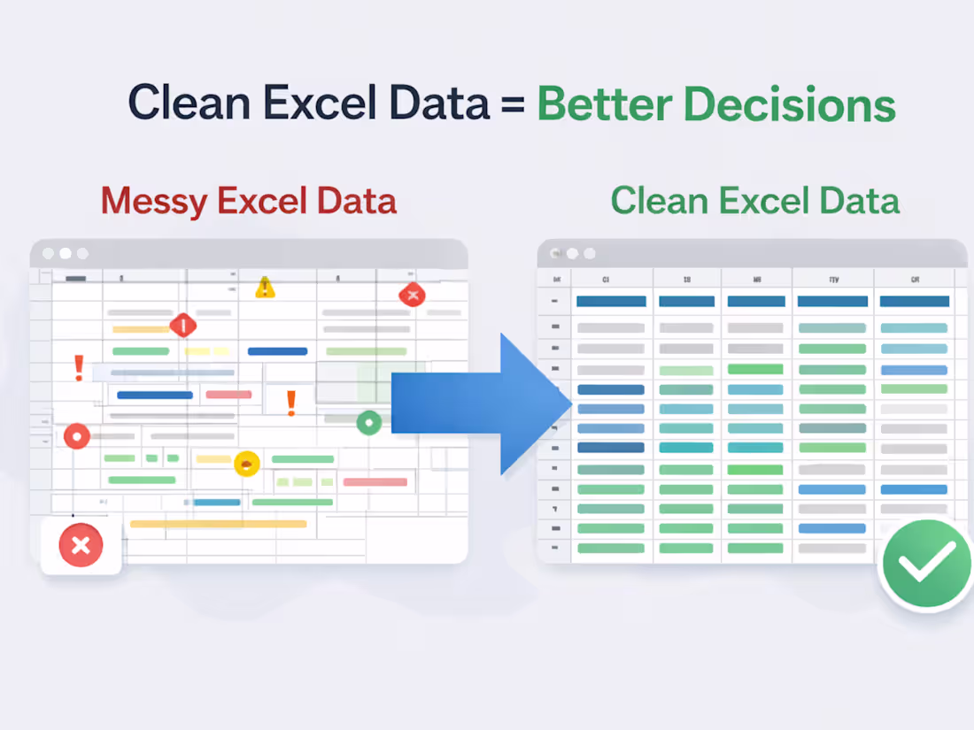
📊 Clean Excel Data = Better Decisions
Most teams don’t have a data problem — they have a messy Excel problem.
Common issues I see:
❌ Broken formulas
❌ Manual workflows
❌ Reports that fail with new data
When Excel data is structured properly:
✅ Dashboards stay accurate
✅ Automation works
✅ Decisions get faster
Clean data isn’t about neat sheets — it’s about trustworthy insights.
I help teams clean, structure, and automate Excel data for decision-ready reporting.
4
6
332
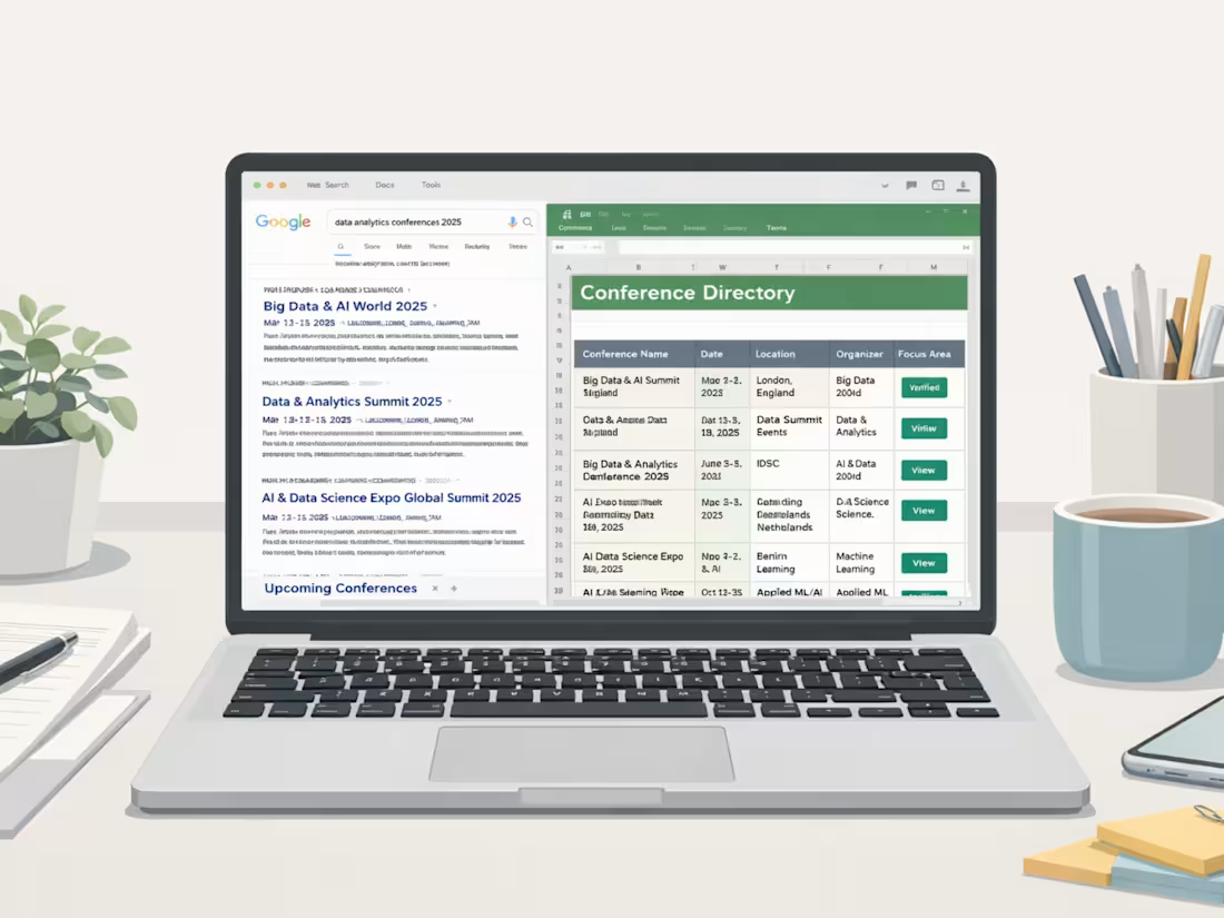
Verified Web Research for Business Decisions
2
3
Excel Data Cleanup → Dashboard Reporting
3
17
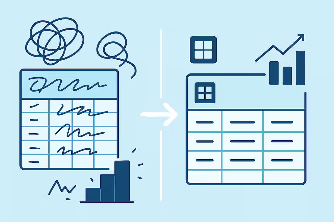
Why Clean Data = Better Decisions 🧼📊
Most teams don’t have a data problem —
they have a messy data problem.
Dirty data causes:
❌ Wrong insights
❌ Slow reporting
❌ Confusing dashboards
❌ Missed opportunities
But when your data is clean and structured:
✅ Decisions get faster
✅ Dashboards get clearer
✅ Teams trust the numbers
✅ Automation works
✅ Revenue opportunities appear
Clean data isn’t “making it look nice.”
It’s the foundation of accurate forecasting, better targeting, and smarter strategy.
If your business is running on messy spreadsheets,
you’re not just losing time — you’re losing clarity.
I help teams turn chaotic data into clean, decision-ready datasets.
Need help cleaning or organizing your data? Let’s talk 🤝
4
300
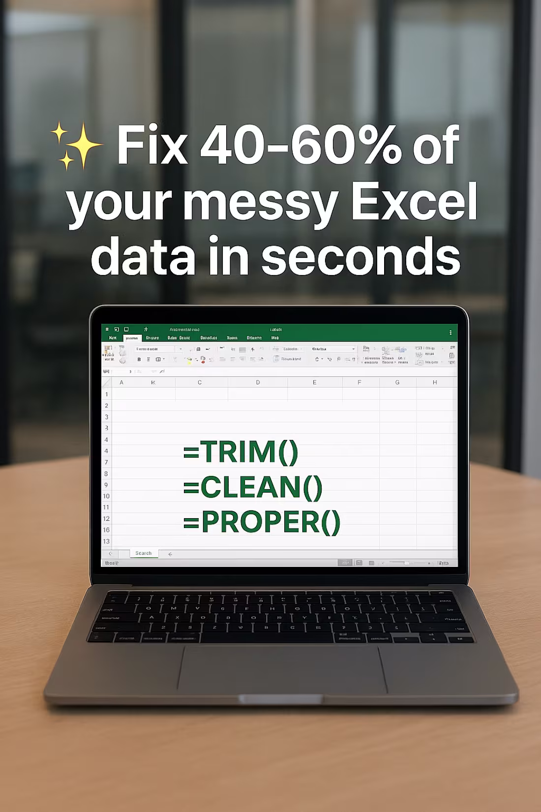
Here’s one of my favorite Excel tricks that saves 40–60% cleanup time—instantly.
Whenever I receive messy spreadsheets, I start with this quick trio:
🟢 =TRIM() – removes unwanted spaces
🟢 =CLEAN() – fixes hidden formatting issues
🟢 =PROPER() – makes text clean + uniform
You’d be surprised how many “complex” data issues are solved with these three simple functions.
I use this approach in my client projects before building dashboards, reports, or analyses—it ensures the entire workflow is smooth and error-free.
If you want your Excel files cleaned, structured, or automated, I offer professional Excel support for both short and long projects.
7
330
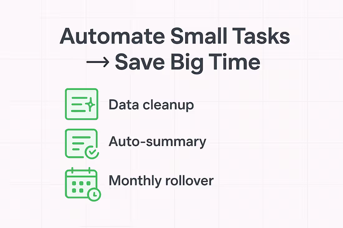
🚀 Automating Small Tasks = Big Productivity Gains
One thing I’ve noticed while working across Excel, data cleanup, and workflow optimization:
Most teams don’t need a full system rebuild — they just need small automations that remove daily friction.
Here are 3 micro-automations I recently built that made a big impact:
🔹 Smart data cleanup rules — auto-standardizing names, dates, and formats
🔹 Auto-generated summaries — creating insights without manually filtering every time
🔹 Monthly rollover logic — treating late-month income/expenses as the next month’s budget
These tiny improvements save hours, reduce errors, and make tools easier for anyone to use — not just “Excel experts.”
If you could automate one small task in your workflow, what would it be? 👇
#Excel #Automation #Productivity #DataEntry #WorkflowOptimization
9
6
366