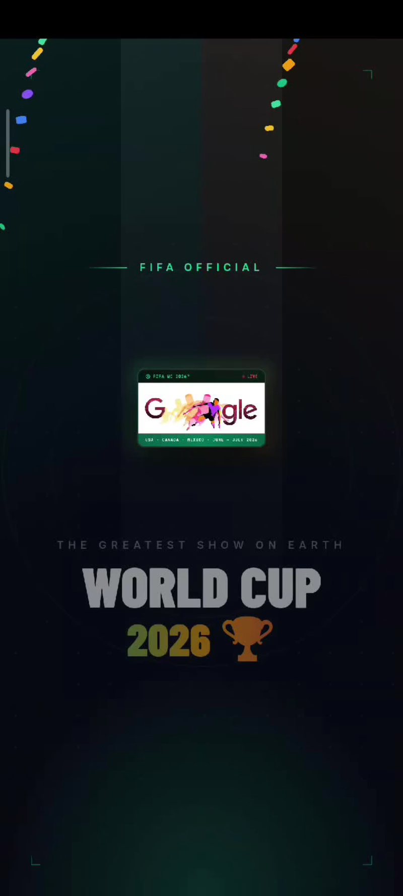
Projects using Figma Make in IkejaProjects using Figma Make in IkejaMyWorldCup App⚽🌍
Ever since the World Cup began, I found myself doing the same thing, jumping between score apps for updates, switching to X for fan debates and banter, checking blogs for news, and moving across different platforms just to follow one tournament.
It felt exciting, but also fragmented. I wanted a simpler way for fans to experience everything in one place.
That idea became MyWorldCup; a fan-first, Mobile-first World Cup companion designed to bring every part of the tournament experience together.
Football fans can follow fixtures, standings, predictions, discussions, and tournament progress through a simple, intuitive experience with dedicated tabs for group tables, fixtures, match predictions, tournament brackets, country fan communities, live match discussions, and World Cup history.
Built using Figma Make, this project explores how AI-assisted design and rapid prototyping can turn an idea into an engaging digital experience faster.
The attached walkthrough shows the design process, key features, and how I used Figma Make to bring MyWorldCup from concept to interactive product.
Figma Make Preview:
https://www.figma.com/make/D0jcSSibf3m6rqOxo0eOtA/MyWorldCup-App-Design?t=eBxJ2o6WBxYlCs3q-1
X Link:
https://x.com/i/status/2067835678906323179
Figma Community:
https://www.figma.com/community/file/1649664233009803364/myworldcup-app
#ConfigMakeathon @figma Mbari Hub: Studio Website Redesign
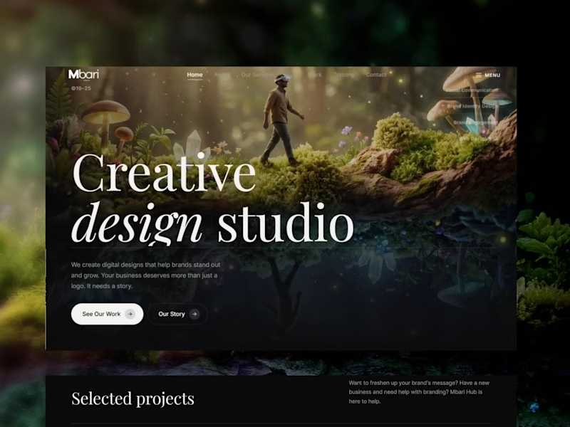
Mbari Hub takes its name from Mbari Mbayo, "when we see it, we shall be happy." Seeing is believing. The studio exists to make brands visible, so the site needed to prove that in the first three seconds rather than explain it in the third paragraph.
What I did:
Positioning and messaging, including the mission line "a brand set on the hill cannot be hidden"
Full art direction, including the composited hero of a figure walking a mossy branch above its own reflection
Editorial type system built on a high-contrast serif with italic emphasis, paired with a clean sans for body
Dark UI with warm light, tuned so client work and packaging shots stay the brightest thing on the page
Responsive layouts across desktop and mobile, with the service sections restructured as questions instead of a feature list
Build, DNS, and analytics setup
Result: a site that sells the studio's core promise through the experience of using it, not just the copy.