
pro
Henry Tochukwu
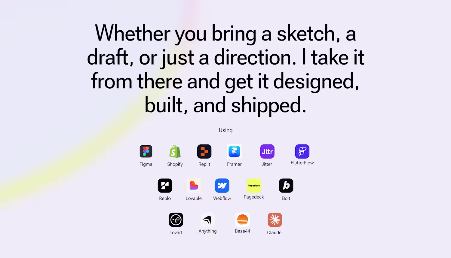
One designer. Messy ideas to shipped, working products.
- $1k+
- Earned
- 1x
- Hired
- 5.00
- Rating
- 50
- Followers
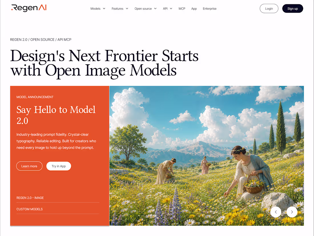
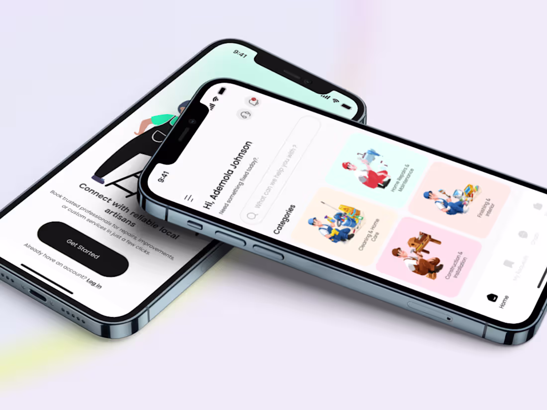
Designing Regen AI: One System, Three Surfaces
1
3
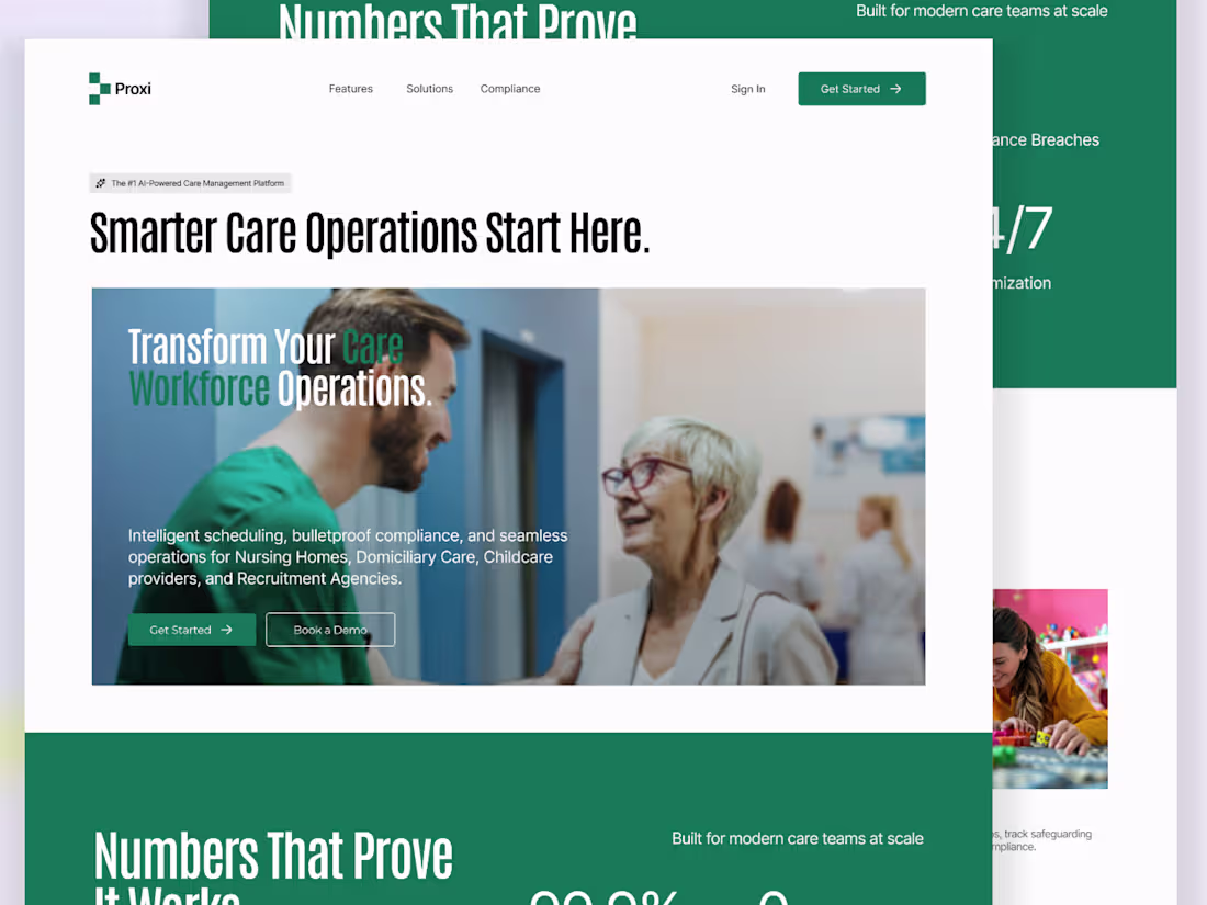
Just wrapped up exploring this Proxi website built in Framer and it’s a solid example of how design meets real world impact.
Proxi focuses on simplifying care operations with tools for intelligent scheduling, compliance management, and workforce coordination across nursing homes, childcare, and domiciliary care. Everything is built to reduce friction, improve efficiency, and keep teams aligned.
What stands out is how clearly the value is communicated, strong visuals, sharp messaging, and a structure that guides you straight to action.
Built entirely in Framer, showing how powerful no code can be when paired with thoughtful UX.
Clean, focused, and built for scale.
3
8
539
The goal here was to communicate trust and realism instantly. The headline leads with a bold, clear promise, while the clean layout and soft visuals reinforce a human, approachable feel rather than a “tech heavy” one.
I kept the interface minimal but intentional so the focus stays on credibility, clarity, and conversion, making the AI feel natural, not intimidating.
3
668
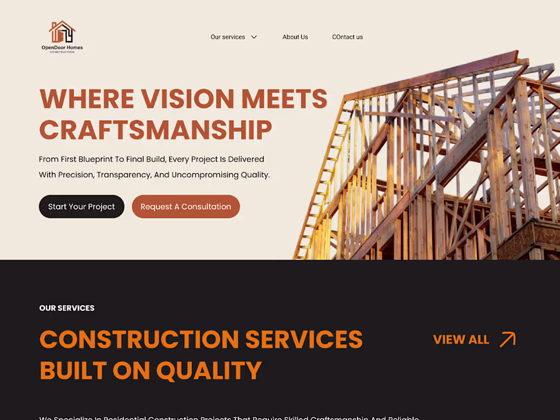
Readymag Landing Page Design for Open Door Home
1
7
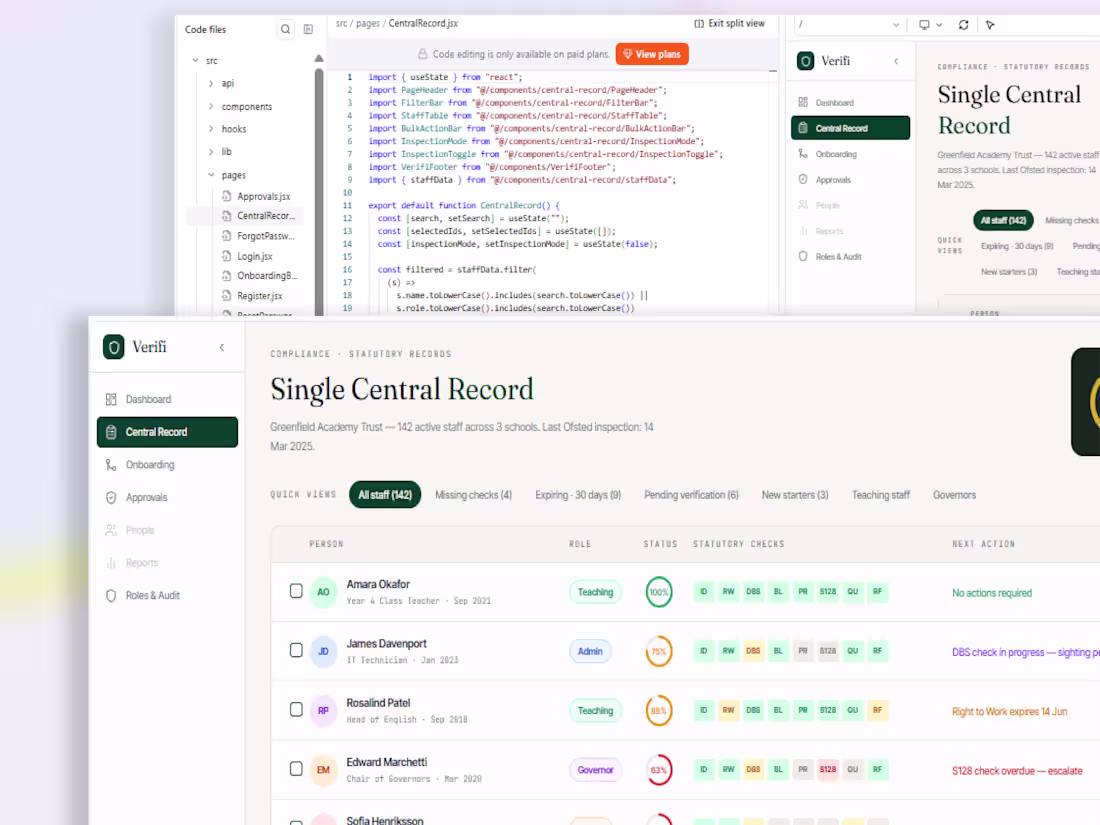
Just wrapped up Verifi, a compliance platform helping UK schools stay inspection-ready.
What started as a spreadsheet based process became a fully interactive product designed around one question:
"Are we inspection ready right now?"
Instead of adding more dashboards, I focused on simplifying verification workflows, improving visibility, automating audit trails, and introducing AI assisted document verification.
Designed in Figma. Built in Base44.
A reminder that great product design isn't about more features, it's about reducing complexity and helping users make decisions with confidence.
1
2
422
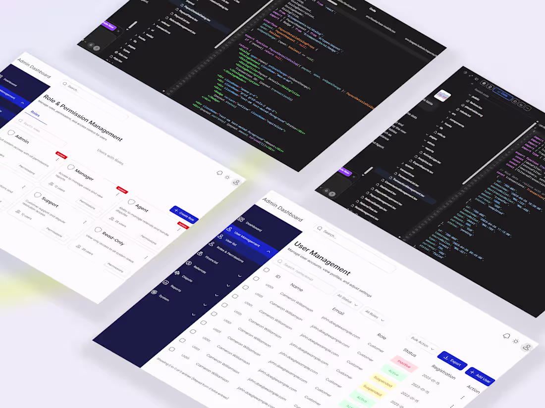
Built a centralized admin dashboard for Sentra to fix a growing operations problem, teams were juggling fragmented tools, which slowed fraud detection, delayed disputes, and limited real time visibility into transactions and financial health. The issue was not data availability, but the lack of a structured system to act on it efficiently.
The solution was an interconnected platform that brings users, transactions, disputes, financials, referrals, and reporting into one workflow driven system. Designed in Figma and built using :Lovable with Supabase integration, the platform focuses on speed, clarity, and actionable insights. This led to faster fraud detection, quicker dispute resolution, improved financial tracking, and a major boost in overall team efficiency.
1
547
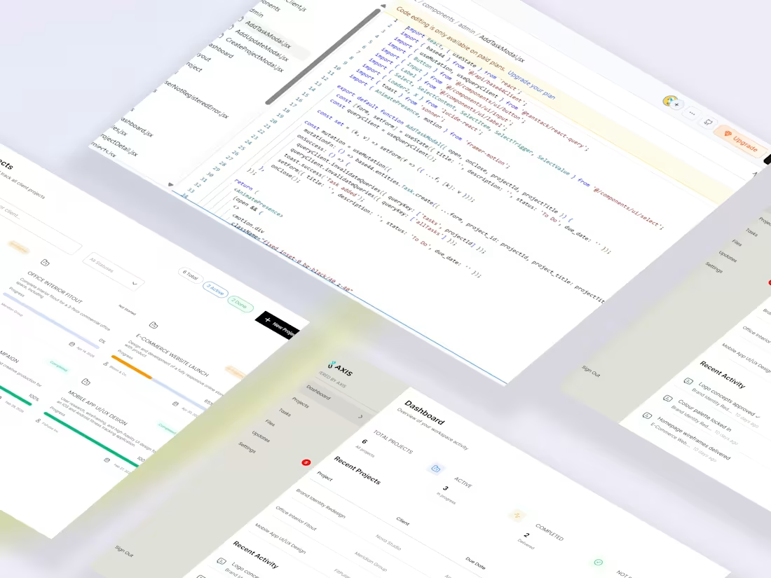
Built a clean client portal with Base44, focused on clarity over clutter. Clients instantly see project status, progress, and updates without asking. Simple roles, clean UI, and structured data that actually builds trust.
3
5
668
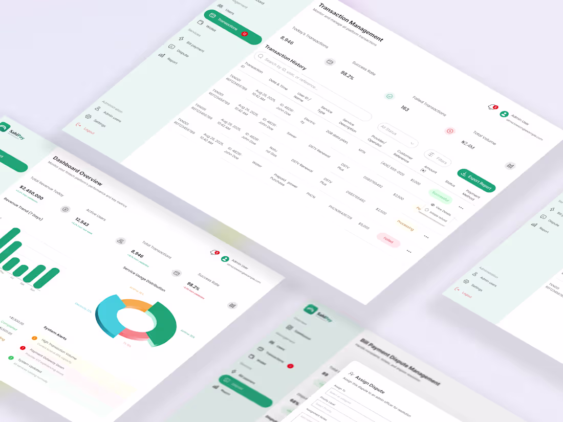
SahlPay Admin Dashboard Design and Implementation
1
8
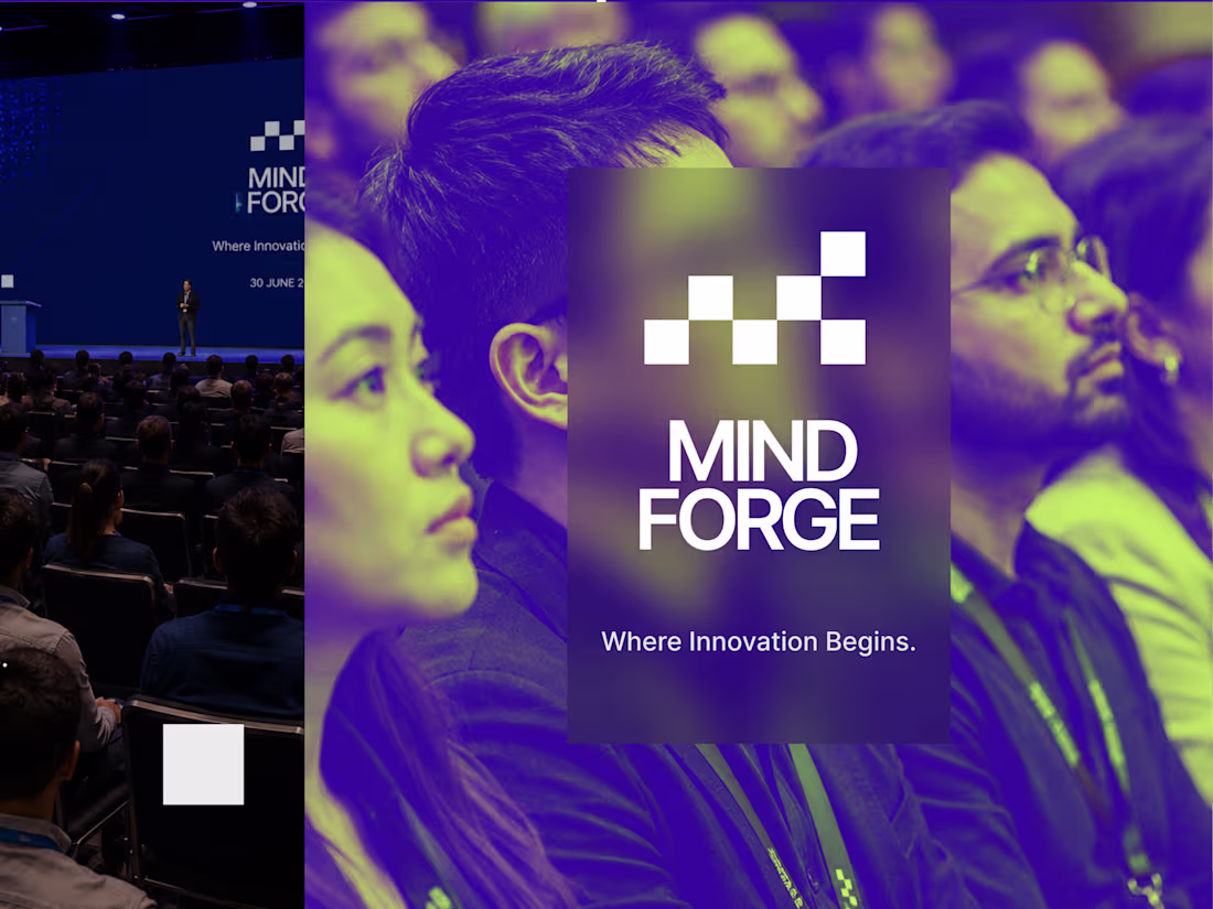
Mind Forge Tech Conference - Branding a Tech Movement
1
2
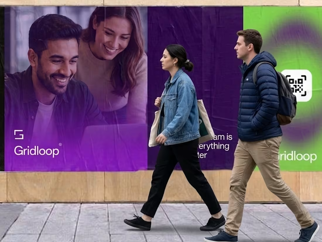
Gridloop Brand Identity Development
1
1
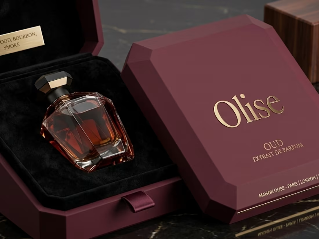
Designing Luxury Through Packaging for Olise
1
1
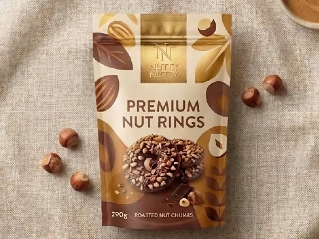
Packaging NUtty for Premium Positioning
1
1
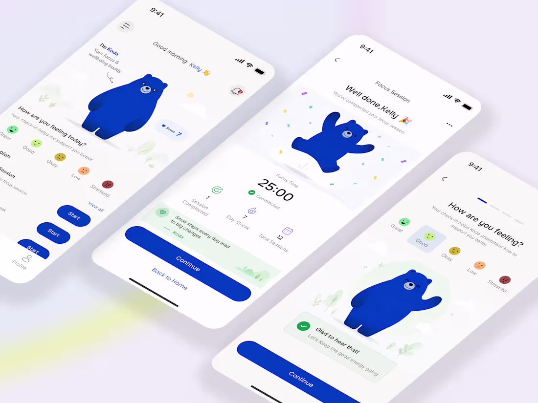
Meet Koda 🐻
Not just a mascot, a companion built into the product.
Koda powers a new kind of wellbeing + focus app where the interface doesn’t just respond to taps, it responds to you. Your mood, your habits, your consistency.
Instead of dashboards full of noise, the experience is simple:
- You check in
- You focus
- You build small wins
- Koda reacts in real time
From a calm idle state, to a gentle wave during onboarding, to a full jump when you complete a session, every motion is intentional. The bear isn’t decoration, it’s feedback.
This project explores how character-driven design can:
- Reduce friction
- Improve emotional engagement
- Make consistency feel rewarding, not forced
- Built as a product concept and interaction system, not just visuals.
Curious to hear how you’d use a companion like this in your daily flow.
1
5
599
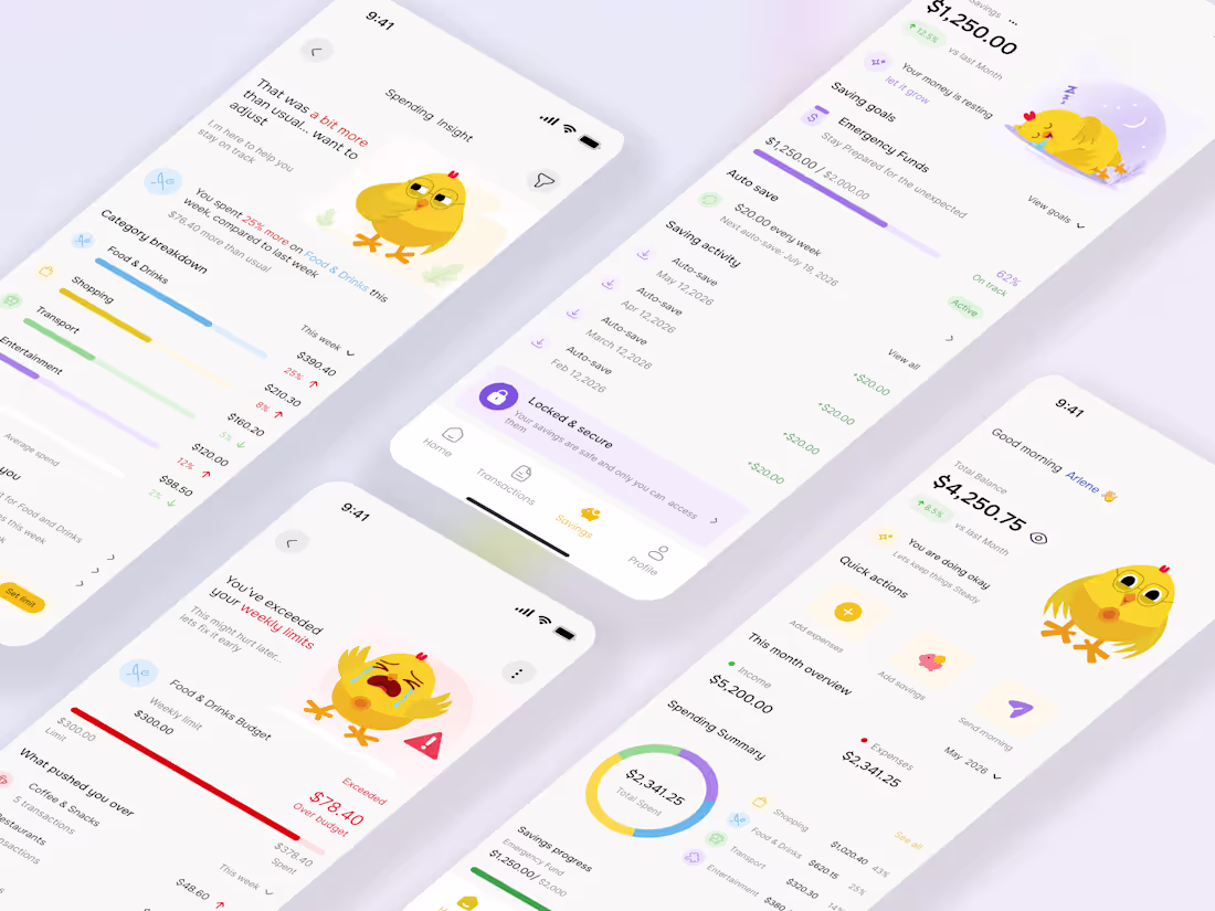
UI revamp for CluckSave 🐥💸
The focus was making finance feel more human, supportive, and engaging, not cold or intimidating.
I leaned deeper into the CluckSave mascot system, using the character to react to spending habits, savings progress, and budget limits in a way that adds personality to the experience while still guiding users clearly.
What changed:
• Cleaner dashboards and spending insights
• More emotional, mascot driven feedback states
• Softer budget alerts that feel supportive
• Improved savings tracking and category visuals
• Better hierarchy, spacing, and readability overall
The goal was simple:
Turn financial stress into a more approachable experience.
5
5
624
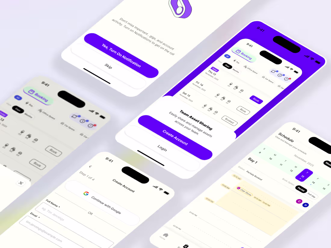
Designed a Figma app concept that helps teams share, organize, and access assets in one clear workspace, reducing friction, saving time, and making collaboration smoother across the team.:
2
582
Helpmate MVP UIUUX Design
1
10
Bringing Illustrations to Life
Been exploring how small interactions can completely change the feel of a product.
Took these illustrations and animated them in Rive, subtle motion, simple transitions, just enough to make the experience feel more alive and responsive.
Static visuals can communicate, but motion adds personality. It guides attention, creates feedback, and makes interfaces feel human.
A small exploration, but a good reminder that interaction is often where design starts to breathe.
1
4
498

Just introduced SageOwl 🦉
A symbol of clarity, focus, and smarter thinking in a noisy world.
This is more than a mascot, it represents tools that help you learn faster, think deeper, and move with intention.
Still early, but this is the start of something built for people who want to see clearly in a cluttered digital world.
2
6
499
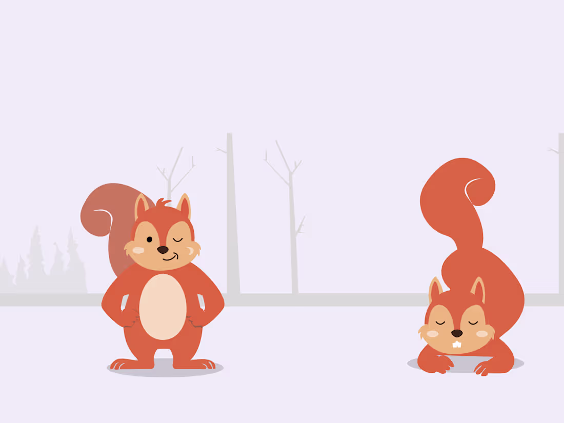
Designing expressive mascot & character illustration
Recently started exploring mascot design, character illustration, and expressive character animation and honestly… I get it now
Designing interfaces is one thing.
Designing characters people emotionally connect with is a completely different game.
Been experimenting with personality, poses, emotion, and storytelling through simple mascot concepts like this little guy 🐿️
What surprised me most is how much emotion a character can communicate without saying a word.
A small pose change can make a product feel:
• more friendly
• more alive
• more memorable
Now I fully understand why the best brands don’t just build products, they build characters people remember.
This is definitely a new creative rabbit hole for me 😂
2
3
495
Designed “Boro” 🐻
A mascot system created for a wellness app focused on building calmer, more human digital experiences.
Every pose was designed to support onboarding, empty states, mood moments, and future animations that make the product feel warm and emotionally engaging.
Exploring more mascot driven UI systems and animated wellness experiences.
5
8
580
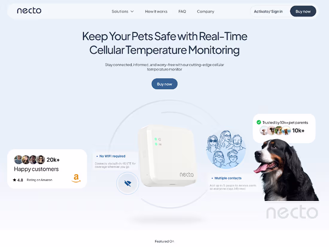
Necto Framer Landing Page Design and Development
2
10
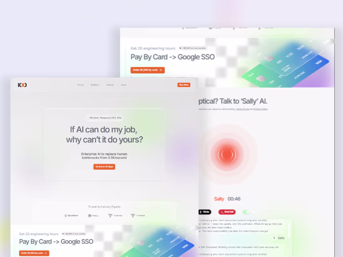
100x High Converting Web site Design
1
14
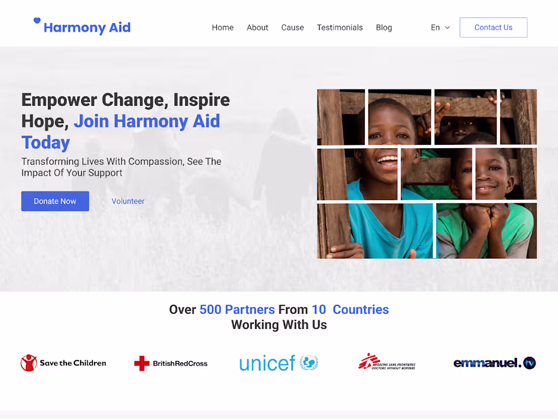
Designing the Harmony Aid Landing Page with Readymag
1
3
The goal here was simple, make flipping feel fast, smart, and profitable.
Bold messaging grabs attention, clean layout keeps it easy, and the product preview builds instant trust, so users can quickly see how they turn deals into wins.
1
489
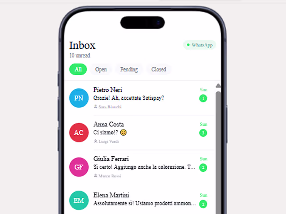
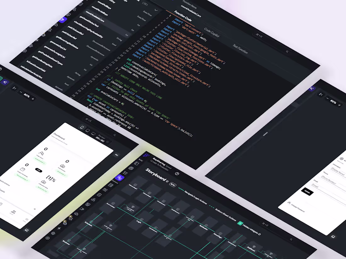
Zappy: Building a Real-Time Workflow Layer for WhatsApp-Based Businesses
Zappy is a mobile first shared WhatsApp inbox for small businesses, designed to turn chaotic customer messaging into structured team workflows.
The core problem is not messaging, but coordination. As small teams grow, conversations become fragmented, messages are missed, and there is no clear ownership or system of work.
I designed Zappy as a real time, multi tenant communication system where every business operates in an isolated workspace, and every conversation is structured, trackable, and assignable across team members.
The system is built with a contract first architecture using OpenAPI and shared types, ensuring the backend and mobile app stay fully in sync as the product scales.
Real time updates are handled through Socket.IO (http://Socket.IO), with fallback polling for reliability across environments.
On top of this communication layer, AI is embedded directly into workflow moments, not as a separate tool. It assists with reply suggestions, conversation summaries, tone rewriting, sentiment detection, and off hours responses, all aimed at reducing cognitive load and response time for small teams.
Zappy is ultimately a workflow layer for WhatsApp based businesses, focused on structure, speed, and clarity in customer communication.
6
500
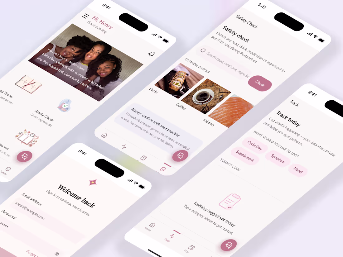
MamaGuide — Maternal Health PWA Designed & Built Solo on Replit
1
0
1
1
12
Race-Safe Booking & Waitlist App (FlutterFlow · Firebase)
1
7
AI Powered Meal Planner App Development using Anything AI
1
6
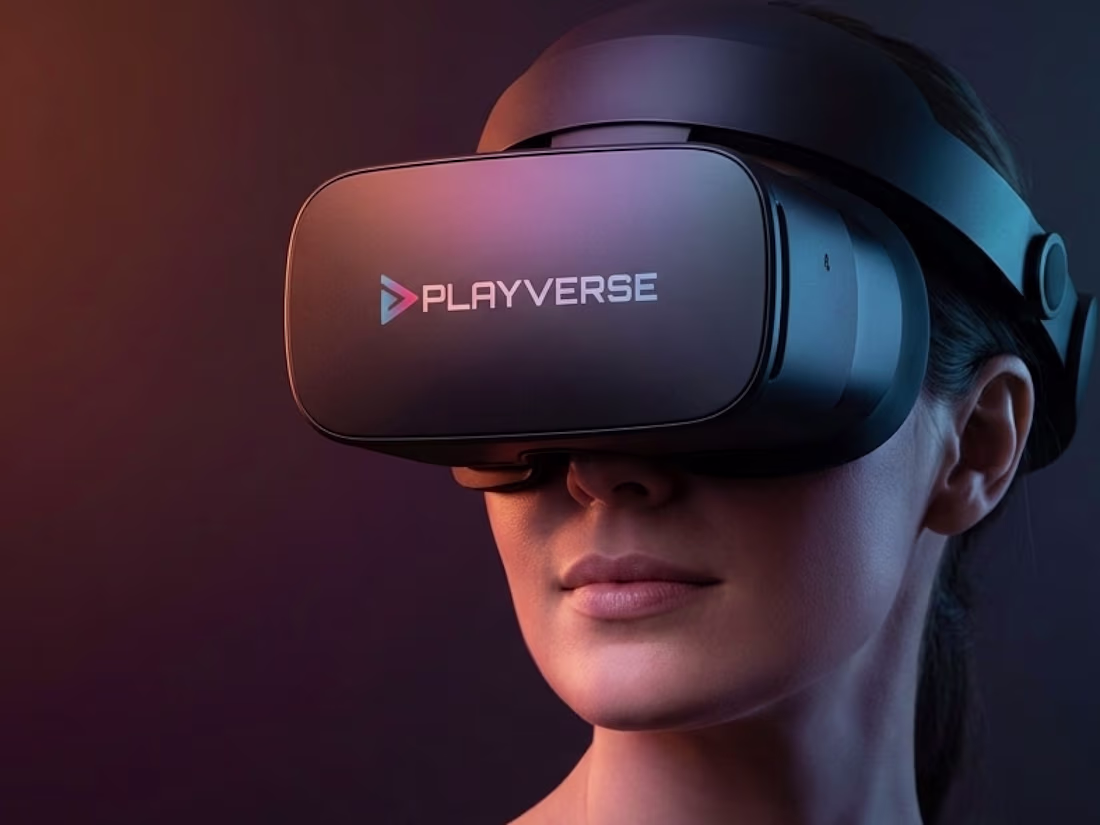
Exploring a brand direction for PlayVerse , a next gen gaming ecosystem built around play, creativity, and community.
Not just games, but a universe where players belong.
As a brand identity designer, I’m testing how this should feel and show up.
Does this direction feel distinct from typical gaming brands?
What would make it more memorable?
Open to honest feedback 👇
3
450
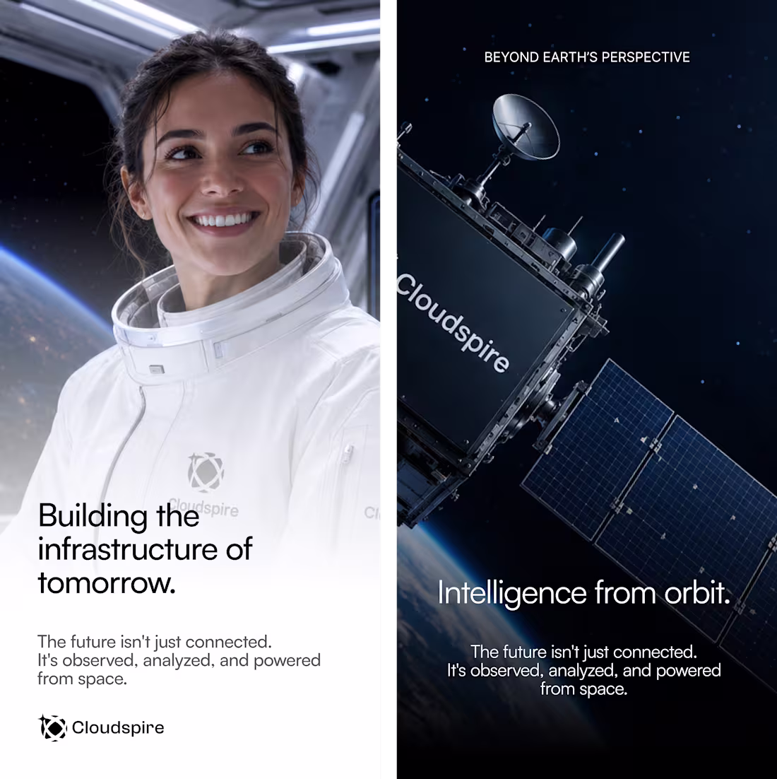
Strategic Branding for Cloudspire
1
1
Brand Overview Summary
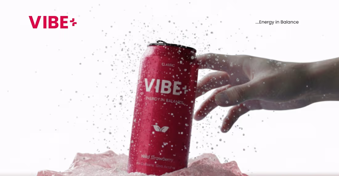
VIBE+ is a modern functional drink designed for young creatives, tech builders, and high achievers. It promotes “Energy in Balance,” offering focused, clear, and intentional energy without the overstimulation or crash of traditional energy drinks.
1
476
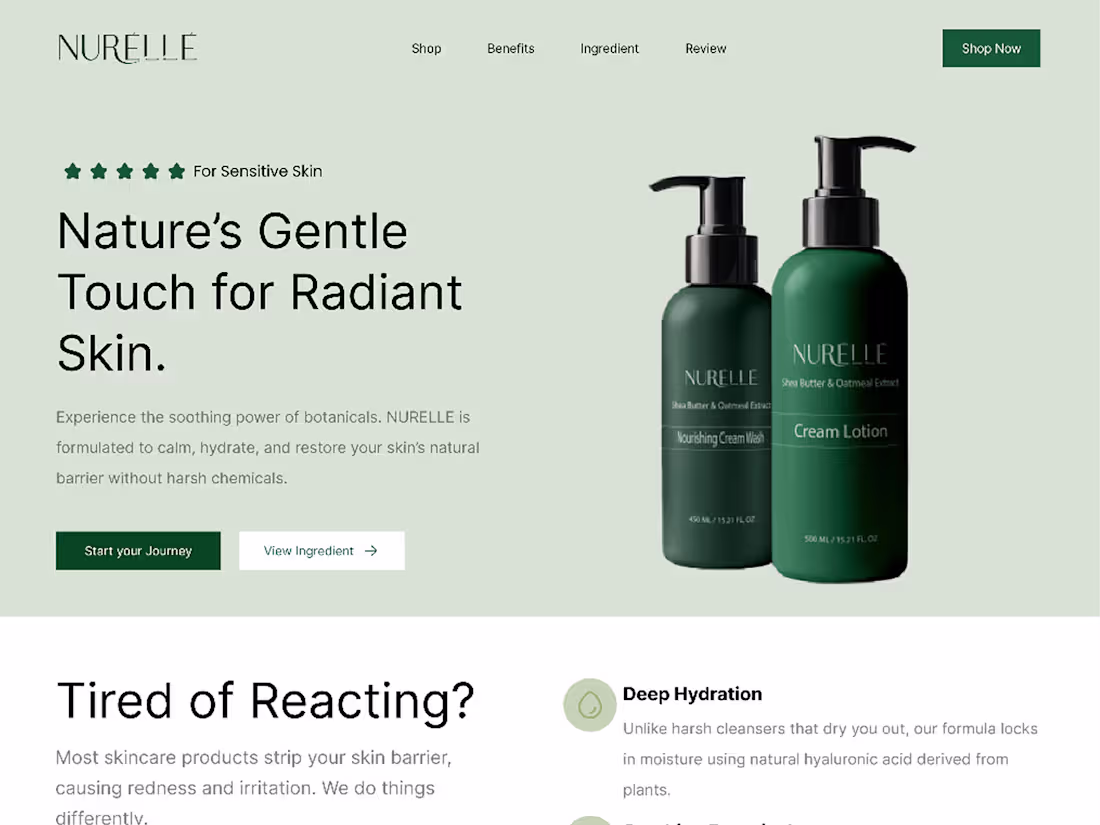
About Summary
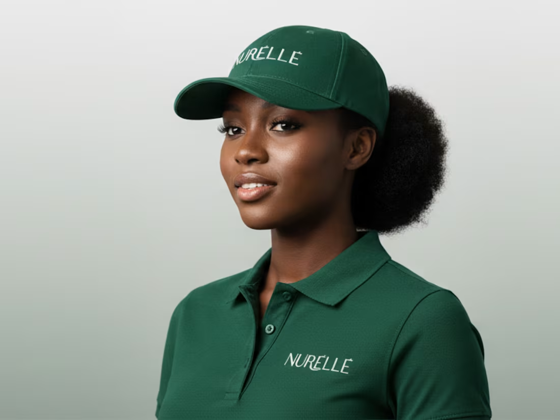
NURÉLLÉ is a premium skincare brand that blends ancient botanical wisdom with modern dermatological science. It focuses on deep, natural nourishment and skin health, offering a mindful approach to beauty. The brand’s hero ingredient is high concentration Aloe Vera, used for intense hydration and soothing relief, relying on bioactive compounds rather than water-based fillers to support lasting skin health and radiance.
1
506
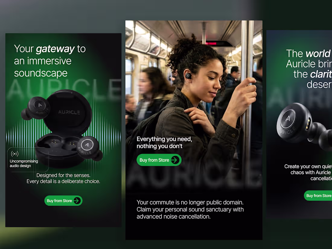
Auricle, Premium Social Media Campaign
Designed a premium social media campaign for Auricle to strengthen its brand presence and showcase its wireless audio products through compelling visual storytelling. The campaign combined product-focused creatives, lifestyle imagery, and feature driven advertisements within a cohesive, modern visual identity to drive awareness and engagement.
Role: UI/Visual Designer Deliverables: Social media campaign, Instagram creatives, product advertisements, visual branding assets
Tools: Figma, Adobe Photoshop, Adobe Illustrator
Goal: Build a premium brand presence and create high-converting social media assets that effectively communicate the product's value while maintaining a consistent, cohesive visual identity.
4
10
388
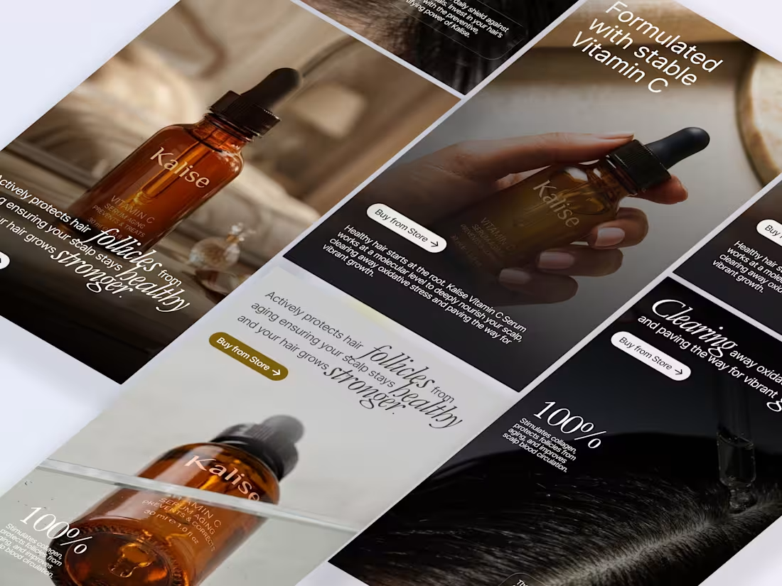
Kalise, Premium Social Media Campaign
Designed a premium social media campaign for Kalise to elevate its brand presence and promote its Vitamin C Hair Serum through elegant visual storytelling. The campaign combined product-focused creatives, educational content, and lifestyle imagery to communicate the serum's benefits while reinforcing a clean, science-backed, and luxurious brand identity.
Role: UI/Visual Designer
Deliverables: Social media campaign, Instagram creatives, product advertisements, educational carousel, visual branding assets
Tools: Figma, Adobe Photoshop
Goal: Build a premium brand presence and create high-converting social media assets that educate customers, showcase the product's benefits, and maintain a cohesive visual identity.
3
10
321
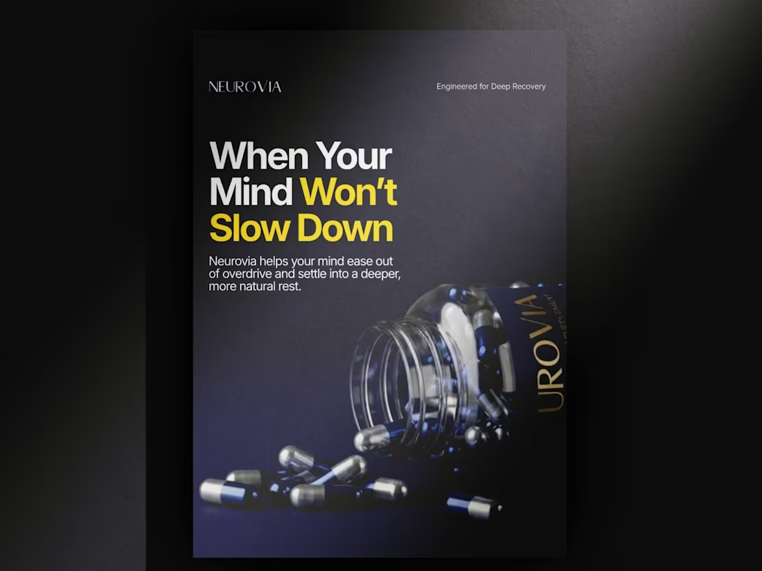
Built this product visual for Neurovia to communicate one idea, deep recovery made simple. The motion blur and layered elements reflect the chaos of daily stress, while the product stays centered as the solution.
3
3
542
Recently explored product marketing design, focusing on ad creatives and visual storytelling.
It was interesting seeing how small design choices can shift perception, clarity, and engagement. Still experimenting, still refining.
Would love to hear your thoughts, feedback is welcome.
2
5
607
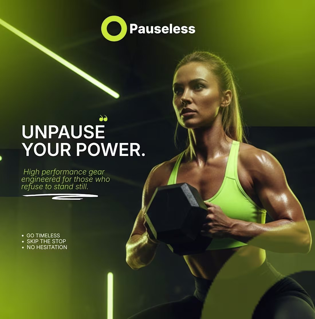
Pauseless Brand Identity Design
1
568
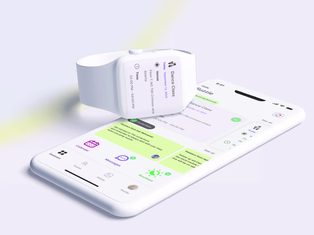
UX Design of a mobile app designed to simplify communication, coordination, and motivation for competitive dance teams.
2
497
NURELLE Sensitive Skin DTC Landing Page with PageDeck
1
18
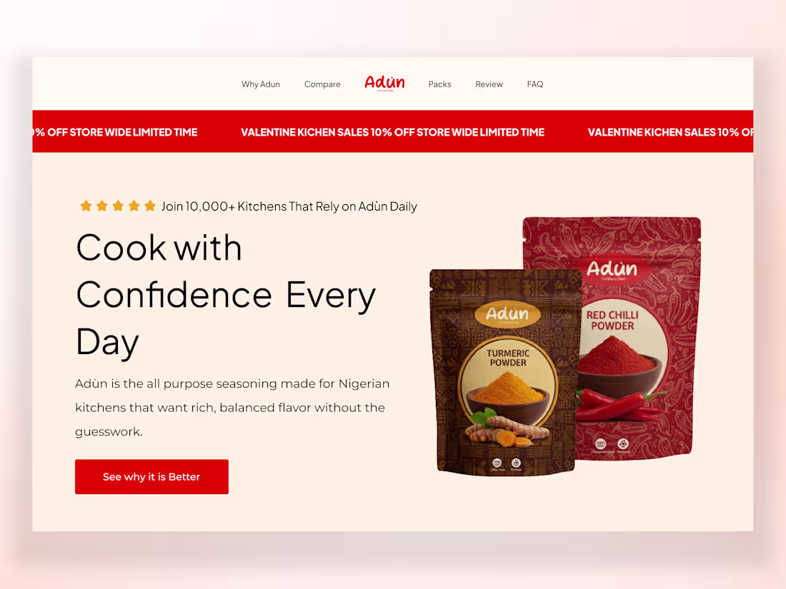
Adùn Pagedeck Landing Page Design and Shopify Integration
1
19
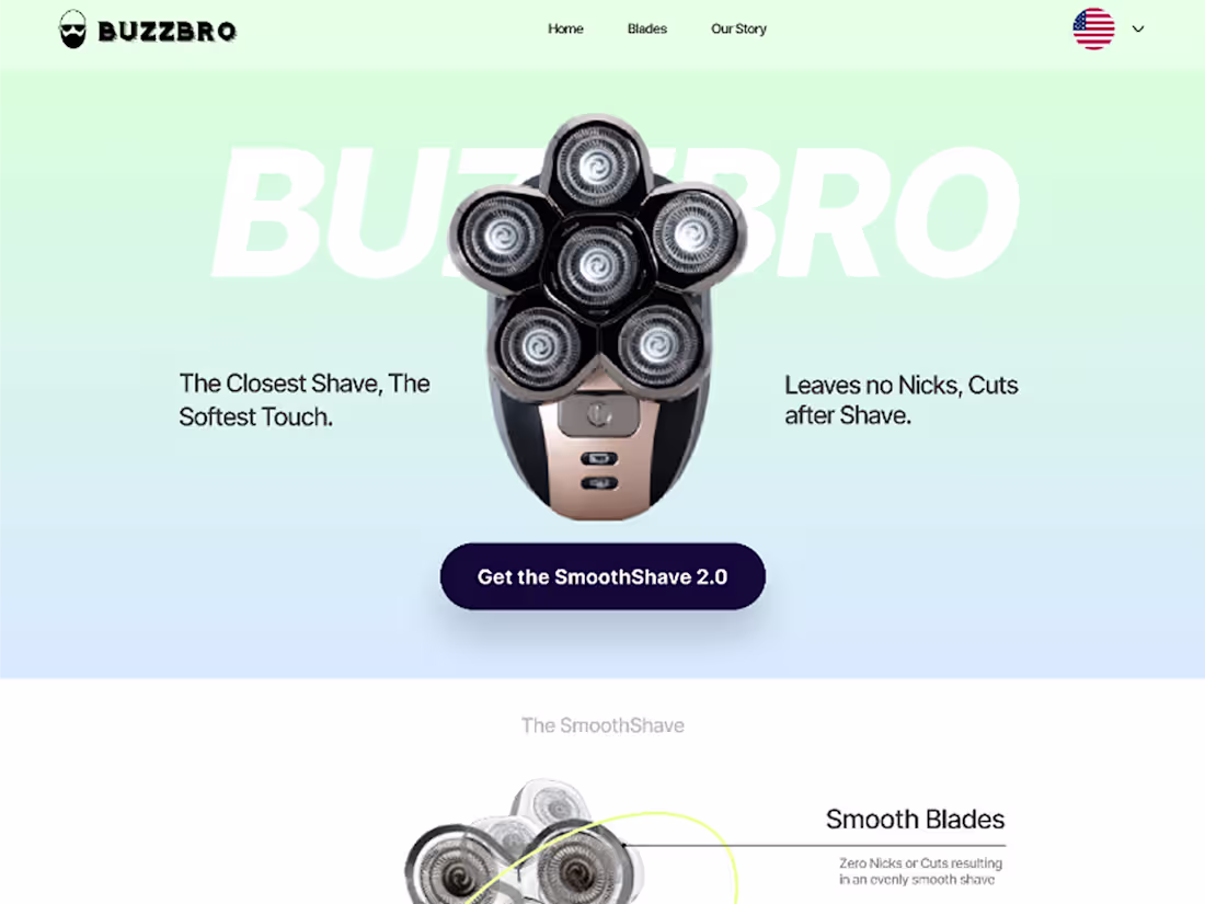
BUZZBRO Premium Shopify Store Design & Development
1
9
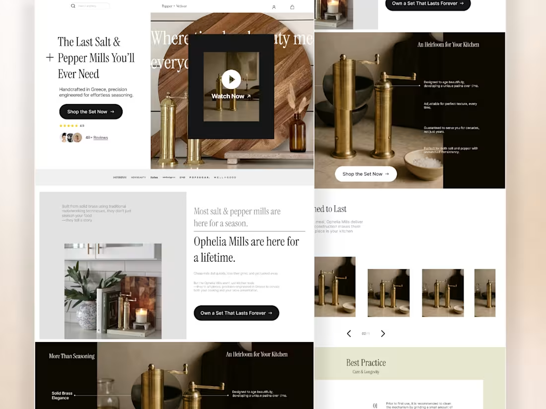
Ophelia Mills Replo Landing Page Revamp
1
6
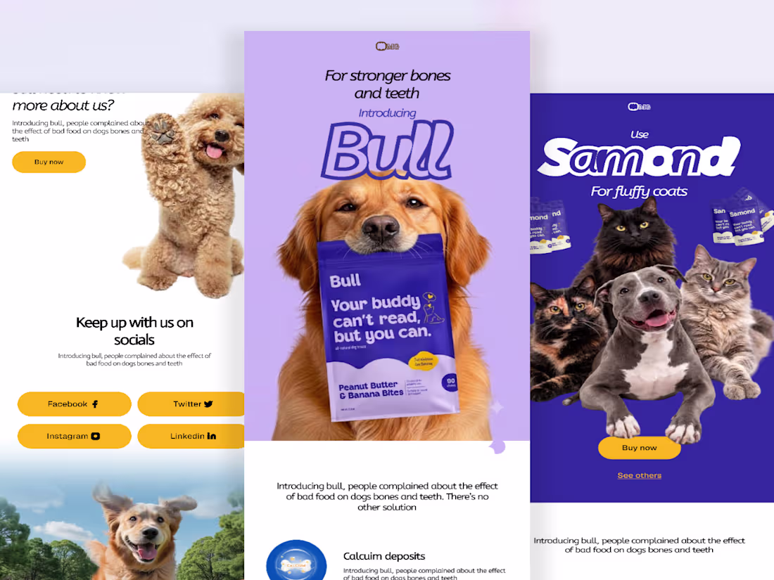
Pet Nutrition Product Launch Email
1
0
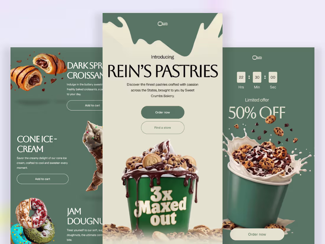
High-Fidelity Promotional Email Design
1
1
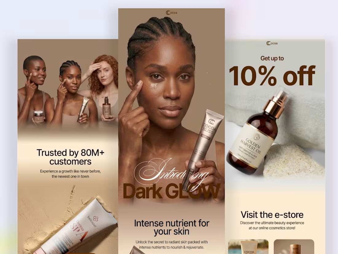
Promotional Email Experience for a Premium Skincare Brand
1
2
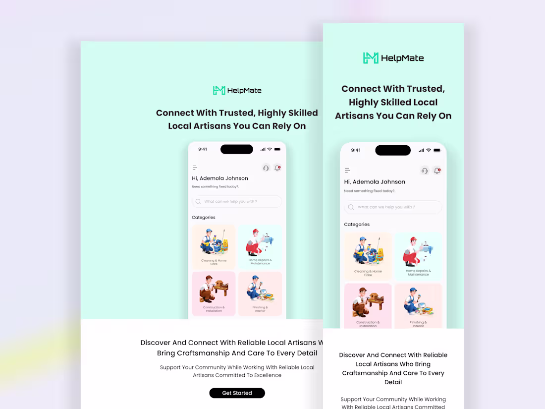
Trust Led Email Template Design for HelpMate Using Stripo
1
9
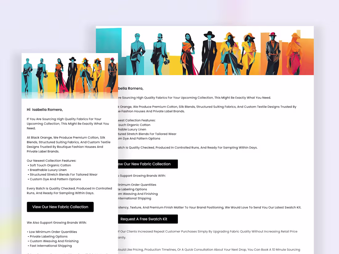
Driving Repeat Purchases Through Quality Led Email Design
1
5
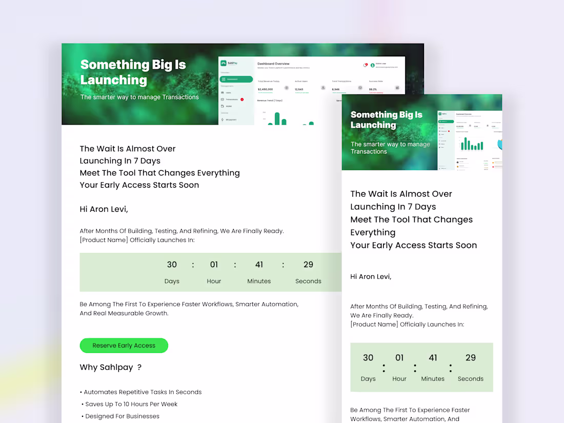
Product Launch Email Design for Sahlpay using Stripo
1
6
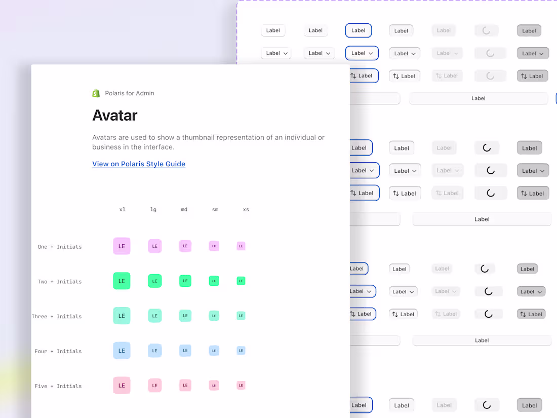
Merchant App Built with Polaris Design System
2
25
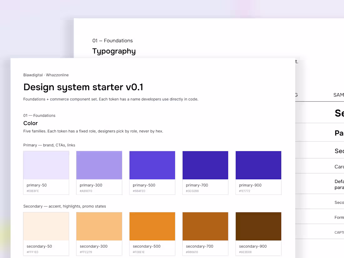
Whazzonline Design System, A Foundational Starter
Tokens, type, spacing, and a six component commerce kit, built to scale across products.
Blawdigital had no design system. No component library, no defined type scale, no documented spacing logic. Whazzonline, their commerce platform was being built without shared design infrastructure, which meant inconsistency was being shipped into the product daily. The brief was to build a foundational system that developers could use immediately and designers could extend as new products joined the company's portfolio.
I built the system in three layers so it could grow without breaking. Primitives hold the raw values, color ramps, type sizes, spacing units on a 4 point base. Tokens are semantic aliases (text-primary, background-surface, border-default) that point at primitives. Components consume tokens, never primitives directly. This separation is what lets the system extend a new product with different brand colors becomes a token remap, not a redesign. Dark mode becomes a token remap. Six commerce relevant components, button, input, badge, product card, navigation, modal, were built with multiple states each, so engineers had real specifications, not just hex values.
The Outcome:💯
A starter system that ships with ~40 color tokens, 8 type styles, 8 spacing values, and six documented components. Small on purpose. The discipline is in keeping it small as it grows.
2
378
PLAYVERSE Logo design
Next generation gaming brand built to redefine how players experience digital entertainment.
1
5
344
Decis Logo Design
1
8
314
CluckSave Mascot illustration
1
2
373
The focus now is simple, make every interaction feel intentional, clear and responsive.
2
4
375
Recently explored interactions and animations using @Jitter and After Effects on a product project.
More than just motion, it pushed me to think about how feedback, transitions and micro interactions shape the overall user experience. Every small movement carries meaning, from guiding attention to reinforcing actions.
Still exploring, but it is clear that good animation is not decoration, it is part of the product thinking.
1
4
350
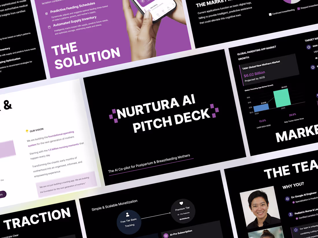
Investor Pitch Deck Design for Nurtura AI
1
8
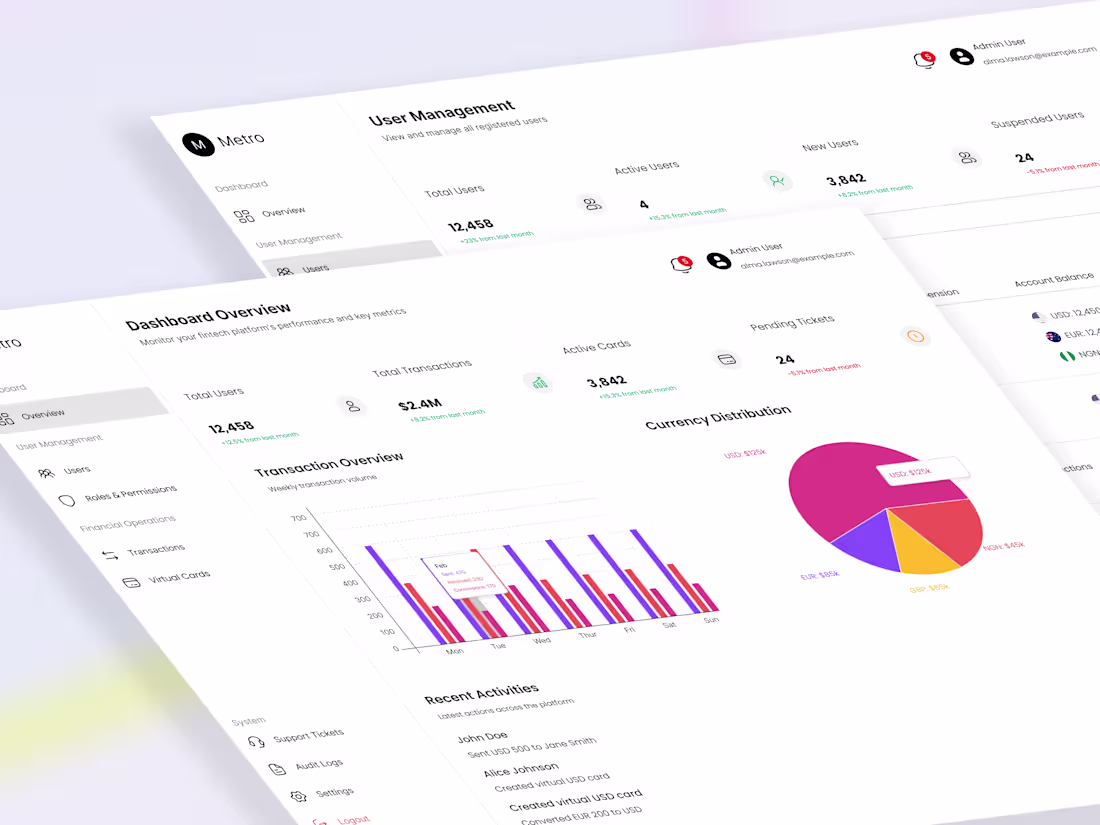
Designed Metro’s cross border payments dashboard, simplified complex flows, improved clarity and speed, balanced compliance constraints with a clean, scalable UX.
1
428
Development of Task Management Mobile App with Anything AI
1
6
Mobile Crypto & Investment App Design - Using Lottiefiles
1
7
1
2
6