pro
Henry Tochukwu
One designer. Messy ideas to shipped, working products.
- $1k+
- Earned
- 1x
- Hired
- 5.00
- Rating
- 50
- Followers
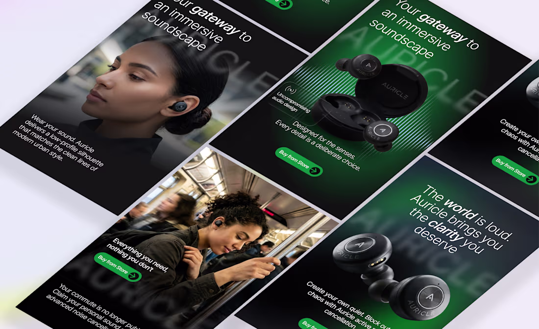
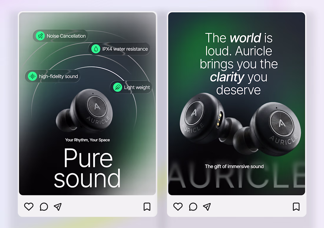
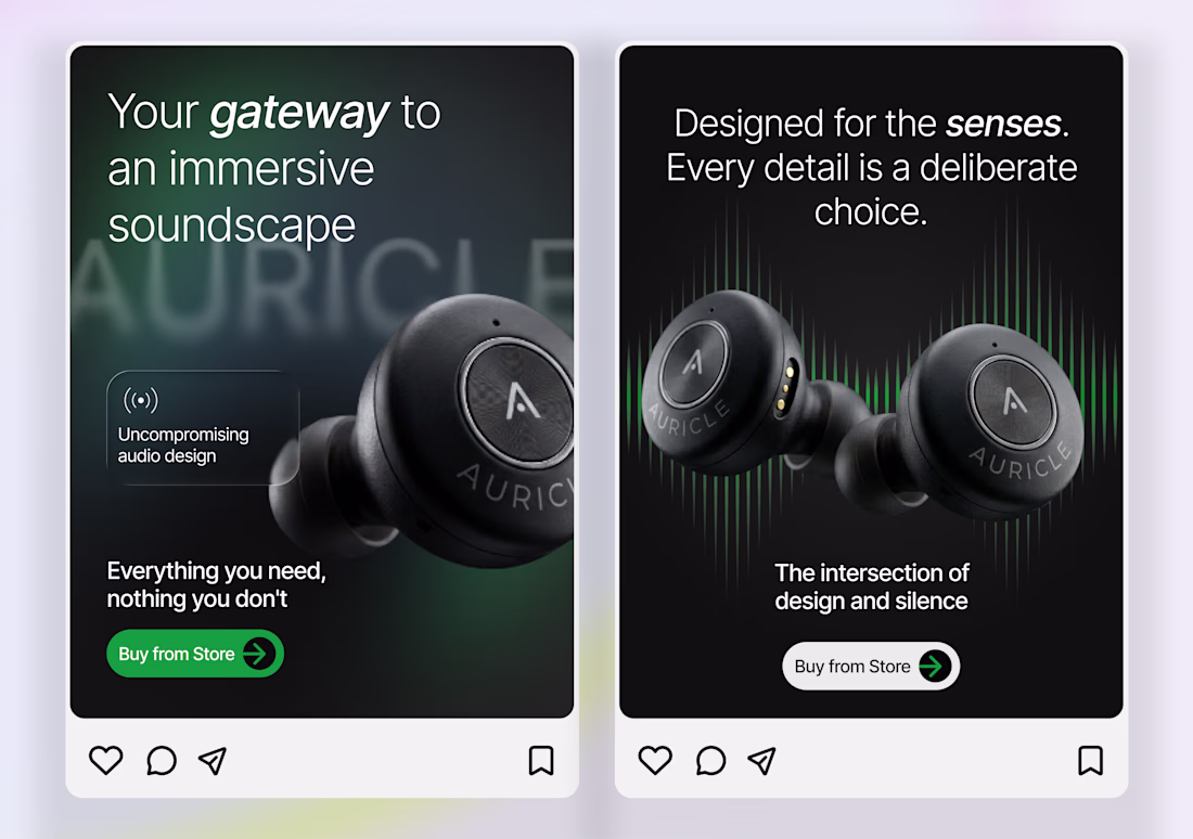
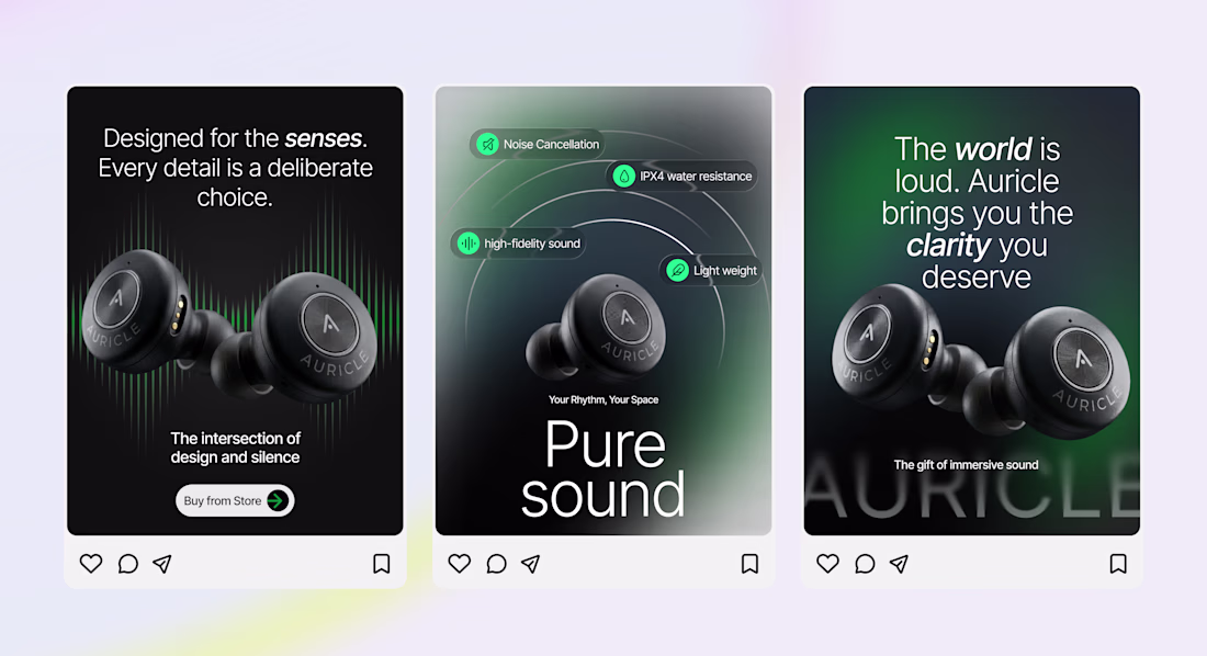
Auricle, Premium Social Media Campaign
Designed a premium social media campaign for Auricle to strengthen its brand presence and showcase its wireless audio products through compelling visual storytelling. The campaign combined product-focused creatives, lifestyle imagery, and...
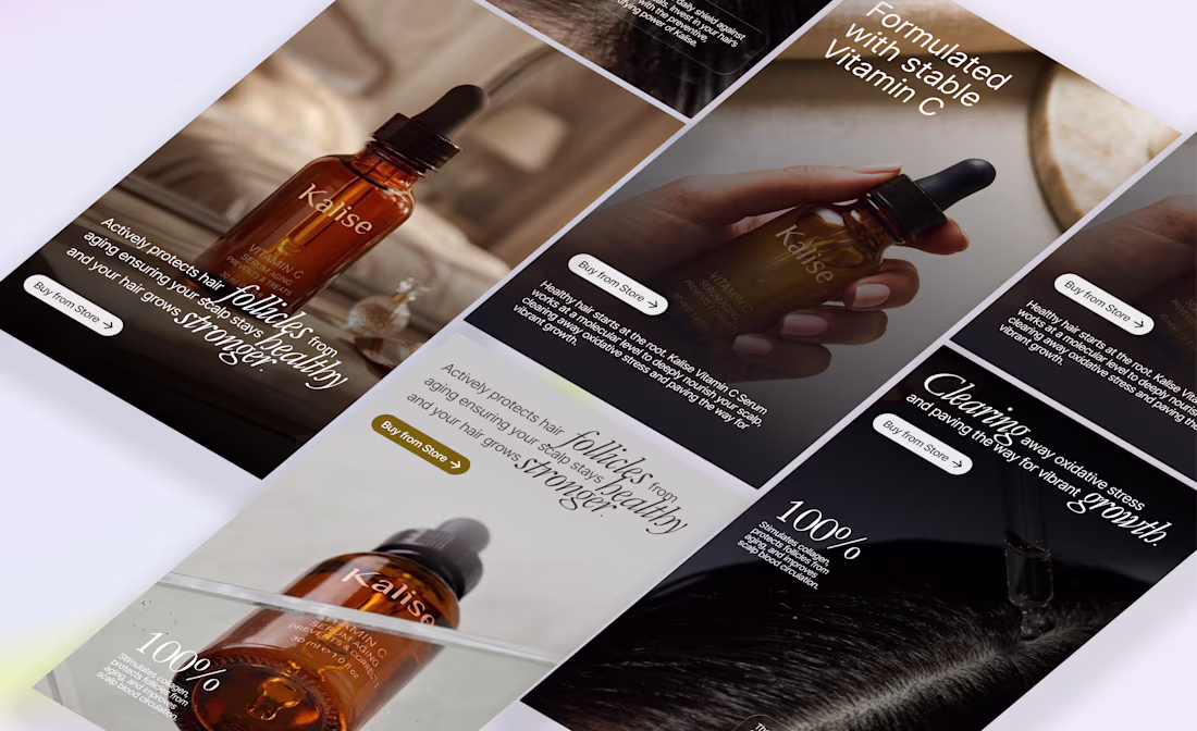
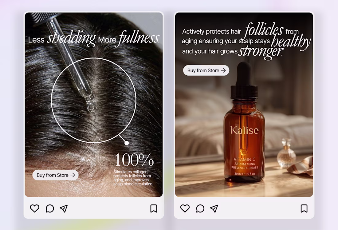
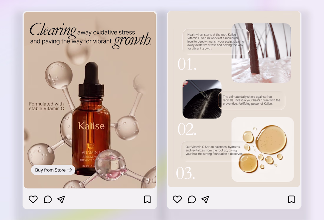
Kalise, Premium Social Media Campaign
Designed a premium social media campaign for Kalise to elevate its brand presence and promote its Vitamin C Hair Serum through elegant visual storytelling. The campaign combined product-focused creatives, educational content, and lifestyle...
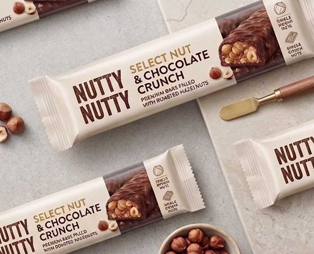
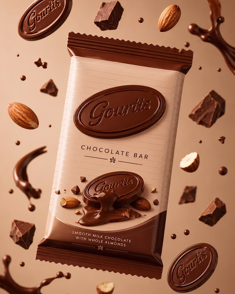
Help me decide, A or B? 👀
I'm running a quick A/B test on a packaging design and I'd love your input.
Which version would you pick at first glance, A or B?
More importantly, why?
Think about things like:
- Which one grabs your attention?
- Which feels more premium or trustworthy?
-...
2 voted
29%
5 voted
71%
7 votes
Closed
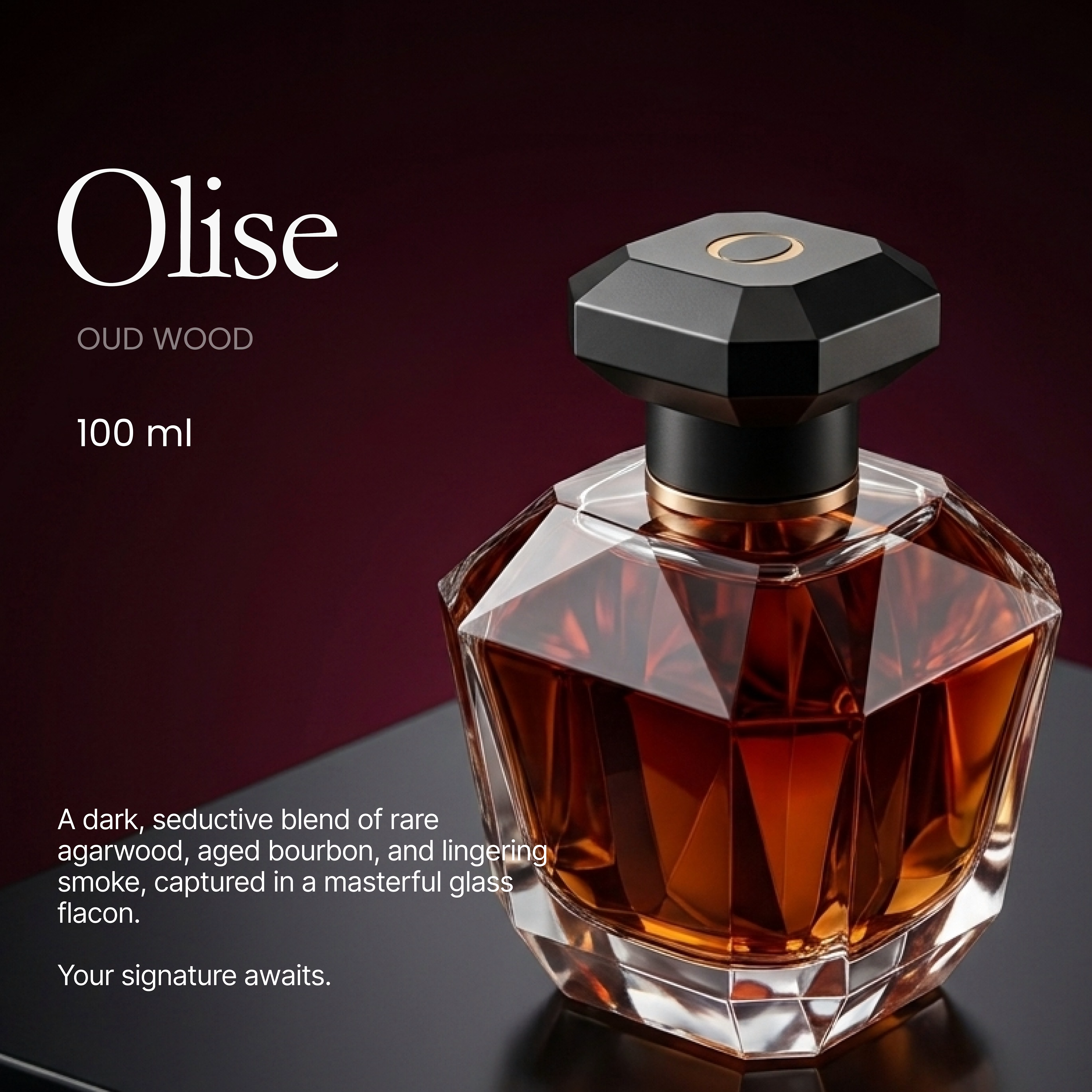
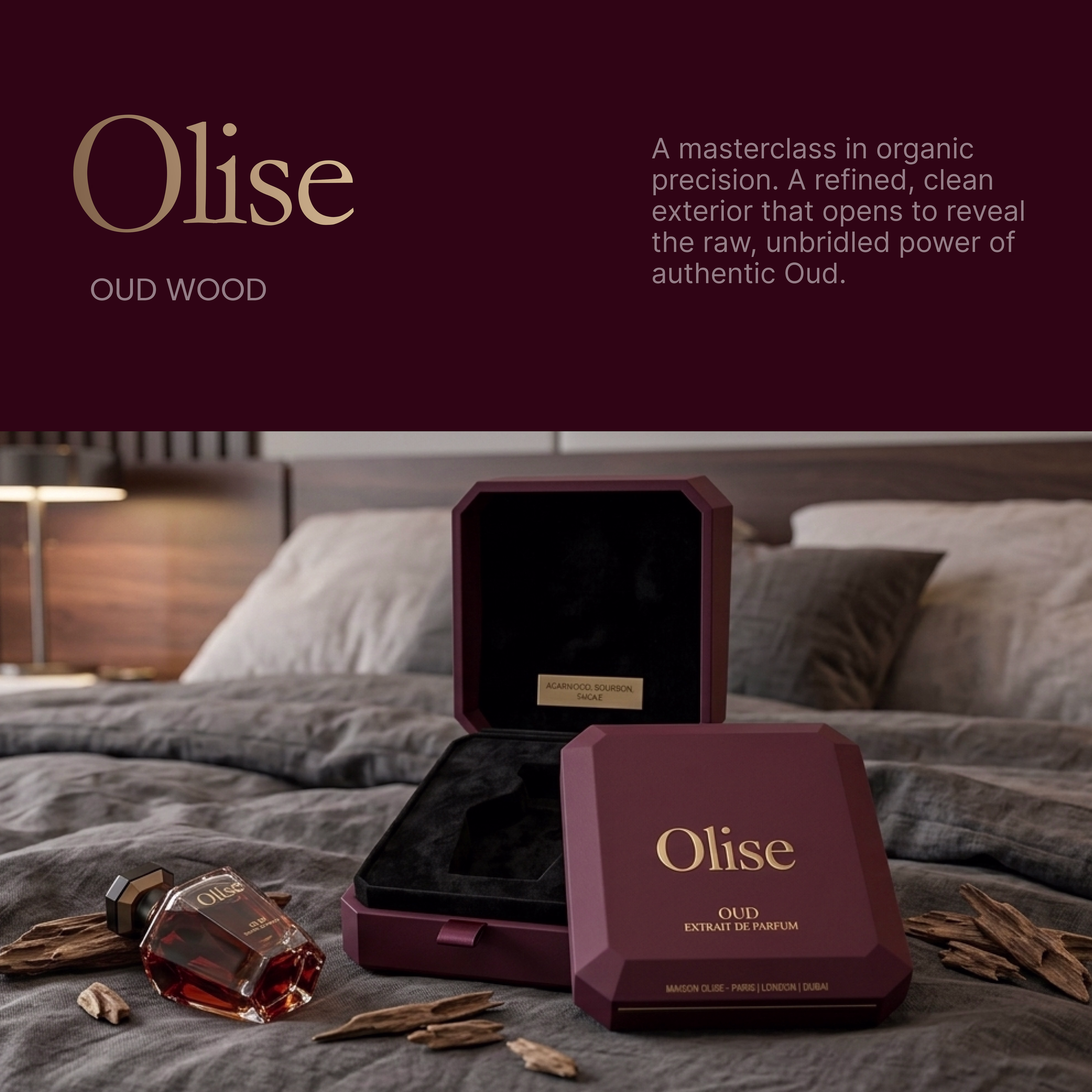
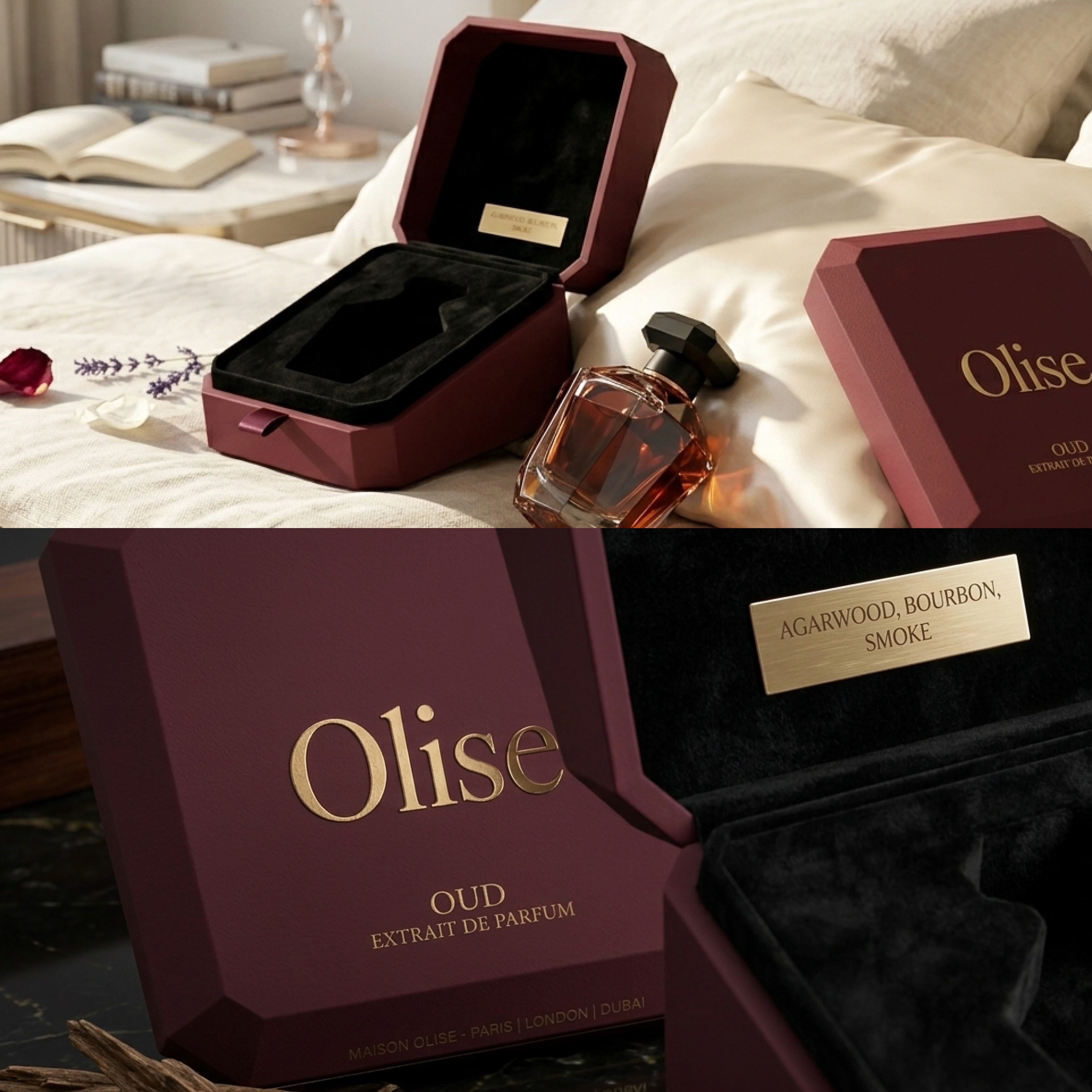
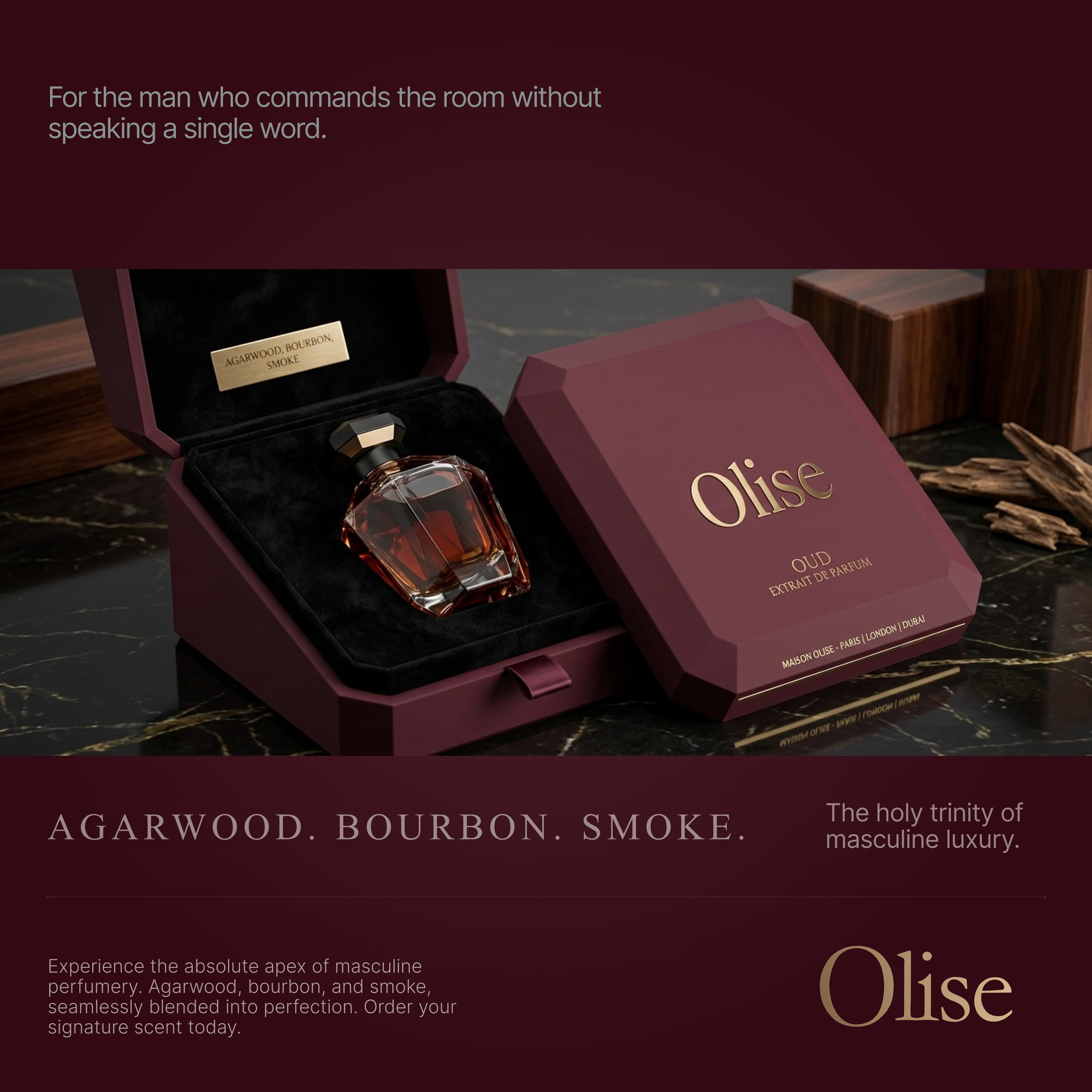
Elevating Perceived Value Through Luxury Packaging
Olise was positioned to compete in the premium fragrance market where luxury is judged long before the first spray. The challenge was to create packaging that immediately communicates exclusivity, craftsmanship, and gifting value...
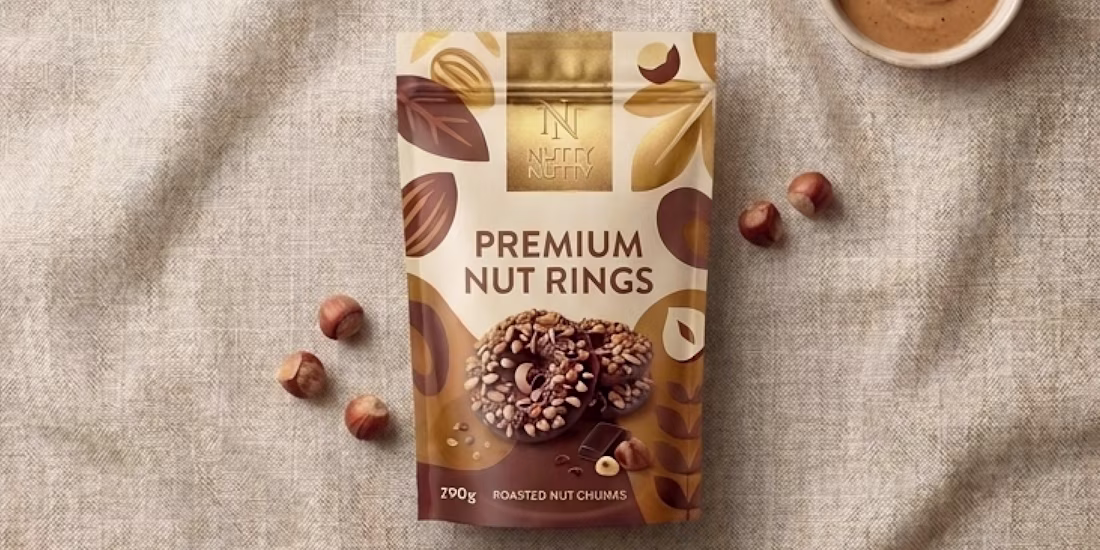
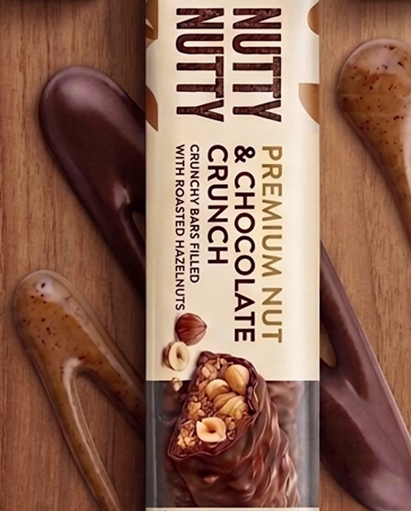
Premium Nut Rings Packaging Design
The objective was to position this nut-based snack range as a premium everyday indulgence, bridging the gap between functional nutrition and artisanal confectionery. Rather than competing on price or flavor alone, the packaging was designed to...
packagingbrandingpackagingdesignbrandpackagingPackaging DesignBrand DesignProduct StrategyAdobe PhotoshopFigmaIdeogram