The network for creativity
Join 1.25M professional creatives like you
Connect with clients, get discovered, and run your business 100% commission-free
Creatives on Contra have earned over $150M and we are just getting started
Back to feedPost
Taste Test

Help me decide, A or B? 👀
I'm running a quick A/B test on a packaging design and I'd love your input.
Which version would you pick at first glance, A or B?
More importantly, why?
Think about things like:
- Which one grabs your attention?
- Which feels more premium or trustworthy?
- Which would make you more likely to pick it off a shelf?
- Is there anything you'd change?
There are no right or wrong answers. Your feedback will directly influence the final design.
2 voted
29%
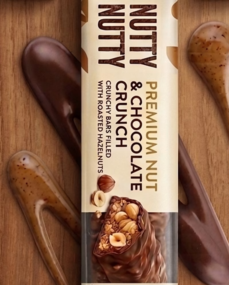
5 voted
71%
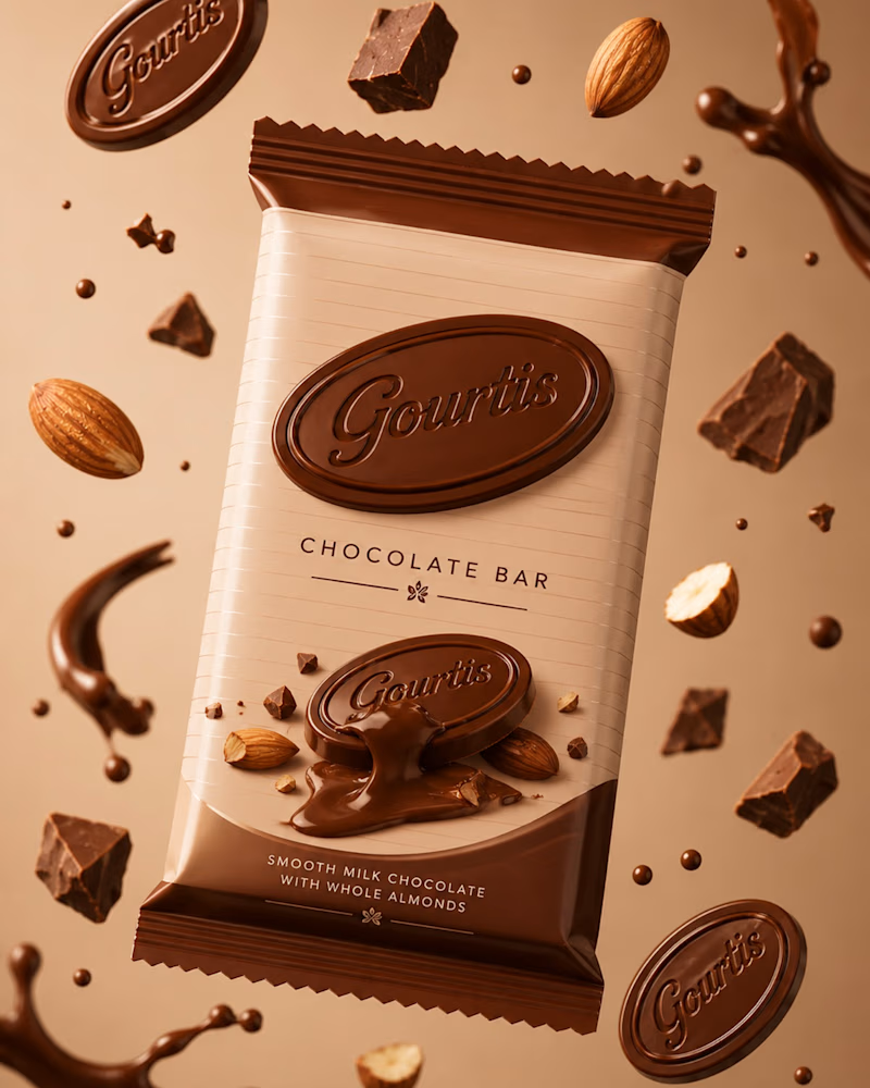
7 votes
Closed


Going for B
The network for creativity
Join 1.25M professional creatives like you
Connect with clients, get discovered, and run your business 100% commission-free
Creatives on Contra have earned over $150M and we are just getting started





Related posts



Both designs are great; it's hard to choose


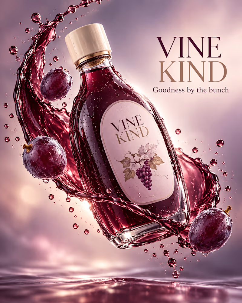
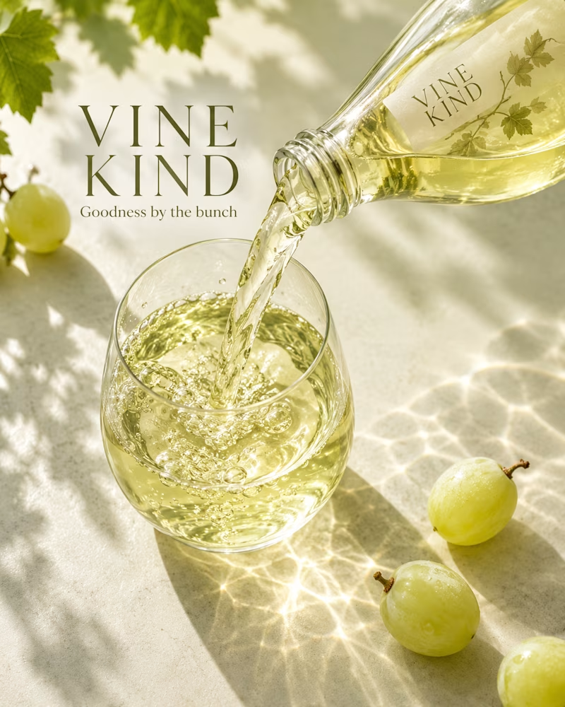
Which one would you take to shelf?
The first is a deep purple bottle suspended in a ribbon of juice, whole grapes and droplets floating around it, mauve mist behind, no surface in frame.
The second is poured white grape juice on cream stone, vine leaves overhead, green grapes on the surface, caustics and leaf shadow across the light.
One sells richness. The other sells freshness.
👇 #packagingdesign #brandconcept #beveragedesign
3 votes
Ends in 1d
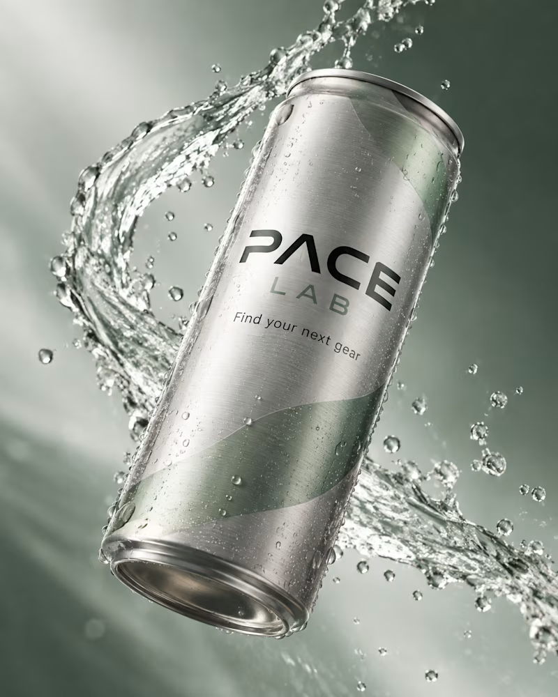
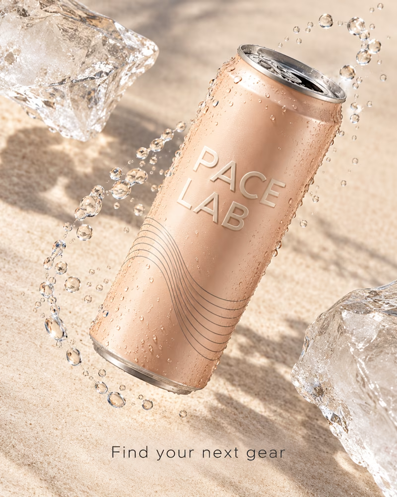
Which one would you shelf?
The first is a brushed silver can tilted against deep sage, a ribbon of water spiralling around it, beads of condensation across the metal, type in black and green.
The second is a blush can over pale sand, embossed type, fine linework up the side, two blocks of ice at the edges, droplets in a loose arc.
One sells performance. The other sells recovery.
👇 #packagingdesign #brandconcept #productphotography
3 votes
Ends in 1d