


The Ultimate Summer to Fall Skin Reset: A 6-Slide Instagram Carousel for Renew Beauty
THE CHALLENGE
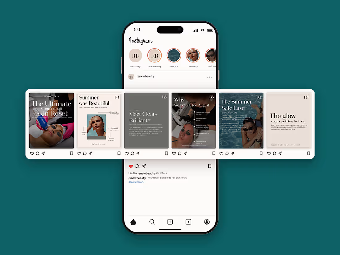
Renew Beauty wanted to promote Clear + Brilliant®, a gentle fractional laser, at the point where summer ends and laser season begins. The topic is technical, and followers scroll quickly. The carousel had to be educational, trustworthy and beautiful enough to stop the scroll.
THE APPROACH
I treated the carousel like a short story, with each slide answering one question:
The hook: a bold cover with a dark, moody treatment photo and a large serif headline.
The problem: "Summer was Beautiful," with callouts pointing to common skin concerns such as uneven tone, dullness and texture.
The solution: "Meet Clear + Brilliant®," explained in plain, friendly language.
The benefits: a clean timeline of five key benefits.
The reassurance: "The Summer Safe Laser," which answers the biggest objection about laser in warm months.
The close: "The glow keeps getting better," a calm, confident ending on the value of beautiful skin.
THE DESIGN SYSTEM
A soft palette of blush, cream, dusty rose and muted olive gives a calm, premium feel, with dark photography on key slides for contrast. High-contrast serif headlines paired with clean sans-serif body text create an editorial, luxury look. Every slide carries the RB monogram and a thin hairline border, so the series reads as one cohesive set. Generous white space keeps the copy easy to read on a phone.
DELIVERABLES
6 Instagram carousel slides (1080 x 1350 px, 4:5)
A consistent layout system the brand can reuse for future campaigns
RESULT
The client approved the set with no revisions and The carousel was published on the brand's Instagram
Need a social media carousel or brand-consistent post designs for your business? Message me and let's talk.
https://www.upwork.com/freelancers/sofiashabbir
1
125
Case Study: Corporate Culture & Transformation Pitch Deck
Use this for Behance, your Upwork portfolio description, your website or the Medium article.
Overview
Project: Presentation design for an internal learning academy session on culture, transformation and growth
Type: Corporate pitch deck (20+ slides)
Role: Presentation Designer
Deliverable: Fully designed slide deck and a portfolio mockup
Tools: Figma, PowerPoint, Canva,Photoshop.
The Challenge
The content was important but heavy. It covered company culture, why it matters, the digital roadmap, people investment and the future vision, and the first draft was text-dense and inconsistent.
Too much information per slide
No clear visual hierarchy
No consistent look across sections
Abstract topics (culture, change) that are hard to picture
The Goal
Turn complex, abstract content into a clear, branded presentation that is easy to present and easy to remember.
The Approach
Content first. I gave every slide a single job: define, explain, show the plan or set expectations. Slides that did two jobs were split.
Simplify the copy. Paragraphs became short phrases and one-line statements, so the slide supports the speaker rather than replacing them.
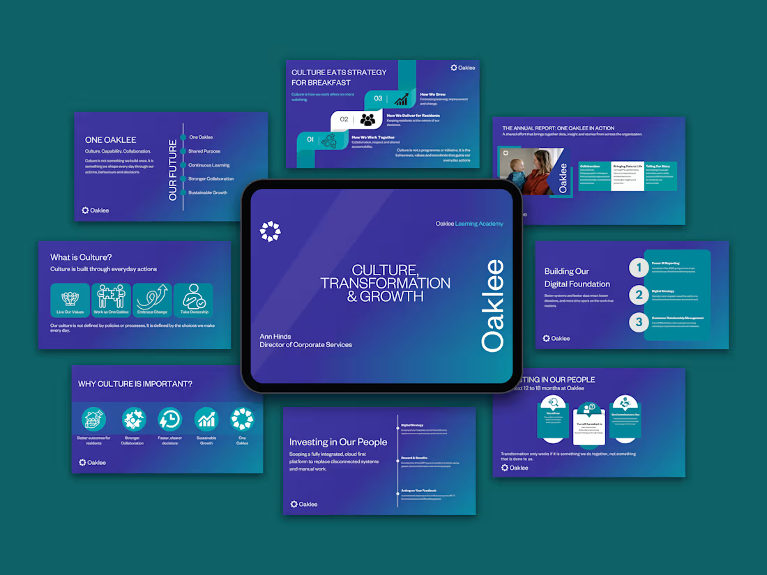
Visualise the abstract. Concepts like "culture" and "one team" became icons, timelines and process flows, so ideas can be seen rather than only read.
Design as a system. I built the rules first (colour, type, layouts) and then applied them to every slide.
The Design System
Colour
Deep purple-to-teal gradient as the base
White for headlines and body text
Teal and white cards for emphasis and contrast
Typography
Large, light headlines for impact
Bold sub-headings and short body text for scanning
One clean sans-serif family throughout
Layout patterns
Icon cards for values and benefits
Staircase and numbered layouts for steps
Vertical timelines for roadmaps
Rounded cards for commitments and expectations
Iconography
Simple line and solid icons in white or teal, used as visual anchors
Brand elements
Logo placed consistently on every content slide, with generous white space
The Solution
A consistent deck where each slide can be understood in about five seconds. Layouts change with the content type, so the deck stays varied without losing its identity.
The Presentation
To showcase the work, I placed the final slides in a flat-lay mockup, with the title slide on a tablet in the centre and the other slides around it. The background uses the deck's own purple and teal, so the thumbnail looks like part of the brand.
The Result
- A clean, professional deck that is easy to present
- A consistent visual identity across every section
- A reusable system for future presentations
Key Takeaway
When structure, colour and hierarchy work together, even complex ideas become simple to follow.
0
86

Wedding Pricing Guide
A complete Walkthrough of Wedding Guide Template
1
310
Pitch Deck Design in Canva | Startup Presentation Design
1
376