The network for creativity
Join 1.25M professional creatives like you
Connect with clients, get discovered, and run your business 100% commission-free
Creatives on Contra have earned over $150M and we are just getting started
Back to feedPost
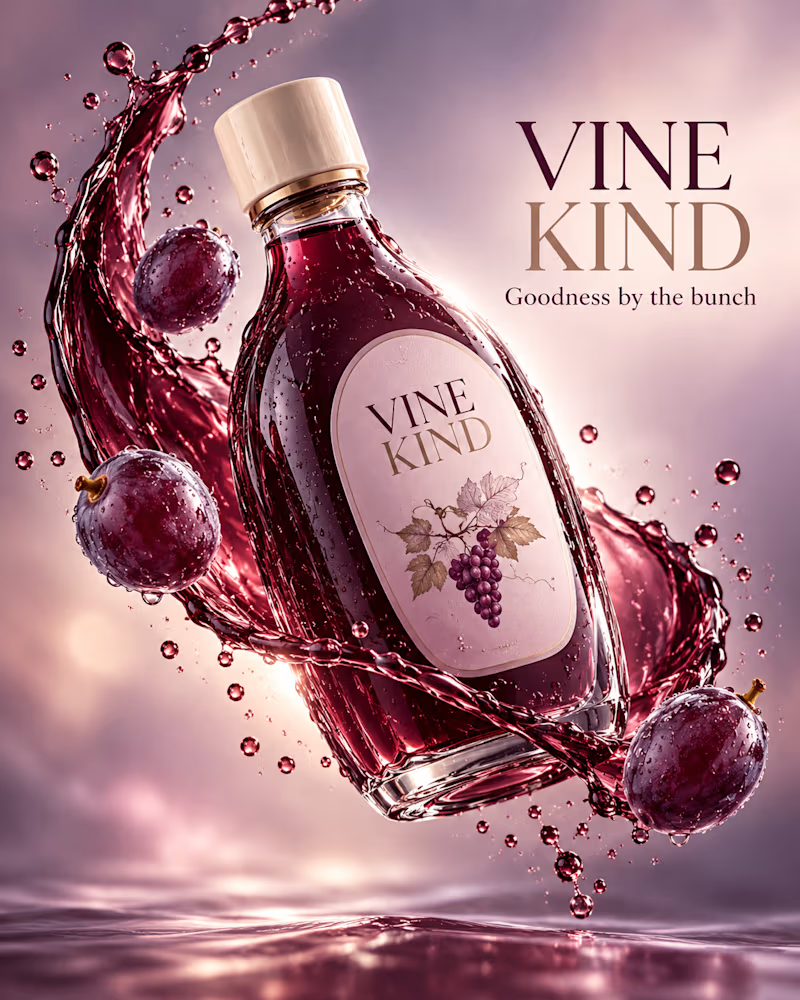
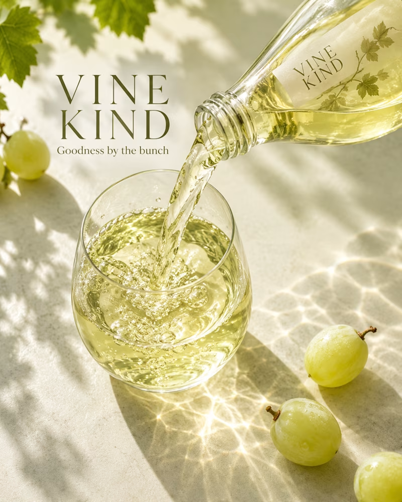
Taste Test


Which one would you take to shelf?
The first is a deep purple bottle suspended in a ribbon of juice, whole grapes and droplets floating around it, mauve mist behind, no surface in frame.
The second is poured white grape juice on cream stone, vine leaves overhead, green grapes on the surface, caustics and leaf shadow across the light.
One sells richness. The other sells freshness.
👇 #packagingdesign #brandconcept #beveragedesign
3 votes
Ends in 1d

Very is better for my opinion but both of them are great choice ❤️❤️
The network for creativity
Join 1.25M professional creatives like you
Connect with clients, get discovered, and run your business 100% commission-free
Creatives on Contra have earned over $150M and we are just getting started





Related posts





Option B feels nothing but premium

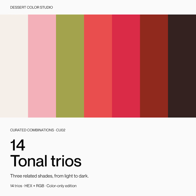
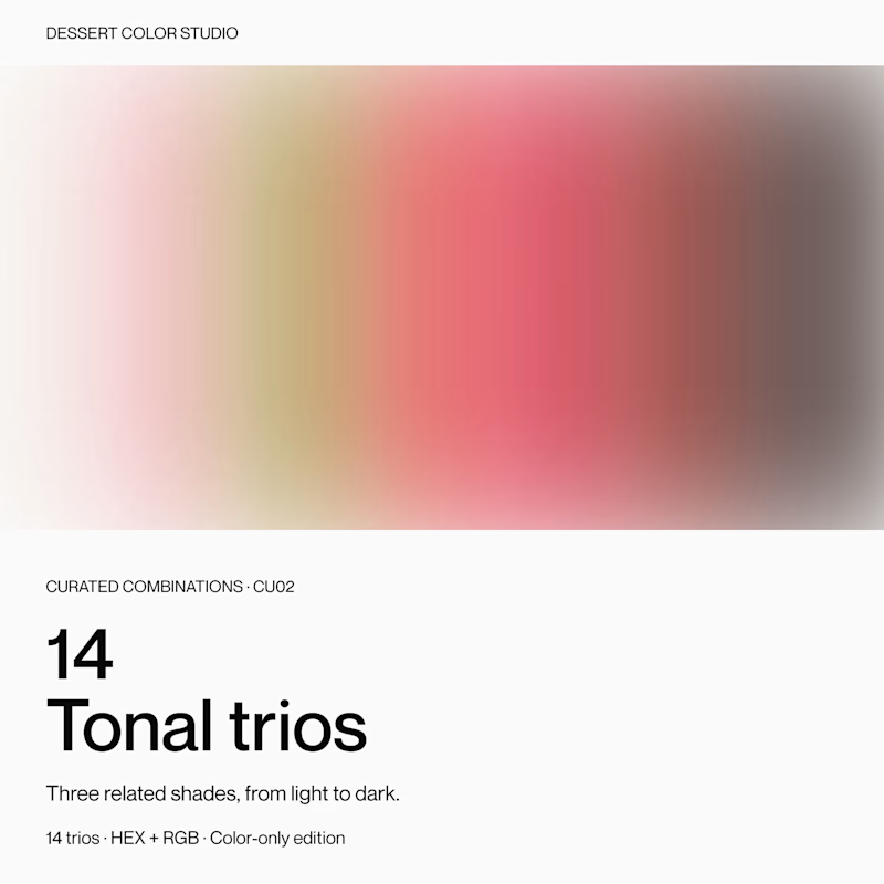
If you were browsing color resources, which cover would make you click to see more?
Same product inside: 14 tonal trios, with three related shades in each.
A or B? Curious what makes you choose one over the other.
9 voted
56%
7 voted
44%
16 votes
Closed


Which hero visual feels right for this brand?
While working on the homepage for Halfspace, a website design and SEO agency, I explored two different hero visuals for the same headline and layout. Same message, same structure, just a different visual metaphor and mood.
Option 1 - Rocket Launch. Bold, literal, and energetic, visually reinforcing the "launch your business" message with motion and fire.
Option 2 - Glass Cube. Abstract, sleek, and premium, giving a more refined, tech-forward feel without relying on a literal metaphor.
Would love your honest UX/UI take, which direction feels more impactful, memorable, and aligned with a web design/SEO brand, and why?
11 voted
41%
16 voted
59%
27 votes
Closed

Both design are great; it's hard to choose one