The network for creativity
Join 1.25M professional creatives like you
Connect with clients, get discovered, and run your business 100% commission-free
Creatives on Contra have earned over $150M and we are just getting started
Back to feedPost
Taste Test

Which hero visual feels right for this brand?
While working on the homepage for Halfspace, a website design and SEO agency, I explored two different hero visuals for the same headline and layout. Same message, same structure, just a different visual metaphor and mood.
Option 1 - Rocket Launch. Bold, literal, and energetic, visually reinforcing the "launch your business" message with motion and fire.
Option 2 - Glass Cube. Abstract, sleek, and premium, giving a more refined, tech-forward feel without relying on a literal metaphor.
Would love your honest UX/UI take, which direction feels more impactful, memorable, and aligned with a web design/SEO brand, and why?
11 voted
41%
16 voted
59%
27 votes
Closed

Rocket launch is looking better


Glass Cube. The rocket is a bit literal for an SEO agency, the cube feels more premium.

Glass cube is super elegant!


Awesome design !

Glass cube got my vote. Both are great

I’d go with Glass Cube. It feels more premium, modern, and aligned with a web design/SEO agency. The abstract visual gives the brand more room to build a distinctive identity without being too literal. 🔥

Both design are great; it's hard to choose one

The glass cube feels stronger for me. The rocket communicates “launch” very literally, while the cube leaves more room for the brand to feel strategic, premium, and less like a startup template.

I’d go with Option 2 — Glass Cube. It feels more premium and modern, which suits a web design and SEO agency well. The abstract visual also leaves more room for the headline to communicate the value without competing for attention.

Keeping the layout fixed makes this a useful visual comparison 👌
The network for creativity
Join 1.25M professional creatives like you
Connect with clients, get discovered, and run your business 100% commission-free
Creatives on Contra have earned over $150M and we are just getting started











Related posts

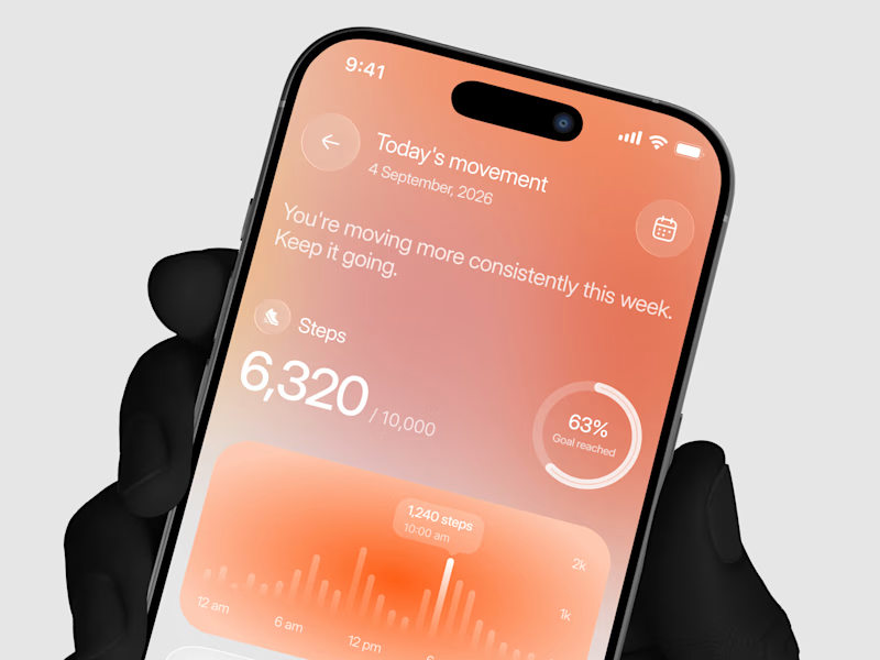
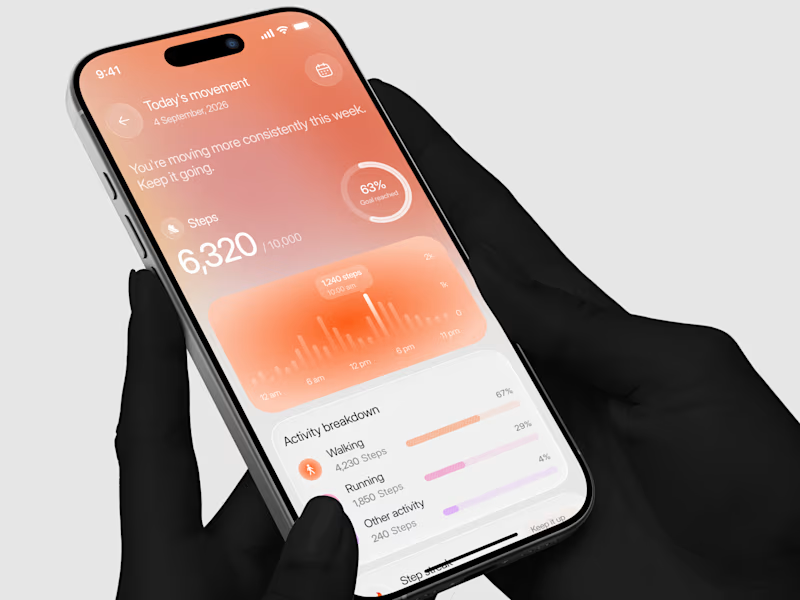
Designed a step tracking screen where you can see your daily progress and weekly trend in one glance.
Same screen, two shots. Which one would stop your scroll? 👀


11 voted
73%
4 voted
27%
15 votes
Closed


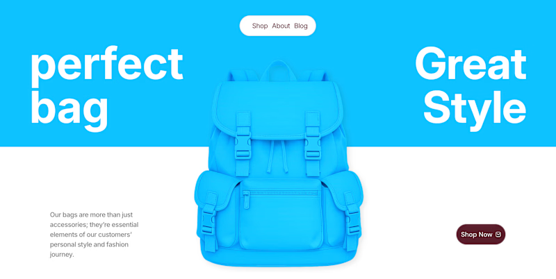
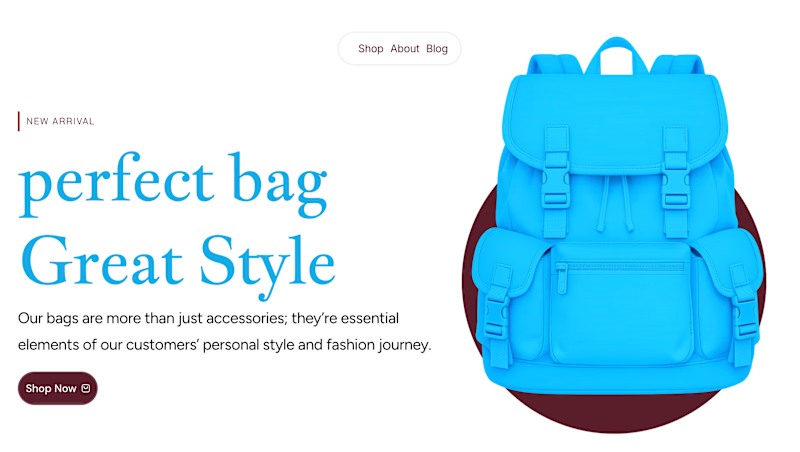
✨ Two Hero Concepts. One Bag Brand. Which One Wins? 👜
Exploring two different visual directions for Vellato, a fictional bag brand designed around everyday style, bold aesthetics, and modern fashion.
🔵 Option A: Bold Vibrant
🤍 Option B: Clean Editorial
If you were designing the digital experience for Vellato, which direction would you choose?
Option A or Option B?
Drop your vote in the comments! I'd love to hear which one catches your eye and why.

3 voted
60%
2 voted
40%
5 votes
Closed

Option A: Bold is great choice but you need make the blue tape darker to increase contrast ❤️❤️
Great job Orlerx🔥🔥

Same design. Which palette? 👀
You picked your favorite preview last time. This time, I’m putting the colors to the vote.
One body-care packaging concept, with the same typography and composition:
A · Rose Cream, Strawberry Sorbet + Plum Jelly
B · Lime Mousse, Coconut Cream + Plum Jelly
Which would you choose and what does it make you feel about the brand?
Both palettes use colors and matching ingredient textures from DCS 654, my library of 654 dessert-inspired colors.
Take a closer look: dcs.mariya.design
7 voted
44%
9 voted
56%
16 votes
Closed
B is absolutely stunning 🎉🎉🎉🎉
Great job Mariya❤️