The network for creativity
Join 1.25M professional creatives like you
Connect with clients, get discovered, and run your business 100% commission-free
Creatives on Contra have earned over $150M and we are just getting started
Back to feedPost
Taste Test

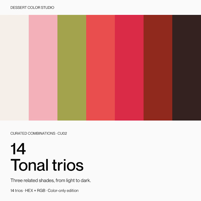
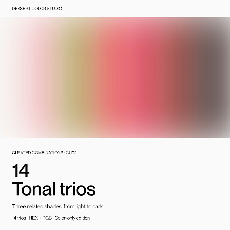
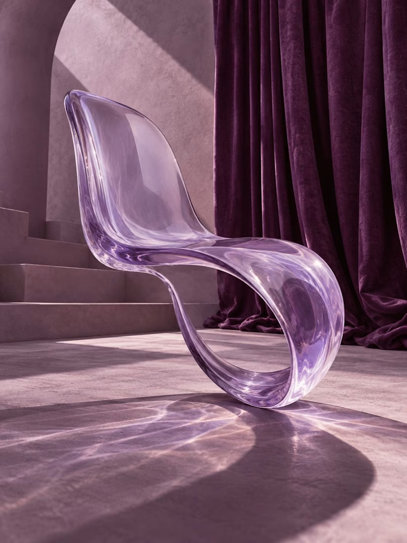
If you were browsing color resources, which cover would make you click to see more?
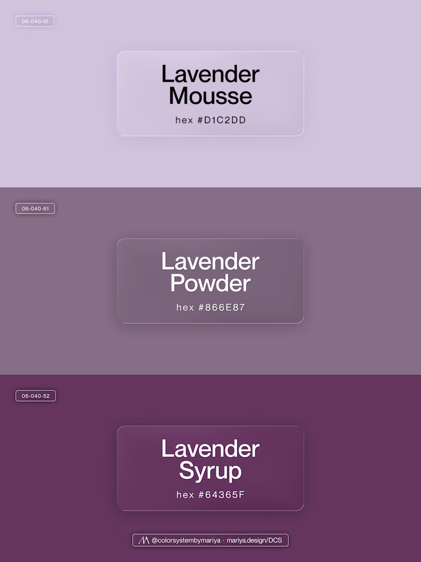
Same product inside: 14 tonal trios, with three related shades in each.
A or B? Curious what makes you choose one over the other.
10 votes
Ends in 1d

A/Crisp is has more visible difference between colors it's better I choose it 🎉🎉
Thanks, Mostafa, I really appreciate the feedback!
Pardon❤️

It is great to hear the reasoning behind the vote, thank you, Faiz!
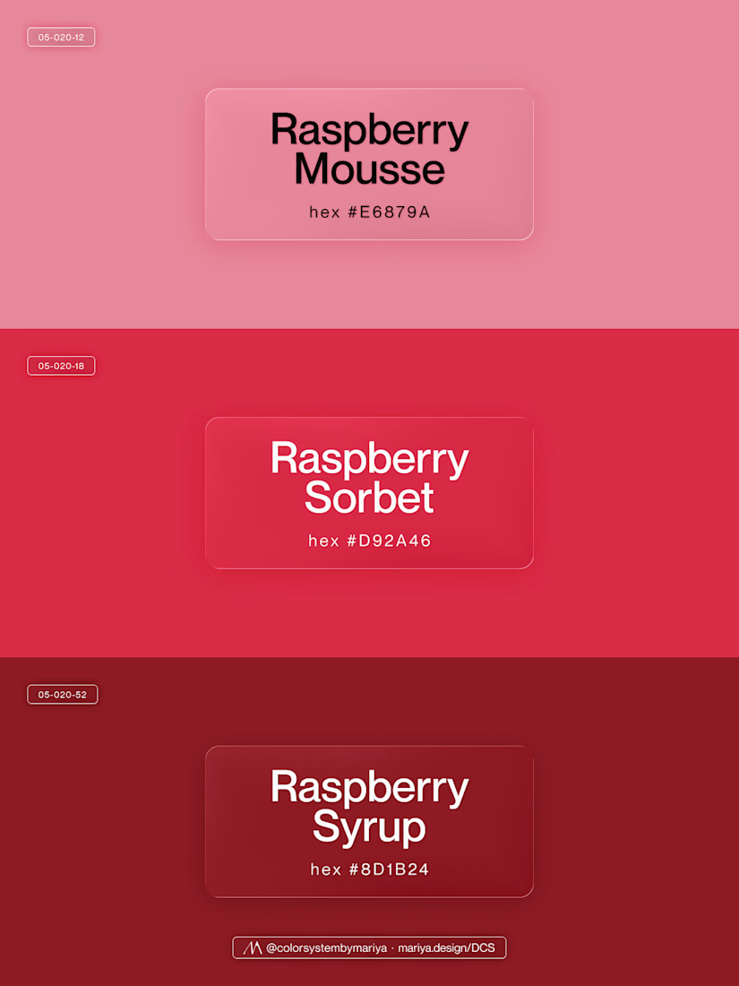
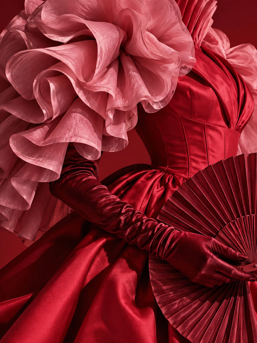
To put more context: this is what a "tonal trio" actually looks like and how it effects the work.
The network for creativity
Join 1.25M professional creatives like you
Connect with clients, get discovered, and run your business 100% commission-free
Creatives on Contra have earned over $150M and we are just getting started





Related posts

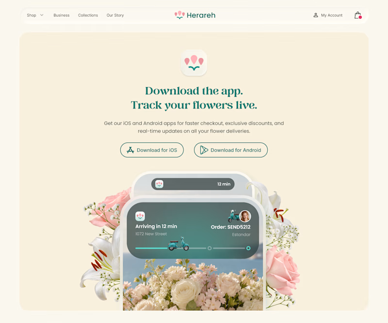
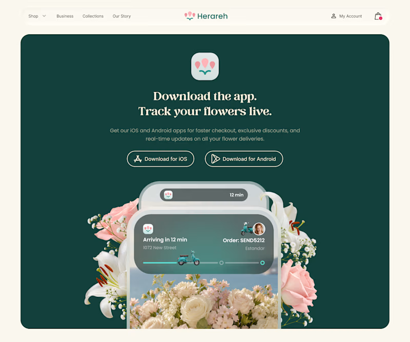
Which version makes you want to download the app? 🌸
I’m exploring two color directions for Herareh’s app download section. Vote A or B and tell me why—I’d love your perspective!
4 voted
24%
13 voted
76%
17 votes
Closed

deep green feels so lovely, good work

exploring some visual directions, which of this hero design looks better?
4 voted
40%
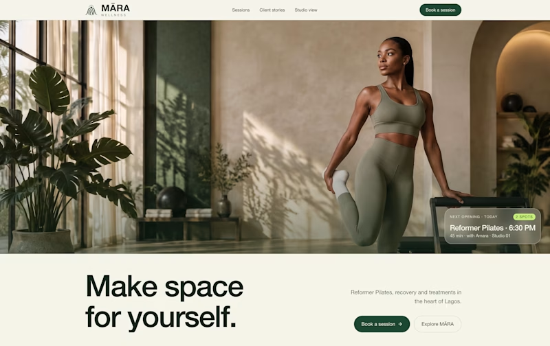
6 voted
60%
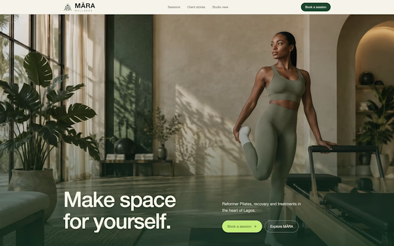
10 votes
Closed

Option 1 looks cleaner and more balanced. The layout feels more spacious and premium. ✨

Which loader did you guys choose and why? I created the approved version for my client and he loved it.
2 voted
20%
8 voted
80%
10 votes
Closed
Approved feels unique I like it ♥️♥️