The network for creativity
Join 1.25M professional creatives like you
Connect with clients, get discovered, and run your business 100% commission-free
Creatives on Contra have earned over $150M and we are just getting started
Back to feedPost
Taste Test

Which version makes you want to download the app? 🌸
I’m exploring two color directions for Herareh’s app download section. Vote A or B and tell me why—I’d love your perspective!
4 voted
24%
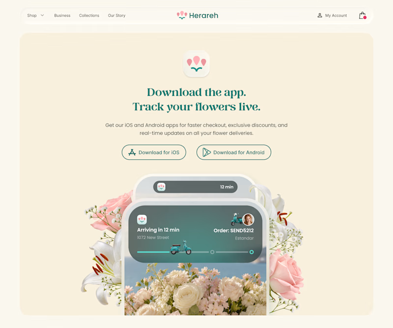
13 voted
76%
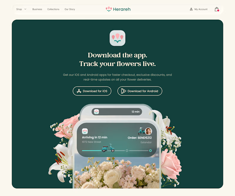
17 votes
Closed

Yes! The ivory feels so welcoming.
Follow along! It motivates me to share more.

soft

both are great! soft ivory has a greater contrast and is more atractive
Thanks, Grecia! Glad you like both!
Follow along! It encourages me to share more.

deep green really does well to highlight the details of the popout arrangements, definitely more of an eye-catcher! plus, i can see the app's icon super clearly, while i can't on the soft ivory.
I love that you always stop by and comment, Nicolette! Your support keeps me motivated to share more 😊

deep green feels so lovely, good work
Thanks, Daxesh! Glad you like it!
Follow along! It motivates me to keep posting.
Yeah sure

Deep green feels rich. Well done!🙌🏼👏🏼
The network for creativity
Join 1.25M professional creatives like you
Connect with clients, get discovered, and run your business 100% commission-free
Creatives on Contra have earned over $150M and we are just getting started











Related posts

Brand identity exploration
Which one do you think it fits better?
36 voted
77%
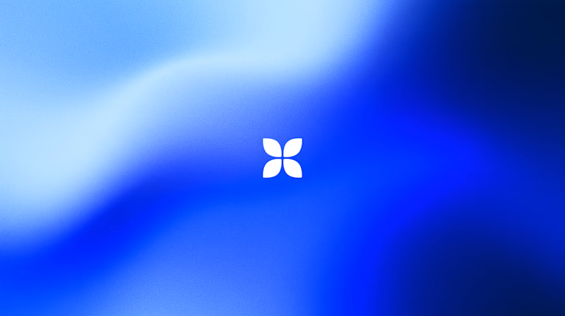
11 voted
23%
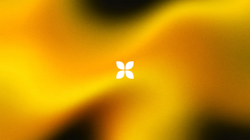
47 votes
Closed

Cobalt is great Gold is unique 🎉🎉🔥🔥

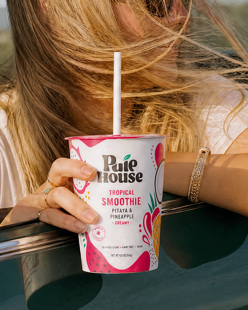
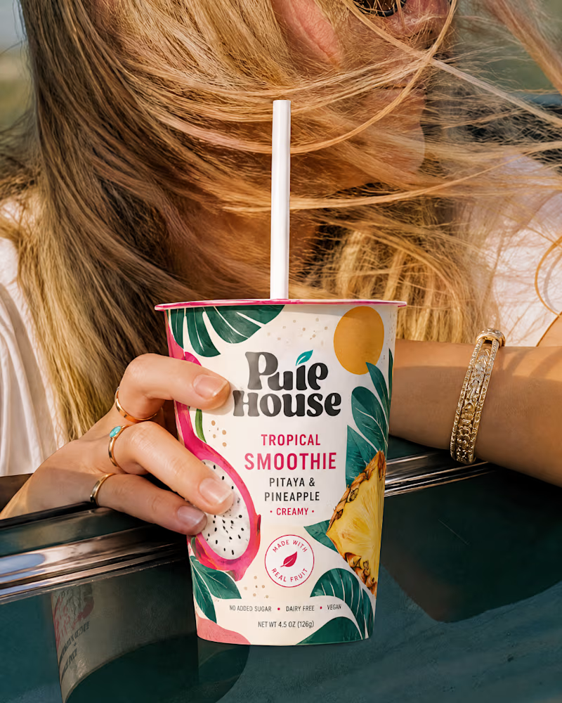
Exploring Two Branding Concepts
I explored two distinct visual directions for Pulp House, focusing on how color, composition, and design elements can shape a brand's identity.
This comparison reflects my approach to creating thoughtful, cohesive visuals that help businesses present their brands with confidence.
1 voted
5%
20 voted
95%
21 votes
Closed

Fun concepts, Mati!

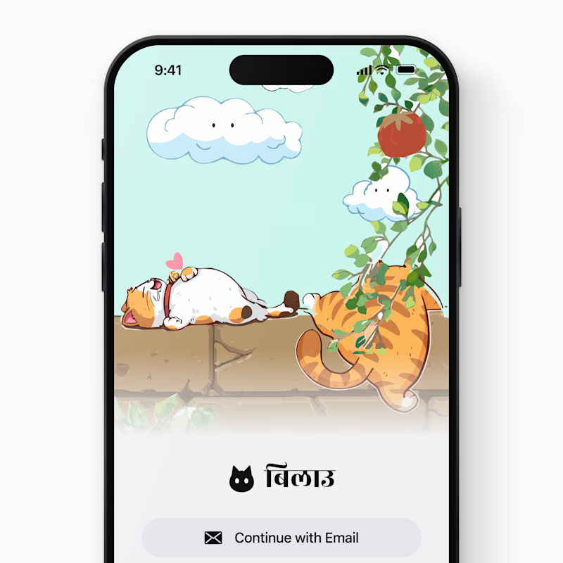
Still, it's a login screen.
In motion, it's a welcome.
Which one would you choose?


7 voted
100%
0 voted
0%
7 votes
Closed

My vote is Motion, Peeyush. The still screen is a login form, but the animated version genuinely feels like a welcome. That is the whole argument for motion in onboarding right there.