The network for creativity
Join 1.25M professional creatives like you
Connect with clients, get discovered, and run your business 100% commission-free
Creatives on Contra have earned over $150M and we are just getting started
Back to feedPost
Taste Test

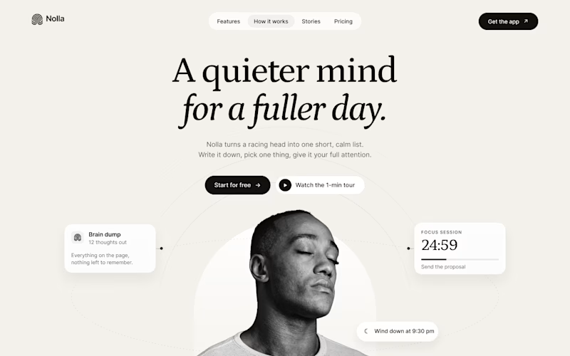
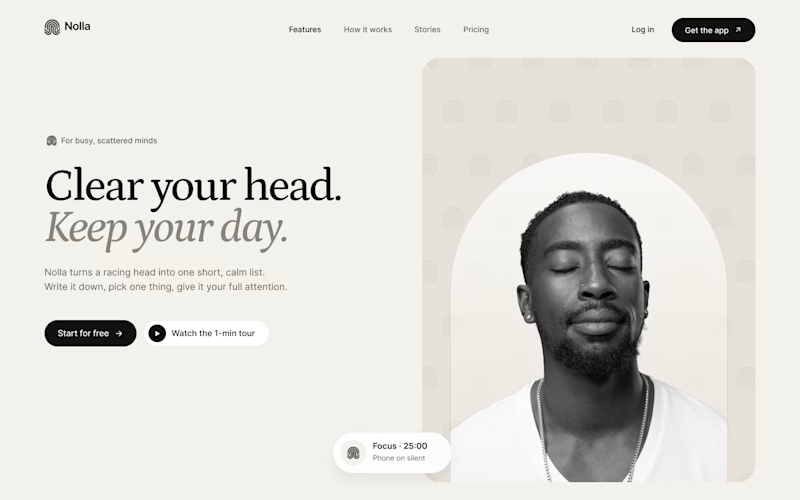
Started a new concept this week: Nolla, a small app for people whose heads won't stop running.
Same words, same brand kit, two hero layouts.
A puts everything in the middle. He sits inside an arch taken straight from the logo, and his to-dos orbit around him.
B is a split. Words on the left. On the right, the logo mark repeats into a quiet pattern behind him.
Fonts are Petrona and Inter.
Which one would make you download the app?


6 votes
Ends in 1d

Split feels more balanced to me!
Thanks Celia! The arch in A was fun to draw, but I think you're right. The split gives the words more room, and the pattern stays quiet behind him.
The network for creativity
Join 1.25M professional creatives like you
Connect with clients, get discovered, and run your business 100% commission-free
Creatives on Contra have earned over $150M and we are just getting started





Related posts

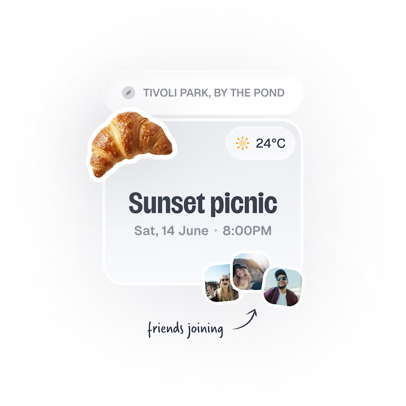
Upcoming card design for a Picnic App 🥞🧺🍎
Do we like the idea of images or predefined avatars more?:)
20 voted
83%
4 voted
17%
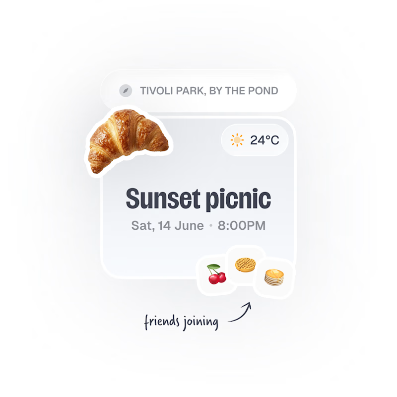
24 votes
Closed

Images, with the fruit avatars as the fallback for anyone without a photo. Faces are how you spot your friends at a glance, and the croissant already gives the card plenty of personality.

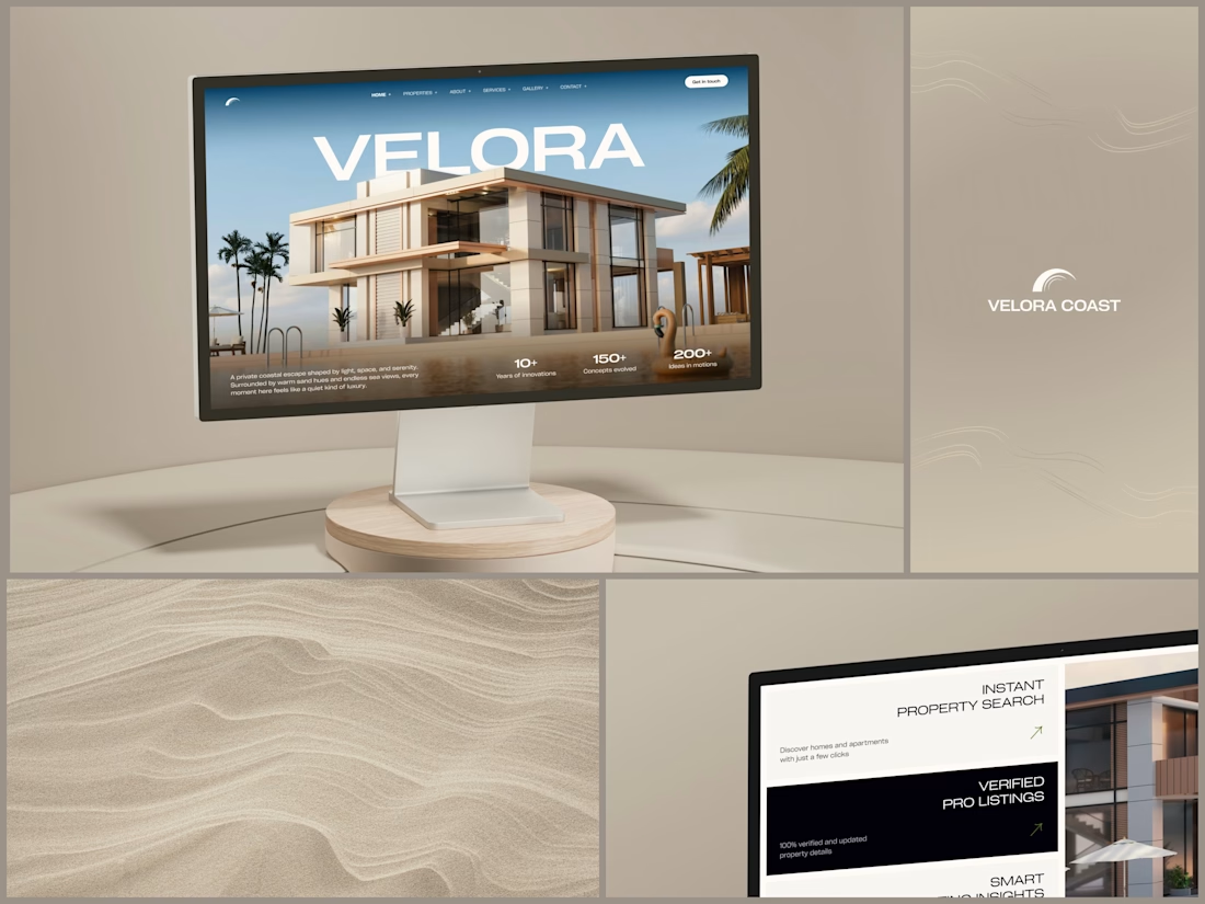
Real Estate Website
The villa stands in front of the name, on purpose.
The hero is one wide image of a modern villa under a blue sky, with palms at the sides and a pool in front. The name runs across the sky in wide white capitals, and the roof covers the bottom of the middle letters. It still reads at a glance, and the house keeps the foreground.
Lower on the page, the feature cards alternate cream and black, so it is clear where one card ends and the next begins. Each heading repeats the wide capitals of the name, aligned right, with a short line of copy and a small green arrow.
Designed by the Hue & Machine team.
#RealEstate #Architecture #RealEstateWebsite #WebDesign #LandingPage #HeroSection #Typography #UIDesign #DesktopDesign #FigmaDesign


This looks so premium! Love the concept of the villa standing in front of the name on purpose, it makes the hero feel so bold and confident. The wide image, the blue sky, palms and pool, everything feels luxurious but still clean. And the way VELORA runs across the sky in big...

Footer explorations.
Which one do you like it?
7 voted
32%
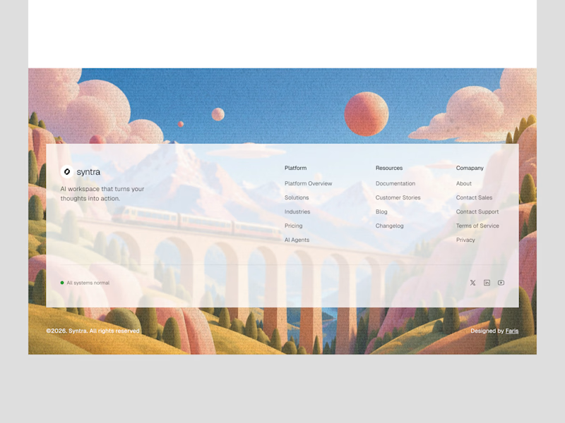
15 voted
68%
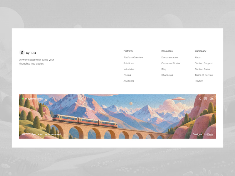
22 votes
Closed
Love these explorations! The first one really stands out to me, the illustrated train scene makes the footer feel so memorable instead of just links at the bottom. It's such a clever way to end the page on a beautiful, branded note. Really great work!