
pro
David Emmanuel
Graphic Designer & 3D Animator


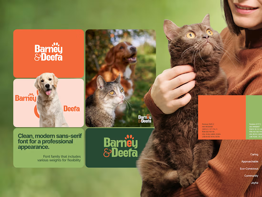
Barney & Deefa — Brand Identity & Strategy
Barney & Deefa is a sustainable pet food and care brand. I led the identity, and the core job was clear from the start: the brand had to earn trust the moment you see it. People are choosing what goes into a family member's body, so it needed to feel both dependable and genuinely warm.
I handled the full identity, from strategy through to a complete brand system.
What I delivered:
Brand strategy and positioning built on ten personality traits
A distinctive wordmark with a hidden paw-print detail
A warm, nature-led colour palette in orange, sage, and forest green
A type system pairing Anton and Inter
Verbal identity and tone of voice guidelines
Applications across packaging, wearables, and stationery
A complete brand guideline document
The result is a cohesive, trustworthy identity that holds up across every touchpoint, from a food bowl to a social post.
Need a brand that turns your positioning into something people trust and remember? I take on a limited number of identity projects. Let's talk.
2
228
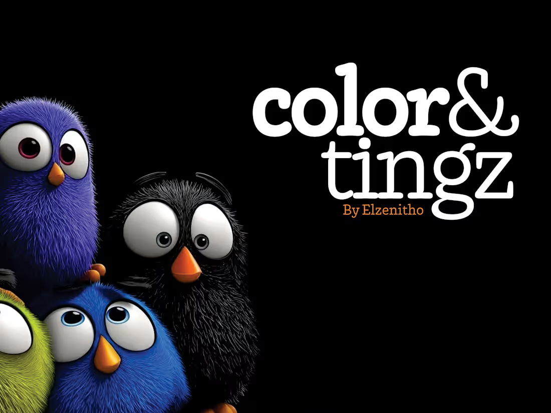
I made color&tingz. One app for every colour code. It's free, it works offline, and there isn't a single ad.
Type a colour and get HEX, RGB, HSL, CMYK, LAB, the closest Pantone and the colour's name, plus harmonies and a contrast check. Drop in a photo and it hands you the palette.
https://elzenitho.org/color-and-tingz/ For Windows and Mac
1
89
Mbari Hub: Studio Website Redesign
Mbari Hub takes its name from Mbari Mbayo, "when we see it, we shall be happy." Seeing is believing. The studio exists to make brands visible, so the site needed to prove that in the first three seconds rather than explain it in the third paragraph.
What I did:
Positioning and messaging, including the mission line "a brand set on the hill cannot be hidden"
Full art direction, including the composited hero of a figure walking a mossy branch above its own reflection
Editorial type system built on a high-contrast serif with italic emphasis, paired with a clean sans for body
Dark UI with warm light, tuned so client work and packaging shots stay the brightest thing on the page
Responsive layouts across desktop and mobile, with the service sections restructured as questions instead of a feature list
Build, DNS, and analytics setup
Result: a site that sells the studio's core promise through the experience of using it, not just the copy.
2
177
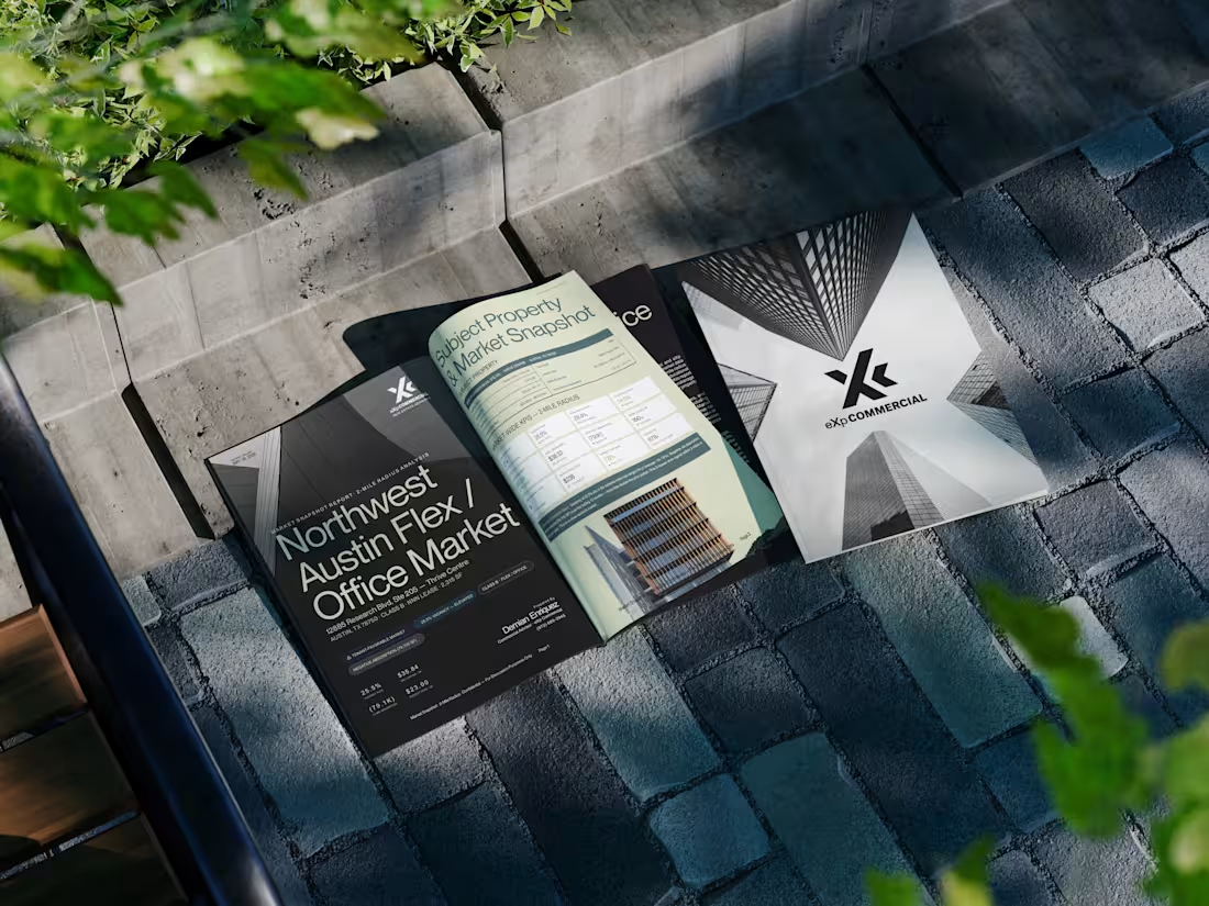
Designed a commercial real estate market report for a client, transforming dense property data, market insights, lease comparables, and positioning analysis into a clean, premium editorial experience.
The goal was to make a data-heavy report feel less like a spreadsheet and more like a publication, using strong typography, structured layouts, visual hierarchy, and architectural imagery while keeping the information easy to navigate.
2
186