
pro
Edward Jaiyeola
Framer Designer & Revenue-Focused Sites | Ecom Partner | AI
- 5.00
- Rating
- 51
- Followers
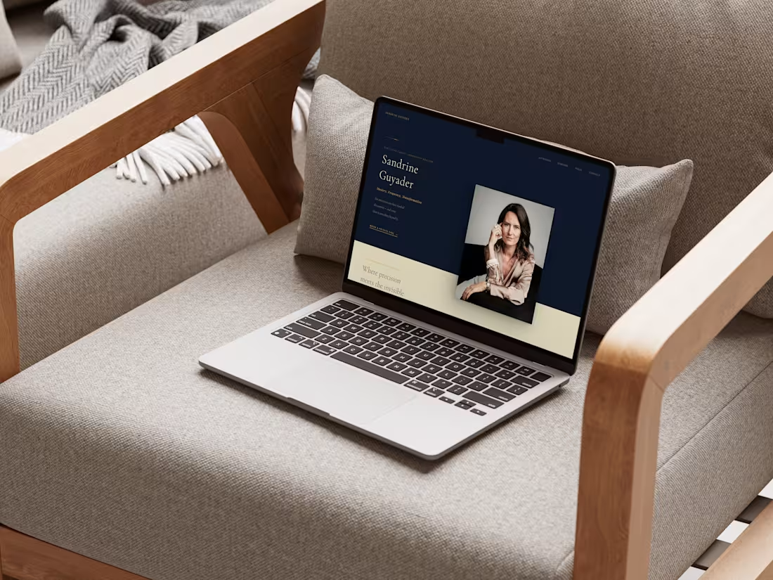
Premium Personal Brand Website for Executive Coach
1
5
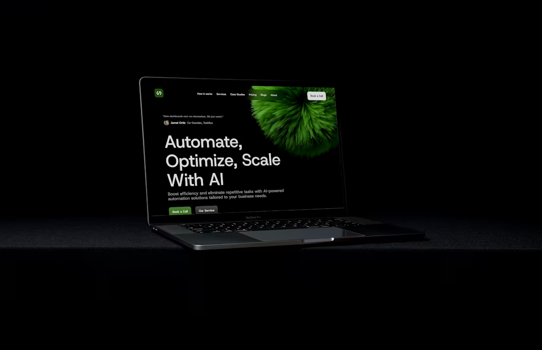
AI Agency Website
1
1
Sassy Hero Section Design on Framer.
1
1
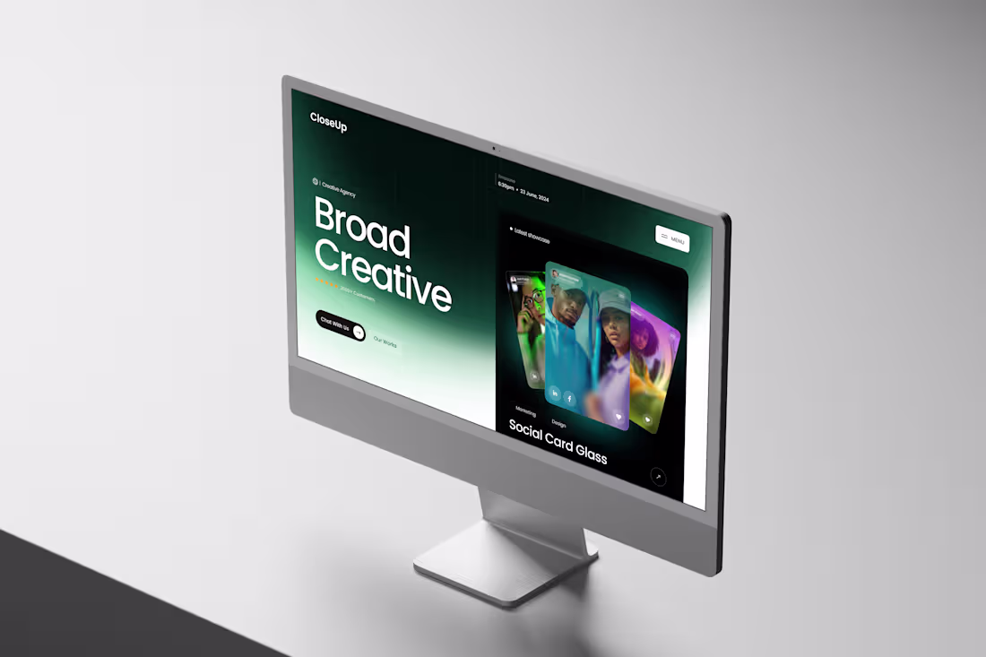
Close Up Creative Agency.
Clean & Modern Hero Section Design.
1
55
GHQ - Creative Studio Website
1
3
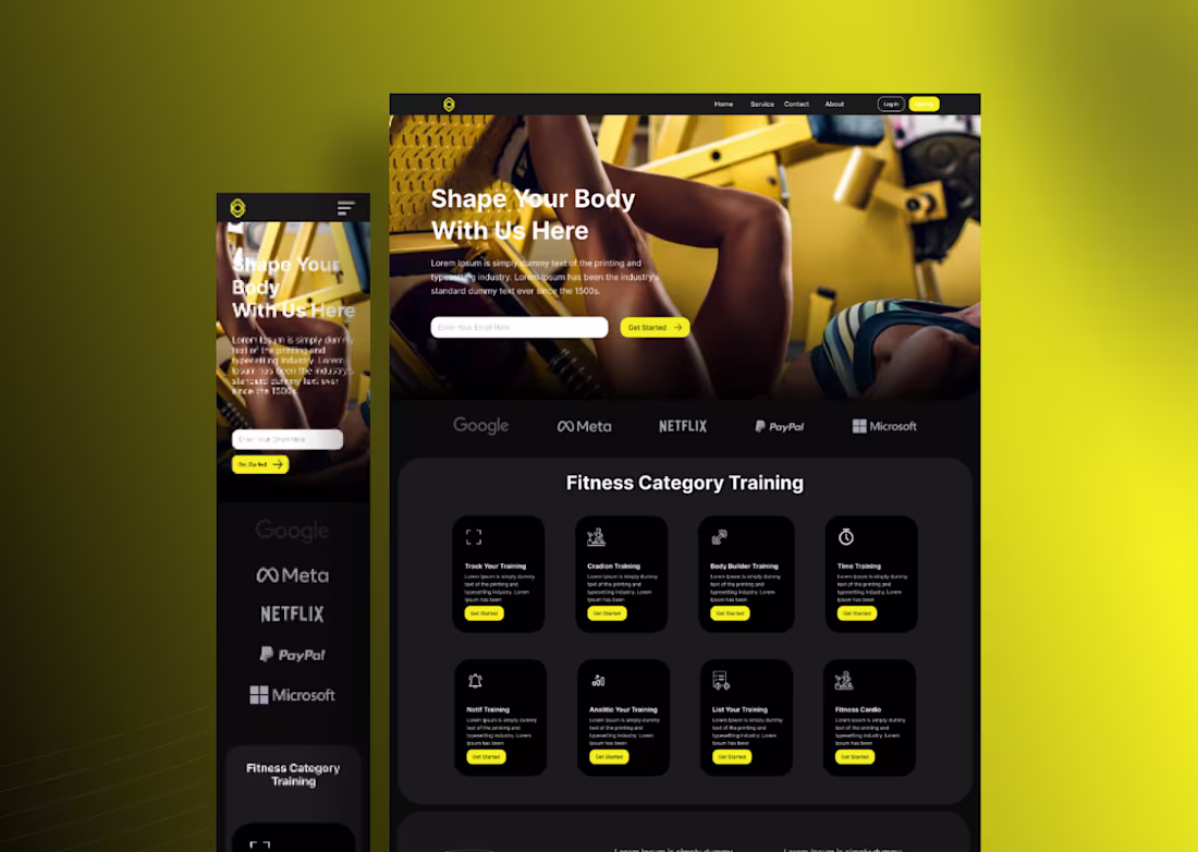
Gymomie Responsive Website Design
1
2
Finass - Fintech Digital Website
Communicating their brand and what they do clearly.
Representing Energy, Passion, Warmth, Power & Dynamic.
1
52
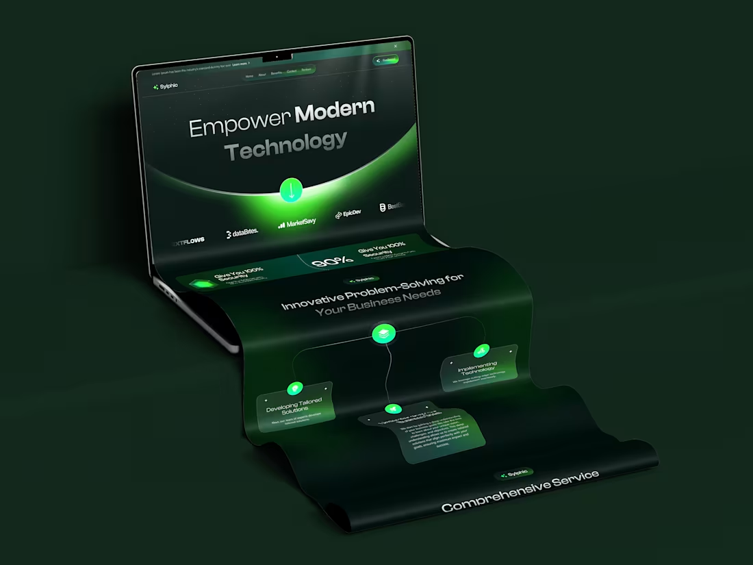
Sylphic - Business Agency Website Design
1
3
VividEcho - Creative Agency Landing Page
1
62
The Goal was to create a catchy & appealing hero section like those high-end posters, but still not losing the necessary UI/UX.
And here we have it.. still a working progress though, but it's a great concept.
8
12
400
Juda - Business Agency Website
1
55
SÉ HELION Hero Section Design.
The Goal was to design an artful feeling hero section for SÉ HELION and here are the concept I came up with.
1
56
Fitness Clothing Website.
Full Ecommerce Build on Figma and Framer linked to Shopify.
Featuring:
- Payment Gateways
- Checkout & Cart
- Sliders
- Shop
- CTA sections
- Variable Footer and Header
- Newsletter and Email Systems
- Fully Responsive
- And Lots more it was an interesting project working with the team.
1
50
Glossia Dashboard Experiment
We wanted to see the feel, look and users experience with a new glossy icons and interface, replacing the flat looking icons with something with much more feel & dept.
And Here We Are
1
77
Just playing on my Framer and trying to create a modern art-like hero section from a screenshot and a reel I saw on Instagram.
Slapped everything together an we have this beautiful hero section.
Tools: Figma, Framer and my Creativity😊 .
1
147
ARTIZO™ needed a digital presence as bold as their vision. The goal: design a landing page prototype that felt alive, not just another portfolio, but a statement.
Built in Figma, the concept leans into high contrast black and electric green, pairing oversized typography with layered 3D elements and fluid card compositions. Every section was crafted to guide the eye while keeping the energy raw and expressive.
From the hero's typographic clash to the gallery's dynamic grid, the design speaks before you read a word. Clean. Confident. Unmistakably creative.
This wasn't about filling a template, it was about building a visual identity that commands attention and makes every scroll feel intentional.
Designed in Figma → Transferred to Framer · UI/UX · Brand Direction
4
6
234
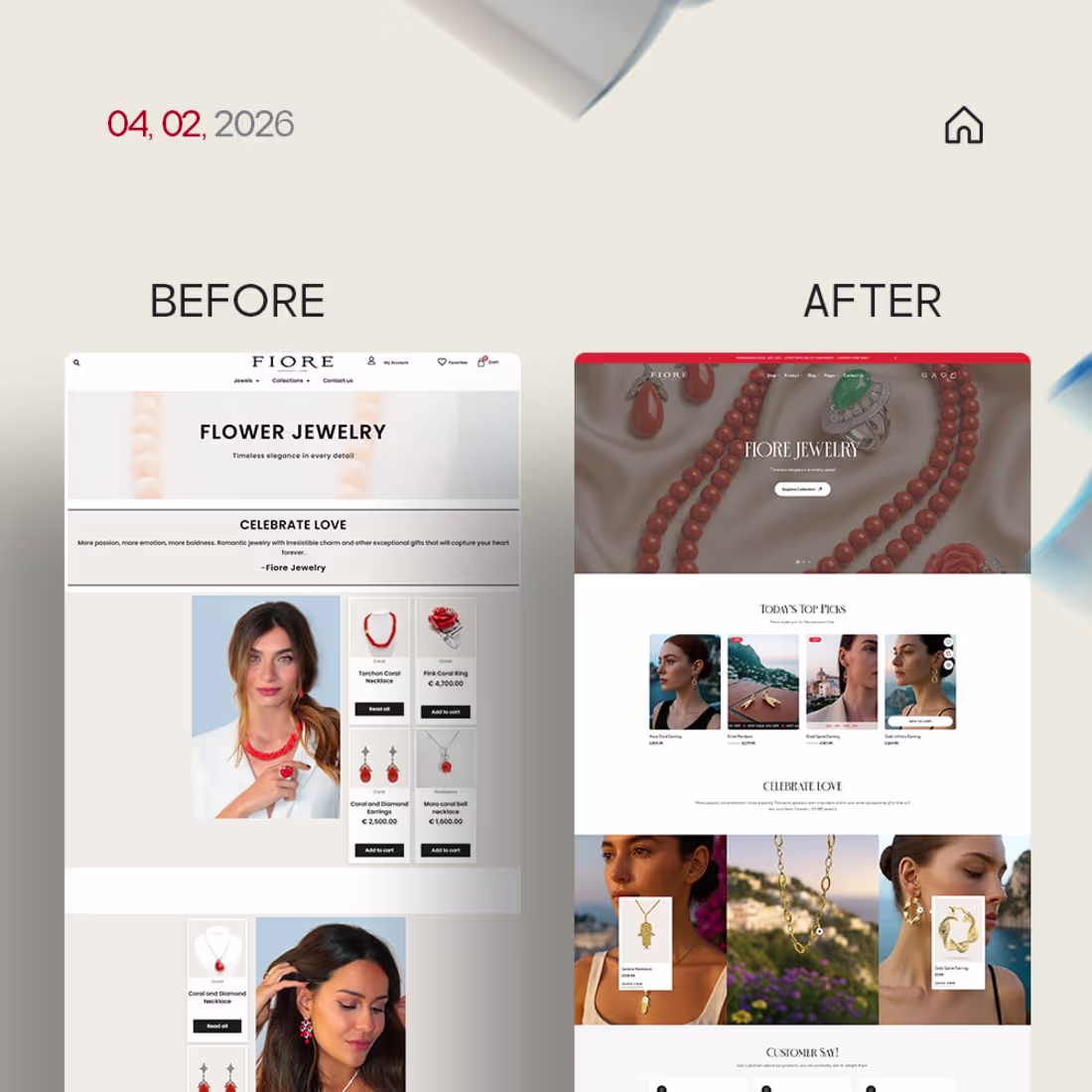
I decided to try and redesign holdersestateagents.co.uk (https://www.holdersestateagents.co.uk/), and without any surprise, it came out well, if not awesome.
The goal was to give it a 2026 look and improve on the UI/UX, Design Principles, and the lack of flexibility the old website had.
And here we have it Holders revamp Figma → Framer website.
Still looking for tips and pointers for improvement, if you have any feel free to share.
1
122
"Crytrad" is what happens when you engineer a landing page for one thing: getting high-ticket investors to aggressively click that "Get Started" button.
I took a foundational Figma template and completely rewired it for maximum conversion, stripping out the fluff and dialing up the aesthetic.
This dark-mode build uses deep, immersive contrast and vibrant, fluid 3D elements to instantly establish premium authority in the web3 space.
But it’s not just eye candy. Every pixel, from the scroll-stopping hero section to the high-contrast social proof blocks, is strategically positioned to build trust and drive action.
It’s a revenue-first design disguised as a futuristic masterpiece. Because a website shouldn't just look good, it should convert.
0
75
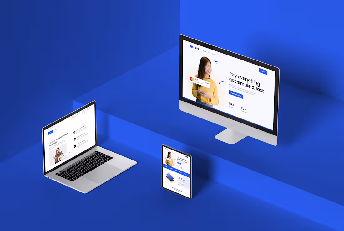
COCA Fintech Website Designed on Figma and Transferred to Framer.
Simple, Neat and Informative.
1
96
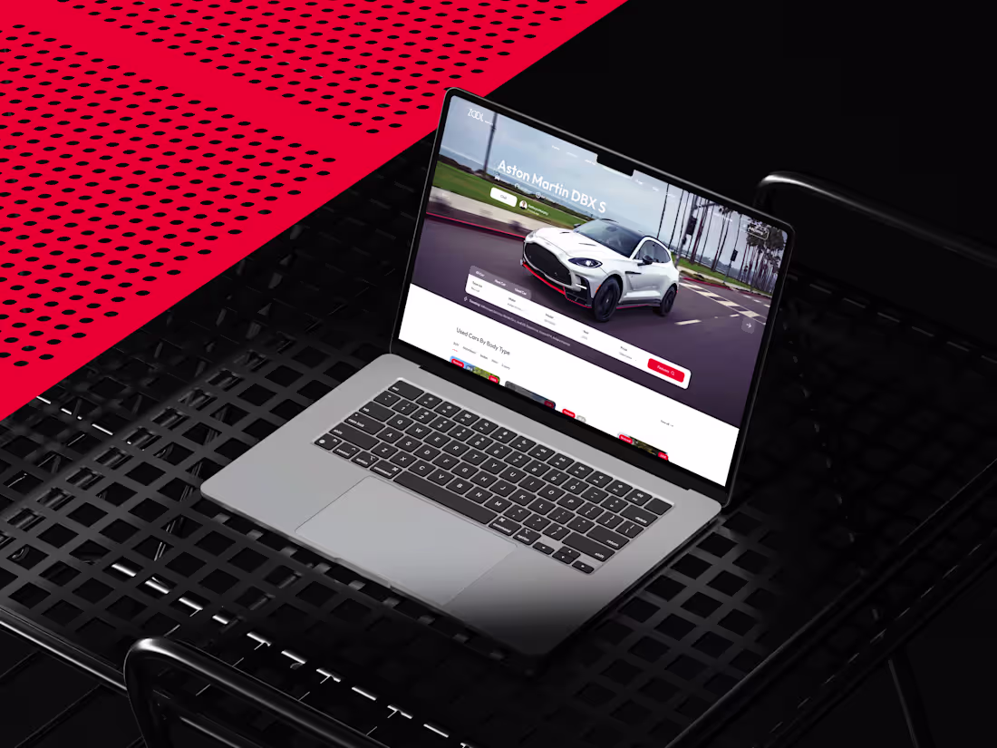
ZOOL Motors wanted something modern, neat and easy to use in terms of UI/UX. The goal was to design the whole website on Figam with the live end UI in mind.
And now we have a landing page we can work with.
Got tips & research from Claude, Framer and Figma AI.
1
101
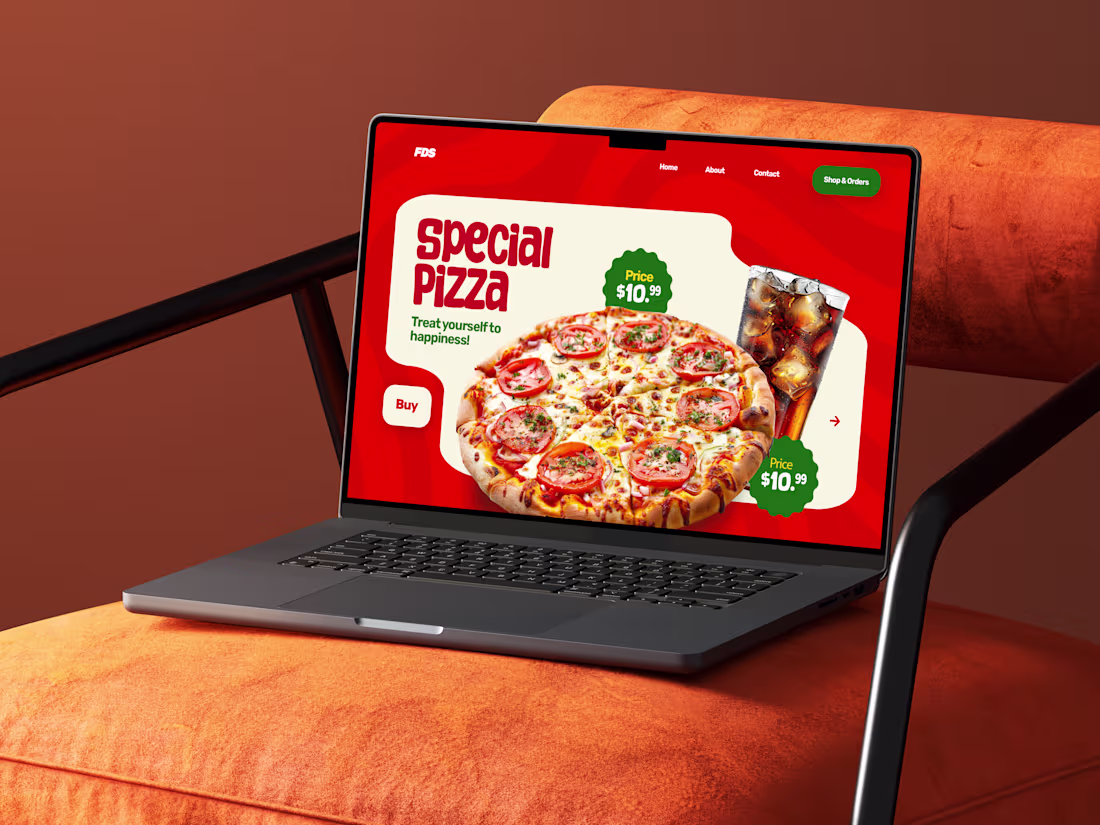
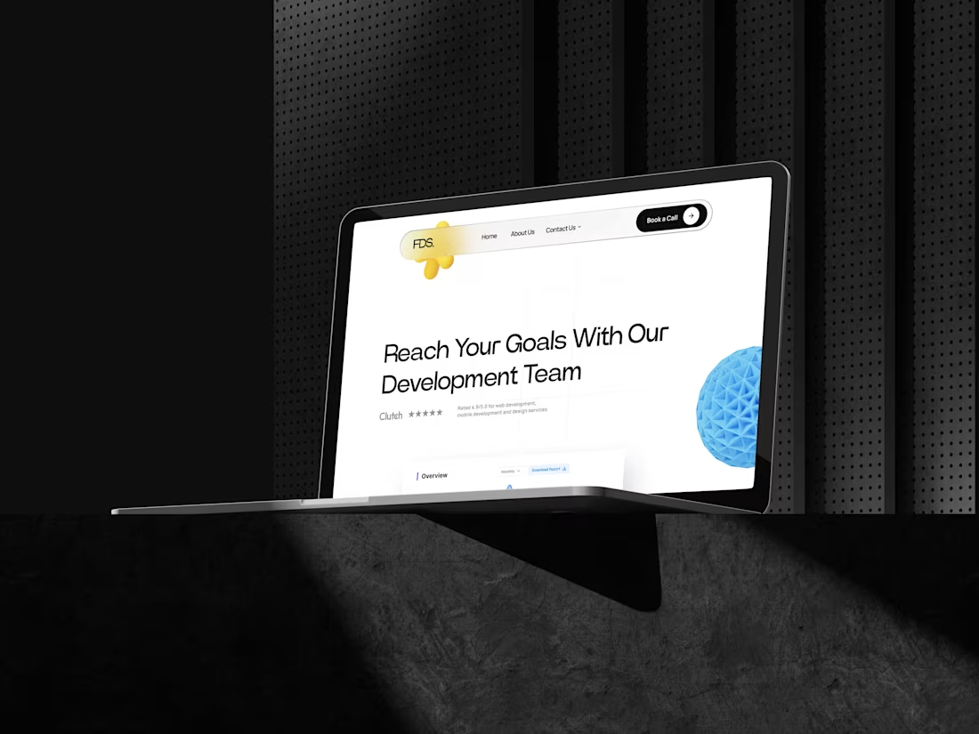
FDS: High-Impact UI Refresh for a Tech-Forward Agency
1
5
3
3
153
3
4
8
282
Meet Darkroom: A high-converting, dark-mode landing page that refuses to be ignored.
Featuring scroll-stopping 3D assets, fluid transitions, and dynamic scroll animations, this design is built to command attention.
It perfectly balances a premium, futuristic aesthetic with a revenue-first layout designed to turn visitors into buyers. A true showcase of immersive web design.
1
49
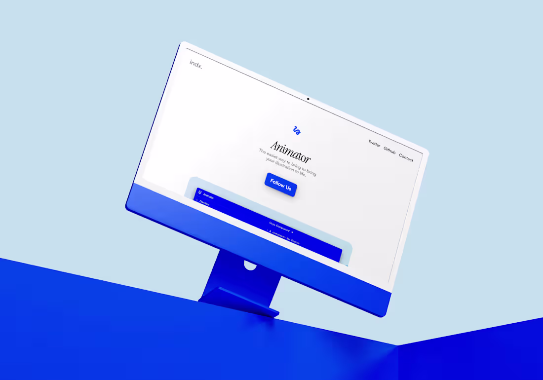
Indx. Animator: Interactive Web Showcase
3
8
2
5
12
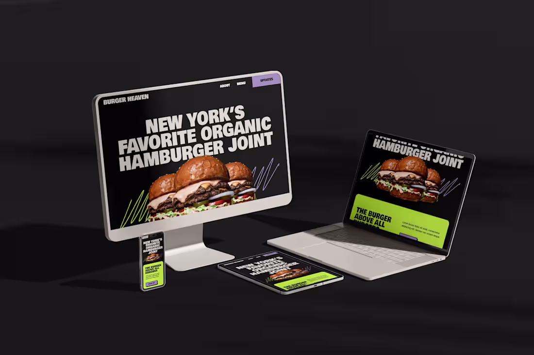
Burger Heaven - High-Fidelity Web Implementation
3
7
1
4
5
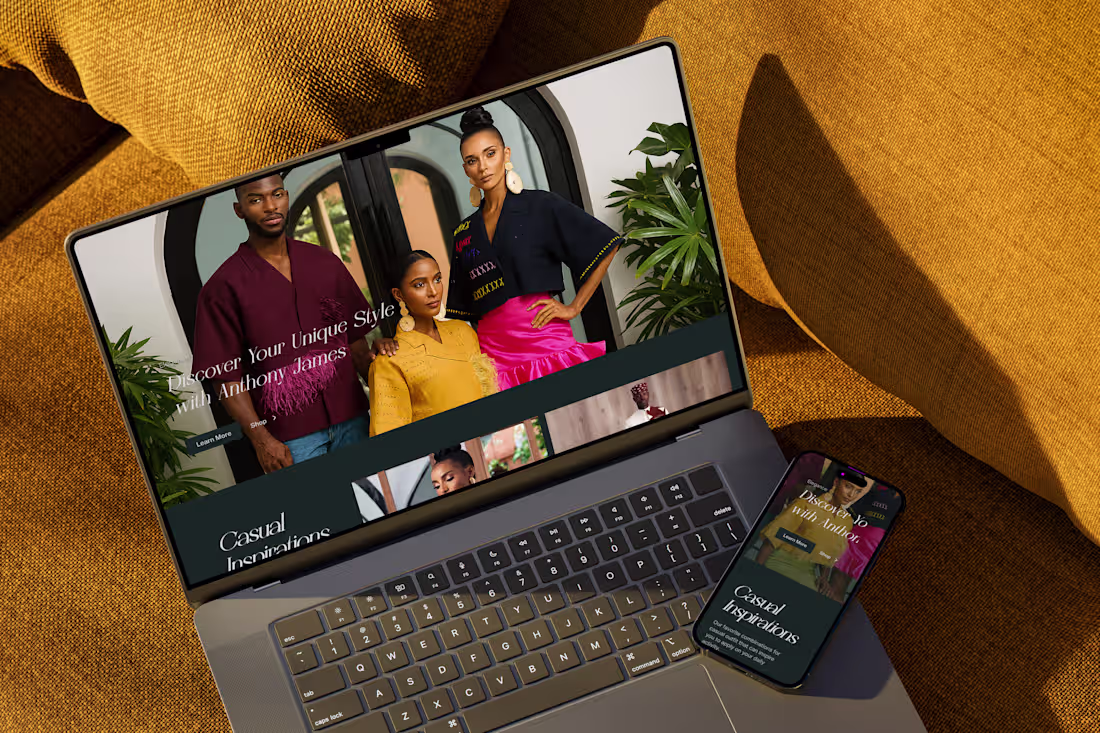
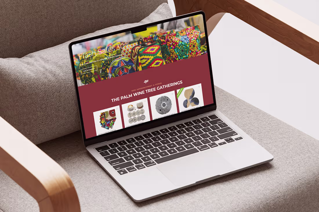
Luxury African Fashion E-commerce Experience for Anthony Edwards
4
2
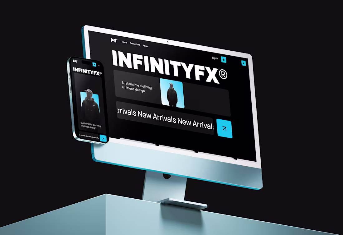
InfinityFX — Sustainable Fashion E-commerce (Custom + Stripe)
3
1
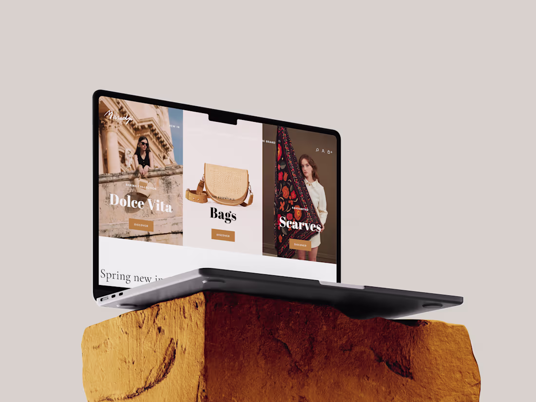
Maradji - Fashion Accessories Store (Framer Commerce + Shopify)
3
3
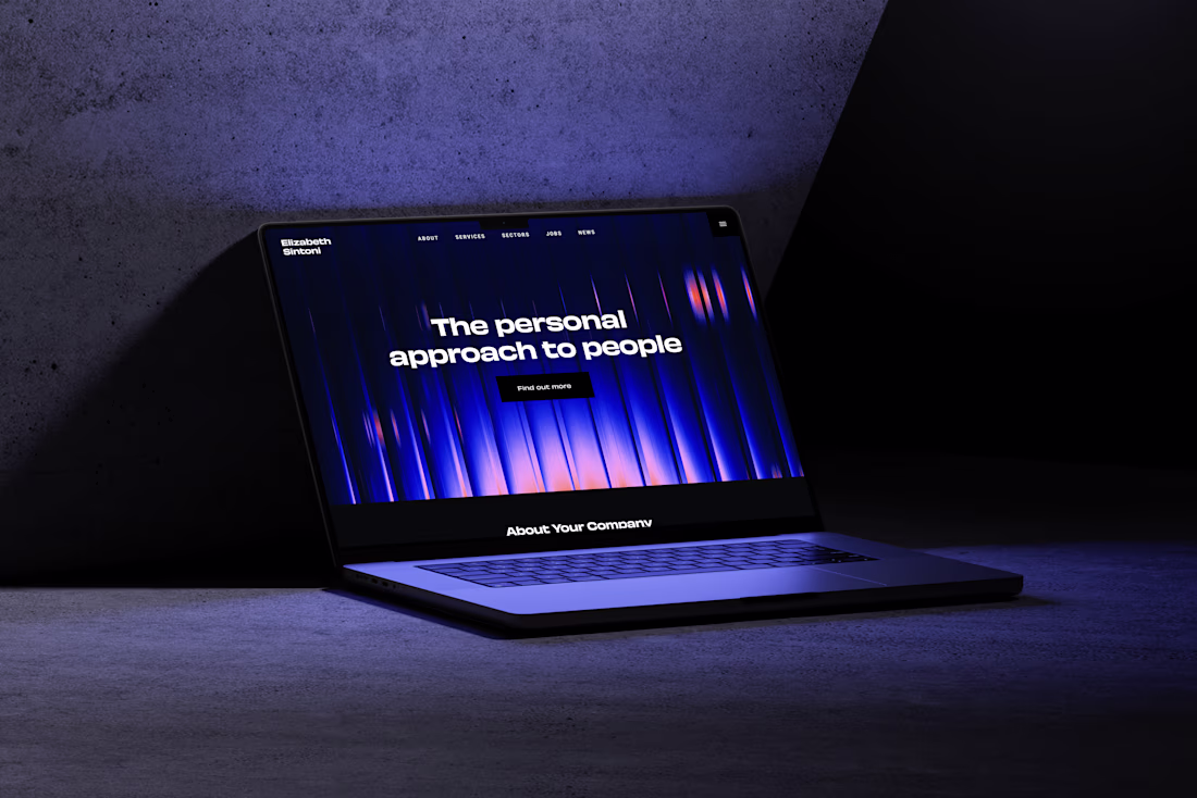
Elizabeth Sintoni — Creative Agency Website
3
3
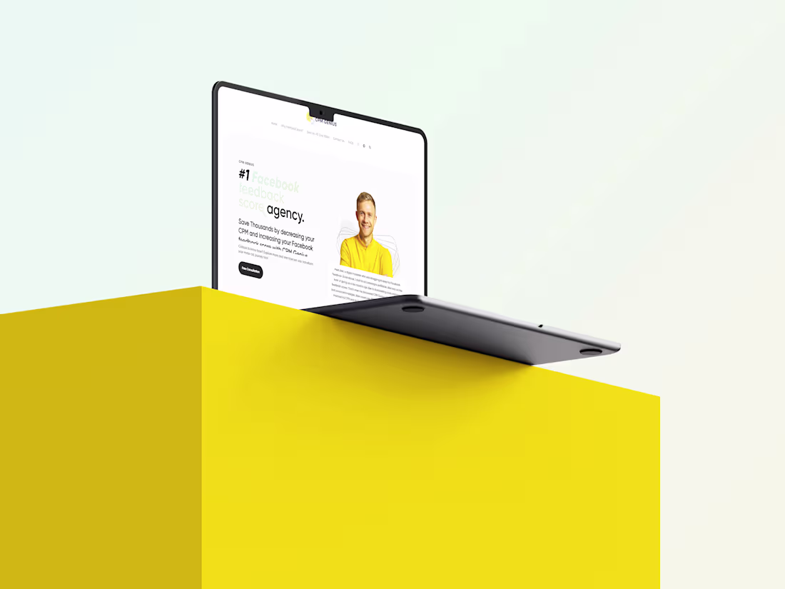
Listen up. A pretty Figma file won't make you a single dime until it’s a live, breathing conversion machine.
CPM Genius, a top-tier Facebook ad agency, handed me their static design with one goal: make it flawless and ready to sell. They didn't just need a web builder; they needed a revenue-first execution.
Using the raw power of WordPress and the Divi Builder, I engineered their flat canvas into a high-performance digital salesperson.
I preserved every pixel of their clean, trust-building aesthetic—from the razor-sharp hero to the dynamic testimonials—while wiring the backend for speed and seamless lead generation.
This isn’t just a simple Figma-to-WordPress translation. It’s a 24/7 lead magnet designed to capture high-ticket clients, slash CPMs, and drive pure profit.
1
50
This was just me having fun with the Qi3 Theme Lucido Automotive template on my figma.
Luxurious, Dark and Modern.
1
39
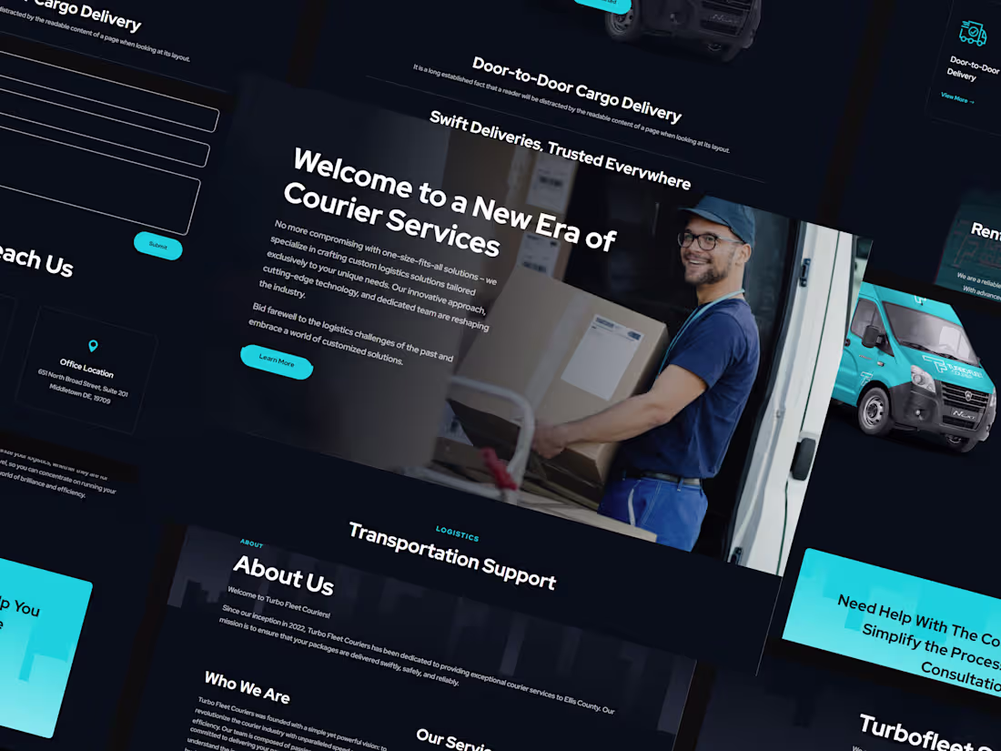
Turbofleet Courier Website
This is one of my earliest project on wordpress..men, at first when I started the project it seemed simple and for some reason it grew challenging. Several revisions and updating, more technical functions that challenged what I already know.
The website included functions like; Careers, Courier Tracking System, with distance/weight calculator which I had to build myself leveraging on plugins and a lot of Youtube and Google research.
Eventually, the CEO of the courier startup was happy with the outcome and results which he even gave me a tip.
2
2
75
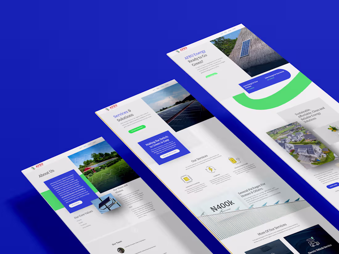
WordPress Website Development for AFRU Energy
1
1
Axumwe (https://axumwe.com/) Is a Multi-vendor dashboard creative with wordpress, elementor and ReHub Theme.
BRAND ESSENCE: AxumWe is reawakening the spirit of Africa's
ancient grandeur of trade in a global digital age just as the
Axum kings wove African identity into global trade two millennia ago.
BRAND PURPOSE:
With AxumWe; "Africa’s
Market is One Story and Spirit", exist to advance AfCFTA’s agenda of a
single digital market for Africa.
The goal was to create a non-complicated buying and selling experience on the website, for both admin, vendor and customers. which was achieved without loosing the brand's purpose and look.
1
47
Tunes - Rapid MVP Development with Wireframer AI
3
8