
Olabode Fasae
High-Converting DTC Landing Pages On Replo || Instant
- $10k+
- Earned
- 40x
- Hired
- 4.7
- Rating
- 134
- Followers


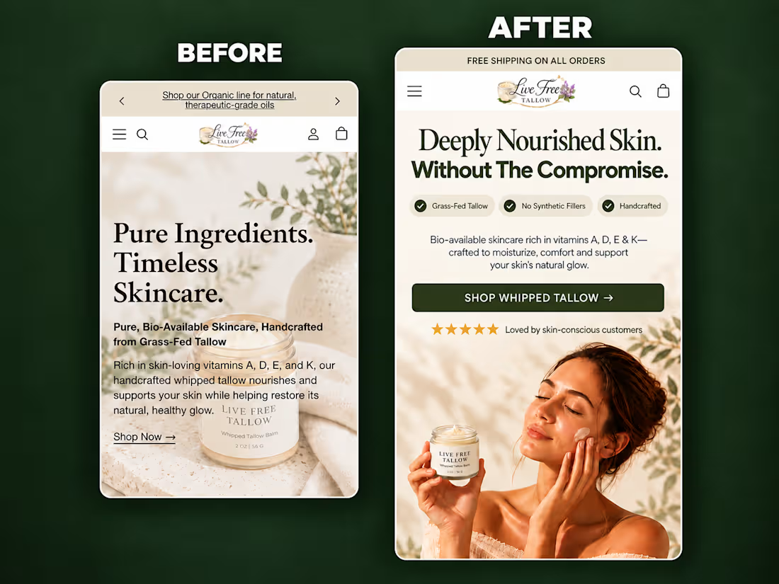
A self-initiated homepage hero redesign concept for Live Free Tallow, created to demonstrate how stronger visual hierarchy and clearer messaging can improve the mobile shopping experience.
The original hero had a compelling product, but the copy competed with the imagery, the product lacked visual prominence, and the next action wasn’t immediately clear.
For the redesign, I focused on:
• A sharper product-in-use lifestyle visual
• A clear, benefit-led headline
• Scannable product differentiators
• Improved spacing and visual hierarchy
• Social proof positioned near the CTA
• A prominent, action-focused shopping button
• Keeping the product and CTA visible above the fold
The result is a cleaner and more premium hero section that helps visitors quickly understand what the product is, why it is different, and where to go next.
I design and build conversion-focused Shopify landing pages, product pages and homepage sections for DTC brands.
Need help improving your store’s customer journey? Let’s work together.
9
9
338
The ad got the click. But cold traffic rarely converts just because they landed on a product page.
Sometimes, they need to understand the problem first.
That’s where an advertorial can make a difference.
Instead of immediately asking the visitor to buy, the page creates context around the problem, educates them, builds curiosity, addresses doubts, and introduces the product as a potential solution.
The visitor gets a reason to care before they’re given a reason to buy.
That’s what makes an advertorial valuable in a cold-traffic funnel.
built in @Replo
0
87
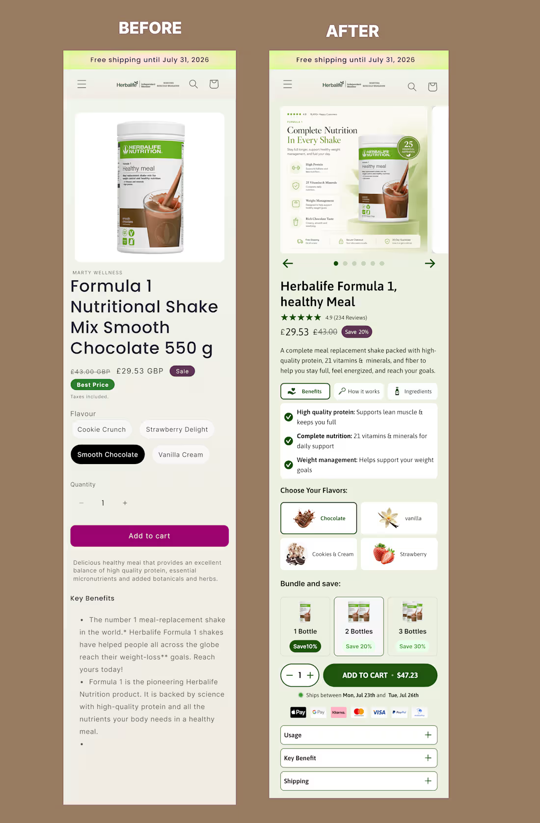
I redesigned this mobile offer section of product page on @Figma to create a clearer, more persuasive buying experience.
The original page presented the essential information, but the benefits, product options and purchase controls were difficult to scan.
For the redesign, I improved:
• Product and offer hierarchy
• Benefit-focused messaging
• Product gallery and visual presentation
• Flavour and bundle selection
• Pricing and savings visibility
• Trust signals near the CTA
• Mobile usability and buying flow
The goal was to help shoppers understand the product, compare their options and move toward purchase with less friction.
This is a concept redesign created to demonstrate my approach to conversion-focused Shopify product page design.
2
4
538
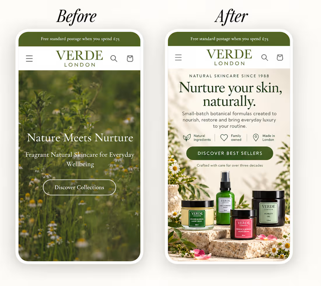
A homepage shouldn't just look good. It should make the buying journey easier.
For this skincare brand, the goal was to move from a generic first impression to a clearer experience that communicates:
→ What the brand stands for
→ What makes the products different
→ Why customers should trust them
→ Where to take the next step
Good design gets attention.
Good UX gives that attention somewhere to go.
I design and develop conversion-focused landing pages for Shopify & eCommerce brands.
3
169