The network for creativity
Join 1.25M professional creatives like you
Connect with clients, get discovered, and run your business 100% commission-free
Creatives on Contra have earned over $150M and we are just getting started
Back to feedPost
My First Figma Makeathon submission
I’ve always wanted a quiet, intentional way to send letters to future me not another productivity app, just a small ritual. This weekend I finally built it with Figma Make.
It’s called Future Inbox. You write a message, pick the exact date and time it should return, and seal it in a bottle that drifts out into a digital sea. When the moment comes, that bottle floats back for you to open.
I also wanted the world to feel interactive, so the sky shifts with the time of day you’re in: soft sunrise, bright afternoon, or deep night while your bottles bob on the water.
Try it out and let me know what you send to future you 👀
https://pin-claim-95068255.figma.site/
X:https://x.com/Crownzdesigns/status/2028674916422222291?s=20
figmamakeathonmarch2026figmamakemadeitpossiblewebdesignInteraction DesignProduct DesignUI DesignFigma Make


really love the idea!

I am glad you do, thank you ❤️

Thank you so much ❤️

Thank you Ron🥹
The network for creativity
Join 1.25M professional creatives like you
Connect with clients, get discovered, and run your business 100% commission-free
Creatives on Contra have earned over $150M and we are just getting started

Challenges
View all


Related posts

One header, two color stories.
Green: cool tones, feels productive and safe
Purple: gradient glow, feels modern and premium
Same words. Different first impression.
Which one would make you click "Get Started"?

26 voted
59%
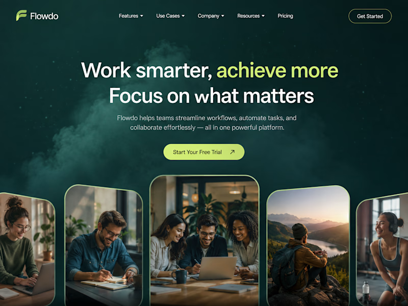
18 voted
41%
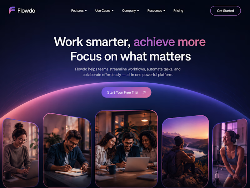
44 votes
Closed

Went with calm and focused. The copy is literally asking people to focus on what matters, so a header that competes for attention with a glow works against its own message.


🚀 FEATURED AGAIN.
THE INTERESTING PART IS WHAT HAPPENED BEFORE THE UI.
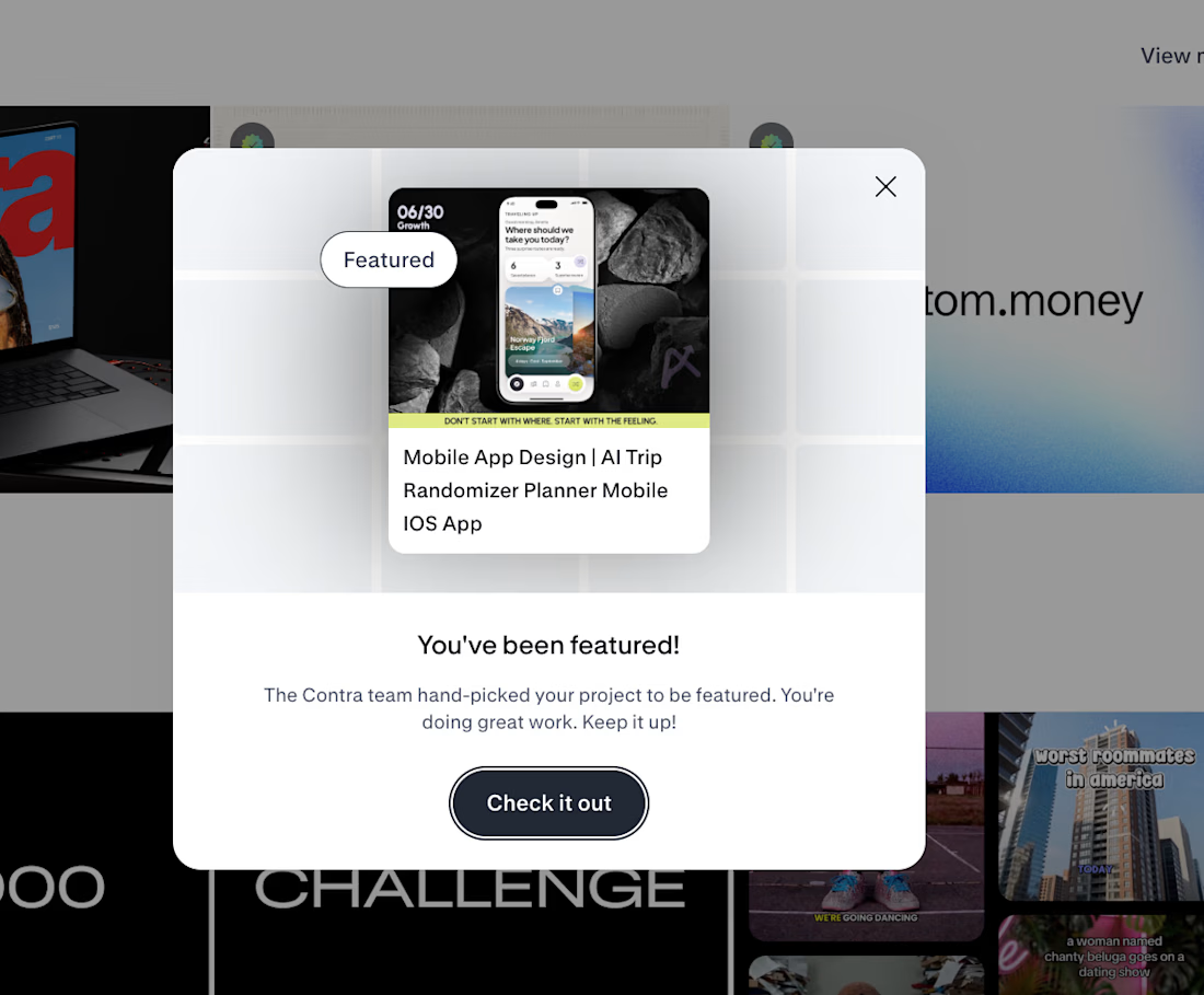
Traveling Up was the first mobile concept I created purely for myself in almost three years.
No client brief.
No existing product.
No predefined feature list.Just one observation from a short trip:
🌍 Most travel products start by asking where you want to go.
I wanted to start one step earlier.
How do you want to feel?
That single shift changed the whole product logic.
✨ Destination search became mood led discovery.
⏳ Time became part of the recommendation.
🎲 Uncertainty became part of the experience instead of something the product had to remove.
That became Traveling Up.
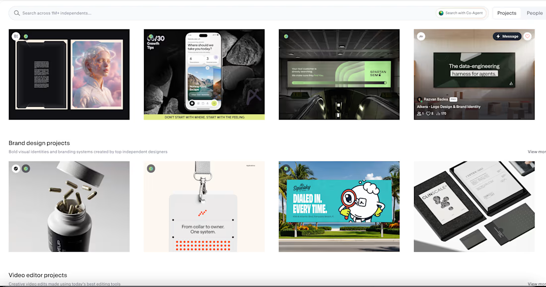
And now Contra has hand picked the project for Featured and placed it in the AI Projects section on the homepage.
The most interesting part for me is not the feature itself.
It is how often the strongest product directions begin before the interface.
In the framing.
In the question.
In understanding what the user is actually trying to experience.
That is the kind of work we keep pushing at Asol Design.
Not just better screens. Better product decisions before the screens exist.
If you are building a mobile product and want more than polished UI, if you want stronger product thinking, sharper UX direction and a visual system built around a clear idea, let’s talk.
#MobileAppDesign #ProductDesign #UXDesign #UIDesign #MobileUX #TravelApp #TravelAppDesign #iOSDesign #ProductStrategy #GrowthDesign #AppDesign #UXUI #DesignAgency #DigitalProductDesign #AsolDesign #Contra #StartupDesign #ProductThinking #MobileProduct #CreativeDirection


Keeping uncertainty in the product instead of designing it out is the risky half of that shift. Curious what the screen shows when the mood input is thin.

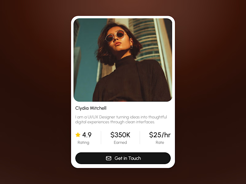
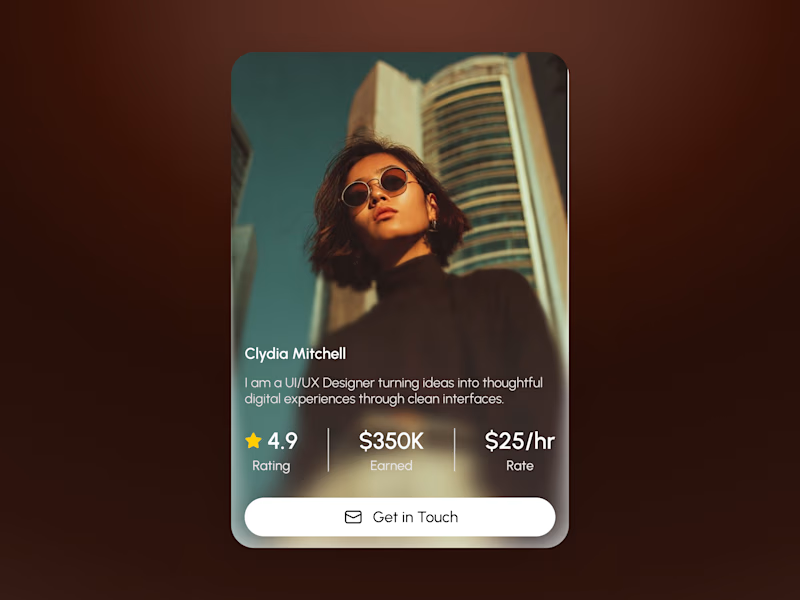
Two takes on the same profile card — which one's better?
Left = classic framed card, photo up top, info below on white.
Right = full-bleed photo with text overlaid on a dark gradient.
Honestly both have their place:
📸 Full-bleed looks way more premium and eye-catching on its own the photo just hits harder.
📋 Framed wins on readability and plays nicer in a grid no fighting with busy photo backgrounds for contrast.
My take: full-bleed for hero sections / standalone spots, framed for anything that needs to repeat consistently (like a team page or listings).
Which one would you pick? 👇

5 voted
50%
5 voted
50%
10 votes
Closed

Classic for a team directory. I’d test both with a longer name and bio too; that’s where the layout really gets tested.