FORM — Fashion E-commerce Website Design

Ashar Qasmani


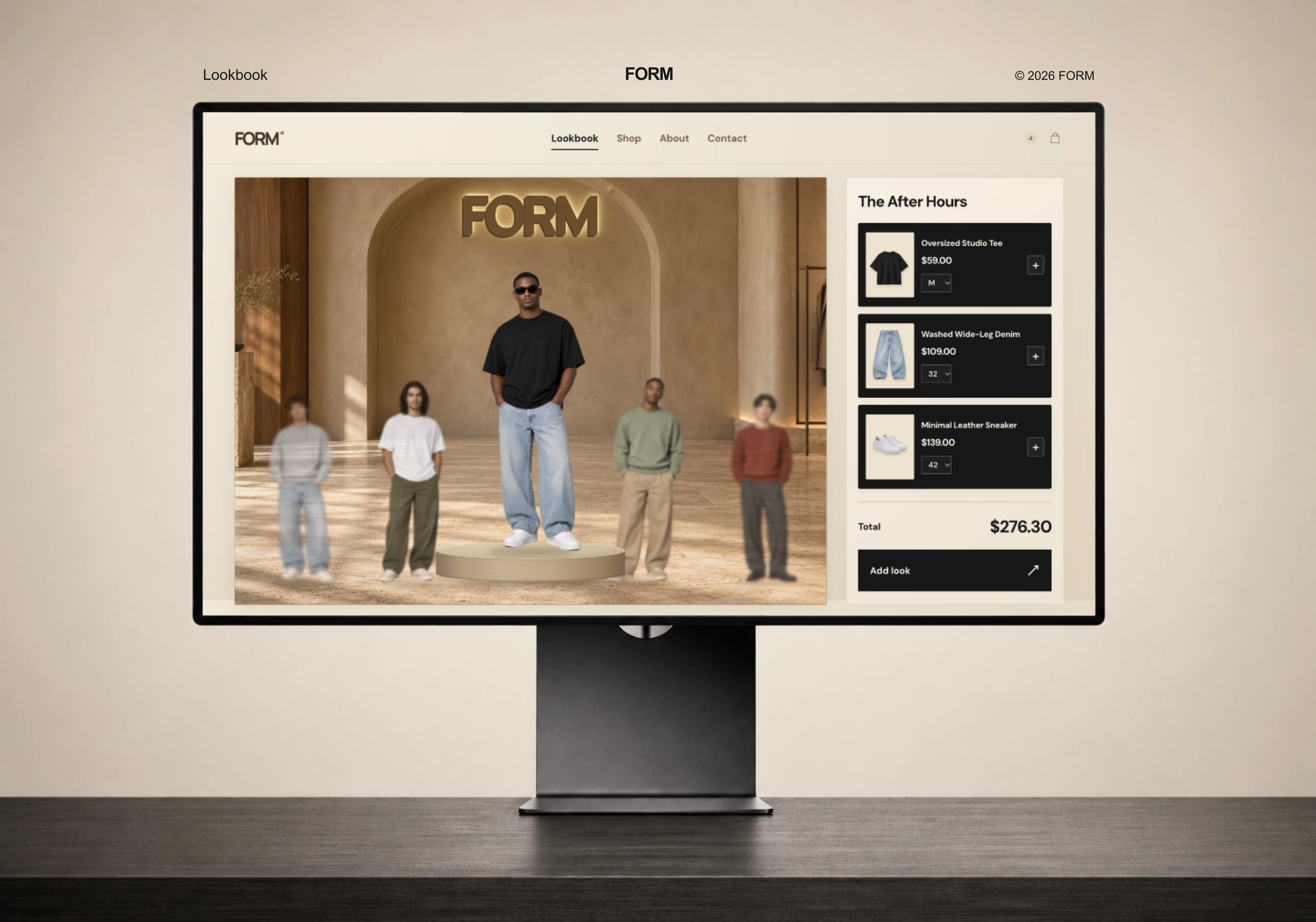
FORM fashion e-commerce homepage displayed on a desktop monitor.
Project context
FORM is a fashion e-commerce website design centered on everyday clothing, coordinated looks, and expressive styling. The project combines a lookbook-led homepage with product-focused layouts and companion mobile screen concepts.
The visual direction brings together warm cream surfaces, charcoal typography, and clothing photography. The interface gives the collection a consistent setting while allowing individual garments to stand out.
The challenge
The design challenge was to balance an editorial fashion presentation with clear shopping information. The homepage needed space for campaign imagery and bold typography, while product names, prices, size choices, and shopping actions remained easy to identify. Related screens also needed to feel connected to the homepage across different dimensions.
My role
I designed the project’s visual direction, website interface, and desktop and mobile layouts. This case study documents the homepage, proposed product and About views, typography, colors, and layout structure.
Design approach
A restrained cream and charcoal palette connects the interface with the warm tones of the photography. Sage, rust, denim, and neutral garments bring variation through the collection itself.
Large sans-serif headlines establish the main hierarchy. Italic accents introduce contrast within selected statements, including “STYLED BY YOU.” Repeated spacing, image treatments, and product-card structures keep the different sections visually connected.
Key design decisions
An outfit-led homepage
The main lookbook scene sits beside an itemized product panel. This composition presents a complete outfit alongside its individual pieces, with product names, prices, and size choices grouped together.
Campaign imagery and product clarity
Lifestyle photographs establish the clothing’s visual context. Individual product images provide a separate view of each garment, supported by consistent naming, pricing, and controls.
Mobile layouts with their own hierarchy
The mobile screen concepts adapt the content into narrower compositions. Product information, shopping controls, newsletter content, and navigation use spacing suited to the smaller format.
A connected page system
The proposed product and About views reuse the homepage’s typography, colors, imagery, and existing wording. They demonstrate how the same visual language can extend beyond the original homepage.
Deliverables
Complete homepage design showcase and recorded walkthrough
Desktop and mobile interface compositions
Proposed product and About views
Typography and color presentation
Desktop and mobile layout-grid study
Device mockups
A 12-section presentation with high-resolution PNGs, SVG compositions, and PDF exports
Design outcome
The completed work presents a consistent fashion storefront across campaign imagery, product displays, and mobile screen concepts. It demonstrates how FORM’s visual identity can support both collection storytelling and clearly organized product information.
This case study documents the visual design and proposed screen layouts. The recorded homepage is a local prototype; live-store functionality and commercial performance are outside the documented scope.
Let’s work together
Planning a fashion or lifestyle storefront? Let’s discuss a distinctive website design that brings your collection and shopping experience together across desktop and mobile.
Complete project presentation
Explore the remaining presentation views below.
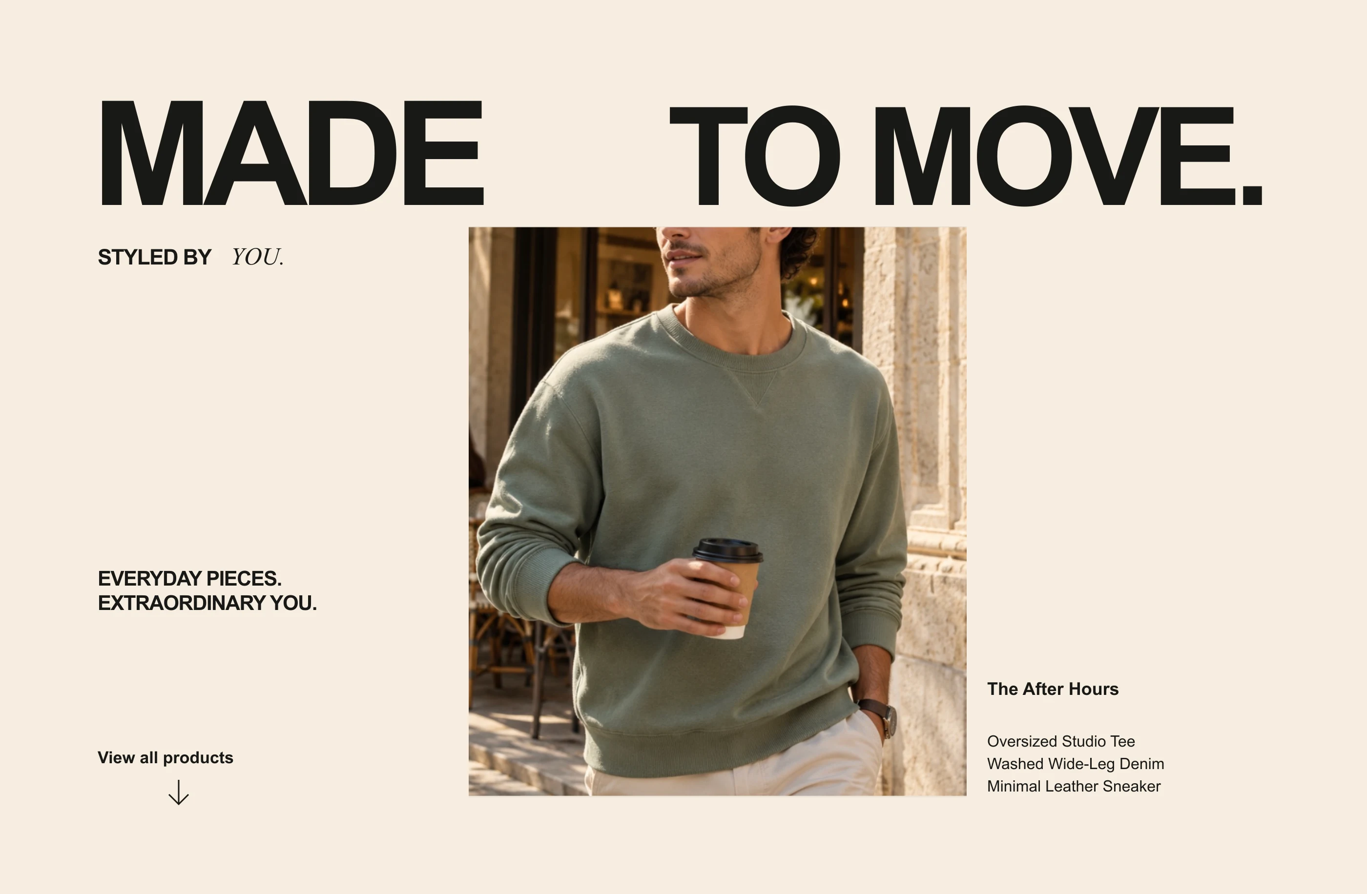
FORM editorial composition with warm neutrals and fashion photography.
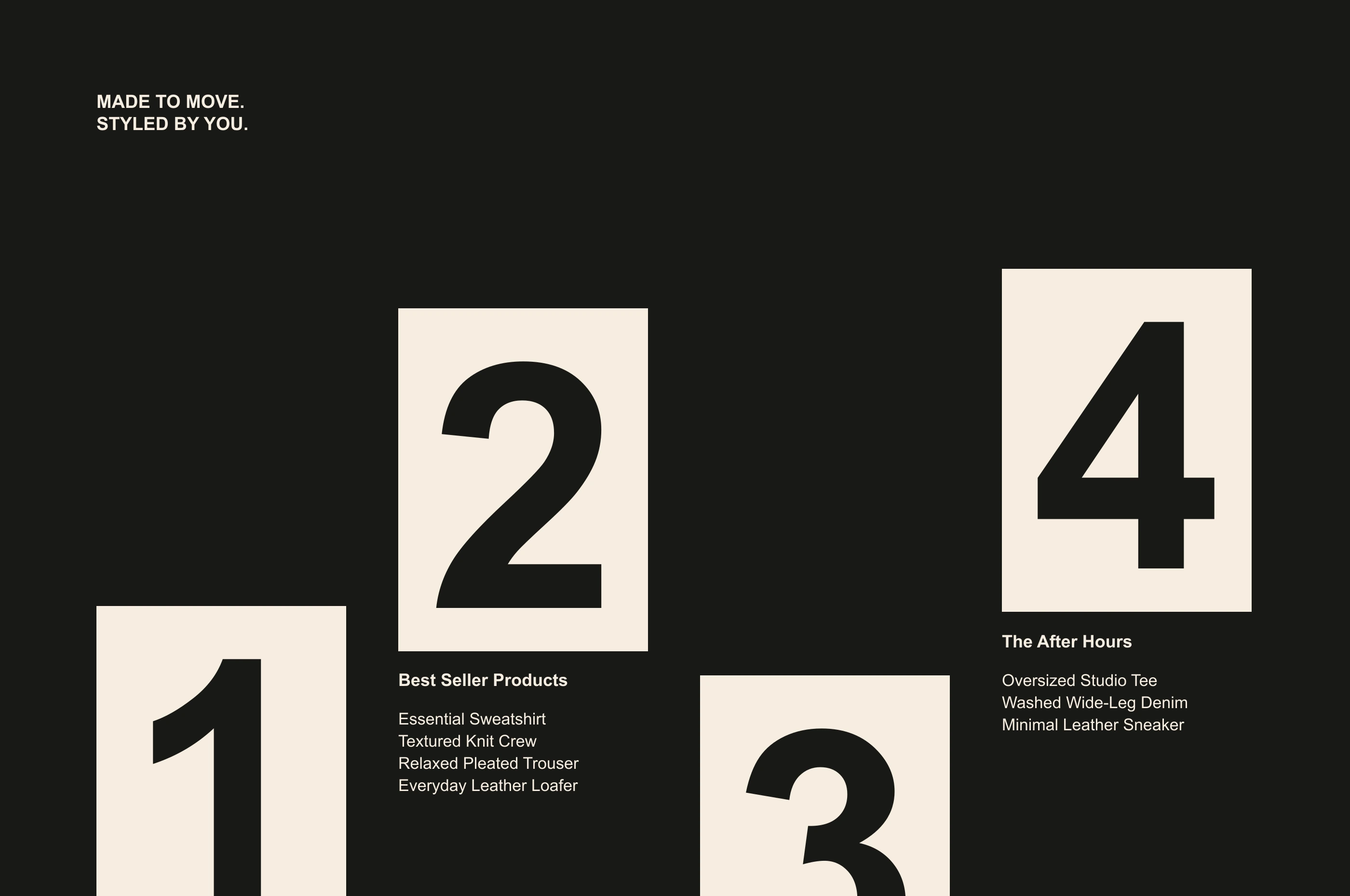
Collection presentation using FORM typography and existing product names.
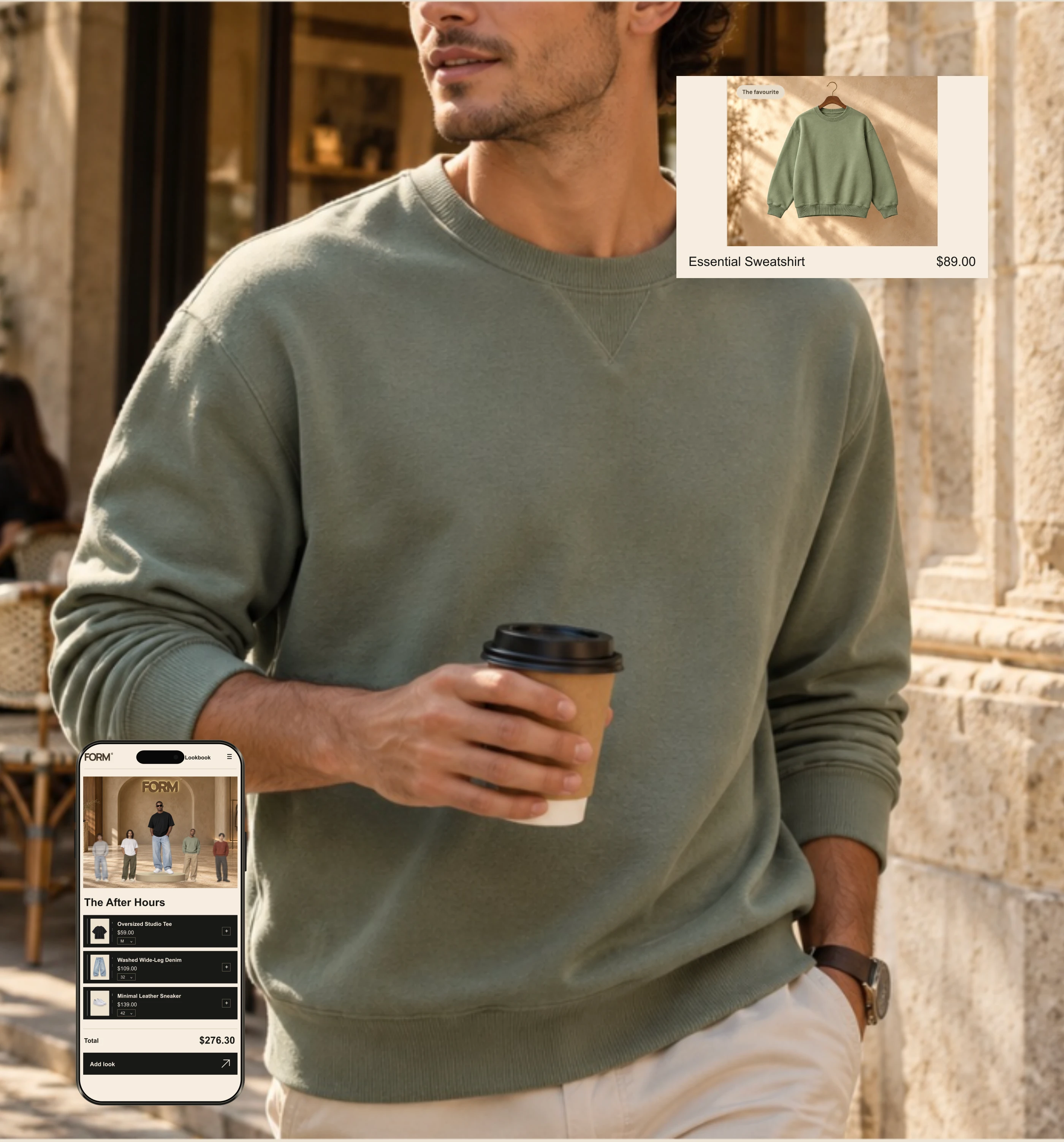
Campaign imagery, an Essential Sweatshirt product card, and a mobile lookbook concept.
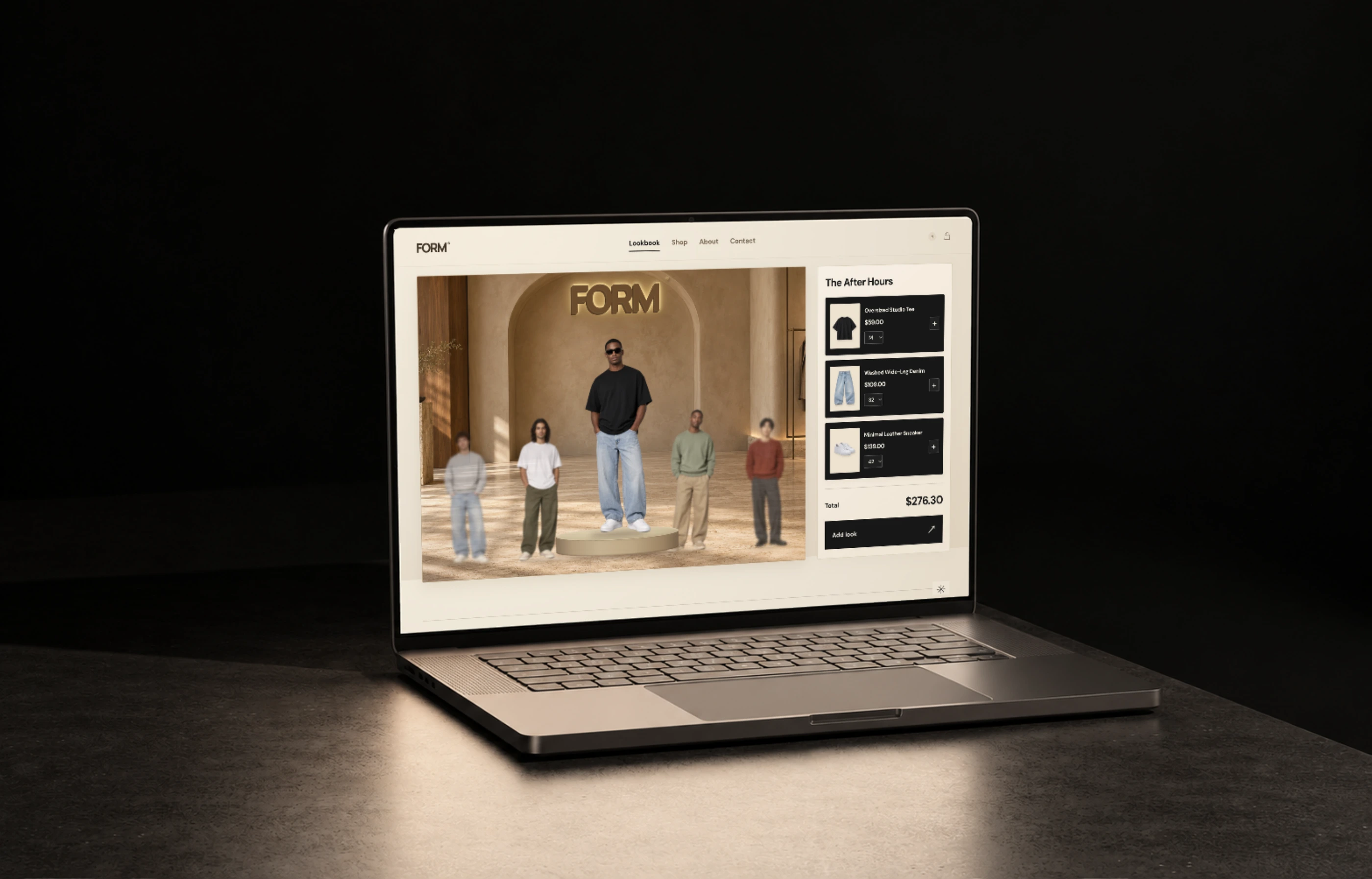
FORM homepage displayed in a laptop mockup.
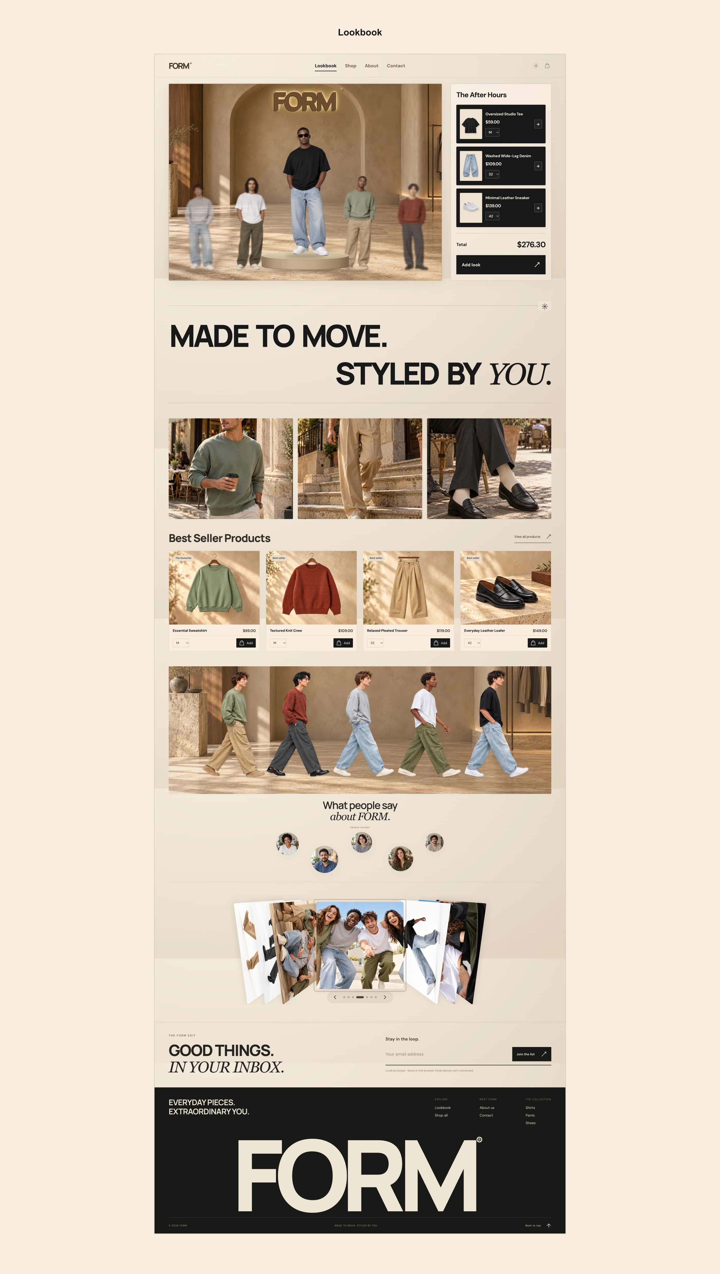
Full homepage showing the lookbook, best sellers, campaign imagery, sample-review section, gallery, newsletter, and footer.
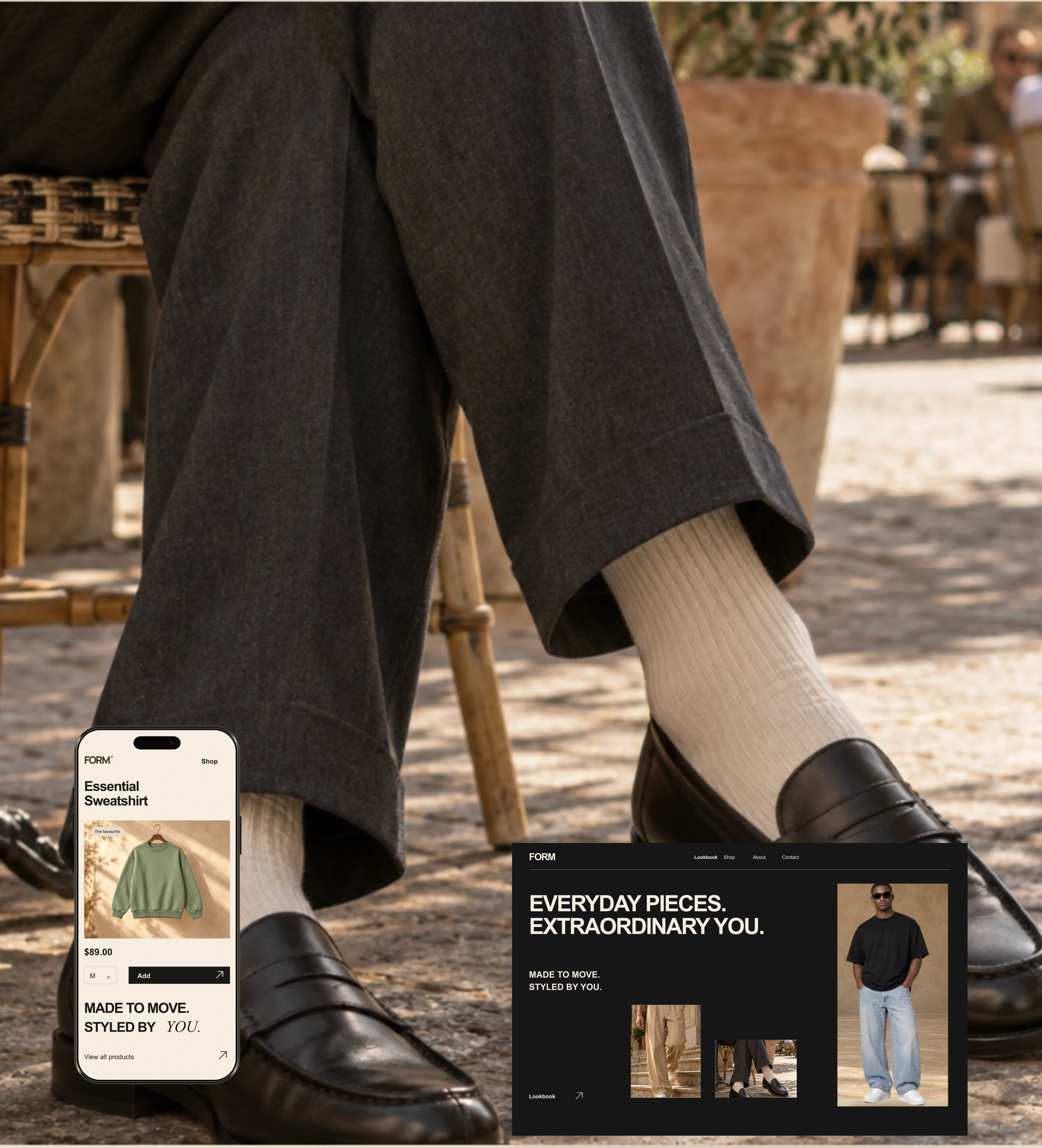
Mobile product-detail concept and About-page proposal within the FORM visual system.
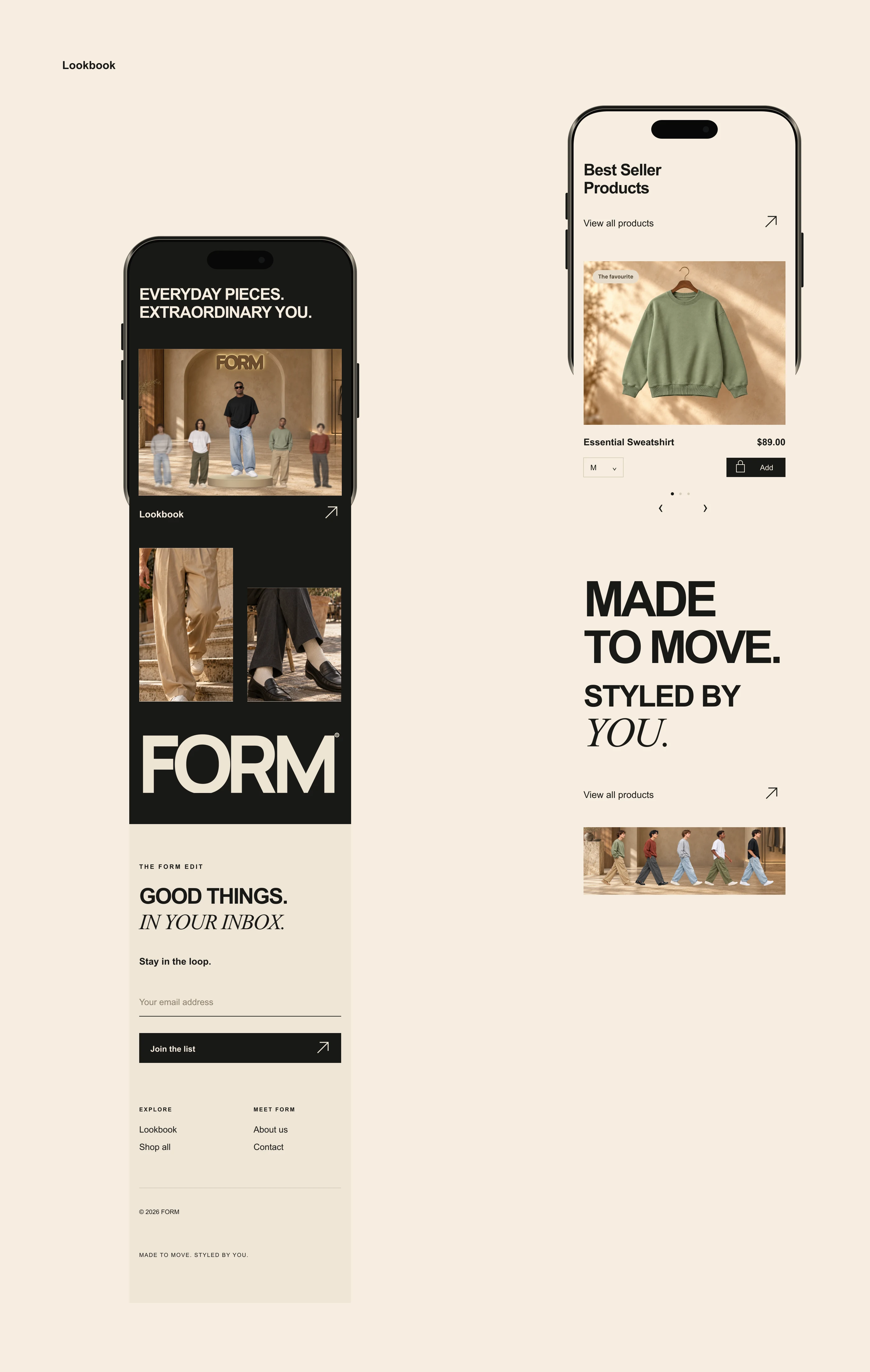
Mobile design concepts for product browsing, brand content, and email signup.
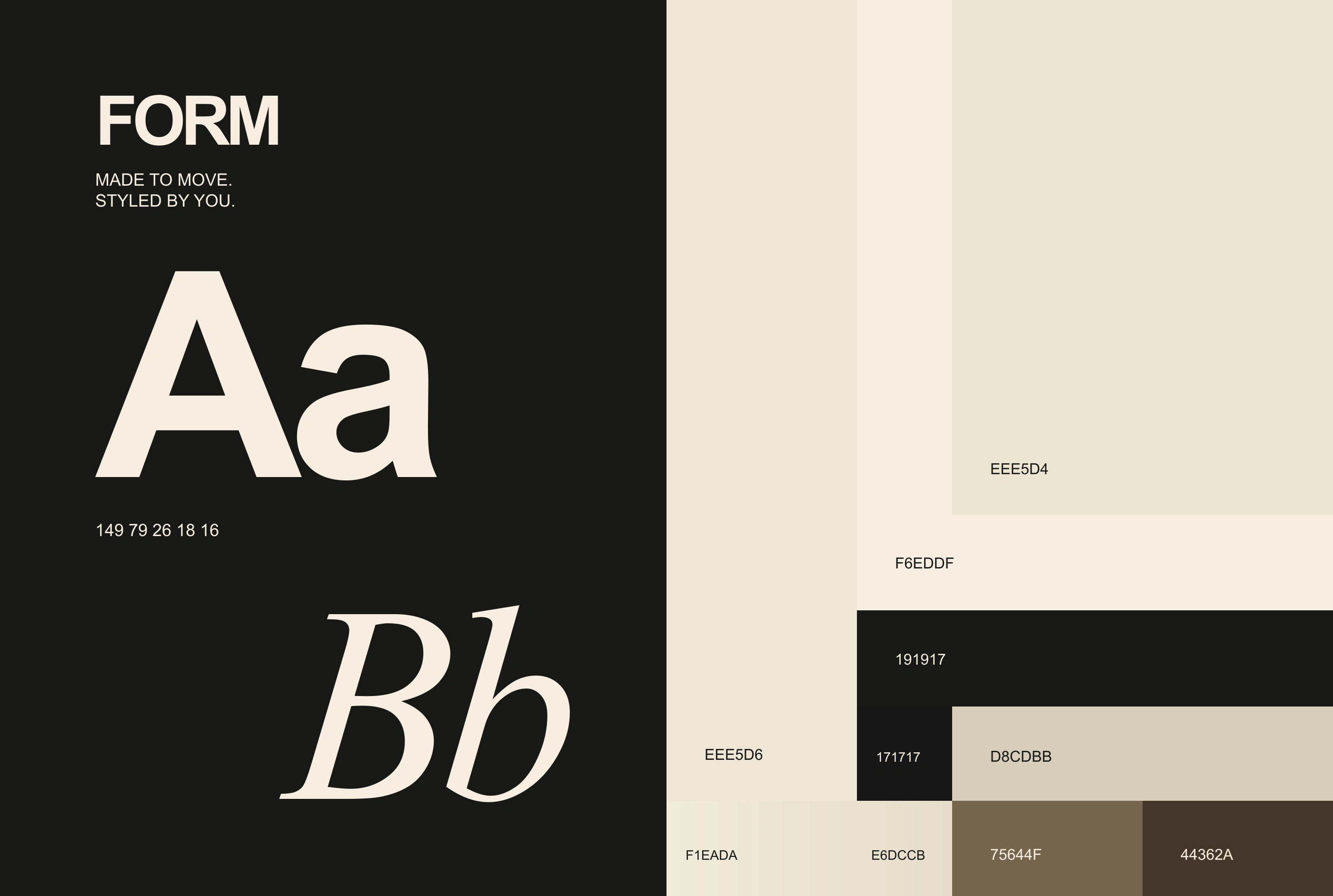
Typography specimen and color values sampled from the FORM homepage.
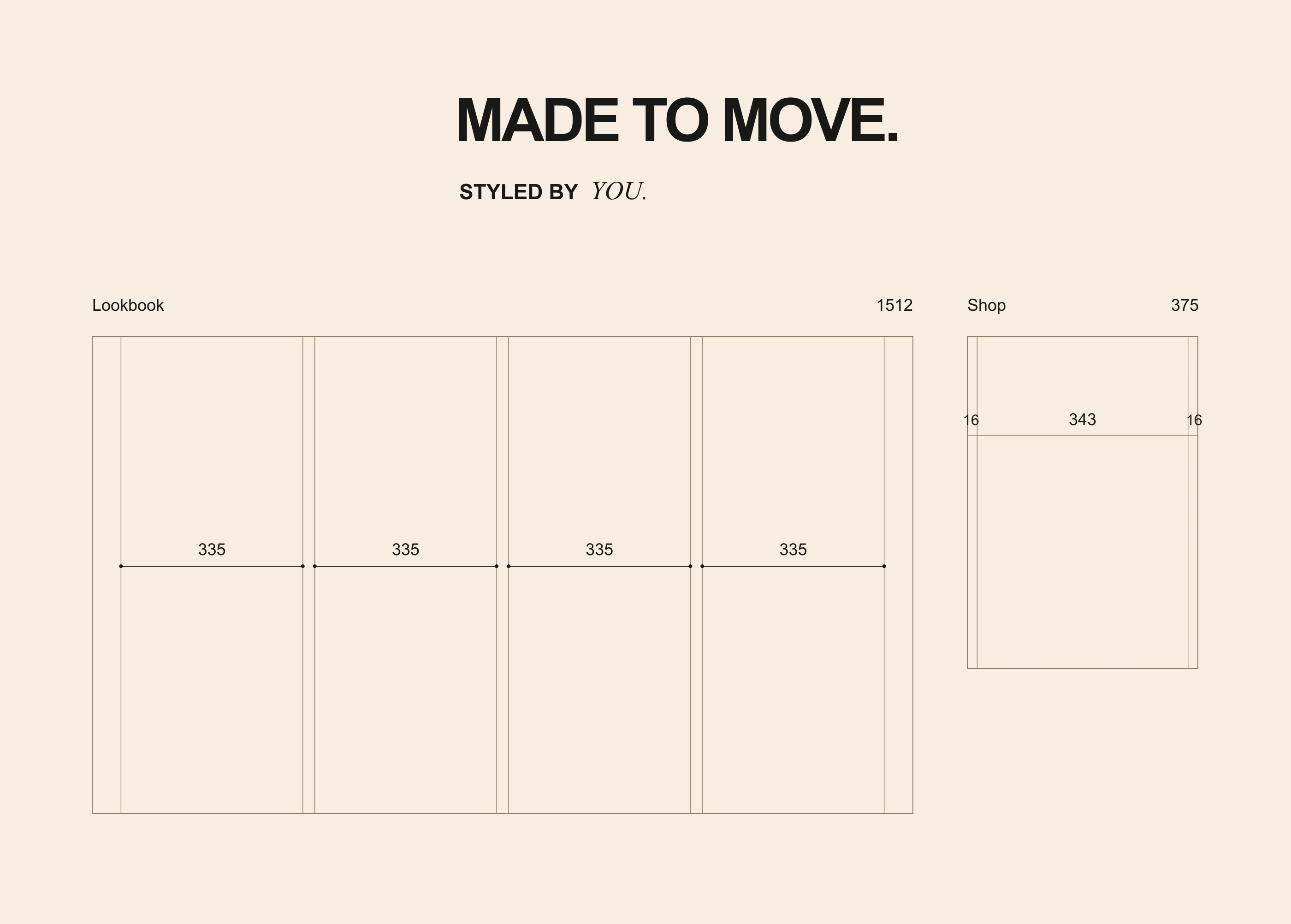
Desktop and mobile layout-grid study.
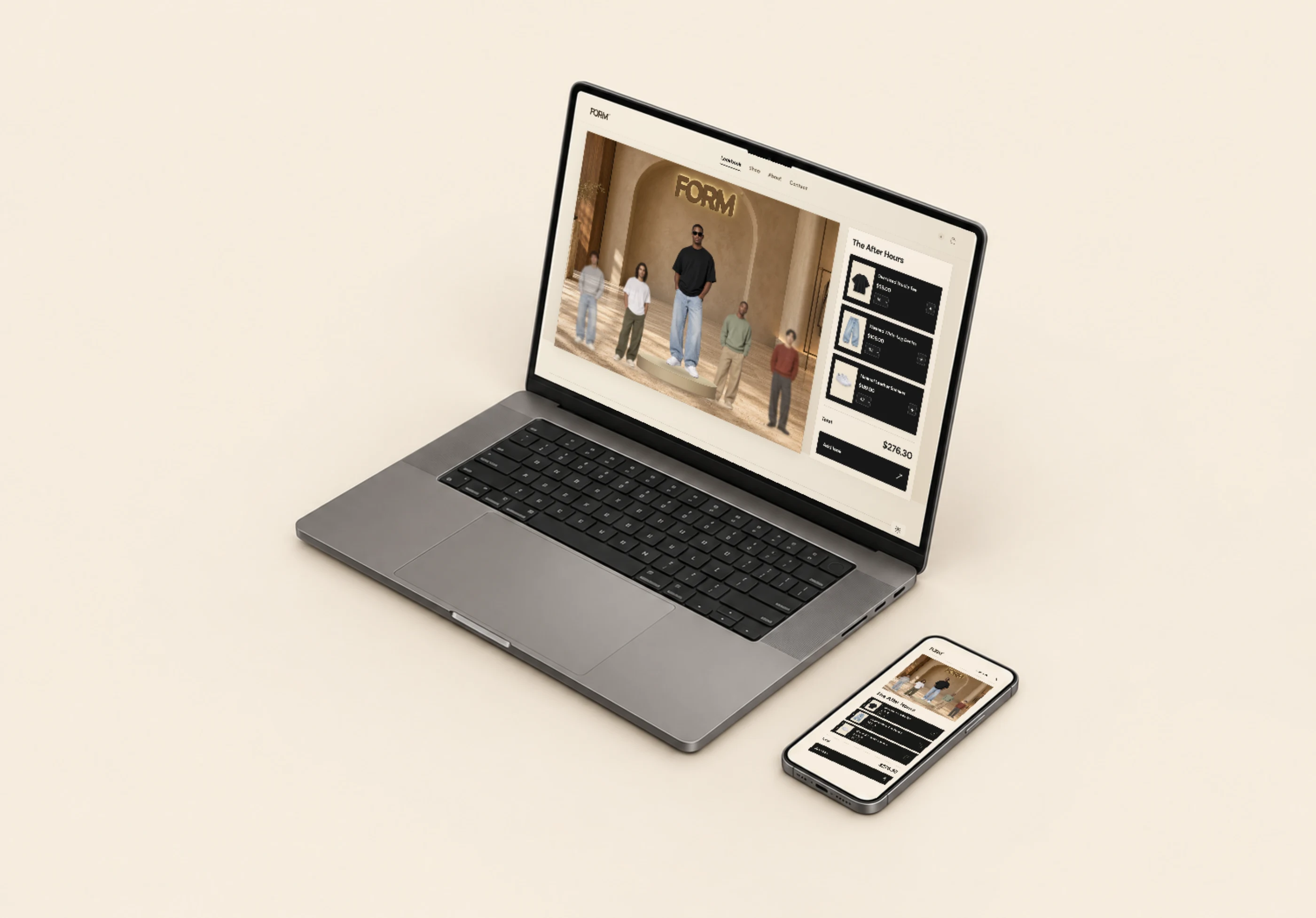
FORM desktop and mobile interfaces shown in device mockups.
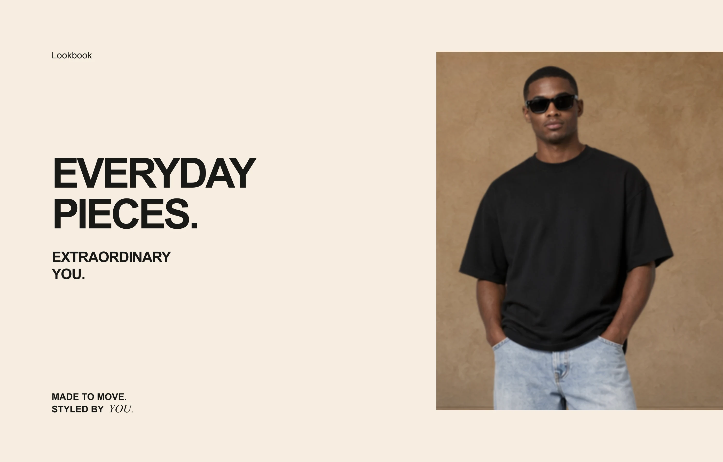
Closing FORM composition with fashion imagery and brand wording.
Like this project
Posted Nov 1, 2026
Fashion e-commerce website design for FORM, combining editorial imagery, warm neutrals, product-focused layouts, and responsive desktop and mobile screens.