Puffy Bites — Gummy Candy Brand Identity & Packaging Design

Ashar Qasmani



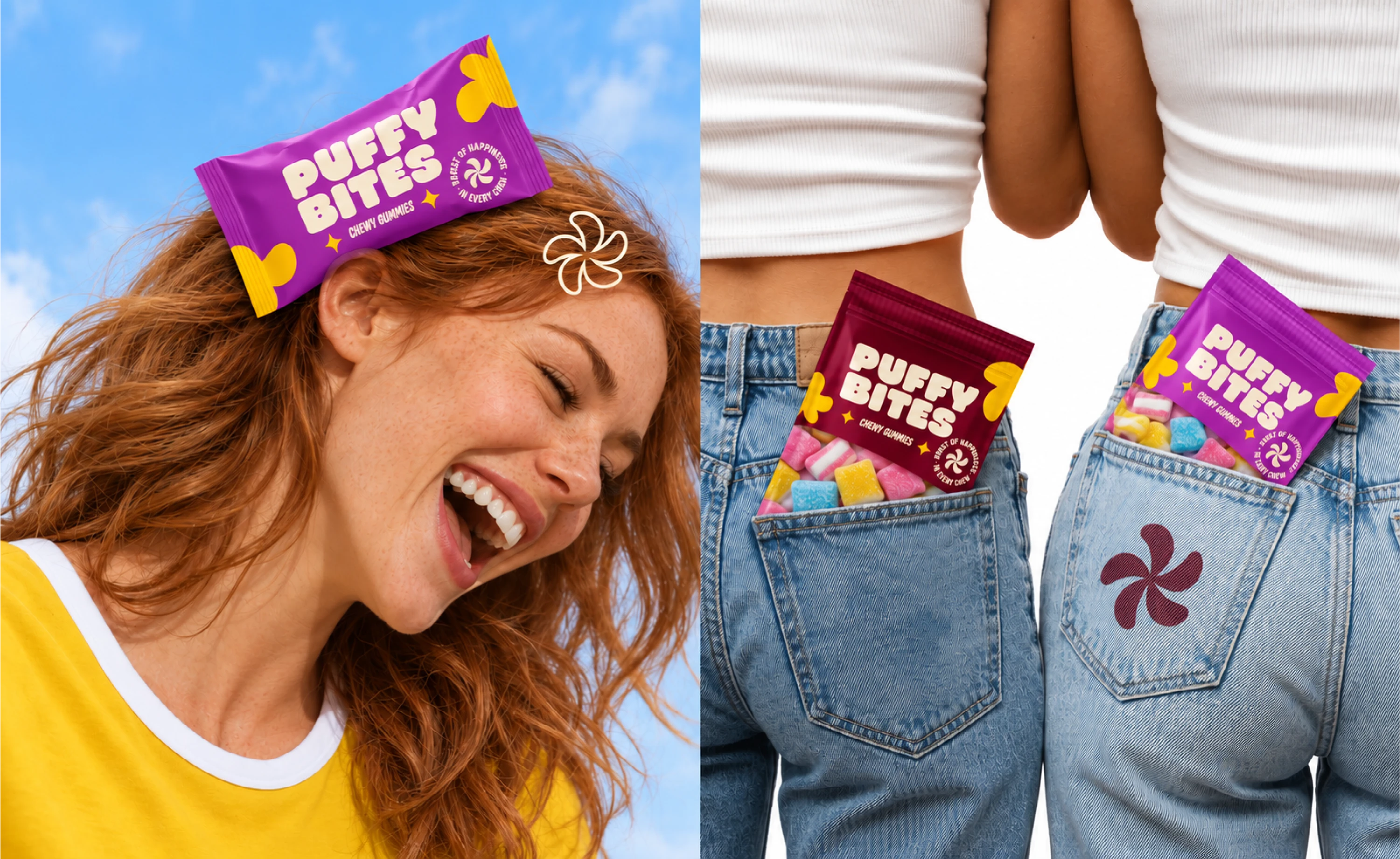
A burst of happiness in every chew
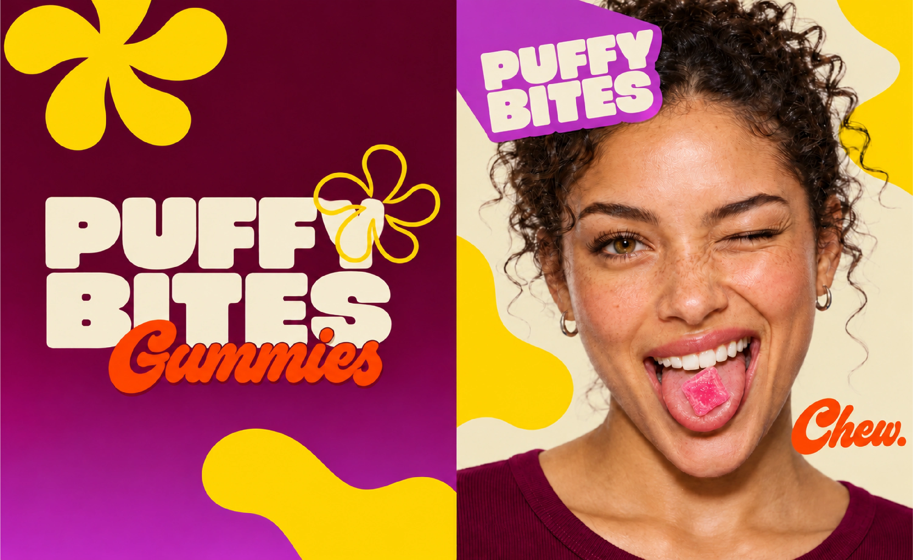
Puffy Bites is a gummy candy brand identity and packaging project built around a playful, expressive visual direction. Rounded lettering, vibrant colors, organic symbols, and candy imagery connect the identity across packaging and campaign applications.
My role
I handled the full project, including logo design, visual identity, packaging design, campaign imagery, and the animated brand showcase.
Tools: Adobe Illustrator, Adobe Photoshop, and Figma.
The design focus
The project brings the soft, playful character of gummy candy into a recognizable visual system. The design connects the brand name, product category, packaging, and promotional imagery through a consistent set of colors, shapes, and typography.
The identity needed enough flexibility to work across different compositions while keeping Puffy Bites recognizable.
Logo and visual identity
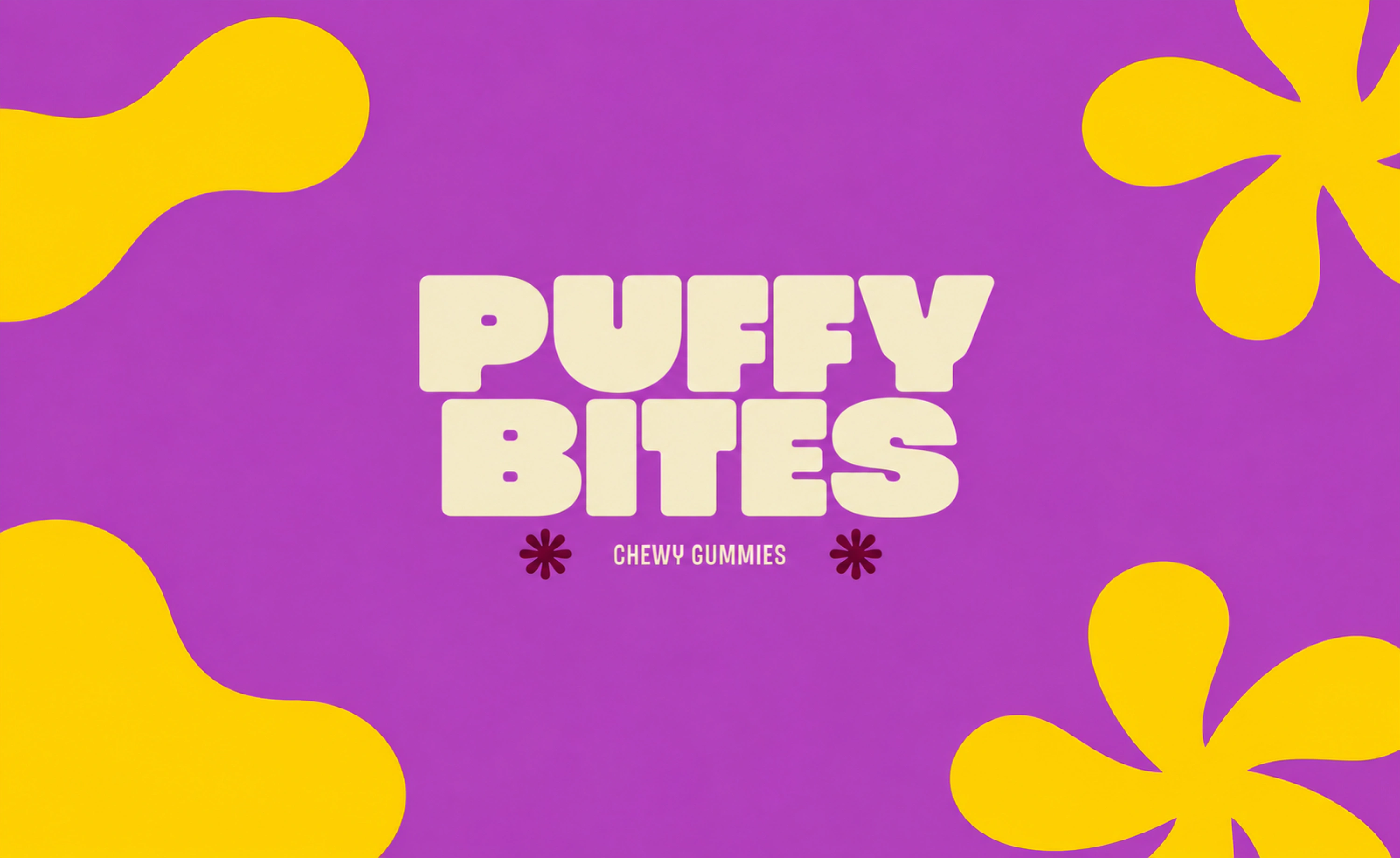
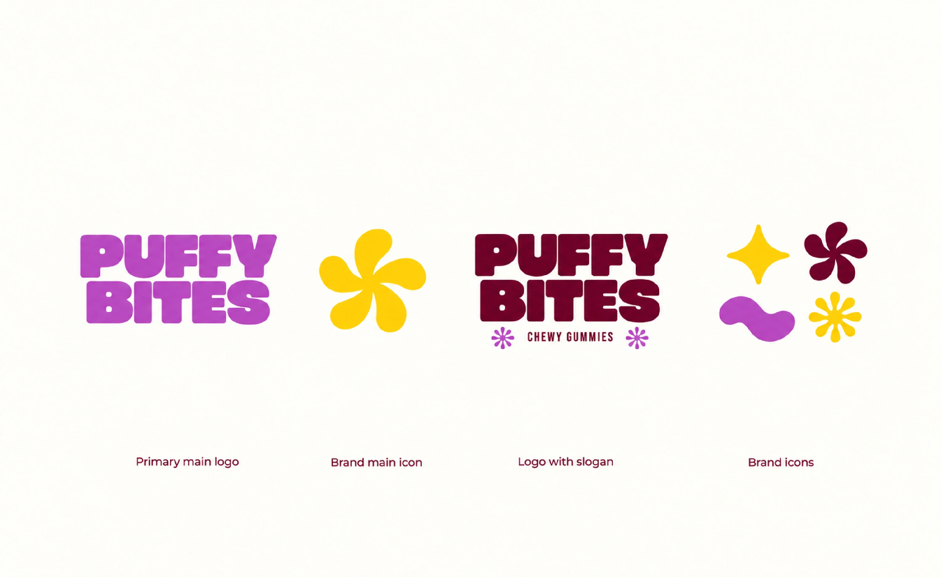
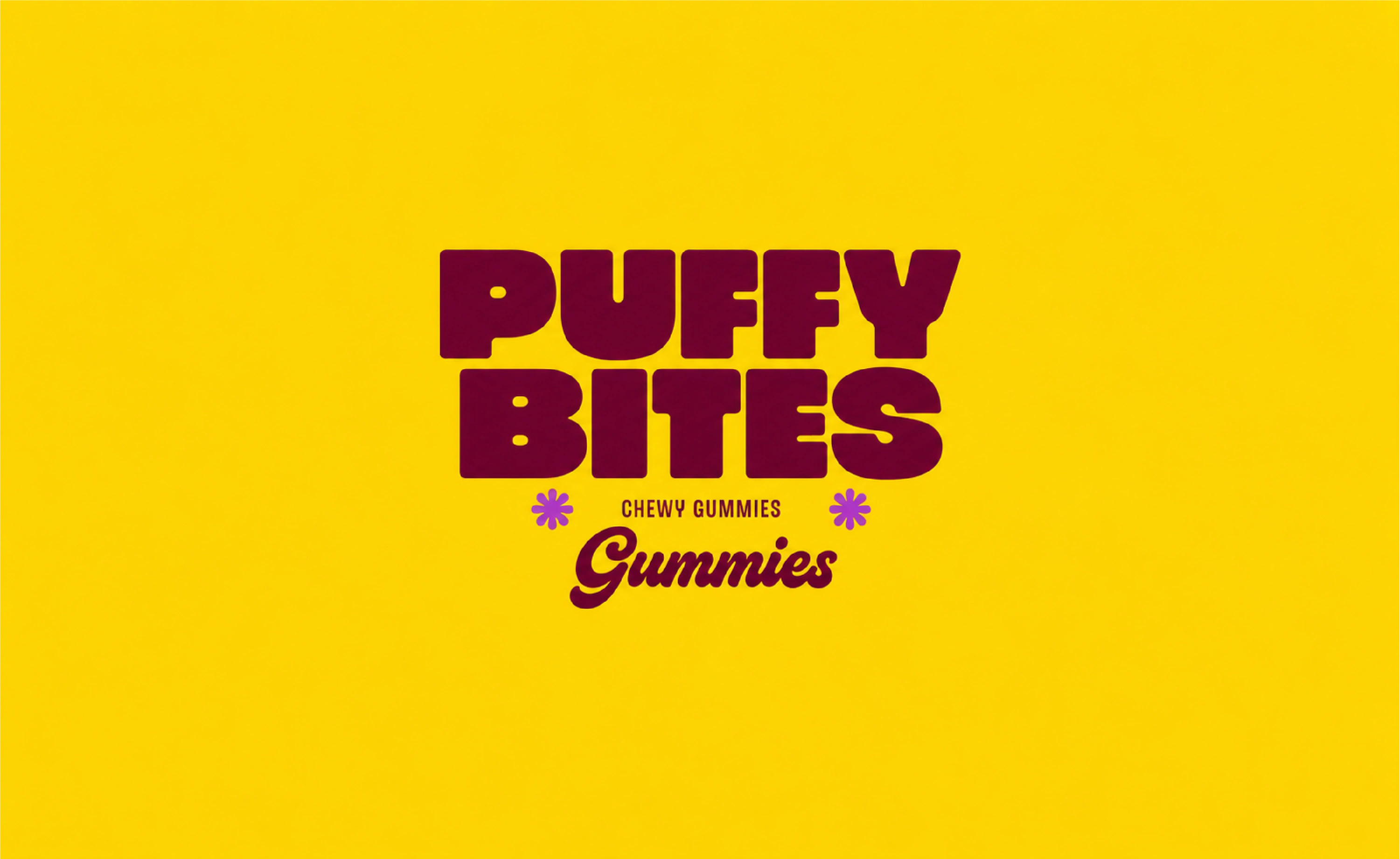
The stacked Puffy Bites wordmark uses bold, rounded letterforms that echo the product’s soft appearance. Its compact arrangement gives the brand name a prominent position on the packaging.
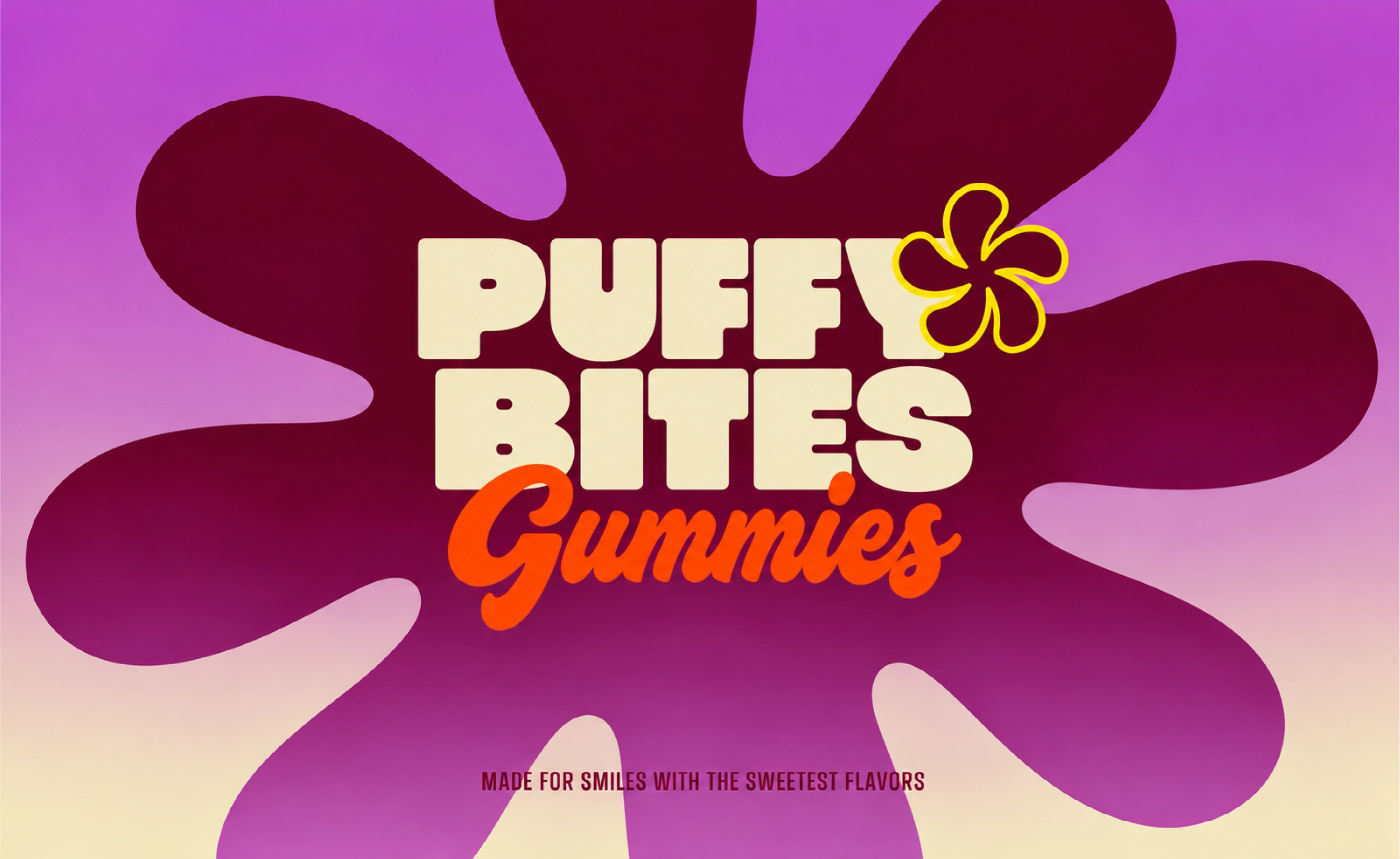
A supporting collection of flower-like symbols, stars, and organic shapes extends the identity beyond the logo. These elements appear as decorative accents, repeated patterns, badges, and larger graphic compositions.
Color and typography
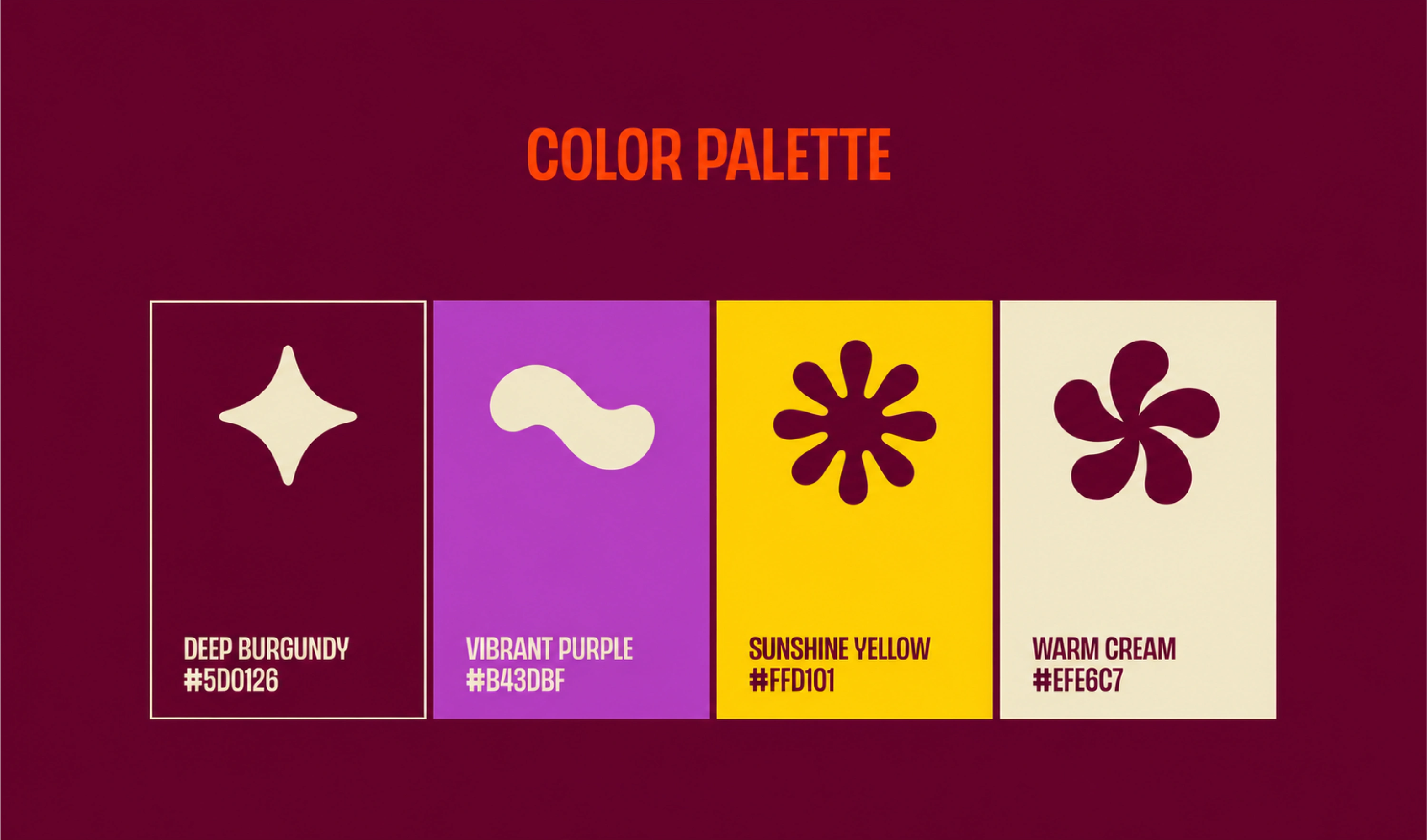
Deep burgundy, vibrant purple, sunshine yellow, and warm cream form the core palette. Their contrasting combinations allow the identity to move between energetic packaging layouts and quieter presentations of the logo.
The rounded wordmark is paired with condensed supporting text to establish a clear hierarchy. Expressive script lettering adds another layer of personality to selected campaign applications.
Packaging design
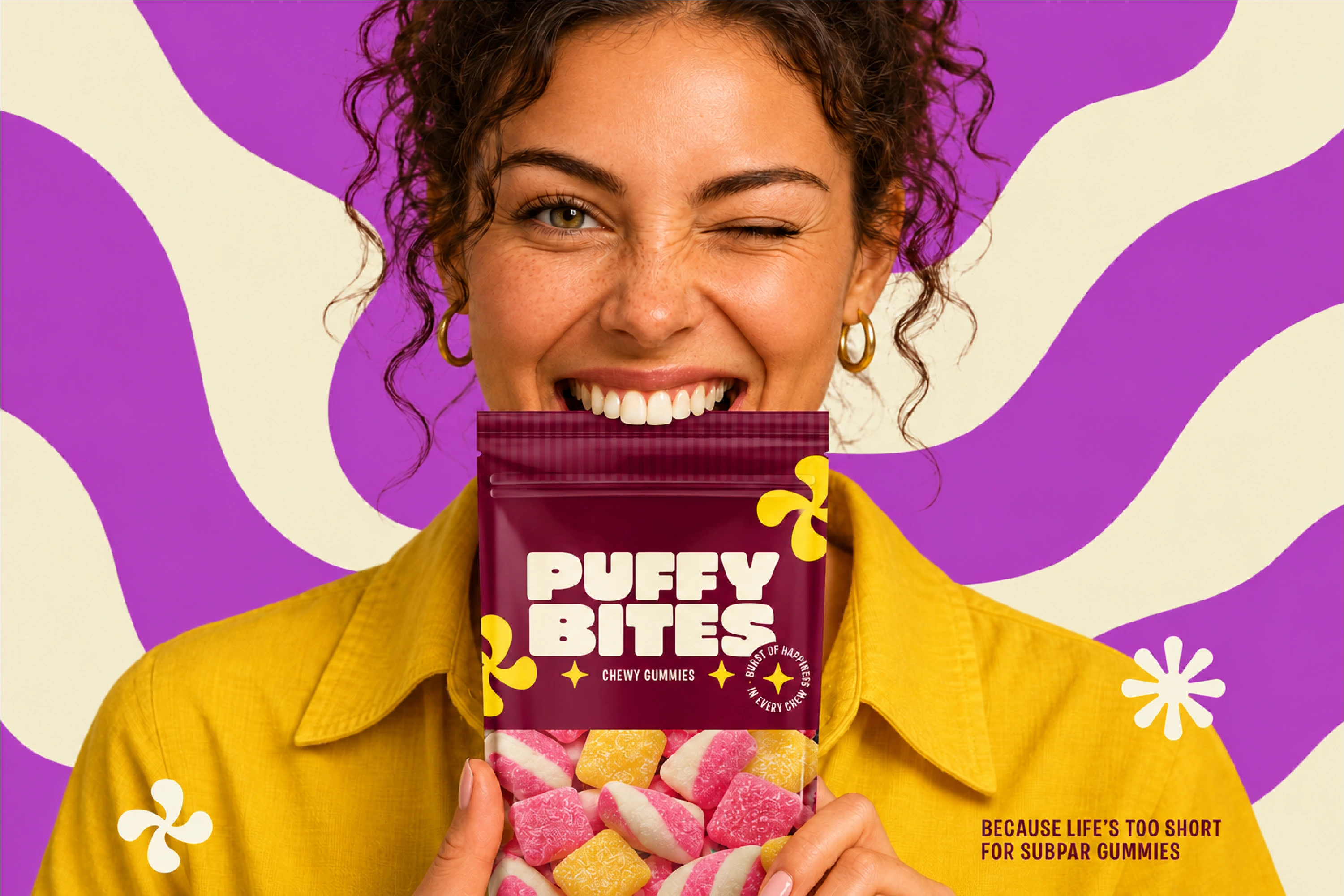
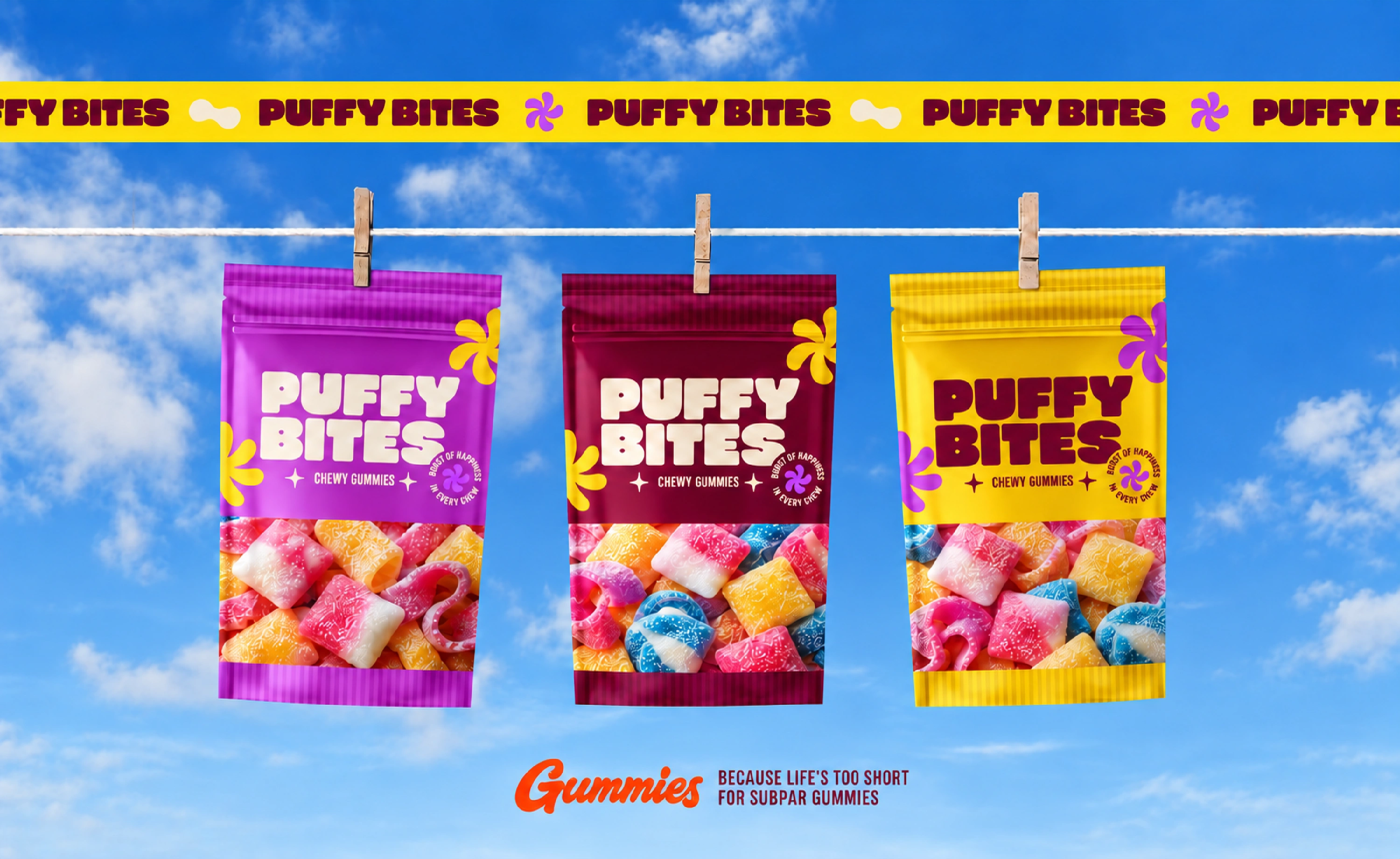
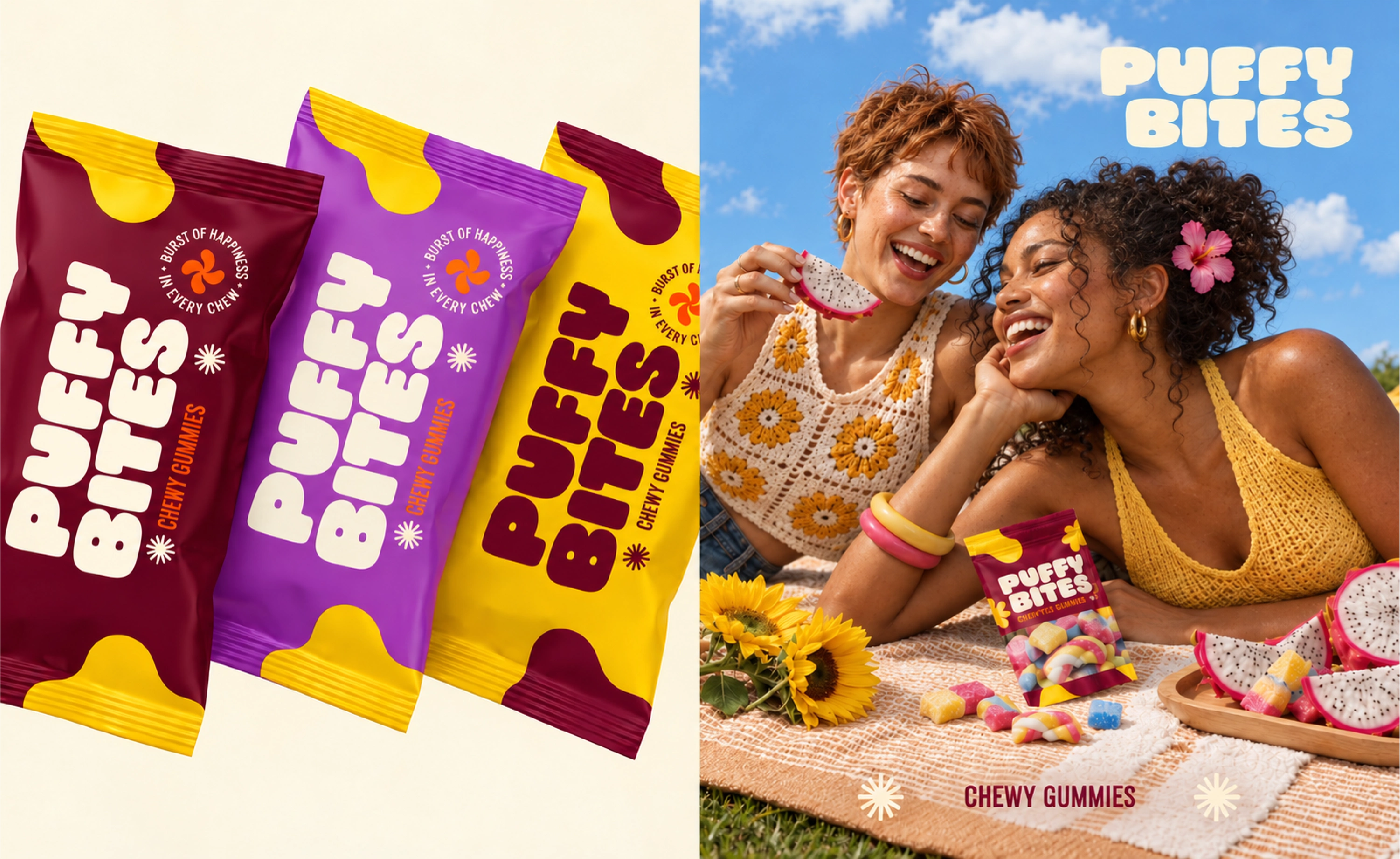
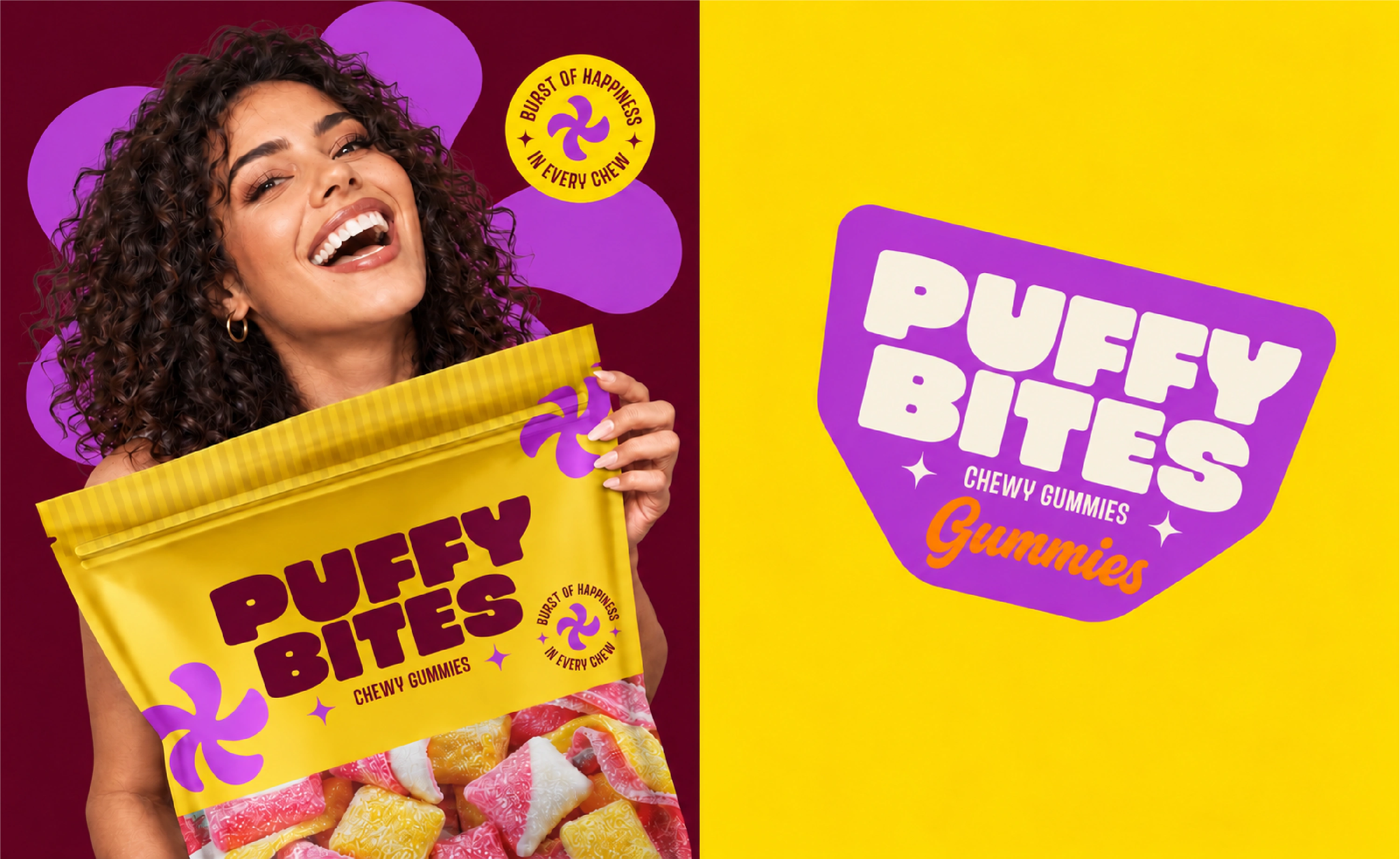
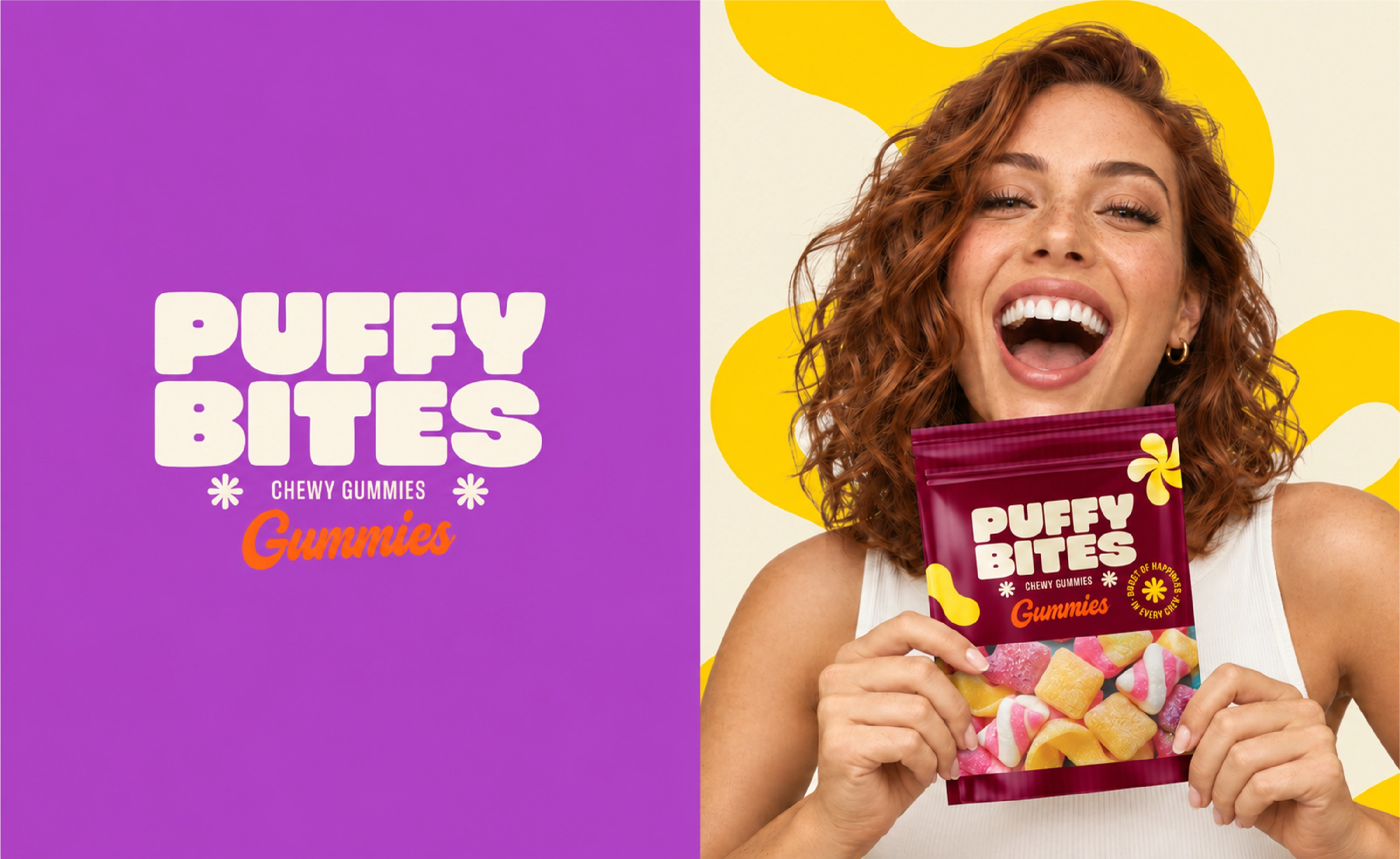
The packaging is presented in purple, burgundy, and yellow colorways. Each keeps the same core structure: a prominent brand name, the “Chewy Gummies” descriptor, supporting brand graphics, and candy imagery.
Repeating these elements creates a consistent family of packs while allowing the colors and compositions to vary. The presentation also shows the identity applied to smaller wrapper formats.
Campaign applications
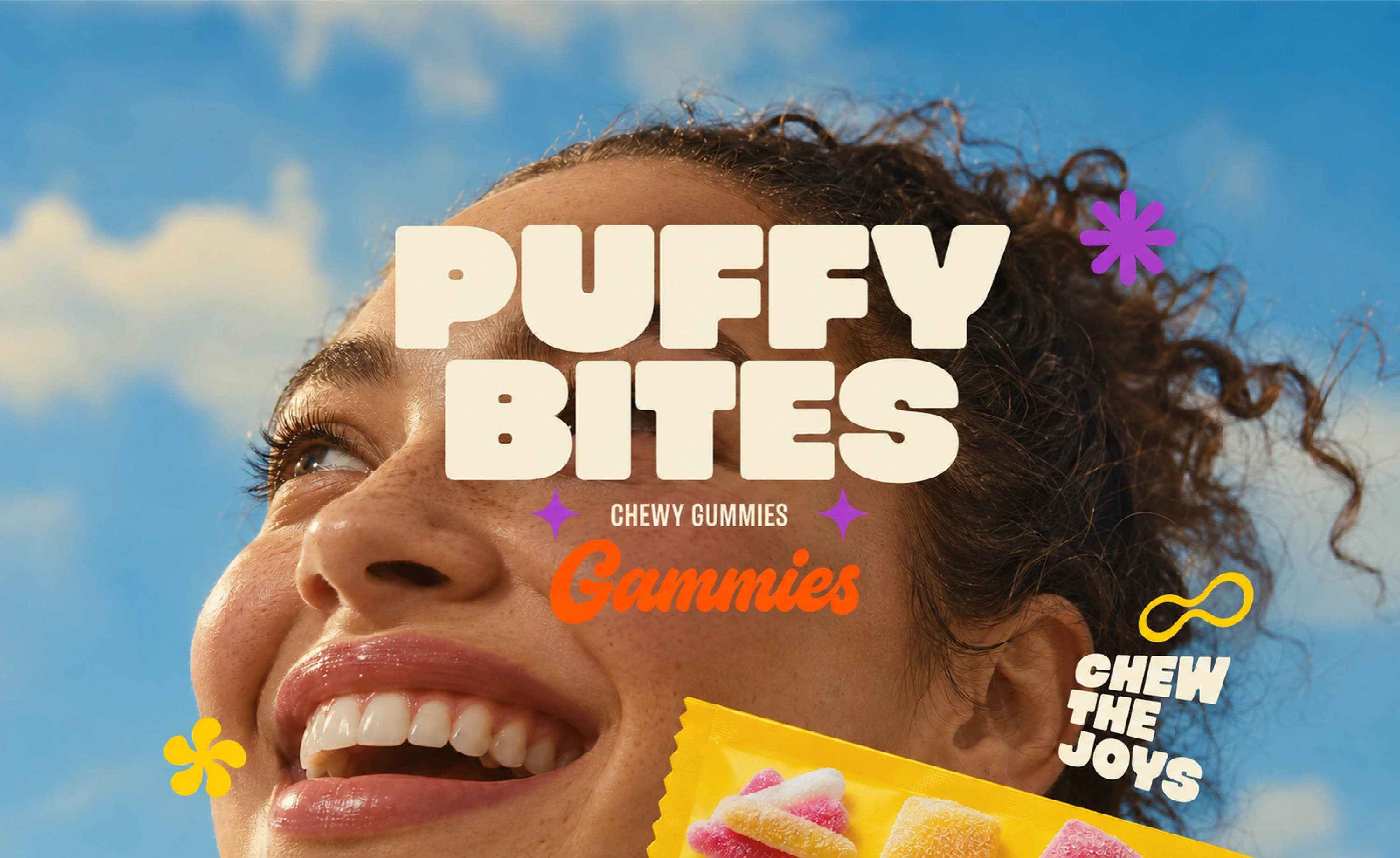
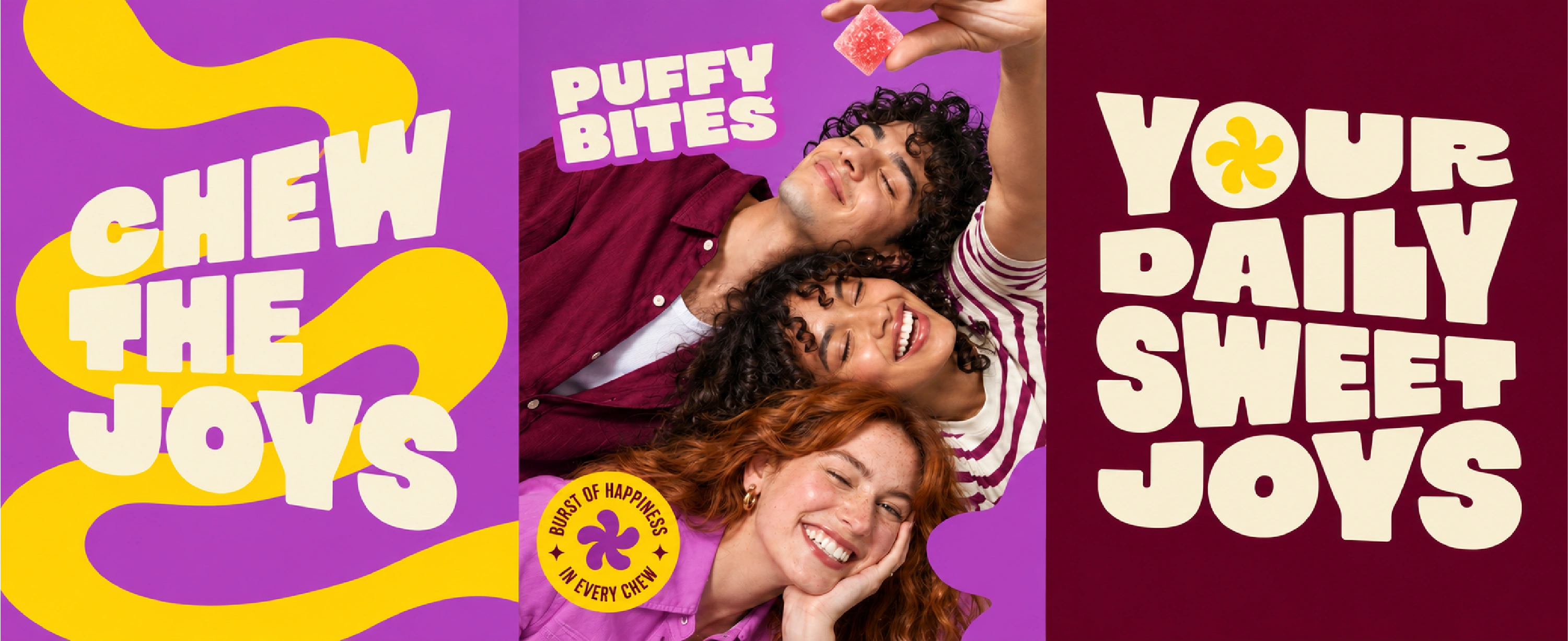
Lifestyle imagery places Puffy Bites in moments of enjoyment and sharing. Large typography, oversized brand symbols, and recurring colors connect these compositions to the packaging.
The animated showcase brings the identity, packaging, and campaign graphics together in a short presentation of the overall system.
Project scope
Logo and supporting lockups
Brand symbols and graphic elements
Color palette and typography direction
Pouch and wrapper packaging applications
Campaign and lifestyle visuals
Animated brand showcase
The result
The finished project presents a cohesive identity across packaging mockups, campaign compositions, and motion. Consistent lettering, colors, and symbols give Puffy Bites a recognizable visual language across the applications shown.
Looking for branding and packaging for your candy, snack, or food business? Get in touch through my Contra profile to discuss your project.

Like this project
Posted Oct 31, 2026
Playful gummy candy branding for Puffy Bites, featuring a rounded logo, a vibrant color system, pouch packaging, and expressive campaign visuals.