Freelance Art Directors in Community of Madrid
Sign Up
Post a job
Sign Up
Log In
Filters
2
Projects
People
Nacho Seoane
Madrid, Spain
Branding & design systems scaled from Figma to Webflow
5.0
Rating
30
Followers
Certified Partner
Follow
Message
Branding & design systems scaled from Figma to Webflow
7
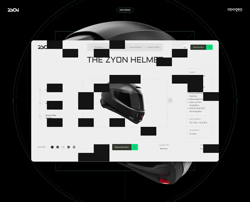
Turning innovation into interaction for Zyon Helmets.
7
114
0
Transforming AAE’s Operations with a Scalable Brand & Website
0
17
0
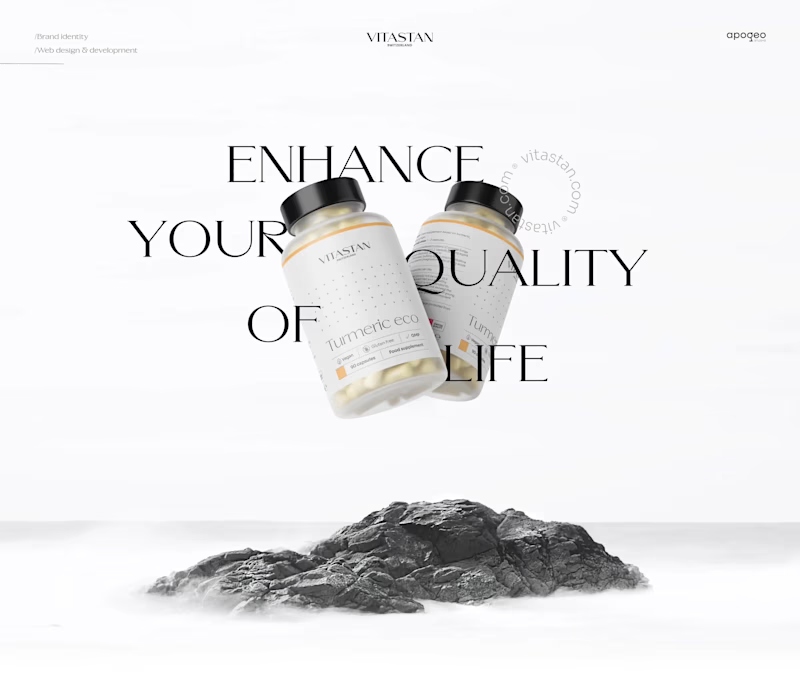
Building a Premium Swiss Brand
0
13
1
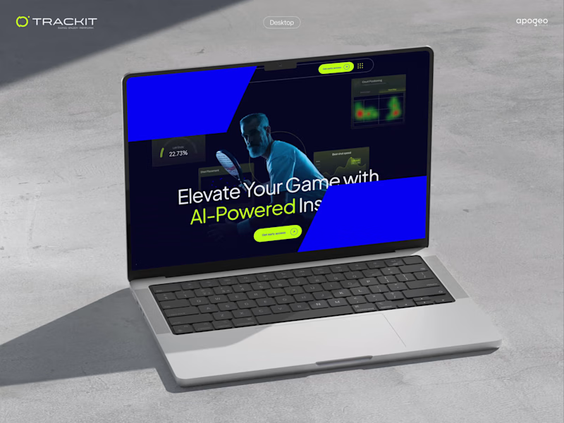
Branding, Web & Product for an AI-Powered Sports Platform
1
18
Art Director
(3)
Follow
Message
Omar Seyidli
Madrid, Spain
Multidisciplinary Graphic Designer / Creative Director
5.0
Rating
24
Followers
Follow
Message
Multidisciplinary Graphic Designer / Creative Director
2
CDP Education - Branding Core Development Platform is a brand that provides training to company employees in various fields. Goal The company aims to become a development platform that not only provides training to companies, but also supports various projects and establishes scholarship programs in the future. Result The symbol is based on the concept that development starts from the core. The circular flow represents continuous development, while the open form represents flexibility and scalable systems thinking. This approach positions the platform in a strong position from both a technological and business perspective.
1
2
290
2
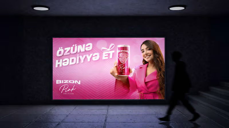
Bizon Energy Drinks / Key visual - FMCG Give yourself a gift - Özünə hədiyyə et Role: Formulation of the campaign idea, creation of a creative concept and overall creative direction. Expression of the product’s “Pink Edition” position in visual language and determination of the emotional tone of the campaign. Execution: Key visual design and creation of a campaign visual system. Establishing a balance between the product, model and color palette, maintaining the readability of the message and preserving the commercial impact were monitored during the production stage. Objective: By presenting the Pink Edition product in a gift and lifestyle context, bringing the brand closer to the audience in a more emotional and attractive way, creating a visual language that is sales-oriented but creates a premium feeling.
2
274
2
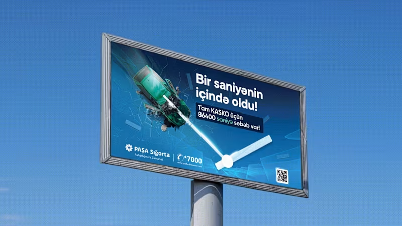
It happened in a second! There are 86400 reasons for full Casco Role: Creating the campaign idea, building the creative concept and overall creative direction. Defining the visual metaphor and planning the approach of the motion version. Execution: The billboard design and the conceptual direction of the motion version were formed. The composition of the visual elements, the metaphor of time (the concept of seconds) and the readability of the message were monitored during the production stage. Objective: To emphasize the unexpected and sudden occurrence of insurance events, to convey the value of the “timely decision” of the CASCO product to the audience with a strong visual and memorable metaphor. That is, the main focus was built on the theme of time.
2
382
94
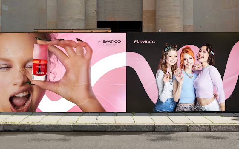
Goal: Our goal for Flaminco was to shape the cosmetic product not only as a functional FMCG category, but as a part of everyday self-expression. The main approach of the brand was based on creating a flexible and emotional visual world that adapts to the dynamic lifestyle of a young audience. The open “M” shape used in the visual system symbolizes the free, changeable and adaptive character of Flaminco. This approach ensures that the brand is distinguished not only through color and aesthetics, but also through behavior and energy. Target: The main target audience of the brand is the young generation aged 16–25, who are sensitive to visual trends, value self-expression and seek aesthetic value in the products they use daily. Flaminco was formed with a more open and contemporary approach, aimed not only at a female audience, but also at everyone who cares about their appearance and style. The goal was to create a premium brand experience that is more interactive, flexible and able to build an emotional connection in the FMCG and retail market. Result: The result was a unified and flexible visual identity system for Flaminco that stood out in retail environments and could be easily expanded across digital platforms. The resulting visual language more strongly reflected the brand’s energy, flexibility and emotional connection with a young audience. The system was developed to serve as a sustainable and adaptive foundation not only for the current product line, but also for future campaigns, new product categories and communication directions.
53
94
4.5K
Art Director
(8)
Follow
Message
Gian Carlo Villarreal
Madrid, Spain
Creative Art Director for Memorable Brands
2x
Hired
5.0
Rating
10
Followers
Follow
Message
Creative Art Director for Memorable Brands
1
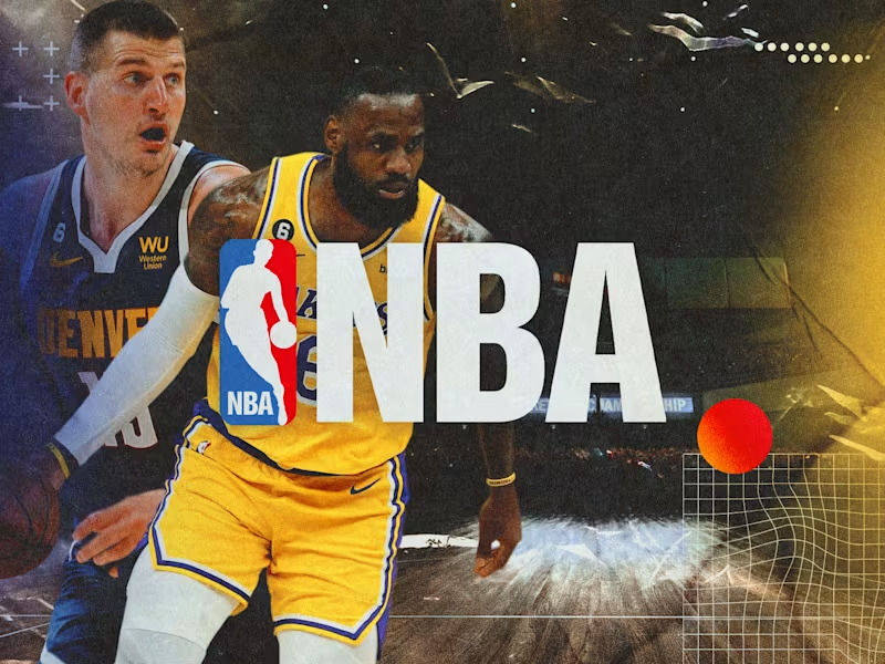
Graphic Design | NBA Playoffs Matchdays
1
44
0
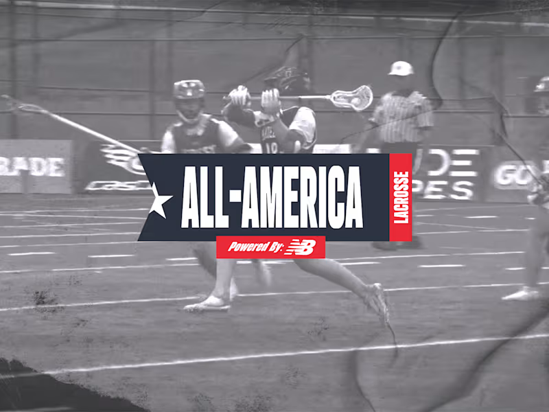
Demo Reel | New Balance X All America Lacrosse Senior Game
0
17
0
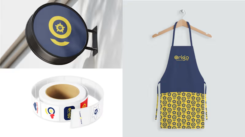
Brand Design | Origo 🍫
0
59
5
Brand Design | ESPN X All America Lacrosse Senior Games
5
85
Art Director
(9)
Follow
Message
Andreu Martínez
pro
Madrid, Spain
VIDRIO| Creative Atelier & Art Direction by Andreu Martínez

28
Followers
Follow
Message
VIDRIO| Creative Atelier & Art Direction by Andreu Martínez
21
Seht — Haircare Product Photography Seht is a dermatologist-tested, fragrance-free haircare brand. The client came to me with a clear vision: a moodboard of minimal, editorial product photography for their shampoo and conditioner, and a request to create images in that spirit without copying any of them. The brief was clear, but it pulled in several directions: liquid in motion, foam, motion blur, dark still lifes, bright editorial rows. So before shooting anything, I built a short visual guide to hold the series together. It sets a three-tone palette, typography, camera and lighting rules, and one core restriction: only the product, its own formula, water and light in frame. From that system I produced a set of 10 campaign images, plus extra frames for social. Each one was built from the client's references, then refined through retouching so the bottles, labels and formula textures stay true to the real product. The result is a set that feels like a single campaign rather than ten separate photos, and a visual language the brand can keep building on.
14
21
1.5K
28
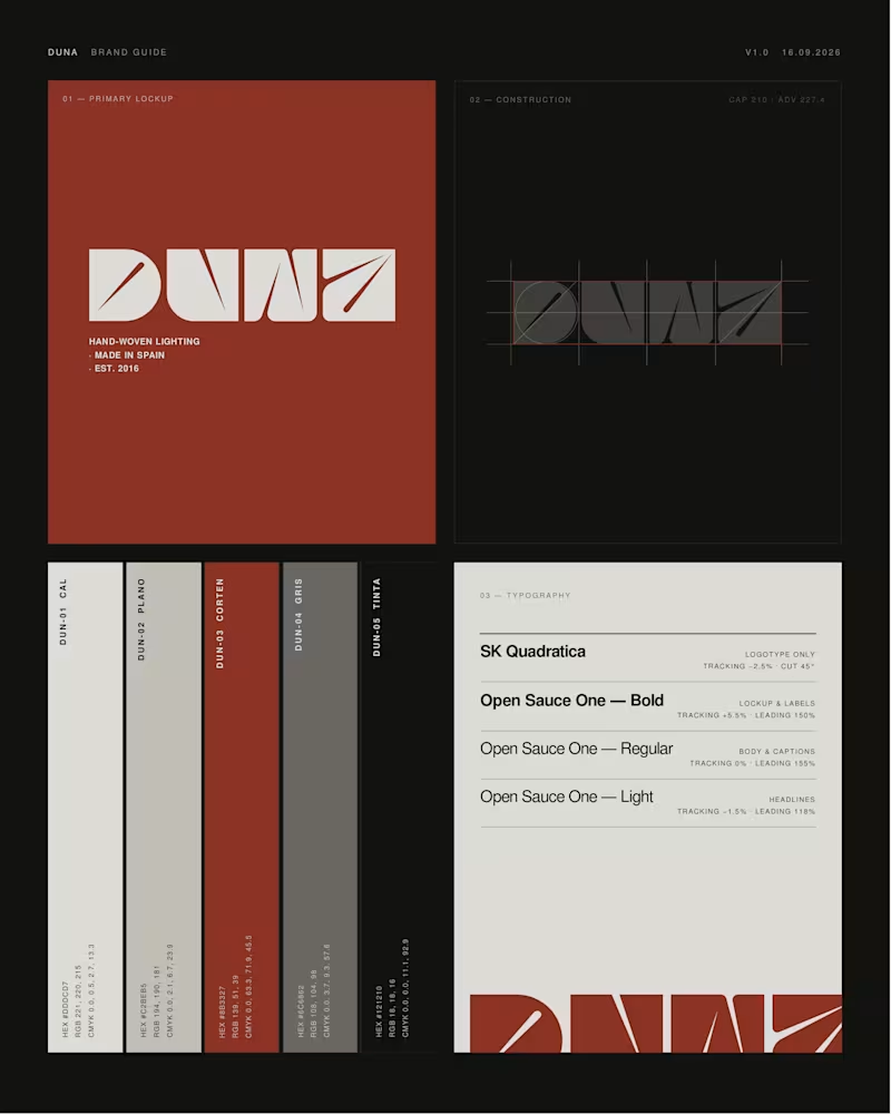
DUNA — Lighting brand identity (self-initiated) A full rebrand of Lab des Sens Atelier, a Spanish workshop that hand-weaves lighting in natural fibre. Every piece in their catalogue is named after a Spanish beach — Portlligat, Riazor, Zarautz. The brand itself was named in French. That gap was the whole project: new name, logotype, colour and type system, two collections, bilingual copy and a full set of campaign imagery, all built on one territory — the light of the Spanish coast. Every image was art-directed before it was made, then generated and finished by hand. Claude · Higgsfield · Photoshop · art direction throughout. Unsolicited concept, not affiliated with the brand. Does the direction land for you? Curious to hear what you'd have pushed further.
18
28
1.4K
35
Caelum — Concept project (fictional brand) Caelum isn't a real product. It's a self-initiated portfolio piece — a fictional daily collagen gummy I built end to end to practise taking a clinical category and giving it clean-beauty desirability. The name (Latin for "sky") set the direction: clarity. Skin, clear as sky. Form came before colour — I skipped the generic supplement jar for a sculptural asymmetric bottle, with a wide mouth for the gummies and matte soft-touch plastic instead of glass (glass would've been dishonest for something you open every day — the luxury is in the touch, not the shine). The campaign was directed through my Augmented Art Direction approach: AI as a precision instrument under tight direction, then unified by hand in Affinity so the set reads as one campaign. Real question for you: does the matte plastic feel more premium than glass here, or less? Curious where people land. 👇 Design & direction: Vidrio.
12
35
1.5K
0
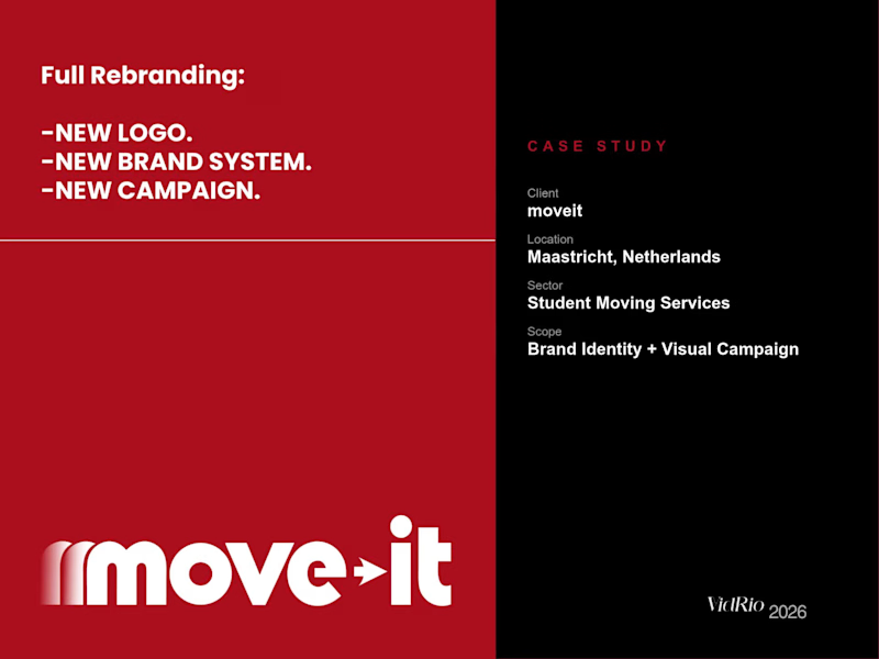
We just completed a full rebranding for moveit, a student moving company operating across Europe from Maastricht, Netherlands. New logo, new brand identity system, brand guidelines, and a 13-piece visual campaign — all art-directed and refined through AI-assisted image generation and photo retouching. From strategy to final delivery.
0
161
Art Director
(8)
Follow
Message
Isabela Santander
pro
Madrid, Spain
Building brands that connect.
Follow
Message
Building brands that connect.
0
Summer Core
0
1
0
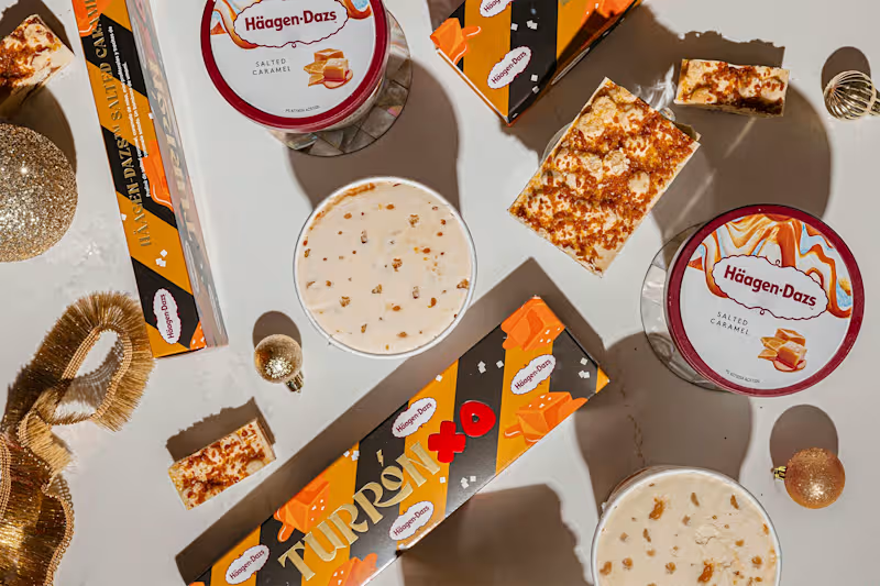
Turronxo - photoshoot art direction
0
1
0
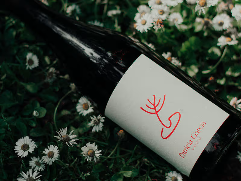
Patricia García
0
1
0
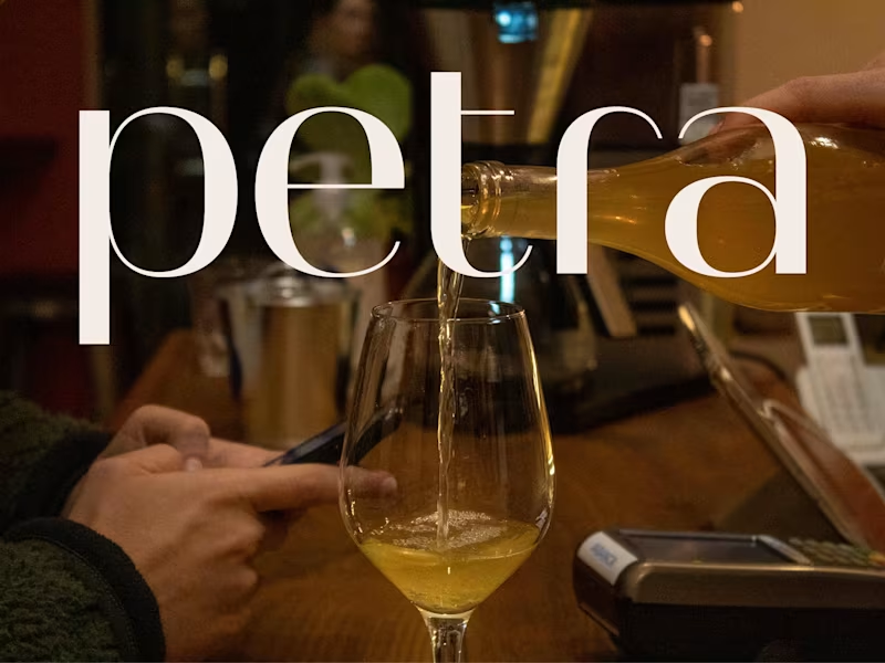
Petra coffee
0
3
Art Director
(5)
Follow
Message
Jose Luis Sánchez-Horneros
Madrid, Spain
Independent Creative Director/art
New to Contra
Follow
Message
Independent Creative Director/art
0
Massira Project- PsTalents
0
0
0
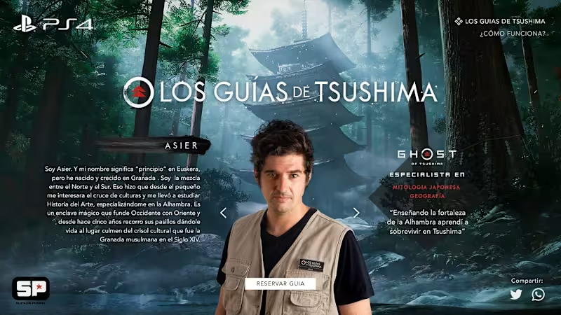
Tsushima Guides - PlayStation
0
0
0
Reflexes - Audi
0
0
0
Let´s believe in advertising - Eficacia 2020
0
0
Art Director
(7)
Follow
Message
Max Vaselashko
Madrid, Spain
3D & AI Motion Designer | Art Director for SaaS, CPG & Produ
New to Contra
Follow
Message
3D & AI Motion Designer | Art Director for SaaS, CPG & Produ
0
Invoicing SaaS — Hybrid 3D & AI Motion Design
0
6
0
3D Motion Design for Web Agency
0
5
0
3D Motion & AI Product Presentation
0
6
0
3D Product Video for a Matcha Tea Brand
0
5
Art Director
(3)
Follow
Message
Marcela Ottilia
Madrid, Spain
Creative Director | Pitch Decks • Brand Presentations
New to Contra
Follow
Message
Creative Director | Pitch Decks • Brand Presentations
0
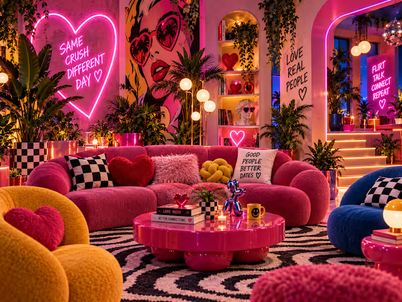
El Loco Amor — Building a Visual Universe for Gen Z Dating TV Expanding the Format The creative work grew from within the format itself. I developed new games, situations and content opportunities, thinking about what could happen inside each space and how the environment itself could generate storytelling rather than simply decorate it. The different areas became more than functional corners. Each one was designed with its own purpose, energy and potential role in the narrative: spaces to meet, flirt, talk, play, reveal information, create tension, capture memories or generate short-form social content. Building the Visual World From that strategic foundation, I developed the visual direction. The universe combined Neo-Memphis, Retro Pop, Boho-Urban and Art Pop, transforming the set into an emotional gallery-meets-pop home: colourful, excessive, playful and designed to be instantly recognisable and shareable. Neon, tactile textures, handwritten messages, hearts, photography, vegetation, saturated colour and expressive objects became part of the format's language—not simply decoration. One Idea Across Every Touchpoint The graphic identity followed the same principle. It needed to be modular and expressive, capable of moving naturally between television screens, vertical video, social media and physical applications. The creative rule was controlled chaos: layering, movement, romantic-pop symbols and visual elements entering the frame almost as if they belonged to an app interface. The Result The result was a proposal in which format development, games, set design, visual identity and social content all came from one creative idea. The goal was never simply to build a set around a television programme. It was to explore what creative direction could add to the format itself: more world, more situations, more storytelling and more possibilities for content. I received an idea. I stepped inside it, challenged it and expanded it into a complete creative universe.
0
20
1
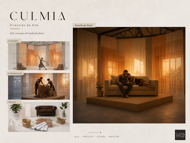
CULMIA — From Empty Space to Home Visual Concept & Art Direction for a Branded Stage Experience How do you turn the emotional journey of building a home into a physical and visual experience? Culmia needed a visual concept capable of expressing more than architecture. The project had to communicate transition, construction, change and, ultimately, the emotional meaning of creating a home. The challenge was to translate an abstract brand idea into a stage environment that could evolve alongside the performance. The space needed to feel poetic rather than literal, support movement and projection, and transform through different narrative states without losing its visual unity. The stage was conceived as a layered, evolving space. Translucent fabrics, projected architectural imagery, cardboard boxes, bricks and domestic objects represented the different emotional stages of creating a home: uncertainty, construction and finally belonging. The architecture was not presented as something static. It became a living environment shaped by movement, light and human presence. The set did not simply represent a home. It showed the process of becoming one. 1. Transition Layers of translucent fabric created depth and ambiguity. Projected architecture appeared and disappeared as the performers moved through the space, suggesting change, memory and possibility. 2. Construction Boxes, bricks and an unfinished scenic fragment transformed the platform into a space under construction. The dancers interacted physically with the materials, turning the act of building into part of the performance. 3. Home The final environment became calmer, warmer and more inhabited. A sofa, domestic lighting and everyday imagery replaced the temporary construction elements. The stage stopped being a space to cross and became a place to stay. Creative Direction Art Direction Visual Concept Development Set Design Visual Storytelling Scenic Narrative Moodboard & Previsualization Materials and Prop Selection I developed the visual concept, scenic narrative and art direction, defining how the same stage could evolve through different emotional and physical states. I translated the central idea into spatial composition, materials, projections, scenic objects and visual references, creating a clear proposal for production and performance. The final proposal transformed the idea of housing into an emotional visual journey. Through a modular scenic system, the environment moved from uncertainty to construction and finally to the warmth of an inhabited home. The project demonstrates how art direction and visual storytelling can make an intangible brand message visible, physical and emotionally understandable. CULMIA From Empty Space to Home Visual Concept & Art Direction
1
45
0
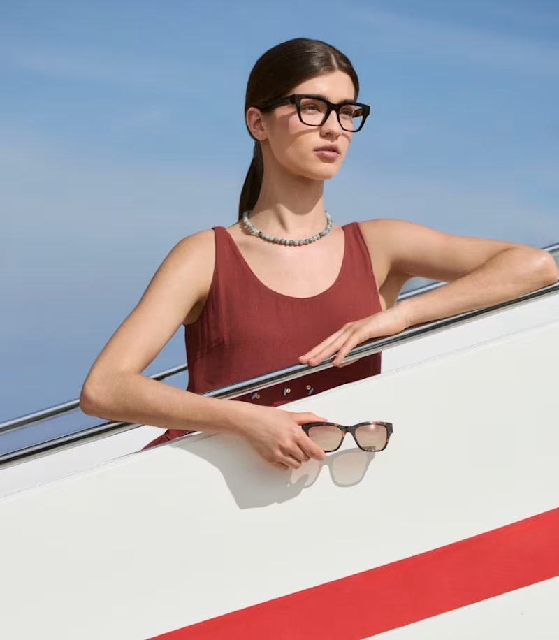
Opticalia España — Destino Paraíso
0
2
1
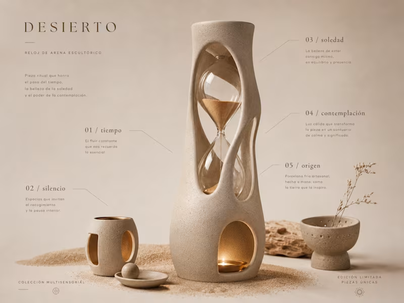
Objects & Editions — From Story to Object Concept Development, Product Design & Material Exploration What if an everyday object could carry a complete story? Objects & Editions began as an exploration of how emotion, memory and human experience could be translated into sculptural, functional objects. Rather than designing isolated pieces, I developed each collection as a complete visual and sensory world—defined by its narrative, forms, colours, textures, materials and central symbolic object. The challenge was to move from an abstract emotional concept to a coherent family of physical objects. Every vase, tray, bowl, candle holder or table piece needed to feel connected to the same origin while remaining functional, reproducible and visually distinctive. I created a story-led product design system in which the narrative came first. Each collection was developed through: — concept and emotional territory; — shape and functional exploration; — colour, texture and material language; — hero-object development; — cold porcelain master prototypes; — mould-making studies; — casting and finishing tests. The objective was not to decorate an object, but to give form to an idea.
1
1
54
Art Director
(3)
Follow
Message
Explore people