The network for creativity
Join 1.25M professional creatives like you
Connect with clients, get discovered, and run your business 100% commission-free
Creatives on Contra have earned over $150M and we are just getting started
Back to feedPost
Goal:
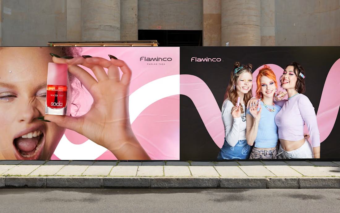

Our goal for Flaminco was to shape the cosmetic product not only as a functional FMCG category, but as a part of everyday self-expression. The main approach of the brand was based on creating a flexible and emotional visual world that adapts to the dynamic lifestyle of a young audience.
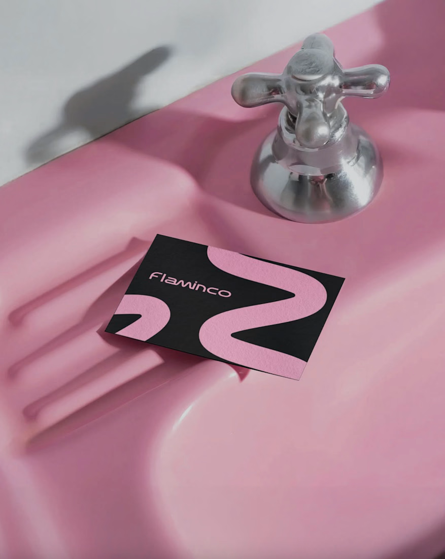
The open “M” shape used in the visual system symbolizes the free, changeable and adaptive character of Flaminco. This approach ensures that the brand is distinguished not only through color and aesthetics, but also through behavior and energy.
Target:
The main target audience of the brand is the young generation aged 16–25, who are sensitive to visual trends, value self-expression and seek aesthetic value in the products they use daily. Flaminco was formed with a more open and contemporary approach, aimed not only at a female audience, but also at everyone who cares about their appearance and style. The goal was to create a premium brand experience that is more interactive, flexible and able to build an emotional connection in the FMCG and retail market.
Result:
The result was a unified and flexible visual identity system for Flaminco that stood out in retail environments and could be easily expanded across digital platforms. The resulting visual language more strongly reflected the brand’s energy, flexibility and emotional connection with a young audience. The system was developed to serve as a sustainable and adaptive foundation not only for the current product line, but also for future campaigns, new product categories and communication directions.




Great work!!


Thank you Celia!😊

The open M shape is a clever way to encode adaptive into the mark itself instead of just saying it in the brand words. What was the first thing you tested to make sure that flexibility actually held up once it left the page, packaging, social, everything at once?
Thank you for the compliment and for asking a great question! The idea is that the shape of the letter "M" above the "destructive wave" plays a key role. It is precisely the elasticity and the preservation of that bend in order to glorify the symbol in the logo. The reason why...

This is awesome!!
Thank you Damilola <3

excellent work, this is beautiufl!
Thank you Nicolette! <3

Wow this is nice
Thank you!✌🏻

I can see the thought behind this one. The pink color has a really nice touch.
Thanks Sekinat! <3

Widening the audience to anyone who cares about appearance and style, not just a female demographic, is the harder brief to design for. How did that broader target actually change the visual choices compared to what you'd have done for a narrower audience?
Thanks! - Anchored the soft rose pink with a deep, solid charcoal/black to ground the identity, giving it a confident, unisex contrast rather than an all-pink palette. Focused on minimalist line (Bezier), clean layouts, and unisex application rather than traditional styling tropes

Yeap!😁

Thank you✌🏻


Excellent work🔥👏👏
Thanks!🔥

Incredible work
Thanks Rahman! ✌🏻

Absolutely amazing work, well done!
Thanks!🚀

WOW!

Very coool job Omar!! 🚀
Thank you Tan!🚀

The pink and black pairing keeps it feeling premium instead of tipping into generic beauty branding. Nice work carrying it across packaging and campaign imagery consistently.

Thanks Lily! <3

Great work, love the thought process guiding the visual direction and also making sure it fits into the target audience the product is meant for .

Love the simplicity here, it gives the brand such a nice feel
Thanks!


Really strong brand thinking. Love how the identity goes beyond visuals and builds a flexible system around the audience and their lifestyle.

Brilliant work! 💚
Thank you <3

super👍 💯


Superb Work

This is exceptional work



This a well articulated project.

Awesome

The 3D animation looks basic but complete. You don't need anything more to showcase the brand. Good job—I like it!
Pairing rose pink with solid charcoal instead of leaning all-pink is what keeps it from reading as gendered by default, that contrast is doing a lot of the work. Curious how the client reacted the first time they saw the unisex direction versus what they originally briefed for.
The network for creativity
Join 1.25M professional creatives like you
Connect with clients, get discovered, and run your business 100% commission-free
Creatives on Contra have earned over $150M and we are just getting started











Related posts

Not every client comes to me for a brand identity and not all my clients are skincare or cosmetic brands.
That was the case with Hoppr, a protein powder brand made from crickets. 🦗 YES, CRICKETS!
Sometimes the logo, colors, and visual system are already there and my job is to bring them to life on packaging and see how far I can push them.
I love projects like this because I get to play with typography, layout, and materials while working within an existing identity.
How much freedom do you think a designer should have when working with an established brand?
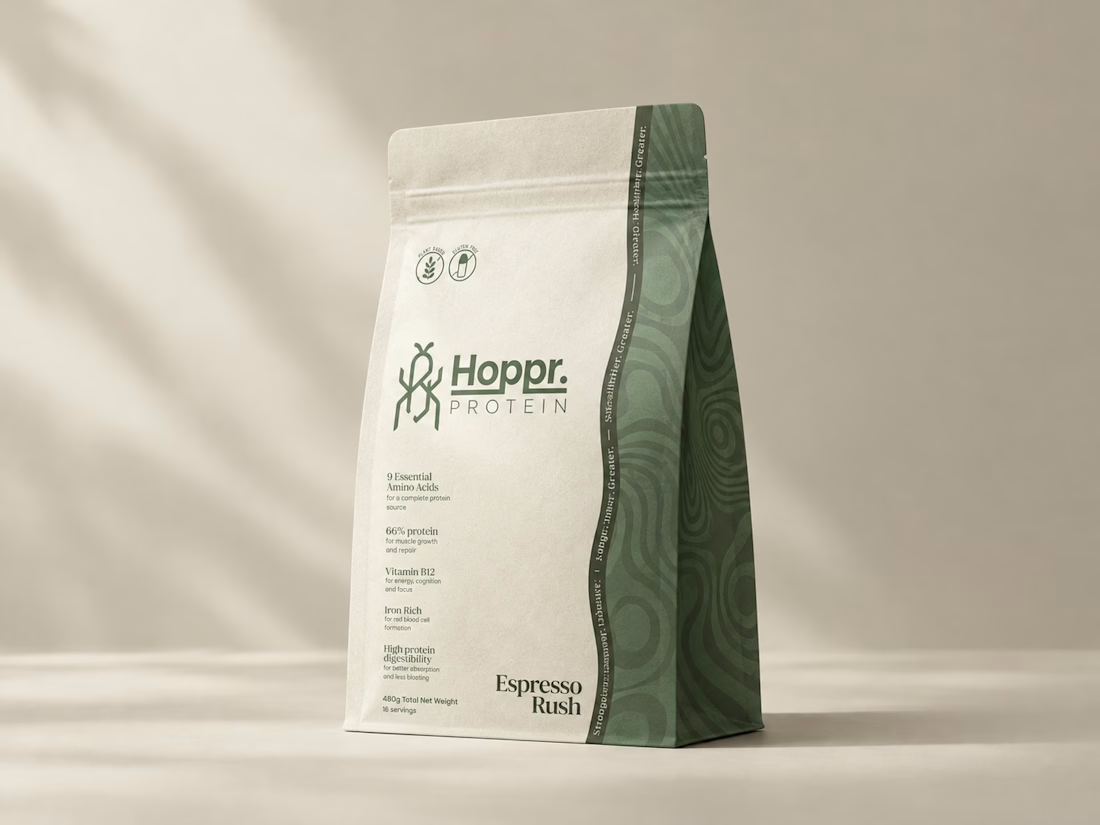
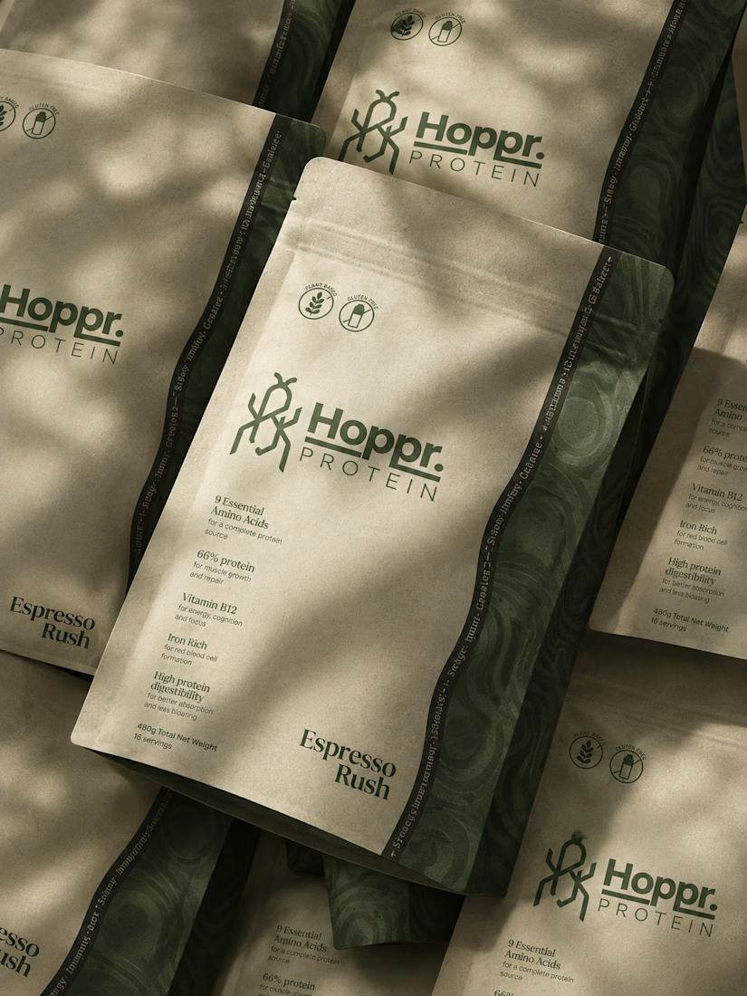

Great packaging work, nice job
Scott, founder of Glenwood Primary Care and Geriatrics, came to me looking for stock photos for his new website. I proposed building an image library for his brand instead, guided by a clear visual guide based on his patients, his logo and the local landscape. The result was 20 images made with AI, art direction and hand retouching, plus home page mockups on desktop and phone to help him choose the hero.
If you were Scott, would you have gone with stock photos or a custom image library?


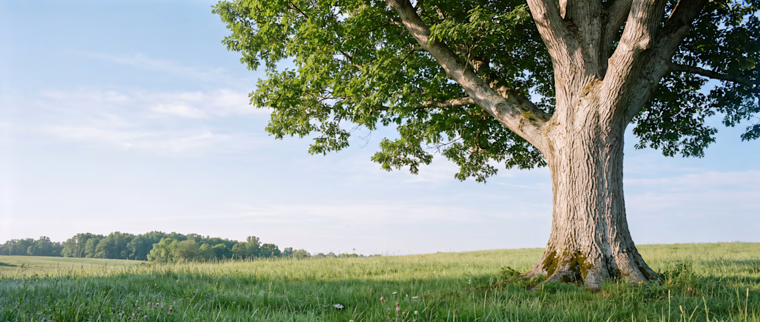
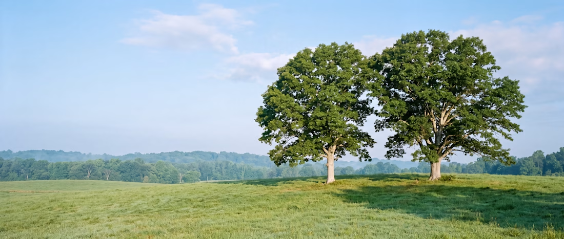

Love this

Project Title:
Dunkin’ Product Web Concept
Project Description:
A playful web design concept created to explore bold product visuals, strong composition, and interactive brand presentation. The goal was to turn a simple product idea into a more engaging digital experience while keeping the layout clean, clear, and visually memorable.
This concept reflects how I approach web design in general — understanding the brand, building a strong visual direction, and creating an experience that works around the product, service, or idea being presented.
Role: Web Designer / Creative Developer
Focus: Visual Direction, Layout, Product Presentation, Web Interaction

