
pro
Charles Chibueze
Brand Identity Designer for scaling startups



All Along: A Maternal Health App for the Whole Journey
1
4
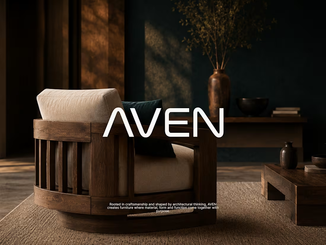
REDEFINING AFRICAN LUXURY (AVEN Brand Case Study0
1
8
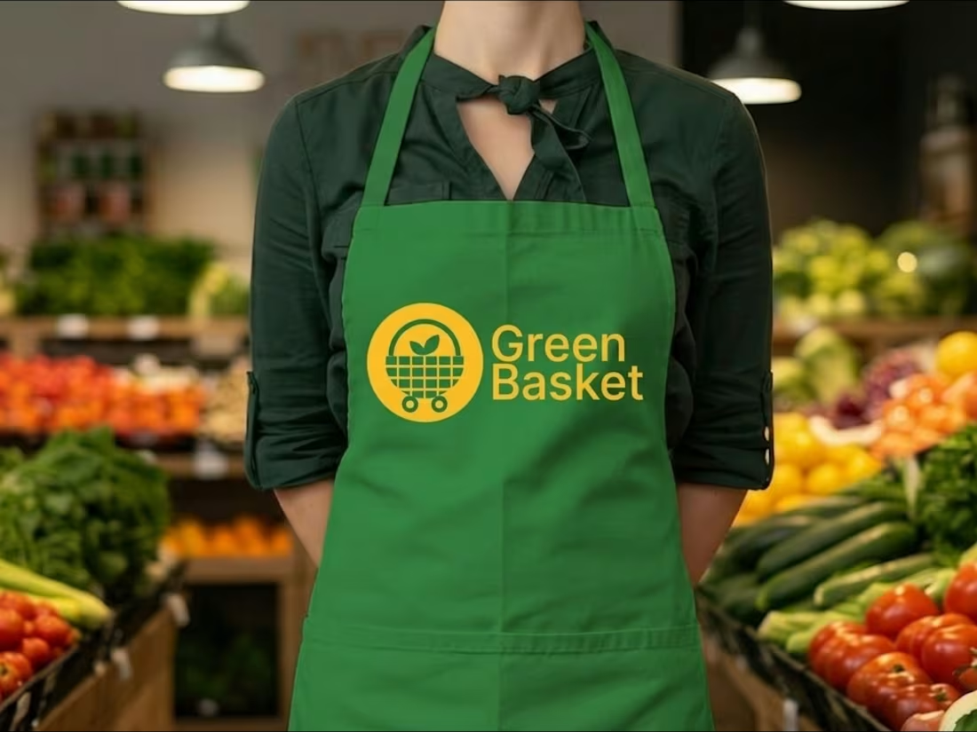
GreenBasket brand identity for a grocery delivery service
Most grocery delivery brands sell speed. GreenBasket sells trust.
The category is crowded with the same promise; fast, fresh, convenient. So the strategic move wasn't to shout it louder. It was to anchor the brand somewhere competitors can't easily copy: the supply chain itself.
GreenBasket sources directly from local farmers. That single fact does the work of three positioning statements, it explains the freshness, justifies the trust, and gives customers a reason to care beyond convenience.
From there the identity followed the logic: simple, warm, and unfussy. A brand that feels like a dependable weekly habit rather than a one-off transaction.
Vision: to become the everyday default for fresh grocery delivery.
Mission: carefully sourced groceries delivered with speed and consistency connecting people to quality food while supporting the farmers behind it.
Grocery shopping is a chore. The job of the brand was to make it feel like one less thing to think about.
1
186
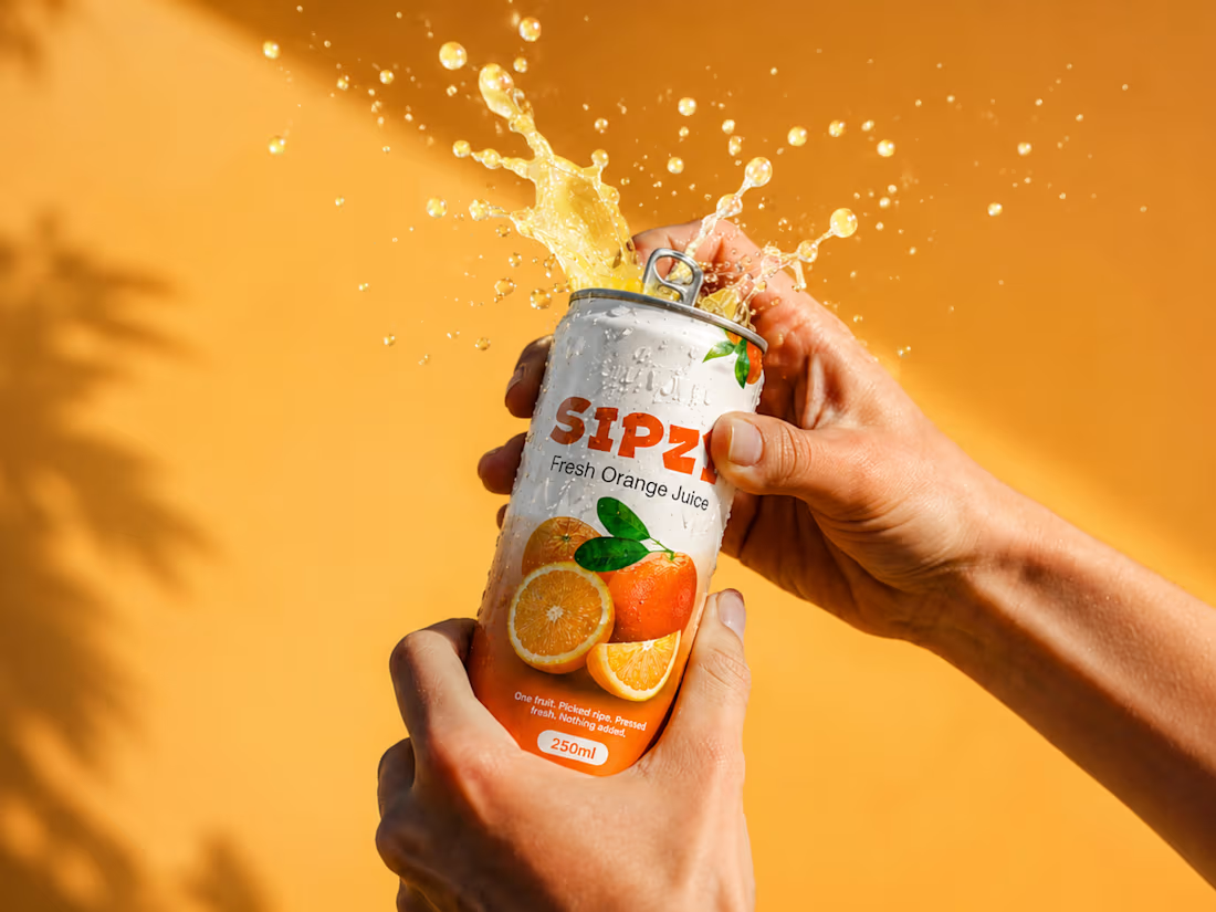
Sipzy Brand Identity: Freshness Through Restraint
Sipzy began with a generic brief, a healthy fruit drink with no additives, but the branding was built around a more ownable truth: fruit picked at peak ripeness tastes better. That insight shaped every decision, from the calm ivory base and bold wordmark to the true-to-life fruit imagery and restrained color palette.
We intentionally avoided the exaggerated cues common in juice packaging, creating a system that feels honest, fresh, and premium without trying too hard.
:The result is a brand identity that makes real fruit the hero and gives Sipzy a clear, memorable position in a crowded category.
2
2
162