
pro
Rosebeth Anyiam
I Help Businesses Turn Their Vision Into Memorable Brands
- 5.0
- Rating
- 57
- Followers


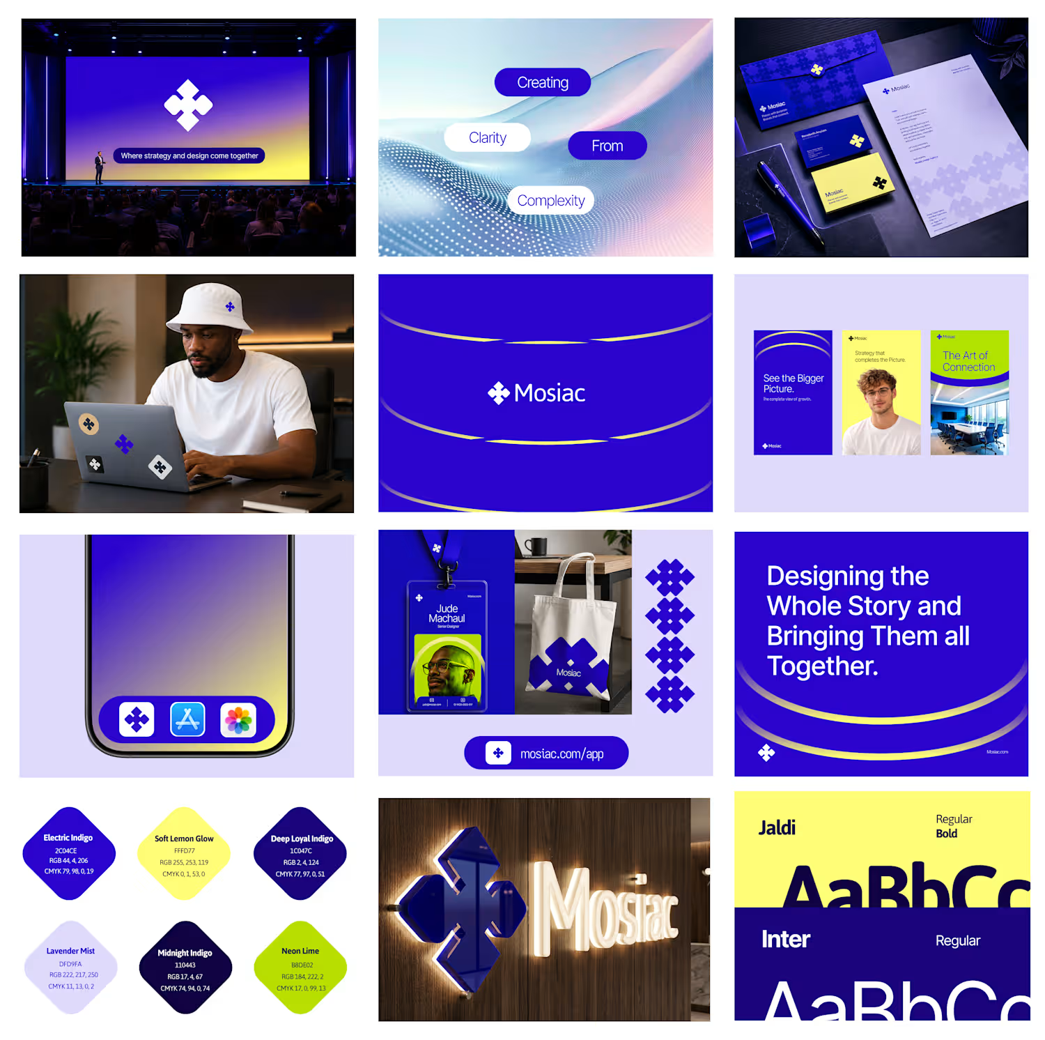

Making a 50% Christmas offer hard to ignore.
For this Christmas campaign concept, I wanted to create something festive, bold and promotional without losing the brand's visual appeal.
My creative thinking
The 50% discount needed to be the first thing people noticed. I used visual hierarchy to give the offer prominence while the Christmas elements helped establish the seasonal mood.
The goal was to balance the festive atmosphere with a clear promotional message.
I would love to hear your thoughts.
Does the design communicate the offer effectively? What would you change?
2
30
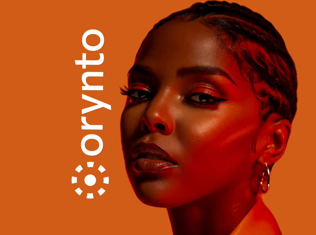
I am excited to share the full case study of Orynto, a workflow automation platform built to help businesses connect their tools, automate repetitive work, and keep things moving.
The goal was to create a brand identity that could make a complex product feel simple, clear, and approachable.
The identity was built around the idea of connection, simplicity, and movement, reflecting how Orynto helps businesses bring different parts of their workflow together.
From the logo and visual identity to the supporting brand system, every element was designed to give Orynto a clear and consistent presence as it grows.
The project was wrapped with a clear brand system and guidelines to help keep the identity consistent across different touchpoints.
3
3
225
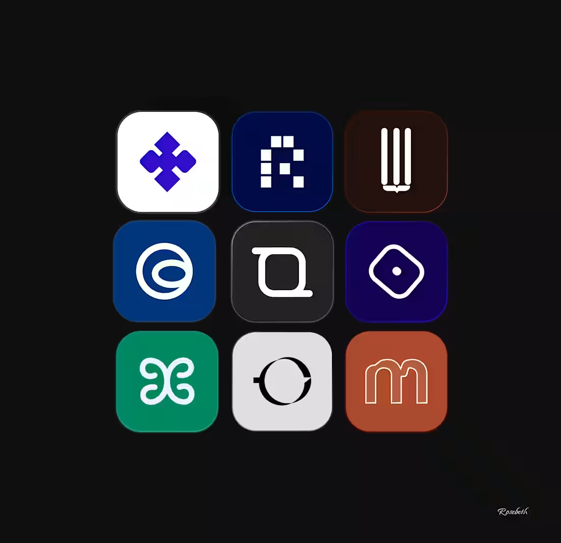
An icon mark built to hold up everywhere it will actually be seen, not just on a homepage or a pitch deck.
I test every mark at favicon size, profile picture crop, and app icon scale before it is ever finished. An icon mark that only works large is not finished.
If your brand is showing up broken in the small places, I would take a look. Send me a message.
2
258
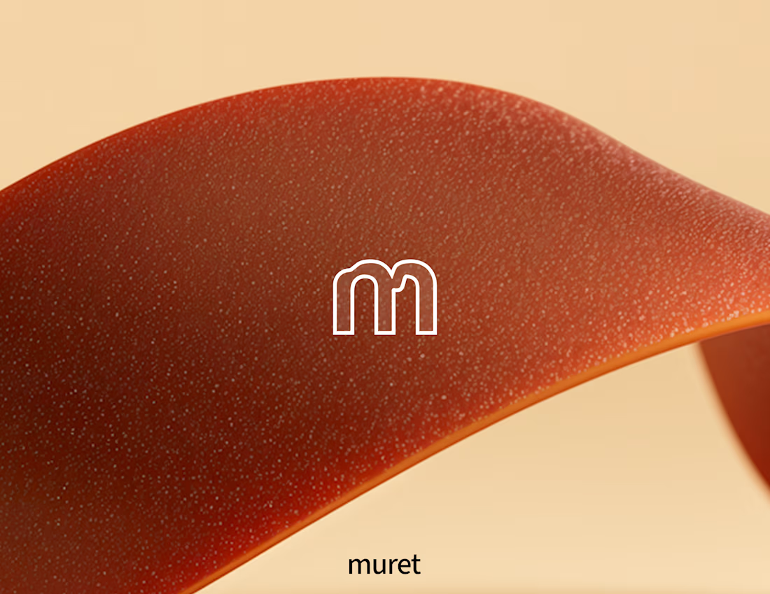
Minimalistic design tends to age well. A clean interface built years ago often still looks reasonable today, while heavily styled ones from the same period usually do not.
It also creates debate. Some people see restraint and read it as confident. Others see the same screen and think something is missing.
For Muret, programmable financial infrastructure for autonomous agents, I chose the stripped down route. The product does not need decoration, it needs clarity, since people are trusting it to work correctly every time.
Where do you stand? Minimal and stripped down, or does that approach go too far and remove personality along with the excess?
1
242