pro
Rosebeth Anyiam
Strategic Branding | Logo Design
- 5.0
- Rating
- 46
- Followers



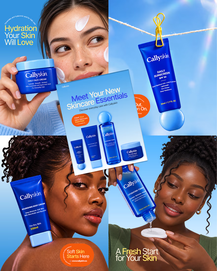
Static Ad Design
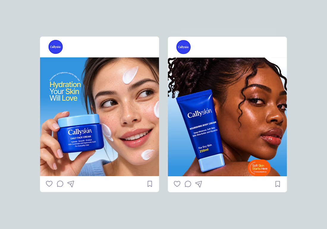
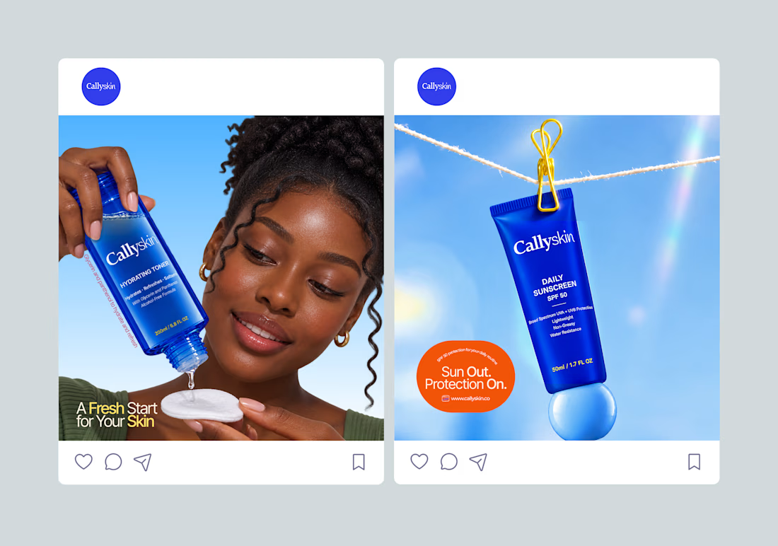
I developed the creative direction and visuals for Callyskin's static ad campaign.
The process involved exploring product-focused compositions, writing short headlines and presenting the benefits of each skincare product in a clear and engaging way.
Each ad has a...

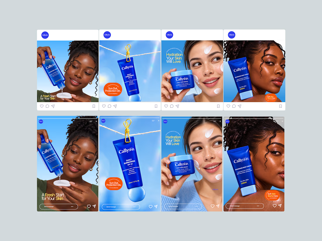
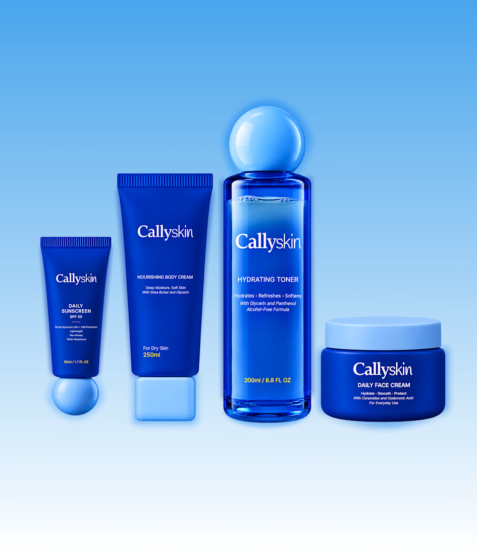
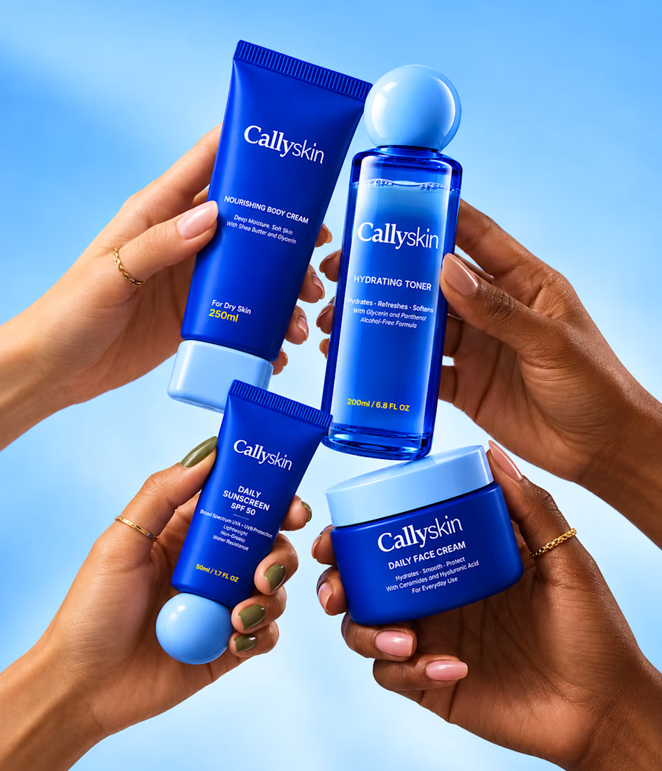
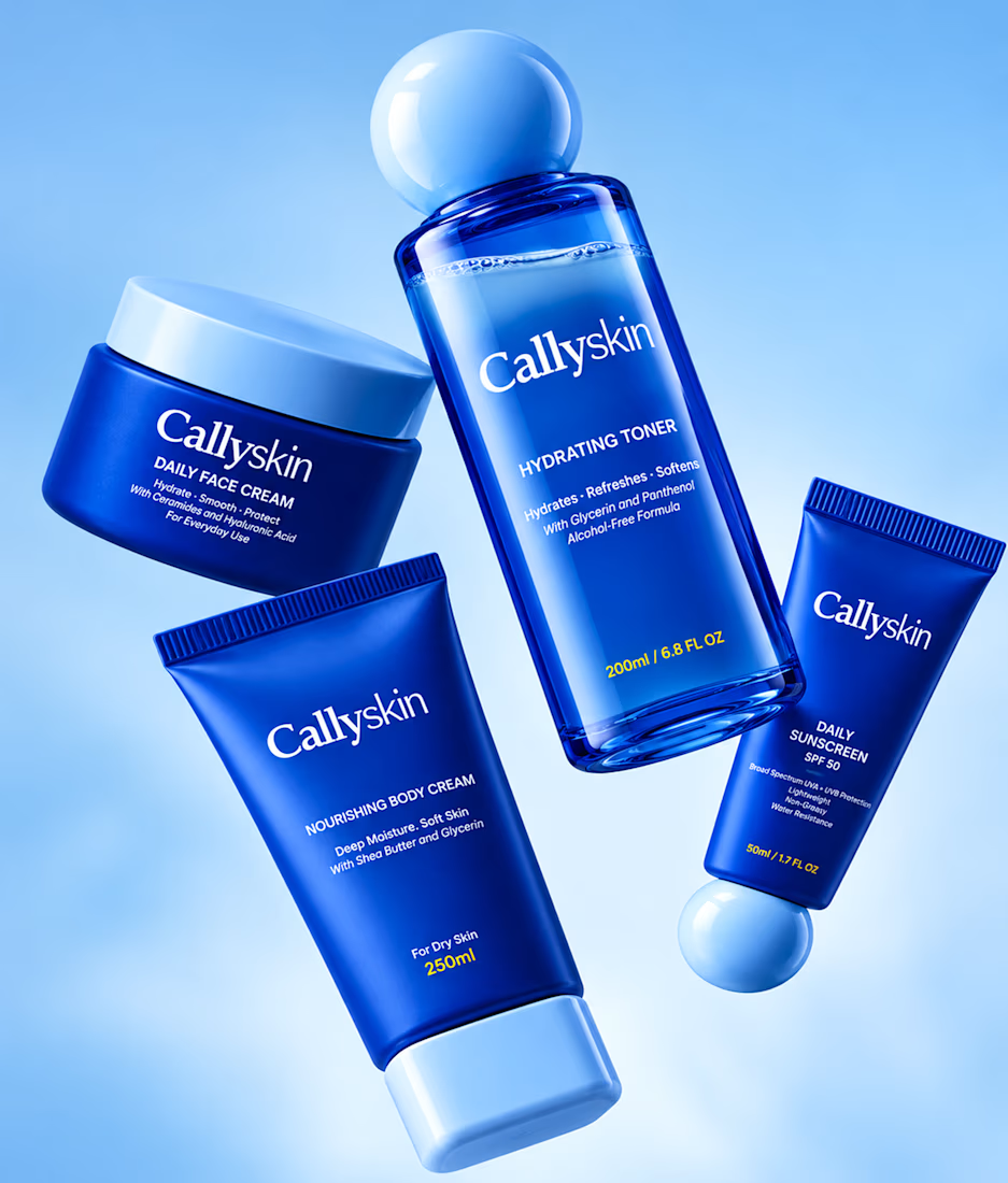
Product Photography for Callyskin
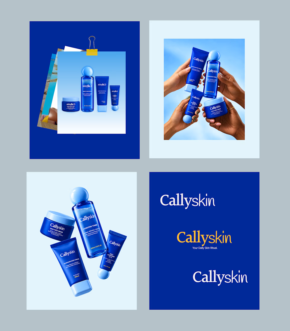
Meet Callyskin, a skincare identity built around everyday care with shea butter, glycerin, panthenol, ceramides and hyaluronic acid.
Blue brings calm and freshness while yellow adds a bold touch.
What do you think?
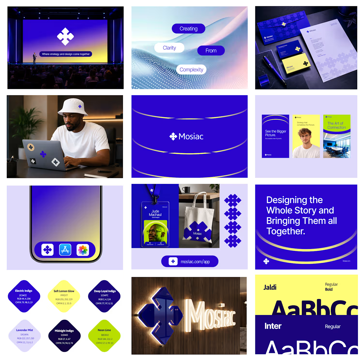
I am excited to share the full case study of Orynto, a workflow automation platform built to help businesses connect their tools, automate repetitive work, and keep things moving.
The goal was to create a brand identity that could make a complex product feel simple, clear, and...

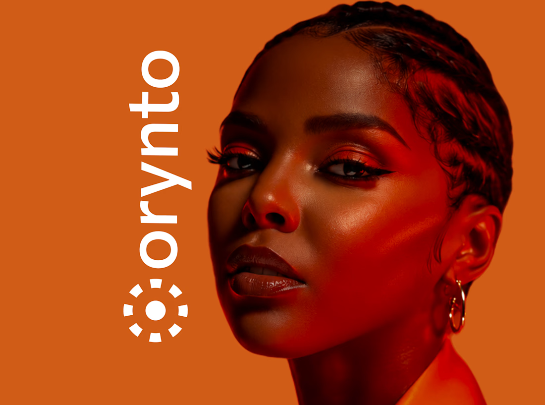
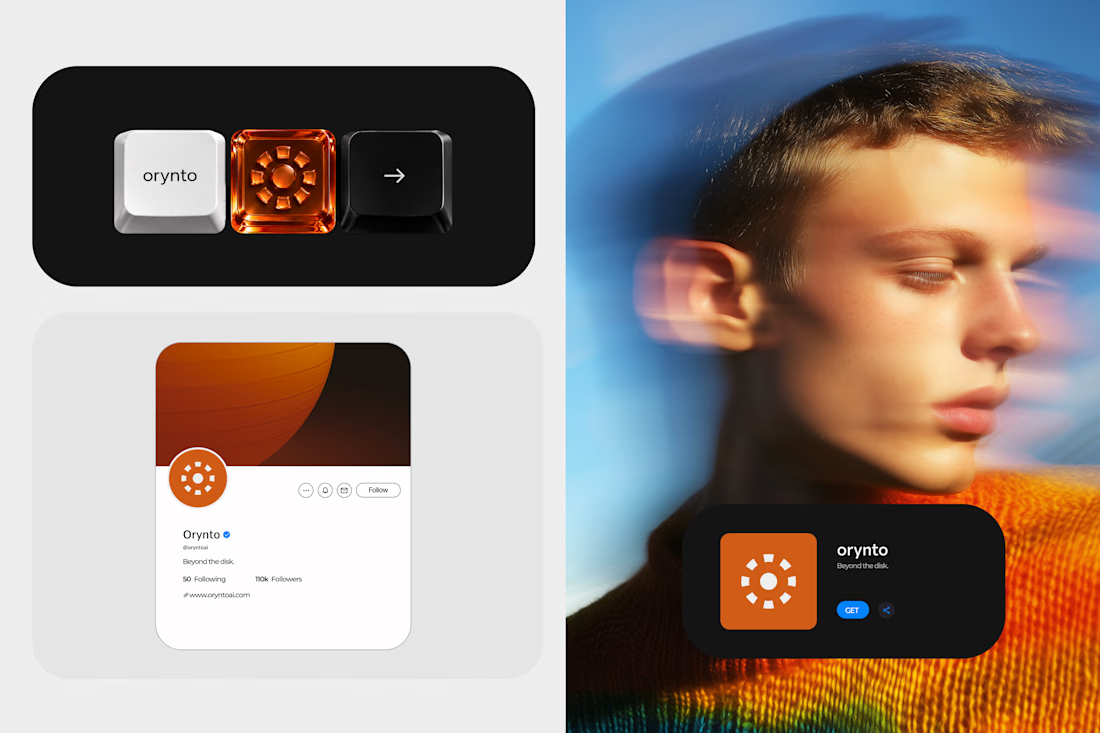
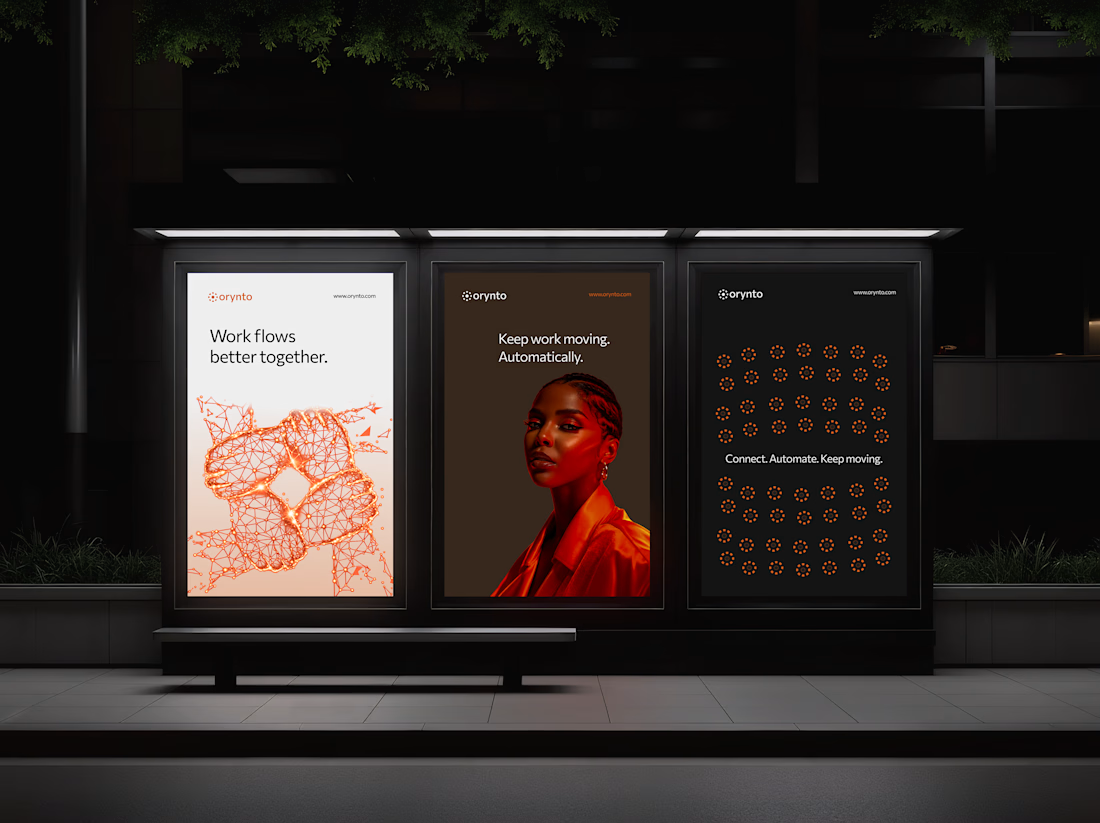
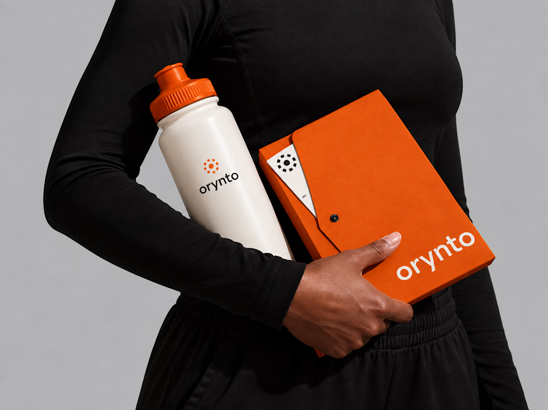
Introducing Orynto.
A workflow automation brand built around one simple idea: work should flow better.
Orynto connects the tools businesses already use, automates repetitive tasks, and helps teams keep work moving.
The challenge was to create a brand that communicates this clearly...
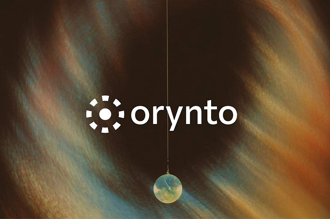
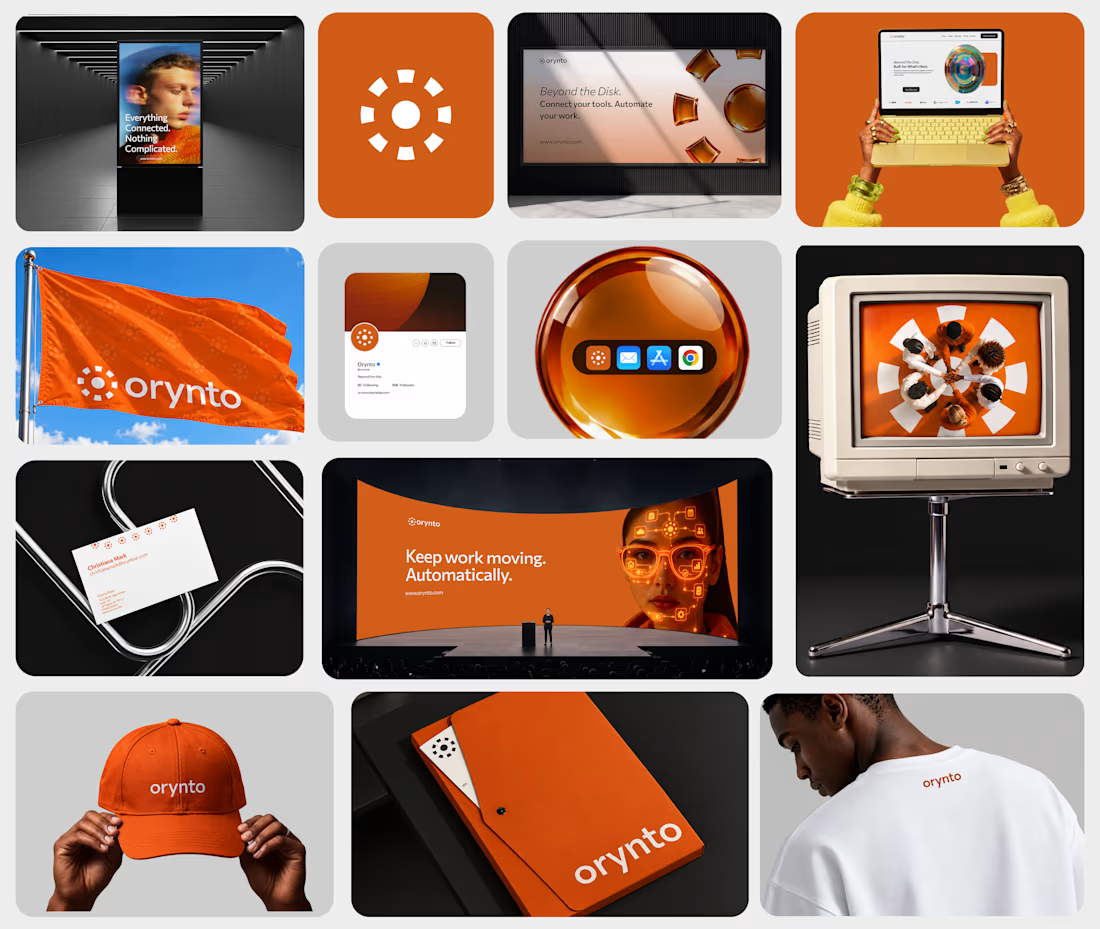
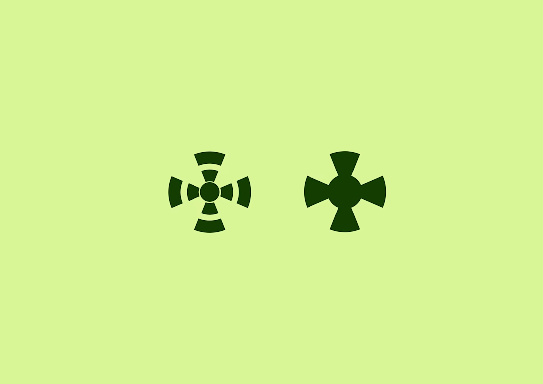
Two logo concepts.
Two different directions.
I have been exploring these two marks and now I am curious.
What industry do you think each one fits?
Tech?
Fintech?
Healthcare?
Fashion?
Hospitality?