The network for creativity
Join 1.25M professional creatives like you
Connect with clients, get discovered, and run your business 100% commission-free
Creatives on Contra have earned over $150M and we are just getting started
Back to feedPost

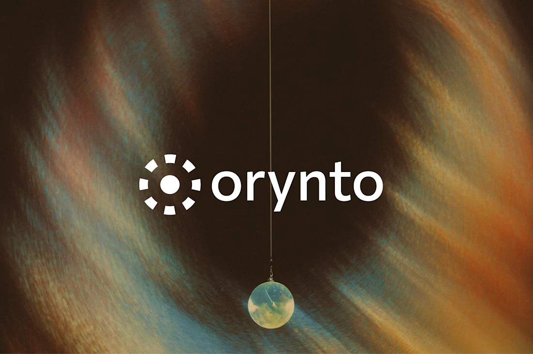
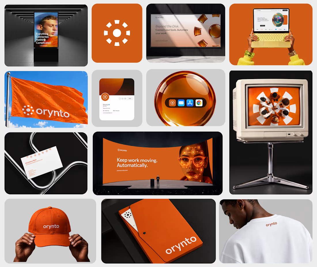
Introducing Orynto.
A workflow automation brand built around one simple idea: work should flow better.
Orynto connects the tools businesses already use, automates repetitive tasks, and helps teams keep work moving.
The challenge was to create a brand that communicates this clearly without making automation feel complicated or overly technical.
The identity was built around simplicity, clarity, and efficiency, giving Orynto a visual presence that feels modern, approachable, and easy to understand.
The idea is simple: Connect your tools. Automate your work.
Orynto is live on Behance.
Check profile

The network for creativity
Join 1.25M professional creatives like you
Connect with clients, get discovered, and run your business 100% commission-free
Creatives on Contra have earned over $150M and we are just getting started







Related posts

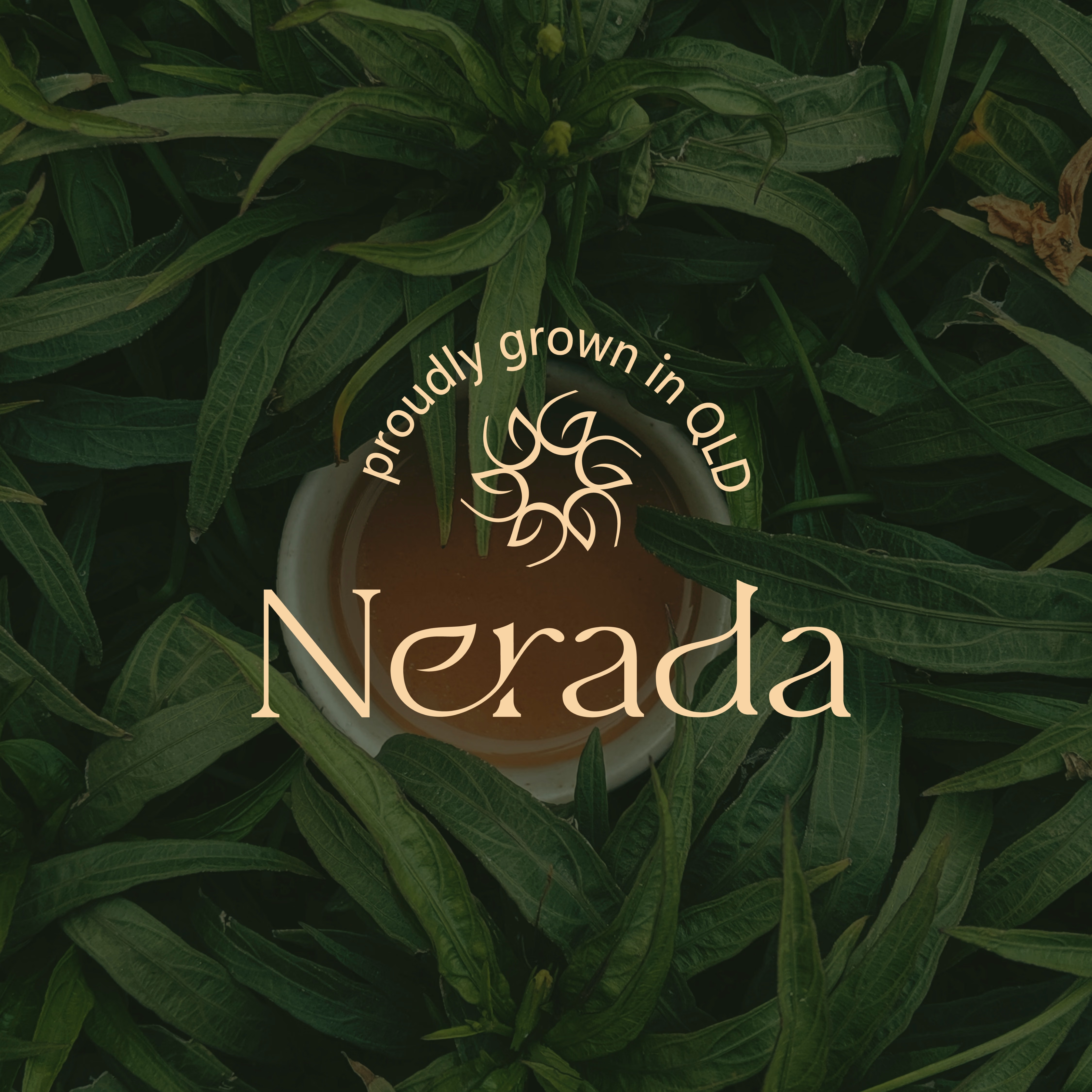
Created the complete brand identity for Nerada, a natural tea brand — developing the visual direction and design elements that shape how the brand looks and feels across every touchpoint. The goal was a clean, organic aesthetic that reflects the brand's natural positioning and builds a consistent, recognizable identity.


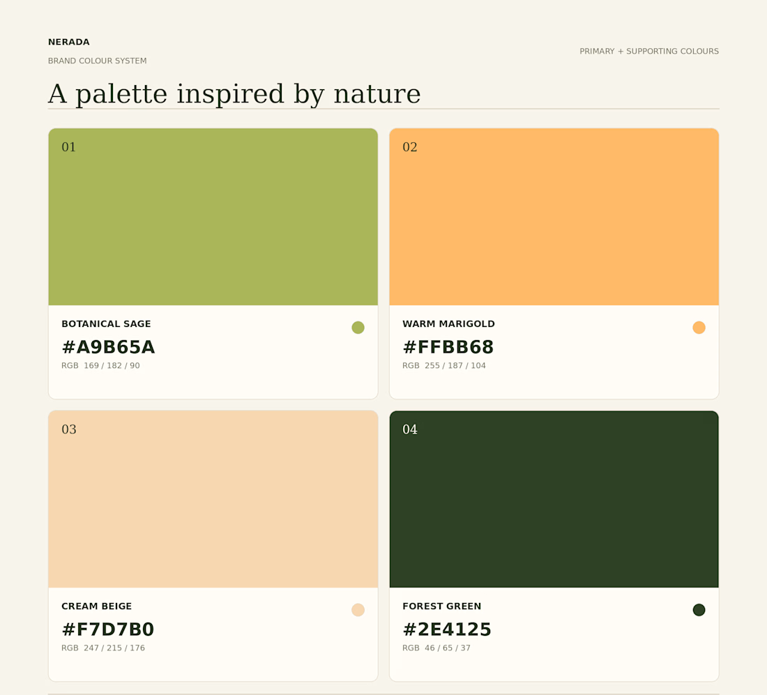
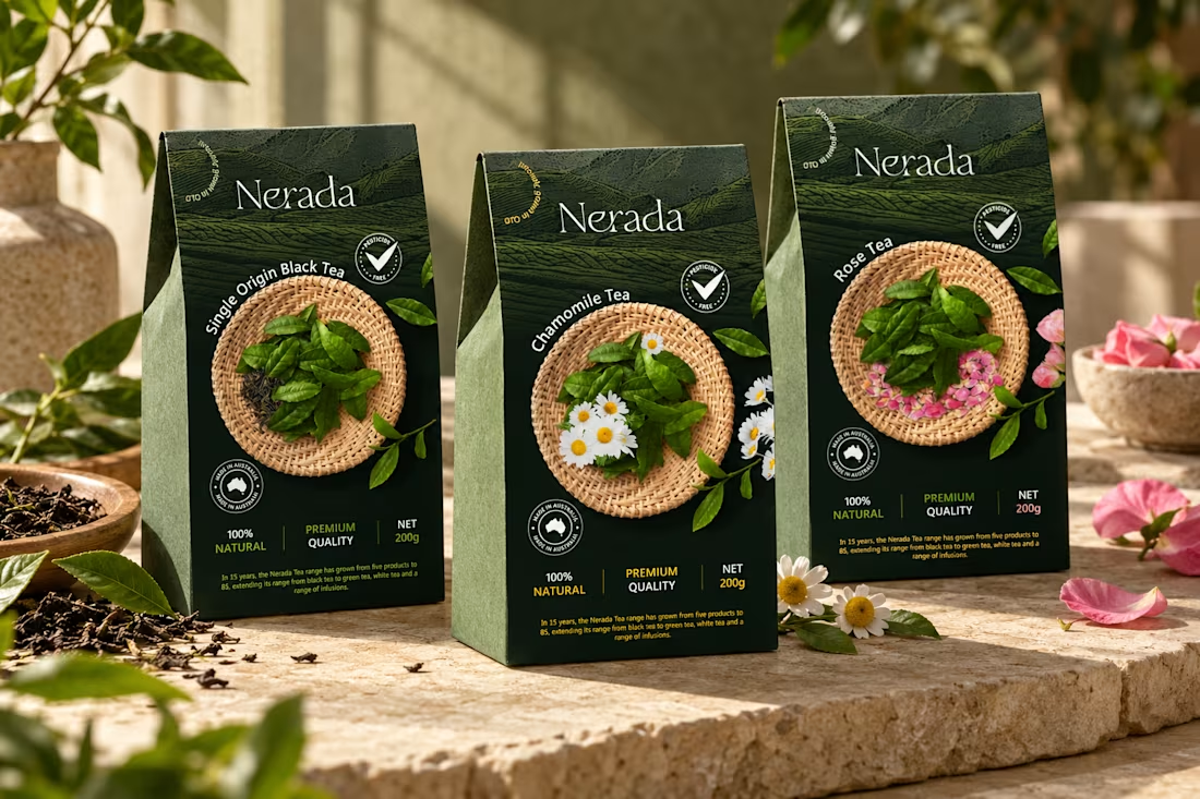
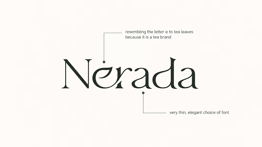

The mark feels grown rather than drawn, which is exactly right for a natural tea brand. Packaging is where tea brands win or lose. Does the identity change tone across blends, or stay one voice with different colours?


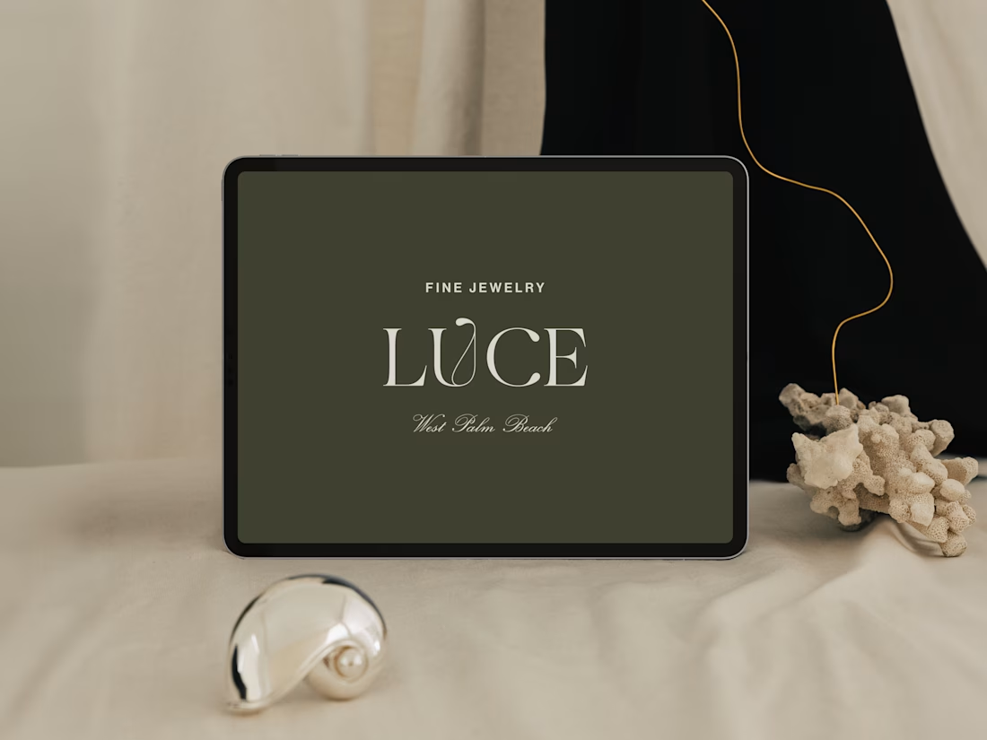
Introducing LUCE, a fresh chapter in four generations of fine jewelry.
Earthy greens, expressive typography, and thoughtful packaging bring warmth and personality to a brand rooted in heritage.
I worked with LUCE across brand strategy, visual identity, packaging experience, and full Shopify website design and development, bringing every detail into one cohesive world.


NEAT


Every element feels perfectly placed! 👏