The network for creativity
Join 1.25M professional creatives like you
Connect with clients, get discovered, and run your business 100% commission-free
Creatives on Contra have earned over $150M and we are just getting started
Back to feedPost
Static Ad Design
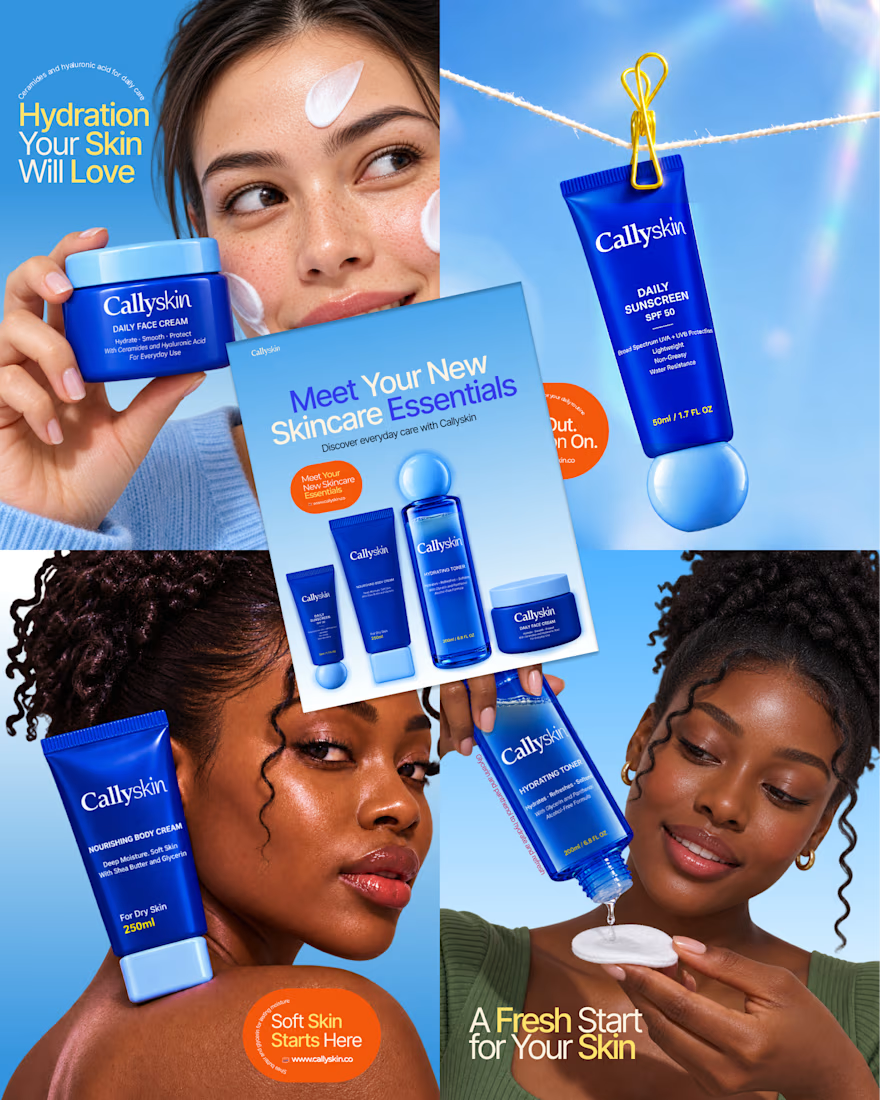
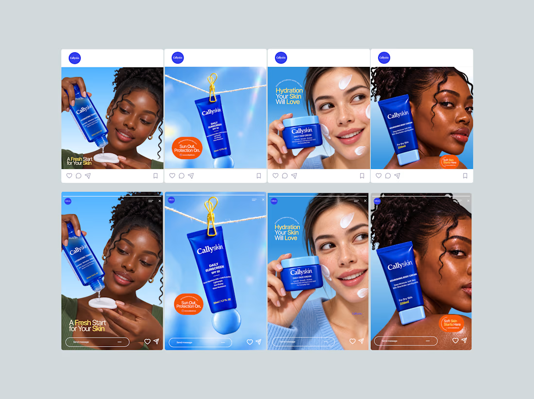
I developed the creative direction and visuals for Callyskin's static ad campaign.
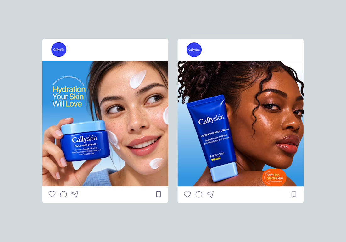
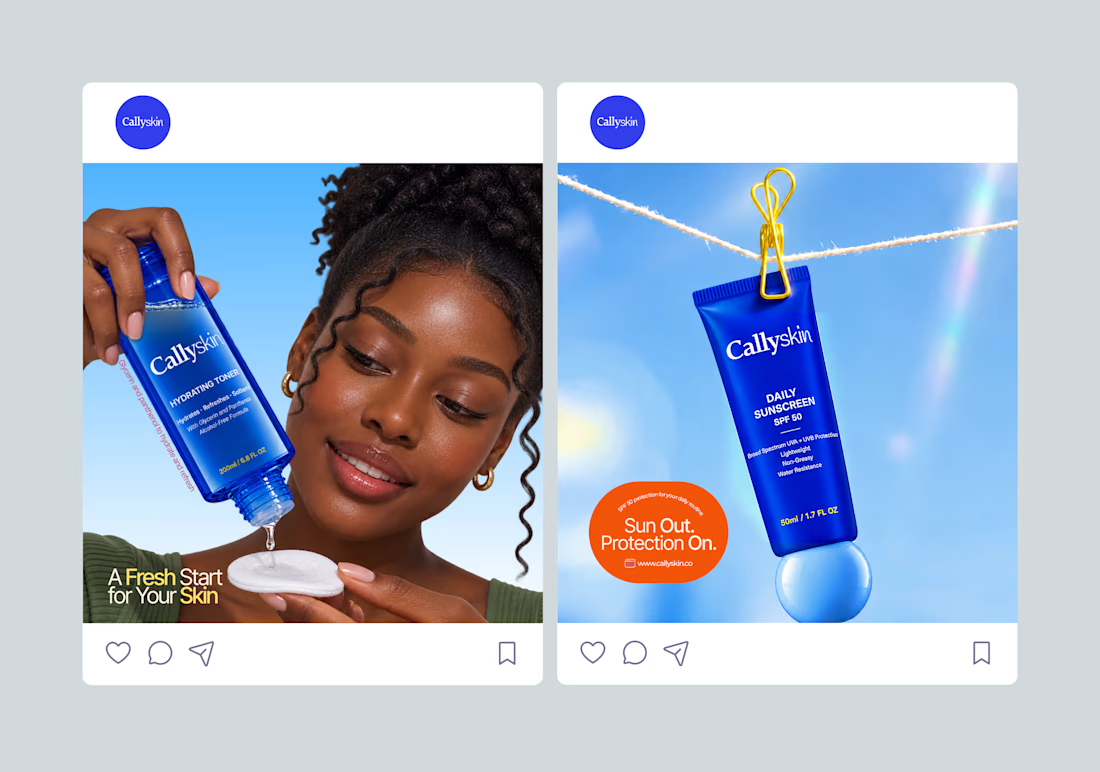
The process involved exploring product-focused compositions, writing short headlines and presenting the benefits of each skincare product in a clear and engaging way.
Each ad has a distinct layout while maintaining consistency across the campaign.



the blue bottles on that sky blue background is a really smart colour call

Thank you 🤗I wanted the colours to feel connected to the product itself 💙

Blue on blue is a confident color story, Rosebeth. Keeping the product blue as the campaign constant across eight distinct layouts is smart brand discipline. Beautiful Callyskin work.
I appreciate Tim🤗

"Awesome case study! What ad objective worked best for your campaign here?
Thank you Hanzla. The goal was to create product awareness and help people understand what each Callyskin product offers.
Thanks for sharing that, Rosebeth! Creating clear visual hierarchy and benefit breakdowns is so crucial for product awareness—and it really shines through in your case study. I focus heavily on Meta Ads and traffic conversion funnels. If you ever need a partner to scale these...
contra.com
Hanzla Tahir’s Work | Contra
View Hanzla Tahir’s work on Contra. The Independent-first, commission-free freelance marketplace shaping the future of work.
The network for creativity
Join 1.25M professional creatives like you
Connect with clients, get discovered, and run your business 100% commission-free
Creatives on Contra have earned over $150M and we are just getting started


Related posts

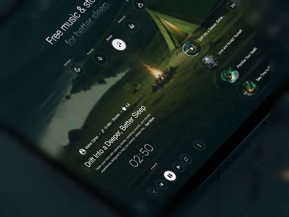
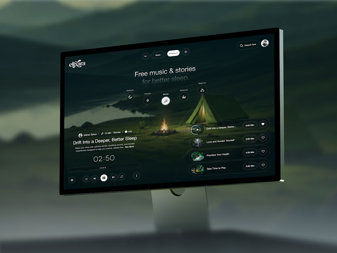
Your body is ready for sleep. But is your mind ready to switch off?
That’s the moment Elivara is designed for.
Instead of another endless scroll, imagine opening an experience that makes slowing down feel natural.
Because better rest starts with how you end your day.
Would you trade 20 more minutes of scrolling for 20 minutes of peace?
#SleepApp #UIUXDesign #ProductDesign #WebDesign #MotionDesign



Great UX understands the user's state of mind, not just what they want to click.

Tendee - Dating App UI UX Design
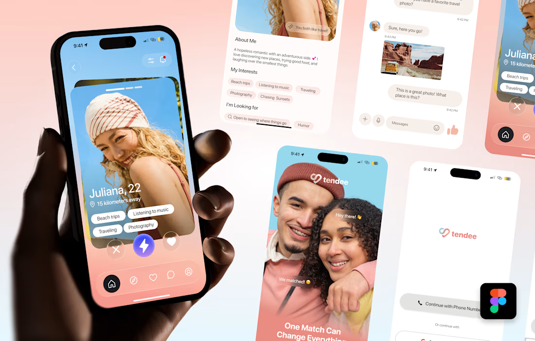
A mobile app UI design showcase focused on discovery, profiles, matching and conversation.
The visual challenge was to bring profile content, interest tags, primary actions and messaging into a consistent mobile experience. The design uses a soft lavender and coral palette, clear typography, rounded cards and recognizable navigation.
The selected mockup presents a profile discovery screen, detailed profile information, chat, onboarding and sign-in views. These screens demonstrate visual hierarchy, consistent interface styling and attention to mobile interactions.
Personal portfolio showcase. Project cost is an illustrative quote for comparable design work, not a past client payment. The date marks this showcase's preparation in October 2026; duration is an estimated production timeframe.

Love the colors!

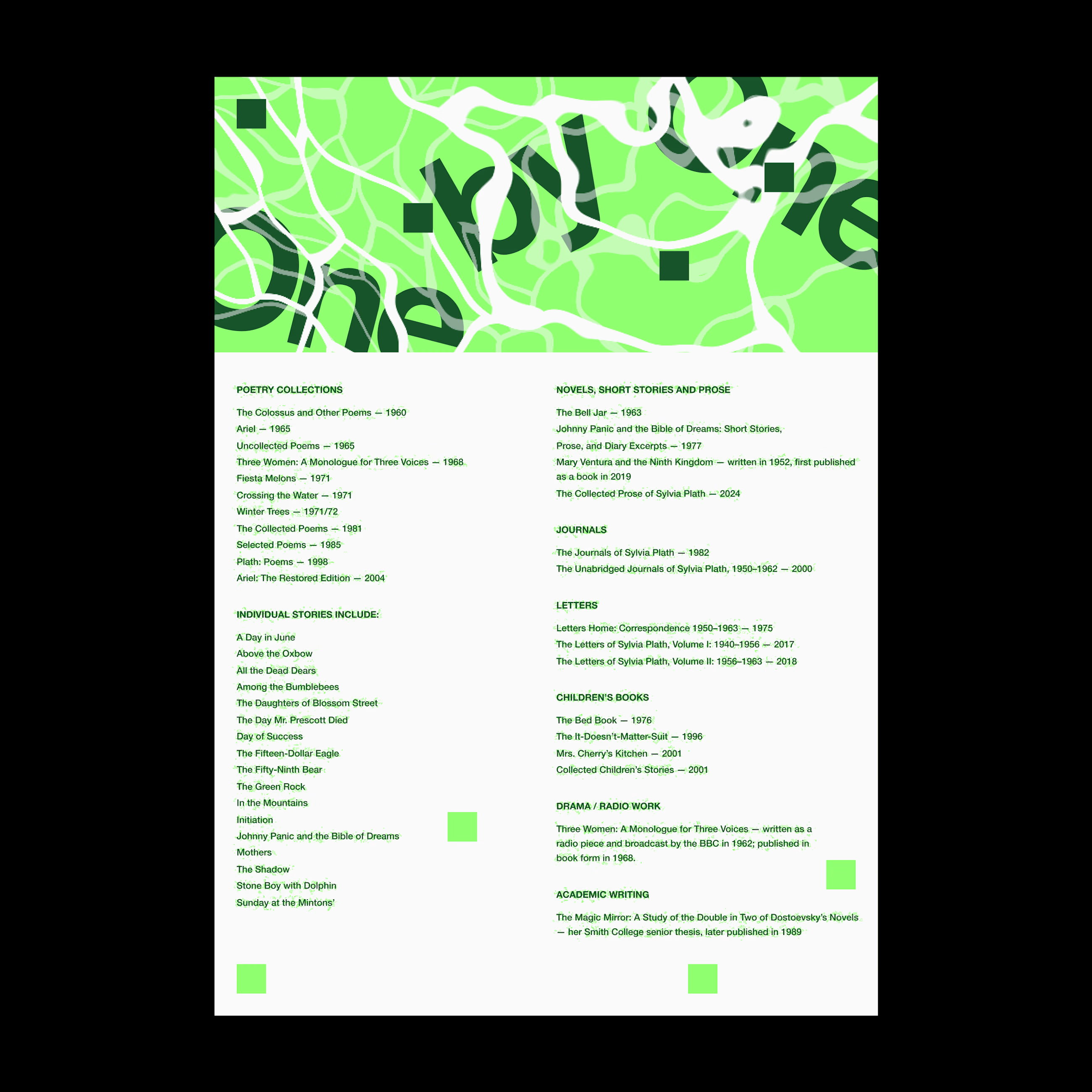
Was playing around with Rogie King's Noise & Texture plugin in Figma and thought it’d be fun to throw in a few excerpts from Sylvia Plath’s The Bell Jar.
One thing led to another, and I ended up with these experiments in typography and texture.
It got me thinking about how texture and typography can do more than just look interesting. They can help communicate the mood and meaning behind the words.
What do you think? Does the chaos add to the story, or get in the way of it?
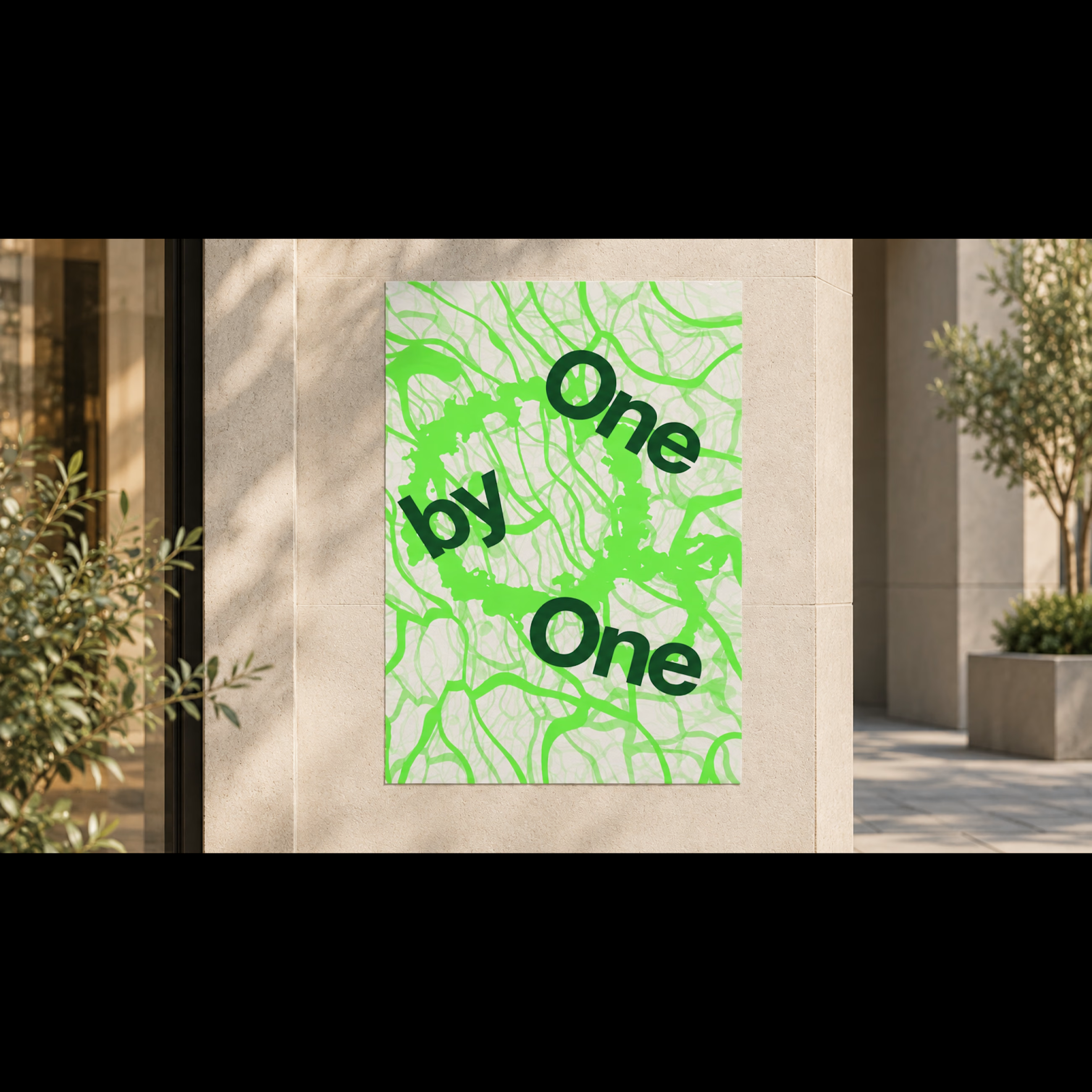
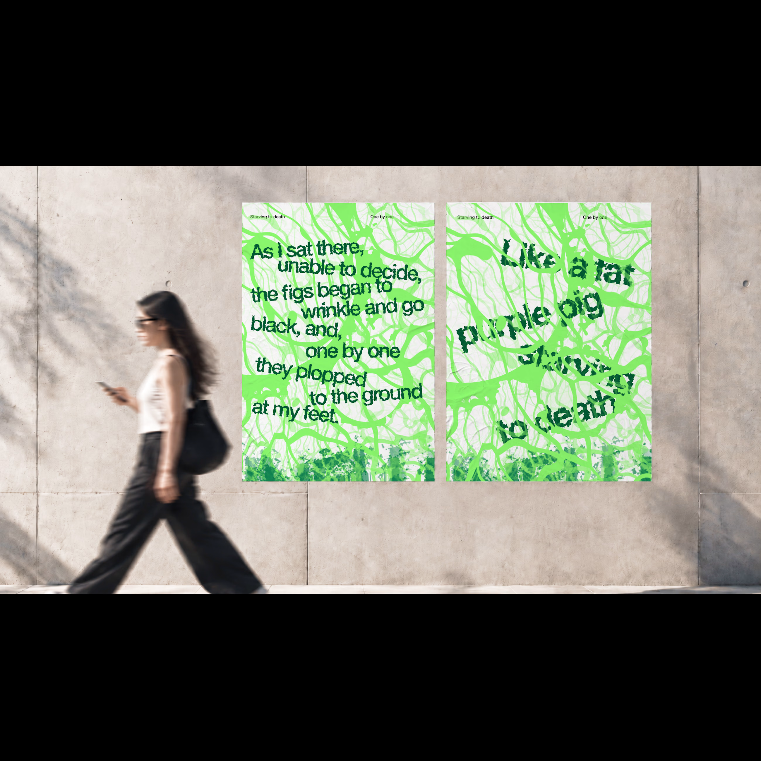
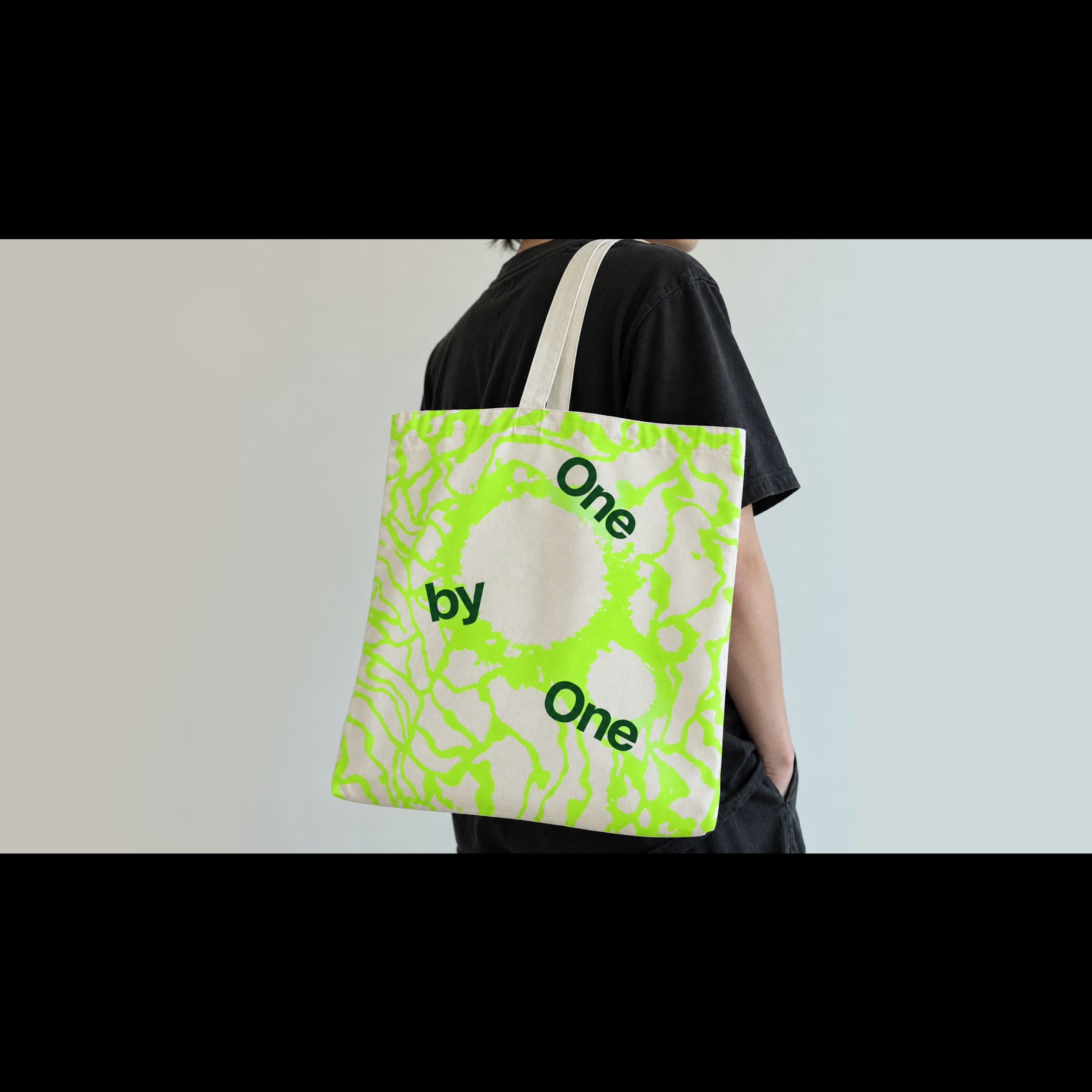

For me the chaos works when it stays tied to the words, like the tangle looping around "One by One". On the dense excerpt layouts legibility starts to eat the story, so I'd keep the noise away from the lines you want read first.