I am working on Bund, a brand identity created for the relationship and connection space. The mark itself is built from two mirrored curls meeting in the center, representing two people coming together while still holding their own shape. I designed the full identity around this idea, using a palette of green, pink, and a warm yellow to keep the balance between softness and strength.
This set includes four slides that walk through the core parts of the identity. The first slide introduces the logo mark, the second slide shows the color palette in use and how each tone was chosen to support the brand meaning., and an app store preview showing the identity in use.
Available for sale as a complete package. Reach out if you want the full files or a custom version built around your own brand name.
3
3
37
Corrently working on a brand identity project for an online kids toy store, built around one core question: what makes a parent trust a brand they've never heard of before, in the first three seconds?
Every color, shape, and type choice here started with research not aesthetics first. Playful without being chaotic, premium without feeling cold, warm enough to feel safe for a category where trust is everything.
Sharing the exploration and direction here as it develops. Open to new branding projects — DM if you're building something in this space.
3
66
Branding for a B2B SaaS company.
This is what you get from strategic branding.
Every element has a purpose. For Astrum, the guiding star represents direction and clarity, while the cyan palette communicates trust, intelligence, and innovation. Together, they tell the story of a platform built to simplify complex work—not just decorate it.
Good branding helps people understand your business before they experience your product.
I'm so happy working on this project.
4
6
203
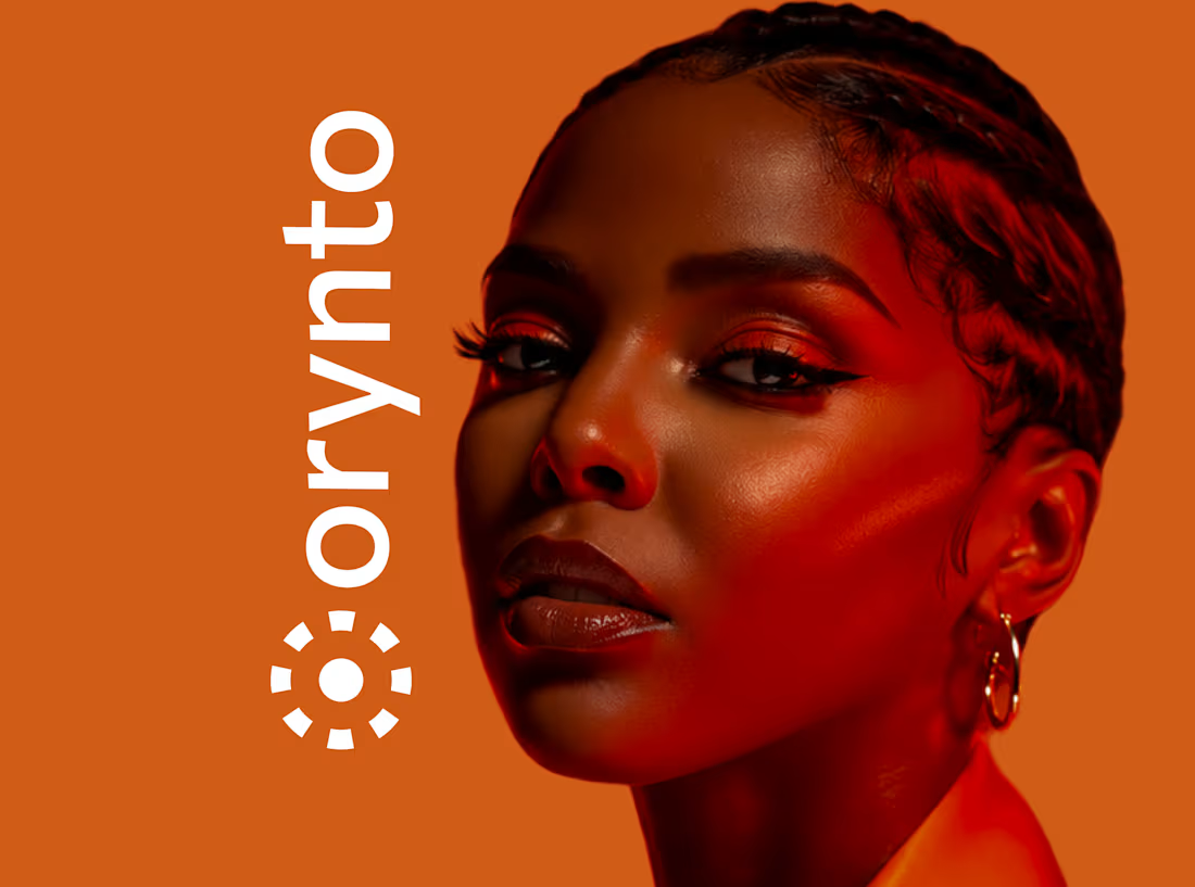
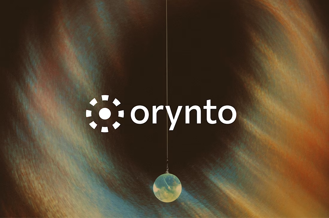
Behind the scenes, I've been working on a new brand identity called Orynto.
It's one of those projects that reminds me why I love branding. Every choice has intention, from the concept to the visual system. I'm not just designing a logo; I'm building an identity that helps the business communicate with confidence.
Looking forward to sharing the full case study once it's complete.
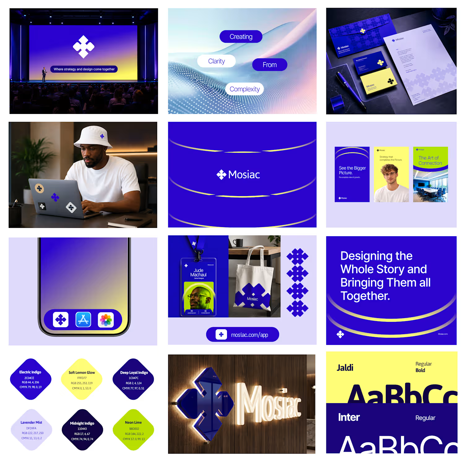
Currently exploring a brand concept called Mosiac.
The name comes from the idea that great businesses are built from many pieces ie strategy, design, messaging, product, and customer experience.
When those pieces work together, people see the bigger picture.
Here's a first look at the visual direction.
Thoughts?
1
114
Brand Identity for Sovel.
Sovelo helps businesses work smarter by bringing their tools, tasks, and workflows together in one place. Instead of juggling multiple systems, teams can stay organized, save time, and focus on growth.
2
3
160
Exploring a brand identity concept for KORYNTH, an architecture and interior design studio.
Focused on structure, balance, and timeless simplicity through a geometric symbol and warm, neutral brand system.
I'd love some honest feedback
• Does the logo feel appropriate for the industry?
• What emotions does the identity communicate?
• What would you improve?
Open to all critiques.
4
3
285
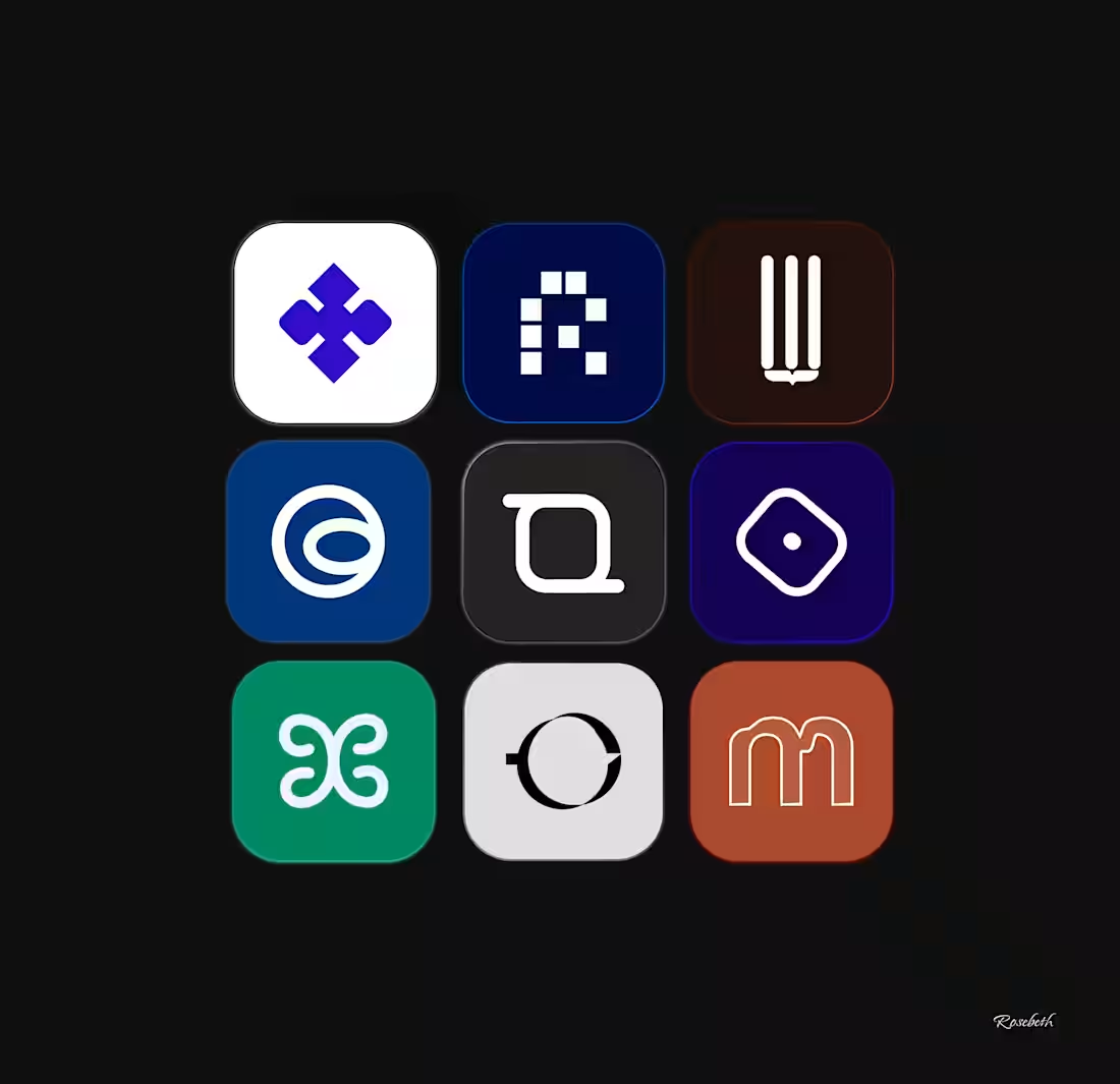
Working on some fresh logo concepts today.
Which one catches your eye first?
2
3
166
Many wellness brands promise calm, balance, and self-care.
But when you look at their branding, it tells a completely different story.
Too much noise.
Too many competing elements.
No clear feeling.
People don't connect with wellness brands because of a logo.
They connect with how the brand makes them feel.
For this concept, I explored a visual identity for a wellness brand called Mora.
A softer color palette, refined typography, and simple brand applications designed to create a sense of calm before a customer even interacts with the product.
Because every touchpoint matters.
So if you're building a wellness brand, ask yourself
Does your visual identity reflect the feeling you want customers to associate with your business?
6
8
332
Syxio is an AI brand focused on building human-centered intelligent systems that help people work smarter, create better, and simplify digital experiences.
The idea was simple.
What if AI felt more human instead of robotic?
Still exploring the direction, but this project is teaching me how branding can make technology feel emotional too.
3
162
Resse Blush Cosmetic was a reminder that effective branding is not decoration. It's positioning.
A strong visual identity helps brands communicate value before a customer reads a single word.
2
154
Amiya is a skincare brand concept created to feel fresh, calm, premium and trustworthy.
Amiya was designed to show how strategy, branding and visual storytelling can help a skincare buisness look more valuable, memorable and conversion focused.
2
146
BUILDMATE is a construction supply brand designed to feel reliable, strong, and easy to trust.
The brand focuses on supporting builders, contractors, and everyday customers by providing materials they can depend on. It’s positioned as a trusted partner in every project, from small builds to large construction work.
3
164
Velune is a modern footwear brand focused on style, comfort, and everyday confidence.
The brand is designed to feel clean, premium, and effortless and appealing to people who want shoes that look good and feel good without trying too hard.
2
153
I design book covers for children. (https://children.book) Book covers that are bright, engaging, and easy to understand at a glance.
A good kids’ cover should instantly grab attention and give a hint of the story inside. My focus is on using playful colors, clear typography, and friendly visuals that connect with young readers and also appeal to parents.
2
165
AIIY is a fitness brand built around one simple idea, people stay consistent when they don’t feel alone.