The network for creativity
Join 1.25M professional creatives like you
Connect with clients, get discovered, and run your business 100% commission-free
Creatives on Contra have earned over $150M and we are just getting started
Back to feedPost

Minimalistic design tends to age well. A clean interface built years ago often still looks reasonable today, while heavily styled ones from the same period usually do not.
It also creates debate. Some people see restraint and read it as confident. Others see the same screen and think something is missing.
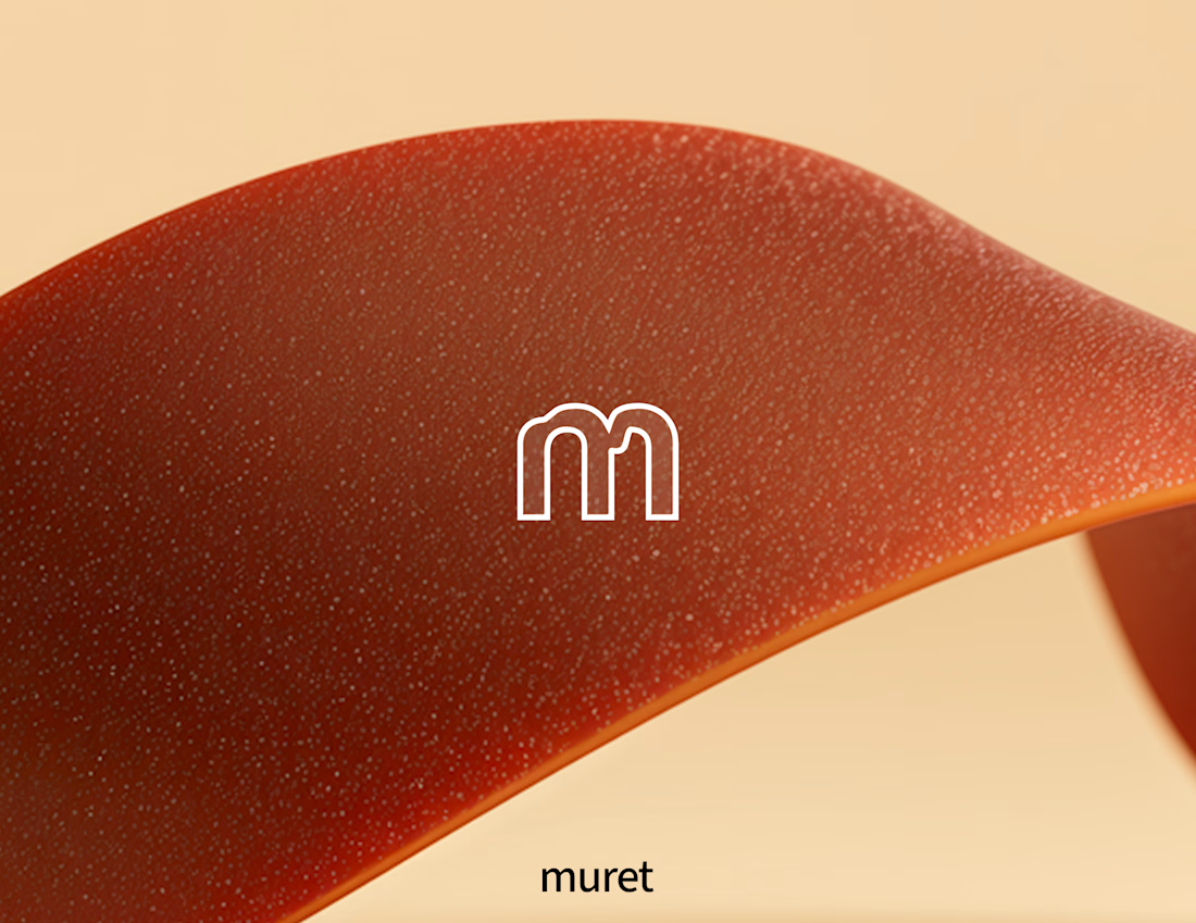
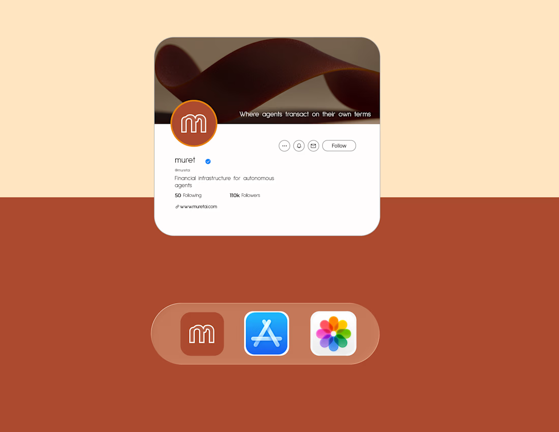
For Muret, programmable financial infrastructure for autonomous agents, I chose the stripped down route. The product does not need decoration, it needs clarity, since people are trusting it to work correctly every time.
Where do you stand? Minimal and stripped down, or does that approach go too far and remove personality along with the excess?




The network for creativity
Join 1.25M professional creatives like you
Connect with clients, get discovered, and run your business 100% commission-free
Creatives on Contra have earned over $150M and we are just getting started


Related posts

Rofella - Brand Expressions



The serif wordmark against that warm, textured paper feels so confident and timeless, and the deep burgundy gives the whole identity real character. Beautifully restrained work, keep going! Did the paper texture come from a real scan or did you build it digitally?

Are you still designing Brand Guidelines presentations from scratch?
I created this Mini Brand Guidelines template as a modular, editorial-style system built to help designers and studios present brand identity work with structure and clarity in no time.
Whether you’re delivering a new identity to a client or documenting internal brand assets, this template provides a confident, consistent framework.
Tap the link above to get it.

Clean and smooth, love it


More screens for mystical tarot reading app concept, inspired by a little spooky season magic 🎃🔮


