The network for creativity
Join 1.25M professional creatives like you
Connect with clients, get discovered, and run your business 100% commission-free
Creatives on Contra have earned over $150M and we are just getting started
Back to feedPost

Rofella - Brand Expressions



visuals are fire

The mark and the serif are such great choices for the brand!!

one of the greatest brand looking premium.


Sleek composition and great contrast!


Looks cool.

The serif wordmark against that warm, textured paper feels so confident and timeless, and the deep burgundy gives the whole identity real character. Beautifully restrained work, keep going! Did the paper texture come from a real scan or did you build it digitally?

🔥

The embossed arrow on paper and the leather-heavy moodboard pull in the same direction, tactile and quiet. Was the arrow drawn from the texture references first, or did the material language come after the mark?


Really nice work and design!

Ahhh, the brand mark is already expressing the brand itself!!!

very cohesive and timeless.

ok i love thisss omg

The editorial typography paired with the textured paper stationery feels premium and cohesive. The embossed mark on the paper is a lovely detail. Great brand expression, Sam.

Brand Design at it's finest✨

The scale contrast is what makes this work for me. The huge cropped serif numerals against tiny, quiet body copy give the layout real tension, and letting the date and address bleed off the edge makes it feel like part of a bigger system rather than a contained poster. The warm...

Looks good!

Nice!


the small italic lines sitting right on the photos make it read like a magazine spread next to that huge roman date. is there a type only version for when they don't have shots to work with?

The editorial type against the warm paper tones feels really considered. Curious how you picked the headline serif.

Good work man

Love it 😍
The network for creativity
Join 1.25M professional creatives like you
Connect with clients, get discovered, and run your business 100% commission-free
Creatives on Contra have earned over $150M and we are just getting started
Related posts

Every creature in this identity is watching you.
Little Fen, a wetland club for kids. 50 creatures. 3 colors. Everyone gets eyes.
Case study drops soon.
Which creature goes first?
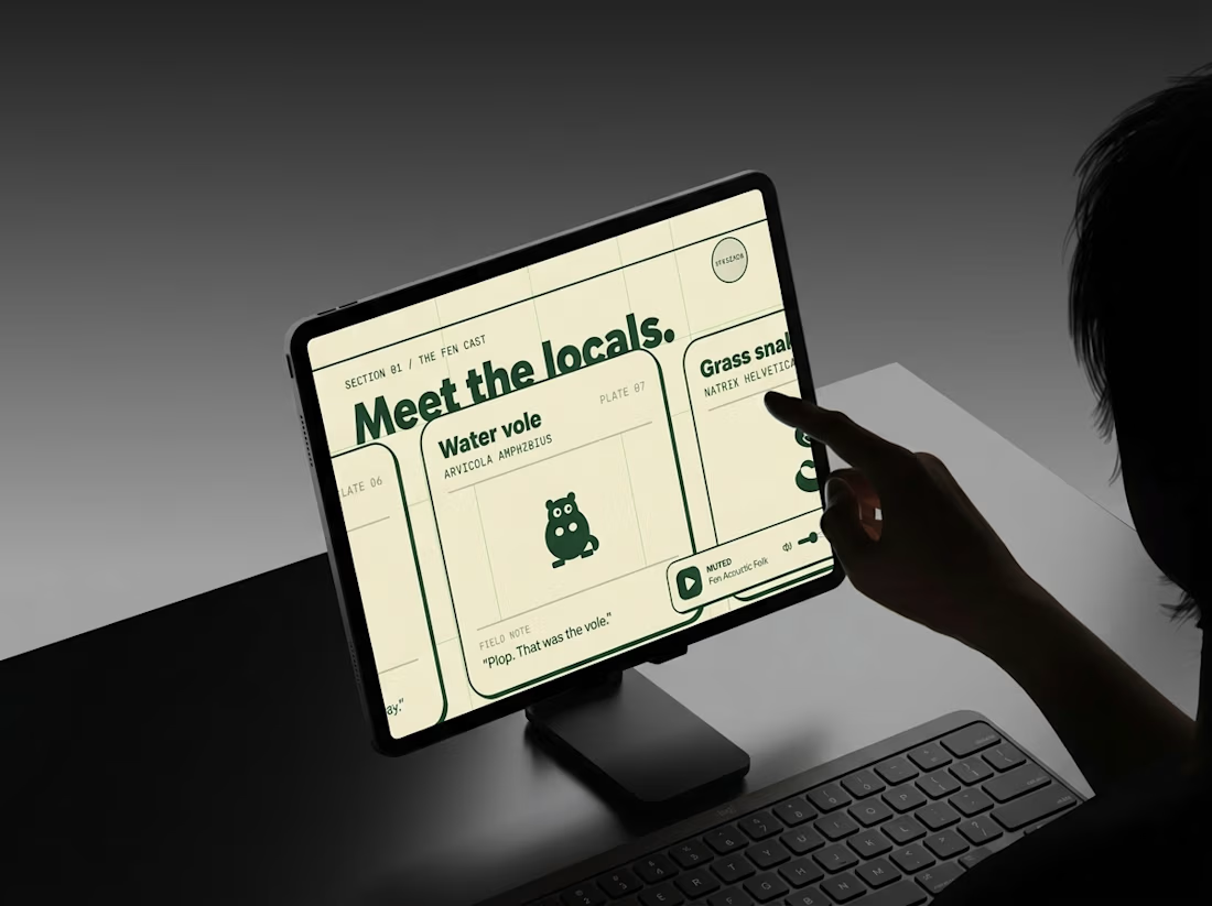
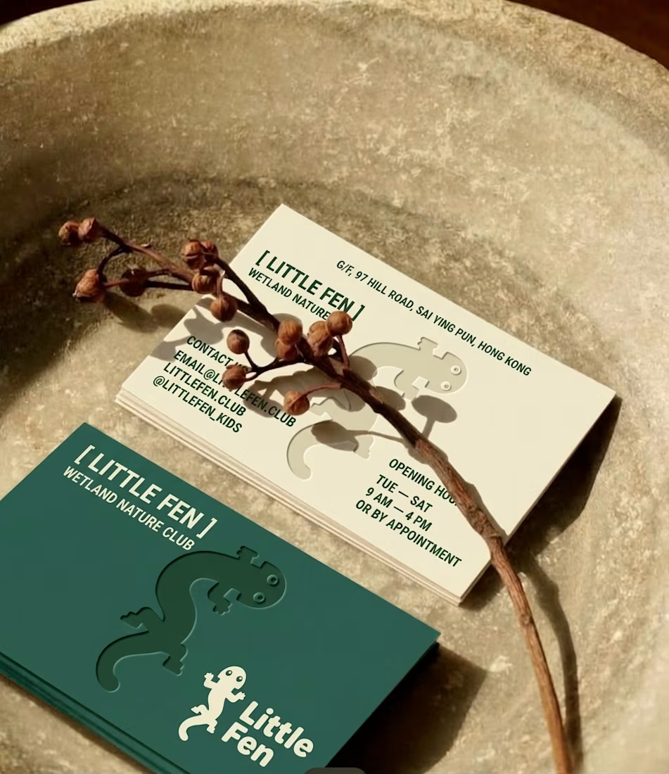
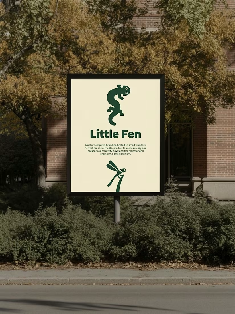

Hey Little Fen,
Can you see me?

The soft blue and lilac gradient against the plain black type feels calm and a bit techy. Nice pacing in the motion too.

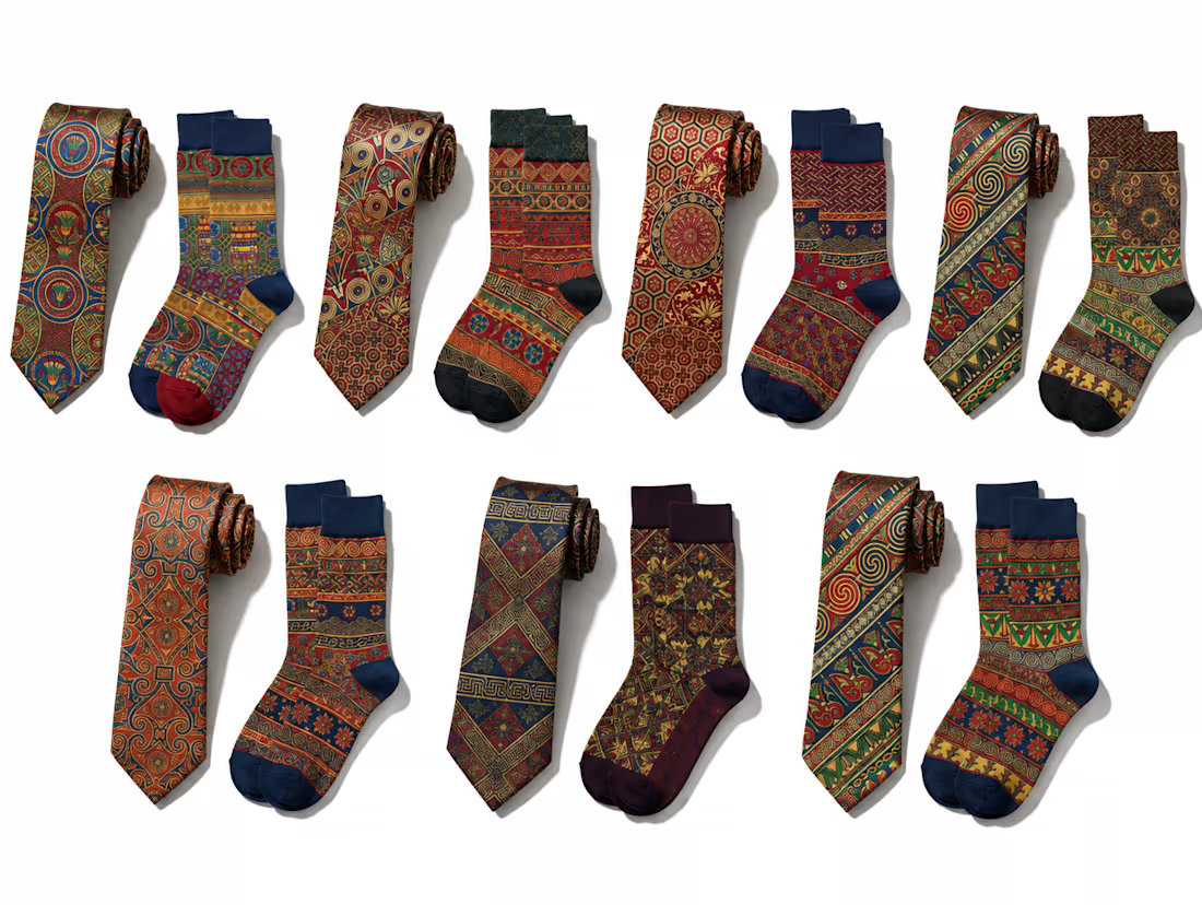
OFF THE CUFF. Business on top. Personality underneath.
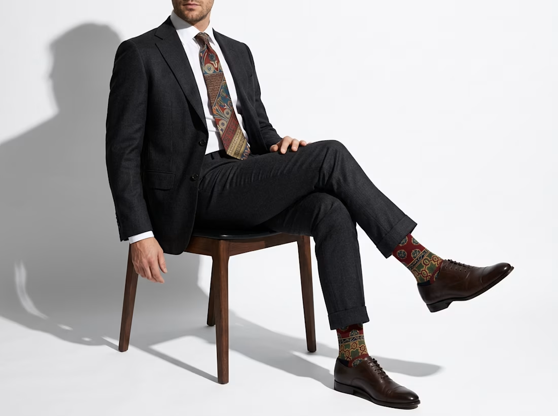
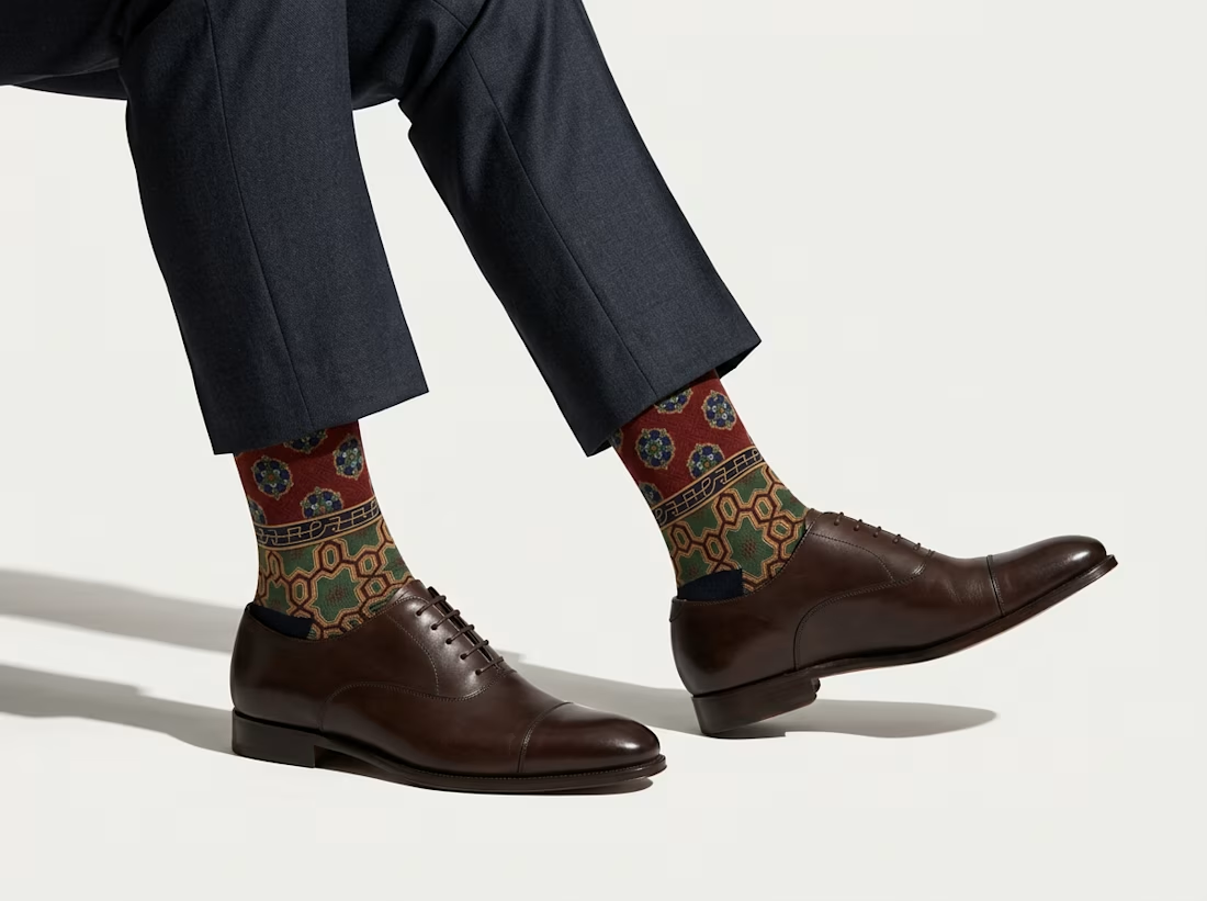
You know those businessmen who wear perfectly tailored suits, polished shoes, and then surprise you with the most colorful socks when they sit down? I've always loved that little detail. 😂
When I discovered Albert Racinet's L'Ornement Polychrome, a collection of beautiful ornamental designs published between 1869 and 1873, I immediately thought these patterns deserved a comeback.
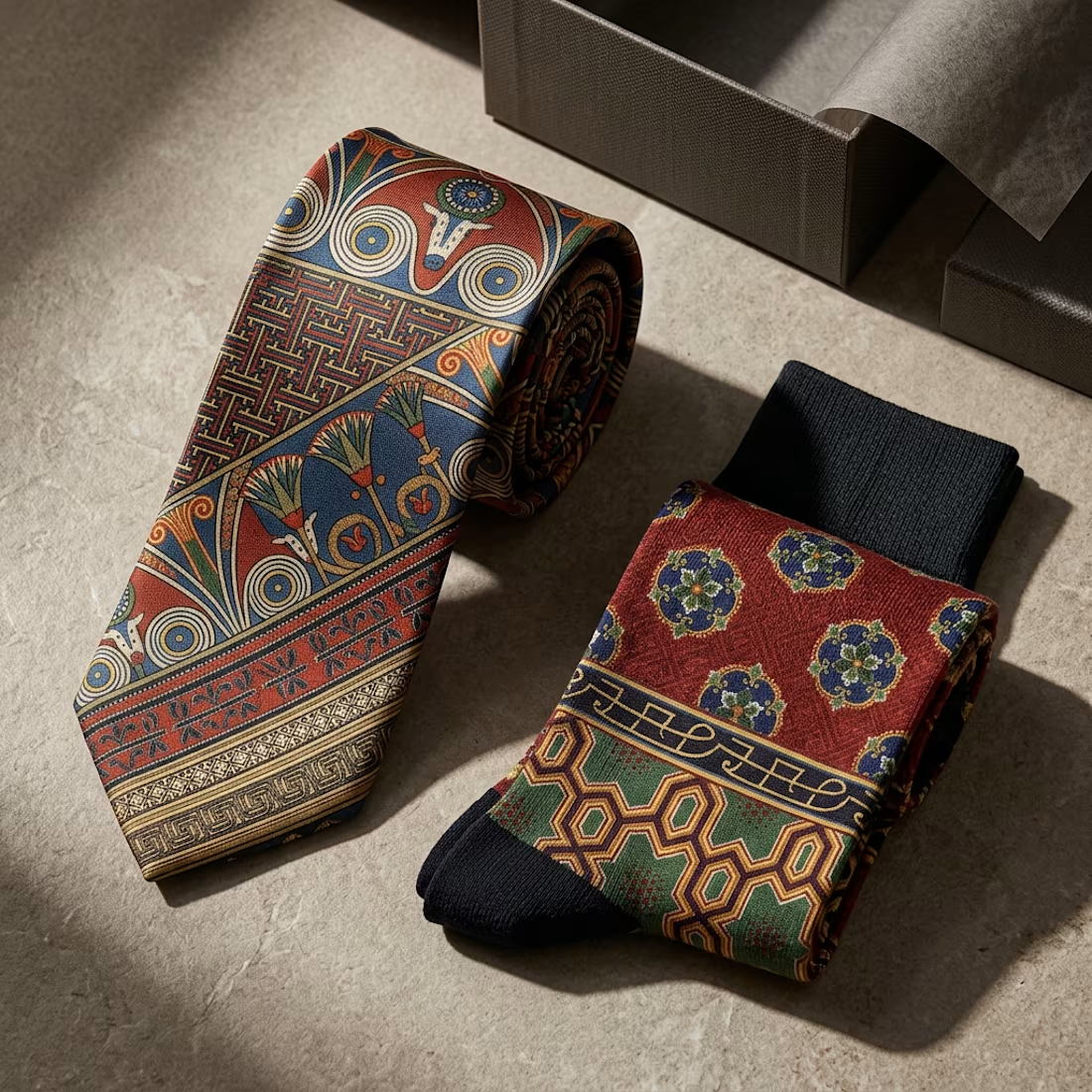
So I imagined OFF THE CUFF, a fictional menswear accessories brand creating matching silk ties and colorful dress socks for gentlemen who take their careers seriously, but not necessarily themselves.
Using Racinet's historical illustrations from The Public Domain Review, I explored how these intricate 19th-century patterns could become a contemporary fashion collection through a custom Recraft Style.
The idea is to keep things elegant and understated above the desk, while letting a little personality show underneath it.