All Along, Brand Identity for the Journey of Motherhood

Charles Chibueze


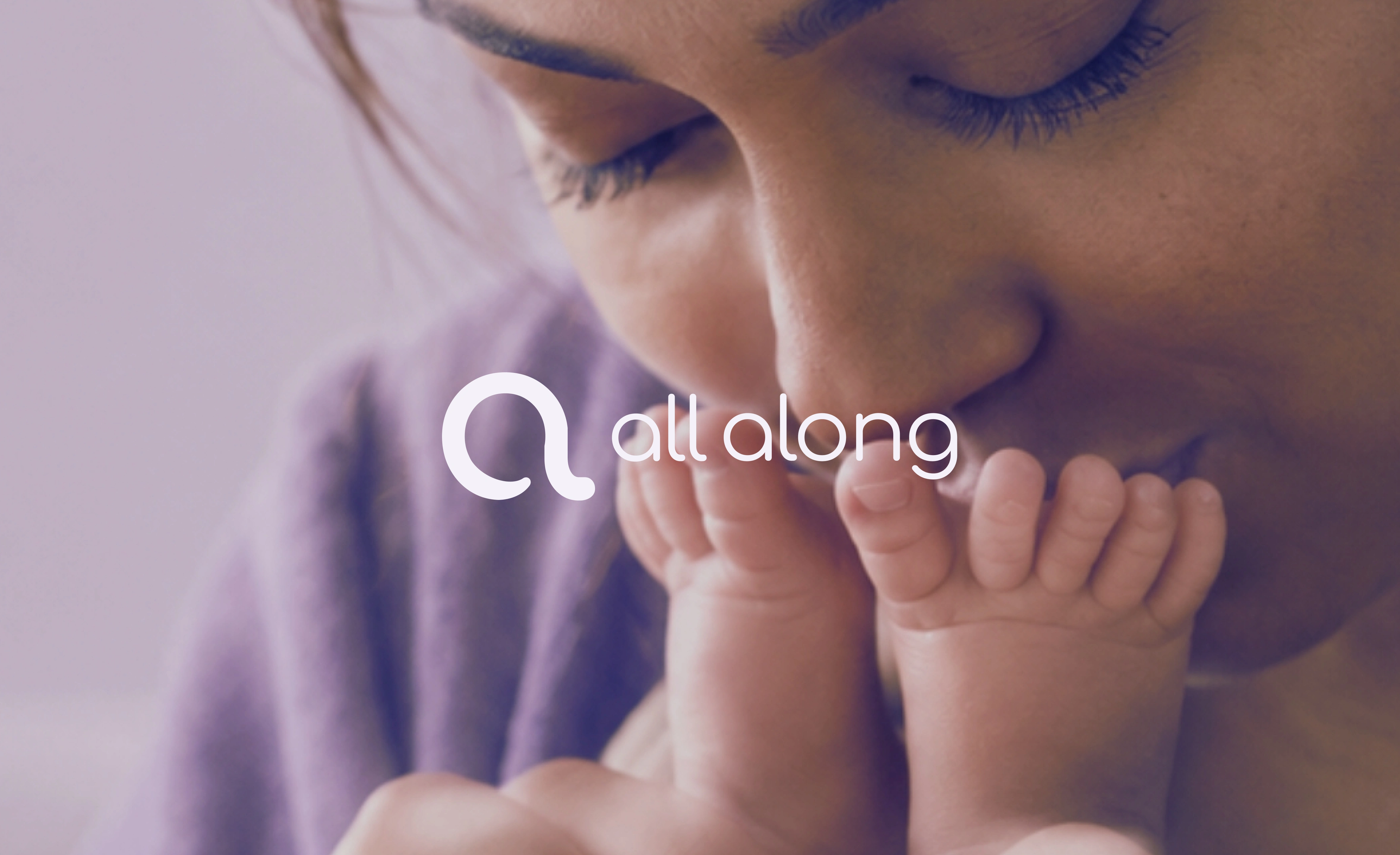
A brand identity built around the journey of motherhood
A brand identity built around the journey of motherhood
Brand Strategy · Brand Identity · Logo Design · Visual Identity System · Art Direction
Overview
Motherhood is not a single moment. It is a journey filled with change, uncertainty, anticipation, and growth.
All Along is a maternal health app designed to support women through the different stages of that journey, from trying to conceive and pregnancy to postpartum.
The challenge was to build a visual identity that could communicate care, trust, and continuity while giving the brand a distinctive presence in the maternal health space.
The goal was to create more than a recognizable logo. It was to establish a cohesive identity that reflects the brand's purpose and can grow alongside the women it serves.

The Brand Challenge
Maternal health is deeply personal. The brands operating in this space need to communicate expertise without feeling cold, and warmth without losing credibility.
For All Along, the identity needed to express three essential ideas:
Trust: A visual language that feels reassuring and dependable in a sensitive health context.
Continuity: An identity that reflects the evolving journey from conception through postpartum.
Connection: A brand that feels human, supportive, and approachable throughout different stages of motherhood.
The challenge was to bring these qualities together in one coherent visual system.
The Creative Direction
The identity was developed around a central idea: motherhood is a continuous journey, and support should be there all along.
Rather than treating each stage as a separate experience, the brand needed to communicate a sense of connection across the entire journey.
This idea informed the creative direction, guiding the visual language toward an identity that feels cohesive, approachable, and adaptable across the brand's touchpoints.
Every element contributes to the same underlying message: support that grows with you.
The Logo System
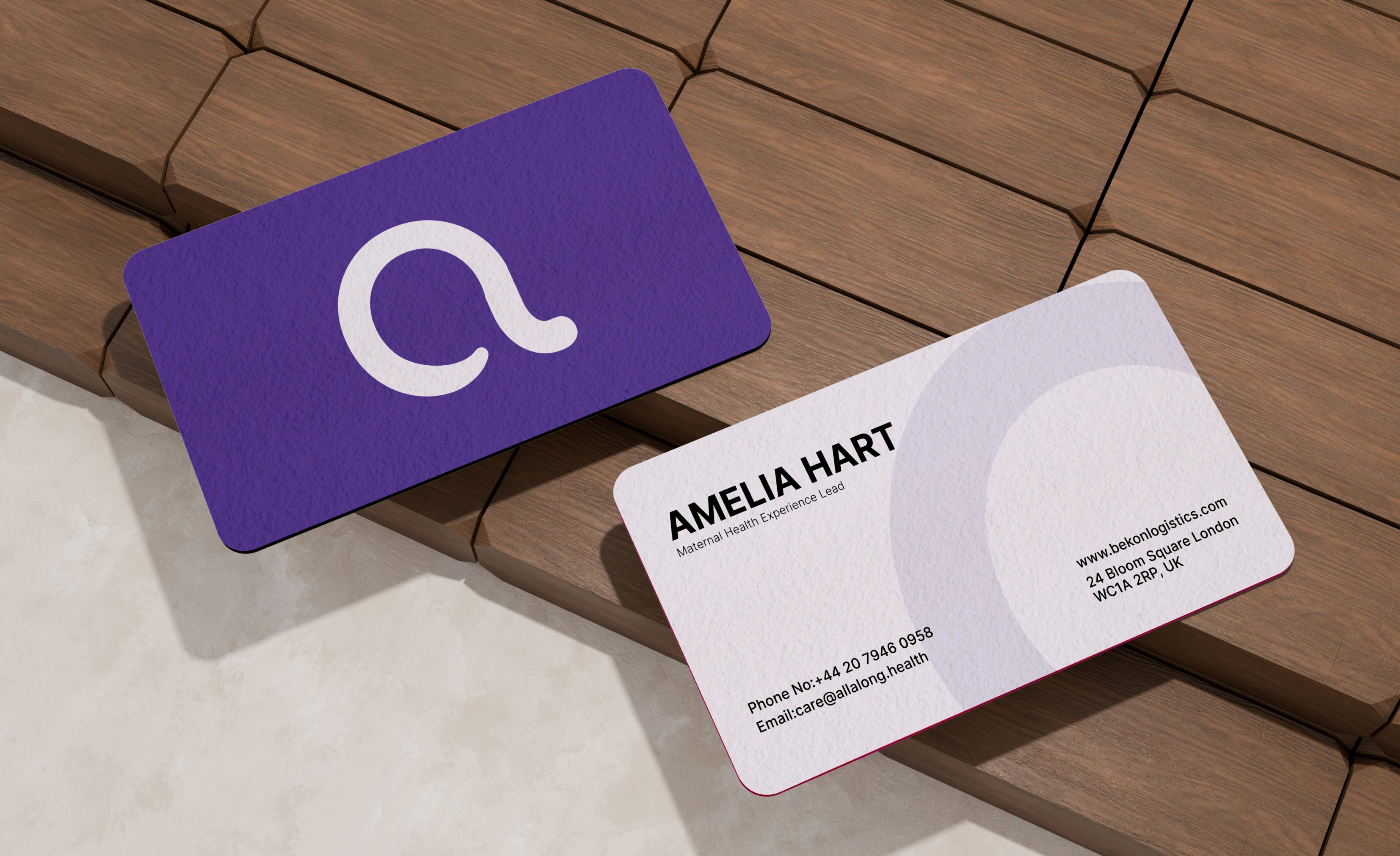
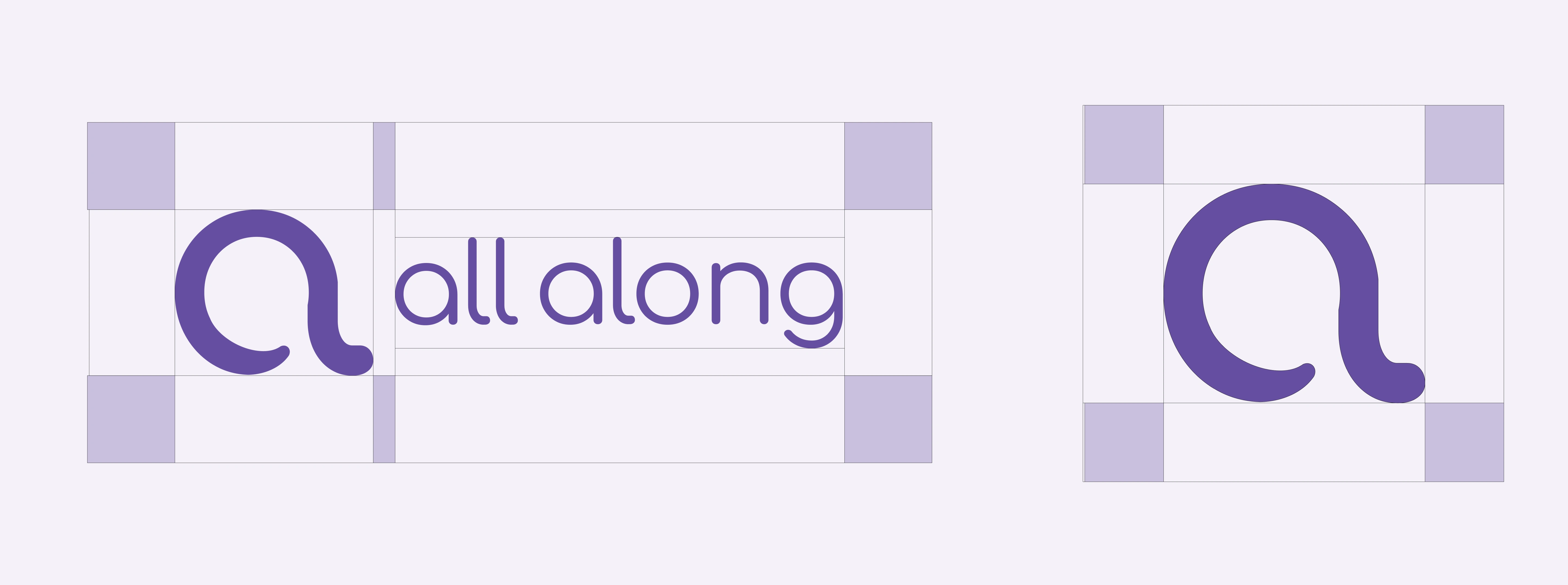
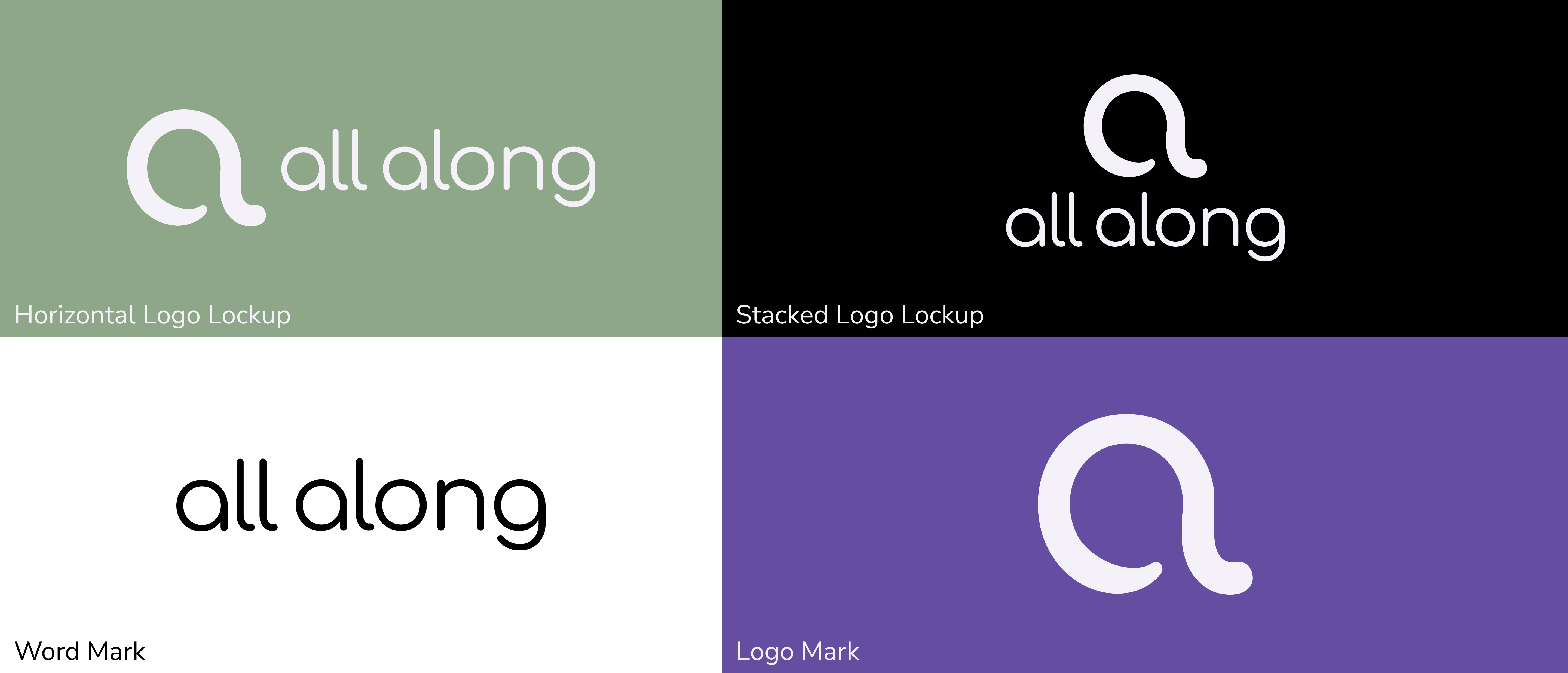
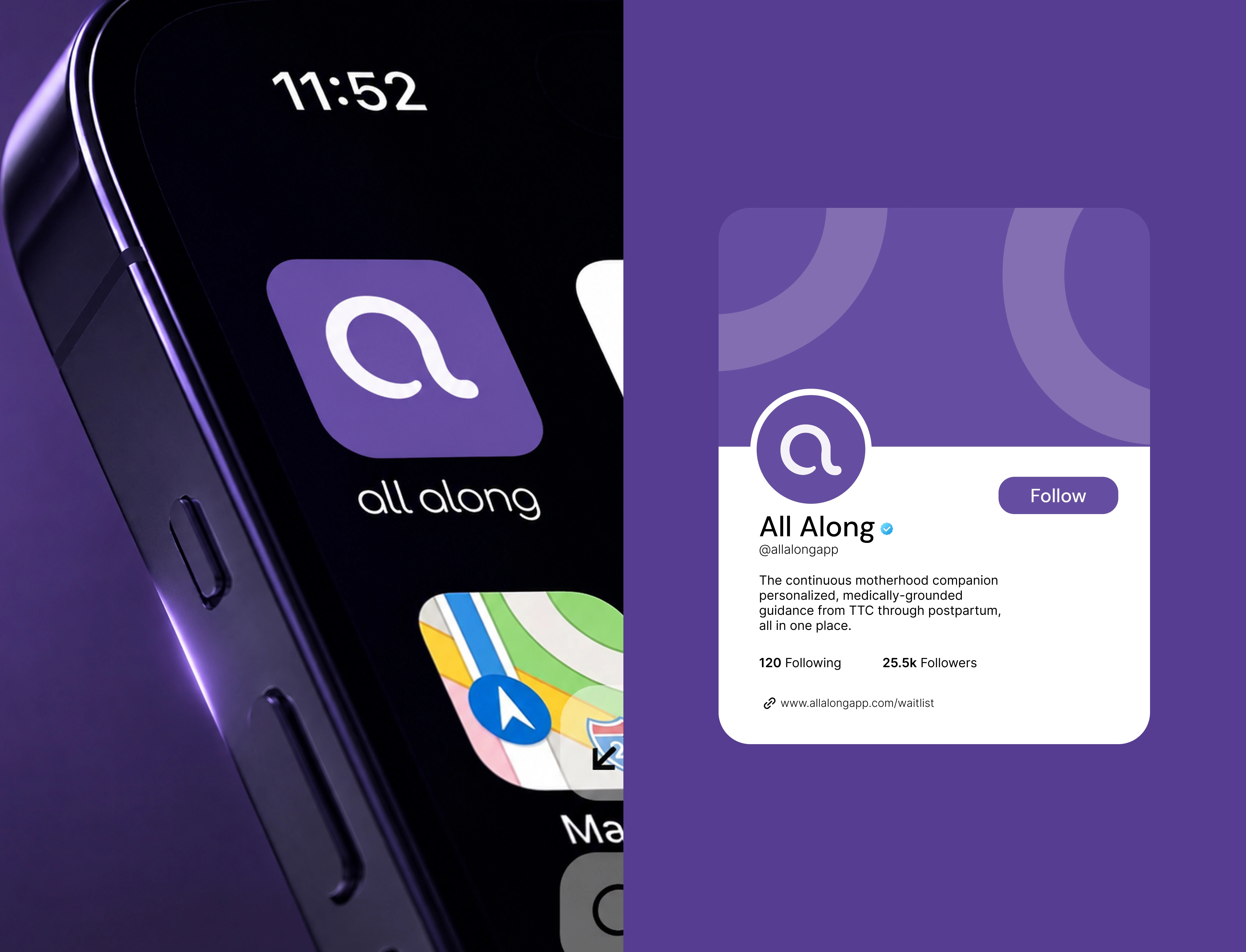
The logo serves as the foundation of the All Along identity, giving the brand a recognizable visual signature.
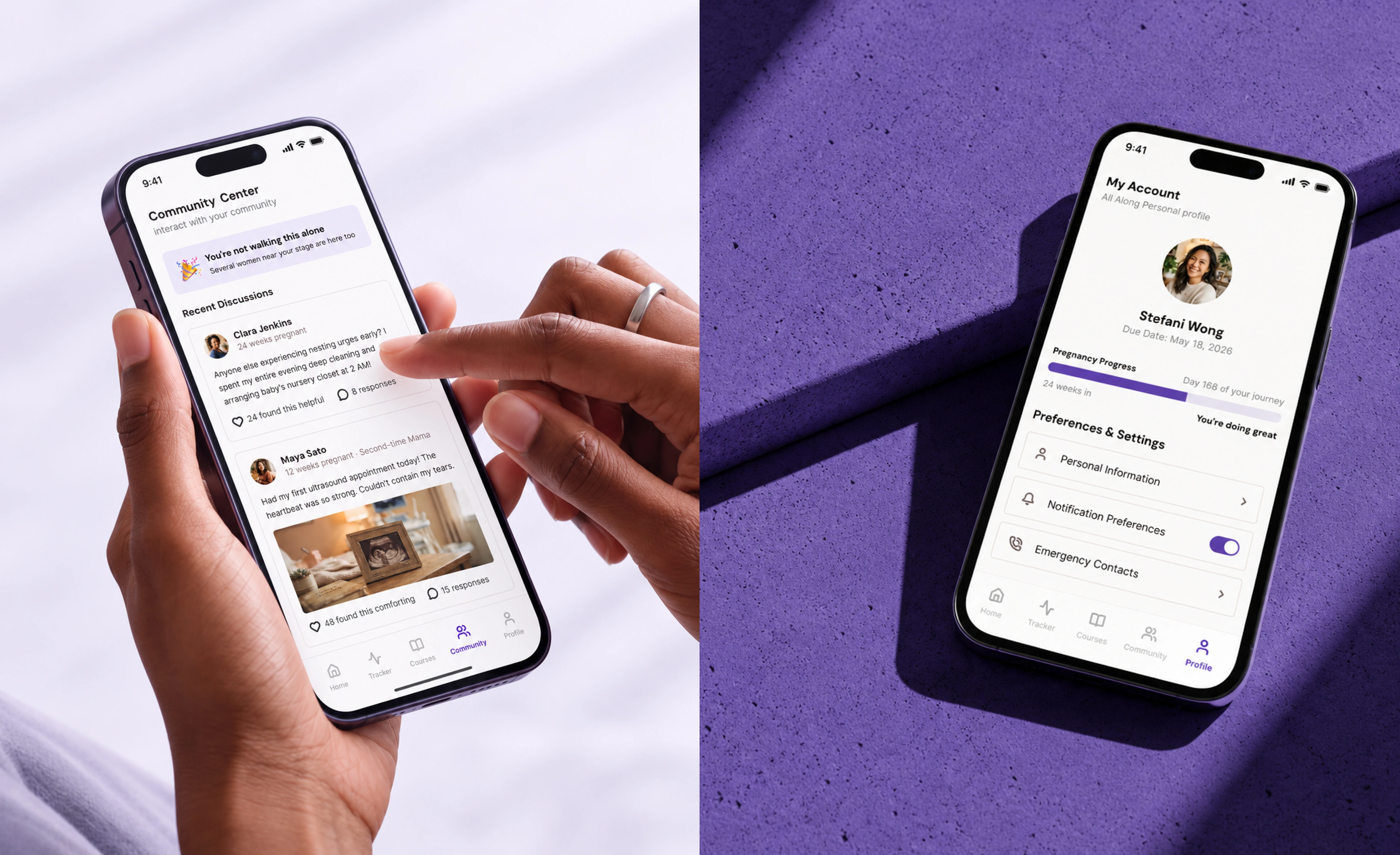
The broader identity system builds on this foundation, ensuring the brand can maintain a consistent presence across different formats and applications.
The Visual Language
A brand identity is more than its logo. It is the combination of visual elements that makes a brand recognizable and consistent.
For All Along, the visual system brings together typography, color, and supporting graphic elements to establish a distinctive brand presence.
Color Palette
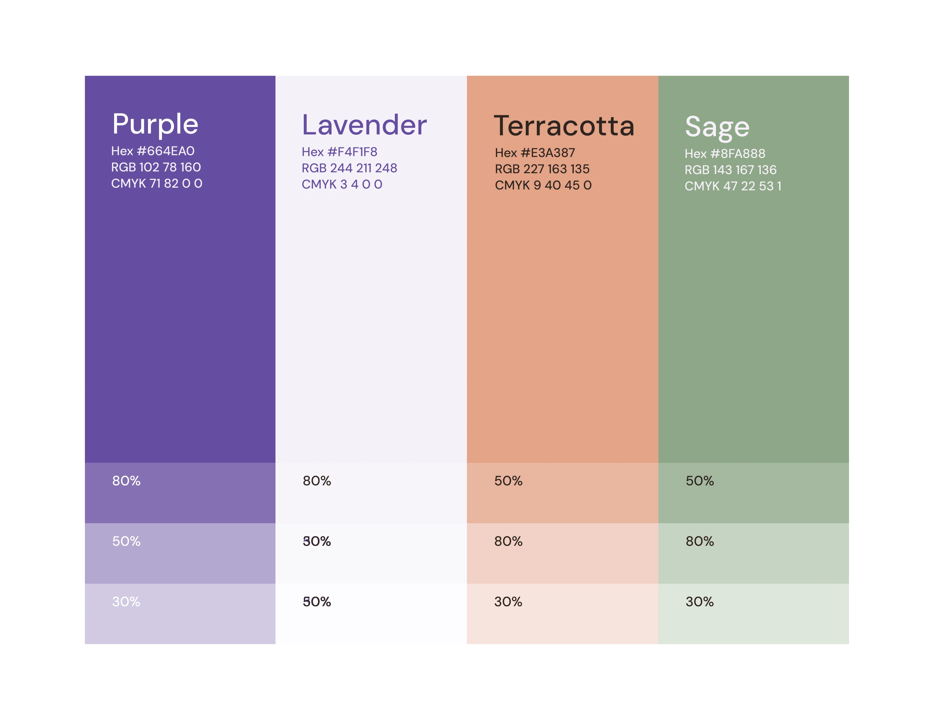
The color system provides a consistent visual foundation for the identity, helping establish its tone across different brand touchpoints.
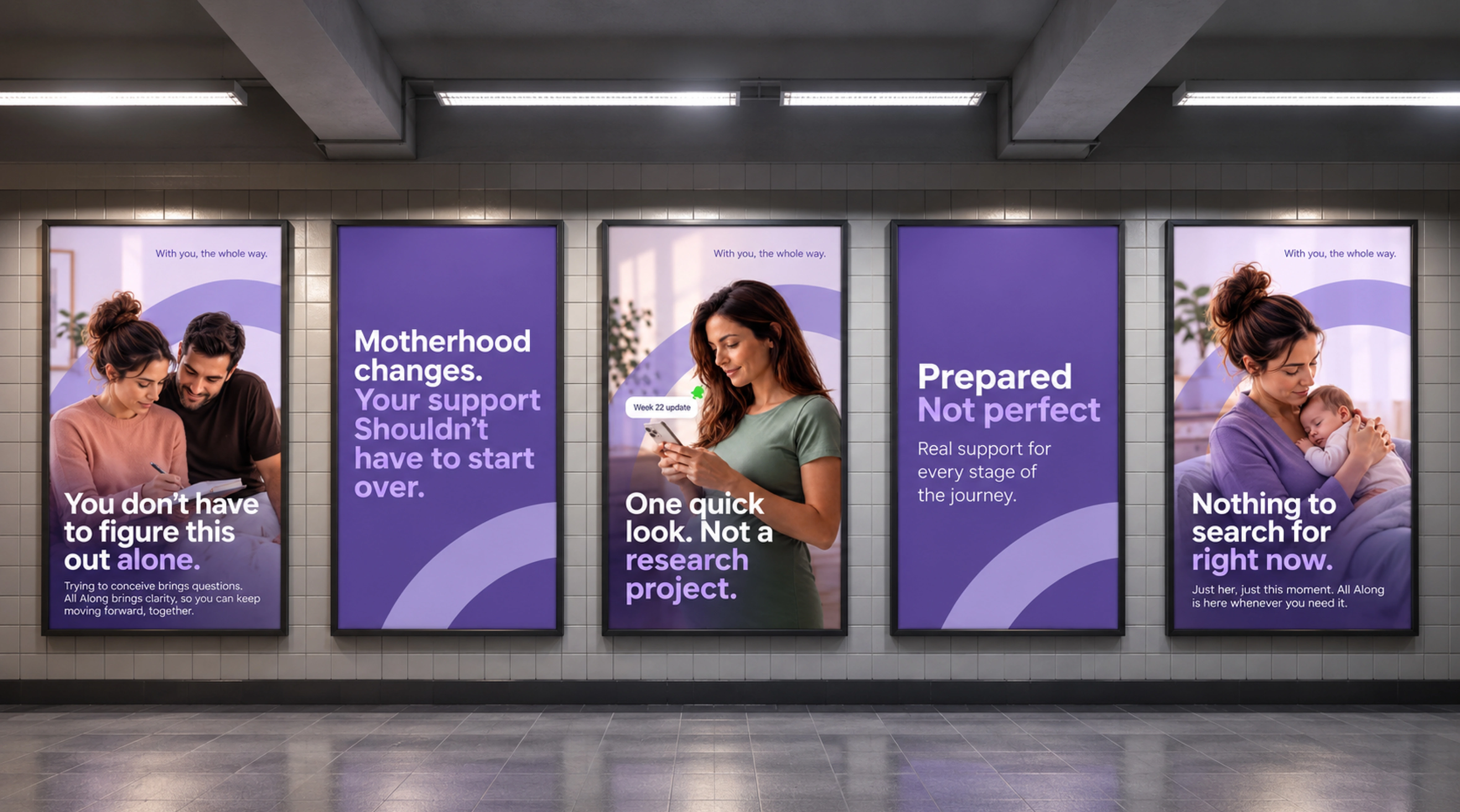
Supporting Graphics
The supporting visual elements extend the identity beyond the logo, creating a more complete and recognizable brand language.
All Along's identity establishes a cohesive visual foundation for a maternal health brand built around continuity, care, and support.
The result is a brand identity designed to communicate the product's purpose while providing a consistent visual language that can extend across its evolving ecosystem.
A brand for every stage of the journey. A presence that stays with you all along.

Like this project
Posted Sep 30, 2026
A brand identity for All Along, a maternal health app supporting women through every stage of motherhood, built around trust, connection, and continuous care.
Likes
1
Views
9
Timeline
Sep 15, 2026 - Sep 30, 2026